Category: Research
-
Hildegard Henning’s Belladonna typeface (1912)
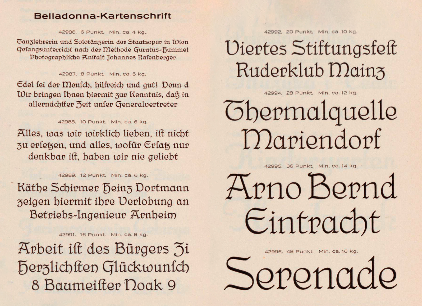
A few times a year, I’ll get an e-mail asking for information about Belladonna. It is generally considered the first German typeface attributed to a woman. The Julius Klinkhardt typefoundry in Leipzig published Hildegard Henning’s design around 1912. Indra Kupferschmid mentions it in an Alphabettes post, First/early female typeface designers. Below, you can read what I’m currently able…
Written by
-
How old is the specimen? And the typeface?
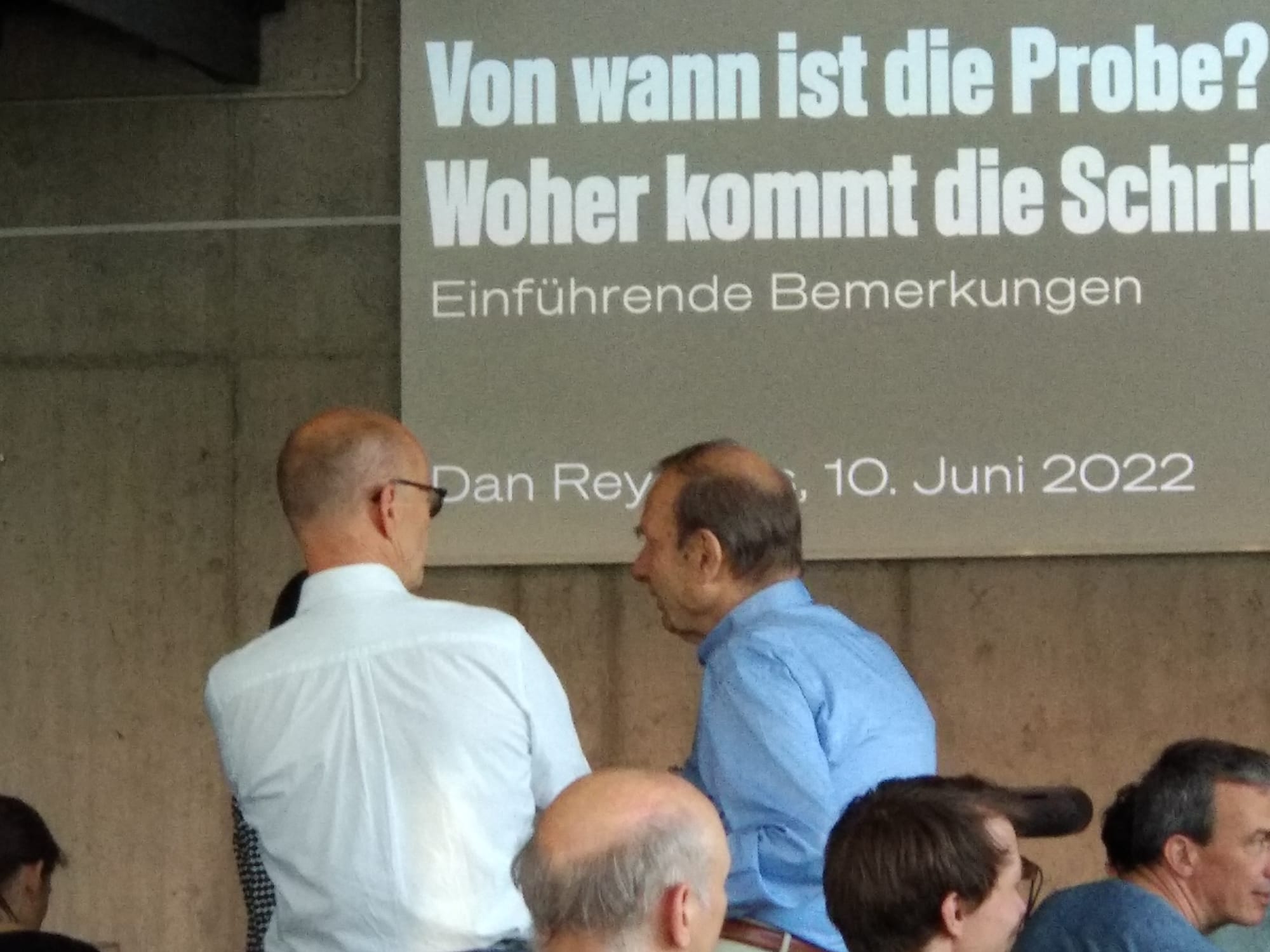
Between April 2020 and June 2022, I participated in a type specimen digitization project. Several public institutions in Berlin joined forces to photograph each page of every type specimen in their collections produced by Berlin-based type-making companies between the 1790s and 1951. Together with Christian Mathieu, I prepared an English-language summary of the project for…
Written by
-
Otto Kaestner’s brass type foundry: A lettering zine
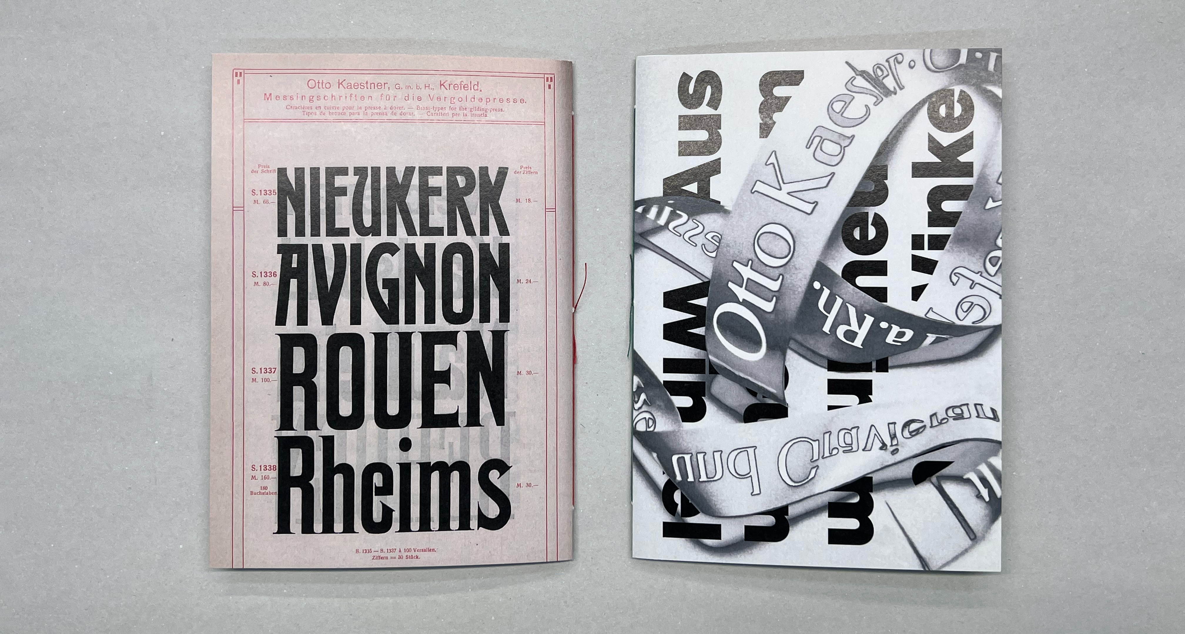
Although Germany had dozens of typefoundries in the early 20th century, none were based in the Lower Rhine region. Once the Düsseldorf branch of Bauer & Co. was closed in 1899, area printers would have had to order their types from more distant parts of the country: from Berlin, Hamburg, Leipzig, the Rhine-Main area, or…
Written by
-
Germany’s brass type foundries: Project start
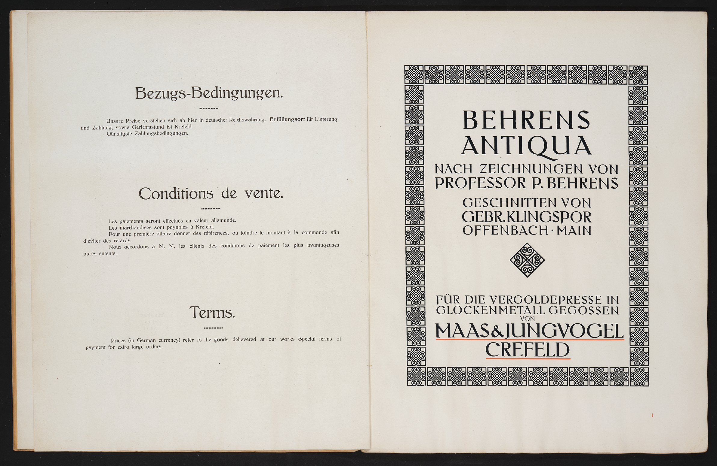
The image above shows the title page from Maas & Jungvogel’s brass-type specimen for the Behrens-Antiqua typeface (Allard Pierson, University of Amsterdam, call number KVB LPF 215). I’m beginning a new research project on the history of Germany’s brass-type foundries, particularly the companies like Maas & Jungvogel that were based in Krefeld. My project started…
Written by
-
H. Berthold AG’s matrices, reference castings & casting slips in the Deutsches Technikmuseum’s depot
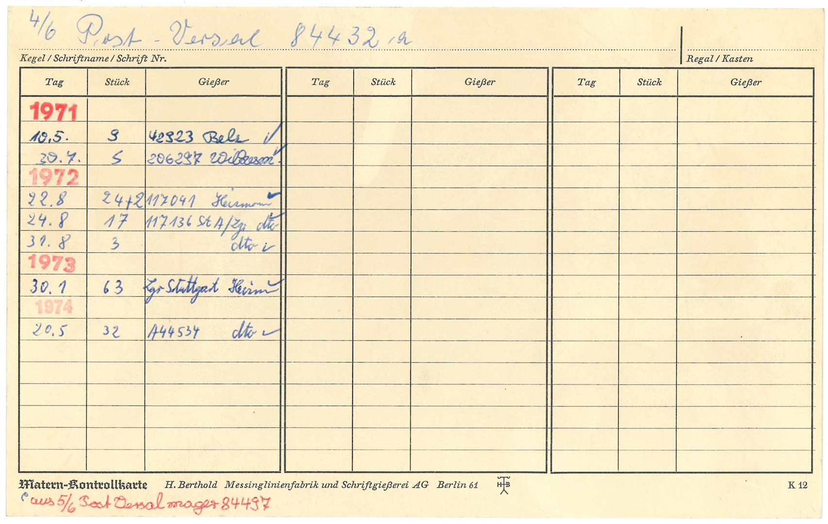
I wrote the following article on Berthold’s matrices with Kerstin Wallbach from the Stiftung Deutsches Technikmuseum Berlin. Our original German-language text was published by the Staatsbibliothek zu Berlin on its blog last week. Since 2020, I’ve been a member of the scientific advisory board a digiS digitization project called Die Sichtbarmachung des Sichtbaren – Berlins…
Written by
-
An independently-invented matrix-engraving machine: The “Ludwig–Hofer pantograph”
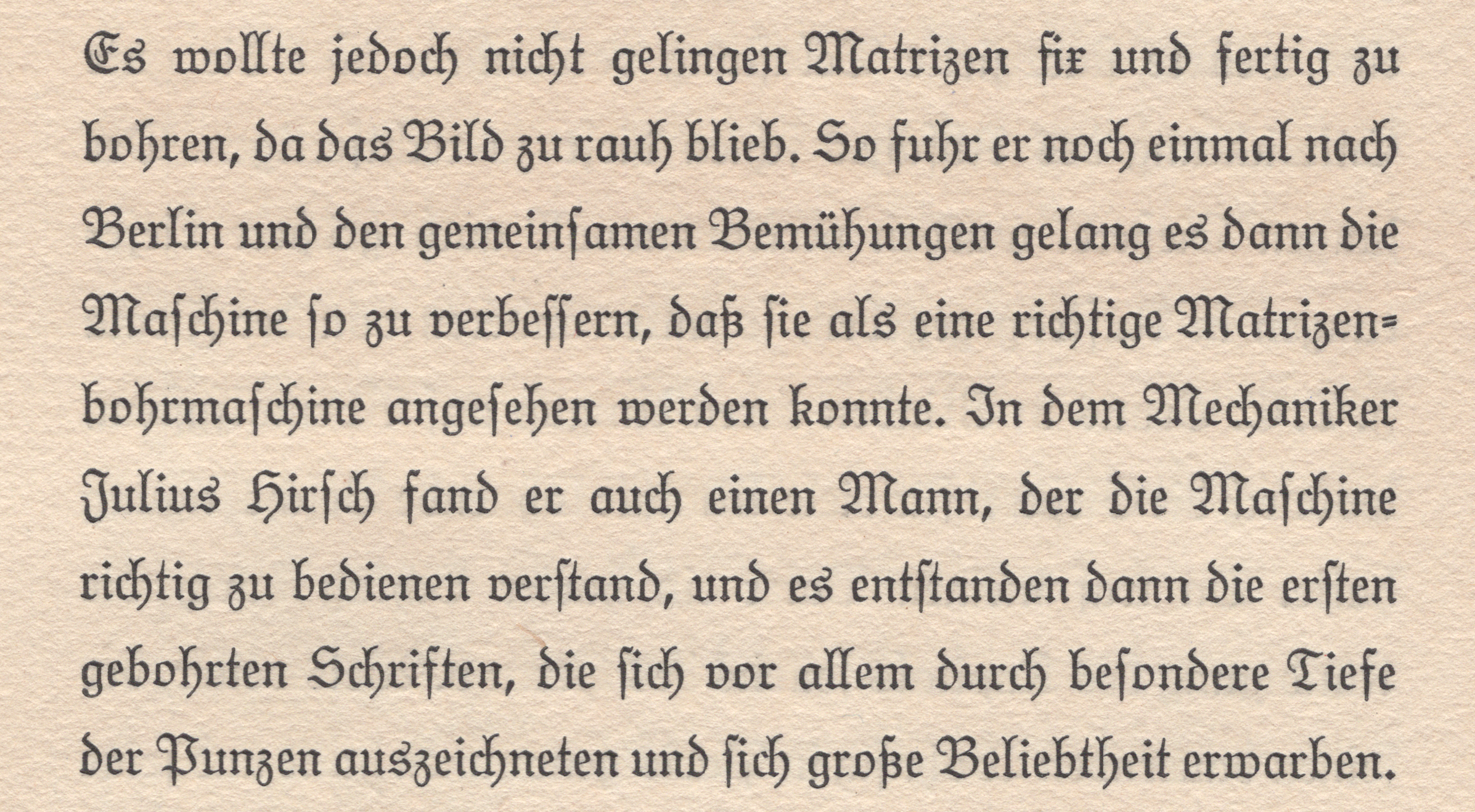
This is a post about a pantographic engraving machine I cannot find a picture of – the “Ludwig–Hofer pantograph.” Nevertheless, I think it could be an interesting missing piece of the historical puzzle surrounding the introduction of pantographic engraving machines in typefounding. In the United States, makers of wood type fonts had already begun using…
Written by
-
On the trail of Berlin’s typefoundries
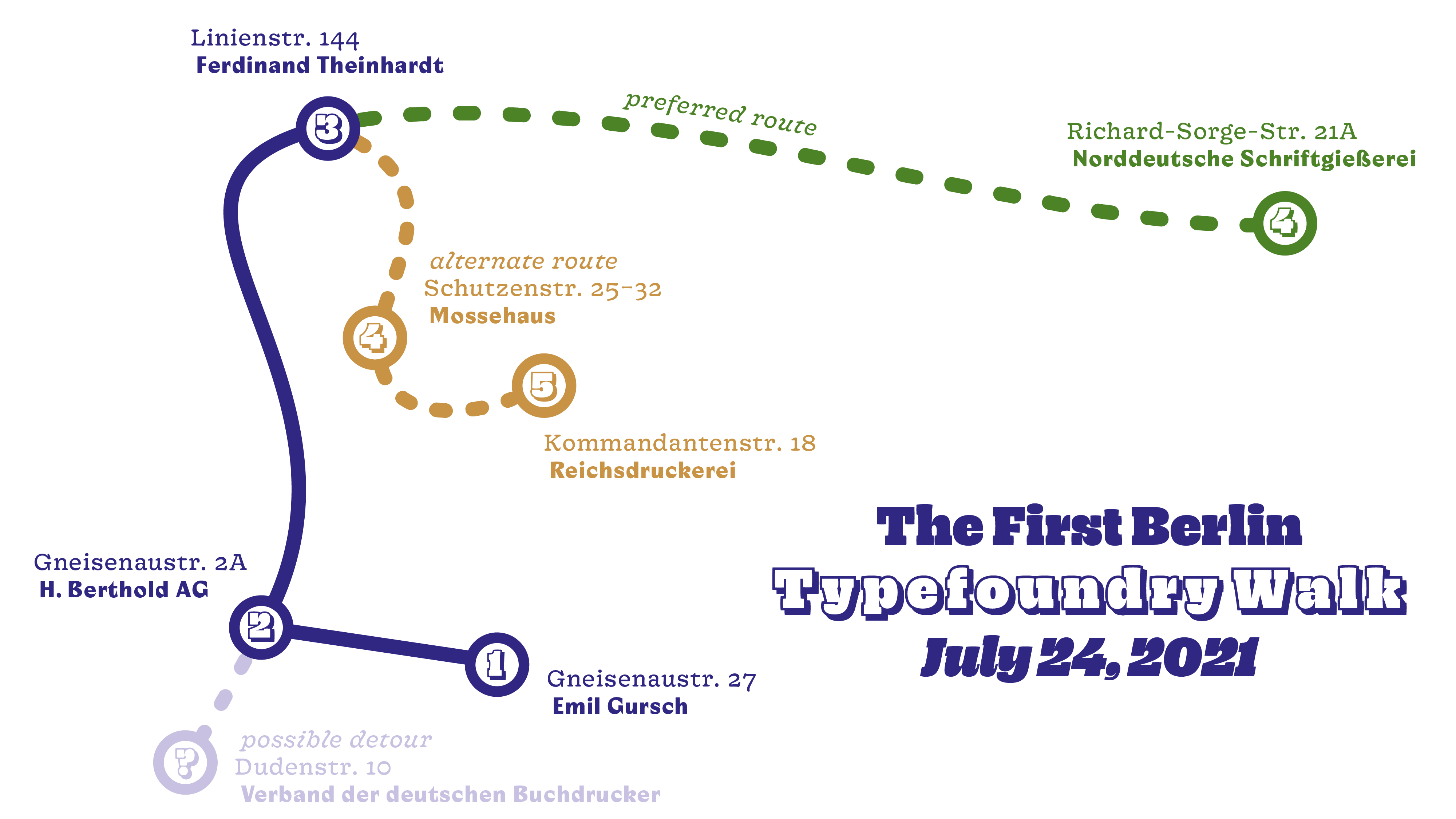
Several factory buildings from the time of industrial type-production are still preserved. These typefoundries and their products shaped the national printing industry during the 19th and 20th centuries. They continue to influence designs made by the international typography community today. On July 24, 2021, as part of the project Die Sichtbarmachung des Sichtbaren – Berlins…
Written by
-
Victor Hammer and punchcutting
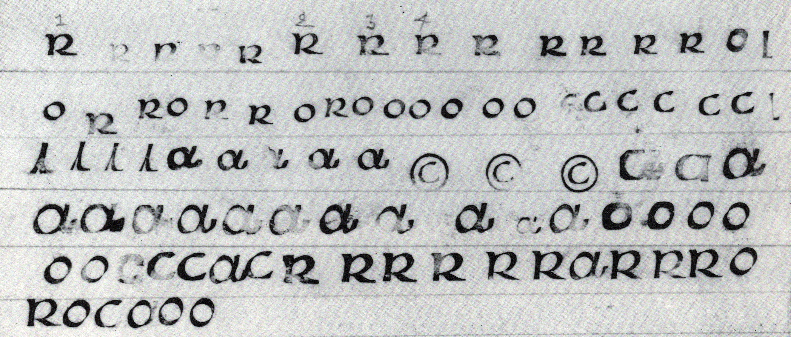
Above, smoke proofs from Victor Hammer’s punchcutting practice, reproduced from Victor Hammer: Artist and Printer (Lexington: The Anvil Press, 1981), p. 119. Was ever a type designer so devoted to uncials as Victor Hammer? Most of his typefaces were in that genre. As a printer, Hammer composed mostly with uncials, too. Uncials also appeared in his…
Written by
-
Victor Hammer and Gebr. Klingspor
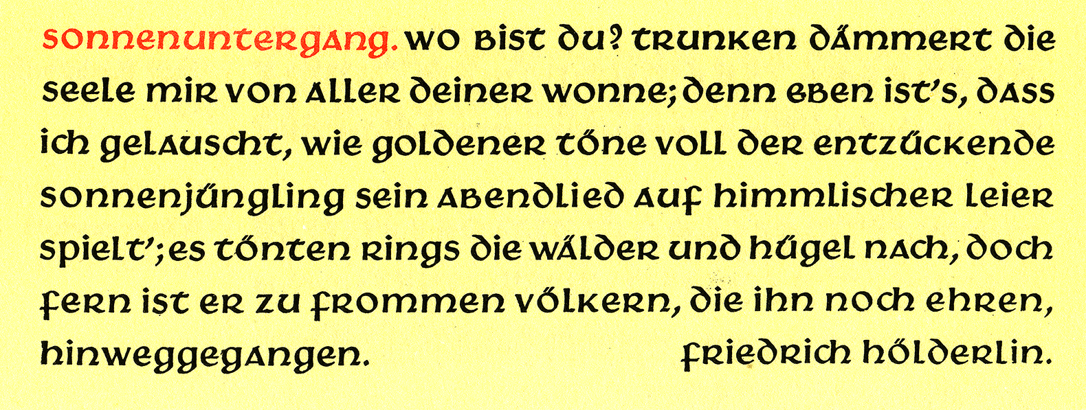
Above, I have reproduced a seven-line specimen of Gebr. Klingspor’s Hammerschrift from Rodenberg 1926. Victor Hammer, who designed the typeface, is most well-known among type designers and typographers for his uncial typefaces today. However, he worked with many letter styles in his lifetime, including monumental Roman capitals and Greek. Hammer probably devoted so much of…
Written by
-
Research results: Sans serif type in nineteenth-century Germany
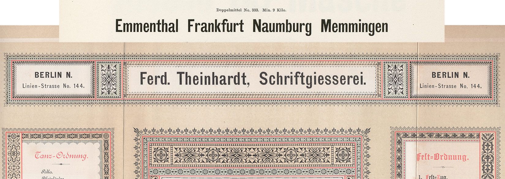
Berthold, Decker, Hamburg typefoundries, Leipzig typefoundries, Nineteenth-century sans serifs, Reichsdruckerei, Research, TheinhardtAbove, a digital collage showing two castings of the same design. The very top reproduces Benjamin Krebs Nachfolger’s product number 333, the 28pt size of the foundry’s Moderne Steinschriften typeface. Krebs first advertised its Moderne Steinschriften in 1865. That was one of the nine or more original sans serifs the Krebs foundry produced before 1900.…
Written by
-
From Vienna to Philadelphia (and further afield, too): Halbfette Cursiv-Grotesque
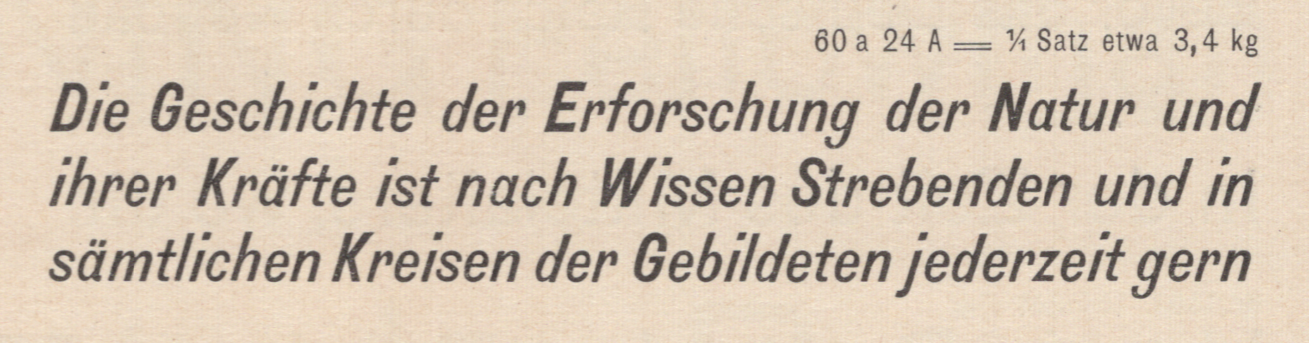
This post is about Halbfette Cursiv-Grotesque, a bold italic sans serif. Common in the last quarter of the nineteenth century, the typeface’s letterforms are slightly condensed. In the lowercase, “a” and “g” have single-story forms. The descenders are all very long. Many typefoundries carried this design – not just in Austria, Germany and Switzerland but…
Written by
-
Lapidar, from Genzsch & Heyse (born 1874)
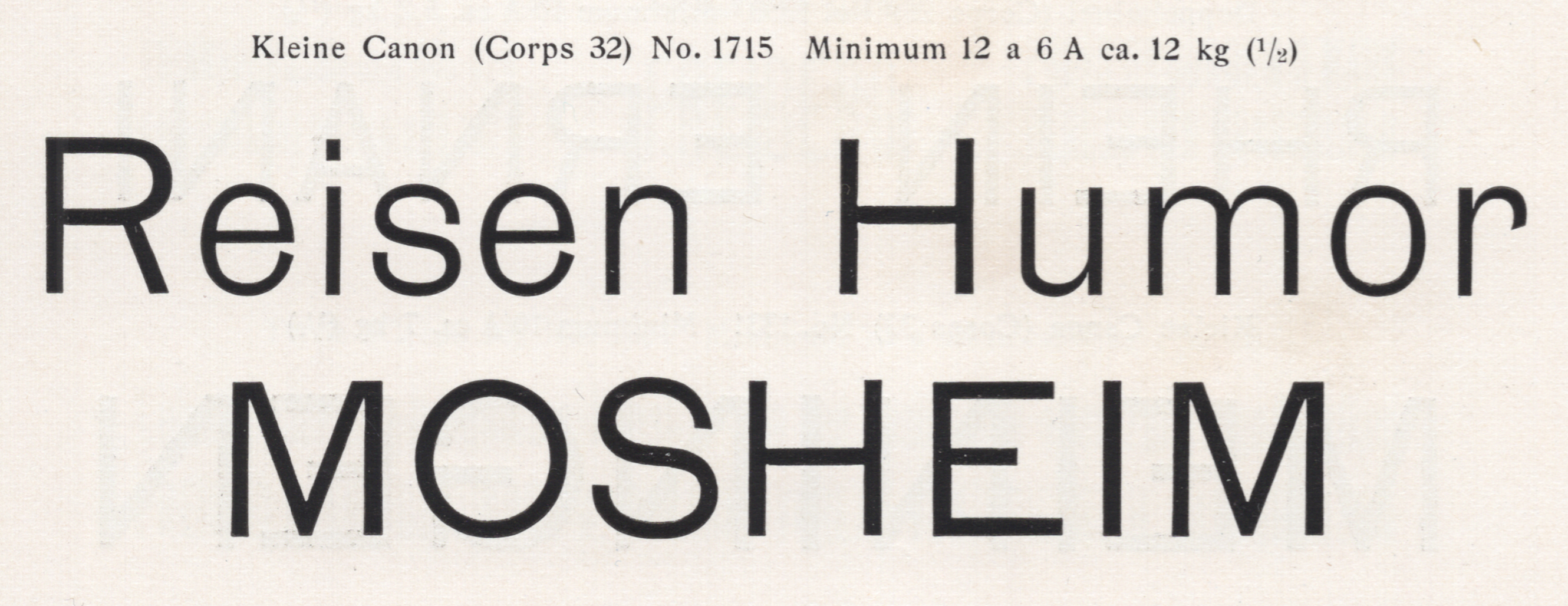
Above, I have reproduced a two-line specimen showing the largest size of the Lapidar-Schriften from a scan of E.J. Genzsch GmbH’s 1902 catalog. Recently, a type designer wrote to ask if I could provide him with some information about Genzsch & Heyse’s Lapidar. There is not much about the Lapidar typeface to be found online; Fonts…
Written by
-
Sanserif type in Germany in the nineteenth century: a preliminary survey
Above, I have reproduced six ornamental sans serif types from an 1850s type specimen sheet printed for the Joh. Pet. Nees & Co. foundry in Offenbach am Main. Philipp Rudhard’s widow purchased complete control of the firm in 1859. Her renamed Rudhard’sche Gießerei stayed in the Rudhard family until 1891. In 1892, a cigar manufacturer from Gießen…
Written by

-
Imperial-era Germany’s definitive heavy sans
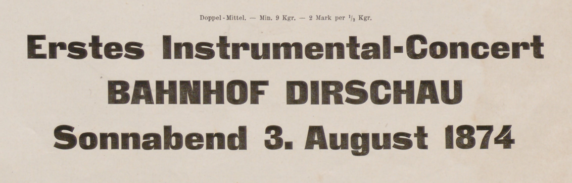
Above, I have reproduced a three-line specimen of the Doppel-Mittel size from the Zeitungs-Grotesque typeface. That translates to about 28 Didot points. The image is cropped from J.G. Francke Nachfolger A.W. Kafemann’s Vorläufige Probe (1874). Courtesy of the Noord-Hollands Archief. In the post below, I discuss this heavy sans serif’s wide distribution. The Danzig-based Francke typefoundry first advertised…
Written by