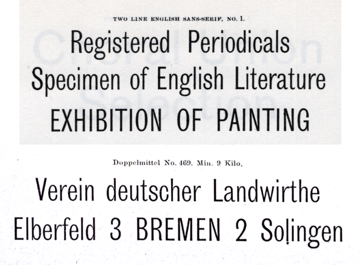
Above, I have reproduced six ornamental sans serif types from an 1850s type specimen sheet printed for the Joh. Pet. Nees & Co. foundry in Offenbach am Main. Philipp Rudhard’s widow purchased complete control of the firm in 1859. Her renamed Rudhard’sche Gießerei stayed in the Rudhard family until 1891. In 1892, a cigar manufacturer from Gießen named Carl Klingspor purchased the foundry. His sons Karl and Wilhelm changed the company name to Gebr. Klingspor in 1906. Even in the 1920s, Gebr. Klingspor catalogues still featured a few nineteenth-century sans serifs, although the six types shown above seem to have been discontinued by that time.
At the beginning of December, the Journal of the Printing Historical Society published some of my research in the article “Sanserif type in Germany in the nineteenth century: a preliminary survey.” It runs in the Journal’s third series, number 1, which you should be able to find in any research library that actively collects printing-research publications. You can also order the issue from the Printing Historical Society directly. Even better: if you become a member, you’ll always get the Journal sent to you, and you can help make sure future issues will be published.
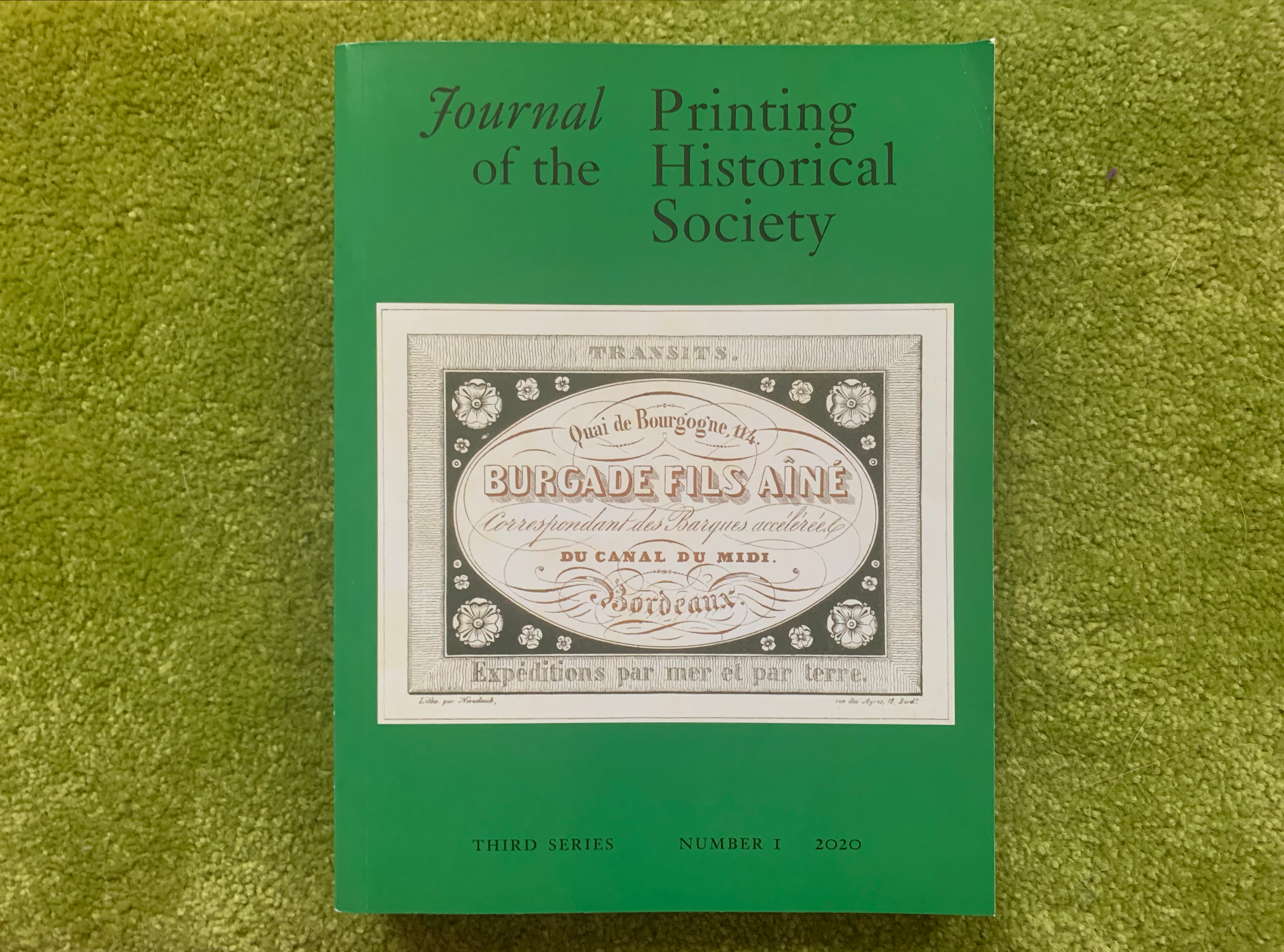
The image on the cover is from Michael Twyman’s paper on Émile Niveduab, but I think it is serendipitous that the chosen print prominently features sans-serif lettering. This image, as well as the following pair, can be enlarged through clicking.
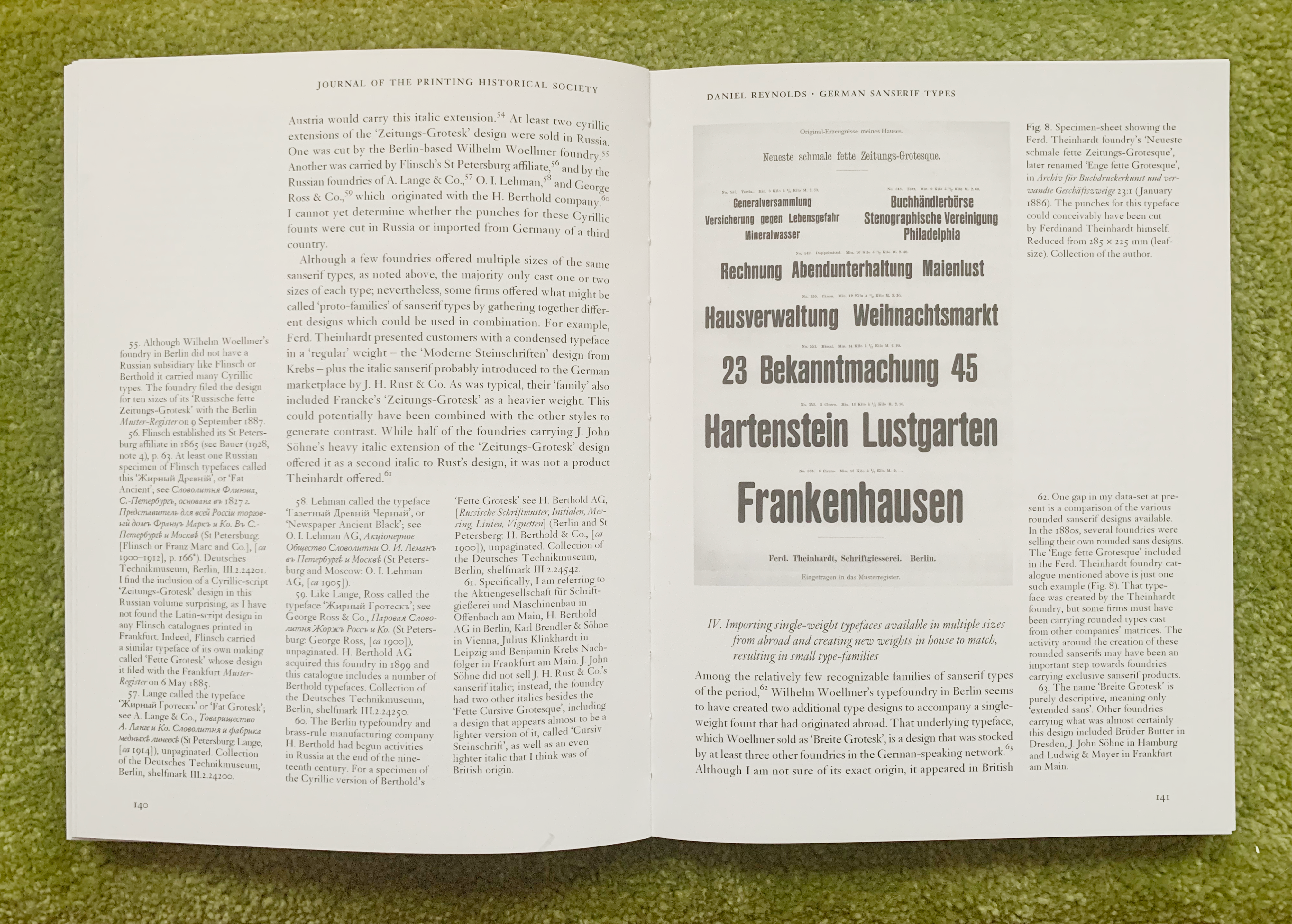
The specimen from the Ferd. Theinhardt foundry reproduced on the above spread can be seen in color over on Flickr. You can read more about its design in this post on the foundry itself.
Sans serif research update II: Thoughts about data presentation
Since I have posted about my research here before, I won’t repeat all the details about my methods here. If you are interested in reading more about that, there is my project announcement post from 2018, just after I had received a PHS research grant. A year later, I posted an update on my research progress. I also gave three lectures on parts of my research in 2019, all of which are online. The first was at the Staatsbibliothek zu Berlin in January (German). In June, I spoke at TypeParis and in October, I presented at the Sans Everything 2 conference at Esad d’Amiens.
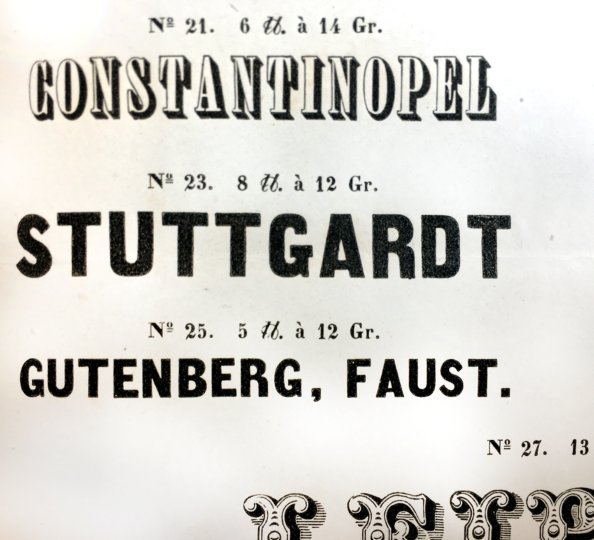
Close-up of two sans-serif types on a Breitkopf & Härtel foundry type specimen sheet that displayed 18 ornamental types from at least seven different type designs. Bundled with an 1840 issue of the Journal für Buchdruckerkunst, Schriftgießerei und verwandten Fächer.
During my research, when I saw types like the two sans-serif sizes above, I input the following kinds of information into an Excel table:
- Country: Saxony
- City: Leipzig
- Foundry: In-house operation at the Breitkopf & Härtel printing-house
- Publication: Journal für Buchdruckerkunst, Schriftgießerei und die verwandten Fächer, Band 7, Heft 11 [supplement].
- Date: October–November 1840
- Page number: unpaginated
- Other numbering scheme: Zier-Schriften aus der Giesserei von Breitkopf und Härtel in Leipzig. Zweites Blatt
- Typeface: Unnamed Zier-Schriften
- Product numbers: 23 and 25
- Type sizes: Not named
- Didot point sizes: Not given
- Company owners: Härtel family
- Type designer: Not named
- Punchcutter: Not named
- Cases: Caps-only
- Is this a “decorative” typeface: No
- Key features: Monolinear strokes and condensed letterforms. “A” has a very thin crossbar in the smaller size. “G” has a beard and a crossbar that goes in both directions. The terminals of the “S” are diagonal.
- Is this claimed by the foundry as an original design: n/a
- Similar to any other designs: n/a
- Foundries that created those designs: n/a
- Identical to other typefaces: n/a
- Foundries selling those typefaces: n/a
- Publication viewed at: Staatliche Museen zu Berlin – Preußischer Kulturbesitz, Kunstbibliothek
- Shelfmark: H 141 x mtl-7.1840
- Mentioned by Sara Soskolne in her 2003 MA dissertation: No
It is questionable whether those two sans-serif sizes could in any way be considered part of the same typeface. Today, it would be a difficult argument to make. The differences in the letters’ details from size to size are too significant. At the moment, I cannot state whether those two type sizes were produced by the same foundry/punchcutter or whether Breitkopf & Härtel paired two different products together. For my Journal article, I decided to limit my scope more-or-less to typefaces that appeared on specimens printed within German-speaking Europe between 1856 and 1900. I do mention that the oldest type specimen I came across was probably printed at Magdeburg in 1833. However, the number of type specimens from 1833 to 1855 that I was able to access was far fewer than for the years from 1856 onward.
Many “typefaces” found on specimens printed before 1850, in particular, were only shown in one or two sizes. Sometimes, when you view later type specimen catalogues from a foundry, you find those types again and realize that they were expanded to a “full” range of sizes, which usually means starting at 8pt and running through at least 36pt, if not up to 72pt or more. I’ll get more into arbitrariness below, but I decided that typefaces with just one or two sizes didn’t “count.” I limited myself to typefaces that had at least three type sizes. Most have eight or more. So an entry from a later year might look like this:

The image above shows the sizes of Benjamin Krebs Nachfolger’s Halbbreite Steinschriften that were not cut at or for the foundry. This design was sold by at least four other foundries in German-speaking Europe. None mentions in their publications that they cut its sizes, either. I assume that the original matrices for these sizes were probably created outside of German-speaking Europe altogether. Perhaps they were imported – or copied – from a foundry in Britain, France, or the United States. Photo credit: Staatliche Museen zu Berlin – Kunstbibliothek. Photographer: Dietmar Katz.

According to Krebs’s specimens, the three large type sizes shown above were cut by or for the foundry. As I mentioned, at least four other foundries sold the same design as Krebs’s Halbbreite Steinschriften. Yet two of those firms – the Aktiengesellschaft für Schriftgießerei und Maschinenbau and Eduard Scholz – did not sell these larger sizes. Therefore, they probably got their matrices from the same source that Krebs did. The Ferd. Theinhardt foundry, as well as Gustav Reinhold/H. Berthold and Bauer & Co., probably bought its matrices of this design directly from Krebs, since its catalogue features these larger sizes in addition to the smaller ones. Photo credit: Staatliche Museen zu Berlin – Kunstbibliothek. Photographer: Dietmar Katz.
- Country: Prussia
- City: Frankfurt am Main
- Foundry: Benjamin Krebs Nachfolger
- Oldest publication including the design: Schriftgießerei Benjamin Krebs Nachfolger Frankfurt a. M.
- Date: 1889
- Page number: unpaginated
- Other numbering schemes: n/a
- Typeface: Halbbreite Steinschriften
- Product numbers: 125–135
- Type sizes: Not named
- Didot point sizes: 8, 10, 12, 14, 16, 20, 28, 36, 48, 60 and 72
- Company owner: Hermann Poppelbaum
- Type designer: Not named
- Punchcutter: Not named
- Cases: Uppercase and lowercase
- Is this a “decorative” typeface: No
- Key features: Close to Helvetica’s widths, from appearance anyway. Very small apertures on “C” and “G.”
- Is this claimed by the foundry as an original design: For sizes 48, 60 and 72 pt: yes. Krebs’s 1907 catalogue (p. 224) states that product numbers 133–135 were created in-house. The smaller sizes must have been imported from another source.
- Similar to any other designs: The caps are like the Breite Grotesquen/Breite Grotesque-Versalien that the Eduard Haenel/Wilhelm Gronau foundry had sold since at least 1856. Also similar to Neue breite fette Groteske.
- Foundries that created those designs: Eduard Haenel/Wilhelm Gronau and Otto Weisert, respectively.
- Identical to other typefaces: Breite Grotesque, Breite von [halbfette] Grotesk, Breite Grotesque, Moderne Grotesk, Halbbreite Steinschriften and Halbbreite Grotesk.
- Foundries selling those typefaces: Aktiengesellschaft für Schriftgießerei und Maschinenbau, Brüder Butter, Ferd. Theinhardt, Eduard Scholz and Gustav Reinhold as well H. Berthold and Bauer & Co., respectively.
- Publication viewed at: Staatliche Museen zu Berlin – Preußischer Kulturbesitz, Kunstbibliothek
- Shelfmark: H 1236 kl
- Mentioned by Sara Soskolne in her 2003 MA dissertation: Not exactly, but Sara does reproduce a specimen of the Eduard Haenel foundry’s Breite Grotesquen.
- Notes: Also shown on p. 180 of Krebs’ 1893 catalogue at the Kunstbibliothek (H 1236 mtl).
In the Journal, I wrote that I had identified a total of 147 different typeface designs sold on this geographic/linguistic market between 1856 and 1900, one hundred of which I believed I could state the exact origins for, and forty-seven for which I could not. The design that Krebs sold as the Halbbreite Steinschriften, for instance, is one of the forty-seven that I cannot yet find the exact origins for, as Krebs only claimed to have cut three of the eleven sizes it sold.
Database-migration, Part A:
My Excel table had no images in it, and its size made it time-consuming to consult. Since it was not very user-friendly for me, I knew that I would be almost unusable for anyone else. After the article was published, I migrated a reduced dataset for those 147 type designs into two Airtable databases.
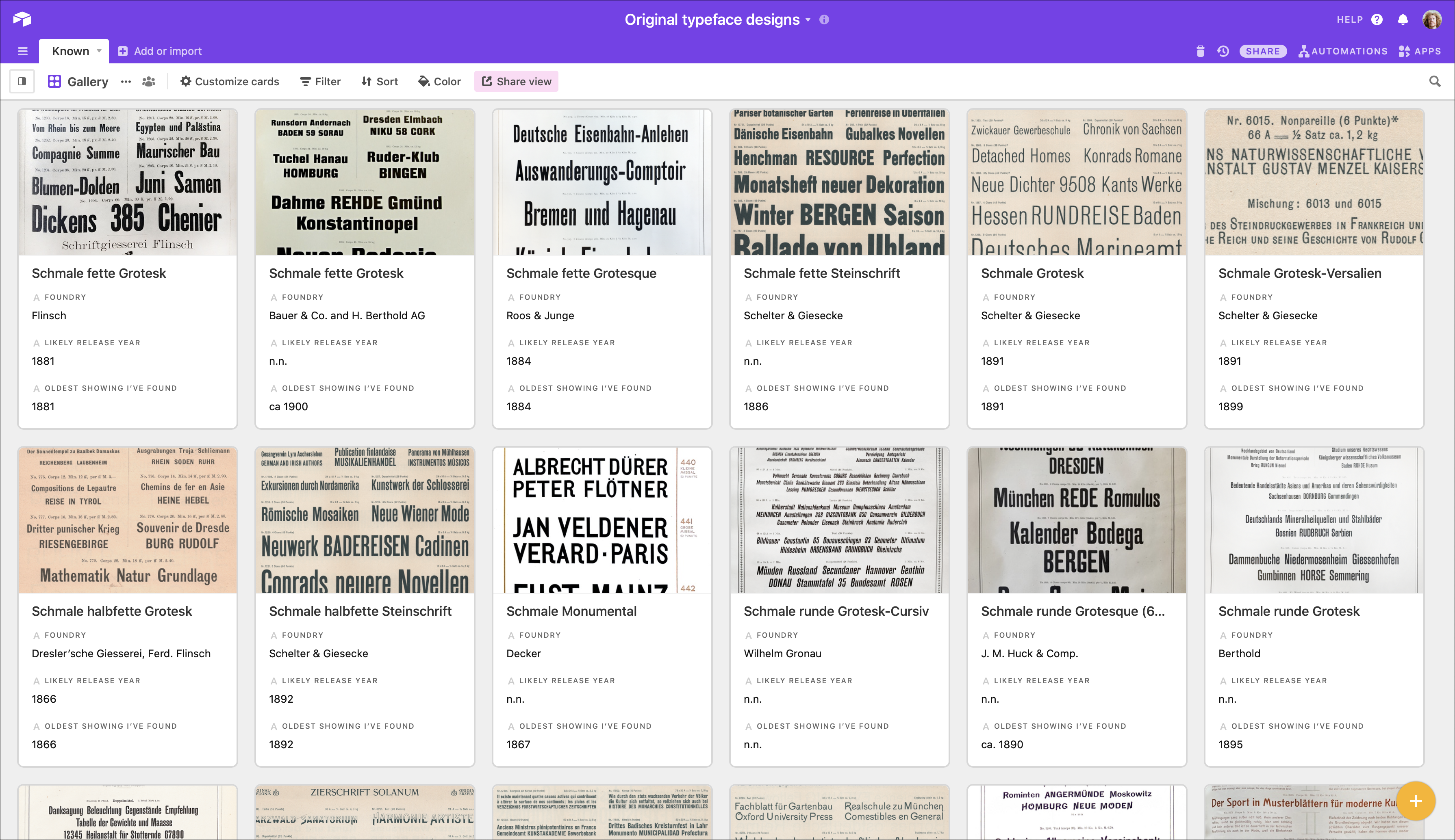
Screenshot showing twelve of the entries from my Airtable database of typefaces I think I can attribute the origins of. Click to enlarge.
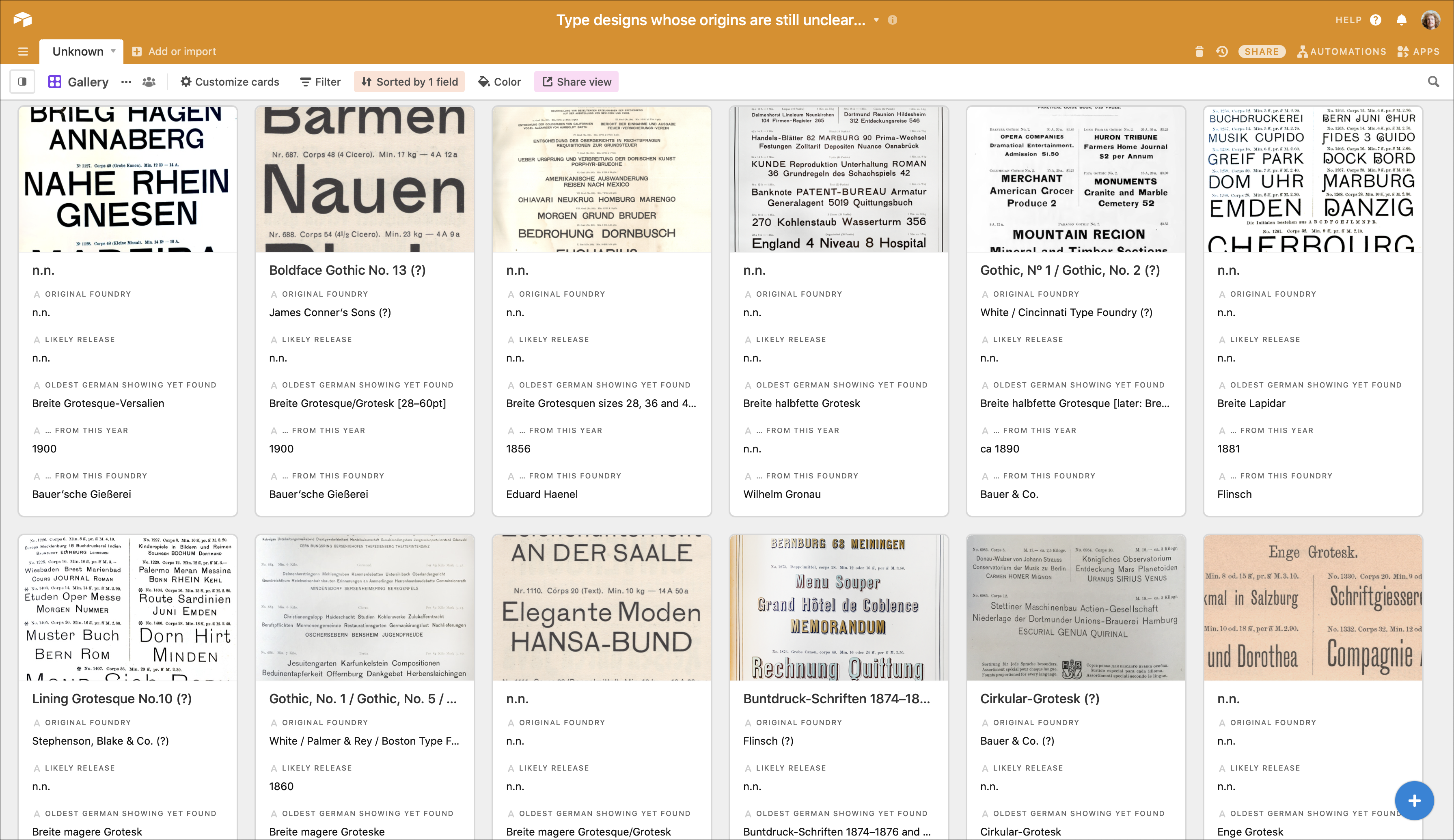
Screenshot showing twelve of the entries from my Airtable database of typefaces I have not entirely settled upon attributions for. The Breite Lapidar entry in the top-right corner is the Caslon foundry’s 1876 Doric, No. 3 typeface. Click to enlarge.
My Excel table entries are group by type specimen. In each nineteenth-century German type specimen I examined, I listed all sans serif typefaces inside. I grouped my databases around “type designs” instead. Some typefaces have more than one “design.” For instance, Krebs’s Halbbreite Steinschriften has three entries: One is for sizes 8–36pt. This is in the database of designs I don’t know the origins of. A second entry is for the sizes 48–72pt. That is in the databases of attributable type designs. Then there is a third entry for an exception. A Brüder Butter specimen broadsheet from around 1900 included the 8–48pt sizes of the design that Krebs sold, together with a “foreign” 42pt size. In my database, this lone entry was simply filed in the unknown database under “Breite Grotesk 222,” the product number of that 42pt font at Brüder Butter. By dividing the number of designs up this way, my data set began to expand past the 147-designs figure I mentioned in the article.
Anyone sifting through this data will see that a great many of these sans serifs were created at the end of the nineteenth century. Indeed, I have even included typefaces with the release year 1900 in this dataset. A result is that my title for this work, “sanserif type in Germany in the nineteenth century” is in one sense inaccurate. While one might argue that these late-in-the-century types were created in styles specific to various nineteenth-century design currents, it must be true that the products had more use in twentieth-century printing. To be specific, I cannot imagine a convincing thesis that Akzidenz-Grotesk (1898) was anything but a twentieth-century design icon.
Typical problems
Sometimes, the images I work with are professionally-made photographs of excellent quality. Other times, my images are high-resolution scans. Most are neither. I often have to rely on iPhone photographs that I made quickly, without a tripod, in low-light conditions or on library “book scanners,” which often apply an algorithm that tries to flatten the image and color correct it. Some libraries use software that allows you to switch those “features” off. Others do not. That discrepancy is even visible in the two Airtable screenshots posted above. The image below illustrates what it is like to work with less-than-perfect photographs in more detail. It also shows a common problem for research into the typeface record itself.
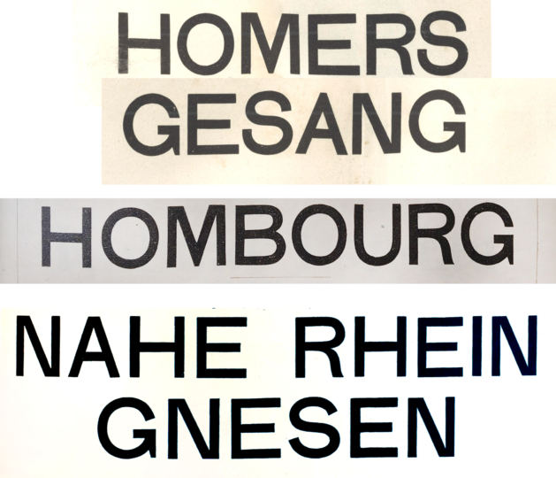
Digital collage made from three re-sized photographs. These depict what was probably the same letterform size, although the types’ body sizes were different. The top two lines show a 44pt-body size of the Eduard Haenel/Wilhelm Gronau Breite Grotesque-Versalien design. It is a design that Haenel had carried since at least 1856. But the size was not cut by or for the foundry. The middle line is from Flinsch’s Breite Grotesk. The “R” and the “G” probably match the Haenel/Gronau design, but the “S” in smaller sizes does not (not shown). The bottom two lines are from the Bauer’sche Gießerei’s Breite Grotesk-Versalien. Looking at the details of letters like “G” and “S,” it is clear that this is not the same design as Haenel/Gronau’s (or Flinsch’s).
Naturally, it would be better for me to make a comparison from three specimens I could scan flat myself. That way, I could guarantee that no re-sizing would be necessary, and I could also prevent any welling on the paper to make letterforms that are the same from appearing different. Perhaps at some later stage in my research, I will be able to replace the bulk of the photographs and scans I have assembled over the past three years.
The sans serif dataset: What is in and what is out?
As should be obvious by now, there is a lot of arbitrariness in my dataset. Other compilers would surely make slightly different decisions about which sans serif types should come in and which shouldn’t. For instance, there are a few nineteenth-century typefaces which included the word “Grotesk” in their names that I think are not sans serif designs, visually. So I have not included them in my count. An examples of this is Berthold’s 1896 Carola-Grotesk, which I think looks more like an upright non-connecting brush-style script typeface than a sans.
As I put the Airtable databases together, I tinkered around a bit with what I wanted to define as a single “typeface,” and what I didn’t. There are several closely-related typefaces that the typefoundries I investigated presented as separate products, but which would be unlikely to be viewed as such by designers today. For instance, I mean that typefaces like Breite magere Grotesk (u&lc) and Breite magere Grotesk-Versalien (caps-only) are separate entries in my dataset. So are single-color and two-color versions of the same design, like the Wilhelm Woellmer foundry’s Schattirte Grotesk and Zweifarbige schattirte Grotesk.
48-pt size of the Zweifarbige schattirte Grotesk from Wilhelm Woellmer’s typefoundry in Berlin. I don’t know when the single-color or two-color version of this type design came onto the market, but both are in Woellmer’s 1894 type specimen catalogue. Woellmer based this decorative typeface on its Breite halbfette Grotesk, which was probably published in 1893. Note that Woellmer’s Breite halbfette Grotesk is a design completely unrelated to the Breite halbfette Grotesk Schelter & Giesecke published around 1891.
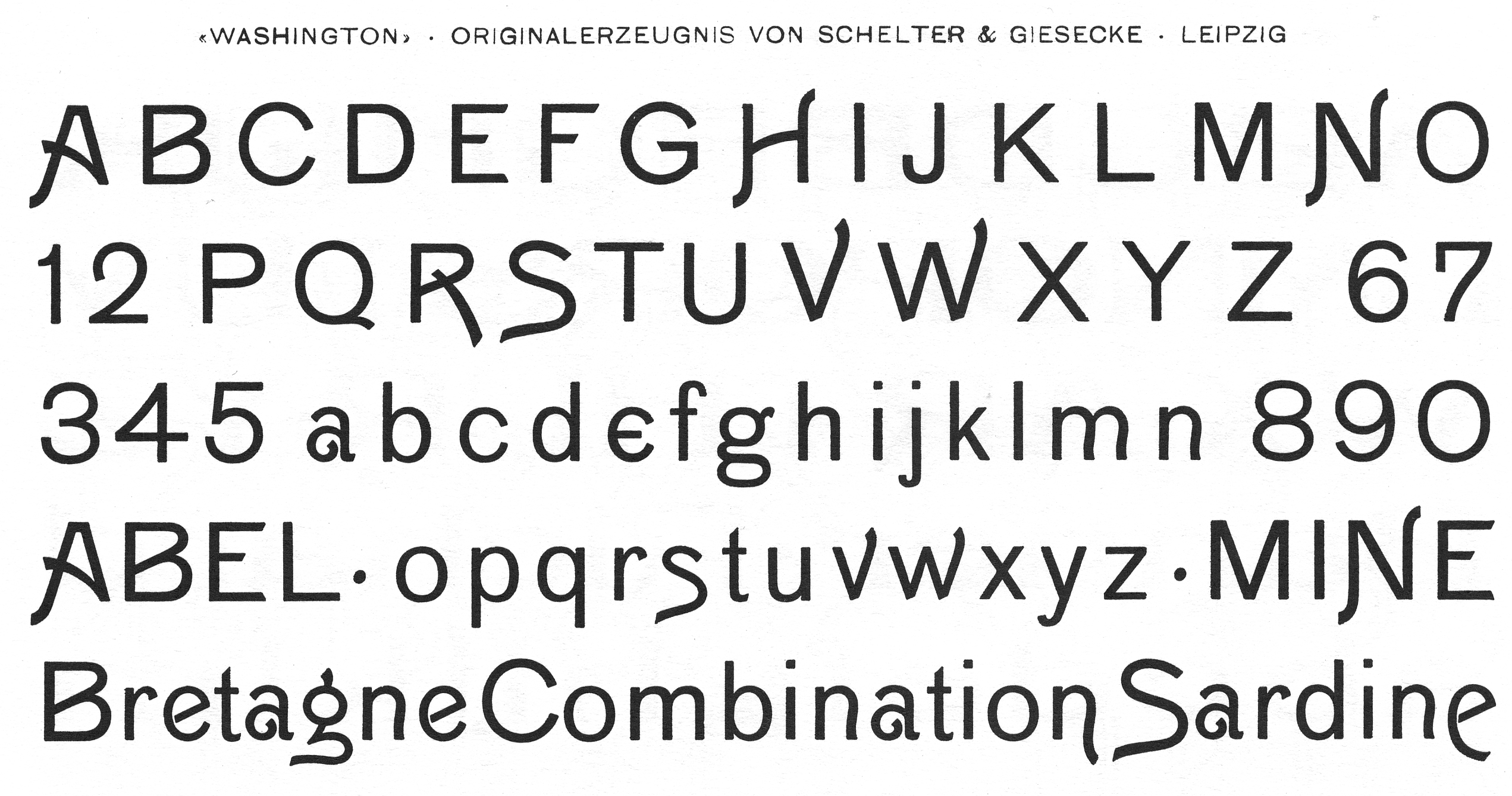
Schelter & Giesecke’s Washington typeface was probably published in 1895. In essence, it was Schelter & Giesecke’s own 1890 Breite magere Grotesk, with several uppercase and lowercase letters having been replaced by “weird” alternate forms. In my dataset, typefaces like this constitute a unique entry, even though Washington could also be viewed as part of the Breite magere Grotesk design. Today, it would be possible for these more-extravagant letters to be stored in the font file as OpenType alternates. However, standard type cases for text-sized fonts in late nineteenth-century Germany had no space allocated for any alternate letterforms (only for a certain number of virtually-standard ligatures). This image was scanned from Schelter & Giesecke’s 1912 catalogue.
What I have assembled is not a complete record of all sans serif typefaces sold in German-speaking Europe between 1856 and 1900ish. There are many more foundry products I could have included in the above-mentioned tally that are left out. For instance, foundries created Greek and especially Cyrillic versions of their own sans serif typefaces, as well as the sans serifs of others. At least for the time being, this survey is Latin-script only. My main reason for that limitation is that both primary and secondary sources list the release dates for script extensions much less frequently. Sometimes, a Latin-script design could have multiple Cyrillic extensions, as I illustrated in an earlier post on the Zeitungs-Grotesk typeface.
Furthermore, my dataset is likely not even a complete list of all nineteenth-century German sans serifs that I encountered during my research. There are surely things I overlooked that I should not have, as well as things I may have missed outright. Since I collected and analyzed the data by myself, I must have inevitably made mistakes I don’t know about yet. So if you notice any gaps or incorrect assumptions, please let me know.
Haunting mistakes in the Journal article
Speaking of mistakes, there are three errors in my Journal article that I would like to highlight and correct here. As those small mistakes are enshrined in print, they shall live on forever, and never cease to disgrace me. First, when discussing typefaces whose ranges Benjamin Krebs Nachfolger had extended, I wrote in footnote 14 that “in ‘Schmale Steinschrift’, these were the products numbered 7 and 18,” when I should have written that “In ‘Schmale Steinschrift’, these were the products numbered 7 and 8.” I then incorrectly stated in footnotes 15 and 16 that the Patent-Schrift from Benjamin Krebs Nachfolger and the Schmale magere Grotesque from Ferd. Theinhardt were the same design. They are not. The Patent-Schrift is probably an instance of Miller & Richard’s Sans-Serif, No. 1, while the design Ferd. Theinhardt sold as Schmale magere Grotesque probably came from the United States. I do not know where the design was first cast, but an 1860 Boston Type Foundry catalogue includes the design as Gothic Condensed, No. 4. Other US foundries had it as well. For instance an 1869 Bruce Type Foundry and an 1870 Cincinnati Type Foundry catalogue list the type design as Gothic Condensed, No. 2 and Gothic Condensed, No. 4, respectively.
Comparison of the approximately 28 Didot-point sizes of the Bruce’s Type Foundry Gothic Condensed, No. 2 and the Ferd. Theinhardt foundry’s Schmale magere Grotesque. The quality of the Theinhardt photograph is much better; the darker letterforms in the Bruce image are almost certainly due to the Google Books digitization process.
Above is a comparison of the approximately 28 Didot-point sizes of Miller & Richard’s Sans-Serif, No. 1 and Benjamin Krebs Nachfolger’s Patent-Schrift.
Finally, an awful lot of new sans serif typefaces come out in the years between 1900 and 1914, which – if you subscribe to the theory of the long nineteenth century – should be considered nineteenth-century types. However, the dataset I used for the article and the Airtable databases mentioned above include six typefaces from 1901 to 1904 that I falsely assumed were first published in 1900 or just before. As some point in the future, I may strip those from those Airtable bases. I did not reproduce any of those typefaces in the article, but I did mention one: Schelter & Giesecke’s Breite fette Grotesk, which probably only came out in 1902. It is part of what – in retrospect – can be called a “typeface family,” having joined Schelter & Giesecke’s Breite magere Grotesk (1890) and Breite halbfette Grotesk (1891).
Database-migration, Part B: Update to this post from 22 March 2021
After publishing this post in late December 2020, I took my research-presentation in a slightly different direction:
- I combined the two databases mentioned above into a single structure.
- Then, I added in more than 100 single and double-sized sans serif designs sold in Germany between 1833 and 1855. The result is a single, public database with about 360 entries, coving a wide swath of the products sold during the 67 years of the nineteenth century when sans serifs were sold in German-speaking Europe.
- Finally, I migrated all of my design-distribution information into the database. You can see the database and read about how to use it here.
Next steps for this project
Instead of a conclusion for this article, I’m just going to write a to-do list. That is it for now!
Clean up the dataset further.Done, 22 March 2021.Figure out how to bring my data about a typeface design’s distribution across multiple foundries into Airtable in a way that can be both understandable and meaningful to other designers and design researchers.Done, 22 March 2021.- Replace poor-quality images with better quality ones.
Experiment with Airtable output. That could mean creating a web page, PDF or a printed object which uses the images and information in the database(s).Done, 22 March 2021. Check out typeoff.de/database-of-sans-serifs/- Determine publication avenues for this information.