Category: Leipzig typefoundries
-
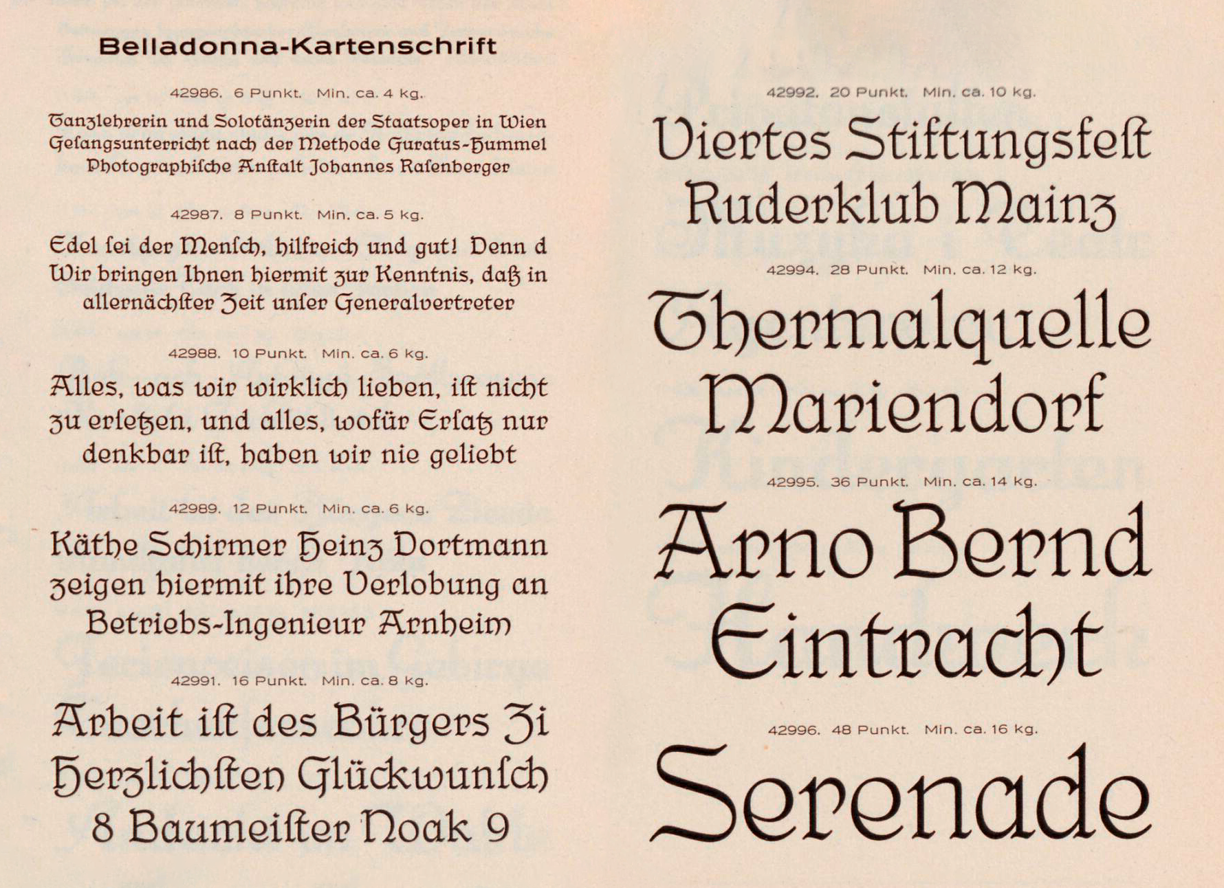
Hildegard Henning’s Belladonna typeface (1912)
A few times a year, I’ll get an e-mail asking for information about Belladonna. It is generally considered the first German typeface attributed to a woman. The Julius Klinkhardt typefoundry in Leipzig published Hildegard Henning’s design around 1912. Indra Kupferschmid mentions it in an Alphabettes post, First/early female typeface designers. Below, you can read what I’m currently able…
Written by
-
Research results: Sans serif type in nineteenth-century Germany
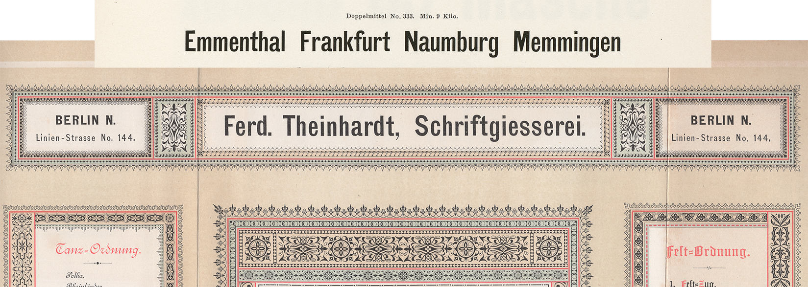
Berthold, Decker, Hamburg typefoundries, Leipzig typefoundries, Nineteenth-century sans serifs, Reichsdruckerei, Research, TheinhardtAbove, a digital collage showing two castings of the same design. The very top reproduces Benjamin Krebs Nachfolger’s product number 333, the 28pt size of the foundry’s Moderne Steinschriften typeface. Krebs first advertised its Moderne Steinschriften in 1865. That was one of the nine or more original sans serifs the Krebs foundry produced before 1900.…
Written by
-
List of employees at the F.A. Brockhaus printing office & typefoundry, 1842
Crop of a 1856 illustration showing the F.A. Brockhaus building in Leipzig. See the full image here. How many people worked at typefoundries during the nineteenth century? Who were those individuals and what did they do? Wouldn’t it be great if registries survived, which could let us know? Employee lists are hard to come by.…
Written by

-
Very brief overview of typefounding – as well as calligraphy, lettering, and type design education – in Leipzig between 1903 and 1914
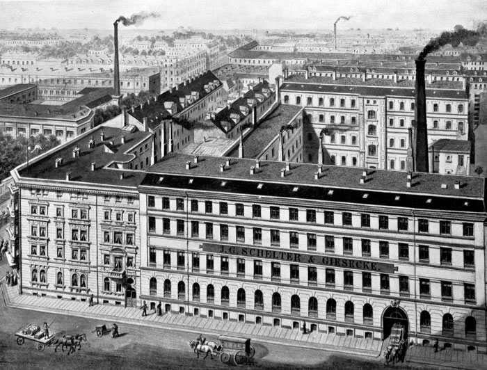
Above: Image of the J.G. Schelter & Giesecke typefoundry’s factory building at Brüderstraße 26/28, circa 1894. The firm was one of the largest players in Leipzig type history. Reproduced from Typografie.info. This past April, I was invited to the Typotage 2018 at the Museum für Druckkunst Leipzig. The conference organizers asked me to speak about typefaces designed…
Written by
-
Albert Kapr and the Complete Works of Marx and Engels
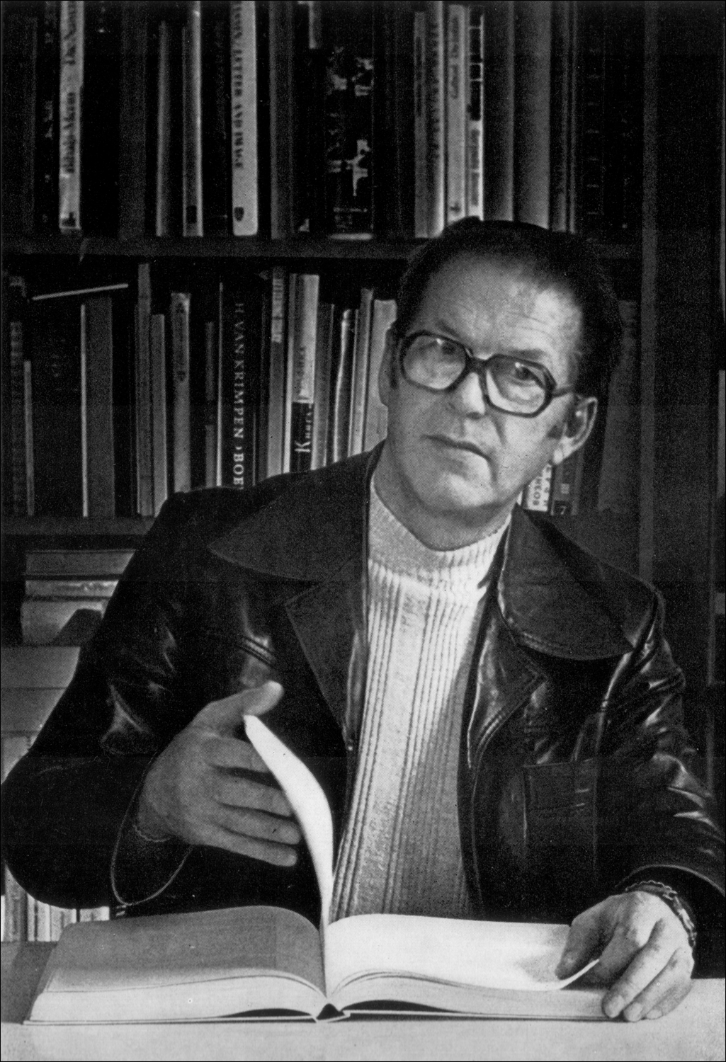
Figure 1 (above): Portrait of Albert Kapr from his 1982 book, Schrift- und Buchkunst. Historical-critical editions pose more than just academic challenges for publishers: they also raise technical and typographic questions. I originally wrote the following article in German for the Journal für Druckgeschichte, which published it in 2012.[1] Sylvia Werfel, who edited that version, invited…
Written by
-
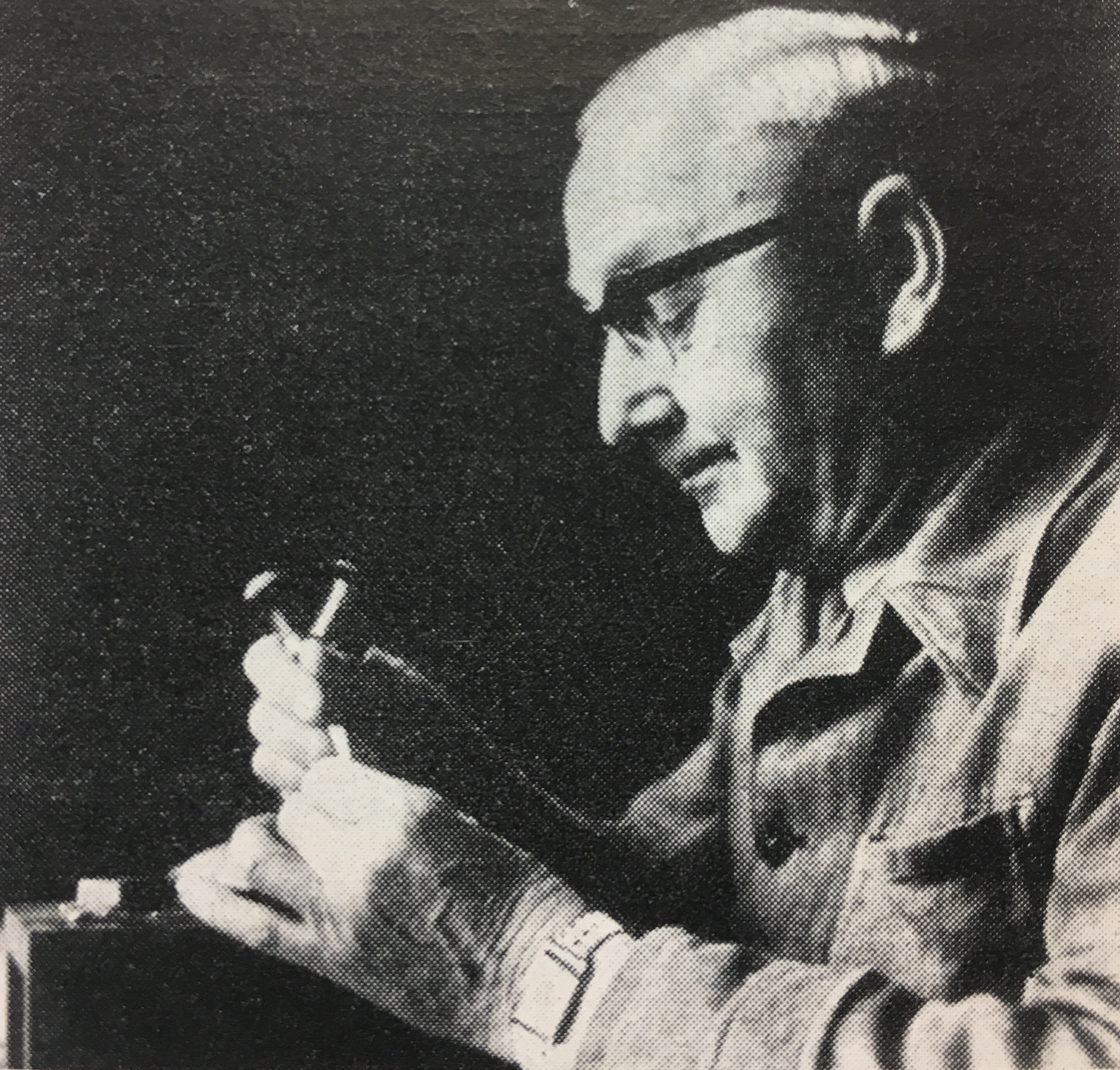
My notes on the punchcutter Otto Erler
The portrait of Otto Erler reproduced above shows him at work, perhaps inside the HGB Leipzig. It accompanied his obituary. The photograph is credited to “Jonsong, Leipzig” and appeared alongside Albert Kapr’s “Personelle Nachrichten – Meister Erler verstorben” in Papier und Druck (issue 11, 1965, p. 87). This pot is a 2,700-word article on the Leipzig punchcutter…
Written by