Category: Research
-
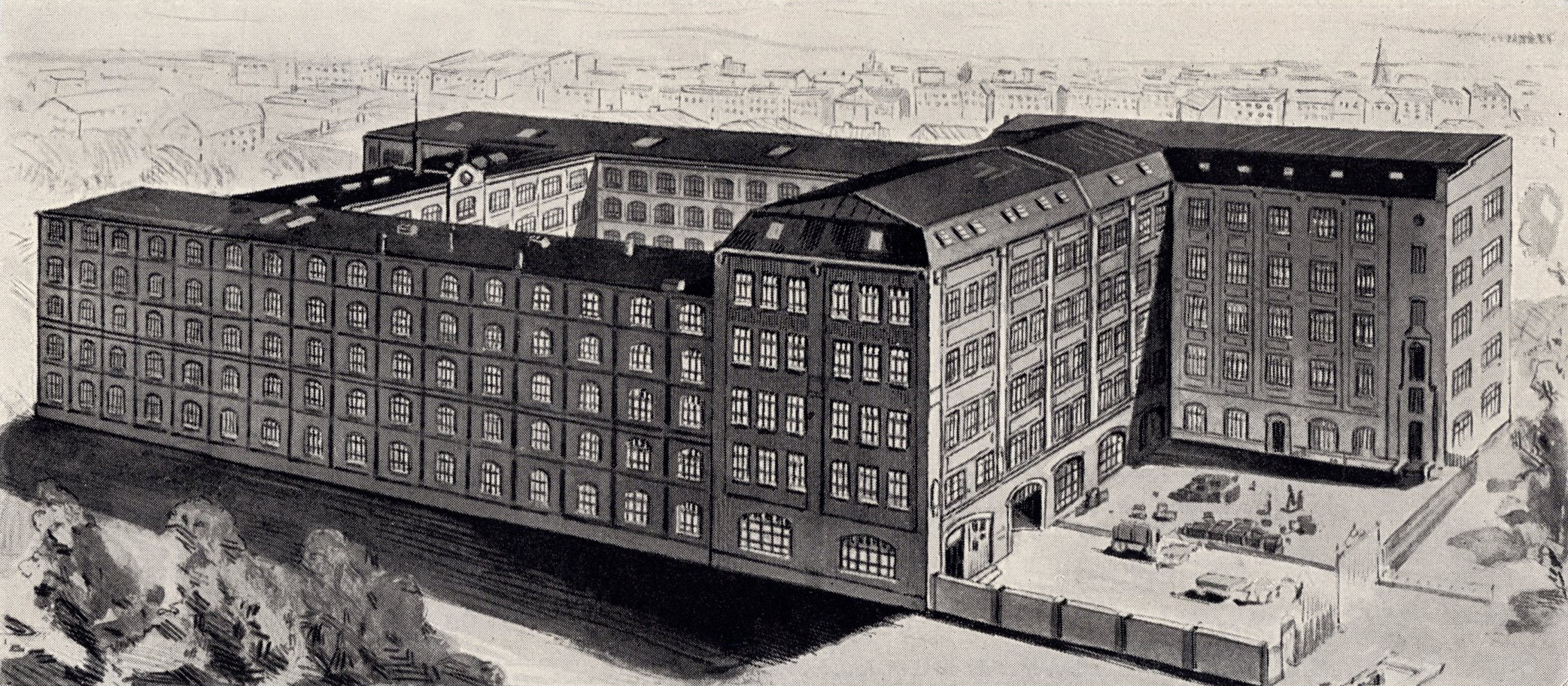
The 1869–1978 headquarters of Berthold today
The illustration above shows appearance of the H. Berthold AG factory in Berlin in 1909. Parts of that factory still stand today in the Mehringhof, a series of structures located behind the street-facing buildings at the intersection of Mehringdamm and Gneisenaustraße. The part of Berlin where this factory was located has been known as Kreuzberg since…
Written by
-
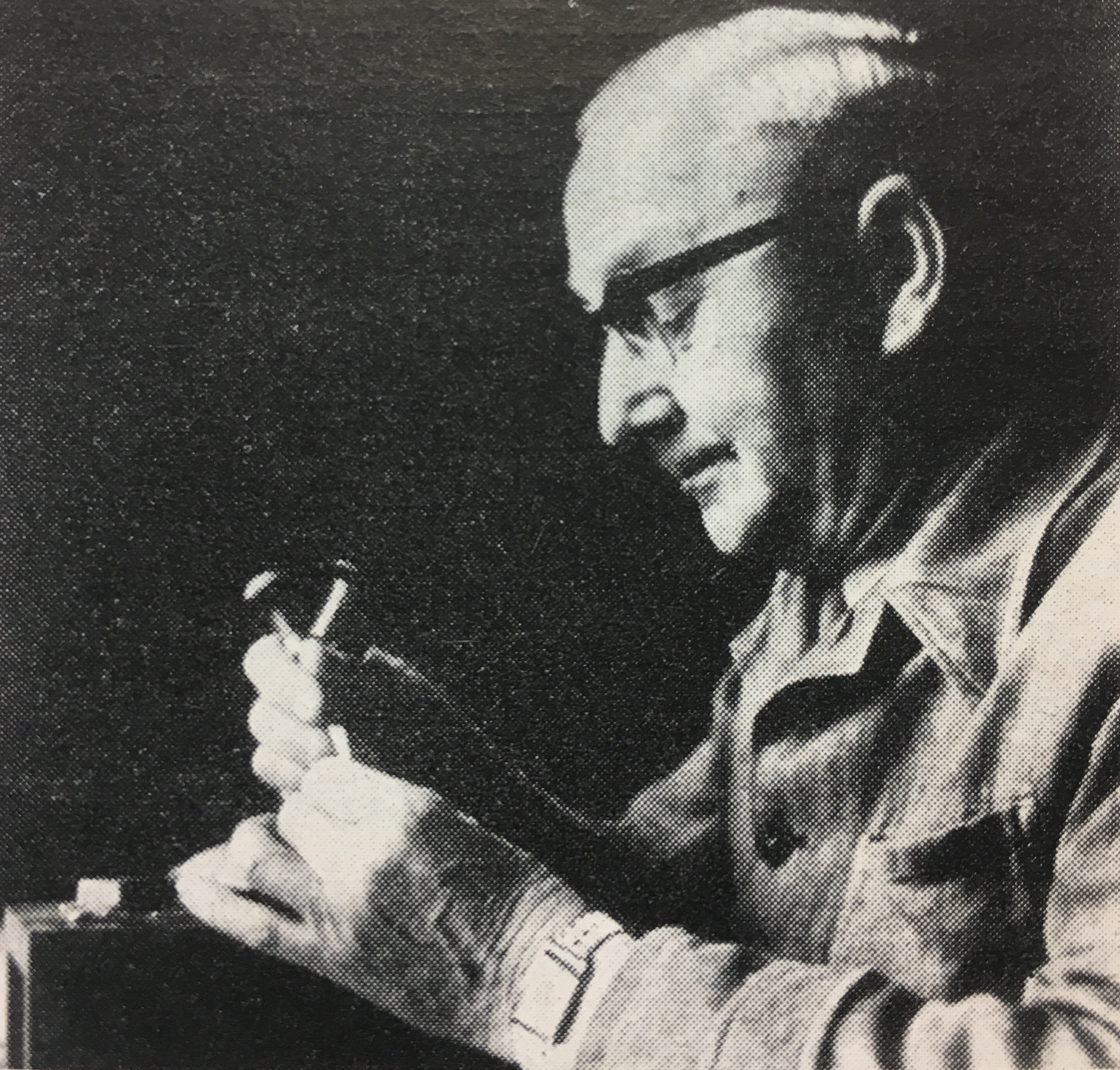
My notes on the punchcutter Otto Erler
The portrait of Otto Erler reproduced above shows him at work, perhaps inside the HGB Leipzig. It accompanied his obituary. The photograph is credited to “Jonsong, Leipzig” and appeared alongside Albert Kapr’s “Personelle Nachrichten – Meister Erler verstorben” in Papier und Druck (issue 11, 1965, p. 87). This pot is a 2,700-word article on the Leipzig punchcutter…
Written by
-
Some thoughts on geometric type
Introduction Graphic design and printing has engaged with geometric letters for at least a century. Designers pride themselves on their ability to create complex systems from simple elements, and the alphabet is no exception. By repeating a series of basic shapes, all of the forms of our writing system may be easily recreated, or at…
Written by
-
How they made fonts in 1986
This video isn’t exactly new, but Karsten recommended it to me today, and I loved every second. It documents type design at Berthold, particularly the development of a Bodoni for photo-typesetting. Quite interesting to see is Günter Gerhard Lange and his large (all-female?) letter-drawing office. The dated graphics and music are an added plus. The…
Written by
-
My dissertation proposal
A view of Hindi newspapers and their typefaces In my M.A. dissertation, I will investigate Devanagari text typefaces currently used in Hindi newspapers. This research will allow me to compare the types and their appearances in print, as well as enable me to develop conclusions regarding which design features make certain Devanagari typefaces more appropriate…
Written by