Category: Research
-
German, Swiss, and Austrian typefaces named Royal or Akzidenz
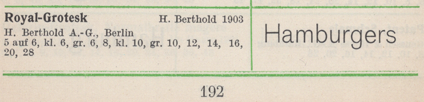
This is another post related to the history of Akzidenz-Grotesk. Contrary to Günther Gerhard Lange’s statement in a 2003 interview with Yvonne Schwemer-Scheddin in Typografische Monatsblätter, the Royal-Grotesk typeface was not a product Berlin’s H. Berthold AG acquired in 1908 when they purchased the Ferd. Theinhardt typefoundry. Instead, Royal-Grotesk had already been created at Berthold…
Written by
-
When Jan Tschichold “blue penciled” Albert Kapr
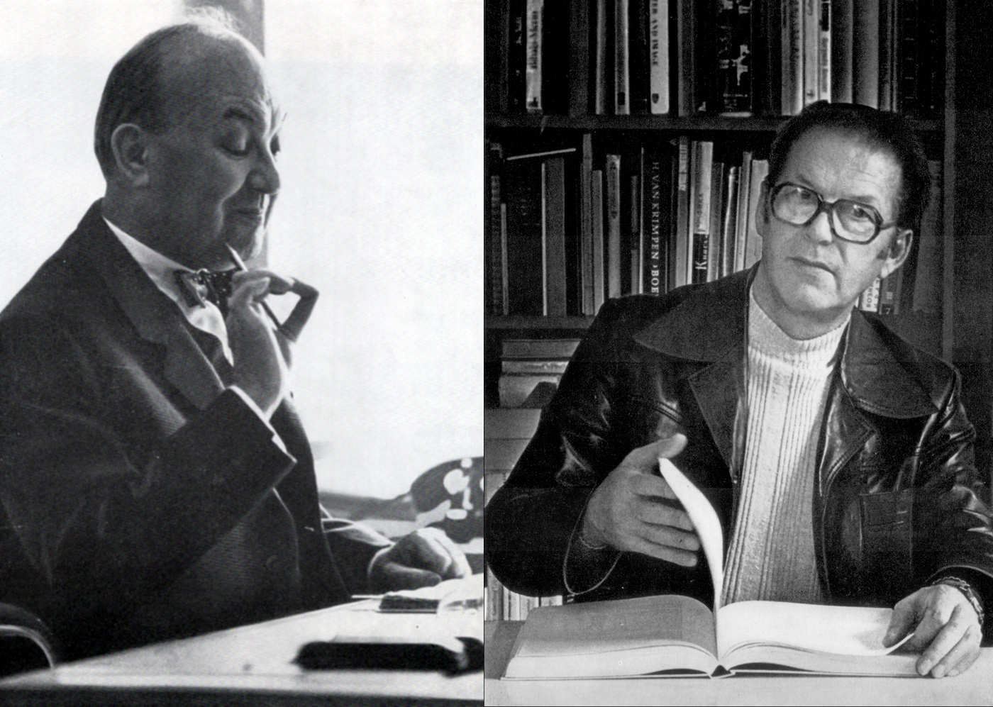
If you read Jost Hochuli’s 2016 Tschichold in St. Gallen: Jan Tschichold’s reference library in the Vadiana Cantonal Library St. Gallen, you’ll come across one of my favourite anecdotes about Jan Tschichold: Of particular interest are the sometimes lengthy letters attached to some of the publications, as either originals or copies, as for example, Albert Kapr’s…
Written by
-
Source material varieties for industrial type design research
As I mentioned in this earlier post, I recently went through my doctoral defence at the HBK Braunschweig. I prepared a presentation summarising a few key points from my dissertation, which you can read via the link in the previous sentence. While I knew I would not be able to include all of the information from…
Written by

-
Artists and craftsmen in German type, 1871–1914
On January 10th, 2019, I successfully defended my doctoral dissertation at the Hochschule für Bildende Künste in Braunschweig. Since it will be about another year until I publish my dissertation – in one still-undecided form or another – I have decided to post an English translation of my defence presentation here. That was about 25-minutes-long,…
Written by

-
Blackletter signage in the Berlin S-Bahn
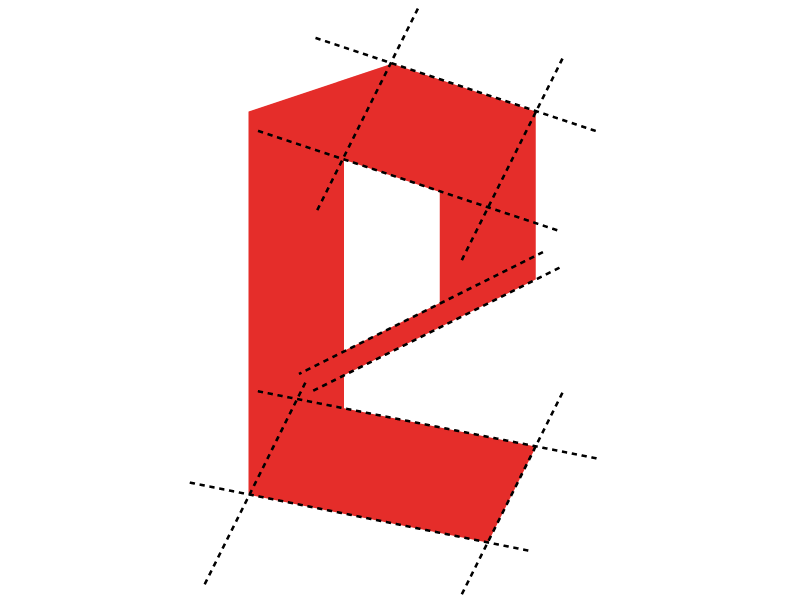
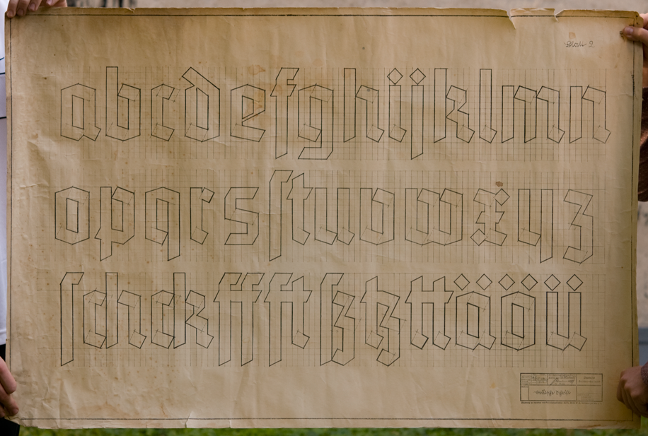
Figure 1: Diagram of the lowercase “e” construction from the so-called Reichsbahnschrift design. HTW Berlin students Aleksej M. and Ronak J. drew this as part of their three-poster series explaining the blackletter alphabets found on various signs in Berlin’s S-Bahn train network today. Earlier this month, I lead a week-long workshop for third-semester communications design students…
Written by
-
Information zu BK 45 Kurzzeitentwurf 1
This month, I’m organizing a short course for communications design students at the HTW Berlin. The following materials are for their reference. I have a general page with a recommended reading list for my students elsewhere on this site, which includes more English-language titles than appear here. Kursvorstellung Hier noch mal eine Kurzbeschreibung des Kurses,…
Written by
-
Very brief overview of typefounding – as well as calligraphy, lettering, and type design education – in Leipzig between 1903 and 1914
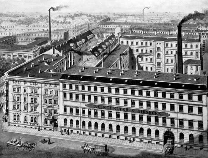
Above: Image of the J.G. Schelter & Giesecke typefoundry’s factory building at Brüderstraße 26/28, circa 1894. The firm was one of the largest players in Leipzig type history. Reproduced from Typografie.info. This past April, I was invited to the Typotage 2018 at the Museum für Druckkunst Leipzig. The conference organizers asked me to speak about typefaces designed…
Written by
-
Albert Kapr and the Complete Works of Marx and Engels
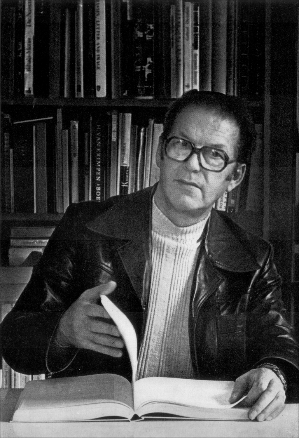
Figure 1 (above): Portrait of Albert Kapr from his 1982 book, Schrift- und Buchkunst. Historical-critical editions pose more than just academic challenges for publishers: they also raise technical and typographic questions. I originally wrote the following article in German for the Journal für Druckgeschichte, which published it in 2012.[1] Sylvia Werfel, who edited that version, invited…
Written by
-
Midolline: How a Frenchman became Germany’s first type designer
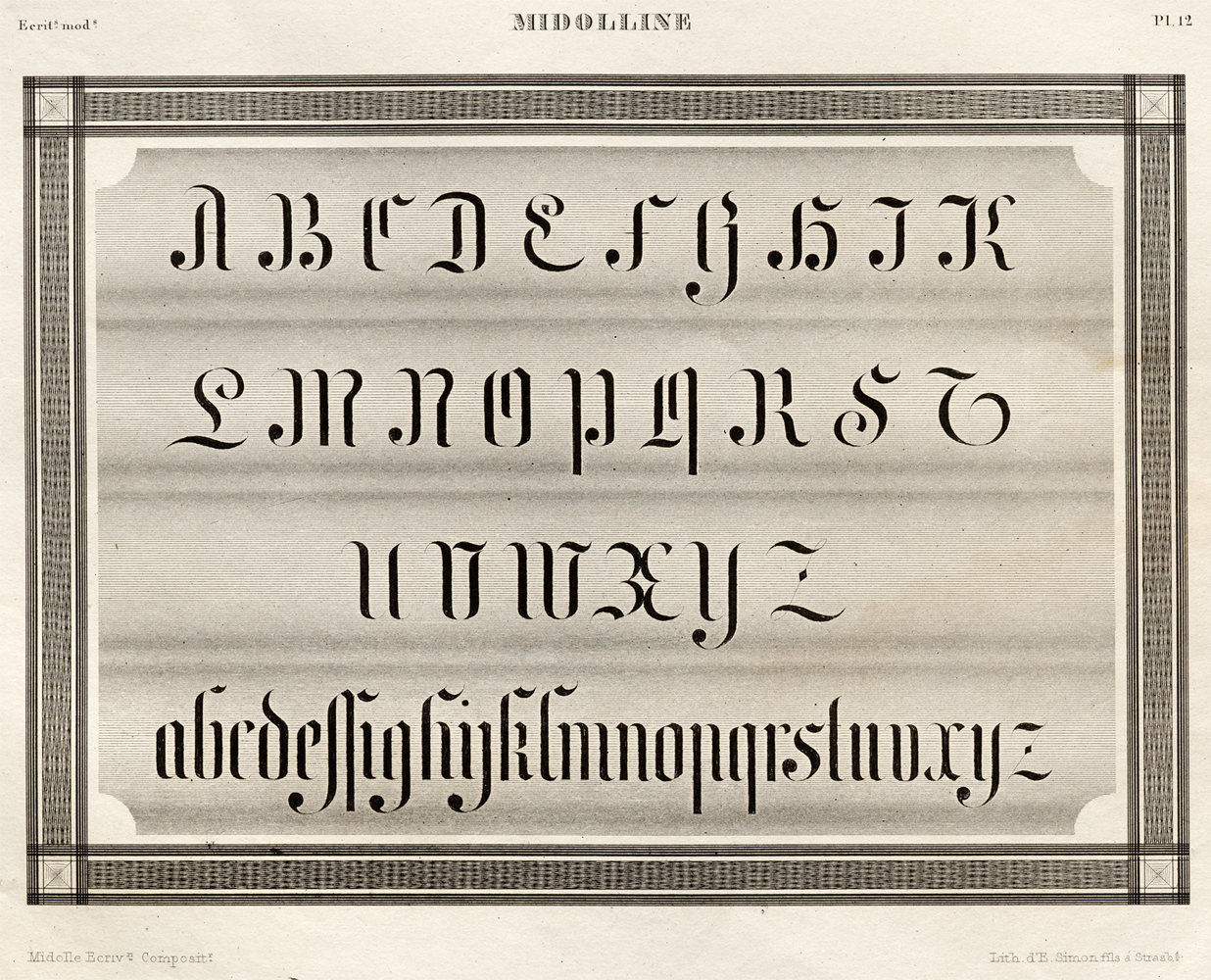
Close-up of plate 12 (Midolline), by Jean Midolle. From the Spécimen des écritures modernes. Printed in Strasbourg by Simon Fils, 1834–35. Image © Letterform Archive. 4 March 2021 update: About the Gotico-Antiqua book An extended version of this post, encompassing additional research and more imagery, was recently published in English and French as part of the…
Written by
-
Rudolf Koch and the Neuköllner Rathaus
Above, I have reproduced an illustration showing and elevation of the Neuköllner Rathaus in Berlin. The drawing was made by Reinhold Kiel. From Deutsche Bauzeitung, 1909 (43), p. 625. Wikimedia. On the 1st of August 1914, Germany declared war on Russia. Declarations of war on France and Belgium followed on August 3rd and 4th. As…
Written by

-
The Berlin locations of the Eduard Haenel and Wilhelm Gronau typefoundries (1838–1918)
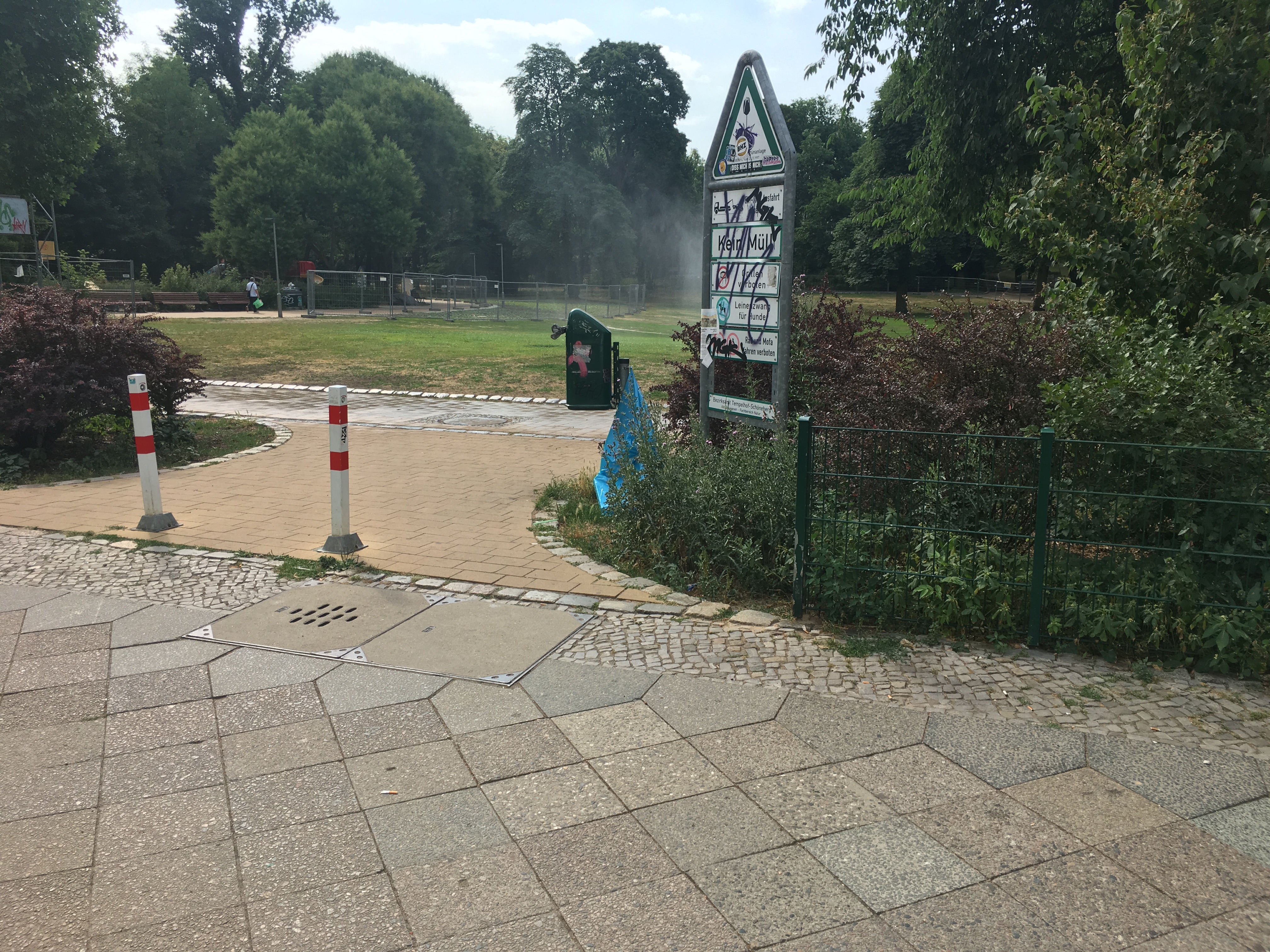
Northwest entrance to the Heinrich Lassen Park in Berlin-Schöneberg. There used to be buildings here. Between 1896 and 1918, one of them – at Belziger Straße 61 – housed the Gronau typefoundry. The printing-office and typefounding facilities Eduard Haenel established in the 1840s were about two-and-a-half kilometers to the north of here. Today, almost nothing remains…
Written by
-
Distribution of sans serif typefaces across German-speaking foundries in the 19th century
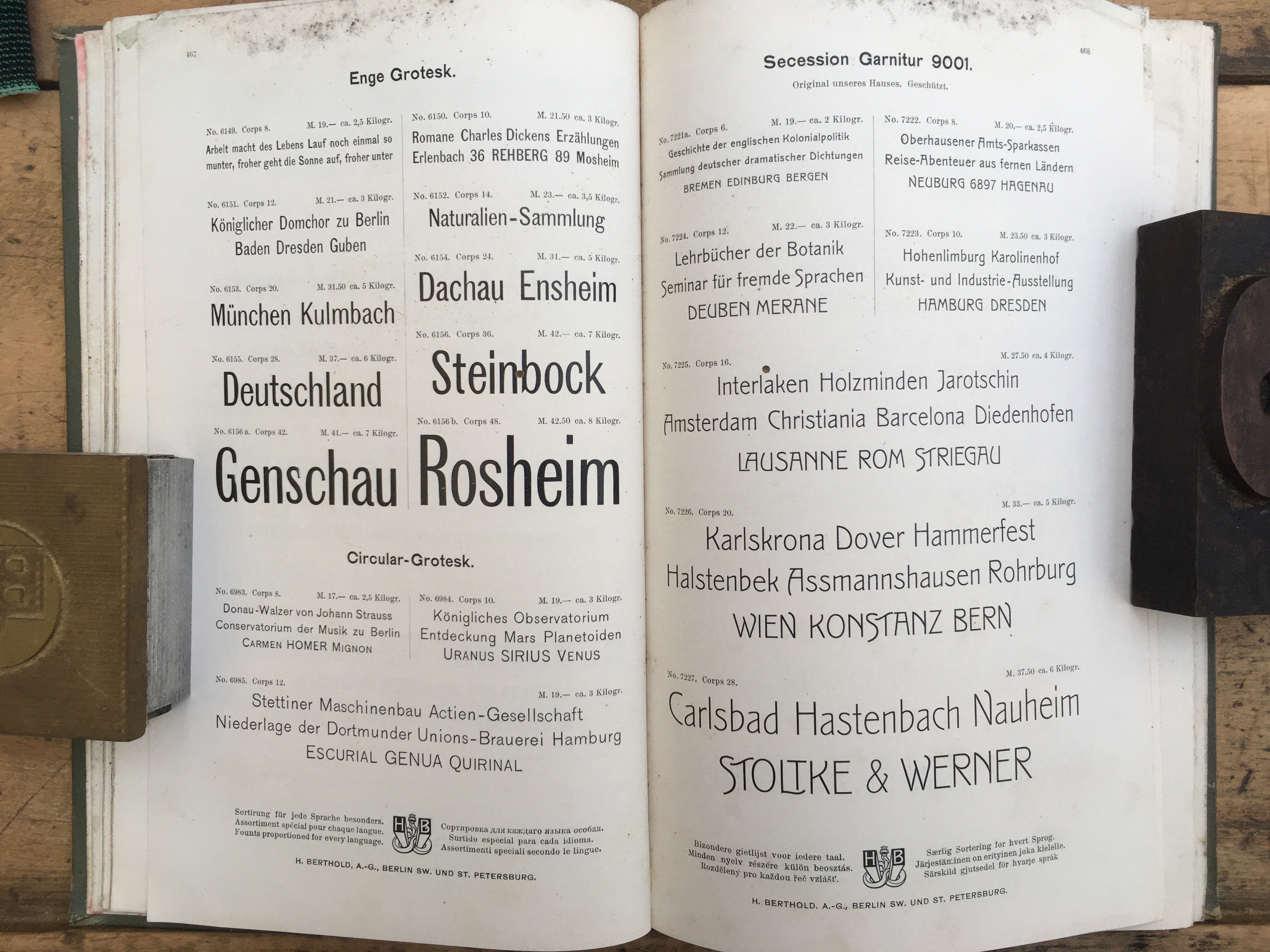
Above, a spread from an H. Berthold AG type specimen catalogue. The photograph is © Boris Chauvet. This spread is likely from Berthold’s c.1900 export catalogue, or one of the additions to it produced in c.1903 or c.1907. See note [1] below. Hey Internet, this is my website. Some of you have told me that you missed…
Written by
-
The Norddeutsche Schriftgießerei and VEB Typoart
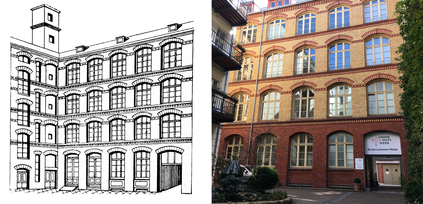
The image above reproduces two views of the building that housed the Norddeutsche Schriftgießerei from 1926/1927 to 1960/1961. The illustration on the left appeared in Die Handsatzletter (issue 8, 1975, p. 6). I took the photograph on the right in 2018. This post is a 2,400-word look into another Berlin typefoundry building that has survived into the…
Written by
-
The Emil Gursch typefoundry’s 1901–1918 building
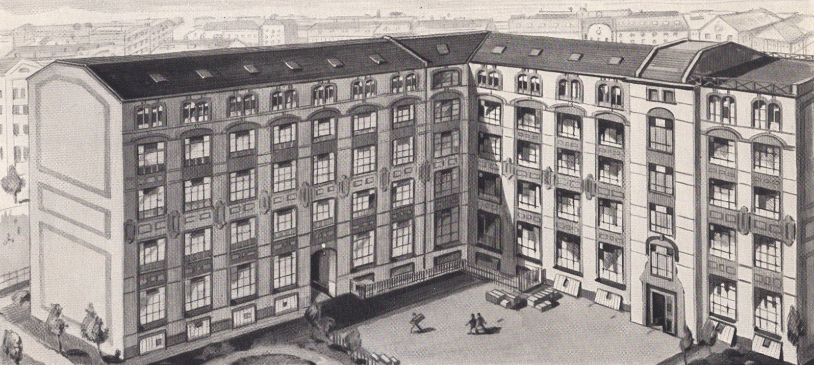
The image above is a rendering of the Emil Gursch typefoundry’s factory building at Gneisenaustraße 27 in Berlin, as it would have appeared in 1917. Reproduced from Das Haus Berthold, p. 77. This article is the second in a series of posts looking at the remains of various Berlin typefoundry factory buildings. Although I mention…
Written by