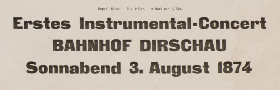
Above, I have reproduced a three-line specimen of the Doppel-Mittel size from the Zeitungs-Grotesque typeface. That translates to about 28 Didot points. The image is cropped from J.G. Francke Nachfolger A.W. Kafemann’s Vorläufige Probe (1874). Courtesy of the Noord-Hollands Archief. In the post below, I discuss this heavy sans serif’s wide distribution.
The Danzig-based Francke typefoundry first advertised a heavy sans-serif typeface called Zeitungs-Grotesque in 1874. Its specimens for the typeface announced that other foundries could purchase duplicate matrices of its design. Many founders took Francke up on that offer: the Zeitungs-Grotesque design quickly became the most widely-distributed heavy sans serif in German-speaking Europe.
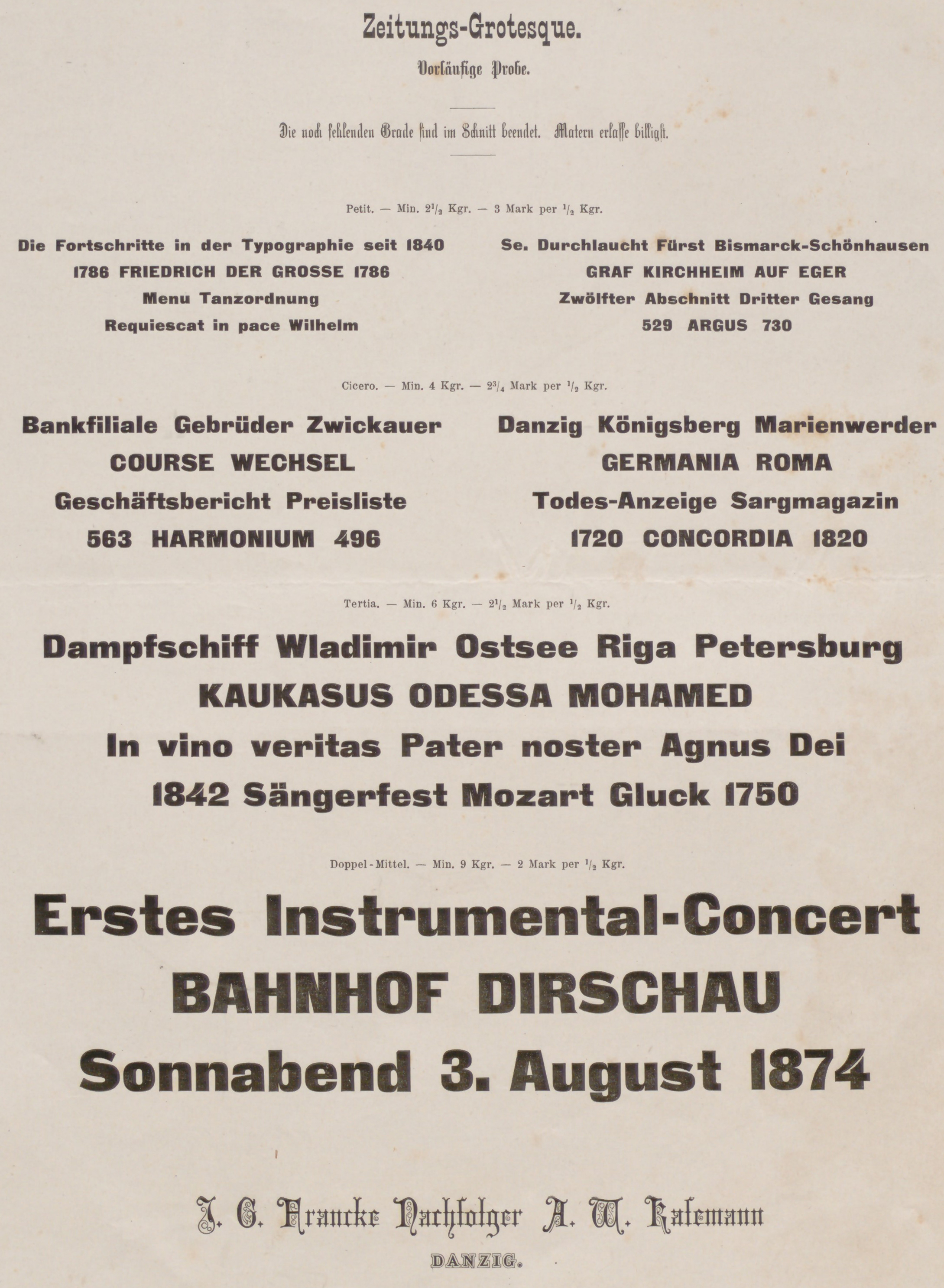
Above: J.G. Francke Nachfolger A.W. Kafemann’s Vorläufige Probe (preliminary specimen) for Zeitungs-Grotesque’s 8, 12, 16, and 28pt sizes. Cropped. The third line of text on the page reads »Die noch fehlenden Grade sind im Schnitt beendet. Matern erlasse billigst«, or “the cutting of the still-missing sizes has been completed. I issue matrices as cheaply as possible.” The Francke foundry bundled prints of this specimen sheet along with an issue of a printing trades journal to advertise its publication, see Archiv für Buchdruckerkunst und verwandte Geschäftszweige, vol. 11, no. 3 (March 1874). Image courtesy of the Noord-Hollands Archief. Click to enlarge.
The typeface’s spread was not limited to Germany, Austria and Switzerland. By the outbreak of the First World War, the fonts were also for sale – at the very least – from founders in Bulgaria, Italy, the Netherlands, Spain and Russia. Zeitungs-Grotesque fonts were probably cast in pre-independence Poland, too. In any event, interwar Polish foundries offered the fonts. Today, Danzig is the Polish city of Gdańsk. Zeitungs-Grotesque may be the most successful typeface yet designed on present-day Polish territory.
Fonts and copies
During the second half of the nineteenth century, typefoundries often copied each other’s products through electrotyping. That process is complicated to explain, but it entailed growing matrices around preexisting letterforms (either cut in metal, or cast type sorts) in an electrochemical bath. According to most accounts, this illicit method of copying was rampant and practiced by almost everyone in the business. Therefore, it is difficult to say which instance of one foundry’s types in another foundry’s catalogues are the result of electrotyped copying and which represent “legitimate” purchases of duplicate matrices. I mention this because I have found the Zeitungs-Grotesque design in about half of the typefoundry catalogues printed in Germany, Austria and Switzerland between about 1880 and 1914.
Francke published Zeitungs-Grotesque about a year before German design patent registration went into effect. The 1876 Geschmacksmustergesetz – still in effect today – allowed punchcutters and founders to register their designs with local magistrates, enabling them to enjoy limited periods of protection. Initially, founders seem to have been given exclusivity over their designs for three years. After that time ended, their registrations could be renewed for an extra ten-year period
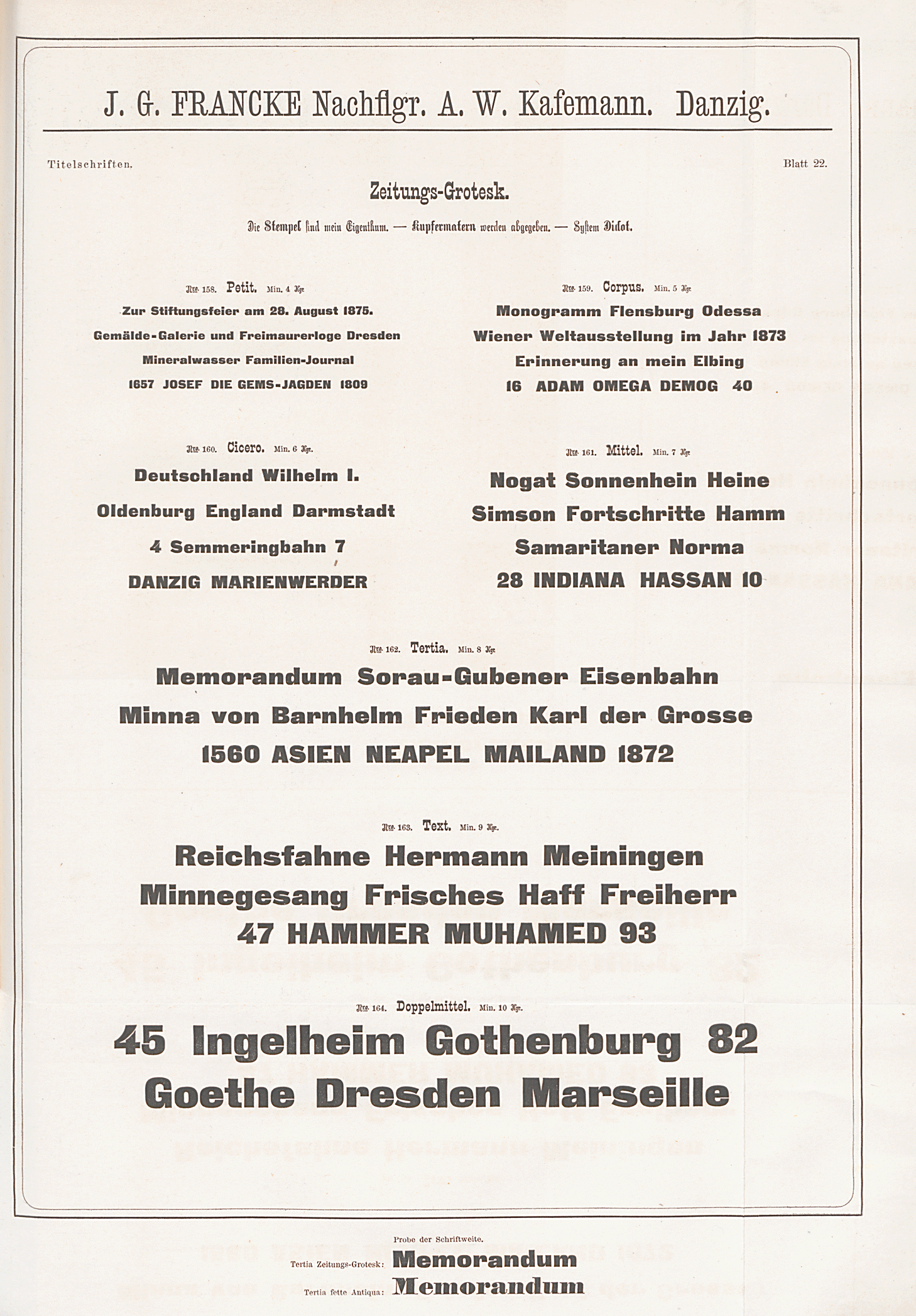
Above: J.G. Francke Nachfolger A.W. Kafemann’s finished specimen for the Zeitungs-Grotesque’s initial size range (8, 10, 12, 14, 16, 20 and 28pt). The fourth line of text on the page reads »Die Stempel sind mein Eigentum. – Kupfermatern werden abgegeben. – System Didot.«, or “The punches are my property. – Copper matrices are available. – System Didot.” The bottom two lines of the page compare the typeface’s 16pt size with a (generic) fat face type in the same size. The Francke foundry bundled prints of this specimen sheet along with Journal für Buchdruckerkunst, Schriftgießerei und die verwandten Fächer, vol. 42, no. 20 (26 May 1875). Image: Staatsbibliothek zu Berlin. Click to enlarge.
To date, I have only come across three European typefoundries’ internal records detailing the sources of their matrices. One of these mentioned the Zeitungs-Grotesque design. In 1968, the Lettergieterij “Amsterdam” compiled a list of their matrices’ sources. This stated that it had acquired the matrices for their ten sizes of the Vette Antieke typeface “Gottlob Franke, Danzig” [sic.]. Vette Antieke is Dutch for “Heavy Antique.” The name is a direct translation of the German Fette Grotesk, using a Francophone term for sans serif type (Antique) instead of Grotesk.
I’m not sure what to make of this list; when I look at the 1907 Lettergieterij “Amsterdam” catalogue, I only find eight Vette Antieke sizes: 6, 7, 8, 10, 12, 16, 20 and 28pt. While the 8, 10 and 20pt sizes look like they came from Francke, the 12, 16 and 28pt sizes are from one of the similar typefaces I discuss below. They are either part of the Patent Type-Founding Company’s Royal Gothic or Flinsch’s Fette Grotesk. The 6 and 7pt sized types are only shown on a small insert bound into the catalogue. Their product numbers are higher than the larger Vette Antieke’s sizes (1575 and 1576 vs. 871, 872 and 953–196). If the Lettergieterij “Amsterdam” did not make those small sizes in-house, they might have procured them from Berthold.
Francke’s total number of Zeitungs-Grotesque sizes
Like the Lettergietereij “Amsterdam,” many of the foundries carrying Francke’s Zeitungs-Grotesque design offered the fonts in ten or more sizes. Although I have only found the two Francke specimens for the typeface reproduced above, I suspect that Francke may have extended the range of the Zeitungs-Grotesque sizes they had on offer, at some time after 1875.
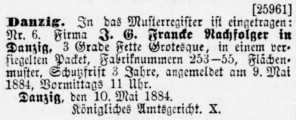
Above: Screenshot made from a scan of this page of the 4 June 1884 issue of the Deutsche Reichsanzeiger newspaper listing J.G. Francke Nachfolger’s registration of three sizes of a Fette Grotesque with the Royal District Court in Danzig on 9 May 1884. Image: Universitätsbibliothek Mannheim.
In 1884, the Francke foundry applied for a design patent covering three sizes of a heavy sans-serif typeface. While I can’t say for certain whether this was an extension of the Zeitungs-Grotesque design covering the sizes 36, 48 and 60pt, I think that this is the most likely scenario, for reasons I will return to below. Anyway, the following notice about their patent registration ran in the Deutsche Reichsanzeiger newspaper on 4 June 1884:
[25961] Danzig. In das Musterregister ist eingetragen: Nr. 6. Firma J.G. Francke Nachfolger in Danzig, 3 Grade Fette Grotesque, in einem versiegelten Paket, Fabriknummern 253–55, Flächenmuster, Schutzfrist 3 Jahre, angemeldet am 9. Mai 1884, Vormittags 11 Uhr. Danzig, den 10. Mai 1884, Königliches Amtsgericht. X.
My translation: “[25961] Danzig. The following is entered in the design registry: No. 6. The J.G. Francke Successors company in Danzig, sealed package containing three sizes of Fette Grotesque with the product numbers 253–55, surface pattern, period of protection [to last for] three years, registered on 9 May 1884 at 11 a.m. Danzig, May 10, 1884, Royal District Court. X.”
Similar heavy sans serifs: Fette Grotesk and Royal Gothic
The Flinsch typefoundry in Frankfurt am Main carried a different heavy sans it called Fette Grotesk. In Flinsch catalogs, the firm claimed Fette Grotesk as a product created in-house. In the specimen reproduced below, the asterisk in the top-left corner of the page indicates this. Flinsch filed for a design patent on seven Fette Grotesk sizes at the Muster-Register in Frankfurt am Main on 6 May 1885. In 1888, Flinsch renewed their design patent on those fonts for another three years.

Above: Specimen showing all seven of Flinsch’s Fette Grotesk sizes from an undated Flinsch foundry catalog, probably printed during the 1890s. Image courtesy of a private collector in Berlin.
Despite Flinsch’s design patent and ownership claims on this Fette Grotesk design, it is possible that some or all of the fonts’ matrices were acquired – or simply electrotyped – from the Patent Type-Founding Company in London. In his book The Visual History of Type (on pp. 142–143), Paul McNeil shows a specimen of the Royal Gothic typeface in a P.M. Shanks & Sons Ltd. London catalog. McNeil states that the Patent Type-Founding Company created Royal Gothic around 1870, which if true predates Flinsch’s Fette Grotesk by about fifteen years. Beginning at some later point – but by about 1910 at the latest – the Keystone Type Foundry in Philadelphia was selling the Royal Gothic design as London Gothic. I have not thoroughly investigated the Royal Gothic fonts’ appearance enough to state how likely it is that it and Flinsch’s Fette Grotesk are the same design, but Fonts In Use concludes that they are, and their sources are credible.
Whatever the origin, Flinsch was not the only German foundry carrying its Fette Grotesk design. The same fonts were sold by Roos & Junge in the neighboring city of Offenbach am Main. Roos & Junge called the typeface Inseraten-Grotesque. After D. Stempel AG acquired Roos & Junge in 1915, they added those fonts into their catalog as Inseraten-Grotesk.
Another similar typeface: Doric No. 5
In the 1890s, H.W. Caslon in London created a heavy sans serif design that they called Doric No. 5. Commercial Classics has reported this about the typeface:
Doric No. 5, which was cut starting in 1893, is a well-considered, bold, square-like design […]. It has more in common with the style of a typeface, such as the much later Eurostile, and appears in multiple sizes (it was around this time that Caslon began casting typefaces in the modern point system we know now).
Doric Italic No.1 almost has the appearance of an italic companion to No. 5 and the two were released in the same period, though the two designs do not appear to have been marketed as such. On closer inspection, however, it is in fact a copy of a German face, Fette Kursiv-Grotesk, from J. John Söhne’s foundry. Whether it was an officially licensed face, or simply a pirated face is not clear. However, it demonstrates how foundries were happy to take the shortcut of using others’ faces, whether by legal or illegal means.
The typefoundry inside the Berlin-based Trowitzsch & Sohn printing house seems to have acquired Caslon’s Doric No. 5, by one means or another. They printed a specimen of the fonts listed under the name Moderne fette Steinschrift (as for J. John Söhne’s Fette Kursiv-Grotesk, I shall mention it again below). The Berlin-based Otto Tech foundry, which acquired the Francke firm in 1912, distributed the Zeitungs-Grotesque design as Fette Zeitungs-Grotesque. The Tech catalog I consulted in the Deutsches Technikmuseum’s historical archive is not dated but it was probably produced before they bought the Francke foundry. On that catalog’s Fette Zeitungs-Grotesque specimen pages, the typeface’s 9 and 24pt sizes look like they may be Caslon’s Doric No. 5 – Francke did not cut Zeitungs-Grotesque in those two sizes. In Italy, Nebiolo’s Neri Americani typeface also combined sizes of Caslon’s Doric No. 5 and sizes of Francke’s Zeitungs-Grotesque.
The intended area of use for Zeitungs-Grotesque
The term Zeitung – German for “newspaper” – hints at this typeface’s intended purpose. Initially, the design was only available in sizes ranging from 8 to 28 Didot points. It was a typeface created to set column titles in editorial design. During the 1870s, the body texts in most German newspapers would have been composed in Fraktur types. Magazine body texts would have been slightly more likely to be composed in roman type, depending on the publication’s subject matter. Almost all academic journals would have been set with roman type. In the nineteenth century, no long passages of text intended for immersive reading were composed with sans serif type. Since Zeitungs-Grotesque would have been combined with everyday roman and Fraktur fonts, it would have offered quite a striking degree of visual contrast.
Most other foundries who carried the Zeitungs-Grotesque design called it by an even more generic, descriptive-sounding name: Fette Grotesk, which just means “heavy sans.” After various foundries produced larger sizes of the design, those fonts may have been used in poster printing. Reymund Schröder has printed from wood type fonts made in the Zeitungs-Grotesque design.
The Woellmer foundry’s script expansion
Wilhelm Woellmer’s Berlin-based typefoundry carried the Zeitungs-Grotesque design in ten sizes. They used the name Fette Zeitungs-Grotesk, meaning Heavy Newspaper Sans. On 9 September 1887, the foundry was issued a design patent at the Berlin Muster-Register for ten sizes of a typeface they called the Russische fette Zeitungs-Grotesk (Heavy Russian Newspaper Sans). They filed for a ten-year extension for these fonts on 13 August 1890.
Like many foundries, Wilhelm Woellmer often included mentions on type specimens that stated when one of the typefaces shown had been produced in-house (in their case, this was often »Original-Erzeugnis meines Hauses«, essentially meaning “original creation of my company”). The Cyrillic-script specimens of Woellmer’s Russische fette Zeitungs-Grotesk include “creation” claims for these fonts, but Woellmer’s Fette Zeitungs-Grotesk Latin-script do not. As most readers will know, several Cyrillic characters take the same visual forms as Latin-script characters.
Looking at late-nineteenth-century specimens, it is not always straight forward how literal such statements should be taken. I have the impression that these statements were often applied liberally. When it came to Woellmer’s Russische fette Zeitungs-Grotesk, the foundry probably meant that “the Cyrillic characters of this typeface are our creation, and this is a specimen of Cyrillic types; we aren’t talking about the Latin-script letterforms here.”
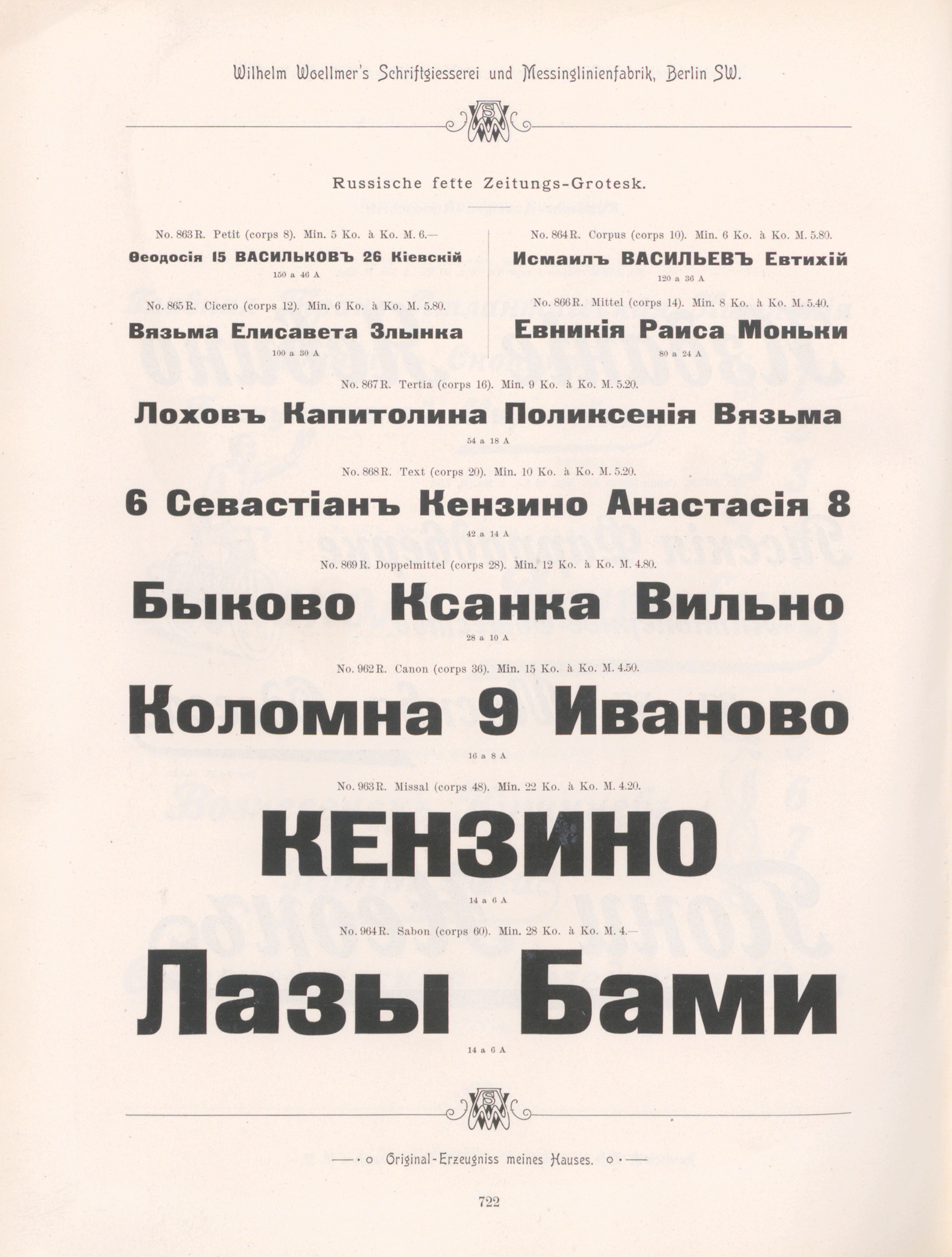
Above: Specimen showing all ten sizes of Woellmer’s Russische fette Zeitungs-Grotesk. Image: Staatsbibliothek zu Berlin. Click to enlarge.
Schelter & Giesecke’s independent size-range expansion
Presuming that Francke did indeed create 36, 48 and 60pt fonts of Zeitungs-Grotesque, and that those were protected for three years from May 1884 onward, I suspect that Francke did not file for an extension of their design patent. Four things lead me to this conclusion:
- I have not found a notice of the Danzig Muster-Register patent number 25,961 being renewed.
- I have not found a notice of Woellmer having filed for a design patent on any Latin-script Fette Zeitungs-Grotesk fonts.
- J.G. Schelter & Giesecke in Leipzig made a design registry on their own 36, 48 and 60pt extensions to the Zeitungs-Grotesque design on 22 August 1888.
- Schelter & Giesecke sold their own design for Fette Steinschrift’s 28pt size, which is a bit of a departure from Francke’s Zeitungs-Grotesque and Schelter & Giesecke’s own Fette Steinschrift 36, 48 and 60pt sizes. You can find that 28pt design on this 1912 Schelter & Giesecke specimen page for the whole Fette Steinschrift range; the top of its lowercase “t” has a completely different flag than in the other sizes (!!).
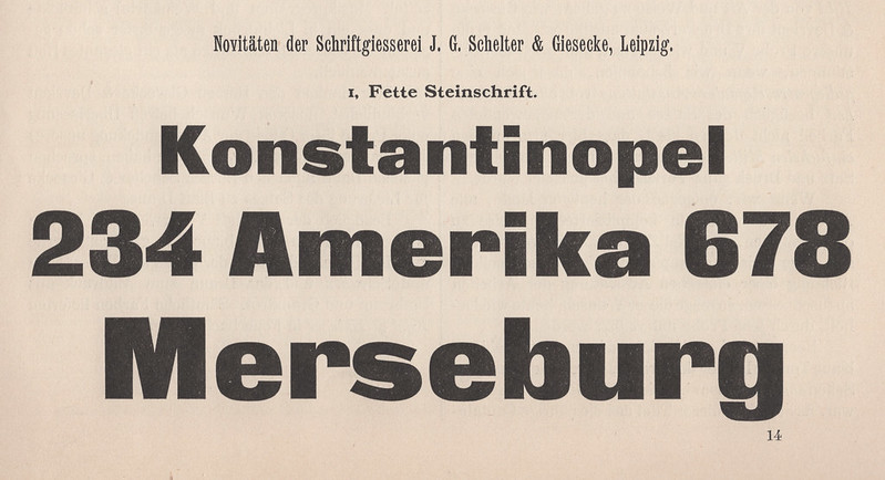
Above: The Leipzig-based J.G. Schelter & Giesecke foundry sold the Zeitungs-Grotesque design under the name Fette Steinschrift. They began showing their uniquely created 36, 48 and 60pt Fette Steinschrift sizes in 1888. From Archiv für Buchdruckerkunst und verwandte Geschäftszweige, vol. 25, no. 7 (July 1888), col. 233–234.
Schelter & Giesecke’s Fette Steinschrift sizes are clearly in the Zeitungs-Grotesque idiom and were sold together with smaller-sized fonts that almost certainly must have originated at the Francke foundry. Nevertheless, Schelter & Giesecke and Woellmer’s punchcutters had interpreted the Zeitungs-Grotesque design differently, as there are subtle differences between the letters in each company’s 36–60pt fonts. I usually look at the shapes of the counters when I try to make comparisons, but an easily differentiable item in these fonts are the horizontal strokes in the lowercase “e.” In Schelter & Giesecke’s version, that middle stroke is much thicker than in the fonts Woellmer sold.
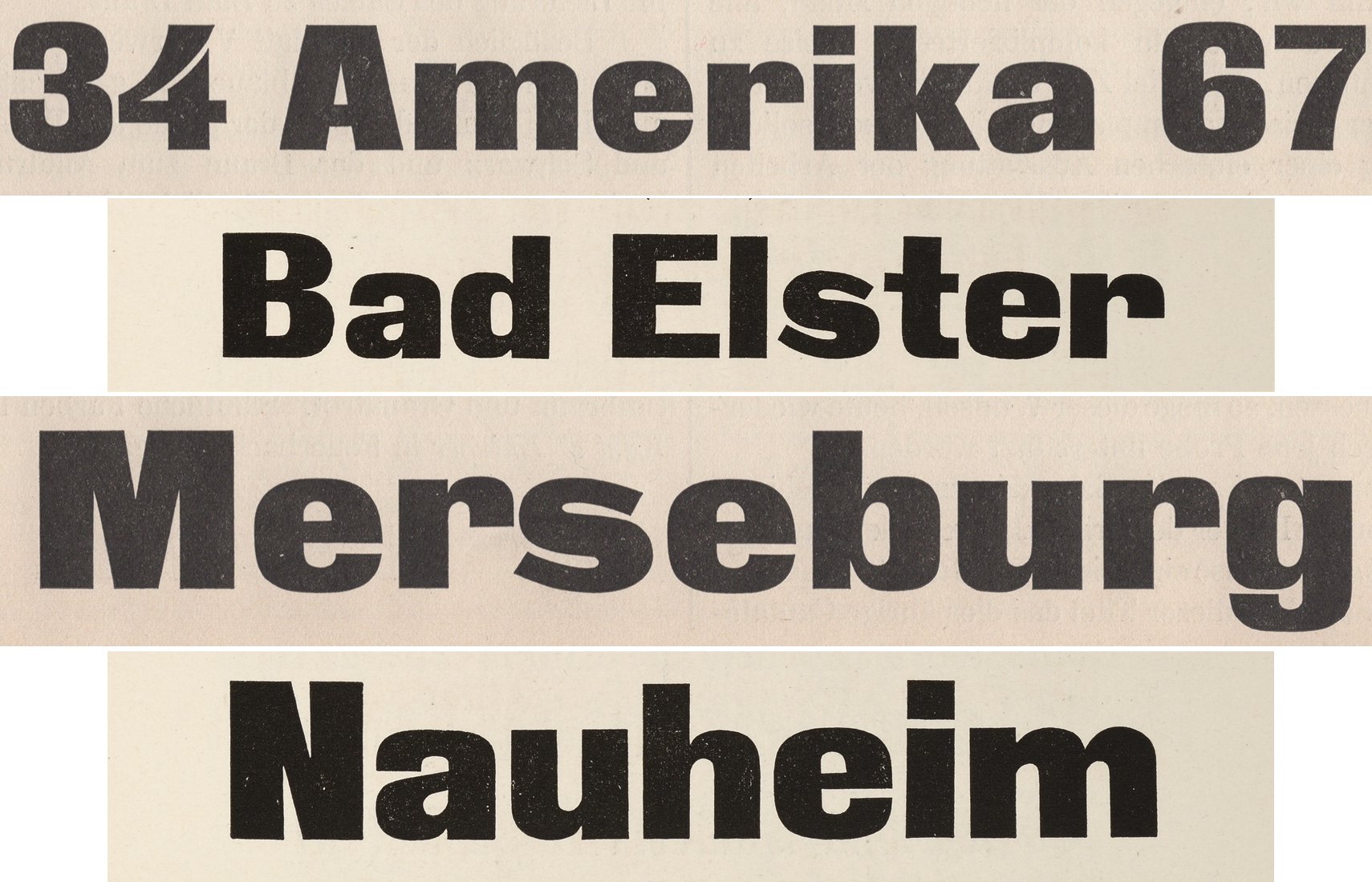
Above: Comparison showing the 48 and 60pt extensions to the Zeitungs-Grotesque design’s size range. The first and third rows are taken from the 1888 Archiv für Buchdruckerkunst specimen of Schelter & Giesecke’s Fette Steinschrift. The second and fourth rows show the “Francke” design. In this case, I have taken them from a photo of the Breite fette Grotesque in an undated Ferd. Theinhardt catalog probably printed during the 1890s. The letterforms match those from the fonts as sold by Woellmer. Click to enlarge.
Other extensions of Francke’s Zeitungs-Grotesque design
That’s not all, of course:
- Two more Viennese foundries – J.H. Rust & Co. and Eduard Scholz’s firm – sold fonts of the Zeitung-Grotesque design as well. In each of their catalogues, one finds what seems to be the same design for their respective 36, 48 and 60pt sizes. I do not know the source of their matrices and therefore cannot say if they originated at Rust or Scholz’s foundry, or came from another firm altogether. All I can see is that these letterforms do not match the extensions that Woellmer or Schelter & Giesecke carried. Curiously’s Tech’s 36pt Fette Zeitungs-Grotesque size is the same as Rust and Scholz’s, but its 48pt size seems match Woellmer’s. Foundries clearly had no qualms mixing and matching, and likely assembled their typefaces’ size ranges over time, rather than all at once.
- At some point between about 1889 and 1893, Gustav Reinhold’s foundry in Berlin added four more Latin-script sizes to their version of the Zeitungs-Grotesque design, which they called Fette Grotesk. One of Reinhold’s added sizes was smaller than anything the design had previously had (6pt), while the other three were larger (72, 84 and 96pt). Reinhold’s 36, 48 and 60pt sizes either came from Woellmer directly or from the same source Woellmer had for them.
- As I mentioned above, the Lettergieterij “Amsterdam” had a 7pt font of the Vette Antieke typeface, and I don’t know where that size was created.
- The larger sizes (60–96pt) of D. Stempel AG’s Inseraten-Grotesk are the 60pt Fette Zeitungs-Grotesque from Woellmer and the 72, 84 and 96pt Fette Grotesk extensions from Reinhold. Inseraten-Grotesk’s smaller sizes are the Flinsch Fette Grotesk design shown earlier in the post.
- J. John Söhne in Hamburg carried Francke’s Zeitungs-Grotesque under the name Fette Grotesque. In 1892, they added a matching italic design, which they named Fette Cursiv Grotesque. Unlike all of the the other typefaces mentioned in this post, Fette Cursiv Grotesque design has been attributed to a specific person. According to Friedrich Bauer’s 1928 Chronik der Schriftgießereien in Deutschland und den deutschsprachigen Nachbarländern, the typeface was designed by Johannes John. At least nine other foundries in Germany and Austria carried John’s italic extension.
- Bauer & Co. in Stuttgart created a condensed typeface whose design was based on Francke’s Zeitungs-Grotesque. As far as I can tell, that typeface was not to market before H. Berthold AG in Berlin acquired the Bauer & Co, Foundry. Berthold, which distributed the Zeitungs-Grotesque design as Fette Grotesk, sold the Bauer & Co. typeface und the name Schmale fette Grotesk, or “condensed heavy sans.” However, I don’t believe that Berthold intended for printers to combine the two typefaces on the page.
Above: The 36, 48 and 60pt Zeitungs-Grotesque extensions sold by the J.H. Rust & Co. foundry in Vienna. A look at the lowercase “e” is telling. Outside, the letterform is much rounder than the variations shown earlier in this post. Click to enlarge.
How do you tell a typeface’s story?
A few weeks ago, I met with two designers to discuss a potential collaborative project. We had been discussing how another typeface’s story could be told when one of the designers remarked that we were trying to do this with just a few pieces of the puzzle. Constructing a narrative out of disparate items taken from the past is exactly how history is written. Historians do not find their narratives in the past, nor do they uncover fully formed stories. All history writing is spinning conclusions between things that the author selects to include.
While I think that many more puzzle pieces that could be used to build a fuller picture of Francke’s Zeitungs-Grotesque’s history are available and can be found – and while I still hope to find more of them in my research practice – I have come to a point in my investigation of the typeface’s creation and distribution throughout late-nineteenth-century German typefounding that I already have a story I’d like to tell. Perhaps other puzzle pieces that I will come across in the future will contradict some of what I have written here, and perhaps other designers and researchers have already found (or will soon find) those contradictory pieces. That’s the game, isn’t it?
I know that story would be better if it included even more images, and if some of the images it does include would be reproduced in a higher quality. Since this post is already ballooned into a rather long blog post, I don’t have a solution at hand for presenting more better illustrations. Please get in touch if you have ideas.
Zeitungs-Grotesque’s distribution in Germany, Austria and Switzerland
As I’ve already written above, an explanation of the exact origins of fonts in the Zeitungs-Grotesque designs can vary from foundry to foundry. Once a specimen includes more sizes than just the initial seven sizes Francke advertised in the mid-1870s, it gets more difficult to hypothesise how that foundry’s specific product range came together. The following list names foundries in German-speaking Europe who printed specimens of Zeitungs-Grotesque-style typefaces were many of the sizes almost certainly must have come from Francke, directly or through indirect means:
- F.W. Aßmann, Berlin: Fette Grotesk.
- Bauer’sche Gießerei, Frankfurt am Main: Fette Grotesk.
- Bauer & Co., Stuttgart and Düsseldorf: Fette Grotesk.
- Schriftgießerei Bern: Fette Grotesque.
- Gottfried Böttger, Leipzig: Fette Steinschrift.
- Karl Brendler & Söhne, Vienna: Breite fette Steinschrift.
- F.A. Brockhaus, Leipzig: Fette Grotesk B.
- Brötz & Glock, Frankfurt am Main: Fette Groteske.
- Brüder Butter, Dresden: Fette Grotesk.
- J.G. Francke Nachfolger A.W. Kafemann, Danzig: Zeitungs-Grotesque (later: Zeitungs-Grotesk).
- Haas’sche Gießerei, Basel: Kompakte Grotesk.
- Genzsch & Heyse, Hamburg and E.J. Genzsch, Munich: Elephant-Schriften.
- Wilhelm Gronau, Berlin: Fette Grotesk.
- Emil Gursch, Berlin: Fette Zeitungs-Grotesk.
- Haas’sche Schriftgiesserei: Kompakte Grotesk.
- Herrlinger & Schmidt/Wilhelm Constabel/A. Reimann, Berlin: Fette Grotesque/Fette Grotesk.
- J.M. Huck & Comp./Actiengesellschaft für Schriftgießerei und Maschinenbau, Offenbach am Main: Fette Grotesque.
- J. John Söhne, Hamburg: Fette Grotesque.
- Julius Klinkhardt, Leipzig: Fette Grotesk.
- C. Kloberg, Leipzig: Fette Grotesque.
- Benjamin Krebs Nachfolger, Frankfurt am Main and K. u. k. Hof-Schriftgießerei Poppelbaum, Vienna: Breite fette Steinschriften.
- Otto Laessig, Vienna: Breite fette Grotesque.
- Ludwig & Mayer, Frankfurt am Main: Fette Steinschrift.
- A. Meyer & Schleicher, Vienna: Fette Steinschrift.
- Gustav Reinhold, Berlin: Fette Grotesk. The H. Berthold brass-rule manufacturing company began casting type after acquiring Reinhold’s foundry. Berthold continued to sell Fette Grotesk, too, although they seem to have modified certain letterforms in some sizes over time.
- Rudhard’sche Gießerei, Offenbach am Main: Fette Grotesque (Gebr. Klingspor continued to sell the typeface as Fette Grotesk).
- C.F. Rühl, Leipzig: Fette Grotesk.
- J.H. Rust & Co., Offenbach am Main and Vienna: Zeitungs-Grotesque.
- J.G. Schelter & Giesecke, Leipzig: Fette Steinschrift.
- Eduard Scholz, Vienna: Fette Grotesk.
- Otto Tech, Berlin: Fette Zeitungs-Grotesque.
- Ferd. Theinhardt, Berlin: Breite fette Grotesque.
- C.E. Weber, Stuttgart: Fette Grotesk.
- Otto Weisert, Stuttgart: Ganz fette Groteske.
- Wilhelm Woellmer, Berlin: Fette Zeitungs-Grotesk.
This heavy sans’s distribution across Eastern Europe
At least three different Cyrillic extensions of the Zeitungs-Grotesque design were sold in Russia. Two of these were created by Berlin-based corporations. The third was from a pair of companies operating out of Frankfurt am Main and Vienna. I’ve already discussed the first Cyrillic design, which originated at Woellmer’s foundry in Berlin during the late 1880s. This was carried by the Russian foundries A. Lange & Co., O.I. Lehman and Georg Ross & Co., and possible by others at well. The Schriftgießerei „Gutenberg“ in Riga carried the Woellmer design, too, as did the Sofia-based W. Bojnkoff-Warna foundry (their 1912 catalog shows it as just one size of an unnamed typeface: Tertia No. 58).
Lehman referred to the typeface as Газетный Древній Черный, meaning “Newspaper Ancient Black.” Lange and Ross each called it Жирный Гротескъ, or “Fat Grotesk” – a direct translation of Fette Grotesk, which was Berthold’s name for the Zeitungs-Grotesque design. A Hungarian foundry, the Erste Ungarische Schriftgießerei Actien-Gesellschaft in Budapest, carried the Zeitungs-Grotesque design in ten sizes under the name Fette Grotesque (in Hungarian, this is Kövér Grotesque). The Budapest firm sold all ten sizes of Woellmer’s Cyrillic design, too.
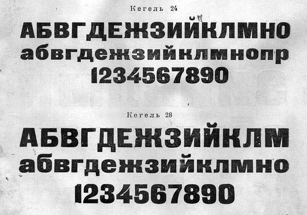
Above: Two Cyrillic extensions of the Zeitungs-Grotesque design. The 24pt type at the top is in the style of a design that H. Berthold AG registered for a Germany design patent in 1900. The fonts may have been cut at Georg Ross & Co. in St. Petersburg, which Berthold acquired the year before. Berthold’s initial Cyrillic offerings of Fette Grotesk did not include a 24pt size. The foundry may have added this size later, or the size could have been added by another entity inside Russia. The 28pt typeface on the bottom half of the image is the design that originated at Wilhelm Woellmer’s foundry in the 1880s. The image shows a cropped view of Типографские шрифты, материалы и принадлежности, Москва: Союзполиграфпром (1950), p. 83. Full a view of the full-page, please view this image’s source at typejournal.ru/articles/OST-1337. Near the bottom of that article, you’ll also find an image reproducing the character set for that added size of the “Berthold“ design.
What I’m calling the “second” Cyrillic extension probably originated at Georg Ross & Co., before the foundry was acquired by Berthold. You can find the typeface in an undated Franz Marc & Co. catalog of Flinsch types where the Zeitungs-Grotesque design appeared under the name of Жирный Древній, or “Fat Ancient.” I find the inclusion of this typeface a specimen of Flinsch products surprising, since Flinsch’s German-language catalogues did not carry the Francke Zeitungs-Grotesque design at all, but rather their own Fette Grotesk instead.
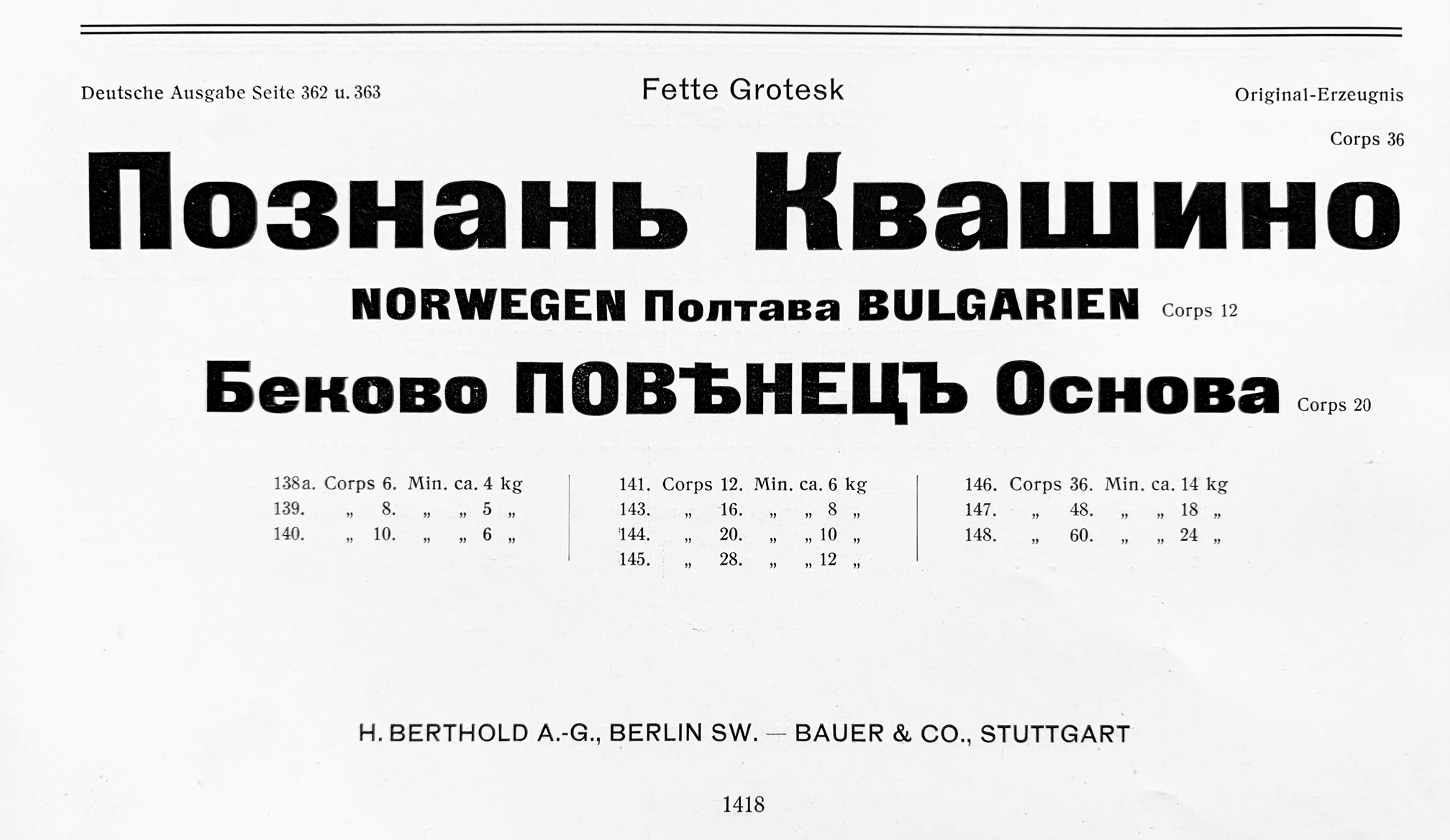
Above: The listing for the Cyrillic-script Fette Grotesk fonts in the H. Berthold AG and Bauer & Co.’s 1911 Hauptprobe unserer Schriftgiesserei und Messing-Erzeugnisse, from the bottom of p. 1418. The Cyrillic types of this style that W. Bojnkoff-Warna, A. Lange & Co., O.I. Lehman, and the Schriftgießerei „Gutenberg“ carried originated either at H. Berthold AG or at Georg Ross & Co., a St. Petersburg foundry that Berthold acquired in 1899. Click to enlarge.
Jan Idźkowski i S-ka in Warsaw carried the Zeitungs-Grotesque design with both Cyrillic and Latin-script characters under name Grotesk Kamienny. Kamienny is “stone” in Polish, and the translation probably references the German Steinschrift, which was an alternate term used by founders for sans serif type (either to reference lettering in stone-carved inscriptions or – what I think is more likely – new styles of lettering used in lithographic printing, as lithography in German was also called Steindruck). I have a hunch that Berthold was the source for their Grotesk Kamienny letterforms – both Latin and Cyrillic – but every time I compare their Cyrillic script letterforms with those from other foundries’ specimens, I guess a queasy feeling.
For the third Cyrillic design, I have a harder time pin-pointing the exact origin. The Poppelbaum family became part owner’s of Benjamin Krebs’s former foundry in Frankfurt am Main in the late 1850s. In 1870, the Popplebaums became the sole owners of Benjamin Krebs Nachfolger and established a typefoundry in Vienna. These two firms seem to have had the same product palette, which should come as little surprise, considering that they were essentially siblings. Benjamin Krebs Nachfolger opened a typefoundry and brass-rule-manufacturing factory in St. Petersburg. In a Poppelbaum catalogue at the Deutsches Technikmuseum in Berlin, I found this version of the Krebs/Poppelbaum Breite fette Steinschrift. Poppelbaum’s specimens don’t claim that these Cyrillic Breite fette Steinschrift fonts originated in-house, and I do not know what their source for them might have been.
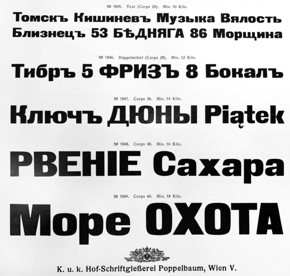
Above: The 20, 28, 36, 48 and 60pt sizes of the Cyrillic-script extension of the Zeitungs-Grotesque design sold by the Poppelbaum foundry in Vienna. I don’t have an explanation for what is going on with these characters’ design. A better-quality specimen of the Krebs/Poppelbaum design may be viewed in a St. Petersburg catalogue Benjamin Krebs Nachfolger printed in 1912 that has been digitized by Letterform Archive.
Back in Warsaw, both the Stanislaw Jezynski and the Odlewnia Czcionek St. Jezynskiego foundries carried the Latin-script portion of the Zeitungs-Grotesque design in 6 through 16pt sizes under the name Kamienne. Odlewnia Czionek E. i Dr. K. Kozianskich in Kraków and Warsaw also had the Latin-script Zeitungs-Grotesk design in sizes ranging from 6 through 28pt.
Eclipse
Above: Comparison of text in the 48pt sizes of Berthold’s Fette Akzidenz-Grotesk and the Francke Zeitungs-Grotesque design. Fette Akzidenz-Grotesk was the heaviest of the Akzidenz-Grotesk weights made before the 1950s. Its thick strokes only seem to be about half of those in Zeitungs-Grotesque. Even though the seemingly monolinear strokes make its “thin” parts heavier than Zeitungs-Grotesque’s thins, Fette Akzidenz-Grotesk does not get as dark. Nevertheless, the style of Fette Akzidenz-Grotesk’s letterforms made their pairing with other styles of the Akzidenz-Grotesk family an easier thing to pull off – perhaps – than finding lighter-weight types to combine Zeitungs-Grotesque with.
By 1914, typefounders were selling printers on the concept of type families that included a range of weights. This was especially true of sans serifs. Printers could buy Akzidenz-Grotesk from Berthold, which had six styles by 1914 (including a heavy Fette weight), or the “Breite Grotesk” family from Schelter & Giesecke. That had three weights, including one that was fett. Klinkhardt’s Ideal-Grotesk probably had seven weights by 1914. Wagner & Schmidt’s Neue moderne Grotesk had seven by then, too. The Bauer’sche Gießerei’s Venus already had a staggering palette of fourteen styles in 1914 and D. Stempel AG’s Reform Grotesk already had thirteen, with six more planed. In that kind of design space, a single-weight typeface must have seemed much less useful. I don’t believe that the Zeitungs-Grotesque design played a role in Weimar-era German printing; however, the Cyrillic fonts did receive continued usage in the Soviet Union.
It is hard to say when the typeface really went away. In some respects it is not gone at all. Paratype’s Black Grotesk is a digital version with both Latin-script and Cyrillic coverage. The Cyrillic characters are based on the Woellmer design. Black Grotesk even has an italic; this is an oblique version of the upright characters, rather than a font based on J. John Söhne’s Fette Cursiv Grotesque. Many foundries I have not mentioned above surely kept selling foundry-type fonts of the Zeitungs-Grotesque design until World War II; just the other day, I found a digital copy of a 1937 catalog for the Italian Fonderia Reggiani’s typefaces. The Zeitungs-Grotesque design was featured there as Serie “Turandot.” Surely, others continued to sell them after that point, too.