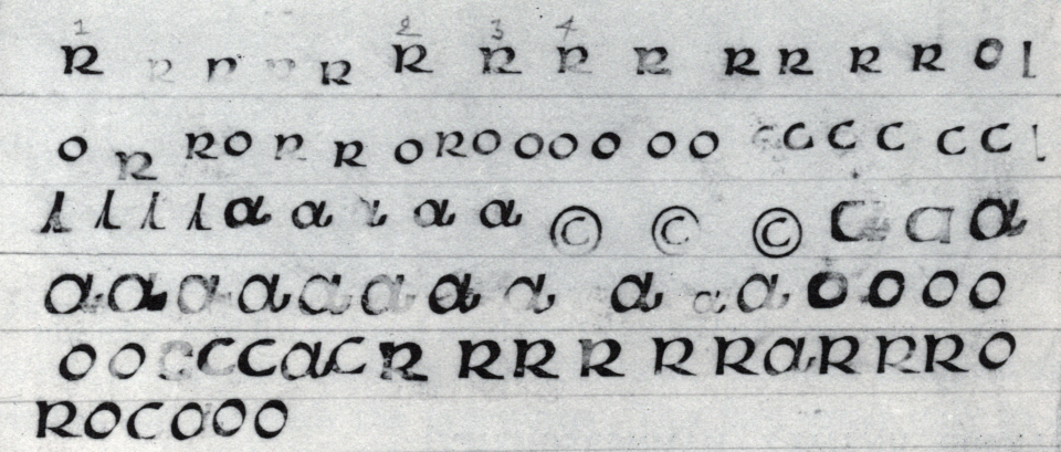
Above, smoke proofs from Victor Hammer’s punchcutting practice, reproduced from Victor Hammer: Artist and Printer (Lexington: The Anvil Press, 1981), p. 119.
Was ever a type designer so devoted to uncials as Victor Hammer? Most of his typefaces were in that genre. As a printer, Hammer composed mostly with uncials, too. Uncials also appeared in his paintings, prints, sculpture, and metalwork. Yet in those media, he also showed his mastery of Roman inscriptional letters. He was born in Vienna in 1882, making him the same age as Eric Gill, the British stone carver, letterer, type designer, and typographer. Gill died in 1940, but Hammer had emigrated to the United States in the previous year – a refugee from Nazi terror after their takeover of Austria in 1938. In America, Hammer began something of second life. There, he was first active in Aurora, New York. In 1948, he moved to Lexington, Kentucky, where he kept working until his death in 1967.
Several years after my presentation at ATypI 2010 in Dublin on Victor Hammer’s relationship with the Gebr. Klingspor foundry, I was invited to prepare a version of this text for the foreword of a book on Hammer’s work. The institution that would have produced that book has a significant collection of Hammer’s work. Had the book been made, the illustrations the editors would have included would be grander than what I have added here. For a longer post with more detail on Hammer’s typefaces and more imagery, see my “Victor Hammer and Gebr. Klingspor.”
Where did Victor Hammer’s typefaces come from?
Many of the typefaces Hammer designed were intended for use on his presses only. Some were marketed commercially as well. His 1943 American Uncial design was never openly sold as a foundry type product on the American market, but it was carried as Neue Hammer-Unziale by the Gebr. Klingspor foundry in Offenbach am Main, Germany from 1953 onward. Later, the fonts were sold by D. Stempel AG. In 1988, Adobe and Linotype digitized the design. In the meantime, several US photo-type houses made their own versions of American Uncial in the 1960s and ’70s, and by the 1990s, several of those had been digitized as well. These American Uncials became quite ubiquitous fonts, almost akin to Papyrus or Comic Sans. Today, American Uncial is usually used to imply that something is Irish or Gaelic. That is far removed from Hammer’s intent for the design. As far as I know, Hammer never visited Ireland. His interest in uncials stemmed from their historical role in the Latin script’s development: uncial was a “current” scribal hand in late Antiquity and the early Middle Ages.
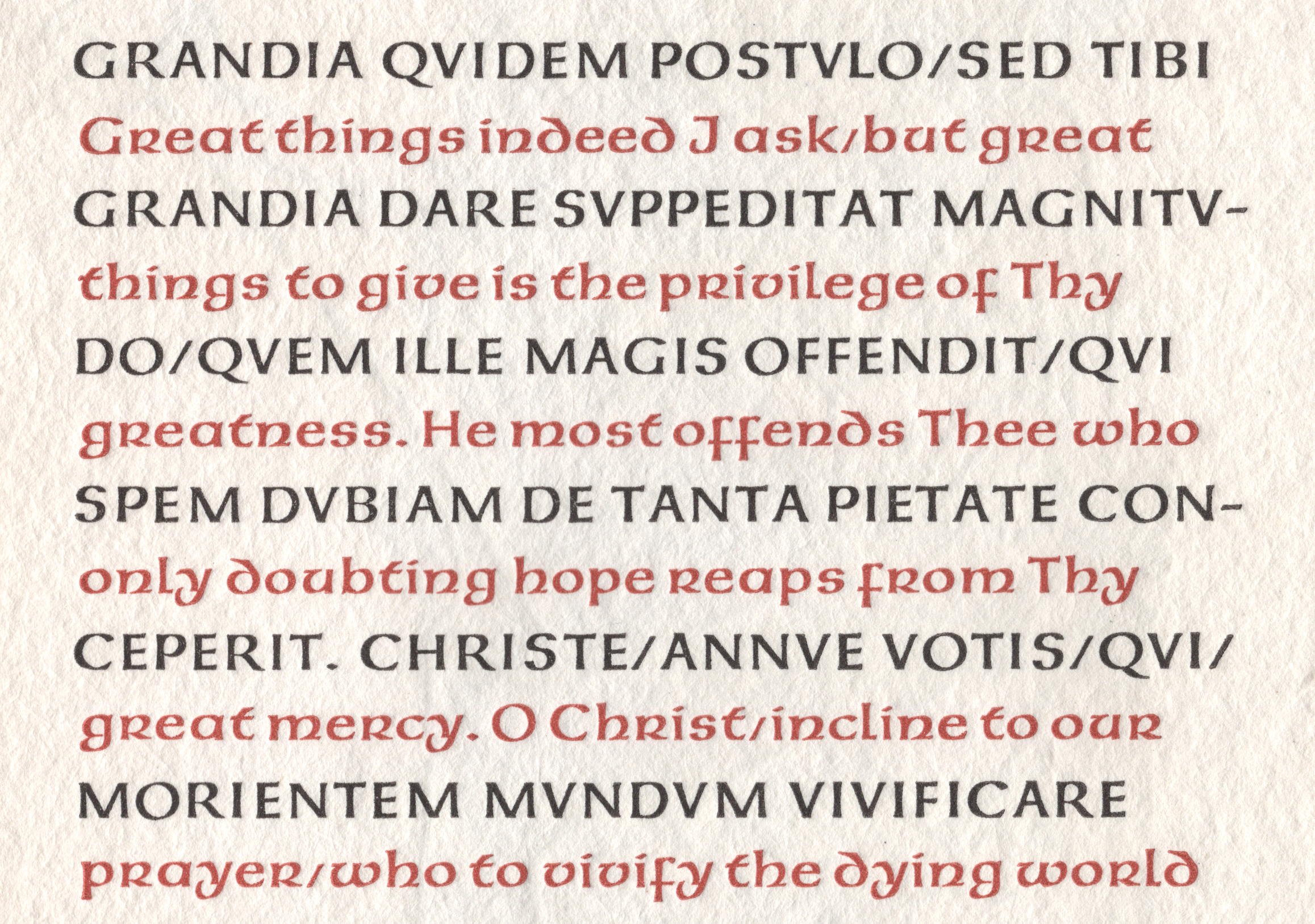
First six lines of The Anvil Press’s Cœlii Sedulii de quatuor evangelistis, ex libro primo operis Paschalis vulgati circa annum cccc · xxxiv. Printed by Carolyn Hammer in Lexington, Kentucky (1955). The text is composed in American Uncial, as the design looked in its original incarnation as foundry type. Of the digital interpretations, Linotype’s Neue Hammer Unziale I comes much closer to this than any other “American Uncial” font. Click to enlarge.
Hammer began writing uncial-style letters by hand – with broad pens – a few years before the First World War’s outbreak. His initial interest in calligraphy may have been inspired, in part, by Edward Johnston’s example. Indeed, Johnston’s 1906 manual, Writing & Illuminating & Lettering, used uncial-style letterforms for many of its illustrations. In the 1920s, Hammer saw a place for uncial letterforms within the dialogue that then dominated German type design. That centered around whether roman or blackletter was more the more appropriate form for the language. He considered uncials a potential replacement for roman. Hammer believed that ascenders and descenders – which are comparatively longer in roman type than in blackletter – slowed down the reading process. His theory is somewhat contrary to contemporary ideas about legibility, which propose that we see word shapes rather than individual letters since our eyes scan a line of text. Ascenders help define those word shapes significantly.
Connections with the Koch family and punchcutting
Although I first encountered Hammer’s work when I was assigned Sebastian Carter’s Twentieth Century Type Designers as a student, his oeuvre came alive for me after I began researching the work of the calligrapher/type designer Rudolf Koch and Koch’s circle of former pupils. Koch and Hammer first met in 1922. The Gebr. Klingspor foundry in Offenbach am Main – where Koch worked from 1906 until he died in 1934 – had agreed to publish the Hammerschrift, its name for Hammer’s first typeface. Hammer had gone to Offenbach for a visit. Although he never studied with Koch, Hammer could almost be considered an honorary member of Koch’s workshop, the Offenbacher Werkstatt.

Three illustrations showing methods for using gravers in punchcutting. These accompanied Paul Koch’s article “The Making of Printing Types” in The Dolphin, no. 1 (New York: The Limited Editions Club, 1933), pp. 24–57, here figs. 9, 14, and 15 from pp. 34, 40, and 42. Victor Hammer must have learned punchcutting by observing Arthur Schuricht and Paul Koch as they worked.
The number of connections between the two men was significant: for example, Hammer’s wife Rosl was a weaver in Koch’s Werkstatt for a time, and their son Jacob worked there from 1933 until 1935. Hammer almost certainly inspired Koch’s experimentation with uncial calligraphy. Between 1926 and 1928, Koch’s son Paul traveled to Florence to work in the studio Hammer had established there. Paul Koch would hand-cut the steel punches for Samson, Hammer’s second typeface. He cast the font’s sorts, too. Thanks to Paul Koch’s instruction, Hammer would cut the steel punches for his third typeface himself: Pindar. In America, Hammer collaborated with Fritz Kredel, an emigre woodcut-engraver who had been a Koch pupil. Kredel’s association with the Werkstatt began in 1921, and like Paul Koch, he had also spent time working with Hammer in Italy, traveling to Florence in 1924. Kredel and Jacob Hammer eventually collaborated in the United States, too. The latter combined illustrations from Kredel in a book he printed, whose type was composed in the Jessen-Schrift. That blackletter typeface had been designed by Rudolf Koch. Its punches were hand-cut by Koch, together with his son Paul.
Victor Hammer’s contemporaries
Hammer’s printed his edition of Milton’s Samson Agonistes – for which the Samson typeface was named – around the same time that Eric Gill made his Essay on Typography. Of all Hammer’s books, Samson Agonistes may be his masterpiece. Despite Gill’s Essay being much more technical, their two books bear comparison. They were reviewed together by The Times Literary Supplement, whose editors saw them both as typographic heresies. Gill wrote the Essay himself, and he must have played a hand in its layout, though it was mostly printed by his son-in-law, René Hague. The pages were composed in Joanna, a typeface of Gill’s design, named after one of his daughters – who was also Hague’s wife. While Gill’s book was printed on his own press, the Joanna type was produced according to Gill’s design by the H. W. Caslon foundry of London.
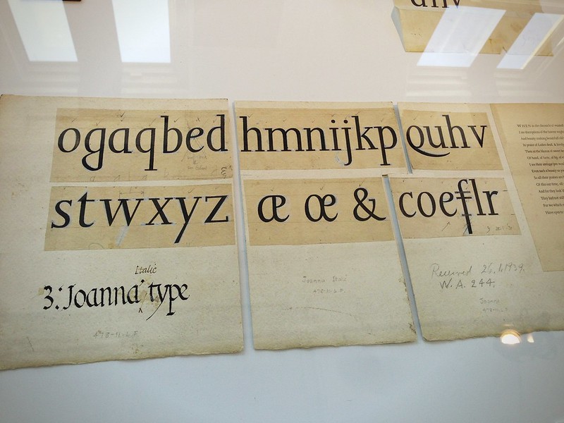
Drawings by Eric Gill for his Joanna Italic typeface, photographed by Lena Groeger at Monotype’s Pencil to Pixel exhibition. Like most 20th-century type designers – at least those active before the advent of digital drawing applications – Gill prepared drawings for various type-makers to interpret (including punchcutters, draftswomen and draftsmen). The punches for Hammer’s first two typefaces were also produced by others.
Koch described Hammer as a portraitist, and indeed he was. Hammer was a fine artist before he began printing, and he continued to work in traditional artistic media throughout his life. Many of the German-speaking type designers of Hammer’s generation would also have self-identified as painters, including Paul Renner – the designer of Futura – and Emil Rudolf Weiß, who designed Weiß-Antiqua, a masterful roman type. Like Koch and Gill, Hammer was an artist and craftsman who performed every task himself, by hand, whenever possible. This meant being hands-on at every stage of book-making: cutting his own punches, striking his own matrices, casting his own type, pulling the pages on the press himself, and binding the finished volumes, too. Koch is reported to have told him, “you are fortunate, Victor, that you are an outsider and not a professional. I cannot do what you do. I must meet the demands of our customers, and sometimes those of the market.“
Punchcutting in German typefounding
Type-making in 1920s Germany – specifically when it came to punches and matrices – was still much more of a craft than the industry that had developed in America and Britain. When the Hammerschrift was published by the Gebr. Klingspor foundry in 1923, it had been produced in what was then still the typical German manner. German-speaking foundries at that time did not all rely on pantograph engraving to the same extent that many British and American type-makers did. Germany’s manual punchcutters would engrave the letters for a pilot size of the typeface – often between 28 and 32 pt – into soft type-metal. After electrotyped matrices were made from these, trial type was cast and printed. Those prints then served as masters for the pantographic matrix-engraving of several other sizes. The exact process differed from foundry to foundry, and there were still more than a dozen firms making foundry type in Germany during the 1920s. Gebr. Klingspor was busy developing a reputation as the most traditionalist.

First spread from the Klingspor-Kalender 1924 showing Willi Harwerth’s woodcut of a punchcutter a work (Der Stempelschneider) and the days of the “snow month” of January. While the Hammerschrift was being produced, 14 punchcutters worked at Gebr. Klingspor, according to surviving company records: Ottokar Brendler, Peter Burckhardt, Gustav Eichenauer, Ferdinand Muntermann, Karl Pfefferle, Philipp Rebell, Josef Reifkohl, Johannes Schade, Max Schniffner, Kaspar Schmidt (who may have only engraved matrices), Peter Schultheiss, Alois Stölting, Paul Wahl, and Adam Weyrich. Text on the previous spread provides what must be an explanation of Gebr. Klingspor’s working methods: “With gravers and files, the punchcutter creates the physical model of the letter according to the drawn template. For the smaller type sizes, he cuts a steel punch, with which the casting form will be imprinted in copper or iron. The larger sizes are cut in type metal and from them, the matrices will be manufactured in the electrotype bath by the electrotyper, who at the same time is also duplicating clichés of all kinds.”
Arthur Schuricht, the freelancer who cut the type-masters for Hammer in Vienna, was a German punchcutter who had probably been trained in Leipzig. Schuricht had come to Austria in 1919, likely to work as an engraver at the State Printing Office. He cut the Hammerschrift’s soft-metal patrices in 1921 – or at least those for its pilot size; Gebr. Klingspor issued the typeface in three sizes. The Hammerschrift was not the only collaboration Hammer carried out with Schuricht. Based on Hammer’s design, Schuricht cut twenty-six letters in soft metal for a typeface Hammer proposed to Underwood, for use on typewriters. Although that project was never realized, Schuricht’s trial letters survive, and the prospect of such letterforms ever being manufactured for typewriters is a fascinating concept to consider.
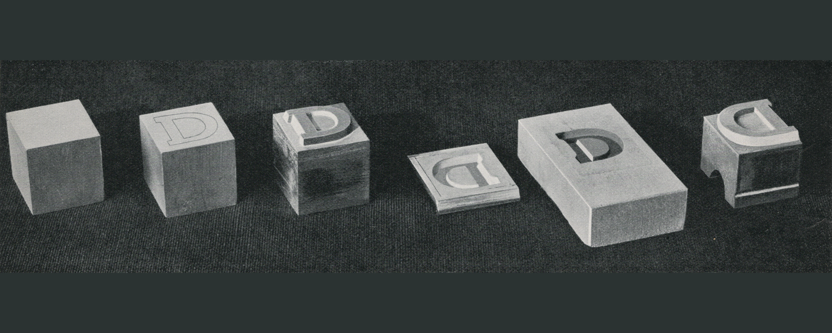
Visual explanation of matrix-making from a hand-cut or pantograph-engraved soft-metal patrix, reproduced from Konrad F. Bauer, Wie eine Buchdruckschrift entsteht (Frankfurt am Main: Bauersche Gießerei, 1931), p. 6. By the time that the Hammerschrift was produced, many sizes of most typefaces made in German foundries were no longer the result of steel-cut punches but were instead cast from electrotyped matrices made from punch-like “patrices” engraved in metal much softer than steel. Often, type-metal was used, as the Gebr. Klingspor methods mentioned in the previous image’s caption relate. Arthur Schuricht also engraved the trial size of Victor Hammer’s Hammerschrift via this method in Vienna around 1921. Click to enlarge.
When it came to the final Hammerschrift type, Hammer was not satisfied with the results, and he began working with Paul Koch on Samson shortly thereafter. Like his father Rudolf, Paul Koch cut his text-sized punches at actual size in the more traditional medium of steel, eschewing the use of pantographs. That was the direction that Hammer would himself go when he began punchcutting. As an artist and a craftsman, Hammer was willing to continue refining a process until he arrived at his ideal forms. This is certainly part of the reason why his typefaces are so similar to one another: he kept at them, eventually doing all the work himself if that proved necessary for his desired results.
What would Victor Hammer do?
By the time Hammer began printing in the 1920s, artist-printers had been making their own books – composed in typefaces of their own design, together with their own imagery, all on handmade paper – for decades. This practice has continued onward into the present day. Now, “maker culture” can encompass both analog and digital means of working: a website can become a book, while printed books’ contents are often distributed in ebook formats, too. Projects often unfold in such a way that an analog work result is realized in part through digital means. Were he alive today, Hammer might work this way, too.