Category: Nineteenth-century sans serifs
-
Notes on the origin of Akzidenz-Grotesk
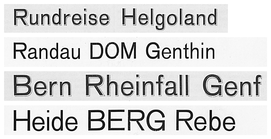
Above, I’ve reproduced my comparison of Bauer & Co.’s 1895 Schattierte Grotesk with Bauer & Co. and H. Berthold AG’s 1898 Accidenz-Grotesk. The image shows both typefaces in their 36 and 48-pt sizes. I took this Schattierte Grotesk specimen is from columns 407–8 of the 1896 Archiv für Buchdruckerkunst und verwandte Geschäftszweige issues. The lines of Accidenz-Grotesk are from Bauer & Co. and Berthold’s…
Written by
-
Research results: Sans serif type in nineteenth-century Germany
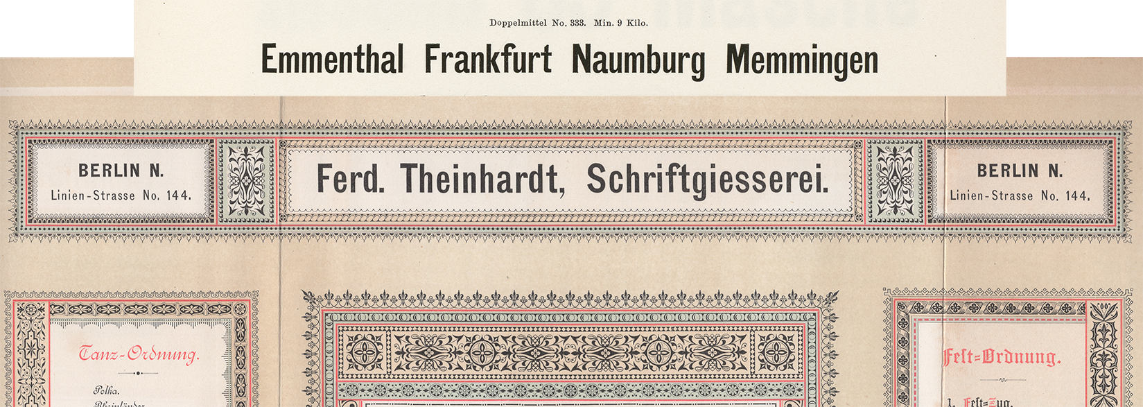
Berthold, Decker, Hamburg typefoundries, Leipzig typefoundries, Nineteenth-century sans serifs, Reichsdruckerei, Research, TheinhardtAbove, a digital collage showing two castings of the same design. The very top reproduces Benjamin Krebs Nachfolger’s product number 333, the 28pt size of the foundry’s Moderne Steinschriften typeface. Krebs first advertised its Moderne Steinschriften in 1865. That was one of the nine or more original sans serifs the Krebs foundry produced before 1900.…
Written by
-
From Vienna to Philadelphia (and further afield, too): Halbfette Cursiv-Grotesque
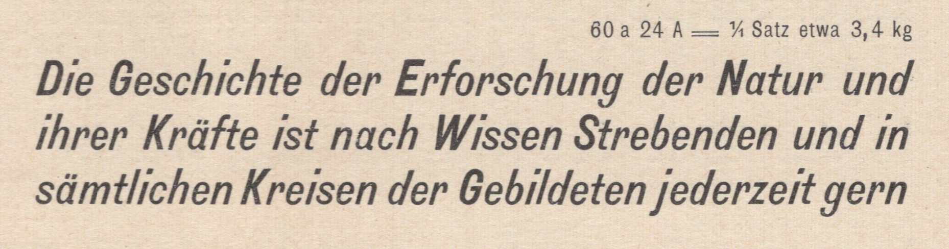
This post is about Halbfette Cursiv-Grotesque, a bold italic sans serif. Common in the last quarter of the nineteenth century, the typeface’s letterforms are slightly condensed. In the lowercase, “a” and “g” have single-story forms. The descenders are all very long. Many typefoundries carried this design – not just in Austria, Germany and Switzerland but…
Written by
-
Lapidar, from Genzsch & Heyse (born 1874)
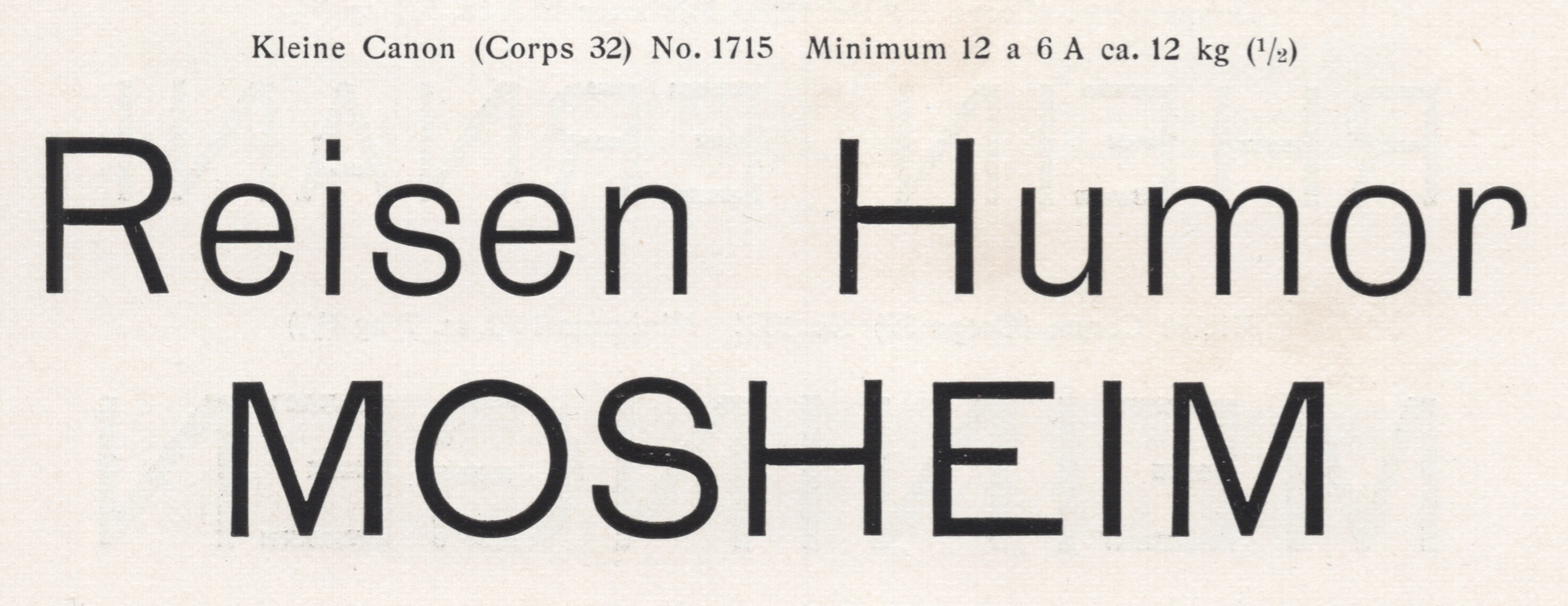
Above, I have reproduced a two-line specimen showing the largest size of the Lapidar-Schriften from a scan of E.J. Genzsch GmbH’s 1902 catalog. Recently, a type designer wrote to ask if I could provide him with some information about Genzsch & Heyse’s Lapidar. There is not much about the Lapidar typeface to be found online; Fonts…
Written by
-
Sanserif type in Germany in the nineteenth century: a preliminary survey
Above, I have reproduced six ornamental sans serif types from an 1850s type specimen sheet printed for the Joh. Pet. Nees & Co. foundry in Offenbach am Main. Philipp Rudhard’s widow purchased complete control of the firm in 1859. Her renamed Rudhard’sche Gießerei stayed in the Rudhard family until 1891. In 1892, a cigar manufacturer from Gießen…
Written by

-
Imperial-era Germany’s definitive heavy sans
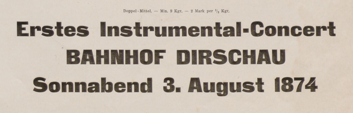
Above, I have reproduced a three-line specimen of the Doppel-Mittel size from the Zeitungs-Grotesque typeface. That translates to about 28 Didot points. The image is cropped from J.G. Francke Nachfolger A.W. Kafemann’s Vorläufige Probe (1874). Courtesy of the Noord-Hollands Archief. In the post below, I discuss this heavy sans serif’s wide distribution. The Danzig-based Francke typefoundry first advertised…
Written by
-
Footnotes C: Retracing the origins of Akzidenz-Grotesk
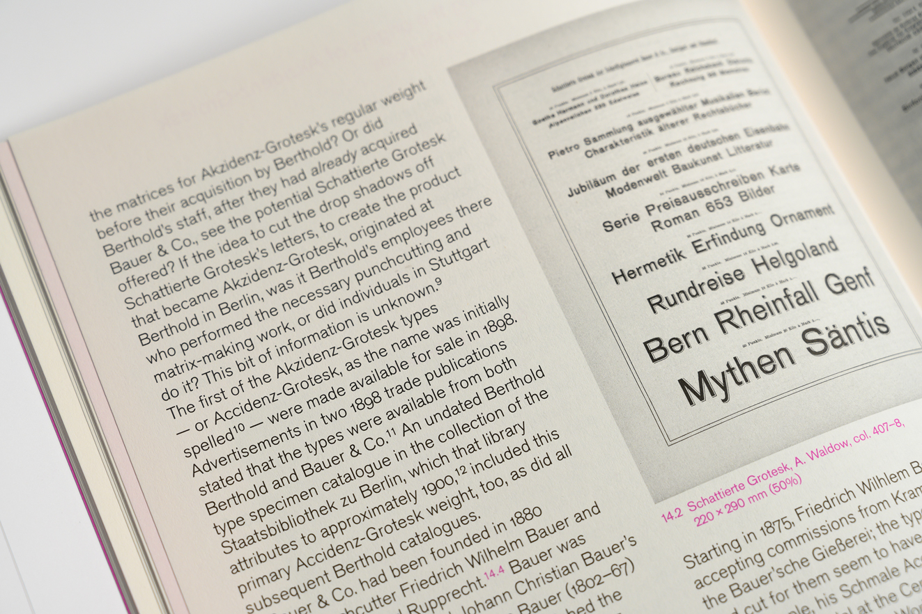
Above. part of a spread from Footnotes C. Footnotes is a typographic journal published in Geneva. Its most recent issue includes my article “The godfather: retracing the origins of Akzidenz-Grotesk.” In the photograph above, you can see an 1896 specimen of Schattierte Grotesk typeface, which the Bauer & Co. type foundry at Stuttgart published the…
Written by
-
Research update: Distribution of sans serifs in German-speaking foundries during the nineteenth century
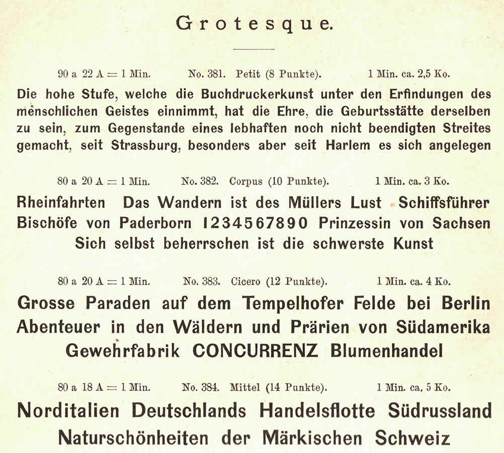
Four sizes of a Grotesque are reproduced above from the Berlin-based Wilhelm Gronau typefoundry’s 1891 catalogue. The foundry began carrying this typeface at the end of the 1850s, while the business was named after Eduard Haenel. An identical product – potentially even the source of these letters’ matrices – was sold by the Dresler foundry in Frankfurt,…
Written by
-
Distribution of sans serif typefaces across German-speaking foundries in the 19th century
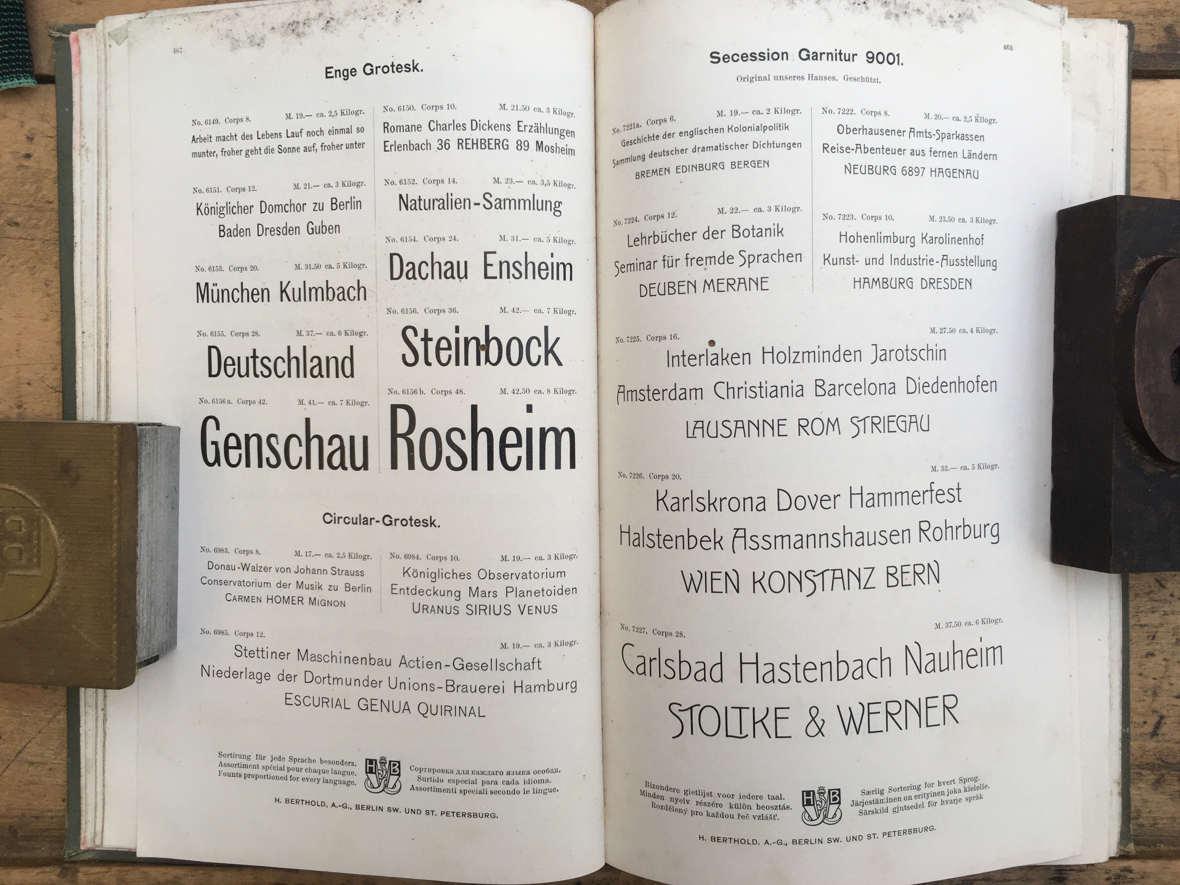
Above, a spread from an H. Berthold AG type specimen catalogue. The photograph is © Boris Chauvet. This spread is likely from Berthold’s c.1900 export catalogue, or one of the additions to it produced in c.1903 or c.1907. See note [1] below. Hey Internet, this is my website. Some of you have told me that you missed…
Written by