A few times a year, I’ll get an e-mail asking for information about Belladonna. It is generally considered the first German typeface attributed to a woman. The Julius Klinkhardt typefoundry in Leipzig published Hildegard Henning’s design around 1912. Indra Kupferschmid mentions it in an Alphabettes post, First/early female typeface designers. Below, you can read what I’m currently able to provide.
As far as I know, Henning wasn’t an employee at Klinkhardt. She probably created Belladonna in some freelance capacity. Before she collaborated with Klinkhardt, other women worked in German typefounding in what might have been permanent design roles. Lina Berger created some ornamental work at Schelter and & Giesecke in Leipzig – and probably for Klinkhardt, too. Genzsch & Heyse’s engraving department in Hamburg also seems to have had one woman working in it, who may have been named H. Hanewacker.
An early success for the Leipzig academy
I do not know when Henning was born. According to a 1915 article in Archiv für Buchgewerbe, she was a student at the Königliche Akademie für graphische Künste und Buchgewerbe in Leipzig. In 1904, the academy established its Schriftklasse (still an ongoing area of specialization). Hermann Delitsch led the Schriftklasse for its first several decades; he was probably one of her teachers. The academy only began admitting women in 1905. The otherwise excellent 2010 book Ein Jahrhundert Schrift und Schriftunterricht in Leipzig does not mention Henning or Belladonna.
Henning was one of several students or graduates whose work was exhibited at a large international fair held in Leipzig during the summer of 1914, the Internationale Ausstellung für Buchgewerbe und Graphik (Bugra). Within the women’s pavilion [das Haus der Frau] typefounding section, Henning’s Belladonna and ornaments from Berger were displayed together with photographs of “women’s work” at the Blackfriars Typefoundry in London. Those photographs may have shown one or more women milling kerns onto individual typographic sorts.
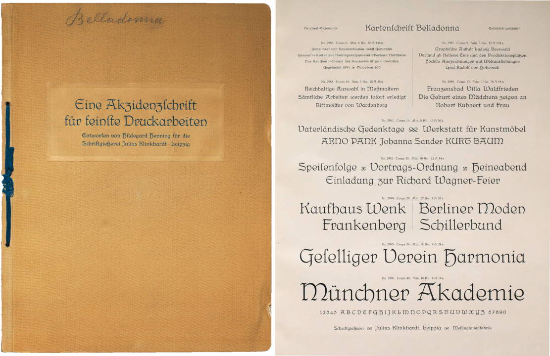
Digital collage showing the front cover and size-listing page from Klinkhardt’s specimen for the Belladonna typeface. Note that the bottom of the size-listing page reproduced on the right includes all of Belladona’s capital letters and numerals – a rarity for foundry specimens from this time. Specimen: Deutsche Nationalbibliothek Leipzig. n.d. but probably from 1914.
Belladonna was also included in the Julius Klinkhardt foundry’s main fair exhibit, not inside the women’s pavilion but in one of the larger exhibition halls, where the Verein der Deutschen Schriftgießereien had booked space for all of its member foundries. In his official report of that group exhibition, Heinrich Hoffmeister named forty-eight type designers in conjunction with the exhibiting typefoundry displays, including Henning. Klinkhardt displayed at least ten other products from six more designs:
- Ernst Deutsch’s Ika-Schrift
- Heinz-König’s Askania
- Hermann Delitsch’s Delitsch-Antiqua and Ramsees-Antiqua
- Schmuck, etc. from Julius Nitsche
- Richard Grimm-Sachsenberg’s Grimm-Kursiv, Magere Römische Grimm-Antiqua, Neue Römische Schriften, and Saxonia
- Wilhelm Scheffel’s Europa-Schrift
Only one typeface brochure for Belladonna?
Today, the Deutsche Nationalbibliothek in Leipzig has a brochure that the Klinkhardt foundry produced for Belladonna. It is entitled Eine Akzidenzschrift für feinste Druckarbeiten, entworfen von Hildegard Henning für die Schriftgießerei Julius Klinkhardt, Leipzig. I recently had the brochure digitized and you can flip through it on the DNB website. The library’s catalog provides 1915 as the approximate publication year for the item, probably because the samples inside it use dates from that year in their designs. However, I suspect Klinkhardt may have put the brochure together for the Bugra. If the specimen was made in 1915, I would expect the sample death notices and poetry samples to mention the war – indeed outbreak of World War I occurred as the Bugra was already underway in Leipzig. I am not aware of any other dedicated specimen brochure for the Belladonna typeface.
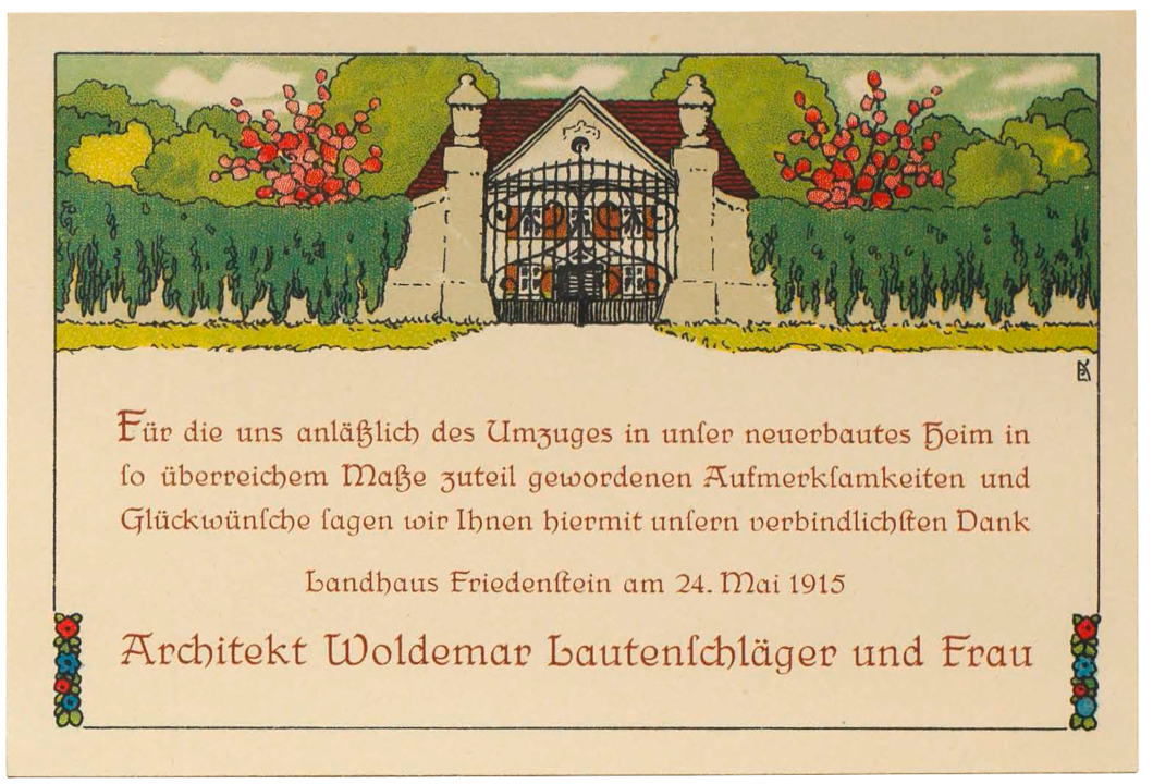
Likewise, this change of address card from Klinkhardt’s Belladonna specimen brochure must also have been a speculative design rather than an actual “in-use” sample.
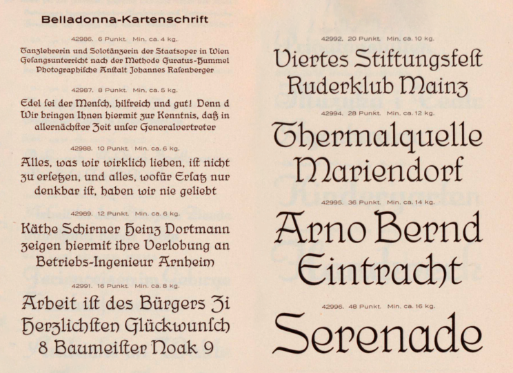
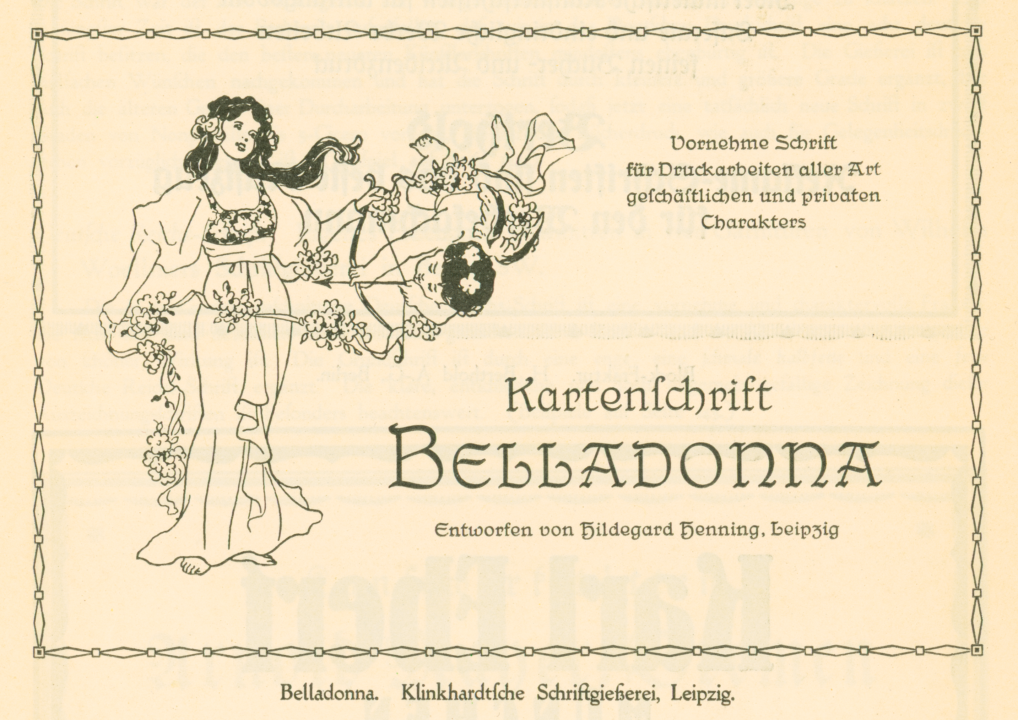
Henning’s typeface is often referred to as “Kartenschrift Belladona” or the “Belladonna-Kartenschrift.” The term Kartenschrift, or card typeface, indicates where Klinkhardt intended Belladonna to be used: on cards, invitations, menus, brief passages of poetry, and other short documents that would fall within jobbing printers’ scope. Although Belladonna was produced in small sizes – there was even a 6p font available – it was not a design that the typographic community today would likely refer to as a “text face.”
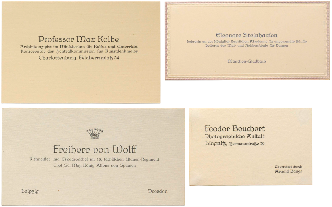
Klinkhardt’s specimen brochure for Belladonna included two pages with sample calling cards or business cards. The above collage shows four of them. As far as I know, these business cards were speculative designs, rather than the actual business cards of the named persons or firms. Each card was designed with more than one size of the Belladonna typeface.
Berthold’s Belladonna specimens from the 1920s
This small 1921 advertisement for Belladonna also illustrates how the typeface was to ideally be used. Notice that a border and illustration are printed with the type:
Advertisement for Kartenschrift Belladonna in Klimsch’s Jahrbuch, vol. 16 (1921–22), p. 138. Although the advertisement’s caption reads “Klinkhardtsche Schriftgießerei, Leipzig,” Belladonna was a Berthold typeface by the time that issue of Klimsch’s Jahrbuch was printed. About 12½ × 8½ cm.
The H. Berthold AG in Berlin acquired Julius Klinkhardt’s typefoundry in 1920. Initially, Berthold continued to sell the Belladonna fonts, just like it did for many with Klinkhardt’s typefaces. Nevertheless, Belladonna is not in many Berthold specimen books.
Aside from the Klimsch’s Jahrbuch illustration I’ve reproduced above, the only Belladonna specimen from Berthold that I’ve found is a half-page showing on this Berthold Register-Probe sheet (the sheet’s being upside down is probably not a digitization mistake). Instead of a follow-up to its c. 1911 Hauptprobe catalog, Berthold published Register-Proben throughout the 1920s and ’30s. Every Berthold Register-Probe copy I’ve seen is a little different: the catalogs were bolt-bound, and each surviving copy has different sheets collated into it. Some have more than twice as many sheets as others. The Register-Probe linked to above seems to have a whole section bound on its wrong side.
Dornemann & Co. in Magdeburg also sold brass-type fonts of Belladonna for bookbinders to use on their gilding presses. I am not sure how many Dornemann & Co. catalogs include the design. So far, I have only seen it in Schriften in Glockenmetall für die Vergoldepresse: Musterbuch P 242. Since that catalog was printed around 1930, Belladonna may have had a longer sales life in brass types than it did as a foundry typeface.
The end
Near the beginning of the Register-Probe mentioned above, Berthold printed a list of Klinkhardt typefaces discontinued in 1928, which includes Belladonna. I do not know if Henning lived to see that. A March 1929 exhibition report mentioned that she had died too early; she could not have lived passed the beginning of 1929. I doubt that Henning even saw her fortieth birthday.