Category: SDTB
-
Hand drawings for Berthold’s phototypesetting library
Most of the Deutsches Technikmuseum’s collections are not on public display, including the original hand-made drawings for Berthold’s phototypesetting faces. The storage for Berthold’s Diatronic typefaces alone fills 32 metal cabinets that together take up 19 meters of storage space. Bundled into 2,179 red-colored cassettes are approximately 270,000 drawings. Aside from a single cassette on…
Written by

-
Notes on the origin of Akzidenz-Grotesk
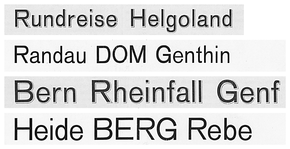
Above, I’ve reproduced my comparison of Bauer & Co.’s 1895 Schattierte Grotesk with Bauer & Co. and H. Berthold AG’s 1898 Accidenz-Grotesk. The image shows both typefaces in their 36 and 48-pt sizes. I took this Schattierte Grotesk specimen is from columns 407–8 of the 1896 Archiv für Buchdruckerkunst und verwandte Geschäftszweige issues. The lines of Accidenz-Grotesk are from Bauer & Co. and Berthold’s…
Written by
-
Fette Fraktur questions
Typeface names in the nineteenth century tended to be descriptive terms rather than brands. That was much less the case in the twentieth century, and today many typefaces are used whose nineteenth-century descriptive names have become brands. I’ve written several posts about Akzidenz-Grotesk, a classic example of this phenomenon. Another example is the Fette Fraktur…
Written by

-
Berthold steel types from Dornemann & Co.
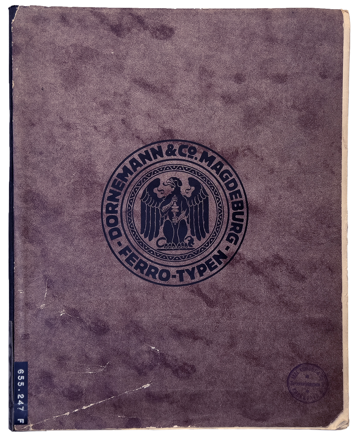
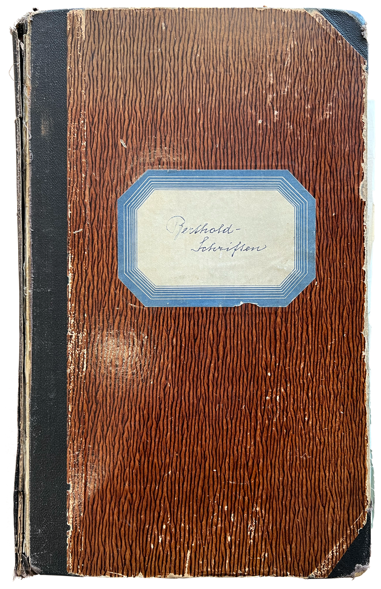
I dedicated a previous post to Berthold-Schriften, a notebook in the Deutsches Technikmuseum’s Historical Archive. That was an internal document from H. Berthold AG in Berlin tracking the company fonts’ sources from around 1900 until the early 1950s. The notebook indicates that Berthold contracted other type-making companies to produce the master patterns for its non-foundry-type fonts.…
Written by
-
Berthold’s patented type designs, 1900–1907 and 1921–1931
In June, on my way to the Historical Archive at the Deutsches Technikmuseum in Berlin, an art historian sent me a message about a handwritten notebook that might have some information about Berthold’s patented type designs. After consulting it, I found that it did include details for many of the company’s design-patent registrations and several…
Written by
-
How old is the specimen? And the typeface?
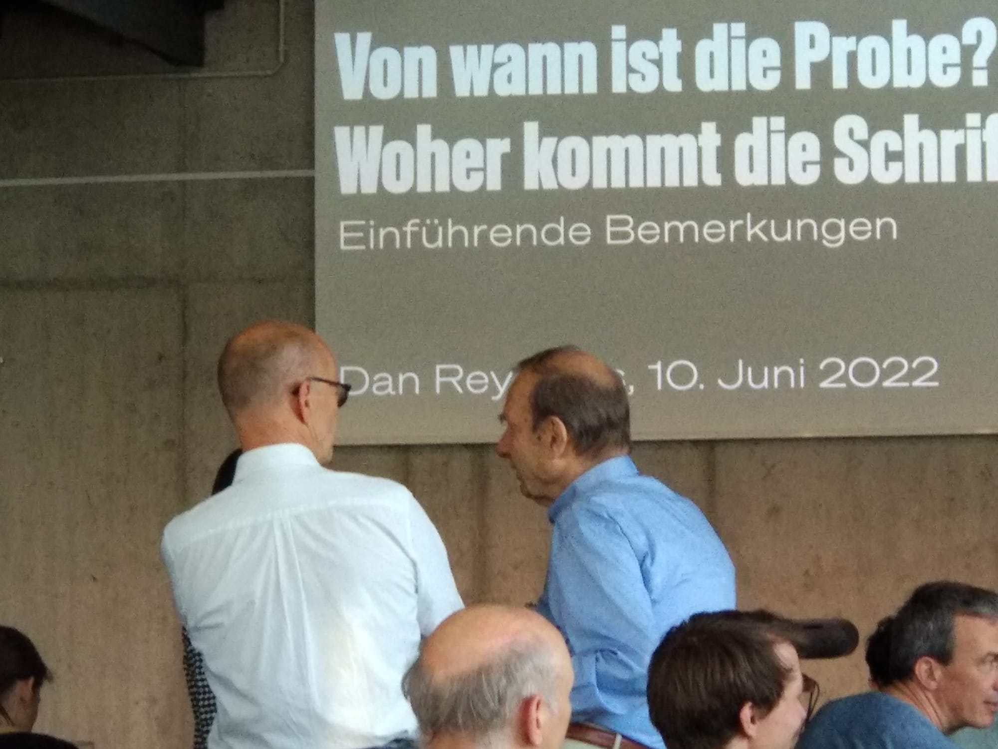
Between April 2020 and June 2022, I participated in a type specimen digitization project. Several public institutions in Berlin joined forces to photograph each page of every type specimen in their collections produced by Berlin-based type-making companies between the 1790s and 1951. Together with Christian Mathieu, I prepared an English-language summary of the project for…
Written by
-
H. Berthold AG’s matrices, reference castings & casting slips in the Deutsches Technikmuseum’s depot
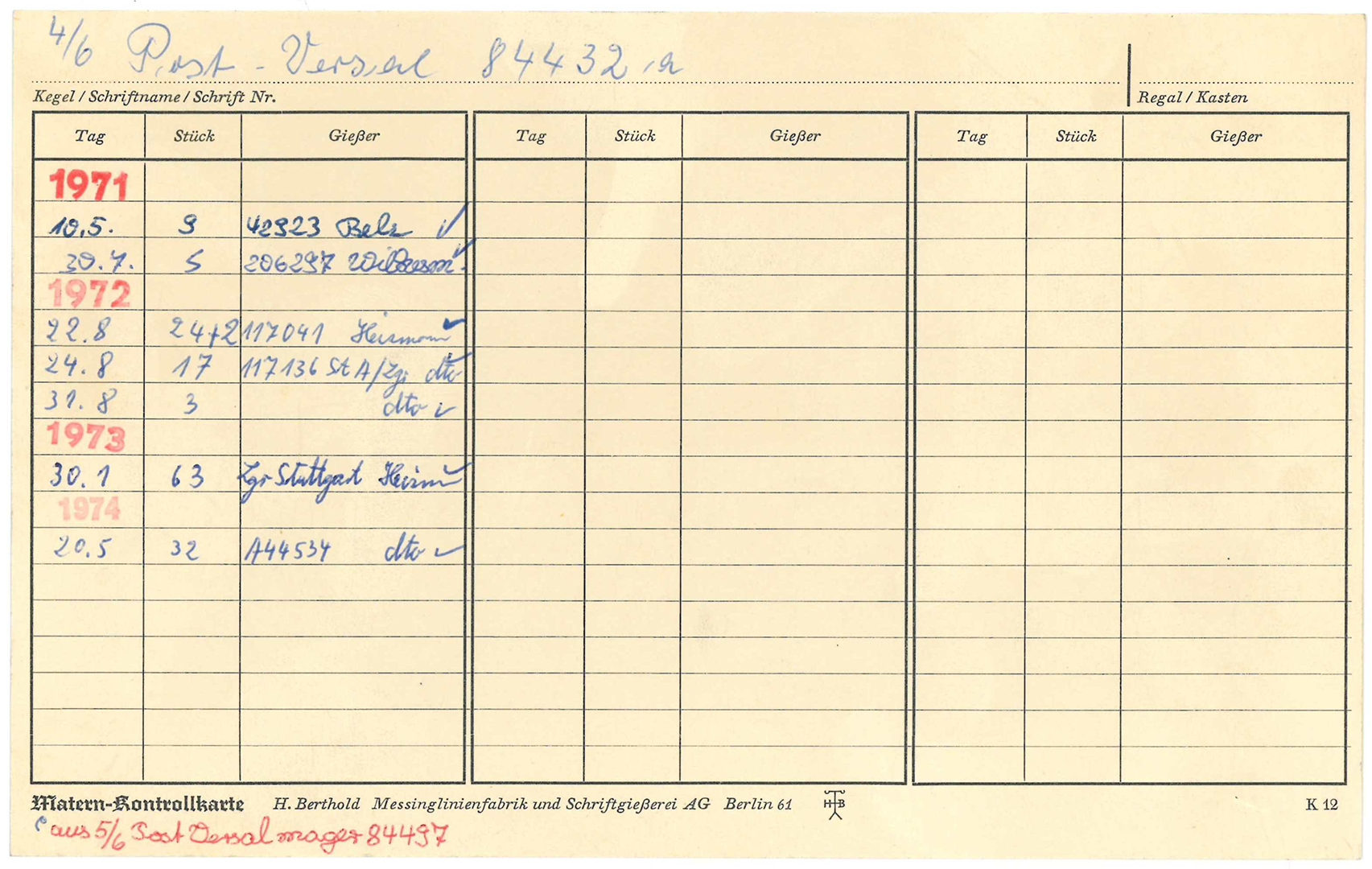
I wrote the following article on Berthold’s matrices with Kerstin Wallbach from the Stiftung Deutsches Technikmuseum Berlin. Our original German-language text was published by the Staatsbibliothek zu Berlin on its blog last week. Since 2020, I’ve been a member of the scientific advisory board a digiS digitization project called Die Sichtbarmachung des Sichtbaren – Berlins…
Written by
-
Another word on Accidenz-Grotesk and Royal-Grotesk’s appearances in Theinhardt specimens
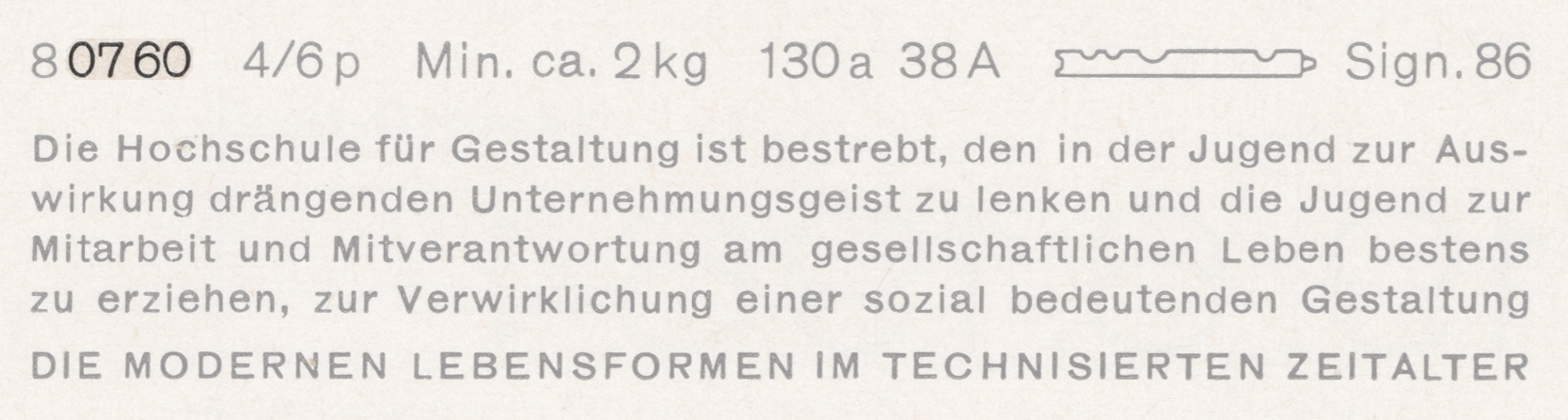
Above, I have reproduced a specimen of Akzidenz-Grotesk’s regular weight showing its 4pt size on a 6pt body. That is taken from a scan of page 58 from the undated H. Berthold AG Hauptprobe Nr. 470, probably printed at some point during the 1960s. I’ve highlighted the last four digits of its product number: 0760. This…
Written by
-
Decker and Reichsdruckerei punches, part 2
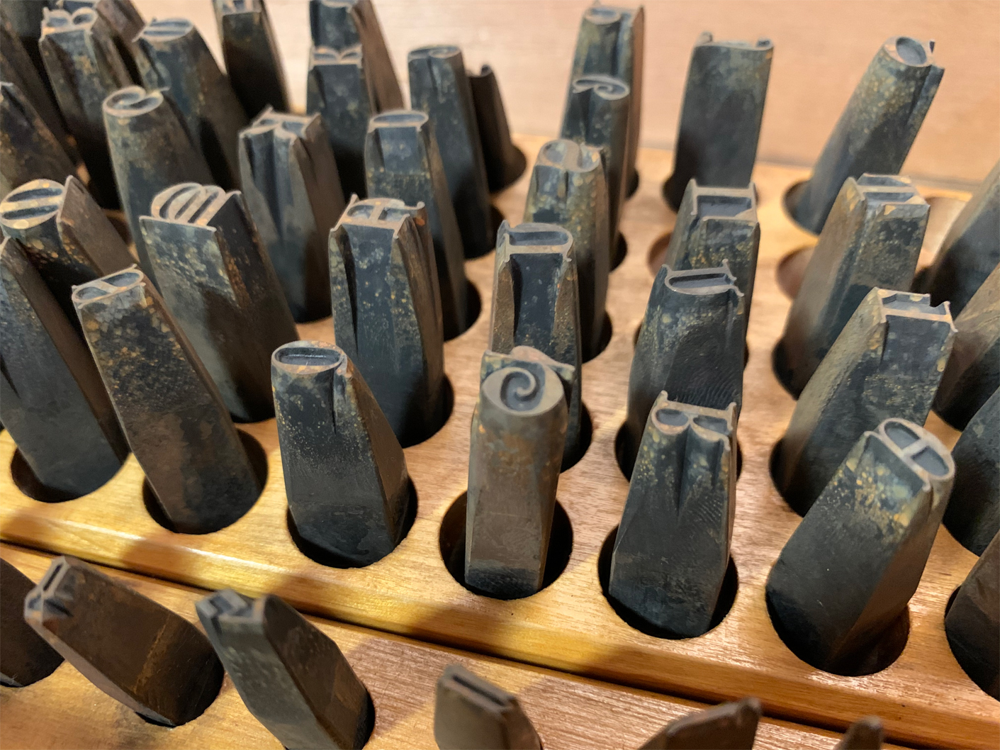
Above, I have reproduced my photograph showing part of Stiftung Deutsches Technikmuseum Berlin, inventory number 1/2018/0342, drawer 28. In it, you see the steel typographic punches for the 28-pt (and maybe a few 24-pt) sizes from one of the Reichsdruckerei typefaces. The design’s name is Diplom-Gotisch and the punches were probably cut in Berlin, ca 1893. This is…
Written by
-
Decker and Reichsdruckerei punches, part 1
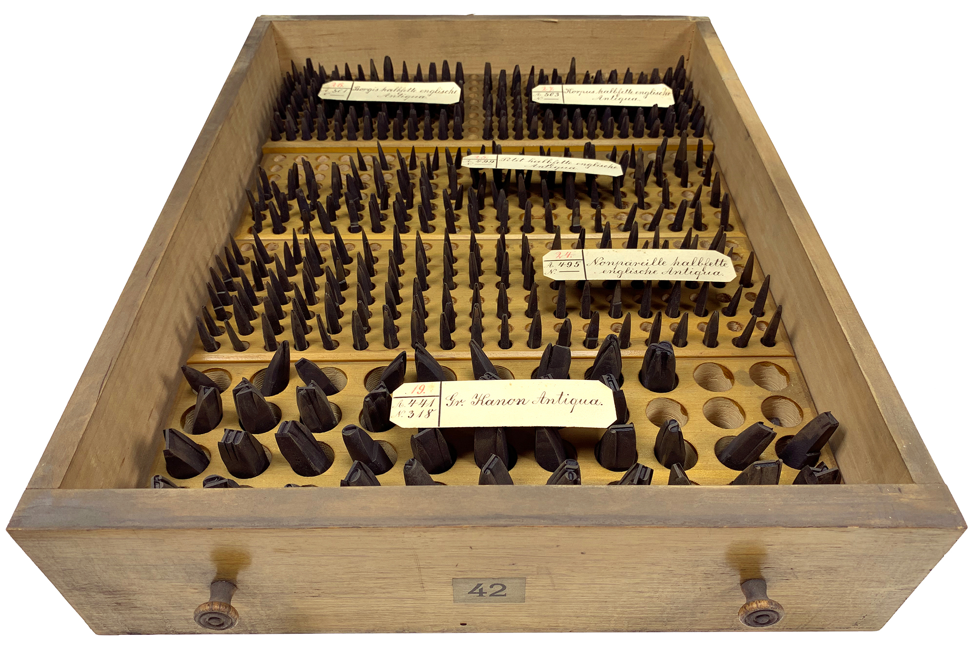
Above, I’ve reproduced my photograph of Stiftung Deutsches Technikmuseum Berlin, item number 1/2018/0443, drawer 42. This stores the hand-cut typographic steel punches for four fonts of a bold English-style roman typeface named halbfette englische Antiqua. Their approximate sizes are 6, 8, 9, and 10 Didot points. They were probably cut at Rudolf Decker’s Court Printing House at…
Written by
-
The Academy of Sciences of the USSR’s hieroglyphs font (1928)
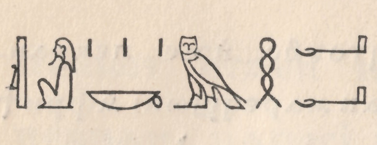
In 1928, the Academy of Sciences of the USSR – then still in Leningrad – published a specimen of their press’s oriental typefaces. This small book’s ancillary text is in both German and Russian. The Academy printed it for the Internationale Presse-Ausstellung (Pressa) held at Cologne that year. One of the book’s pages displays Egyptian…
Written by