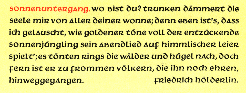
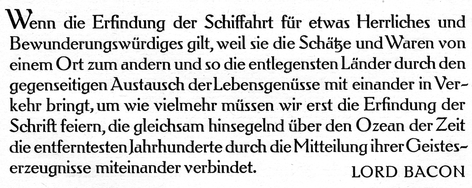
Above, I have reproduced a seven-line specimen of Gebr. Klingspor’s Hammerschrift from Rodenberg 1926. Victor Hammer, who designed the typeface, is most well-known among type designers and typographers for his uncial typefaces today. However, he worked with many letter styles in his lifetime, including monumental Roman capitals and Greek. Hammer probably devoted so much of his efforts to uncial because of his dislike for Carolingian minuscule. In his books, he avoided roman lowercase letters. Even though most printers since the Renaissance had used them. This post revises a presentation I gave at the 2010 conference of the Association Typographique Internationale in Dublin.
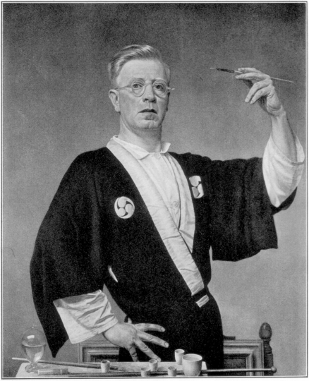
Above, one of the self-portraits printed in Hammer 1936.
Victor Hammer was born in Vienna in 1882. By his death in 1967, he was living in Lexington, Kentucky. As a young man, Hammer trained as a fine artist. He worked as a portraitist throughout his life. Like Emil Rudolf Weiss, Walter Tiemann, Paul Renner and many other type designers in German-speaking Europe during the first third of the twentieth century, Hammer saw himself primarily as a painter. He travelled widely, working in several countries and speaking multiple languages. Only during the second half of his life would he take up printing and type design.
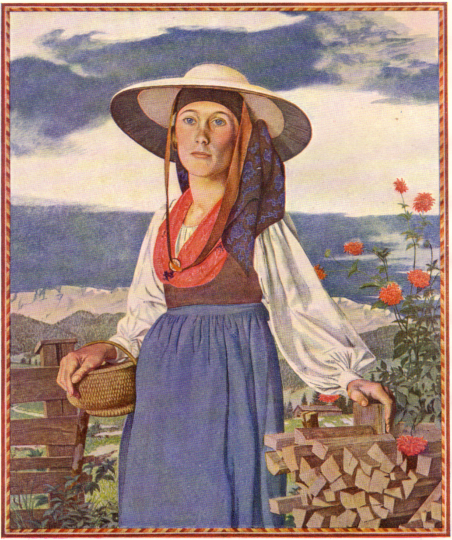
Grundlseer Bäuerin in alter Tracht, frontispiece of Hammer 1936.
Fashion seems to have been one of many topics that caught Hammer’s interest. He was not fond of menswear, writing that “our men’s clothes negate any possibility for image constellation. Today’s uniform has something repressively boring about it; there are only a few traditional elements, which have been preserved in our Alps – but not everywhere, and these are not appropriate for everyone” [Hammer 1936: 38]. His painting of Grundlsee farming-woman reproduced above illustrates his appreciation of regional attire.
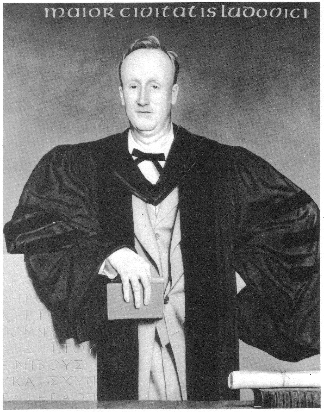
Portrait of Charles R. Farnsley, mayor of Louisville, Kentucky from 1948 to 1953, reproduced from Hammer 1981: 93. At the bottom-left of the painting, the stone-carved inscription is painted entirely with Greek capitals. Click to enlarge.
Academic and civic leaders present opportunities where a male figure may still wear traditional clothing. Hammer likely considered that academic robes offered him more possible varieties for a portrait’s composition.
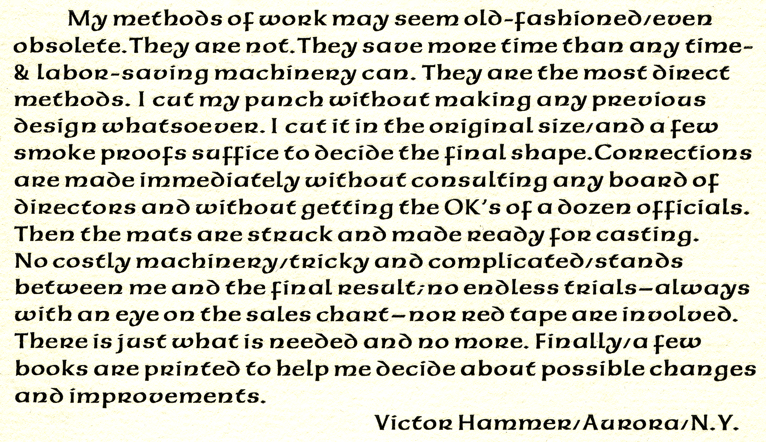
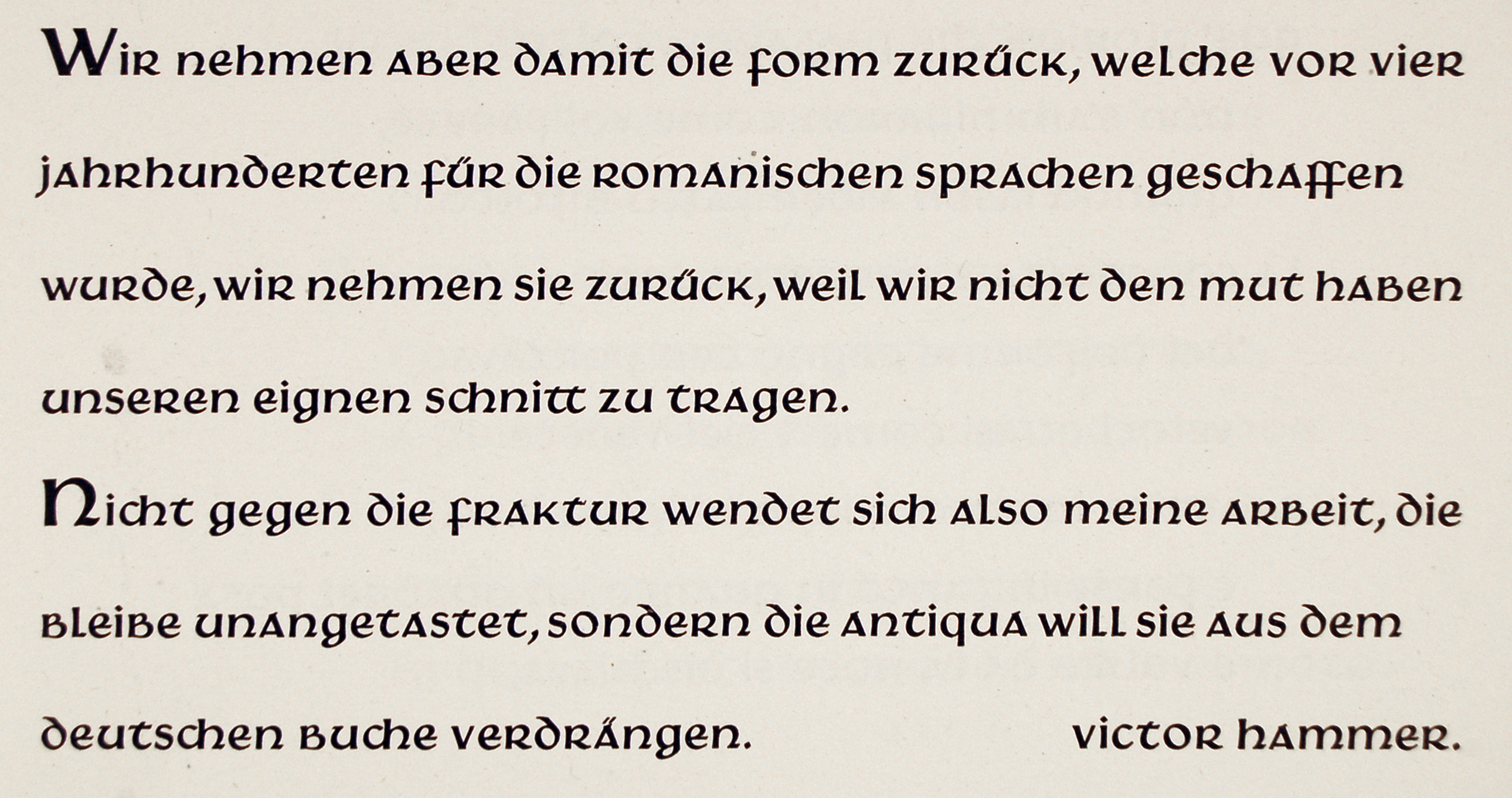
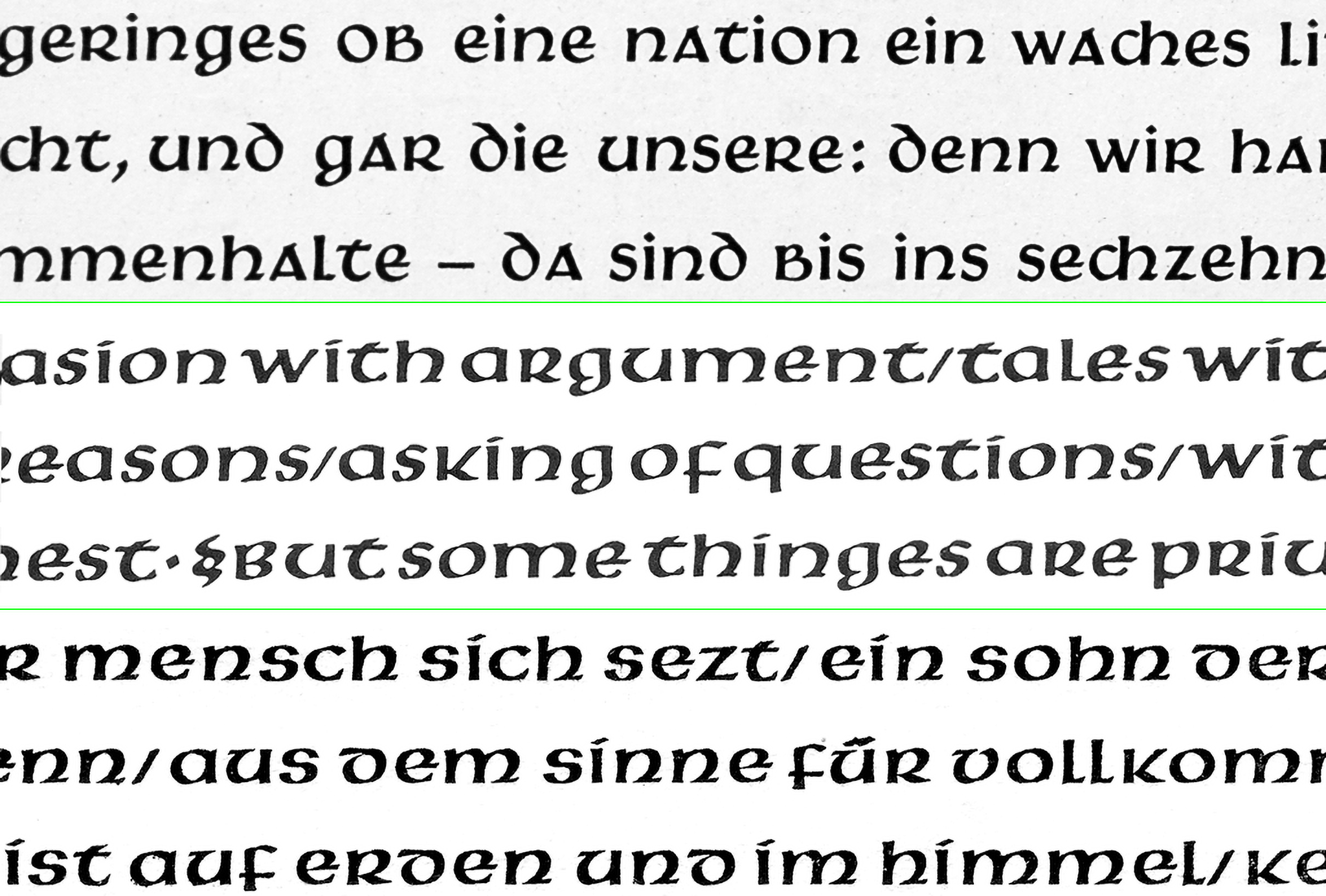
Last paragraph from Hammer 1946, his essay called Type Design in Relation to Language & to the Art of the Punch-Cutter. Hammer composed the text in his American Uncial typeface and printed the essay himself. My copy of this essay was presented to Sol Hess from Paul Standard in March 1946. Click to enlarge.
Victor Hammer’s most successful typeface is American Uncial, a design he began in his sixties. American Uncial is often used as a stand-in for things that are supposed to be “Celtic” or “Irish.” Although Hammer did have some contact with Irish design during the 1930s, I cannot find any significant connection to Ireland in his work. While Hammer did name the Book of Kells as an influence for his uncials’ forms, he must have been just as influenced by Edward Johnston’s uncial hand in Writing & Illuminating & Lettering and general debates around the script question that occupied so many Austrian and German designers of his time. In 1946, Hammer wrote that his uncial was “a letter form which eventually may fuse roman and black letter, those two national letter forms, into a new unity” [Hammer 1946]. Three-quarters of a century later, there is still no sign that this may yet happen. Nevertheless, the vitality of Hammer’s work makes it an interesting point of study for typographers and type designers, even if they have no desire to work with uncials themselves.
Karl Klingspor and the German script debate
Letterforms were serious business in Wilhelmine Germany. In 1911, the Reichstag debated on the issue, considering whether the roman script should become the official style of letter used in Germany. Before the debate, there had been no official style of letter proscribed for governmental or public use. Instead, some texts were drawn, painted, printed, or written in blackletter styles (Fraktur), while others appeared in roman (Antiqua). Fraktur and Antiqua lived side by side. While the debate did not lead to any official changes in German life, it may have caused the partisans on each side of the script debate to entrench themselves and cause them to be less interested in any compromise on the issue.
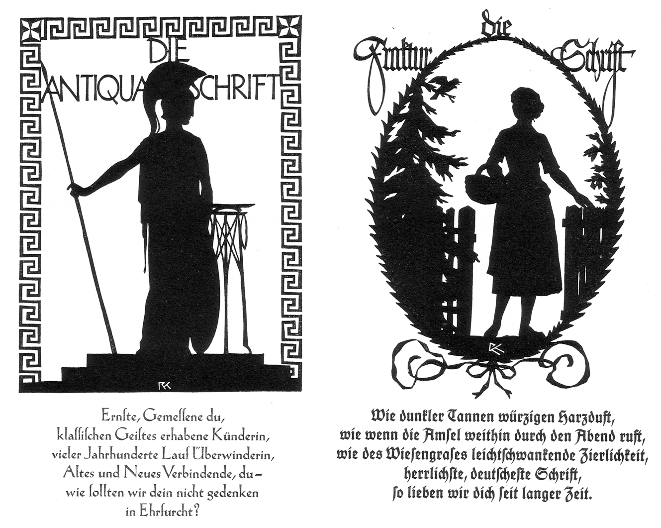
Two paper-cut silhouettes from Rudolf Koch combined with lines of verse. The silhouettes depict female personifications of roman and blackletter script. For roman – die Antiqua Schrift – Koch chose the goddess Athena. For blackletter – die Fraktur Schrift – Koch depicted a woman with a basket walking through a gateway, a scene for which his wife or one of his daughters could have modeled. The verse on the left is composed is in Koch-Antiqua, the verse on the right in Koch’s Deutsche Schrift. I scanned both images from Klingspor 1949, which itself reproduced them from Koch 1918. Click to enlarge.
In 1911, the Gebr. Klingspor typefoundry of Offenbach am Main was owned by Karl Klingspor (1868–1950) and his brother Wilhelm Klingspor (1871–1925). Like almost every typefoundry active in Germany at the time, Gebr. Klingspor’s product range included both Fraktur and Antiqua typefaces. Karl Klingspor got involved in the national script debate. The adoption of roman as the country’s official letter style – which indeed would happen thirty years later – would not have pleased him. Indeed, after the Nazi government implemented its script change, he lobbied against the measure. In addition to the artistic and cultural reasons Karl Klingspor believed in that caused him to want to preserve Fraktur’s place in German printing, he certainly had had a strong business interest in the maintenance of Germany’s script duality. His foundry surely sold more Fraktur type than roman, and the simple fact of the country using competing scripts must have caused more fonts of type to be sold than might have been the case if Fraktur were decommissioned.
By the 1920s, Gebr. Klingspor was firmly associated with a revival of interest in Fraktur types. Around 1900, however, the foundry’s releases show a desire for the firm to attempt to occupy a middle ground between those scripts. Rodenberg 1926: 11 put it this way:
[…] there is no slavish imitation [when it comes to Gebr. Klingspor’s typefaces], but new life springs forth out of old roots. The movement is specifically German, because it started from the dispute about roman or blackletter. After the failure to fuse the two, the dispute was renewed and subsequently settled by the answer roman and blackletter. [The italics are Rodenberg’s.]
Gebr. Klingspor’s hybrid types
Eleven years before the Reichstag script debate – while the Gebr. Klingspor foundry was still doing business as the Rudhard’sche Gießerei – the company began to release a program of new typefaces. While its competitors may have all had well-performing typefaces for book-composition, Karl Klingspor began to collaborate with a series of well-known commercial artists on the foundry’s successful Künsterlerschriften, or “artistic typefaces.” Although the road that Karl Klingspor followed had already been laid by foundries in the United States and France, he was the first typefoundry owner in Germany to commission well-known artists to develop new typefaces, which the foundry then marketed under those artists’ names.
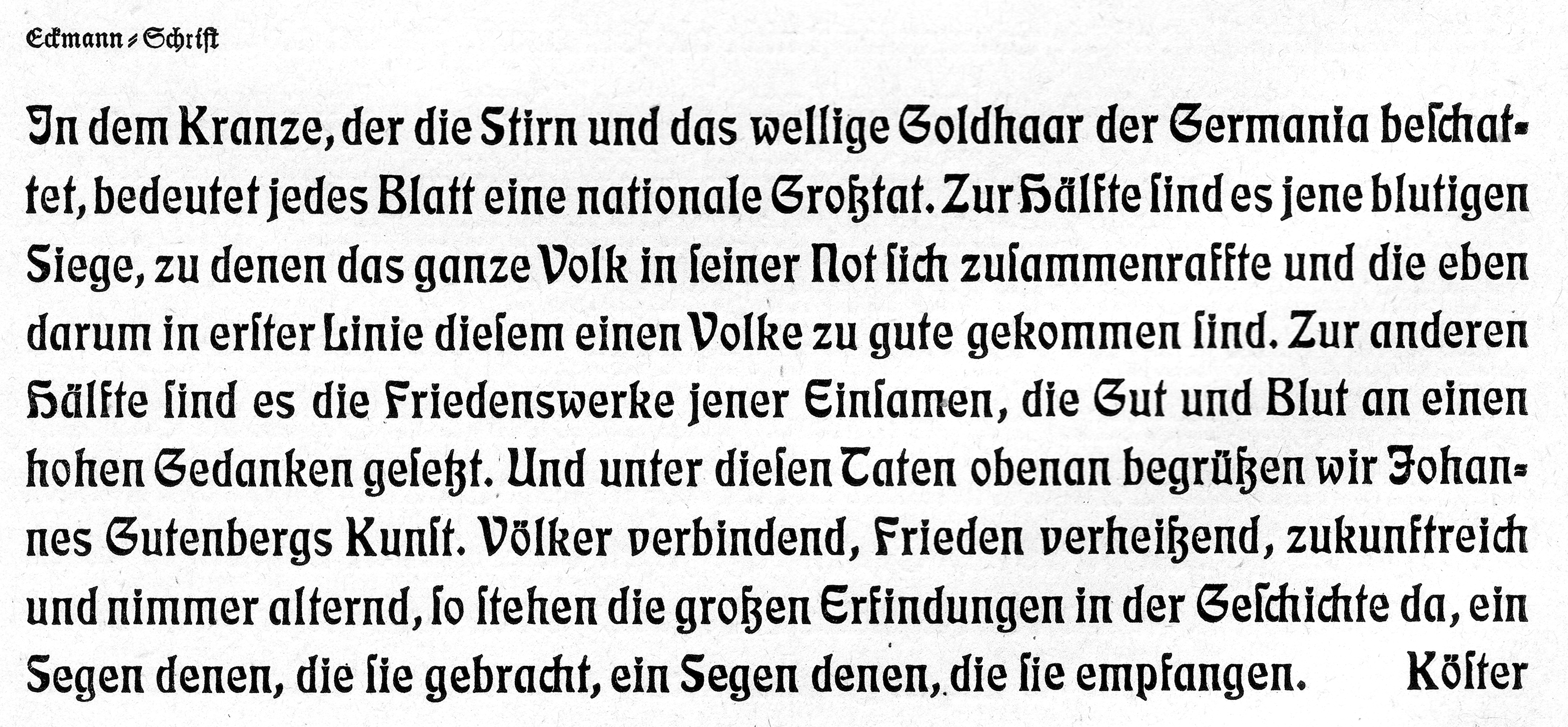
The Eckmann-Schrift, designed by Otto Eckmann and published by the Rudhard’sche Gießerei in 1900. The typeface’s punches were cut by Louis Hoell. Reproduced from Rodenberg 1940. Click to enlarge.
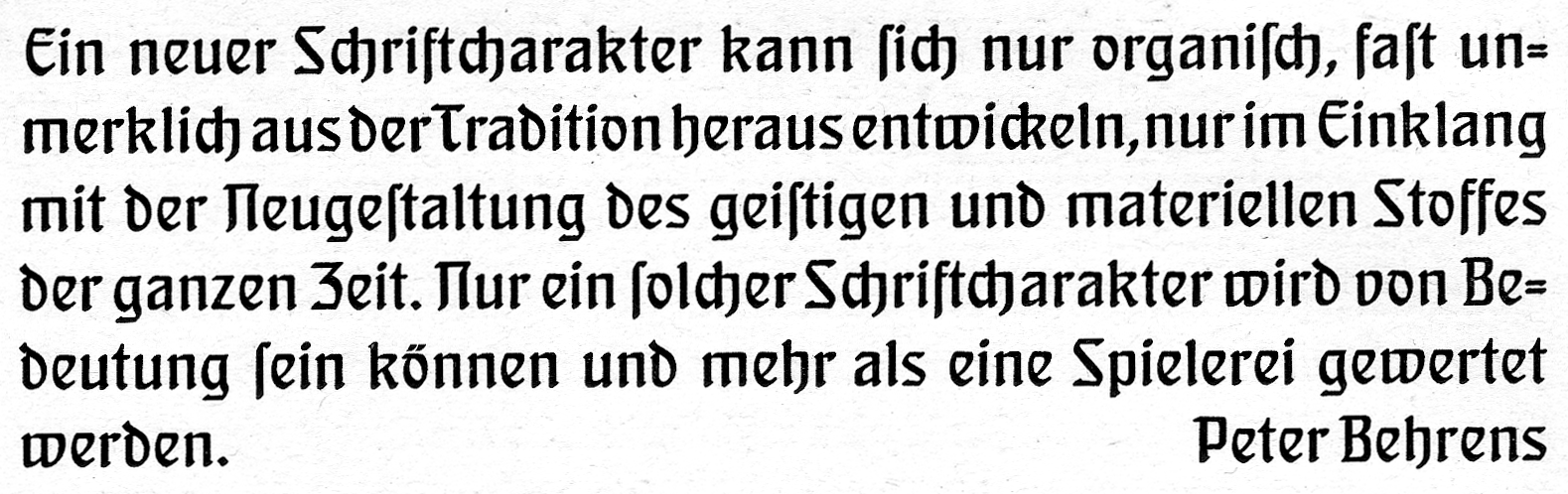
The Behrens-Schrift, designed by Peter Behrens and published by the Rudhard’sche Gießerei in 1901. The typeface’s punches were cut by Louis Hoell. Reproduced from Rodenberg 1940. Click to enlarge.
Behrens-Antiqua, designed by Peter Behrens and published by the Gebr. Klingspor foundry in 1907. Reproduced from Rodenberg 1940. Click to enlarge.
In the Eckmann-Schrift, Otto Eckmann combined roman, Fraktur and uncial elements. The Behrens-Schrift is more of a roman/blackletter hybrid. The Behrens-Antiqua reproduced above is much less of a hybrid design than the previous examples. However, Peter Behrens was inspired by letterforms written with an uncial hand while designing the typeface. Specifically, he reported taking inspiration from the Codex Argentus, a fifth/sixth-century manuscript Bible in the Gothic language.
Uncial letterforms: Victor Hammer’s introduction to writing and type designing
Edward Johnston’s 1906 Writing & Illuminating & Lettering appeared in Anna Simons’s German translation in 1910. That book may have inspired a then-28-year-old Victor Hammer to begin his calligraphic writing exercises. That is what Farrell 1989 suggested, writing that Hammer had modified Johnston’s eighth-century-based uncial model so that his letterforms feature an emphasis on the diagonal rather than the vertical model shown in Writing & Illuminating & Lettering. In his 1946 “A Dialogue on the Uncial Between a Paleographer and a Printer,” Hammer wrote that “instinctively, I chose my models from uncials and half uncials. Straight Gothic and Humanistic hands did not interest me at all. That was a dead-end; they could be copied but could scarcely be developed; at least that was my feeling” [Graves 1954: 5].
Around 1910, Gebr. Klingspor published its first uncial typeface. That was still more than a decade before the foundry began to work with Hammer. This early uncial was part of a trio of typefaces Klingspor had commissioned from Otto Hupp. Together, the Hupp-Fraktur, Hupp-Antiqua and Hupp-Unziale presented an interesting palette of options to German printers. Aside from offering publishers who wanted their works to appear in either Fraktur or roman new typefaces, the suite included a third option that rested somewhere between the two. It was the first time an uncial offered this “middle ground” option at Gebr. Klingspor.
Specimen of Hupp-Unizale’s 10-pt size reproduced from a scan of a ca 1923 Gebr. Klingspor catalog. Click to enlarge.
Victor Hammer’s Hammerschrift, designed and cut in the early 1920s, was published by Gebr. Klingspor in 1923. Gebr. Klingspor was a good fit for Hammer. He was a fine artist, and the foundry had already worked with several artists. Hammer also had some ideas about script that were unorthodox. While Karl Klingspor may not have shared those ideas himself, I think that there was room in their library for them. Especially in light of the typefaces already mentioned above.
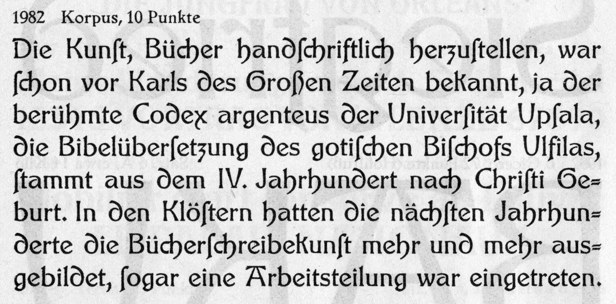
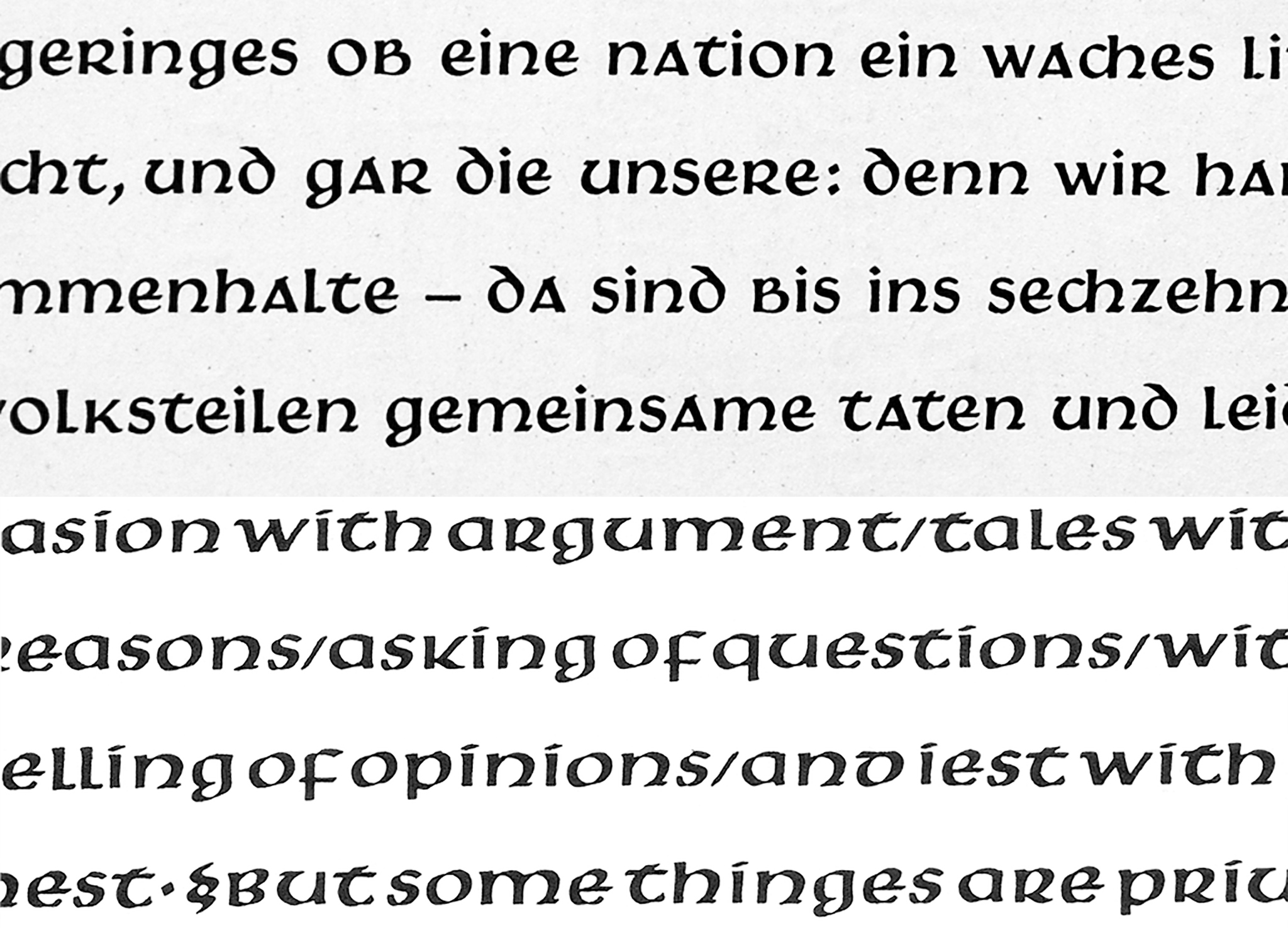
Above, a text sample composed in two sizes of the Hammerschrift reproduced from Gebr. Klingspor’s specimen brochure for the typeface. Victor Hammer spent more than a decade practicing uncial-style writing before he began this typeface’s design. Unlike Edward Johnston’s uncials in Writing & Illuminating & Lettering, Hammer emphasized the letters’ diagonal strokes rather than their verticals. Photographed at the Klingspor Museum in Offenbach am Main. Click to enlarge.
An introductory essay, written about the typeface by the artists themselves, was a common feature in the type specimen brochures Gebr. Klingspor printed on the occasion of new typeface releases. The foundry produced just such a brochure for the Hammerschrift. At the end of his essay – reproduced in the image above – Hammer wrote disparagingly of the increasing use of roman type in German books, especially in academic and modern texts. He explicitly remarked that his uncial typeface was not a reaction against Fraktur typesetting. “My work does not turn against Fraktur,” Hammer wrote, “that remains untouched. Rather, my work should eliminate the roman from German books.” That is a direct statement, and it is difficult for me to imagine that Karl Klingspor fully shared the sentiment. Just as he did not wish to see roman become the official script of Germany because – at least, in part – it would hurt his business’s Fraktur sales, Klingspor would probably not have wanted Fraktur to be declared the country’s sole script, either. He also sold many roman typefaces, after all.
Victor Hammer’s first link with the Irish tradition: The Book of Kells
According to the Irish printer Colm Ó Lochlainn (1892–1972), Hammer had explained in a July 29, 1932 letter that he had begun his uncial studies by looking at the Book of Kells, which was written in Latin [see Ó Lochlainn 1964:38.] Yet, the Hammerschrift “t” and “i” were not designed according to the traditional canon of Irish letterform design. An Irish uncial “t” should have no stroke penetrate above the horizontal stroke, and the “i” should not have a dot.
It seems to me that, at least in the early 1920s, Hammer was not considering Irish-language printing as a possibility for the typeface. Modern languages, including German or English, feature words with more ascenders and descenders than Latin. Hammer thought that Latin text looked better, aesthetically, and wanted to make modern text look more like the Latin books of old [Middeldorf 1952].

Cropped photograph of the text area on the Gebr. Klingspor Hammerschrift brochure’s title page. Using a two-color design, the text was placed on top of yellow lines printed with thick rules. Those yellow lines – which are as tall, vertically, as the letters’ x-height – call attention to the typeface’s horizontal thrust. For Victor Hammer, the ability of uncial text to apply a strong horizontal movement to a line of text was one of its chief benefits over the roman lowercase common in most serif typefaces. Click to enlarge.
Interestingly, Hammer believed that ascenders and descenders slowed down the reading process. I guess that this is contrary to the contemporary thoughts about the role word images play in reading.
Another link with Ireland: Baoithín
Hammer’s consideration of the Hammerschrift’s potential use for Irish seems to have changed by 1932, at the latest. In “Irish Script and Type in the Modern World,” which Colm Ó Lochlainn had sent to the Gutenberg-Jahrbuch journal for publication, the very last page reproduced an English-language poem composed in the Hammerschrift. Above the poem, Ó Lochlainn wrote that “with the necessary additional of accented vowels and dotted consonants […] this could be very effectively and beautifully used for Modern Irish in Display, Titles, Advertisements etc. are […] it could be the most beautiful Irish type in existence” [Ó Lochlainn 1932: 26].
Hammer wrote his July 29, 1932 letter to Ó Lochlainn, mentioned above, after reading that piece. According to Ó Lochlainn’s 1964 article, Hammer wrote to express his admiration for Irish manuscripts and his desire to create a new typeface for the Irish language. Yet, even before his correspondence with Hammer, Ó Lochlainn had already been in touch with the Gebr. Klingspor foundry regarding an Irish extension to the Hammerschrift. He had visited Offenbach himself in 1930. In late 1932 or shortly thereafter, Gebr. Klingspor did finally produce a modified version of the Hammerschrift. Several of the letters were replaced with more Irish designs. The foundry also cast the necessary accented characters, reproduced in the image below. The modified typeface was named Baoithín, after one of St. Columba’s disciples. According to Ó Lochlainn, the punches for the Baoithín sorts were either cut by “Rudolf Koch, or perhaps [his son] Paul” [Ó Lochlainn 1932: 39]. Ó Lochlainn had met both men on his visit to Offenbach and Dermott McGuinne states that Ó Lochlainn considered each of them a friend [McGuinne 1995: 198–200].
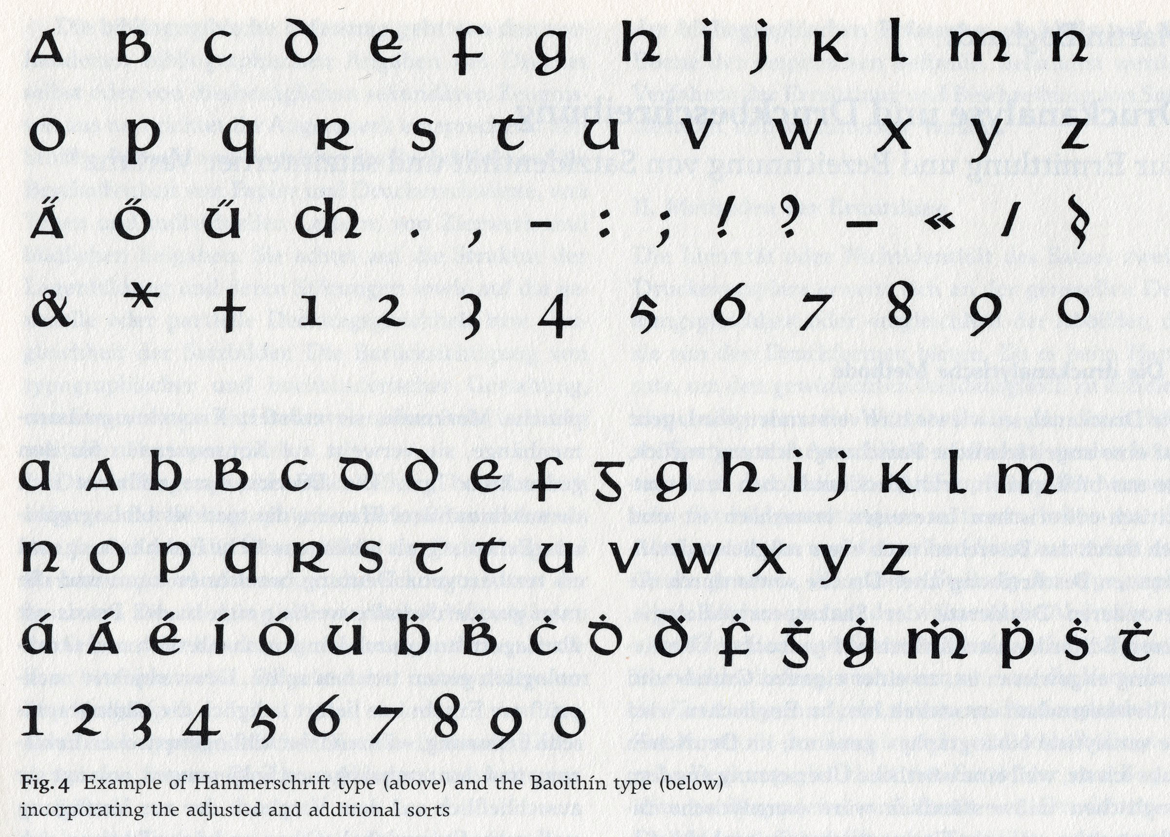
Chart from Dermot McGuinne’s 1995 article, “Victor Hammer and the Baoithín Irish Type” comparing the initial Hammerschrift character set with that of Baoithín. Both typefaces were cast by Gebr. Klingspor and the additional Baoithín punches may have been cut by Rudolf Koch or his son, the printer and punchcutter Paul Koch. Reproduced from McGuinne 1995: 201. Click to enlarge.
This intriguing mention of punches cut by Rudolf Koch or Paul Koch in 1932/1933 necessitates a brief transition to the subject of Hammer’s punchcutters. That is a necessary angle that helps us understand how and why Hammer created more typefaces after the Hammerschrift.
Arthur Schuricht, Victor Hammer’s first punchcutter
In what was by then standard company practice, Gebr. Klingspor’s specimen brochure for the Hammerschrift proudly stated that the typeface had been cut and distributed along the lines of drawings provided by Hammer. Yet, Gebr. Klingspor did not cut the Hammerschrift in-house. Or at least, the three sizes that the foundry cast and sold were not all cut in-house. The masters for at least one of those sizes (30 pt) was cut into soft-metal patrices by Arthur Schuricht, a punchcutter from Leipzig who had moved to Vienna in 1919. Hammer commissioned these from Schuricht directly. I am not sure if Schuricht also cut the typeface’s two additional sizes or if those were indeed made at Gebr. Klingspor.
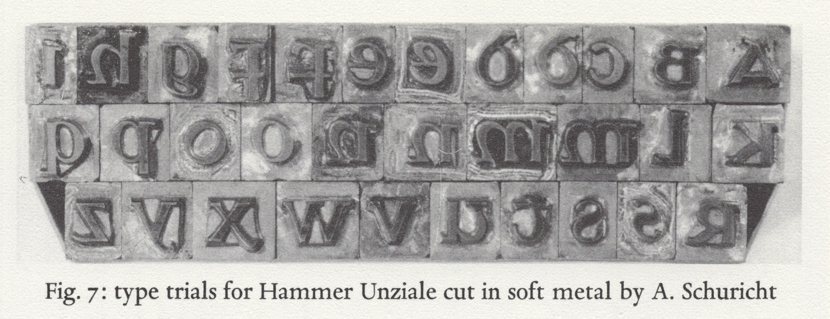
Scan of a photograph of soft-metal patrices for the Hammerschrift’s 30-pt size, cut by Arthur Schuricht, reproduced from W. Gay Reading Jr.’s article “A Documentation of Hammer Types” in Hammer 1981: 120. Click to enlarge.
When it comes to Arthur Schuricht (1882–1945), his biography is a mystery. The only available biography is a 40-word stub in one of the appendices printed in Bertheau 1995: 593. According to that account, Schuricht may have moved to Vienna to work at the Austrian Staatsdruckerei. Hammer, who was the same age as Schuricht, worked closely with him on the production of the Hammerschrift patrices. The brief account of that typeface’s development in Hammer 1981 describes that Hammer was not satisfied with the finished fonts, but he must have learned a lot from Schuricht. Hammer retained Schuricht’s 30-pt Hammerschrift patrices, and I assume they must still be with the rest of Hammer’s estate in the United States today.
An unrealized proposal for a typewriter uncial
While Hammer was working with Schuricht, he developed an uncial for typewriters to propose to the Underwood Standard Typewriter Company. Writing to that firm, he stated that “I have had a simplified typeface cut for the typewriter. It is a unification of majuscule and miniscule. My typeface has just 26 letters, and is for three set widths.” The first set width was for “i,” “j,” and “l”. The third was for “m,” and “w.” The second was for all the others.
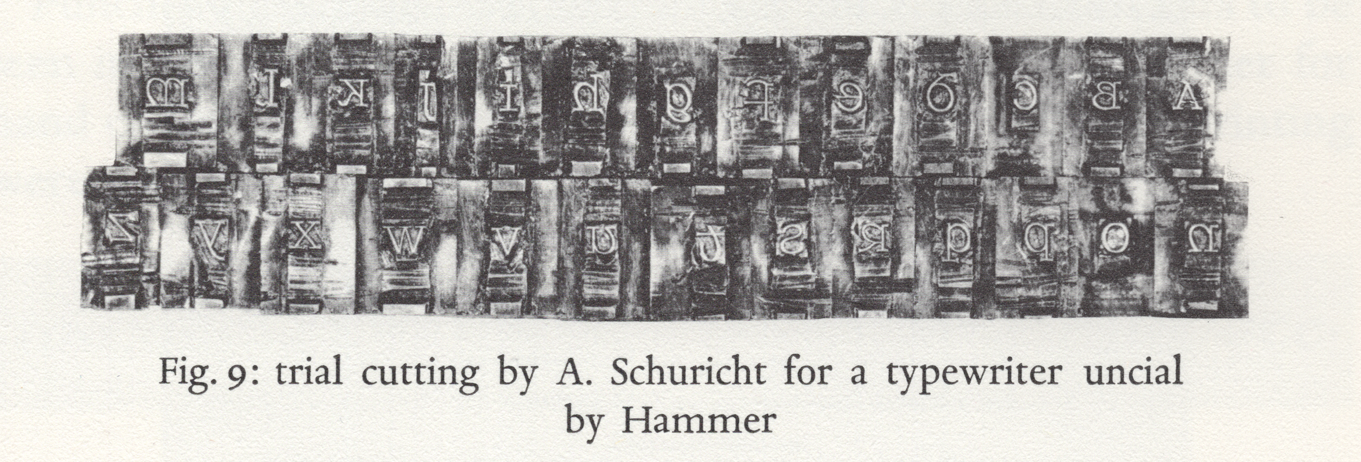
Scan of a photograph of soft-metal patrices for the typewriter uncial design, cut by Arthur Schuricht, reproduced from Hammer 1981: 121. Click to enlarge.
Schuricht also cut trial patrices for these letters, but the typeface was never realized.
Rudolf Koch’s interest in uncial scripts
Although Rudolf Koch (1876–1934) likely needs no introduction to this post’s readers, I will attempt a summary of the designer’s career here. Bore Karl Klingspor hired him in 1906, Koch had been working in Leipzig as an illustrator. Gebr. Klingspor published Koch’s first typeface in 1910. That was a blackletter design that the foundry alternatively referred to as the Deutsche Schrift (i.e., the “German type”) and the Koch-Schrift. The latter name fit the tendency co-pioneered by Gebr. Klingspor to name typefaces after their designers.
Many Gebr. Klingspor apprentices trained at the Technische Lehranstalten, Offenbach’s local arts & crafts school. Over the years, several workers attached to the foundry also taught here. Koch began to offer calligraphy classes at the school in 1907. In 1921, Koch set up an independent lettering workshop in the school’s attic. Naming it the Offenbacher Werkstatt, he engaged some students, graduates, friends, and craftsmen on large-scale commissioned lettering projects produced under the Werkstatt’s name.
Victor Hammer and Rudolf Koch first met in 1922, on a visit of Hammer’s to the Klingspor foundry. Gerald Cinamon, Koch’s English-language biographer, writes that Hammer’s visit profoundly influenced Koch and altered the direction of Koch’s subsequent work [Cinamon 2000: 90]. Cinamon also writes that it had been Hammer’s suggestion in 1924 that caused Koch to begin producing large lettered tapestries in the Offenbacher Werkstatt [ibid.: 102], although Cinamon also writes that the first Werkstatt tapestry had been woven two years before Hammer’s suggestion [ibid.: 89].
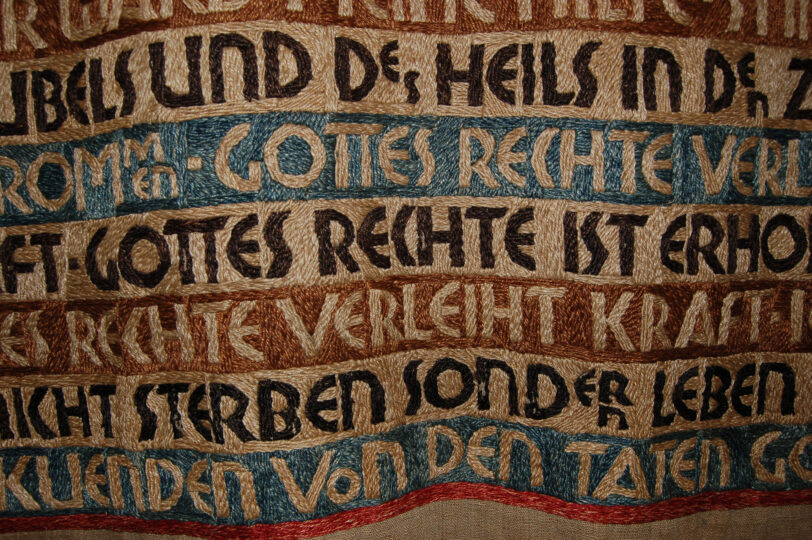
Close-up of a tapestry created by the Offenbacher Werkstatt for Siegfried Guggenheim, ca 1926 and designed by Berthold Wolpe. One of several tapestries intended to hang in the Guggenheim family dining room during Seder, it contains the text of part of Psalm 118 in German. Today, the tapestry is part of the Klingspor Museum’s collections. Click here to see a full-length photograph of the piece. Many of the letters Wolpe used in the design have uncial forms. The most obvious example is probably the lowercase-style “N.” Additionally, the “A” looks like the “A” in the Hammerschrift. The “E” looks like the capital “E” in the Hupp-Unziale.
The circle of designers around Rudolf Koch overlaps the circle of Gebr. Klingspor designers and employees like a Venn diagram. Collaborations between those circles and Victor Hammer’s circle would take place over several decades in at least four countries on two continents. Hammer’s first wife Rosl spent some time as a weaver in the Offenbacher Werkstatt.
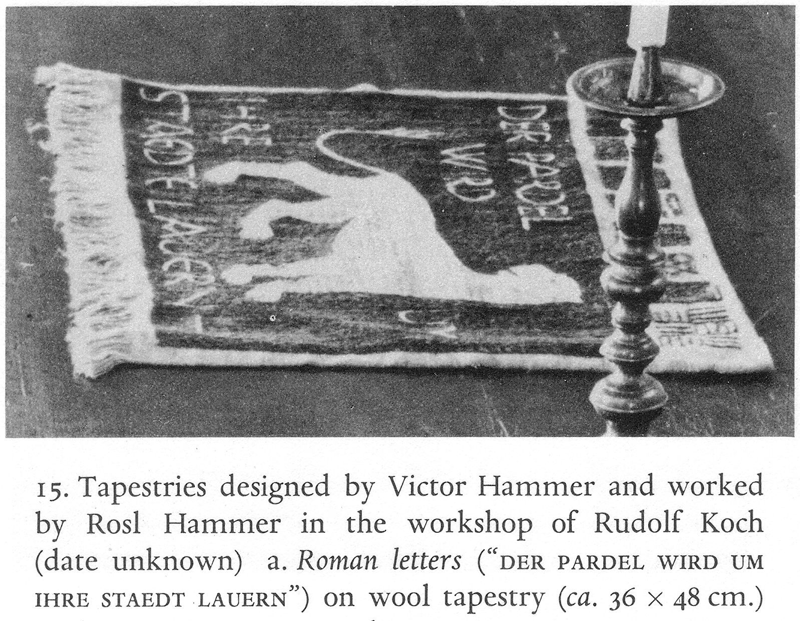
Tapestry designed by Victor Hammer and woven by Rosl Hammer at the Offenbacher Werkstatt, reproduced from Hammer 1981: 91. Click to enlarge.
Paul Koch, Victor Hammer’s second punchcutter
Rudolf Koch’s son Paul Koch (1906–1945) followed in his father’s footsteps. In a 1933 article, I wrote “though I originally wanted to be a physician, the influence of my father […] accounts for my becoming a printer; Dr. Karl Klingspor suggested I learn punch-cutting; and to Mr. Victor Hammer’s advice I owe my having learned also justification and hand-casting” [Koch 1933: 34].
Paul Koch’s first punchcutting project was part of his father’s Jessen-Schrift, the capitals for the 12pt size. Afterwards, Paul Koch lived and worked with Victor Hammer in Italy for about five years, from 1926–1931. He was just one of many workers who came from abroad to help Hammer print. Sebastian Carter mentions that Hammer was also:
[…] assisted by his son Jacob, Fritz Arnold from [the Gebr.] Klingspor [foundry], and Eduard Kaufmann, and American disciple who father generously subsidized the Stamperia [del Santuccio, Hammer’s press]. (He also commissioned Frank Lloyd Write to design his epoch-making house, Falling Water.) Later a student from the Bauhaus at Dessau joined the workshop for a brief period [Carter 2004: 33].
Carter does not mention the Bauhäusler’s name, but it was Reinhold Roether.
Differences between the Hammerschrift and Samson typefaces. The top-four lines reproduce text from Gebr. Klingspor’s Hammerschrift specimen brochure. The bottom-four lines are in Victor Hammer’s Samson type, taken from Hammer’s 1933 edition of Francis Bacon’s Essayes. Click to enlarge.
Victor Hammer’s second typeface, called Samson, was cut for him by Paul Koch in Florence. The type was first used in a 1931 edition of Milton’s Samson Agonistes, the first book Hammer printed at his Florentine press, the Stamperia del Santuccio. The book’s page size is 9 by 13 inches. In 1932, The Times Literary Supplement reviewed this book, together with Eric Gill’s An Essay on Typography. The editors considered both books typographic heresies [Graves 1954: 7].
Rudolf Koch died in April 1934, aged just 58. Within a few days, Paul Koch designed and printed a booklet for his father’s memorial service using materials he had in his own Frankfurt studio, the Haus zum Fürsteneck. The booklet’s title page was set in Post-Versal, a typeface designed by Herbert Post, who had been one of Rudolf Koch’s pupils at the Technische Lehranstalten. Paul Koch had cut Post-Versal’s punches and the typeface was published by H. Berthold AG in Berlin. The rest of the text was composed with Samson. The booklet also included musical notation set in Paul Koch’s music typefaces, which he had designed and cut himself.
Victor Hammer’s own punchcutting practice
Hammer’s next typeface was named Pindar, after the title of the fourth book he printed: an edition of Hölderin’s Fragmente des Pindar. Pindar was Hammer’s first typeface to include a complete range of capital letters. A trial uppercase had been cut for Samson but not finished. Pindar’s lowercase letters are not a tremendous departure from Samson’s. The typeface is most noteworthy for being the first typeface that Hammer cut the punches for himself, without assistance from an engraver like Arthur Schuricht or Paul Koch.
Comparison of three lines each of the Hammerschrift and Samson typefaces with the lowercase letters from Pindar. While Victor Hammer designed all three typefaces, each had a different punchcutter. Hammerschrift at the top was cut by Artur Schuricht. Paul Koch cut Samson, in the middle. Victor Hammer cut Pindar, at the bottom, himself. Click to enlarge.

Part of a poem printed composed with Pindar and printed by Hammer for Hammer 1936. Click to enlarge.
Hammer made books by being hands-on at every stage. He cut his own punches, stamped the matrices, cast type, printed his text, and bound the volumes up, too. As he wrote in 1946, “my methods may seem old-fashioned, even obsolete. They are not. They save more time than any time and labor-saving machinery can. Corrections are made immediately, without consulting any board of directors and without getting the OK’s of a dozen officials…” [Hammer 1946].
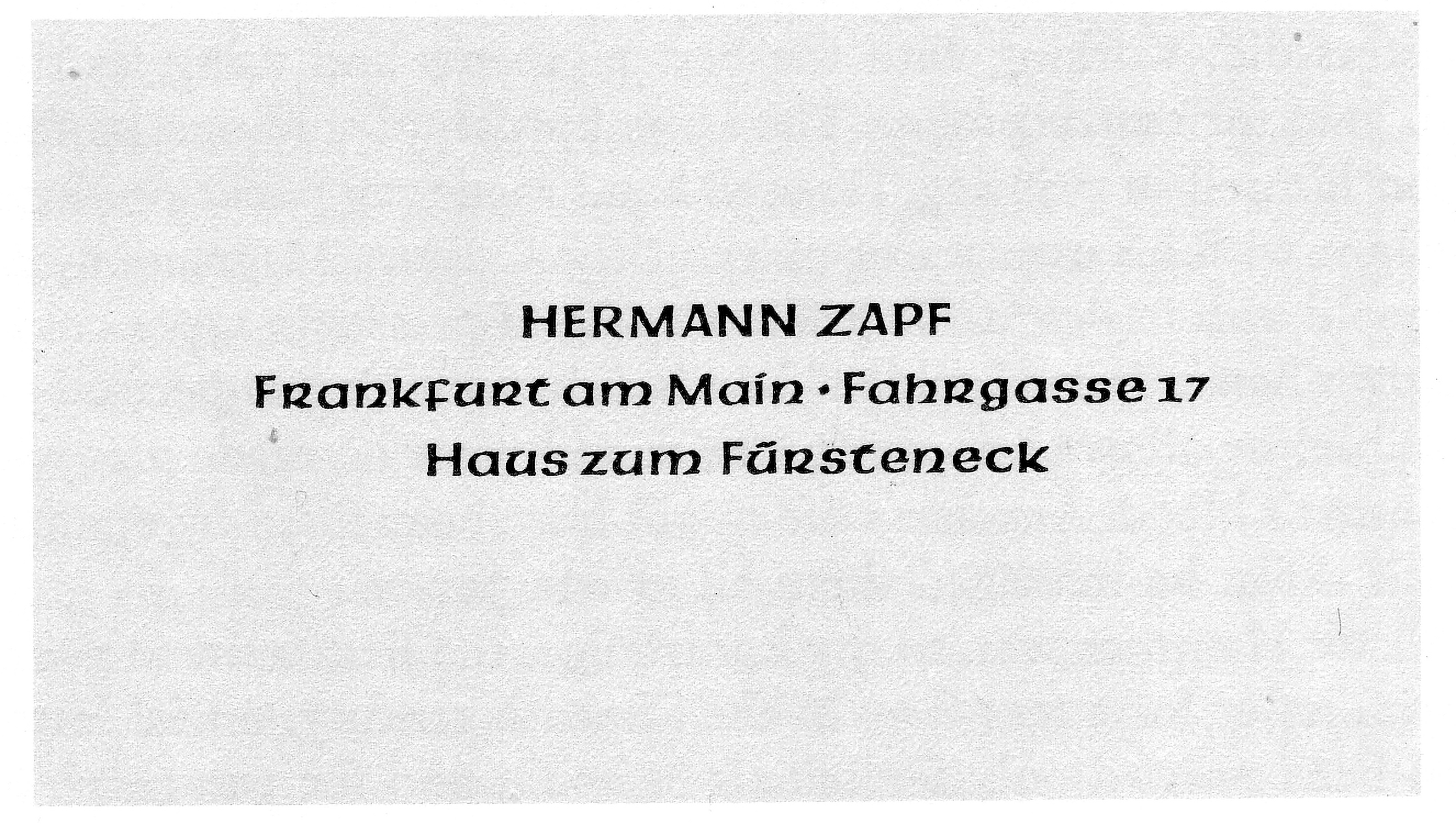
In 1938, the young Hermann Zapf moved from Nuremberg to Frankfurt am Main to work at Paul Koch’s student in the Haus zum Fürsteneck. The Pindar typeface Hammer cut had been cast in one trial size by Gebr. Klingspor in 1935 and Paul Koch had a font of it in his studio. This business card, composed by Zapf in Pindar, is the first item he ever printed. Zapf remained at the Haus zum Fürsteneck until he was drafted into national service, in the month’s leading up to Germany’s invasion of Poland on September 1, 1939, and the beginning of the Second World War. Neither Paul Koch nor the Haus zum Fürsteneck survived the war. Scan from Hammer 1981: 113. Click to enlarge.
Gebr. Klingspor cast a trial-size of Pindar in 1935, but the typeface was never distributed on the font market.
Aurora Uncial: Victor Hammer’s first American type design
Hammer left Vienna in 1939 to take up a post at Wells College in Aurora, New York. Although he left all his printing material in Europe, Hammer did not stop making books. Since Hammer had left his fonts of type in Europe, too, he used other designer’s types first. But he must have quickly begun work on a new typeface. In 1940/1941, the American Type Founders Company cast a trial font of Aurora Uncial.
Print from ATF’s trial casting of Aurora Uncial showing three lines of Latin text and five lines of English; reproduced from Hammer 1981: 125. Click to enlarge.
ATF’s Aurora Uncial trial casting was for a 14 pt typeface (Anglo-American point system). W. Gay Reading, Jr. reports that this trial casting was done after Hammer had cut about 25 punches [Hammer 1981: 125]. The sample print reproduced above shows five uppercase. No further work on this typeface seems to have been undertaken after this text. Perhaps the build-up to the war played a role in ATF’s non-continuation of the project.
American Uncial
Following the Aurora Uncial text, Hammer kept cutting uncial punches in Aurora. By 1943, he had another design ready. That was the typeface that came to be called American Uncial. As it was initially cast, American Uncial bears little relation to the fonts of American Uncial available today. In fact, American Uncial has become a typeface many designers love to hate, but this is surely because of the poor decisions made by Letraset and/or photo-type manufacturers decades after Hammer designed the first version of the typeface. The fonts we call “American Uncial” are not the design that Hammer intended. Yet, before I explain what went wrong, let us take a good look at Hammer’s version of American Uncial.
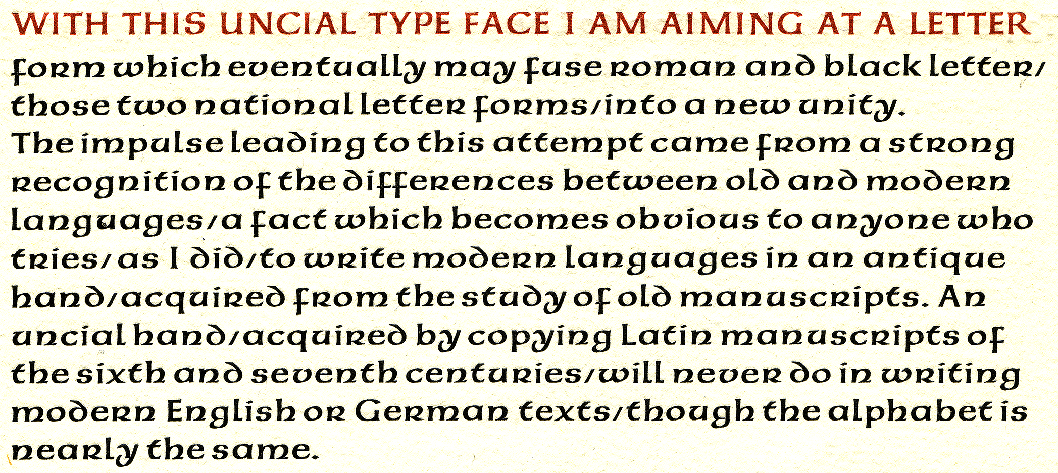
The first paragraph of Victor Hammer’s 1 946 “Type Design in Relation to Language & to the Art of the Punch-Cutter.” Hammer composed the text in his American Uncial typeface and printed the essay himself. Click to enlarge.
The American Uncial sample shown above was cast from matrices struck by punches Victor Hammer cut himself. Just as with all of his previous faces, Hammer needed to collaborate with a typefoundry for actual fonts of his types to be cast. His earliest fonts had all been cast by Gebr. Klingspor. By the time Hammer had American Uncial ready, the United States and Germany were at war. Further collaboration with Gebr. Klingspor was out of the question for the time being, and Hammer’s dealings with ATF, the largest provider of type in the United States, had come to nothing.
In 1943, Robert Hunter Middelton of the Ludlow Typograph Co. assisted Hammer in getting his type produced. He collected the necessary funds for Charles Nussbaumer at the Dearborn Type Foundry cast American Uncial. I do not know how much type Nussbaumer cast. The Dearborn Type Foundry was certainly able to provide Hammer with enough type to print with, but it does not seem that Dearborn distributed American Uncial commercially.
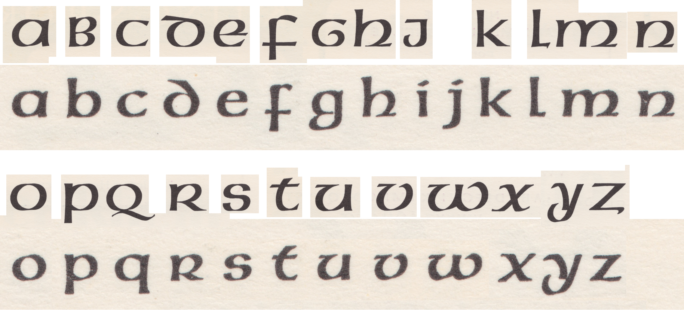
Unicase/lowercase-only comparison of five Victor Hammer typefaces: Hammerschrift, Samson, Pindar, Aurora Uncial and American Uncial (from top to bottom). No majuscule forms are used in this comparison since Hammerschrift and Samson did not have uppercase letters. This comparison provides a good overview of how Hammer’s ideas about the uncial seem to have evolved over the more than 20 years he had been designing type. You can see that certain letterforms remained the same over time – like the “r” and the “n.” After the Hammerschrift, Hammer’s uncials had single-story “a” designs. Although he chose a shorter form for the “d” in Samson and Pindar, he reverted to his longer-descender form for Aurora Uncial and American Uncial. Click to enlarge.
Fritz Kredel’s woodcuts
Despite not having played a part in making the Offenbacher Werkstatt’s large Deutschlandkarte (map of Germany), Hammer did hang a copy of it in his home in Lexington, Kentucky. Hammer lived in Lexington from the mid-1940s until he died in 1967. The Deutschlandkarte had been engraved in wood by Fritz Kredel, who worked with Hammer twice: first in Florence, Italy from 1923 to 1924, and again at Aurora, New York in the 1940s. The text on the map was printed from Rudolf Koch’s Peter-Jessen-Schrift, whose punches Koch had cut together with his son Paul and the freelance Offenbach punchcutter Gustav Eichenauer.
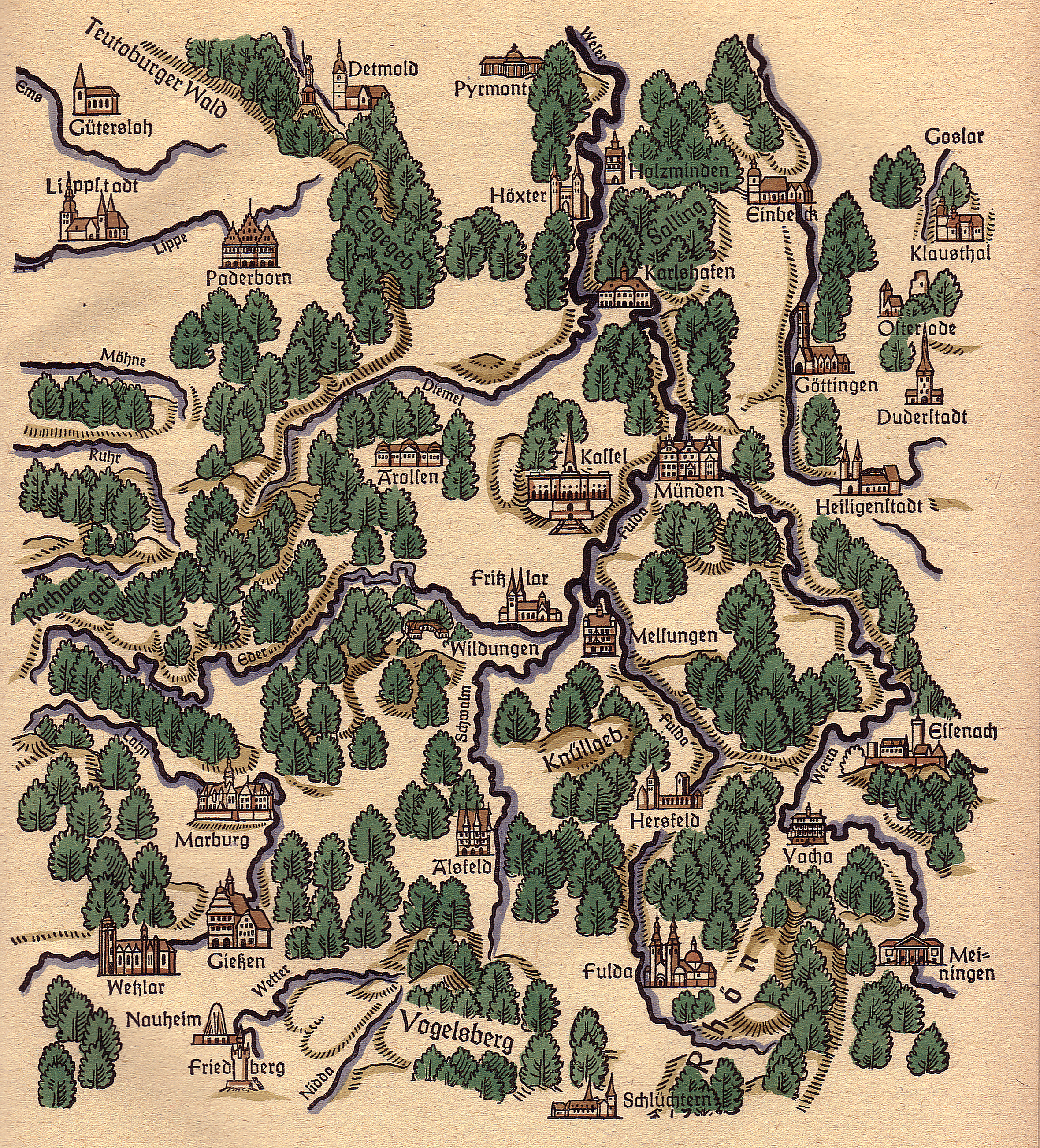
Except from the Deutschlandkarte created by the Offenbacher Werkstatt and published by the Insel-Verlag in Leipzig. Scan from an un-numbered sheet bound into Koch 1938 after p. 20. Hand-colored. Place names are printed with the Peter-Jessen-Schrift. Click to enlarge.
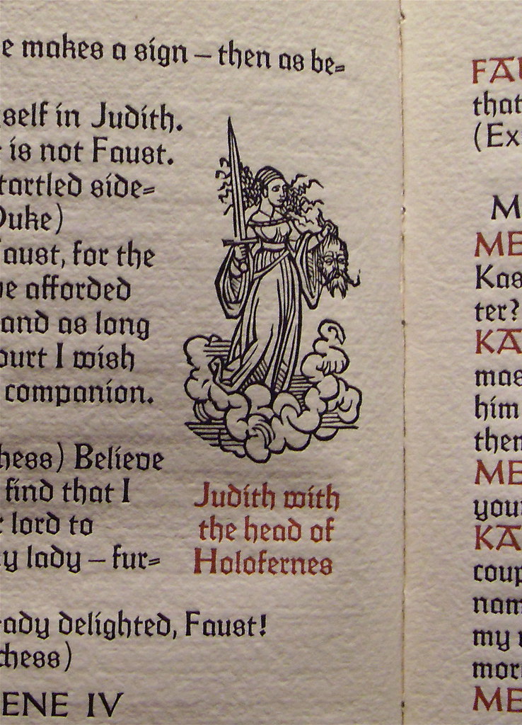
Close-up of Fritz Kredel’s woodcut of Judith with the head of Holofernes from a Victor Hammer edition of Dr. Faust, A Play, printed in Lexington, Kentucky. The book’s type is composed in the Peter-Jessen-Schrift, designed by Rudolf Koch and cut by Koch together with his son Paul and the freelance Offenbach punchcutter, Gustav Eichenauer. The type was published in 1930 by Gebr. Klingspor in Offenbach am Main. Photograph by Paul Ritsch.
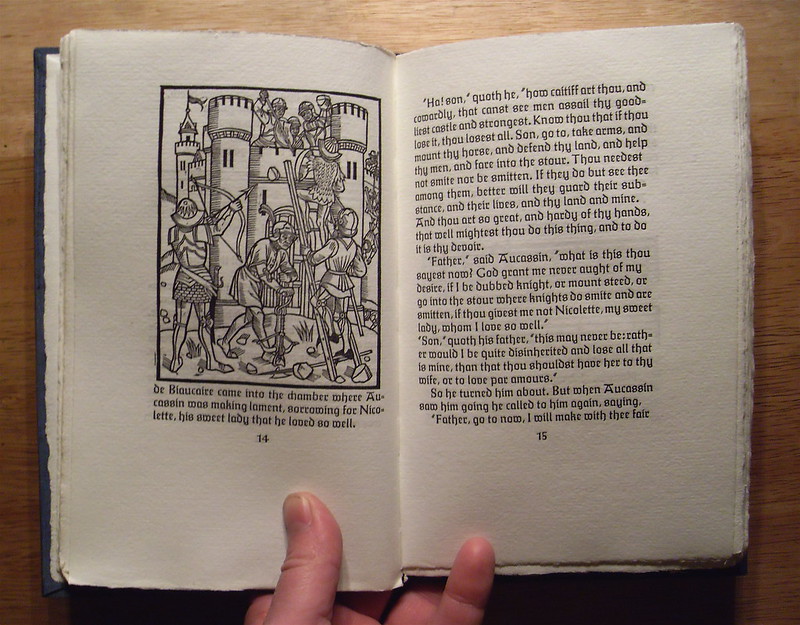
Paul Ritscher’s photograph of the Gravesend Press’s edition of Auccassin & Nicolette, designed by Joseph Graves and printed in Lexington, Kentucky by Victor Hammer’s son Jacob Hammer. The woodcut is from Fritz Kredel. Text composed with the Peter-Jensen-Schrift, cut by Rudolf Koch, Paul Koch and Gustav Eichenauer.
Karl Hermann Klingspor publishes Neue Hammer-Unziale
Hammer began printing with American Uncial immediately after it had been cast, but no American foundry wanted to distribute it – even after the end of the war. The typeface was eventually distributed by Hammer’s original typefounding business partner, Gebr. Klingspor.
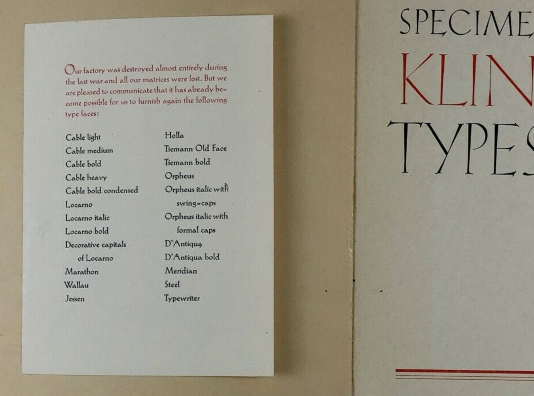
Un-dated Klingspor catalog created for the English-language market, probably printed in the late 1940s. The sheet affixed to the inside front cover reports that all foundry-type matrices were destroyed during the war. It provided a list of typefaces for which new matrices had already been created, using their English names (i.e., Cable for Kabel, Locarno for Koch-Antiqua, Steel for Stahl, etc.). Click to enlarge.
Along with much of Offenbach am Main, Allied bombing raids destroyed the Klingspor foundry in 1944. All the foundry’s matrices seem to have been lost at that time, which must have been quite a blow to Karl Klingspor. Nevertheless, Karl Klingspor was determined to rebuild, despite his age. He turned 77 shortly after World War II ended. As far as I can tell, he was successful in his endeavors. He died on January 1, 1950.
Afterwards, D. Stempel AG encouraged Karl Klingspor’s nephew – the 47-year-old Karl Hermann Klingspor – to become the company’s new director. In 1892, Karl Hermann Klingspor’s grandfather Carl Klingspor had purchased the Rudhard’sche Gießerei for his sons, Karl Klingspor and Wilhelm Klingspor. Karl Hermann Klingspor was Wilhelm Klingspor’s son. Wilhelm Klingspor died in 1925 of wounds suffered on military service during the First World War.
Between 1926 and 1930, Karl Wilhelm Klingspor had worked at various companies in New York, San Francisco, Rio de Janeiro and Mexico City [Halbey 1991: 28–29]. Although he returned to Gebr. Klingspor afterwards, Karl Wilhelm Klingspor would emigrate to Brazil in 1932. As Isabella Aragão explained in her lecture at the 2015 ATypI conference in São Paulo, he helped establish the Funtimod typefoundry in São Paulo that year, together with Joseph Tscherkassy, Técnica Bremensis and the Haas’sche Giesserei. Although Funtimod continued to operate until 1998, Karl Hermann Klingspor left the firm and returning to Germany in 1951.
Halbey credits Karl Hermann Klingspor with reestablishing the company’s business relationship with Hammer in 1952. They began corresponding, and the Klingspor foundry started distributing the American Uncial design that year. In total, it would publish three fonts under the name Neue Hammer-Unziale. The first, a 12 pt size, came onto market in 1952. Victor Hammer cut all of its punches in the United States. Klingspor published a 16 pt size four years later, also cut by Hammer. Printers could combine those sizes with a set of 28 pt initials, which Hammer cut himself as well. Those large initials were essentially ornaments and were not seen by Hammer as type to use for setting continuous texts.
Specimen of Victor Hammer’s Neue Hammer-Unziale showing the 12 pt type size combined with two of the Neue Hammer Unziale’s initials. Neue Hammer Unziale’s upper- and lowercase letters were essentially the same design as Hammer’s American Uncial. Reproduced from a 1954 Klingspor foundry catalog. American Uncial had been cut in the United States but if you were an American printer during the 1950s and you wanted the “American Uncial” type, you would have had to import fonts of the Neue Hammer-Unziale typeface from Germany. Click to enlarge.
Although the company remained active in the printing industry for a few more decades, Gebr. Klingspor stopped casting type in 1956. Its font-making materials went to D. Stempel AG in Frankfurt am Main, who had been a part-owner of the business since 1917. Stempel continued to cast and sell fonts of Neue Hammer-Unziale, although the foundry did not adapt the typeface for use on Linotype‘s hot-metal or photo-typesetting machines. Hammer would design one more typeface – another uncial named Andromaque – which was sold by Deberny et Peignot in Paris. Since this was published in 1959, I shall not reproduce it here. It has no connection to Gebr. Klingspor or Hammer‘s other types. Despite being an uncial, its letters are formed by thin monolinear strokes and in its appearance, Andromaque looks like a cursive-style Greek face, despite being a Latin-script design.
Digital fonts of Neue Hammer-Unziale
The foundry-type printed examples of American Uncial and Neue Hammer-Unziale look nice, don’t they? That is not the American Uncial many people with computers are familiar with. If you look at the printed sample reproduced above, you see the result of a real, proper typeface that features appropriately-formed uncial-style lowercase letters. They include the expected ascenders and descenders. All characters are correctly spaced.
In 1988, Linotype and Adobe published a digital version of Neue Hammer-Unziale. It was a “family,” with two variants:
- Neue Hammer Unziale I: This font is a digital reinterpretation of the uppercase and lowercase letters from the American Uncial/Neue Hammer Unziale foundry types.
- Neue Hammer Unziale II. Somewhat confusingly, this font contains the same uppercase characters as Neue Hammer Unziale I, but its lowercase letters are the “initial” letters from Klingspor’s Neue Hammer-Unziale, shrunken down so that they are smaller than the font’s capital letters. Those initials were never intended by Hammer and Gebr. Klingspor to be used for use in running text, but Linotype and Adobe seem to have completely disregarded this. Therefore, Neue Hammer Unziale II fails as a font.
Digital fonts called American Uncial
Like Linotype and Adobe’s Neue Hammer Unziale II, the digital font from URW named American Uncial D is unfortunately not really a proper typeface for setting words – or texts of any length. It gives a poor impression of Victor Hammer’s actual work.
Specimen showing URW’s American Uncial D in two sizes (“D” stands for display). From URW TypeWorks 1. The letterforms used for this font – for the most part – are the 30-pt initials Victor Hammer designed and cut to accompany Neue Hammer-Unziale. As such, these letters do not represent Victor Hammer’s American Uncial design at all. The Neue Hammer-Unziale initials were never designed to be used together to set running text, as they are in this sample. Click to enlarge.
Several United States photo-type houses had made their own versions of American Uncial in the 1960s and ’70s. One of those photo-type bastardizations must have served as Letraset’s American Uncial model, which seems to have been the source for URW’s used for American Uncial D. I cannot believe that this poor interpretation of Hammer’s oeuvre is something the company determined to do itself.
Also from URW TypeWorks 1, this image shows the character set for the American Uncial D font. From the double-dots, you can see that the character set just included one case for each letter, rather than a full set of uppercase and lowercase letters. As mentioned above, the letters shown here were primarily taken from Neue Hammer-Unziale’s special initials font. Yet, not all of the letters are from Neue Hammer Unziale’s initials: the “G” is from the proper, text-setting version of the American Uncial/Neue Hammer-Unziale design, for instance. Click to enlarge.
In the above image, I have shrunken down the Neue Hammer-Unziale initials (first and third rows, to compare them with the lowercase letters from the Neue Hamer-Unziale 12 pt size. The Neue Hammer-Unziale lowercase letters in the second and fourth rows were meant to function in running text. The initial letters in the first and third rows were only intended to be used as initials! So, if you want Victor Hammer’s “real” American Uncial design on your computer, use the font called Neue Hammer Unziale I and not Neue Hammer Unziale II or American Uncial. Click to enlarge.
The font called Uncial, made by Agfa and still sold by Monotype is similarly bad. Unlike American Uncial D, however, its character set includes both uppercase and lowercase letters. Florian Hardwig has reminded me that it can easily be spotted because its “y” is oblique.
Conclusion
So what are we to learn from Victor Hammer? He saw himself as a craftsman. Like Edward Johnston, who would have also described himself in such terms, he was inspired by early Medieval manuscript hands, though in Hammer’s case, they were probably more Irish than English examples. Hammer’s printing is historicist in the same sense as William Morris’s books. Rudolf Koch is reported to have once said the following to Hammer:
You are fortunate, Victor, that you are an outsider and not a professional. I cannot do what you do. I must meet the demands of our customers and sometimes those of the market. We professionals have to stick to one line and can only ill afford to look right or left [Middeldorf 1952: 168].
In 1946, Hammer wrote that “it is not the reader and his demands that I wish to satisfy […] it is my conviction that the type designer should do his work in the service of language” [Hammer 1946]. When he did consider Insular letterforms, Hammer examined their forms and saw the languages they were used for. He wanted to bring something of this beauty that they had in the Latin language to contemporary typefaces that would compose modern languages. When an Irish designer expressed interest in using the Hammerschrift, he went along with it. Nevertheless, I do not see any strong connections between his ideas and “Irish” design. That association comes from the way his typefaces are used today, and perhaps also from the way that type-makers have marketed them.
Victor Hammer’s association with Gebr. Klingspor lasted for more than three decades and was not entirely broken by geographic distance, the Nazi takeover of Germany and Austria’s political and social systems, or the destruction of Europe during the Second World War. Some of Hammer’s fidelity to Gebr. Klingspor must be traceable to his strong friendship with the Koch family, even after Rudolf Koch died in 1934 and Paul Koch in 1945. Although Hammer was never a member of Koch’s Offenbacher Werkstatt, he inspired its practice and – more importantly – several of its members collaborated with him. His relationship with Fritz Kredel even continued in the United States. Rudolf Koch’s friend Siegfried Guggenheim was probably the Werkstatt‘s most significant patron, but Hammer may have been the external artist most closely related to it and the most significant custodian of its memory in the United States.
When Hammer’s uncials were described – at least until the photo and digital type age – the adjective used most often about them was “medieval,” and not “Irish,” as would certainly be the case in time. While I suspect that this is also how Hammer would have viewed his uncials, I nevertheless suspect that he must have agreed with the following statement from Ó Lochlainn 1932: 12:
Here come the Irish in the twentieth century, as often in former ages, with a gift to Europe. To a Europe which has rung the changes in Gothic, Roman, and Italic types, until it would seem that nothing more can be evolved except atrocities, Ireland offers a fresh and unspoiled, an old yet modern, an ancient but still living script, full of charm, full of suggestion for designer and type cutter.
I think that I can agree with Ó Lochlainn, too.
Bibliography
- Philipp Bertheau (ed.), Buchdruckschriften im 20. Jahrhundert: Atlas zur Geschichte der Schrift, ausgewählt und kommentiert von Philipp Bertheau unter Mitarbeit von Eva Hanebutt-Benz und Hans Reichardt (Darmstadt: Technische Hochschule, 1995).
- Sebastian Carter, “Victor Hammer” in Type & Typography: A Matrix Anthology (West New York, New Jersey: Mark Batty Publisher, 2004), pp. 28–39.
- Gerald Cinamon, Rudolf Koch: Letterer, Type Designer, Teacher (New Castle, Delaware: Oak Knoll Press and London: The British Library, 2000).
- David Farrell, “Pursuit of the Ideal: The Uncial Letters of Victor Hammer” in Fine Print on Type (San Francisco: Bedford Arts, 1989), pp. 10–12.
- Joseph Graves, Victor Hammer: Calligrapher, Punch-Cutter, & Printer (Charlottesville: Bibliographical Society of the University of Virginia, 1954).
- Hans Adolf Halbey, Karl Klingspor: Leben und Werk (Offenbach am Main: Vereinigung „Freunde des Klingspor-Museums“ e.V., 1991).
- Carolyn R. Hammer, Victor Hammer: Artist and Printer (Lexington, Kentucky: The Anvil Press, 1981).
- Victor Hammer, Victor Hammer: Österreichische Blätter, vol. 2 (Graz: Verlag Schmidt-Dengler, 1936).
- Victor Hammer, Type Design in Relation to Language & to the Art of the Punch-Cutter (Aurora, New York: The Hammer Press, 1946)
- Karl Klingspor, Über Schönheit von Schrift und Druck (Frankfurt am Main: Georg Kurt Schauer, 1949).
- Paul Koch, “The Making of Printing Types” in The Dolphin: A Journal of the Making of Books, vol. 1 (New York: Limited Editions Club, 1933), pp. 24–57. Translated into English by Otto W. Fuhrmann.
- Rudolf Koch, Die Schriftgießerei im Schattenbild: Wie bei Gebr. Klingspor in Offenbach a. M. eine Druckschrift entsteht (Offenbach am Main: Gebr. Klingspor, 1918).
- Rudolf Koch, Wilhelm Michel et al, Rudolf Koch: Ein Deutscher Meister (Kassel: Barenreiter-Verlag, 1938).
- Dermot McGuinne, “Victor Hammer and the Baoithín Irish Type” in Stephan Füssel (ed.), Gutenberg-Jahrbuch 1995 (Mainz: Gutenberg-Gesellschaft, 1995), pp. 197–201.
- Ulrich Middeldorf, “Victor Hammer on his Type-Face” in Aloys Ruppel (ed.), Gutenberg-Jahrbuch 1952 (Mainz: Verlag der Gutenberg-Gesellschaft, 1952), pp. 165– 169.
- Colm Ó Lochlainn, “Irish Script and Type in the Modern World“ in Aloys Ruppel (ed.), Gutenberg-Jahrbuch 1932 (Mainz: Verlag der Gutenberg-Gesellschaft, 1932), pp. 9–26.
- Colm Ó Lochlainn, “An Irish Typographical Link with Germany” in James Moran (ed.), Book Design and Production, vol. vii, no. 1 (Spring 1964).
- Julius Rodenberg, “Karl Klingspor” in Stanley Morison (ed.), The Fleuron V (Cambridge: The University Press and New York · Garden City: Doubleday Page & Co.,1926), pp. 1–33. Translated into English by Anna Simons.
- Julius Rodenberg, In der Schmiede der Schrift: Karl Klingspor und sein Werk (Berlin: Buchmeister-Verlag, 1940).