Category: Berthold
-
Bauer’s view of Berthold up until about 1927
Welcome to the seventh post from my Friedrich Bauer Project. Below is my translation of his entry for Berthold as it appears on pages 24–31 of his Chronik der Schriftgießereien in Deutschland und den deutschsprachigen Nachbarländern (1918). I added illustrations and captions to the text, plus some commentary in this post’s footnotes. Berthold 1858 On…
Written by

-
Unger versus Decker
For decades after the 1760s, the in-house typefoundry within the Decker printing house was the most significant foundry in Berlin. Arguably, it was only surpassed after Eduard Haenel moved his Magdeburg-based foundry to Berlin in the late 1830s. Despite Decker’s long prominence, it never developed a typeface as influential in German typography as the Unger-Fraktur,…
Written by

-
Hand drawings for Berthold’s phototypesetting library
Most of the Deutsches Technikmuseum’s collections are not on public display, including the original hand-made drawings for Berthold’s phototypesetting faces. The storage for Berthold’s Diatronic typefaces alone fills 32 metal cabinets that together take up 19 meters of storage space. Bundled into 2,179 red-colored cassettes are approximately 270,000 drawings. Aside from a single cassette on…
Written by

-
Notes on the origin of Akzidenz-Grotesk
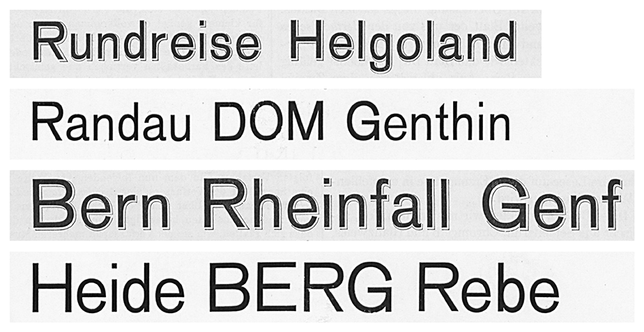
Above, I’ve reproduced my comparison of Bauer & Co.’s 1895 Schattierte Grotesk with Bauer & Co. and H. Berthold AG’s 1898 Accidenz-Grotesk. The image shows both typefaces in their 36 and 48-pt sizes. I took this Schattierte Grotesk specimen is from columns 407–8 of the 1896 Archiv für Buchdruckerkunst und verwandte Geschäftszweige issues. The lines of Accidenz-Grotesk are from Bauer & Co. and Berthold’s…
Written by
-
Berthold steel types from Dornemann & Co.
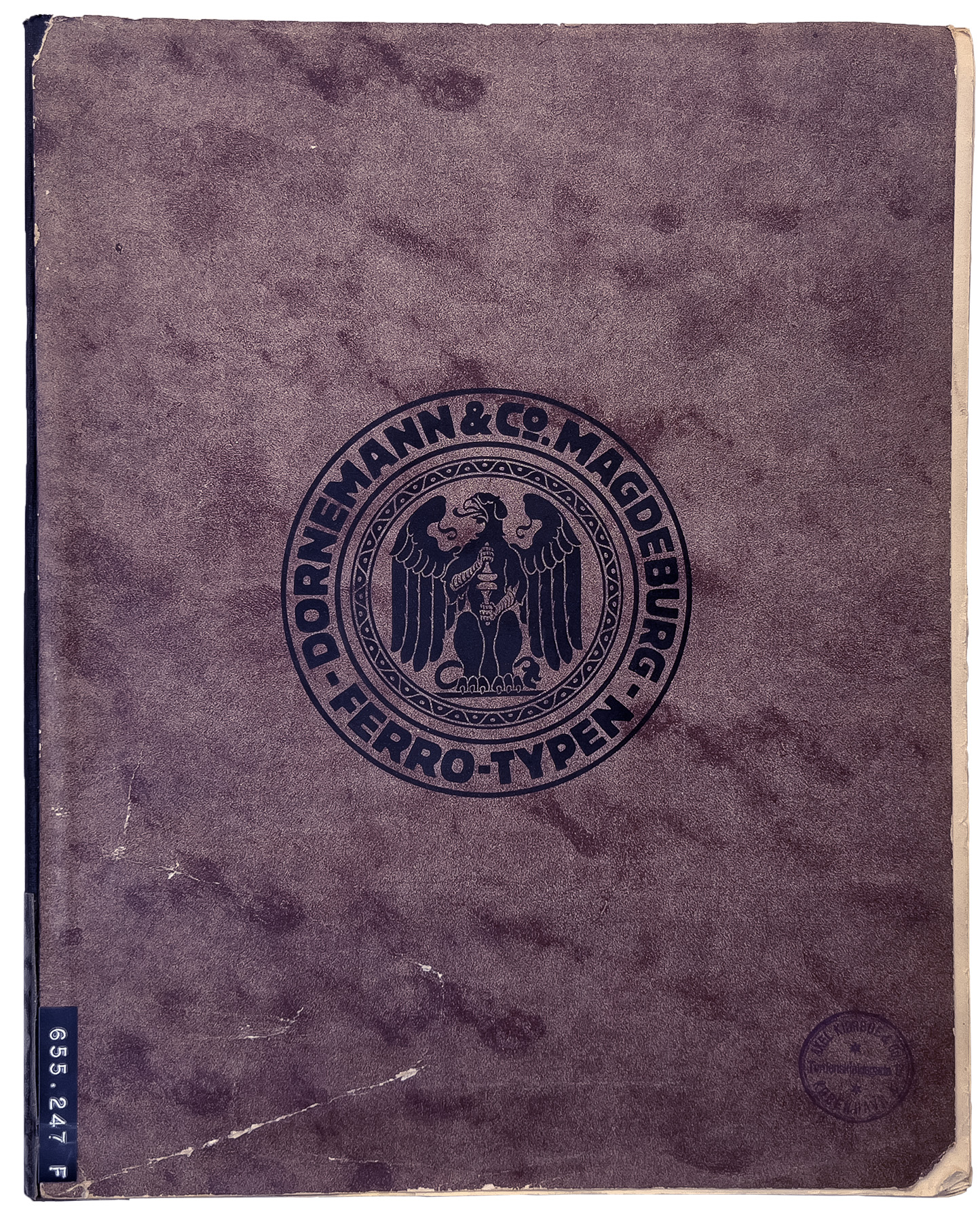
I dedicated a previous post to Berthold-Schriften, a notebook in the Deutsches Technikmuseum’s Historical Archive. That was an internal document from H. Berthold AG in Berlin tracking the company fonts’ sources from around 1900 until the early 1950s. The notebook indicates that Berthold contracted other type-making companies to produce the master patterns for its non-foundry-type fonts.…
Written by
-
Berthold’s patented type designs, 1900–1907 and 1921–1931
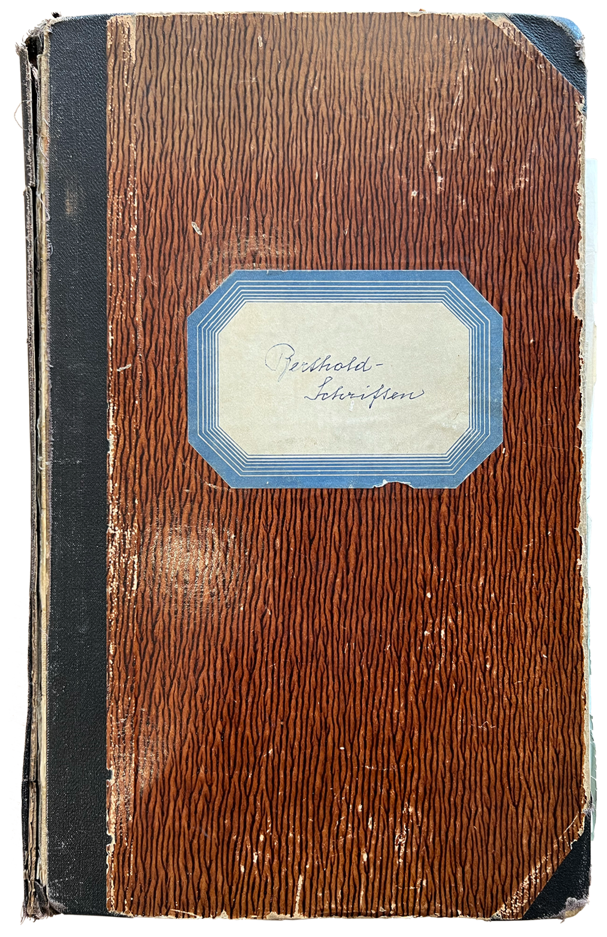
In June, on my way to the Historical Archive at the Deutsches Technikmuseum in Berlin, an art historian sent me a message about a handwritten notebook that might have some information about Berthold’s patented type designs. After consulting it, I found that it did include details for many of the company’s design-patent registrations and several…
Written by
-
Hildegard Henning’s Belladonna typeface (1912)
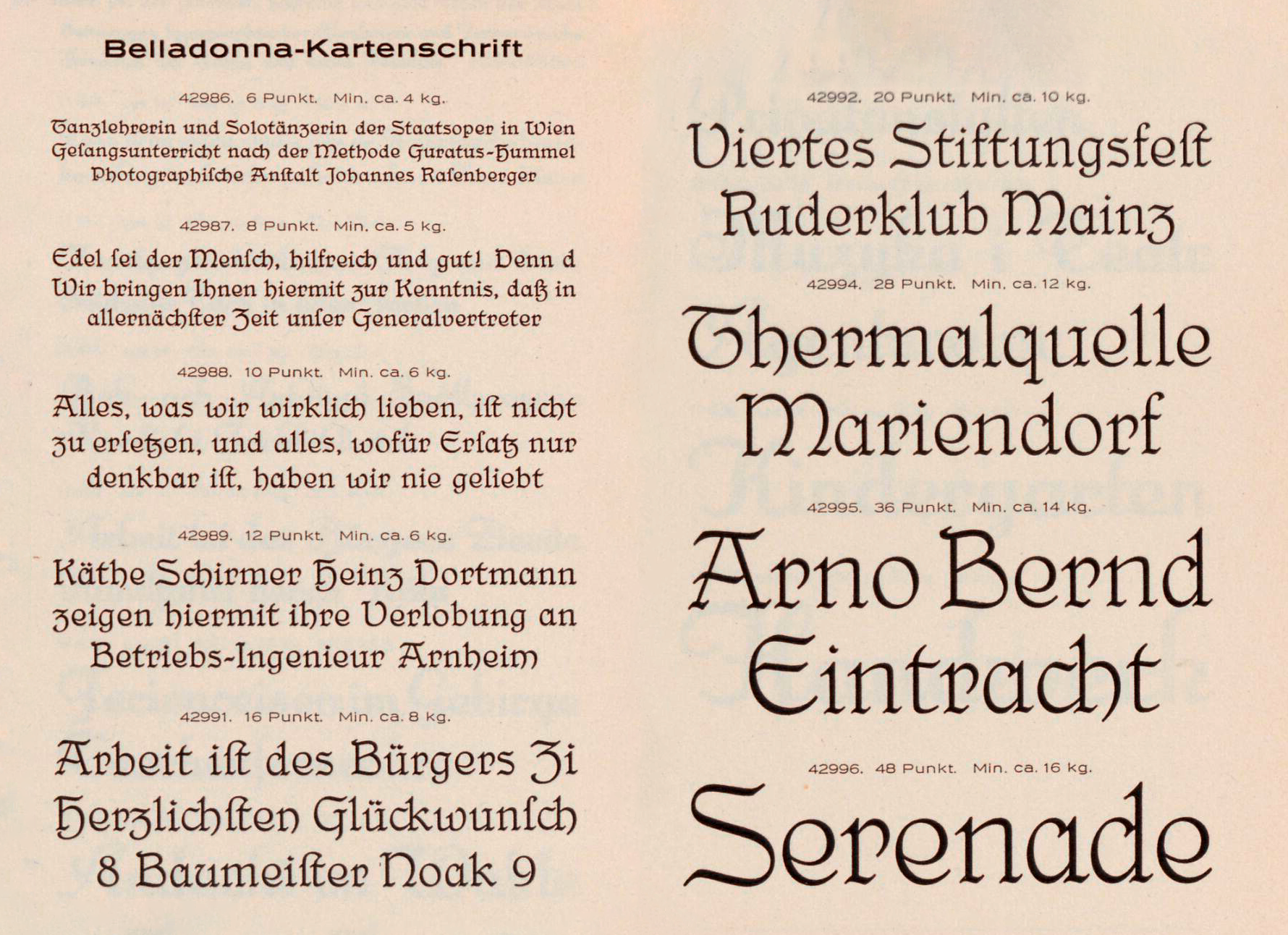
A few times a year, I’ll get an e-mail asking for information about Belladonna. It is generally considered the first German typeface attributed to a woman. The Julius Klinkhardt typefoundry in Leipzig published Hildegard Henning’s design around 1912. Indra Kupferschmid mentions it in an Alphabettes post, First/early female typeface designers. Below, you can read what I’m currently able…
Written by
-
How old is the specimen? And the typeface?
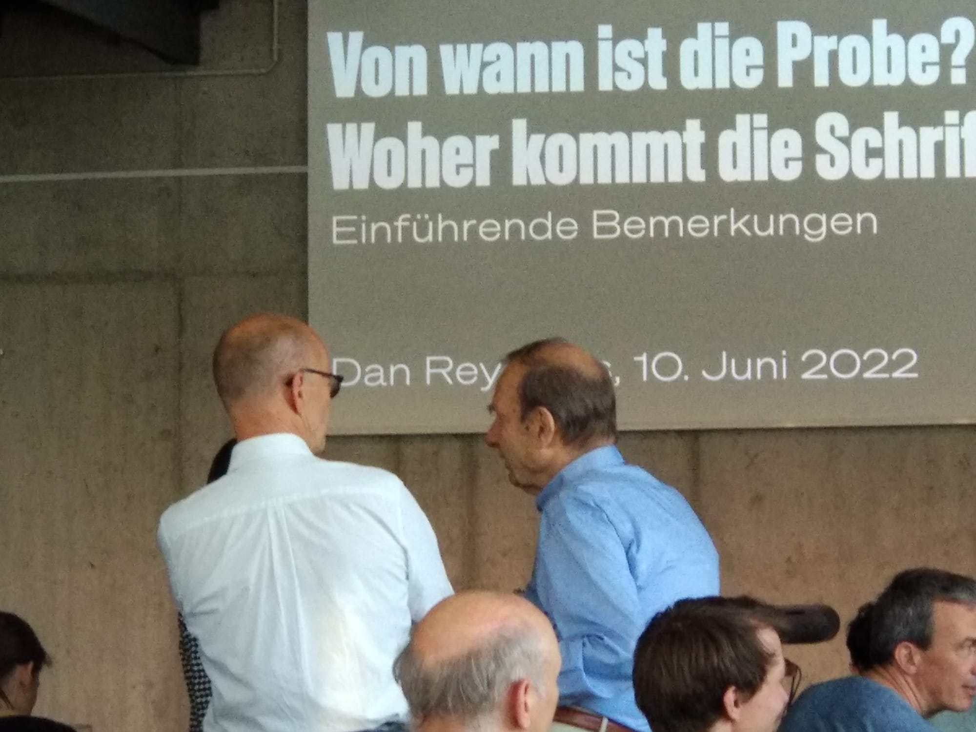
Between April 2020 and June 2022, I participated in a type specimen digitization project. Several public institutions in Berlin joined forces to photograph each page of every type specimen in their collections produced by Berlin-based type-making companies between the 1790s and 1951. Together with Christian Mathieu, I prepared an English-language summary of the project for…
Written by
-
H. Berthold AG’s matrices, reference castings & casting slips in the Deutsches Technikmuseum’s depot
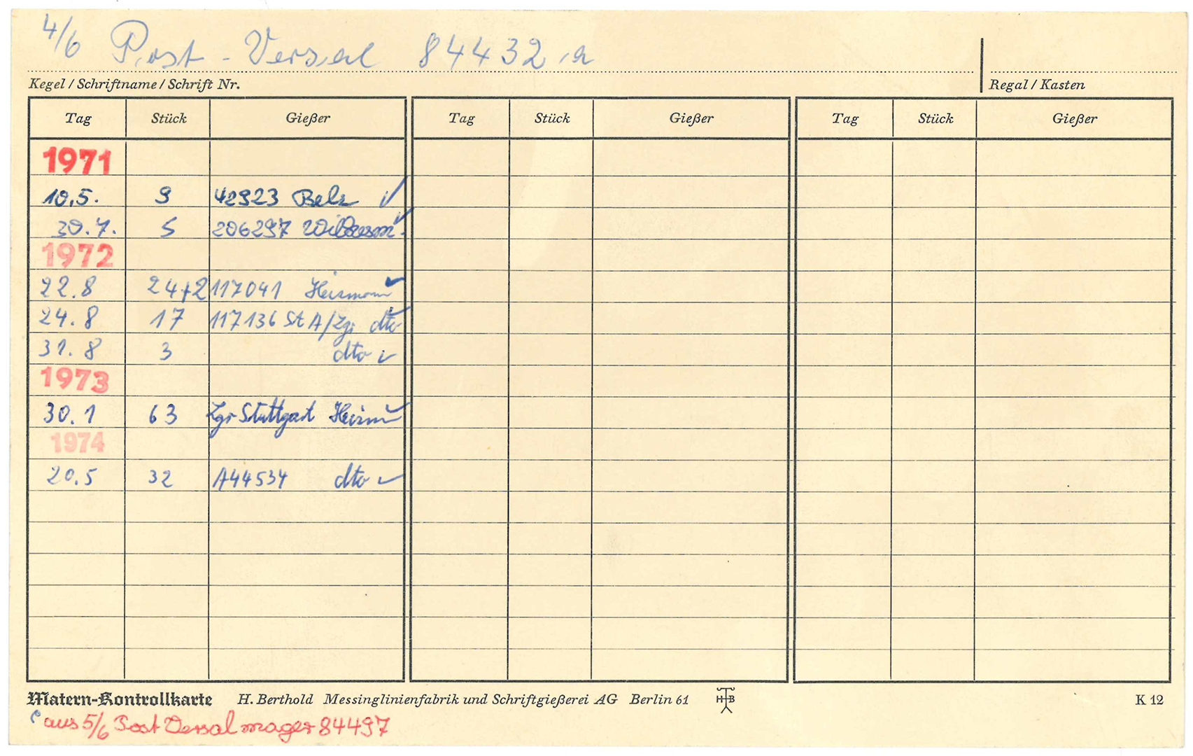
I wrote the following article on Berthold’s matrices with Kerstin Wallbach from the Stiftung Deutsches Technikmuseum Berlin. Our original German-language text was published by the Staatsbibliothek zu Berlin on its blog last week. Since 2020, I’ve been a member of the scientific advisory board a digiS digitization project called Die Sichtbarmachung des Sichtbaren – Berlins…
Written by
-
On the trail of Berlin’s typefoundries
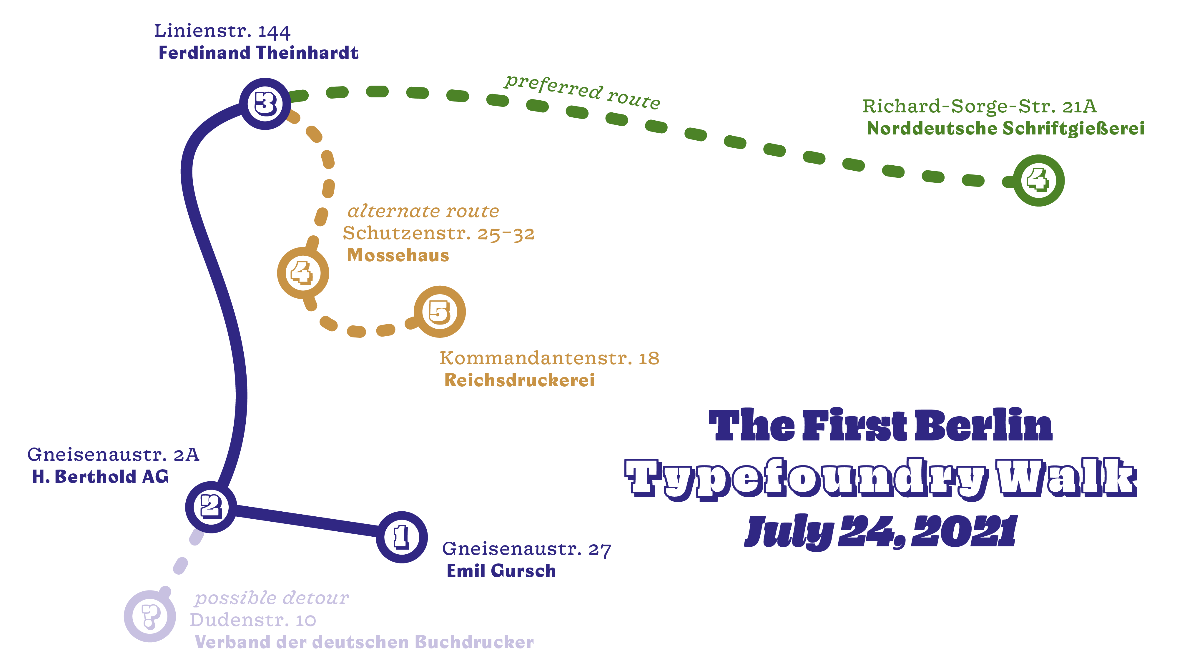
Several factory buildings from the time of industrial type-production are still preserved. These typefoundries and their products shaped the national printing industry during the 19th and 20th centuries. They continue to influence designs made by the international typography community today. On July 24, 2021, as part of the project Die Sichtbarmachung des Sichtbaren – Berlins…
Written by
-
Research results: Sans serif type in nineteenth-century Germany
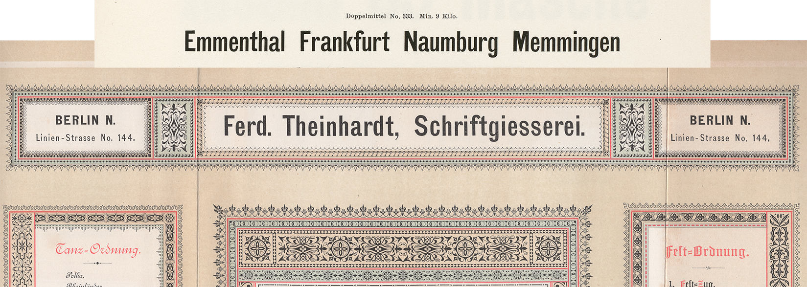
Berthold, Decker, Hamburg typefoundries, Leipzig typefoundries, Nineteenth-century sans serifs, Reichsdruckerei, Research, TheinhardtAbove, a digital collage showing two castings of the same design. The very top reproduces Benjamin Krebs Nachfolger’s product number 333, the 28pt size of the foundry’s Moderne Steinschriften typeface. Krebs first advertised its Moderne Steinschriften in 1865. That was one of the nine or more original sans serifs the Krebs foundry produced before 1900.…
Written by
-
Sanserif type in Germany in the nineteenth century: a preliminary survey
Above, I have reproduced six ornamental sans serif types from an 1850s type specimen sheet printed for the Joh. Pet. Nees & Co. foundry in Offenbach am Main. Philipp Rudhard’s widow purchased complete control of the firm in 1859. Her renamed Rudhard’sche Gießerei stayed in the Rudhard family until 1891. In 1892, a cigar manufacturer from Gießen…
Written by

-
Imperial-era Germany’s definitive heavy sans
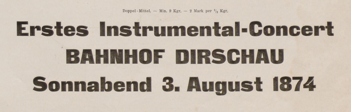
Above, I have reproduced a three-line specimen of the Doppel-Mittel size from the Zeitungs-Grotesque typeface. That translates to about 28 Didot points. The image is cropped from J.G. Francke Nachfolger A.W. Kafemann’s Vorläufige Probe (1874). Courtesy of the Noord-Hollands Archief. In the post below, I discuss this heavy sans serif’s wide distribution. The Danzig-based Francke typefoundry first advertised…
Written by
-
Another word on Accidenz-Grotesk and Royal-Grotesk’s appearances in Theinhardt specimens
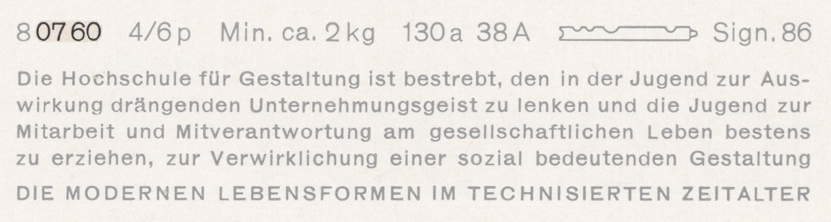
Above, I have reproduced a specimen of Akzidenz-Grotesk’s regular weight showing its 4pt size on a 6pt body. That is taken from a scan of page 58 from the undated H. Berthold AG Hauptprobe Nr. 470, probably printed at some point during the 1960s. I’ve highlighted the last four digits of its product number: 0760. This…
Written by