Category: Reichsdruckerei
-
Unger versus Decker
For decades after the 1760s, the in-house typefoundry within the Decker printing house was the most significant foundry in Berlin. Arguably, it was only surpassed after Eduard Haenel moved his Magdeburg-based foundry to Berlin in the late 1830s. Despite Decker’s long prominence, it never developed a typeface as influential in German typography as the Unger-Fraktur,…
Written by

-
Fette Fraktur questions
Typeface names in the nineteenth century tended to be descriptive terms rather than brands. That was much less the case in the twentieth century, and today many typefaces are used whose nineteenth-century descriptive names have become brands. I’ve written several posts about Akzidenz-Grotesk, a classic example of this phenomenon. Another example is the Fette Fraktur…
Written by

-
Research results: Sans serif type in nineteenth-century Germany
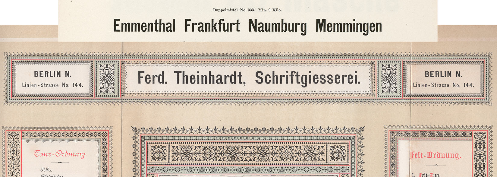
Berthold, Decker, Hamburg typefoundries, Leipzig typefoundries, Nineteenth-century sans serifs, Reichsdruckerei, Research, TheinhardtAbove, a digital collage showing two castings of the same design. The very top reproduces Benjamin Krebs Nachfolger’s product number 333, the 28pt size of the foundry’s Moderne Steinschriften typeface. Krebs first advertised its Moderne Steinschriften in 1865. That was one of the nine or more original sans serifs the Krebs foundry produced before 1900.…
Written by
-
Decker and Reichsdruckerei punches, part 2
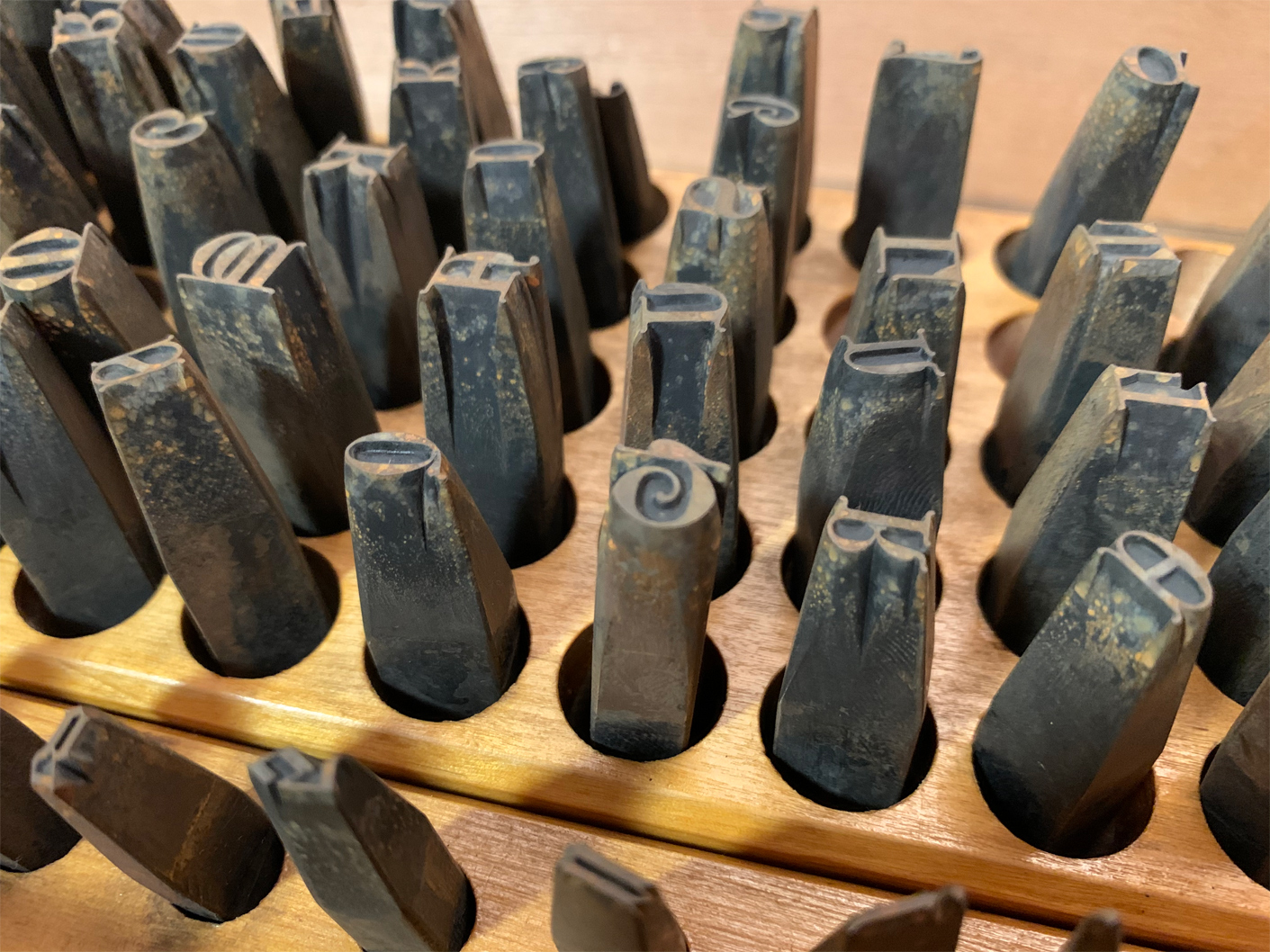
Above, I have reproduced my photograph showing part of Stiftung Deutsches Technikmuseum Berlin, inventory number 1/2018/0342, drawer 28. In it, you see the steel typographic punches for the 28-pt (and maybe a few 24-pt) sizes from one of the Reichsdruckerei typefaces. The design’s name is Diplom-Gotisch and the punches were probably cut in Berlin, ca 1893. This is…
Written by
-
Decker and Reichsdruckerei punches, part 1
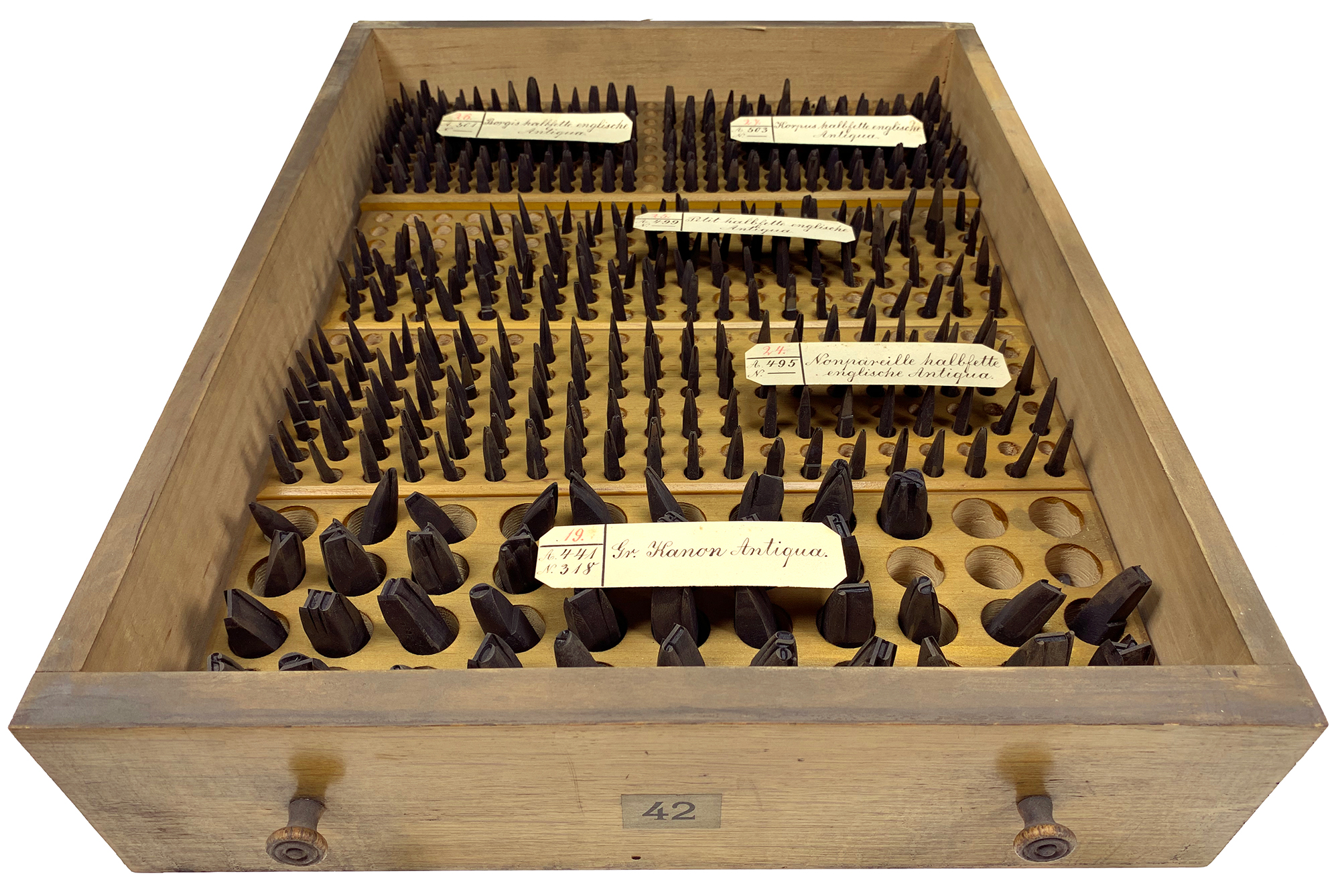
Above, I’ve reproduced my photograph of Stiftung Deutsches Technikmuseum Berlin, item number 1/2018/0443, drawer 42. This stores the hand-cut typographic steel punches for four fonts of a bold English-style roman typeface named halbfette englische Antiqua. Their approximate sizes are 6, 8, 9, and 10 Didot points. They were probably cut at Rudolf Decker’s Court Printing House at…
Written by