Category: News
-
Making Neuland
Jérôme Knebusch and Alice Savoie’s Poem Pamphlet series has been a typographic highlight of 2020s. The first pamphlet tells the story behind Rudolf Koch’s Blumenbuch. Back in 2020, I wrote the fourth, which questioned the details of Gebr. Klingspor’s accounts of the Eckmannschrift’s. I refocused the view of that story onto the typeface’s punchcutter, Louis Hoell. This…
Written by

-
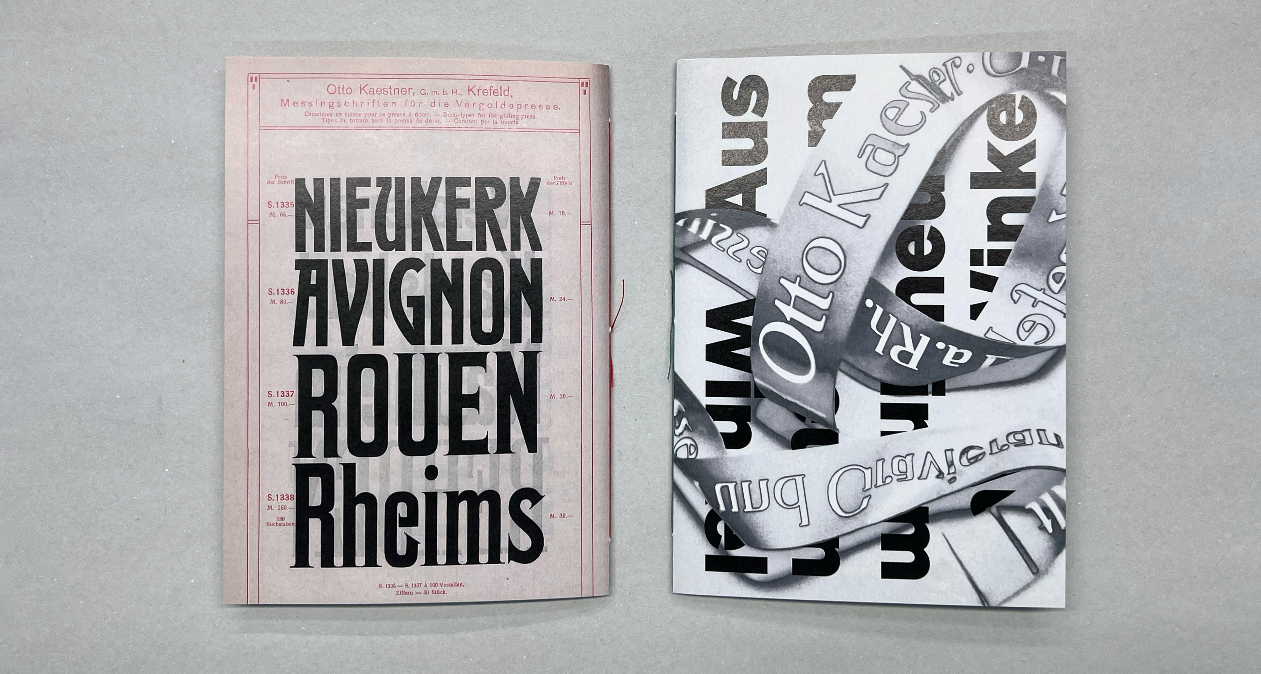
Otto Kaestner’s brass type foundry: A lettering zine
Although Germany had dozens of typefoundries in the early 20th century, none were based in the Lower Rhine region. Once the Düsseldorf branch of Bauer & Co. was closed in 1899, area printers would have had to order their types from more distant parts of the country: from Berlin, Hamburg, Leipzig, the Rhine-Main area, or…
Written by
-
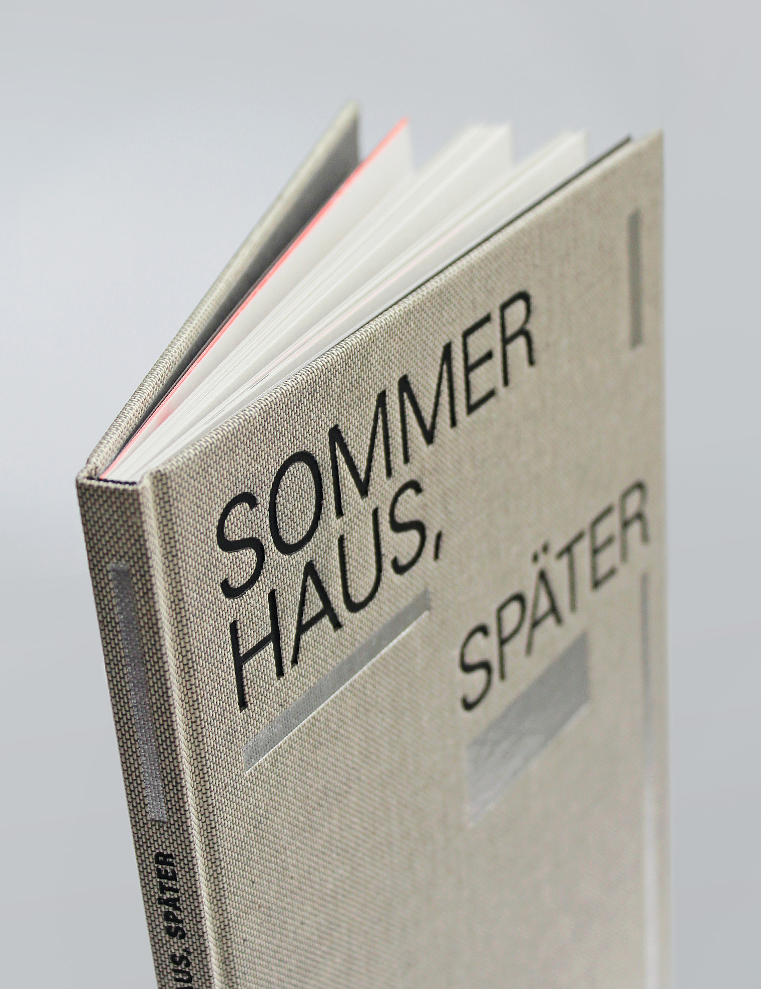
The Maximilian-Gesellschaft’s edition of Sommerhaus, später
Founded in 1911, the Maximilian-Gesellschaft is one of Germany’s bibliophile societies. The society has a regular publications program, and the book it sent to members for 2021 was a new edition of a text from Judith Hermann’s 2004 book, Sommerhaus, später. Stefan Gunnesch designed this hard-cover book using my Malabar typeface, together with Adrian Frutiger’s Univers. Maximilian-Gesellschaft produced this Sommerhaus, später edition in…
Written by
-
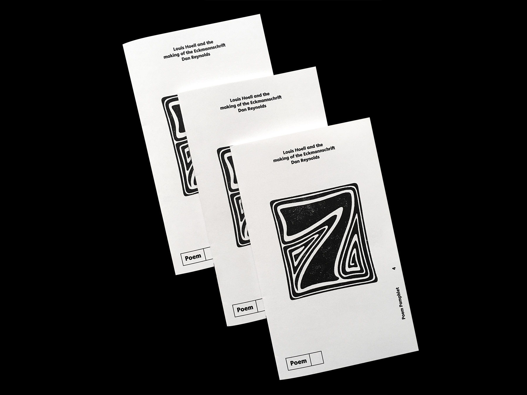
Louis Hoell and the making of the Eckmannschrift
Jérôme Knebusch and Alice Savoie’s Poem Pamphlet series has been a typographic highlight of 2020. The first pamphlet tells the story behind Rudolf Koch’s Blumenbuch. In the second, Sébastien Morlighem writes on “Robert Thorn and the origin of the ‘modern’ fat face.” Riccardo Olocco wrote the third pamphlet, about Erhard Ratdolt’s 1486 type specimen sheet.…
Written by
-
Limited number of copies of my dissertation available
My doctoral dissertation on late-19th and early-20th-century German typefoundry-collaboration with external designers is now available for publication. I’ll make the document available as a PDF on the website of the Braunschweig University of Art’s library. There, it will be downloadable for free. I’ll also upload the file to some other sites, like Academia.edu, etc.[*] As part…
Written by

-
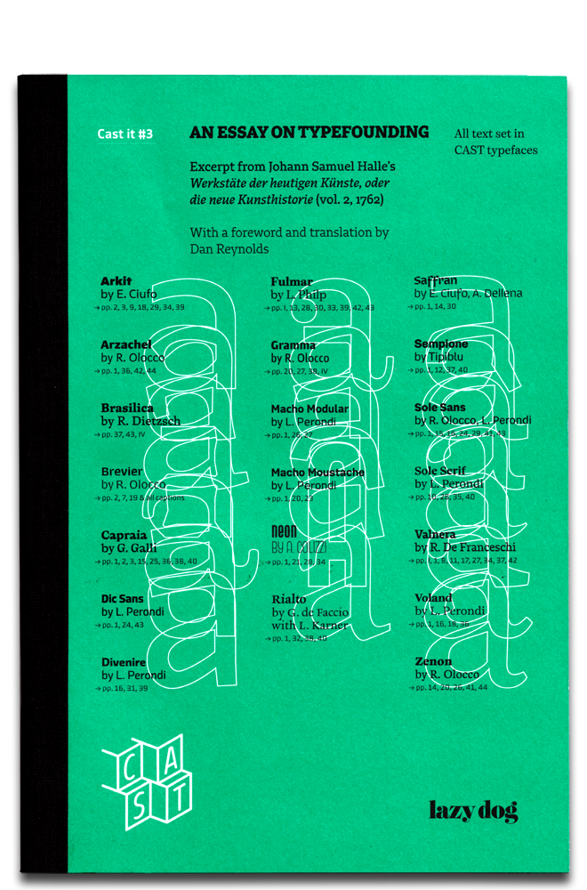
Read about 18th-century typefounding in Cast it #3
In December 2019, the third issue of Cast it became available. This republishes an eighteenth-century description of typefounding from Johann Samuel Halle, as well as my translation of his German text into English. Cast it is a series of printed specimens showcasing the typefaces of the Italian digital font foundry CAST – Cooperativa Anonima Servizi Tipografici.…
Written by
-
Artists and craftsmen in German type, 1871–1914
On January 10th, 2019, I successfully defended my doctoral dissertation at the Hochschule für Bildende Künste in Braunschweig. Since it will be about another year until I publish my dissertation – in one still-undecided form or another – I have decided to post an English translation of my defence presentation here. That was about 25-minutes-long,…
Written by

-
Specimen for two new typefaces
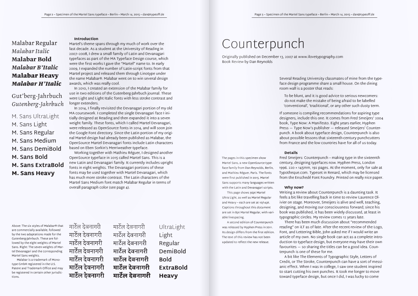
In late 2014 and early 2015, I worked on two Latin & Devanagari typefaces with Mathieu Réguer that you can have for free: Biryani and Martel Sans. Here are the first PDF specimen I designed for each of them; these PDFs really only illustrate the Latin-portions of those families. As for the fonts themselves, you…
Written by
-
Laziness
Oh my heavens, this blog has not been updated since February 27, 2012! That is terrible. Since then, I have moved twice, and also gotten married. I finally have a dog, too. Fortunately, though, I am still doing exactly the same sort of work that I was three years ago. Today, my Twittersphere shamed me…
Written by
-
TYPO TALK in Mainz in March
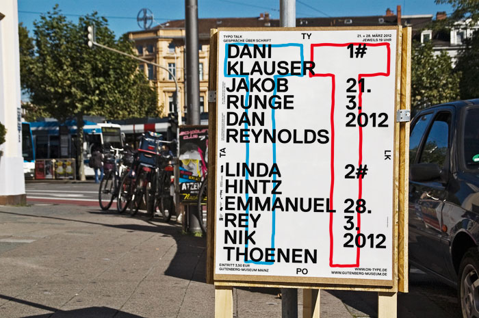
As part of their ON-TYPE exhibition, the Gutenberg-Museum in Mainz will hold a two-day lecture series entitled TYPO TALK on March 21 and 28, 2012. I’ve been invited as one of three speakers to present on the 21st. The series organizer, Marcel Häusler shared some information with today that I am pleased to translate into…
Written by
-
The History of My Commute
Since January 1, 2012, Mark Simonson has been putting all other type bloggers to shame – his New Year’s Resolution was to post every day, and he’s been keeping pretty good on his word. My last TypeOff. post, in comparison, was on October 13, 2011! Today, however, he moved me out of my complacency by…
Written by
-
Darmstadt type design update
In addition to my ongoing design projects – and my work and research in Braunschweig – I’ll be in Darmstadt once a week October–February, too. For the fifth time, I’ve been invited to teach an intro to type design course at the Hochschule Darmstadt. This semester, it will be two classes; the same course repeated…
Written by
-
Thank you, Steve
I suspect that there will be a lot of reminiscing about Apple this morning. Yet, despite all of the items on my to do list, I’d rather ponder the moving example of Steve Jobs’s life and career. If it were not for Jobs – and the company he founded and led so well – I…
Written by
-
Now: type design and research
This month, I’ve switched jobs. Today, I took up a half-time position as research assistant at the Braunschweig University of Art, where I’ll soon begin my doctoral research into early 20th century German type foundries. Additionally, I’ve gone out on my own as type designer and font marketer in Berlin. September was my last month…
Written by