This post is about Halbfette Cursiv-Grotesque, a bold italic sans serif. Common in the last quarter of the nineteenth century, the typeface’s letterforms are slightly condensed. In the lowercase, “a” and “g” have single-story forms. The descenders are all very long. Many typefoundries carried this design – not just in Austria, Germany and Switzerland but also in other European countries – including Russia – and the United States.
The oldest specimen I have found for the design was printed for a typefoundry named J. H. Rust & Co. in 1875. That sheet shows three sizes of type – 8, 10 and 12pt. A year earlier, Rust & Co. had produced a sheet for the design’s 14, 20 and 28-pt sizes. The foundry sent both sheets to a periodical called the Journal für Buchdruckerkunst, Schriftgießerei und die verwandten Fächer. Unfortunately, none of the bound collections of 1874’s Journal issues I was able to consult included the advertising supplements sent to subscribers that year. I have no idea how the 1874 specimen looked. The 1875 specimen is reproduced above. It explicitly marketed matrices of Halbfette Cursiv-Grotesque to other typefoundries, not just fonts of type to printers.
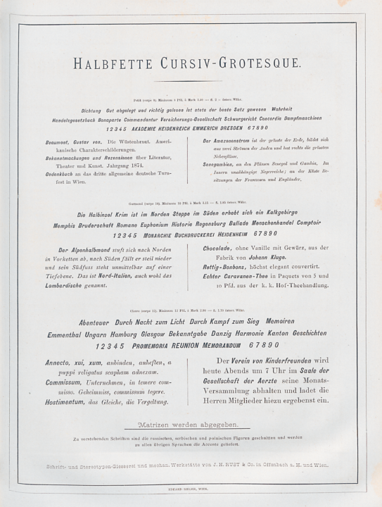
Type specimen sheet printed by Eduard Sieger in Vienna for the J. H. Rust & Co. typefoundry advertising the 8, 10 and 12pt sizes of the Halbfette Cursiv-Grotesque typeface. Bundled as a supplement to the 3 March 1875 issue of the Journal für Buchdruckerkunst, Schriftgießerei und die verwandten Fächer. Image from the Staatsbibliothek zu Berlin – Preußischer Kulturbesitz. Click to enlarge.
I am not sure whether Rust & Co. cut the initial punches for the sizes of the Halbfette Cursiv-Grotesque it sold. The company may have bought punches or matrices for some of the six sizes from Aigner & Gutenberg – a new Viennese typefoundry set up by Adolf Gutenberg in 1874.
Who was J. H. Rust & Co.?
Georg Fritz’s book Geschichte der Wiener Schriftgießereien 1482–1923 includes a summary of the J. H. Rust & Co. typefoundry’s history in Vienna:
In 1867, Johann Heinrich Rust – from the Offenbach typefoundry J. H. Rust & Co. – went to Vienna to set up a company subsidiary there. Later, the Offenbach and Vienna branches separated into two businesses. Rust remained in Vienna for good, and his partner [Georg] Juxberg continued the Offenbach business. Rust was not only a capable and active specialist but also a clever, far-sited businessman. He immediately recognized the importance of the Didot system Hermann Berthold of Berlin had codified in 1879, based on the meter. He was the first to successfully introduce this in Austria-Hungary, the Danube countries, and the Orient. The company created a large number of good original products. Its popular roman faces were enriched by Russian, Serbian, Bulgarian, and Greek types cut in the institution, and many good borders were also published. These successful original-products found recognition, selling well not only in European countries but also in America and Asia. Both domestic and foreign typefoundries purchased matrices from Rust. In exchange, the company received original matrices from German, French, English and American foundries. In Geschichte der Wiener Schriftgießereien 1482–1923 (Vienna: H. Berthold GmbH, 1924), p. 115–117.
Fritz’s book was a Berthold company publication. Since Berthold entered the Viennese market by purchasing the Rust & Co. foundry in 1905, I find it unsurprising that Fritz presented the history of Rust & Co. in a favorable light.
Advertising Halbfette Cursiv-Grotesque
Rust & Co. ran Halbfette Cursiv-Grotesque specimen sheets in the 15 July 1874 and 3 March 1875 issues of Journal für Buchdruckerkunst, Schriftgießerei und die verwandten Fächer. These critiques have no bylines, but are probably from Theodor Goebel, the Journal’s editor for most of the 1870s. Translated into English, the piece from 1874 about the Rust & Co. specimen for the Halbfette Cursiv-Grotesque 14, 20 and 28-pt sizes read:
Specimen review. The specimen sheet that Messrs J. H. Rust & Co. in Offenbach and Vienna enclose with our current issue contains English, Paragon and Double English bold Italic-Grotesque; although this sheet does not bear the words “original products from our typefoundry,” but only the ominous “matrices are available,” we nevertheless believe that we have no reason to fear that – if we direct praise or criticism in the direction of the company named above – our respective praise or rebuke will have been directed at the “wrong address” […] today we want to draw the attention of our readers specifically to the specimen sheet in question, which is an extraordinarily-easy task for us. We have seen this genre of Italic-Grotesque many times recently in American type specimens and could only express our surprise that it had not been imported to Germany yet, or recut because such a generally-usable kind of typeface does not require any special recommendation. It is equally-suited for fine and minor jobbing printing. At the same time, it has great resilience. We are very pleased to see this typeface made available to German printers and their neighbors. At the same time, we are pleased to read on the specimen that Rust & Co. is currently cutting the smaller sizes – we believe they will find many grateful buyers. In Journal für Buchdruckerkunst, Schriftgießerei und die verwandten Fächer, vol. 41, no. 27 (15 July 1874), col. 453–454.
And here is my translation of the Journal’s review of Rust & Co.’s specimen for the 8, 10 and 12-pt sizes:
Specimen review. Italic again! […] The Halbfette Cursiv Grotesk, which the firm of J. H. Rust & Co. in Offenbach and Vienna encloses as an original product of its house in the smaller sizes ranging from Petit to Cicero today, may undisputedly be also counted among the pretty and beautiful and therefore has every right to share-entitlement, no less so than the larger sizes of the same typeface that, cast from American original matrices, already accompanied issue no. 27 [of our Journal] last year. It is tastefully drawn, easy to read and also extremely resilient– because it has no delicate out-strokes, like all grotesques. Nevertheless, it seems to us that some letters have not had their side-bearings set quite properly. For instance, the z in the Brevier size has too much space on each side. Likewise, the c is not spaced tightly enough on its right-hand side. In the Long Primer size, the o has a little more space around it than is necessary. That is visible in the word “Historie,” which is all the more striking since the capital letters in Long Primer and Pica appear almost as if they were condensed. The fact that these small imperfections we find on the specimen sheet will not in-and-of-themselves detract from the typeface’s beauty needs no special affirmation. They do not need to appear at the next casting. Every colleague knows how good of a jobbing typeface such a pretty bold Italic makes, and the specimen sheet shows that it can be used advantageously and skillfully. The fact that it has thin strokes should perhaps give it preference over typical Bold Condensed [fonts] or Aldines – in short, more speaks for this typeface than for some of her sisters. Only one thing seems conspicuous on this sheet: the name of the foundry is printed in Nonpareil type – it almost disappears under the other fonts, which are also not large, and cannot even provide effective contrast. From the Journal für Buchdruckerkunst, Schriftgießerei und die verwandten Fächer, vol. 42, no. 10 (3 March 1875), col. 160–161.
Two weeks later, J. H. Rust & Co. ran a correction in the 17 March 1875 issue of the Journal, informing readers that all six Halbfette Cursiv-Grotesk sizes were the foundry’s own creation: “The specimen review section included an error that we would like to try to correct. You mentioned that the larger sizes of the Cursiv-Grotesk are cast from American original matrices and that only the smaller sizes were cut by us. That is not the case, because the typeface was cut by us in six sizes, from Petit to Doppelmittel [8pt–28pt] in punches.”
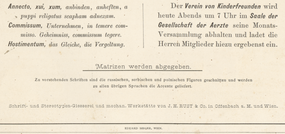
Above, a close-up of the bottom of Rust & Co.’s 1875 specimen sheet for the 8, 10 and 12pt sizes of Halbfette Cursiv-Grotesque. The two columns at the top of the image show how the fonts could emphasize texts otherwise set with serif italic and roman types. Underneath that, a line of text reads »Matrizen werden abgeben« (matrices are available). The smaller-sized text below that explains that Russian, Serbian and Polish sorts had been cut and that accented characters were available for all other languages. Click to enlarge.
Introducing Aigner & Gutenberg
Another Viennese typefoundry named Aigner & Gutenberg may have cut the steel punches for some or all of Halbfette Cursiv-Grotesque’s six sizes. In 1874, it was likely common practice for typefoundries to commission specific typefaces from independent engraving firms. Perhaps larger foundries even commissioned new typefaces from smaller punchcutteries-cum-typefoundries, too.
In April 1875, Aigner & Gutenberg ran a small announcement about a Halbfette Cursiv-Grotesque in the Österreichische Buchdrucker-Zeitung from 1875 (vol. 3, no. 15, 15 April 1875, p. 115). In my translation, this reads:
To the gentlemen typefoundry-owners. We will be selling the latest bold Italic Grotesque – presented for our dear business friends and pleno titulo customers to see in our specimen sheet from 1 May – as strikes or matrices from the original punches at 50 Austrian Kreuzer each. [Or as] casts at 10 Austrian Kreuzer per piece. Aigner & Gutenberg.
At present, I am not aware of any other 1870s fonts of foundry type called halbfette Cursiv Grotesque aside from Rust & Co.’s Halbfette Cursiv-Grotesque.
Although I did not find a listing for a company named Aigner & Gutenberg in Vienna’s address books, I did find a typefounder named Adolf Gutenberg. Friedrich Bauer’s Chronik der Schriftgießereien in Deutschland und den deutschsprachigen Nachbarländern states that this Adolf Gutenberg established his foundry at Vienna in 1874. I assume that its first business name was Aigner & Gutenberg, although I am not sure who “Aigner” was.
Curiously, Aigner & Gutenberg and Rust & Co. were engaged in a mud-fight in the advertising section of the Österreichische Buchdrucker-Zeitung’s April 1875 issues. Each firm claimed that the other only sold typefaces cast from electrotyped matrices instead of matrices struck by steel punches (you can read Rust & Co.’s complaint online, as well as Aigner & Gutenberg’s response and Rust & Co.’s counter-response). Strikes can only be created by the foundry or punchcuttery who had cut the series of punches.
As part of this mud-fight, we read that a “Herr Gutenberg” from Aigner & Gutenberg had previously spent two years employed as a typefounder and justifier at Rust & Co. In the dispute, Gutenberg claimed that ninety per cent of Rust & Co.’s matrices were electrotyped copies. Nevertheless, it is still conceivable that Aigner & Gutenberg could have supplied Rust & Co. with Halbfette Cursiv-Grotesque matrices before relations between these foundries broke down in such a public way.
United States foundries
Alastair M. Johnston and Stephen O. Saxe show one size of type that looks like Halbfette Cursiv-Grotesque in Nineteenth-Century American Designers and Engravers of Type. According to their entry, Andrew Gilbert cut design that for the Boston Type Foundry and patented it in 1872. However, the image on the type design’s patent registration sheet does not seem to match the Halbfette Cursiv-Grotesque-style design they include in the book. That patent image has not been reproduced at a high-level of quality, but the alphabet in it features lighter letterforms, and the lowercase “g” is double-storied. Boston’s 1880 catalog does include a Halbfette Cursiv-Grotesque-style design. This was sold in fonts named Gothic Italic, No. 2 and No. 3.
Other United States foundries must have acquired matrices of Rust & Co.’s Halbfette Cursiv-Grotesque fonts quickly. For instance, the Philadelphia-based typefoundry MacKellar, Smiths & Jordan already showed the typeface in its 1876 catalog, under the name Italic Gothic, No. 2. The Cincinnati Type Foundry included that design in its 1878 catalog, also as Italic Gothic, No. 2.
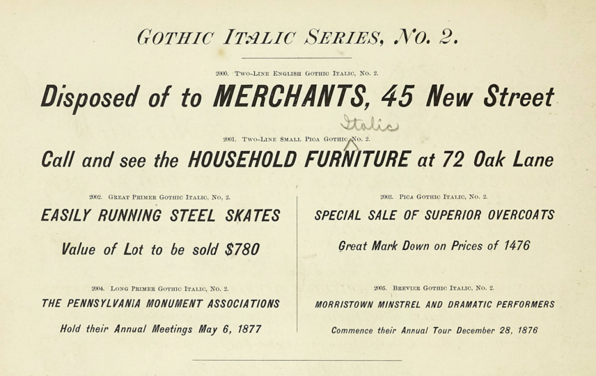
All sizes of Gothic Italic Series, No. 2 in an 1878 specimen catalog from the Cincinnati Type Foundry, n.p. St. Louis Public Library, Nicholas J. Werner Typographic Collection. Click to enlarge.
Robert A. Mullen suggests in his book Recasting a Craft: St. Louis Typefoundries Respond to Industrialization that the Inland Type Foundry introduced this design in 1894, which must only describe its first appearance in that city. Fonts In Use lists additional United States catalogs carrying this design – but none of the instances named are from before 1884. It does not mention any (!) of the European founders who sold the typeface.
Could the United States foundries’ letters and the European foundries’ fonts have been cast from matrices struck by the same set of punches? It certainly seems possible to me. German foundries only really began to systematically use a common Didot point after 1878. The Anglo-American point was not standardized until later – note that the Cincinnati Type Foundry specimen reproduced shown above does not even denote its type sizes in points. Based on the standard measurements eventually established in the United States and much of Western Europe, I present the following hypothesis:
- Brevier = 8 angloamerican pt, 7.5 Didot pt; probably the same letters cast on Petit bodies (8 Didot pt) by Austrian and German foundries.
- Long Primer = 10 pt, 9.38 Didot; probably the same letters cast on Corpus bodies (10 Didot) by Austrian and German foundries.
- Pica = 12 pt, 11.25 Didot; probably the same letters cast on Cicero bodies (12 Didot) by Austrian and German foundries.
- Great Primer = 18 pt, 16.8 Didot; these letters could have been those that Austrian and German foundries cast on Mittel bodies (14 Didot) only if the American letters are very small on the body.
- Two-Line Small Pica = 22 pt, 20.64 Didot; these letters could have been those that Austrian and German foundries cast on Text (20 Didot) bodies only if the American letters are slightly small on the body.
- Two-Line English = 28 pt, 26.26 Didot; these letters could have been those that Austrian and German foundries cast on Doppelmittel (28 Didot) bodies if the European letters are small on the body.

In this comparison, the letters printed on a light-yellow background are from a Franklin Type Foundry catalog. Each is from Franklin’s Italic Gothic, No. 2 (28pt). The letters on a darker background are from Schelter & Giesecke’s 1912 catalog. They represent the 28pt Halbfette Kursiv-Grotesk. These letters must be two instances of the same design. The minor differences between some must be due to ink spread, not formal variations on the respective pieces of type. Click to enlarge.
The typeface’s distribution throughout the Austrian, German and Swiss typefoundry network
By 1900, the Halbfette Cursiv-Grotesque design was carried by at least 20 foundries in Germany, Austria and Switzerland. After Rust & Co. introduced the design on the marketplace in these countries, every other foundry carrying the typeface offered at least all six of the “Rust & Co.” sizes. Below, you can read information about the source and distribution of each size making up the design. At least as it was sold in German-speaking Europe.
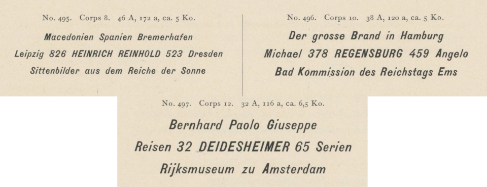
8, 10 and 12pt sizes of the Halbfette Cursiv Grotesque design – as cast by the Benjamin Krebs Nachfolger typefoundry in Frankfurt am Main. Scan from Krebs’s 1899 catalog. Krebs sold the design with the product name Kursiv-Steinschrift. Click to enlarge.
Sizes: 8, 10 and 12 Didot-points.
Creator: J. H. Rust & Co., Offenbach am Main and Vienna or Aigner & Gutenberg, Vienna.
Year published: 1875.
Also carried by: Aktiengesellschaft für Schriftgießerei und Maschinenbau, Bauer’sche Gießerei, Emil Berger, Karl Brendler & Söhne, Britz & Glock, W. Drugulin, Flinsch, Julius Klinkhardt, C. Kloberg, Benjamin Krebs Nachfolger, Haas’sche Schriftgiesserei, Rudhard’sche Gießerei, Schelter & Giesecke, D. Stempel AG, Ferd. Theinhardt, Otto Weisert and Wilhelm Woellmer’s typefoundry [at the very least].
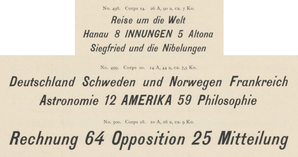
14, 20 and 28pt sizes of the Halbfette Cursiv-Grotesque design as cast by the Benjamin Krebs Nachfolger typefoundry in Frankfurt am Main. Scan from Krebs’s 1899 catalog. Krebs sold the design with the product name Kursiv-Steinschrift. Click to enlarge.
Sizes: 14, 20 and 28 Didot-points.
Creator: J. H. Rust & Co., Offenbach am Main and Vienna or Aigner & Gutenberg, Vienna.
Year published: 1874.
Also carried by: Every foundry in German-speaking Europe who had Rust & Co.’s three smaller sizes. C. Kloberg in Leipzig cast the 20-pt size on a 16-pt body.

This 6-pt specimen of Flinsch’s Halbfette Kursiv-Grotesk is a scan from the foundry’s ca 1915 catalog.
The Frankfurt-based Flinsch foundry had a 6-pt font of the Halbfette Cursiv-Grotesque design. It had a very large x-height, as one might expect for so small a size. I do not know who cut this size.
Size: 6 Didot-points
Creator: Unknown.
Year published: Unknown.
Carried by: Flinsch.
[Imagine an image of a 32pt font here. I haven’t got a proper scan, folks. Sorry! If anyone can send me one, I’d be chuffed.]
According to information the Hessisches Landesmuseum, Abteilung Schriftguss, Satz und Druckverfahren provided me, the Frankfurt-based D. Stempel AG created a 32-pt size for the Halbfette Cursiv-Grotesque design. Stempel sold the Rust & Co. design as Halbfette Kursiv-Grotesk. The foundry’s large 1925 has catalog includes a specimen of the 32-pt font alongside the other sizes of the design Stempel sold.
Size: 32 Didot-points.
Creator: D. Stempel AG.
Year published: Unknown. Probably between 1898 and 1912.
Also carried by: Gebr. Klingspor.
D. Stempel AG’s 1925 catalog also includes a 6-pt for on its Halbfette Kursiv-Grotesk page. However, that product does not match the Halbfette Cusiv-Grotesque design described here. It might be a small size of Miller & Richard’s Sans-Serif Italic.
For the German Linotype company, D. Stempel AG created Linotype matrices for a 6-pt size of the Rust & Co. Halbfette Cursiv-Grotesque design, which they distributed under the names Grotesk 1731 and Grotesk 1732 (the latter product was identical to Grotesk 1731 but featured shorter descenders). Today, the patterns Stempel created to engrave the punches for Linotype-matrix production are kept in Rainer Gerstenberg’s matrix-storage area at the Haus für Industriekultur in Darmstadt.

This 36-pt specimen of Schelter & Giesecke’s Halbfette Kursiv-Grotesk is a scan from the foundry’s 1912 catalog.
Size: 36 Didot-points.
Creator: Unknown.
Year published: 1894 or before.
Also carried by: Schelter & Giesecke, Bauer’sche Gießerei
Beginning in 1894, Schelter & Giesecke catalogs include a 36pt size of this design, as shown above. The Bauer’sche Gießerei was selling the design in 1900, if not earlier (however, Bauer cast the design on a 32pt body). I do not know the source of this font. Since neither Bauer nor Schelter & Giesecke specimens claim it as an in-house creation, I doubt either foundry was behind it.
Matching extensions sold elsewhere in Europe
This section of the post is more abbreviated than it perhaps could be. While I have systematically investigated German-language type specimen catalogs, I have not done this from type specimens from other parts of the world. The following two images show examples of Halbfette Cursiv-Grotesque/Gothic Italic, No. 2 extensions that have come across while looking for other things. If you are aware of additional extensions to the design discussed in this post, please let me know!
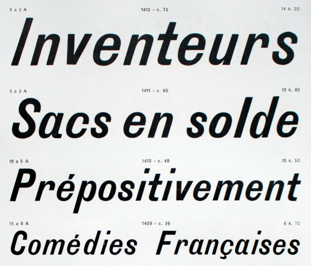
The 72, 60, 48 and 36-pt sizes of Antiques Italiques, 2e Catégorie, from a 1926 Deberny & Peignot foundry catalog. Its predecessor, the Fonderie G. Peignot et fils, had already been selling these fonts by ca 1907. Photograph from Emilios Theofanous.
The Fonderie G. Peignot et fils in Paris sold 6, 8, 10, 12, 20 and 28-pt sizes of a typeface named Antiques Italiques, 2e Catégorie that seem to me to match the Halbfette Cursiv-Grotesque/Gothic Italic, No. 2 fonts sold in Austria, Germany, Switzerland and the United States. Peignot also sold a 16-pt size, which was probably the same design sold on 14-pt bodies in German-speaking Europe. Those were accompanied by 36, 48, 60 and 72-pt sizes in a matching design. I have not been able to determine yet whether the 36pt size matches the 36pt font Schelter & Giesecke sold. I have not seen these 48pt, 60pt or 72pt sizes for sale in German-speaking Europe. Perhaps they were created by the Fonderie Peignot, or another French source.
On the 1875 Rust & Co. Halbfette Cursiv-Grotesque specimen sheet reproduced toward the top of this post, the foundry stated that Russian, Serbian and Polish characters had been cut for the typeface. I have not found a Rust & Co. specimen showing its Cyrillic fonts of Halbfette Cursiv-Grotesque. Both the Berlin-based Wilhelm Woellmer typefoundry and the Leipzig-based W. Drugulin printing house’s internal typefoundries each sold Cyrillic extensions of the Halbfette Cursiv-Grotesque design. Interestingly, while Woellmer and Drugulin’s Latin-script Halbfette Cursiv-Grotesque fonts probably came to them from Rust & Co., the Cyrillic-script versions they sold may have been products each foundry created itself. If that is true, then as many as three or more Cyrillic versions of the Halbfette Cursiv-Grotesque design would have been circulating in German-speaking Europe around the end of the nineteenth century.
![12, 14 and 20-pt sizes of W. Drugulin’s Steinschrift Cursiv [Russisch]](https://www.typeoff.de/wp-content/uploads/2021/03/Steinschrift-Cursiv-Drugulin-Cyrillic-692x540.png)
Three of the six Cyrillic-script sizes from W. Drugulin’s Steinschrift Cursiv. Although Drugulin almost certainly did not create the Latin-script characters in its Steinschrift Cursiv, it may have cut these Cyrillic characters. Click to enlarge.
Although I have not systematically searched Russian typefoundry specimen for instances of the Halbfette Cursiv-Grotesque design, I know that at least two St. Petersburg-based firms carried it: A. Lange & Co. and O. I. Lehman. Each foundry sold their Cyrillic fonts in the six sizes common to the German-speaking typefoundry network. At the moment, I cannot state whether or not each Russian foundry’s fonts matched Drugulin’s.
Un-matching sizes sold in the German-speaking network

In a ca. 1923 catalog, Gebr. Klingspor featured a 36-pt font accompanying its instance of the Rust & Co. Halbfette Cursiv-Grotesque design (called Steinschrift-Kursiv at Gebr. Klingspor). The letterforms in this 36-pt font are narrower than in the Rust & Co. design’s sizes. From a scan of the catalog made by Hans Reichardt.
Gebr. Klingspor in Offenbach am Main sold a 36-pt font that accompanied its instance of the Halbfette Cursiv-Grotesque design. I do not know where this font originated.
Size: 36 Didot-points.
Created by: Unknown.
Year published: Unknown.
Carried by: Gebr. Klingspor.
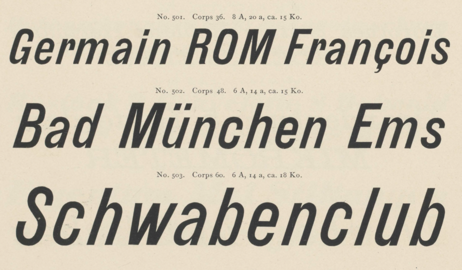
Three sizes Benjamin Krebs Nachfolger sold together with its castings of Rust & Co’s Halbfette Cursiv Grotesque design. Although Krebs claimed these sizes as internal products, the Krebs foundry may have acquired them from the Dickinson Type Foundry in Boston. Scan from Benjamin Krebs Nachfolger’s 1899 catalog.
Although the Benjamin Krebs Nachfolger typefoundry in Frankfurt am Main claimed the three sizes shown above as its own, they may be connected to the Gothic Italic sizes from the Dickinson Type Foundry in Boston (ca 1890). Alastair M. Johnston and Stephen O. Saxe attribute it to the punchcutter John F. Cuming.
Sizes: 36, 48 and 60 Didot-points.
Creator: Either the Dickinson Type Foundry in Boston or Benjamin Krebs Nachfolger in Frankfurt am Main.
Year published: Unknown, but between 1890 and 1899.
Also carried by: Flinsch.

120-pt Nike specimen shown in Schelter & Giesecke’s 1912 catalog.
In its 1912 catalog, Schelter & Giesecke advertised a series of large-sized types together with its Halbfette Kursiv-Grotesk sizes. Called Nike, those fonts could be had as both metal type and wood type in sizes 72, 84, 96, 120, 144 and 168 Didot-points. They sold even larger sizes as wood type fonts. Nevertheless, Nike’s letters are not a stylistic match for Halbfette Kursiv-Grotesk’s. For more Nike sizes, see the first page and the second page of this specimen. Nike might have originated with another typefoundry or wood type manufacturer.
