I have embedded my project’s Airtable database of sans serifs below. Although you can browse this database on mobile browsers, you’ll get a richer user experience by opening this page on your desktop. On a desktop browser, you can expand the database to fill your screen, where it will then display multiple entries at once. Airtable includes its Filter, Sort and Search icons on desktop views. They allow you to interact with the project’s data in a much more powerful way than simply scrolling. The default view is alphabetical by design name. There are more than 350 entries, so it can take a while to reach the Flinsch foundry’s Zierschriften if you are looking for those.
Especially if you are looking at this in a desktop browser, you’ll be able to navigate through the database faster and easier if you click on the View larger version link at the bottom-right of the embedded frame. This should open a Gallery in a new browser tab or window.
How to sort through this data
This database of sans serifs includes designs rather than typefaces. Since designs do not have names, per se, I try to provide the original name given to its first published instance. And the foundry that was its publisher. Many entries are types imported from British or United States foundries, so I provide a second date for the design’s first appearance in the German-speaking network. All but one entry is accompanied by an image. Not every specimen is a high-quality photograph or scan. The images are the best I have yet been able to acquire for each design. A few entries include more than one specimen, but this is rare.
Some designs only had a single foundry selling them. Others had dozens. That information is also in the database, but you will have to dig a little to find it. Fortunately, Airtable enables filtering.
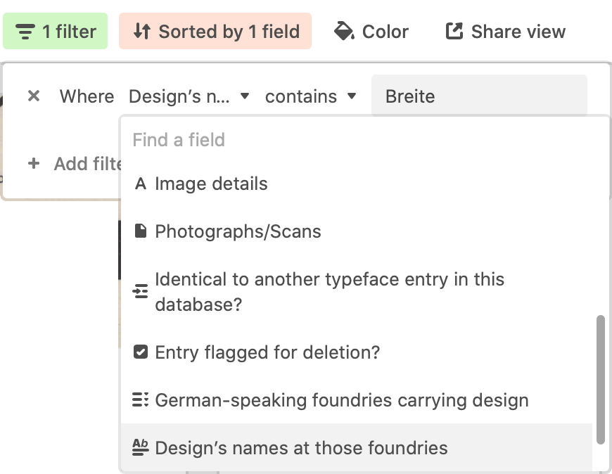
The best way to search for a particular foundry’s products – or a specific type design – is to choose the Filter option and select the “Design names at those foundries.” Then, input a foundry or typeface name in the text field to the right of “contains.” You can also enter generic terms in that field, like the German term for “wide” – Breite – used in the names of many common nineteenth-century sans serifs.
There are three reasons why this database of sans serifs is a catalog of designs rather than typefaces: First, it makes the database more easily navigable. An entry for every design instance sold in the German-speaking network would result in a database with more than 1,200 entries, rather than just 350. Second, not every foundry offered a design in the same range. While one foundry might have all sizes of a design ever cut, another might only sell a single font of it. Finally, any foundry’s typeface might be a collection of multiple designs. My data also reflects that kind of information.
Cataloging all sans serifs sold in German-speaking Europe during the 19th century
Several typefaces from the nineteenth and early twentieth centuries were made up of multiple designs. For instance, the Bauer’sche Gießerei’s Breite Grotesque-Versalien combines types from at least four different sources. The sizes from 5 through 20pt were cut in-house at the foundry. Larger sizes seem to combine at least three pre-existing designs, including at least one sans serif that Figgins in London was already selling in 1847. My database has four entries tagged with this Bauer “typeface.” You can find them all by creating a Design’s names at those foundries filter with the text Bauer: Breite Grotesque-Versalien.
Also, one design might later be expanded upon by multiple foundries. As I wrote in my post on J. G. Francke A. W. Kafemann’s Zeitungs-Grotesque, the design was originally published in sizes ranging from 8 through 28pt. In the 1880s, three larger-sized extensions were created. One either by Kafemann itself or Wilhelm Woellmer’s typefoundry in Berlin, a second by Schelter & Giesecke in Leipzig, and a third whose origins I cannot identify. J. H. Rust & Co. in Vienna may have created the third extension. In the 1890s, Gustav Reinhold’s foundry in Berlin added even larger sizes of the Zeitungs-Grotesque design (72, 84 and 96pt). It also added a 6pt font. Therefore, in my database, there are five entries for designs in the Zeitungs-Grotesque style. No one foundry sold more than three of those designs.
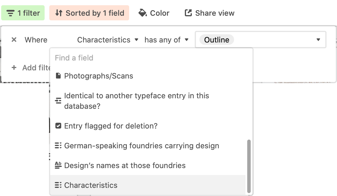
Another way to view a specific subset of designs is to go to Filter and choose the “Characteristics” option. Then you can select one or more stylistic descriptions, such as All-Caps, Shaded, or Two-Color Printing. Applying such a filter can help you find the names a specific design went by, even if you do not know them beforehand.
To offer an example of the kinds of results this sans serif database offers, I shall use Genzsch & Heyse’s Lapidar-Versalien typeface as an example. The foundry first advertised it in the January 1875 issue of Archiv für Buchdruckerkunst und verwandte Geschäftszweige.
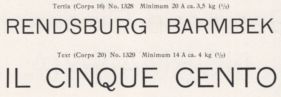
Two of Lapidar-Versalien’s ten sizes: 16 and 20pt. Scan from E.J. Genzsch GmbH’s 1902 catalog. The eccentric Q is perhaps the best indicator of the Lapidar-Versalien design. Click here to see the full-page showing all ten sizes. For more information about Lapidar-Versalien and Genzsch & Heyse’s extension of the design including lowercase letters, see Lapidar, from Genzsch & Heyse.
Genzsch & Heyse’s design was sold by at least ten other foundries. If you open the entry for Lapidar-Versalien and scroll down to “German-speaking foundries carrying design,” you will find the following list:
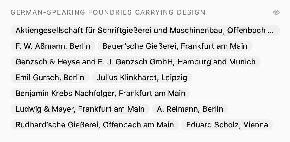
Just below that, at “Design’s names at those foundries,” you’ll see another list presenting the full, proper names Genzsch & Heyse’s Lapidar-Versalien went by at each of those foundries:
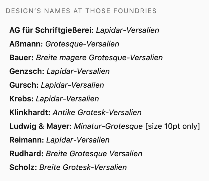
For Lapidar-Versalien, every company listed represents an independent nineteenth-century firm. When it comes to many other designs in the database of sans serifs, the lists showing the German foundries carrying them may be shorter than the results suggest. For instance, “AG für Schriftgießerei” and “Huck” are the same firm. J. M. Huck & Comp. was the first typefoundry in Germany to become a joint-stock company. When they did this, they changed their name to Aktiengesellschaft für Schriftgießerei und Maschinenbau. Similarly, “Berger,” “Berthold,” and “Reinhold” are all the same entity, more or less: Gustav Reinhold of Berlin purchased Emil Berger’s Leipzig-based foundry in 1890. H. Berthold entered the typefounding business by acquiring Reinhold’s foundry in 1893.
Methodology
From April 2018 through April 2021, I visited several archives, libraries and museums and examined their collections of type specimen catalogues and printing periodicals from the 19th and early 20th centuries. Read more about my research in blog posts tagged 19th-century Sans Serifs.
My motivation behind this research was to see how many sans serifs each German foundry carried in the 19th century and what percentage of each foundry’s sans offerings were “original”. For instance, Ferdinand Theinhardt’s foundry had twelve sans serifs by 1900. No single catalog shows them all. At most, the company only created one of those designs, plus a single size of another. Larger foundries sold more sans serifs than Ferd. Theinhardt. Flinsch in Frankfurt, for instance, had more than 40. For dozens of foundries now, I can use my data to answer these questions.
To see a list of all sans serifs any single foundry carried, the best way to search is to add a filter for German-speaking foundries carrying design and then to select one or more names from the radio-button list accessible in Select an option.
The second entry from the drop-down menu in the filter command gives you the opportunity to a filter for Foundry. In that option, you have to type in a name, which will not give you the same kind of results as the radio-button list mentioned above. It only returns sans serifs created by the foundry in question, not all of the sans serifs the foundry sold. My database’s Foundry field is also not very flexible: if you input “Schelter & Giesecke” into it, you will see Schelter & Giesecke’s original types. Yet, if you enter “J. G. Schelter & Giesecke” in the field, no results will be returned. Entering either “Schelter” or “Giesecke” will give you the same results as “Schelter & Giesecke.”
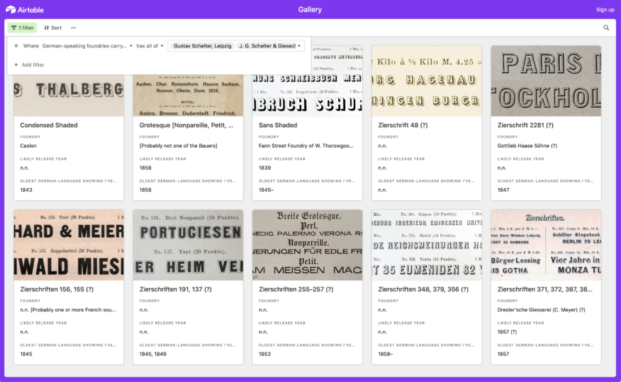
The database also contains the sans serifs sold by another Leipzig foundry: the one established by J. G. Schelter’s nephew Gustav Schelter. However, Gustav Schelter did not create any of the sans serifs that his foundry sold. Therefore, if you enter “Schelter” in the Foundry filter field, you will only see original typefaces from Schelter & Giesecke. If you want to see all of the sans serifs sold by Gustav Schelter and Schelter & Giesecke in common, you must create a German-speaking foundries carrying design filter in which both foundries’ radio buttons are activated and the has all of option has been selected from the the drop-down menu to the foundries’ names left.
Bugs
If you find a bug in the data, please let me know! Since my research focused on the distribution of sans serif designs within the German-speaking typefoundry network, I very often cannot yet pinpoint the exact origins of designs that originated outside that network. There are surely designs in my database that originated at an American, British or French foundry I have not mentioned (look, for instance, at all those question marks and “n.n” listings in my entries). Please drop me a line of you have a lead on a source.
Finally, there are typefoundries in the network I was not able to consult any specimens at all from. This is especially the case with Viennese firms. I hope to expand this database of sans serif designs further in the future to fill those and any other gaps.