Between April 2020 and June 2022, I participated in a type specimen digitization project. Several public institutions in Berlin joined forces to photograph each page of every type specimen in their collections produced by Berlin-based type-making companies between the 1790s and 1951. Together with Christian Mathieu, I prepared an English-language summary of the project for Fontstand News. On June 10th, I held the introductory presentation at a small conference about the project at the Deutsches Technikmuseum. This article translates what I said there. I also expand on a few points in greater detail.
Introduction
As part of a 2021 project funded by digiS, Berlin’s typographic heritage moved online. In addition to prints of the typefaces at the Erik Spiekermann Foundation, type specimens from the Deutsches Technikmuseum, the Staatsbibliothek zu Berlin and the Kunstbibliothek der Staatlichen Museen zu Berlin were digitized. Due to various funding and copyright restrictions, we had to limit ourselves to the type specimens in those collections printed before 1951 and produced by companies based in Berlin. However, among the hundreds of type specimens digitized, you will find a few that are exceptions to the guidelines listed above.
The Deutsches Technikmuseum preserves the material legacy of the H. Berthold AG, a brass-rule factory and typefoundry based in Berlin between 1858 and 1993. It cast and sold fonts of metal type from 1893 until 1978. The museum’s Berthold collections cover more areas than I can describe here. They have typecasting equipment, including matrices, photo-typesetting machines, the drawings for photo-typefaces, the company’s post-WWII archive, and its typographic library. Not all of these collections came to the museum while the company was in business or directly after its bankruptcy. Most of the Deutsches Technikmuseum’s type specimens came as parts of former Berthold employees’ estates. For instance, the museum acquired Günter Gerhard Lange’s personal library and working papers in 2011. Lange began working for Berthold in 1950 and eventually became its artistic director. When Berthold closed, it gave the type specimen collection – which had probably been kept at the Schriftenateilier in Taufkirchen, near Munich – to its last artistic director, Bernd Möllenstädt. The museum purchased most of them after Möllenstädt’s death in 2013.
The digiS project could only digitize a fraction of the Deutsches Technikmuseum’s type specimens. That surely applies to the Kunstbibliothek and Staatsbibliothek as well. To give you a better idea of the numbers, the “Sammlung Möllenstädt” contains about 700 specimens. Around half of them are more than 70 years old, but only 173 fulfilled the project’s other criteria and could be digitized. I was also able to examine the books from Günter Gerhard Lange’s personal library, which are now kept in the museum’s historical archive. While his library was quite large, only a small percentage of its items were type specimens. 16 of those could be digitized in the digiS project. So altogether, the Deutsches Technikmuseum digitized 189 total specimens. These were all uploaded to museum-digital.
My research primarily focuses on the late nineteenth and early twentieth centuries. I spend a great deal of time estimating the publication dates for certain typefaces. Below, three examples illustrate how I use type specimens as historical sources.
Midolline specimens from Eduard Haenel and Wilhelm Gronau
I rely on type specimens to try to reconstruct the business relationships that must have existed between typefoundries within Germany and internationally. I began applying this approach during my doctoral studies after realizing that a specific hybrid typeface named Midolline appeared in dozens of European and North American type specimens printed during the nineteenth century. It was based on the work of a French calligrapher named Jean Midolle.
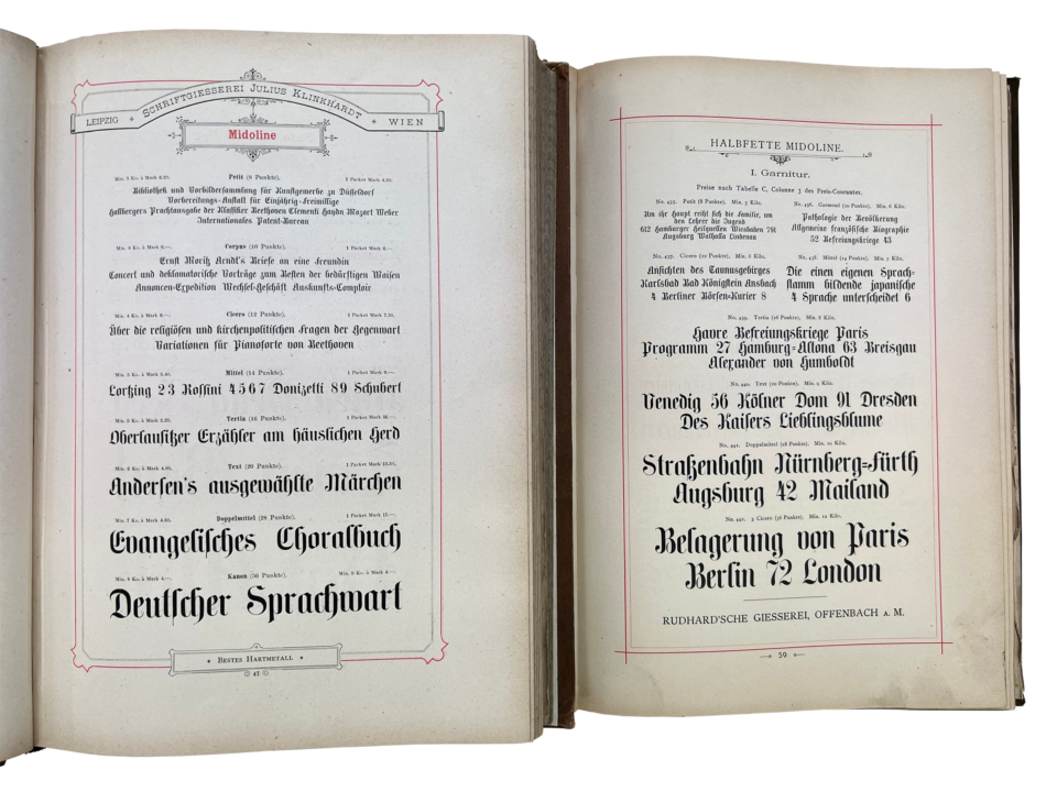
Two instances of the same type design in late nineteenth century type specimen catalogs. The example on the left is from the Gesamt-Probe der Schriftgiesserei Julius Klinkhardt in Leipzig und Wien, Oktav-Ausgabe (1883). The one on the right is the Muster-Sammlung der Rudhard’schen Giesserei; Schriftgiesserei, Stereotypie und Galvanoplastik, Fachtischlerei und Utensilien-Handlung (ca. 1893). Both from the author’s collection. As part of the 2021 Berlin type-specimen digitization project, the Klinkhardt catalog was digitized. I have hopes that the Klingspor Type Archive will someday digitize the Rudhard catalog on the right.
Occasionally, type specimens alone are enough to determine where certain typefaces first appeared. Midolline, for instance, was not created in France. It was first published around 1850 by Eduard Haenel’s Berlin-based typefoundry. The foundry produced three specimen sheets to promote the typeface’s eight sizes. Text in a footer on the first states that all Midolline sizes were cut in steel, and matrices were available for each. That footer text was a clue to other foundries, informing them that the typeface was from Haenel’s firm and that matrices could be obtained there.
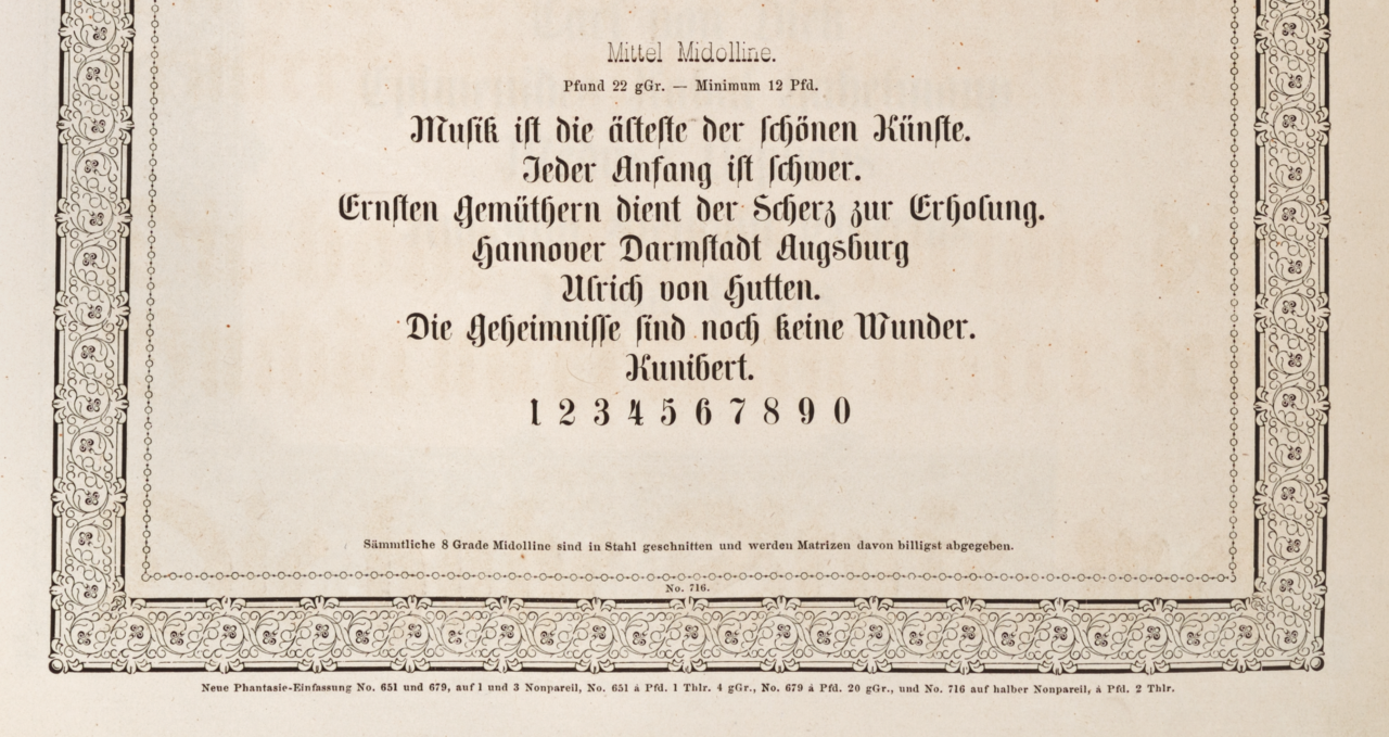
Bottom half of one of three Midolline type specimen sheets printed by Eduard Haenel’s typefoundry. Later bound into Wilhelm Gronau’s Buchdruckerei und Schriftgiesserei Berlin, Lützowerwegstrasse (no date), sheet 275. Kept at the Kunstbibliothek, Staatliche Museen zu Berlin – Preußischer Kulturbesitz. Shelf number H 1209 mtl-2.
Eduard Haenel died in 1856. The business was sold to Karl David in 1852 or 1862, depending on the source. A Darmstadt bank acquired it at the beginning of 1864. Wilhelm Gronau then bought the firm and renamed the printing office and typefoundry after himself. Later in 1864, Alexander Jürst became a part-owner. Jürst, who died in 1914, was an owner of the foundry for fifty years.
In 1906, Jürst donated a volume with all specimen sheets the Haenel and Gronau foundries had produced “up to that point” to the library of Berlin’s Kunstgewerbemuseum. “Up to that point” did not mean through to 1905. However, the volume likely does include all specimen sheets the business printed before 1896 – the year it moved from Lützowerwegstraße to Belziger Straße 61 (also in Schöneberg).
The Kunstgewerbemuseum library’s incoming registry for 1906 has been digitized, and Jürst’s specimen is mentioned on 19 April. Many type specimens in that library are donations from industry, and Berlin’s Kunstgewerbeschule was one of the first art-education schools in Germany that taught lettering. Today, the Berlin Kunstgewerbemuseum library’s items comprise part of the Kunstbibliothek at the Staatliche Museen zu Berlin. The building is located on Berlin’s Kulturforum plaza, just a few blocks up Potsdamer Straße from the location Eduard Haenel’s printing house had when Midolline was published.
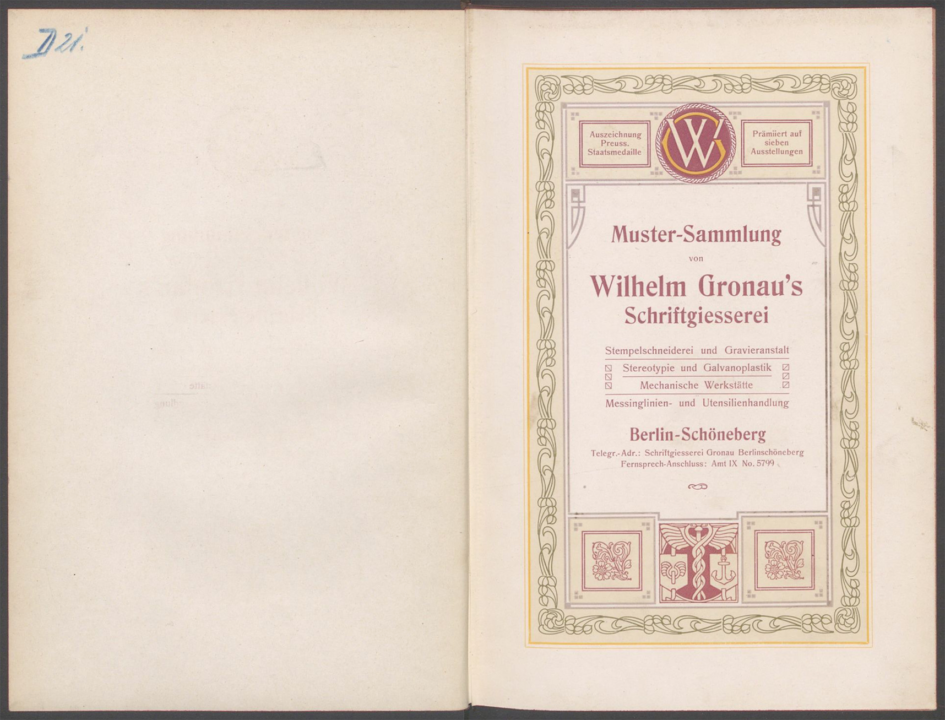
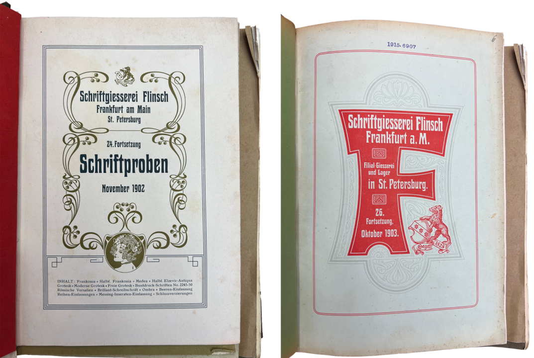
Opening spread from Muster-Sammlung von Wilhelm Gronau’s Schriftgiesserei (1891). SDTB/Hist. Archiv III.2-24105.
For some skeptics, the Midolline specimen sheet’s footer may not be enough proof for a definitive attribution of the typeface to Eduard Haenel’s foundry. However, the foundry produced additional specimens that also provided information about the origins of its typefaces. Above, I’ve reproduced the title page from Wilhelm Gronau’s 1891 catalog. Berlin’s Kunstbibliothek and Staatsbibliothek each have it, as does the Deutsches Technikmuseum. All type sizes in the catalog that have an asterisk after them are original foundry products, including Midolline.
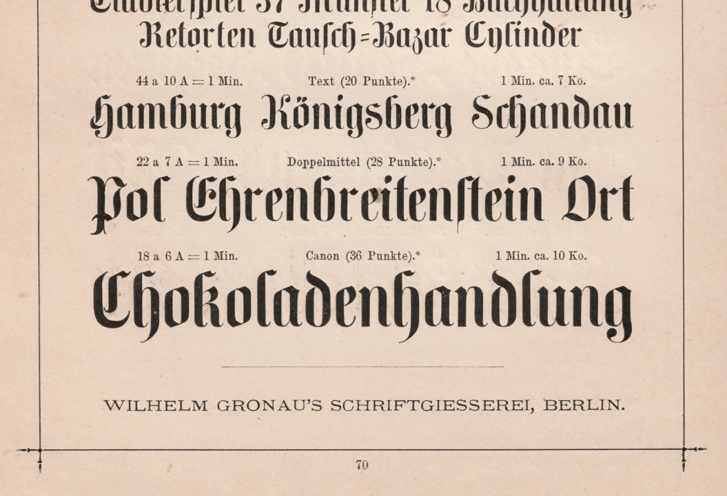
Midolline from Muster-Sammlung von Wilhelm Gronau’s Schriftgiesserei (1891), p. 70. SDTB/Hist. Archiv III.2-24105.
H Berthold AG’s Royal- und Accidenz-Grotesk specimen brochure
My second example is a small brochure at the Staatsbibliothek zu Berlin. The cornerstone of that library’s type specimen collection came from a bibliophile named Flodoard von Biedermann. According to a commemorative pamphlet produced by H. Berthold AG’s Hausdruckerei after his death, Biedermann brought together all typeface specimens published by German typefoundries between 1900 and 1914 (!) and donated them to the Prussian State Library.
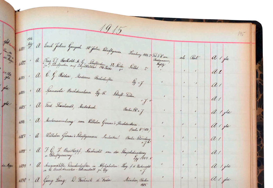
Above, you can see the top part of a page from a 1915 incoming registry book kept by the Prussian State Library. It shows the entries for some of the type-specimen collection the library acquired from Flodoard von Biedermann. The second entry on the above page is for a volume of 32 type specimen brochures from Berthold and 176 type specimens printed on individual sheets. These have the entry-number 6882. Image courtesy of C. Mathieu.
The Prussian State Library bound many of Biedermann’s type specimen brochures together in larger volumes. In a happy accident, the rarest of the 32 Berthold specimens represented in entry 6882 is on top of the volume’s contents. That specimen was the first brochure printed for Berthold’s Royal-Grotesk and Accidenz-Grotesk typefaces. It is probably the first Royal-Grotesk specimen of any kind that was published. Before this, Berthold had already included Accidenz-Grotesk in a few catalogs and advertisements. Photograph by the author.
As you can see in the digitized copy of H. Berthold AG and Bauer & Co.’s Royal- und Accidenz-Grotesk specimen, the library’s entry number 1915.6882 is stamped onto the catalog’s cover. Currently, the Staatsbibliothek’s catalog lists 1915 as this brochure’s year of publication, probably because the entry-number stamp was misinterpreted. We can definitively place the brochure’s publication date in 1904. During that year, the type-specimen review section of an Archiv für Buchgewerbe issue mentioned the brochure. And 19 years later, Berthold’s Hausdruckerei produced a bibliography for the German typefounding industry that included a type specimen section. The information Biedermann collected when assembling his type specimen collection must have flowed into that book, because his son Lothar himself edited Die deutsche Schriftgießerei: Eine gewerbliche Bibliographie. In that bibliography, the year 1904 is also given for the Royal- und Accidenz-Grotesk brochure.
The bibliography mentioned above is an excellent source. No subsequent attempt to list every German foundry’s specimens was ever made. However, readers familiar with bibliographies assembled for other countries’ typefoundries will know that those present much more detail. A few years after publishing Die deutsche Schriftgießerei: Eine gewerbliche Bibliographie, Berthold’s director Oscar Jolles called for the creation of detailed bibliographies for type specimens from Germany and abroad kept in German collections. It has been almost 100 years since Jolles made that proposal, without the bibliography he called for being realized.
Archiv für Buchgewerbe ran a notice about the Royal-Grotesk typeface in its January 1903 issue. That is a good indicator that Berthold began selling the typeface at the end of 1902, probably more than a year before it printed the Royal- und Accidenz-Grotesk specimen brochure. Type specimens and trade-media publications are two primary sources I use when determining the date when a typeface was published. Design patents are an additional tool on which I greatly rely. Although most of Germany’s design patent registration documents from the metal-type era seem not to have survived, announcements of design patent registrations were printed in publications like the Journal für Buchdruckerkunst and, especially, in the Deutscher Reichsanzeiger. The Deutscher Reichsanzeiger newspaper’s issue have been digitized by the University Library in Mannheim. The text of those issues is also digitally available and has been searchable for a few years.
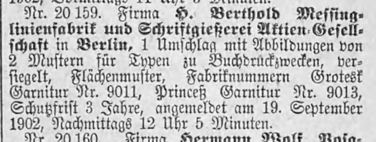
Close-up of the Berlin Muster-Register filing [1902] Nr. 20,159. The notice was printed in the Deutscher Reichsanzeiger issue on Saturday, 4 October 1902. The “Grotesk Garnitur Nr. 9011” mentioned was the still-unreleased Royal-Grotesk typeface from H. Berthold AG.
On September 19, 1902, Berthold registered an unnamed sans serif typeface with internal Garnitur-Nummer 9011. Nine months later, the Cyrillic characters were also filed with the Berlin Muster-Register – before the First World War, a good percentage of Berthold typefaces supported the Cyrillic script. By the time Berthold registered its Cyrillic characters for this design, the Latin-script characters were already on the market under the name Royal-Grotesk. (If you are interested in the earlier Accidenz-Grotesk design patent, see this post from 2019).
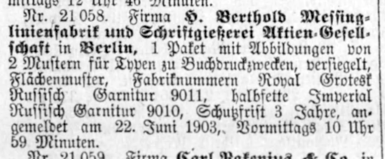
Close-up of the Berlin Muster-Register filing [1903] Nr. 21,058. The notice was printed in the Deutscher Reichsanzeiger issue for Monday, 6 July 1903. It is a report of Berthold’s design patent registrations for the Cyrillic-script extensions to its Royal-Grotesk and Halbfette Imperial typefaces.
On my way to the June 10th type specimen conference at the Deutsches Technikmuseum, an art historian sent me a message about a handwritten notebook from Berthold that might have some information about the company’s design-patent registrations. The museum’s Historical Archive staff brought the notebook into the reading room. It verifies that Berthold indeed used the Garnitur-Nummer 9011 for Royal-Grotesk. According to the notebook, Berthold also registered the Royal-Grotesk design in Vienna on 26 June 1903 (filing number 73436) and Budapest the next day (filing number 17540). It also filed the design in St. Petersburg on 3 July 1903 (filing number 846). That latter submission may have been limited to Royal-Grotesk’s Cyrillic characters.
The notebook also verifies that the original Accidenz-Grotesk weight was a creation of the Bauer & Co. foundry. It did not come from Berthold in Berlin or any other typefoundry, such as Böttger, Poppelbaum, or Theinhardt, etc. I’ve made another another post about that notebook. The object itself can be viewed at the Historical Archive in the Deutsches Technikmuseum. It has the handwritten title Berthold-Schriften and the shelf number SDTB/Hist. Archiv I.4.327 0038 NL Möllenstädt.
Riegerl, Weißenborn & Co.’s Moderne halbfette Etienne typeface and its appearance in various typefoundry specimens
For my final example, I would like to discuss the origin of a typeface that can be seen on the covers of two Theinhardt catalogs. By 1903 at the latest, the Theinhardt typefoundry was selling this typeface under the name Viktoria. Since it can be seen on the covers of Theinhardt catalogs, one could come to the conclusion that it was made in the company’s own punchcutting workshop.
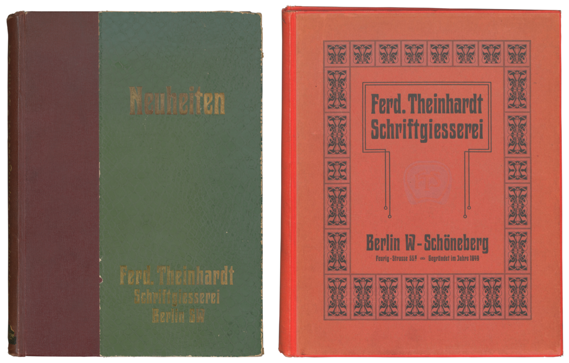
These specimens are not to scale. Ferd. Theinhardt had the Neuheiten catalog on the left printed before its move to Schöneberg. Today, it is part of the Kunstbibliothek’s collection. Note that, even though it used the “Viktoria” typeface’s design for this cover, that typeface itself does not appear in the catalog. The Deutsches Technikmuseum has the one on the right. It includes specimen sheets printed before and after H. Berthold AG acquired the Theinhardt foundry in 1908.
Ferd. Theinhardt specimen sheets for the Viktoria typeface are included in the red catalog that I reproduced on the right-hand side of the image above. Those state that the design was “legally protected” [Gesetzlich geschützt]. On the other hand, the sheets do not specify that it was an original product [Originalerzeugnis] of the Ferd. Theinhardt foundry. Note also that the footers on the Viktoria specimen sheets read “Ferd. Theinhardt, Schriftgiesserei, Berlin” – not “Ferd. Theinhardt Schriftgießerei GmbH., Berlin.” The specifics of the company name indicate that the specimen sheets were printed before H. Berthold AG took over the Theinhardt company in 1908, as it was Berthold who reorganized the traditional typefoundry into a limited liability company. Specimen sheets printed after the Berthold acquisition bear a footer with that new organizational indicator.
Close-up of a double-wide specimen sheet produced by the Ferd. Theinhardt typefoundry for its Viktoria typeface. Theinhardt must have procured matrices of the design from the Riegerl, Weißenborn & Co. punchcuttery in Leipzig. On the other hand, the ornaments shown on the specimen were cut inside the Theinhardt foundry. SDTB/Hist. Archiv III.2-24541.
A larger-format sheet from a later Theinhardt catalog mentions that a matching border-printing elements font was an original product from the foundry. And Universum – an other typeface mentioned on the sheet, but not shown – is also described there as a Theinhardt original.
Between about 1902 and 1904 at least three other typefoundries displayed a design resembling Viktoria. Like the Theinhardt foundry, two others stated on their specimens that the design was legally protected by law. For instance, Nebiolo did this, when it showed its instance – named Urania – in Archivio Tipografico, its house magazine.
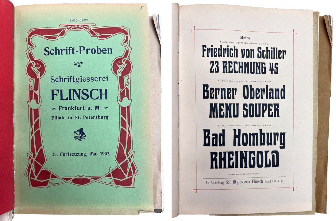
Title page and second Medea page from Schrift-Proben der Schriftgiesserei Flinsch Frankfurt a. M., Filiale in St. Petersburg, 25. Fortsetzung, Mai 1903. Kept at the Staatsbibliothek zu Berlin – Preußischer Kulturbesitz, shelf number RLS Fp 6437-2. Photographed by the author.
The Staatsbibliothek zu Berlin has a Flinsch typefoundry specimen dated 1903 in its collection acquired from Biedermann in 1915. It includes two pages showing Flinsch’s Medea typeface, which is identical to the design Theinhardt sold as Viktoria. The Medea sheets state that the typeface had been filed with the Muster-Register. To date, I have not been able to find a typeface named Medea, sold by Flinsch, mentioned in Muster-Register filing notices printed in the Deutscher Reichsanzeiger newspaper.
Just as Wilhelm Gronau’s typefoundry did in its 1891 catalog, many Flinsch specimens included large asterisks on pages displaying designs that originated in-house. Those Medea specimen pages from 1903 have no asterisk. Interestingly, both Flinsch and the Theinhardt typefoundry used Medea/Viktoria on the designs for covers or title pages on samples printed around this time. Poppelbaum in Vienna also sold an instance of the design, as Phönix, which the Czech printing journal Typografia reported on in 1904.
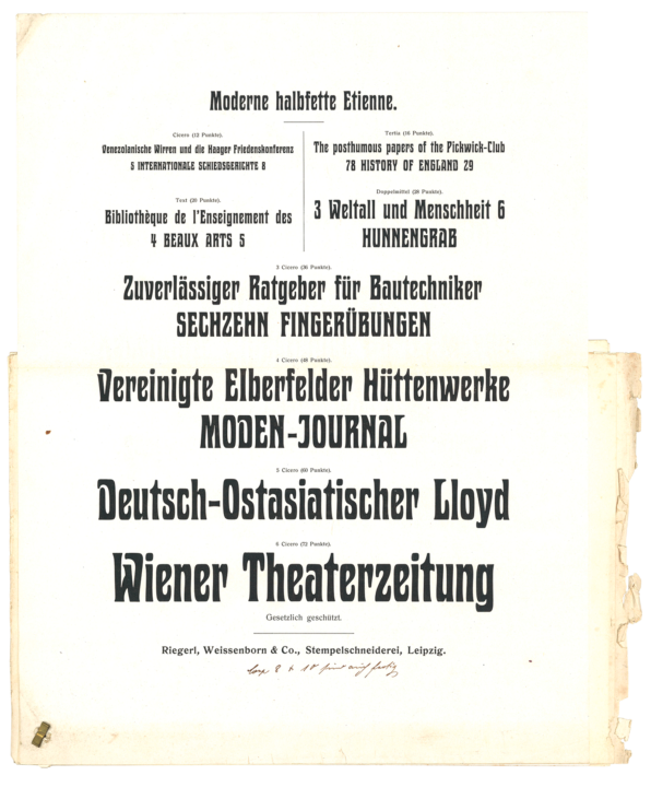
Specimen sheet of the Riegerl, Weissenborn & Co. Leipzig punchcuttery’s Moderne halbfette Etienne design. From a collection of Riegerel, Weißenborn & Co. specimen sheets kept by the Lettergieterij ‘Amstedam’, now at the Allard Pierson Museum, University of Amsterdam, shelf number UBA 371/392. Image courtesy of Mathieu Lommen.
The typeface was most likely cut by the Leipzig punchcuttery Riegel, Weißenborn & Co. Achilles Tzallas noticed the above sheet at the Amsterdam University Library. Its Moderne schmale Etienne was probably one of several designs Riegerl, Wießenborn & Co. hoped to sell to Tetterode (the Lettergieterij ‘Amsterdam’). The company library of that typefoundry has been part of the university library’s holdings since the 1970s. Riegerl, Weißenborn & Co.’s specimen sheet also states that the typeface is legally protected, without any additional ownership notice. Yet, underneath that, someone has added a handwritten note mentioning that the 8p and 10p sizes of the typeface had also been finished.
Two more title pages from the RLS Fp 6437-2 volume kept at the Staatsbibliothek zu Berlin – Preußischer Kulturbesitz. Each is designed with Flinsch’s Medea typeface, which the foundry must have acquired from Riegerl, Weißenborn & Co. in Leipzig. Photographed by the author.
The very first mention of this design anywhere that Tzallas or I found is from November 1902. Flinsch used it on the type specimen title page shown on the above left. Riegerl, Weißenborn & Co. filed a still-untitled typeface with the Muster-Register in Leipzig on 6 October 1902, which might have been the Moderne schmale Etienne. The registration notice in the Deutscher Reichsanzeiger describes a “schmale halbfette Auszeichungsschrift” [condensed bold typeface for emphasis].
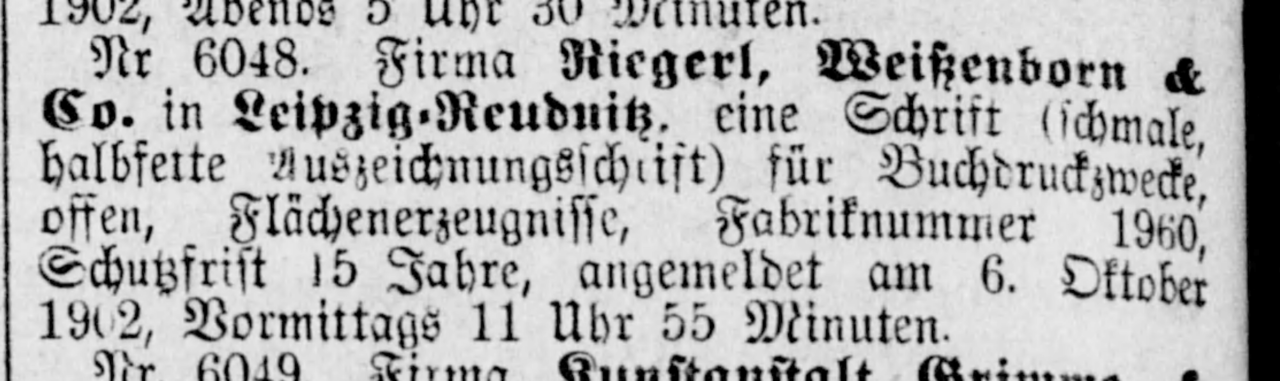
Close-up of the Leipzig Muster-Register filing [1902] Nr. 6048. The notice was printed in the Deutscher Reichsanzeiger issue for Friday, 14 November 1902.
In the Deutsches Technikmuseum’s Printing and Paper Collections, there is one size of this type design as a wood type font. The font may have been manufactured at the Theinhardt factory. The reverse of Theinhardt’s specimen sheet for Viktoria mentions that large-sized fonts of the design were available in wood. The sizes mentioned were 9 Cicero, 10 Cicero, 12 Cicero, 14 Cicero, and 16 Cicero.
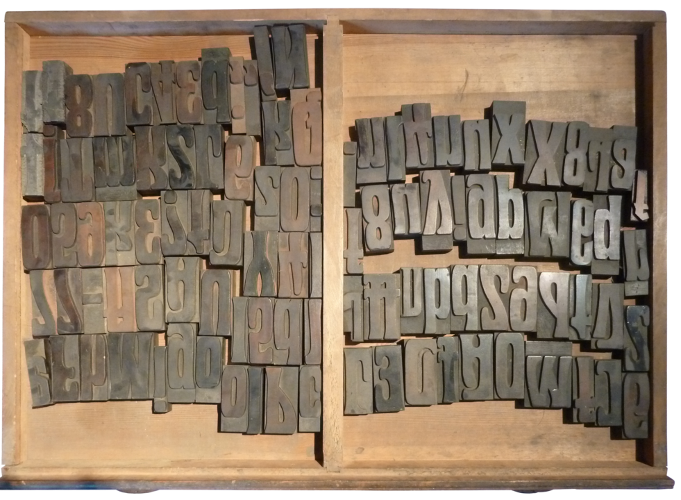
Unnamed wood type font at the Deutsches Technikmuseum, in item number 1-1984-0140, drawer 20. I have not measured the letters for their type size. It may have been manufactured by the Ferd. Theinhardt foundry in Schöneberg at some point between 1902 and 1910. Photo: SDTB/Wallbach.
Alternatively, Roman Scherer in Lucerne or Sachs & Co. in Mannheim may have manufactured the Technikmuseum’s wood-type font. Scherer carried the design as series 53290 and Sachs & Co. sold it as Hadrian. A Sachs & Co. type specimen sheet in Biedermann’s collection at the Staatsbibliothek shows Hadrian in 6 Cicero, 10 Cicero, 12 Cicero, and 16 Cicero sizes.
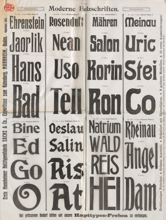
Specimen of wood type fonts made and sold by the Erste Mannheimer Holztypenfabrik Sach & Co. Bound into a collection of loose sheets from various type-making companies at the Staatsbibliothek zu Berlin – Preußischer Kulturbesitz, shelf number 4″ An 1204/10. Sachs & Co. sold a wood-type instance of Riegerl, Weißenborn & Co.’s Moderne halbfette Etienne design under the name “Hadrian.” You can see Hadrian in the top half of the third row from the left.
At some point shortly after Berthold acquired the Theinhardt foundry, it stopped selling Viktoria. After 1910, the Theinhart foundry no longer had an independent location. Up until the 1930s, a Theinhardt department at Berthold provided typefaces for former Theinhardt customers. In another Theinhardt catalog from the Möllenstädt collection, employees indicated which typefaces were still in stock and which could still be obtained from the stocks of other Berthold companies. A note written onto its Viktoria sheet suggest that Berthold’s Herold was to be recommended to customers instead.
Conclusion
This gives you an insight into how I use type specimens as sources. As a kind of source, type specimens are of limited use if you only have a few to choose from, or if you can only rely on the specimens in one collection. They are also not the only kind of historical document from the typefounding industry I’d like to see digitized.
Mathieu Lommen, who spoke after I did at the conference, has also posted an article-version of his presentation on the Allard Pierson website (in Dutch).