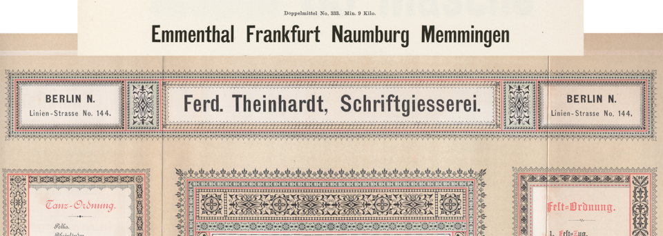
Above, a digital collage showing two castings of the same design. The very top reproduces Benjamin Krebs Nachfolger’s product number 333, the 28pt size of the foundry’s Moderne Steinschriften typeface. Krebs first advertised its Moderne Steinschriften in 1865. That was one of the nine or more original sans serifs the Krebs foundry produced before 1900. [Click here to see the collage in a larger size.]
The letters in each line of the collage are the same. That is the premise you will need to entertain to understand the information I present below. If you are not sure the letterforms in these lines match, I am happy to try to convince you.
Prologue
Most of the collage above is from the top-middle section of a fold-out broadsheet from Ferdinand Theinhardt’s foundry. It accompanied an 1885 issue of the Archiv für Buchdruckerkunst und verwandte Geschäftszweige. The text on the broadsheet reading “Ferd. Theinhardt, Schriftgiesserei” was printed from the foundry’s product number 613, the 28pt size of the typeface it sold under the simple name “Grotesque.” Ferd. Theinhardt’s Grotesque was cast from duplicate matrices of Krebs’s Moderne Steinschriften. More than 30 other foundries in Austria, Bohemia, Germany and Switzerland alone would sell sizes of Krebs’s design by the end of the nineteenth century.
You may notice that the text is looser in the second line. Justification – or what we might refer to as “spacing” today – was almost certainly the responsibility of each foundry casting a design. Matrices made for foundry-type casting machines do not contain “side-bearings” or spacing information. Krebs either cast its original version of this size with less space on the left and the right-hand sides of most letterforms than the Theinhardt foundry, or Theinhardt’s compositor added spacing material between many of the sorts manually. Some type designers I’ve spoken with have been shocked that spacing may not have played the same role in the nineteenth-century punchcutter’s process as it would in late-twentieth and early-twenty-first-century type design.
A foundry would have a reference font for each size for the typecasting workers to compare widths of new sorts against as they cast. I speculate that when one foundry bought duplicate matrices of a design, they only received matrices (either already justified or as unjustified “strikes”) but would have to assemble their own reference casting. When a foundry copied another firm’s products via electrotyping, it must have had sorts from the original font – the very nature of the process required this. In those cases, the copying-foundry would have already had a “reference font” it could use for spacing. That is my explanation, anyway.
Presenting my collected data
This post represents the formal conclusion of my three-year research project on the sans serif typefaces sold in German-speaking Europe during the nineteenth century. I am pleased to share my results. Although this post delivers much of the information I’ve accumulated, it is unlikely to be my last on the subject.
Designs vs. typefaces
In the text below, I use the term designs rather than typefaces. Some designs were exclusive to a single foundry. Others were sold by dozens at the same time. Although some foundries carried all the type sizes ever cut for a specific design, others might only sell a single font from the design’s range. What was presented in a foundry catalog as a typeface was occasionally a collection of multiple designs.
For instance, the Bauer’sche Gießerei probably began selling a typeface it called Breite Grotesque-Versalien in the early 1890s. That typeface combined fonts from at least four different sources. The type sizes from 5 through 20pt were either cut in-house at the foundry or were commissioned by the foundry. The larger sizes seem to combine at least three pre-existing designs. According to Nicolete Gray, at least one of those was already sold by the London-based Figgins foundry in 1847.
Original sans serifs (per foundry)
When I began this research, my goal was to determine how many sans serifs each foundry in German-speaking Europe sold during the nineteenth century. I also hoped to determine the percentage of each foundry’s Grotesks that were “original.” In a future post, I may present the most widely-distributed designs, sorted by the number of foundries carrying each one.
In this project, I limited myself to the foundries’ Latin-script designs only. While I did include large-sized fonts in my tallies, I excluded designs explicitly marked in type specimens as being made from wood or brass. Designs published after 1900 are not included, either. In an older post, you can find a list of archives, libraries, and museums whose collections I consulted. Feel free to compare the totals below with my database of nineteenth-century German sans serifs.
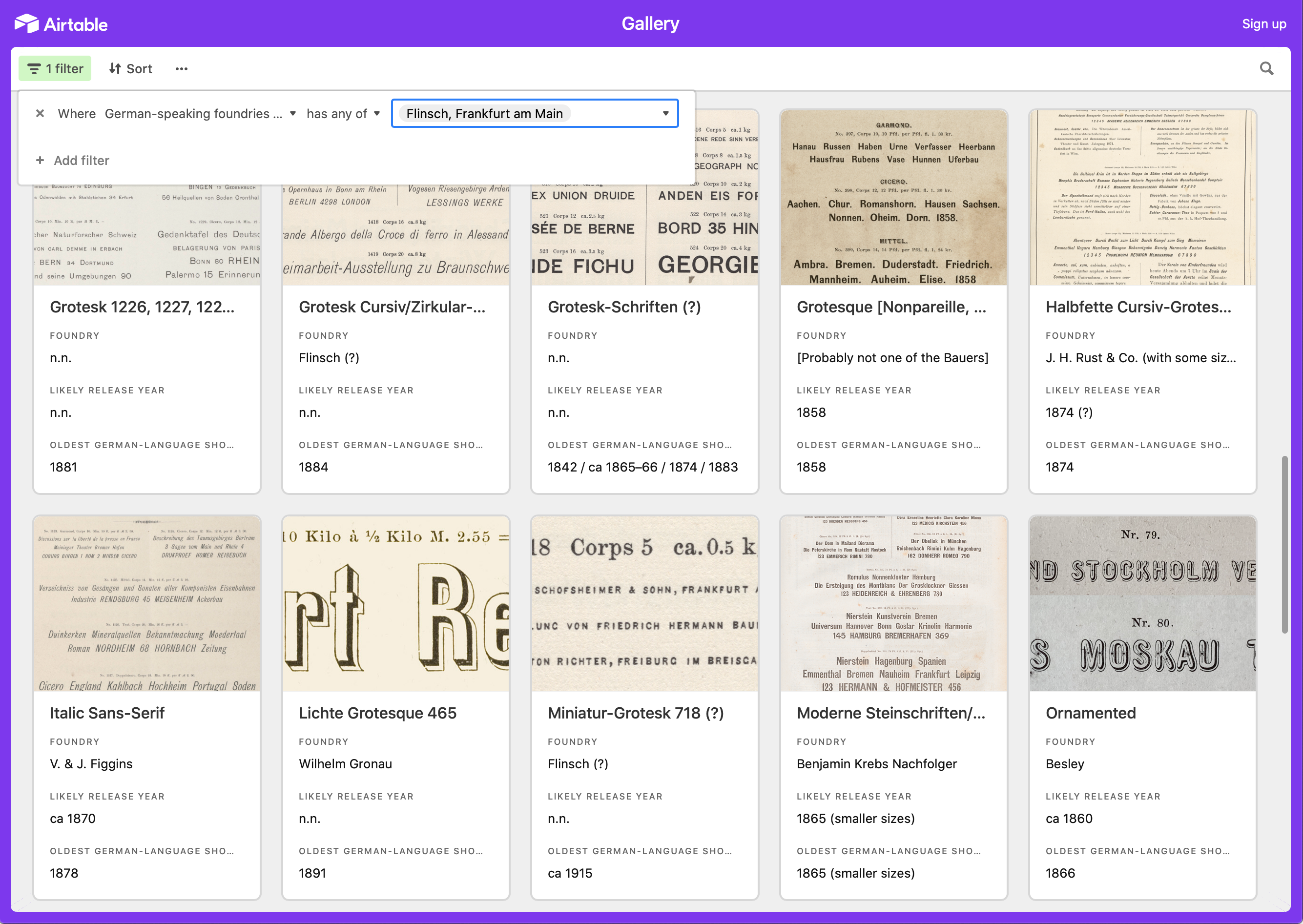
Filtered results for ten of the 46 sans serif designs the Frankfurt-based Flinsch typefoundry sold during the nineteenth century. Click to enlarge.
Based on the type specimens I examined between April 2018 and March 2021, I have compiled the following totals for foundries in Austria, Bohemia, Germany, and Switzerland:
- F. W. Aßmann, Berlin: 6%. From the 15 Grotesk designs I found in Aßmann foundry specimens, the foundry created one.
- Bauer & Co., Stuttgart and Düsseldorf (through 1897): 14% to 29% The foundry sold fourteen Grotesk designs. I can attribute three to Bauer & Co., and think that two others might have originated there, too.
- Bauer’sche Gießerei, Frankfurt am Main: 19% to 35%. I found 31 Grotesks the Bauer’sche Gießerei sold between 1859 and 1900. Eleven might be Bauer designs. I think that six designs are safe attributions. For five more, I am still on the fence.
- Emil Berger, Leipzig + Gustav Reinhold, Berlin + H. Berthold, Berlin: 16% to 23%. This entry summarizes one foundry that changed ownership a few times. It sold 31 Grotesk designs. Seven were probably created by the company, not counting the three Bauer & Co. typefaces mentioned above. H. Berthold AG acquired Bauer & Co. at the end of 1897. For this tally, I counted Accidenz-Grotesk as a Berthold design – although I suspect Bauer & Co. cut it. Of the seven Grotesk designs Berthold and its predecessors sold in the nineteenth century, there are two I can only cautiously attribute to Emil Berger’s foundry. The 16% figure represents the possibility that Berger’s foundry did not make them.
- Göttfried Böttger, Leipzig: 0%. In the Böttger specimens I examined, I saw six Grotesk designs. None were Böttger foundry creations.
- Karl Brendler & Söhne, Vienna: 0% to 13%. Of the 23 nineteenth-century Grotesk designs in the Brendler specimens I examined, I could not determine an origin for three designs. Perhaps they were created at this foundry.
- F. A. Brockhaus, Weimar/Leipzig: 0% to 9%. Of the 21 Grotesk designs in the Brockhaus specimens I consulted, two may have come from Brockhaus.
- Brüder Butter, Dresden: 0%. This foundry was only established in the early 1890s. By 1900, I believe that it sold ten Grotesk designs.
- Rudolf Ludwig (von) Decker, Berlin + Reichsdruckerei, Berlin: 27% to 45%. The Reichsdruckerei, or German imperial printing-house, was created after the Decker printing-house merged with the Prussian State printing-office. Both organizations had internal foundries. Five of the eleven Grotesk designs these foundries cast could have been produced internally. The way I interpret their catalogs’ metadata, however, the foundries only claimed three as in-house products.
- Dresler, Frankfurt am Main + Flinsch, Frankfurt am Main: 22% to 30%. Another business whose ownership changed over time. I count 46 Grotesk designs in its specimens, 14 of which Dresler/Flinsch created. For four, I am not entirely sure about the origins. Note that Flinsch catalogs claim several British designs as its products, for which I have no ready explanation. I have not included those designs in this Flinsch-creation figure. Of the Grotesks that almost certainly did not originate at Flinsch, five must be from the Caslon foundry in London.
- Gebr. Fickert, Berlin: 0%. A specimen produced by the Gebr. Fickert printing house for its foundry’s liquidation sale around 1864 showed 19 designs, none of which are likely to have been internally produced.
- Genzsch & Heyse, Hamburg and E. J. Genzsch, Munich: 35% to 39%. Of the 23 Grotesk designs Genzsch & Heyse sold, the foundry created at least eight of them. I have added one otherwise-not-yet-attributable design to the total, bringing the number of potential in-house designs to nine.
- Emil Gursch, Berlin: 48%. This foundry created ten of the 21 Grotesk designs it sold through the end of 1900.
- Eduard Haenel, Magdeburg/Berlin + Wilhelm Gronau, Berlin: 28% to 34%. Haenel moved his business from Magdeburg to Berlin in 1837. He sold it in 1852, and Wilhelm Gronau acquired it in 1864, changing its name. The business seems to me to have sold 74 sans serif designs between 1833 and 1900. The design count is very high here, as my tally takes designs of any size range into account. Many of the designs factoring into this were cast in just one size. The Haenel/Gronau foundry created 25 of those designs. Of those, there are four I am not entirely sure of; in the database, these are filed under Wasserzeichen-Schrift 440, Zierschrift 449, Zierschrift 463 and Zierschriften 370, 343, 375.
- Produktivgenossenschaft Berliner Buchdrucker und Schriftgießer, Berlin + Herrlinger & Schmidt, Berlin + A. Reimann, Berlin: 0% to 7%. This foundry was established in 1874. Herrlinger & Schmidt purchased it in 1880, renaming the business. The firm was renamed again after Alexis Reimann took sole ownership in 1894. I count 15 Grotesk designs in its catalogs, one of which the firm may have made itself.
- Heinrich Hoffmeister, Leipzig: 0%. This foundry was only established in 1898. In its catalogs, there are two Grotesk designs from the 19th century, both of which came from other sources.
- J. M. Huck & Comp. Offenbach am Main + Actiengesellschaft für Schriftgießerei und Maschinenbau, Offenbach am Main: 29% to 37%. The J. M. Huck & Comp. foundry became a publicly-traded company in 1888 and changed its name to reflect that. This Offenbach foundry sold at least 35 Grotesk designs in the nineteenth century, 13 of which it created. Of those 13, there are three designs I am not entirely certain of.
- J. John Söhne, Hamburg: 15%. This foundry sold 20 Grotesk designs during the nineteenth century and created three of them.
- C. Kloberg, Leipzig: 39%. The Leipzig-based C. Kloberg foundry sold 28 Grotesk designs. 11 of them were original sans serifs the firm created itself.
- Benjamin Krebs Nachfolger, Frankfurt am Main + K. u. K. Hofschriftgießerei Poppelbaum, Vienna: 31% to 41%. Hermann Poppelbaum entered part-ownership of Benjamin Krebs’s foundry in 1857 and assumed full control in 1870. Also in 1870, he established a new foundry in Vienna. Nineteenth-century Poppelbaum type specimen catalogs seem to present the Krebs foundry palette, at least when it comes to sans serifs. The Krebs operation sold 29 Grotesk designs that I have counted, perhaps creating 12 of them. There are three designs in that total where I am uncertain.
- Oskar Laessig, Vienna: 0%. I have no grounds to attribute any of the nine Grotesk designs Laessig’s foundry sold to his firm.
- Ludwig & Mayer, Frankfurt am Main: 36%. 13 of the 36 Grotesk designs Ludwig & Mayer sold originated at that foundry.
- A. Meyer & Schleicher, Vienna: 0% to 7%. Of the 30 Grotesk designs Meyer & Schleicher sold, two might have originated at that foundry.
- Roos & Junge, Offenbach am Main: 4% to 7%. Of the 27 Grotesk designs Roos & Junge sold, one was created for the foundry. Another design it sold is not one I can yet attribute to any other source.
- Joh. Peter Nees & Co., Offenbach am Main + Rudhard’sche Gießerei, Offenbach am Main: 0%. These are two nineteenth-century names for the foundry renamed Gebr. Klingspor in 1906. Klingspor was still selling many nineteenth-century Grotesk designs in the 1920s. In Nees & Co. and Rudhard specimens exclusively, I found 21 sans serif designs. I do not believe that any of them were created by the foundry.
- C. F. Rühl, Leipzig: 0%. By my count, the Rühl foundry sold 19 Grotesk designs produced before the end of 1900. I cannot attribute any of those designs to the firm.
- J. H. Rust & Co., Offenbach am Main and Vienna: 9% to 33%. This foundry sold 21 sans serif designs that I have counted. As many as seven of those may have been cut by or for Rust & Co., but I am only certain when it comes to two Grotesks.
- Gustav Schelter, Leipzig + Julius Klinkhardt, Leipzig: 5%. Gustav Schelter was the nephew of Johann Gottfried Schelter, co-founder of Schelter & Giesecke. Both men were punchcutters and Gustav Schelter inherited his uncle’s punches in 1841. Gustav Schelter acquired the ancient Ehrhardt foundry in 1846. He sold his foundry to the Julius Klinkhardt company in 1872. Taken together, I have tallied 36 Grotesk designs that Schelter und Klinkhardt sold during the 1800s. Two were created by the Klinkhardt foundry at the very end of the century. If you would discount them, the “originality” percentage would be zero.
- J. G. Schelter & Giesecke, Leipzig: 34% to 39%. Schelter & Giesecke sold 64 Grotesk designs during the nineteenth century that I have tallied. As many as 25 may be original sans serifs the foundry created itself. Of that number, there are three designs that I cannot attribute to Schelter & Giesecke with as much certainty as the others.
- Eduard Scholz, Vienna: 0%. Scholz’s foundry did not create any of the 11 nineteenth-century Grotesk designs it sold.
- Ferd. Theinhardt, Berlin. 8% to 17%. During this research project, I wrote more posts about Ferd. Theinhardt than any other foundry. Want to catch up on them? By 1900, Ferd. Theinhardt had sold as many as 12 different sans serif designs. One, published in January 1886, was a foundry creation. It may have added one size to a pre-existing design as well.
- Otto Weisert, Stuttgart: 6%. One of the 16 Grotesk designs the Weisert foundry sold was an original sans serif it created. That was a typeface it named Neue breite fette Groteske, which is similar to the Halbbreite Steinschriften probably introduced by the Benjamin Krebs Nachfolger foundry.
- Wilhelm Woellmer, Berlin: 58%. When it came to sans serif originality, was Woellmer’s the foundry practicing it most? Woellmer sold 34 nineteenth-century Grotesk designs. Of those, only 20 are definitively attributable to Woellmer’s foundry.
Above: Cropped scan of Blatt No. 275 from Wilhelm Woellmer’s Schriftgiesserei in Berlin showing the 28, 36, 48 and 60pt sizes of the Fette runde Grotesque typeface. Together with a sheet showing the typeface’s smaller sizes, this accompanied the December 1887 issue of Archiv für Buchdruckerkunst und verwandte Geschäftszweige (vol. 24, no. 12). The typeface was one of the foundry’s original sans serifs. A line of small type at the bottom of the image explains that this was an original creation and that matrices of the sizes were available for sale. I have not found this design in the nineteenth-century specimens of any other German-speaking foundry. Perhaps a foreign foundry placed an order.
For the following foundries, I examined too few specimens to be able to make helpful conclusions:
- Gebr. Arndt & Co., Berlin: In my database, this foundry is listed as selling two sans serif designs – Enge Grotesque from J. John Söhne and Moderne Steinschriften from Benjamin Krebs Nachfolger. However, I have only collected this data from a secondary source, not from Gebr. Arndt specimens themselves.
- F. W. Bauer, Frankfurt am Main: I only found a specimen of one size of one design of any typographic category. That font was a sans serif.
- Schriftgiesserei Bern: I found specimens for seven sans serif designs sold by the Schriftgiesserei Bern bound into a volume of Aktiengesellschaft für Schriftgießerei sheets. That Offenbach-based firm must have bought the Swiss foundry.
- Augustus Beyerhaus, Berlin: I only found two specimens from this foundry. One showed seven decorative types. I think Beyerhaus made them all. This specimen included an original sans serif, which might be the first sans serif whose punches were cut in German-speaking Europe. The other specimen that I found from this foundry was for Beyerhaus’s Chinese typeface.
- Breitkopf & Härtel, Leipzig: In the few specimens I examined, I encountered three Grotesk designs. Perhaps one was created by the firm.
- Brötz & Glock, Frankfurt am Main: Of the six Grotesk designs I saw, Brötz & Glock might have created one.
- Fr. B. Culemann & Sohn, Hannover: I consulted one type specimen catalog with five sans serif designs, the matrices for which likely all came from other foundries.
- W. Drugulin, Leipzig: I’ve found 14 Grotesk designs in Drugulin specimens but none were created by that foundry.
- Albert Falckenberg & Comp., Magdeburg: Of the five Grotesk designs I found on Falckenberg specimen sheets, I do not believe that any were cut by the foundry.
- J. G. Francke Nachfolger A. W. Kafemann, Danzig: Despite this foundry’s Zeitungs-Grotesque being one of the most-widely distributed sans serifs of the century, I was not able to find a Kafemann specimen showing any other Grotesk.
- Gebr. Gundelach & Ebersbach, Leipzig: This is the foundry Ludwig Wagner – of the Leipzig punchcuttery Wagner & Schmidt – purchased in 1902. In the Staatsbibliothek zu Berlin, I found a few specimen sheets from Gebr. Gundelach & Ebersbach bound into a larger volume containing the work of several foundries. Nevertheless, it is conceivable that they sold more than the three related designs included in my database.
- Haas’sche Giesserei, Basel: I have tabulated 91 Grotesk designs that Haas sold, only one of which is an original sans serif attributed to the foundry. However, I do not have a good understanding of the foundry’s product-line development between the late 1860s and the late 1890s. Also, my Haas data is a mess. I’m looking for a research buddy to help fix it!
- Gottlieb Haase Söhne/A. Haase, Prague: In the specimens from this foundry I was able to consult so far, I found 48 sans serif designs. At when it comes to sans serifs cut between the late 1850s ans 1870s, the foundry seems to have procured several designs from the Bauer’sche Gießerei in Frankfurt am Main and J. H. Rust & Co. in Vienna.
- Ch. G. Heuecke, Munich: To date, I have only found one specimen from this foundry, and it only included one Grotesk design, which itself must have originated in Britain.
- Schriftgiesserei van der Heyden, Offenbach am Main: In terms of sans serifs, I have only found a single Van der Heyden specimen. This was shown in a small advertisement printed in an 1886 issue of the Journal.
- Gebr. Natermann, Hannoversch Münden: So far, I have only found one 1863 specimen of poster types from this foundry, including one sans serif design. I am not sure whether this typeface is even allowed to “count” in my survey. The letters were probably produced via stereotyping, instead of through traditional typefounding.
- Nies’sche Schriftgießerei, Frankfurt am Main: So far, I have only found specimens of four Grotesk designs Nies sold, and all of those probably originated at Wilhelm Woellmer’s Berlin foundry.
- A. Numrich & Co., Leipzig: I was only able to examine two Numrich catalogs. Both were from the early twentieth century. These included eight nineteenth-century sans serif designs. It is not likely that Numrich created any of them. One seems to be an adaptation of Kafemann’s Zeitungs-Grotesque I cannot yet attribute to another source. Another looks like a custom set of larger sizes for Krebs’s Moderne Steinschriften.
- Rohm’sche Schriftgießerei, Frankfurt am Main: The specimens I found from this foundry were all sheets accompanying trade journals. Only one sheet included a Grotesk. That was an original sans serif design.
- C. G. Schoppe, Berlin: The only proper specimen of Schoppe’s I’ve so far found including sans serifs was produced for the foundry’s liquidation sale in 1868. Unlike a similar specimen produced by Gebr. Fickert during its foundry liquidation, I have a hunch that Schoppe’s liquidation specimen doesn’t include the foundry’s entire inventory. For instance, Schoppe’s iconic Central-Schrift is missing. The liquidation specimen includes ten sans serif designs, some of which might have been cut at Schoppe.
- C. Schreyer & Ignaz Fuchs, Prague: The only collection of specimens I viewed from this foundry contained about a dozen sans serif designs. That specimen is at Letterform Archive and was probably bound in the late 1860s.
- D. Stempel, Frankfurt am Main: The Hessisches Landesmuseum, Abteilung für Schriftguss, Satz und Druckverfahren, has a handwritten book from Stempel listing information for each of the foundry’s products. In a foundry at this time, the base product was not the “typeface” or even the “design” I mention above, but rather the “font.” A font was a design cast in one size. Often, many fonts would share a common design. A typeface could contain one or many designs. In some instances, one typeface = one font. In others, a typeface might have 13 fonts. David Stempel established his Frankfurt-based company in 1895. According to information provided to me from the museum, Stempel’s typefounding activity essentially began with his acquisition of the Offenbach-based Juxberg–Rust foundry in 1898. For the moment, I have no list of “nineteenth-century” Stempel designs. In my database, you will find 12 nineteenth-century Grotesk designs from other foundries that Stempel was still selling in 1925.
- Otto Tech, Berlin: My database includes three designs also sold by the Otto Tech foundry.
- Trowitzsch & Sohn, Berlin: Aside from specimen sheets bundled together with issues of the Journal für Buchdruckerkunst, Schriftgießerei und die verwandten Fächer, I have only found two nearly-identical Trowitzsch & Sohn catalogues kept at the Deutsches Technikmuseum in Berlin. Each was probably assembled in the 1880s or 1890s, before the printing-house stopped casting type. I am not certain that all of the ornamental sans serifs the foundry sold are included in these.
- Buchdruckerei und Schriftgießerei des Verlags-Comptoirs, Grimma: An 1853 issue of the Journal included a specimen from this foundry. That showed one serif whose design matches a design I’ve attributed to Augustus Beyerhaus in my database.
- C.E. Weber, Stuttgart: I was only able to examine a single Weber catalog, printed in 1907. That included eight nineteenth-century sans serif designs. Thanks to records about German design patent registrations, I know that one of those designs – a decorative Grotesk named Plastik – was created by (or for) the Weber foundry. Its sizes had been filed with the Stuttgart Muster-Register in 1890. The other seven Grotesk designs German and Austrian foundries.
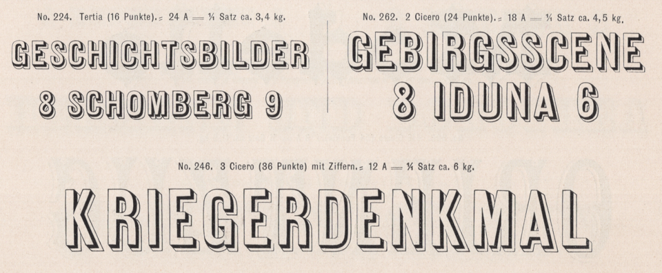
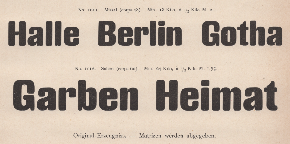
Schelter & Giesecke’s Antiqua-Zierschriften, numbers 224, 262 and 246. I do not know the source of this design – it may have come to Germany from abroad. Eduard Haenel’s foundry was the first to show fonts in this style in German-speaking Europe during the 1850s. About fifteenth other German foundries carried this design, although everyone was not necessarily selling these three sizes. Scan from Schelter & Giesecke’s 1899 catalog.
Conclusion
The percentages of original sans serifs each foundry sold do not provide much information on their own. Of the foundries listed above, each sold products it did not create itself. Yet, the ratio of internal to external designs sold could be very different for each foundry when it comes to other styles of type, ornaments, border-printing elements, and vignettes. My figures could be used as a starting point to investigate and compare more products from specific foundries. For instance, even though Böttger did not create any of the nineteenth-century sans serifs it sold, how do its other products’ origins compare? Schelter & Giesecke had the most original sans serifs in its nineteenth-century product palette. Perhaps that should be no surprise. Around 1900, Schelter & Giesecke may have been the largest typefoundry in Germany. In terms of original sans serif percentages, Wilhelm Woellmer’s foundry could read as the most-creative firm. It sold fewer Grotesks in total than Schelter & Giesecke, but a higher rate were in-house creations. However, the question we should ask is whether these data points apply to those firms and their products as a whole.
Many of the more than 400 designs I collected during my research originated outside of German-speaking Europe. So far, I have found examples from British, French, and United States foundries. Through the end of the nineteenth century, German foundries added new types from Britain and the U.S. into their product ranges. The mere appearance of foreign designs in German catalogs is not proof of international business relationships in-and-of-itself. Yet, the number of Caslon designs Flinsch added to its product palette could indicate a possible connection between those two foundries. In general, I find this a ripe topic for future researchers to investigate.
I was not able to locate specimen sheets and catalogs from every foundry operating in Austria, Bohemia, Germany and Switzerland during the nineteenth century. Nevertheless, I suspect that my results offer a nearly complete image of the breadth of Grotesks sold in that network during this timeframe. I find it unlikely that a large catalog from an untallied foundry carrying 20 unique sans serif designs is present in any existing collection. Nevertheless, I am certain that my data set will continue to expand with time, as I am able to view additional specimens kept in yet-unvisited collections.