Category: Theinhardt
-
Berlin foundries, part 3
As I have translated Friedrich Bauer’s accounts of the histories of Berlin-based typefoundries, I have been adding too much commentary. That is quite visible in my previous two entries. At this pace, who knows when I will have gotten through the entire book! To speed the project along somewhat, I have compiled my translations of…
Written by

-
How old is the specimen? And the typeface?
Between April 2020 and June 2022, I participated in a type specimen digitization project. Several public institutions in Berlin joined forces to photograph each page of every type specimen in their collections produced by Berlin-based type-making companies between the 1790s and 1951. Together with Christian Mathieu, I prepared an English-language summary of the project for…
Written by
-
Research results: Sans serif type in nineteenth-century Germany
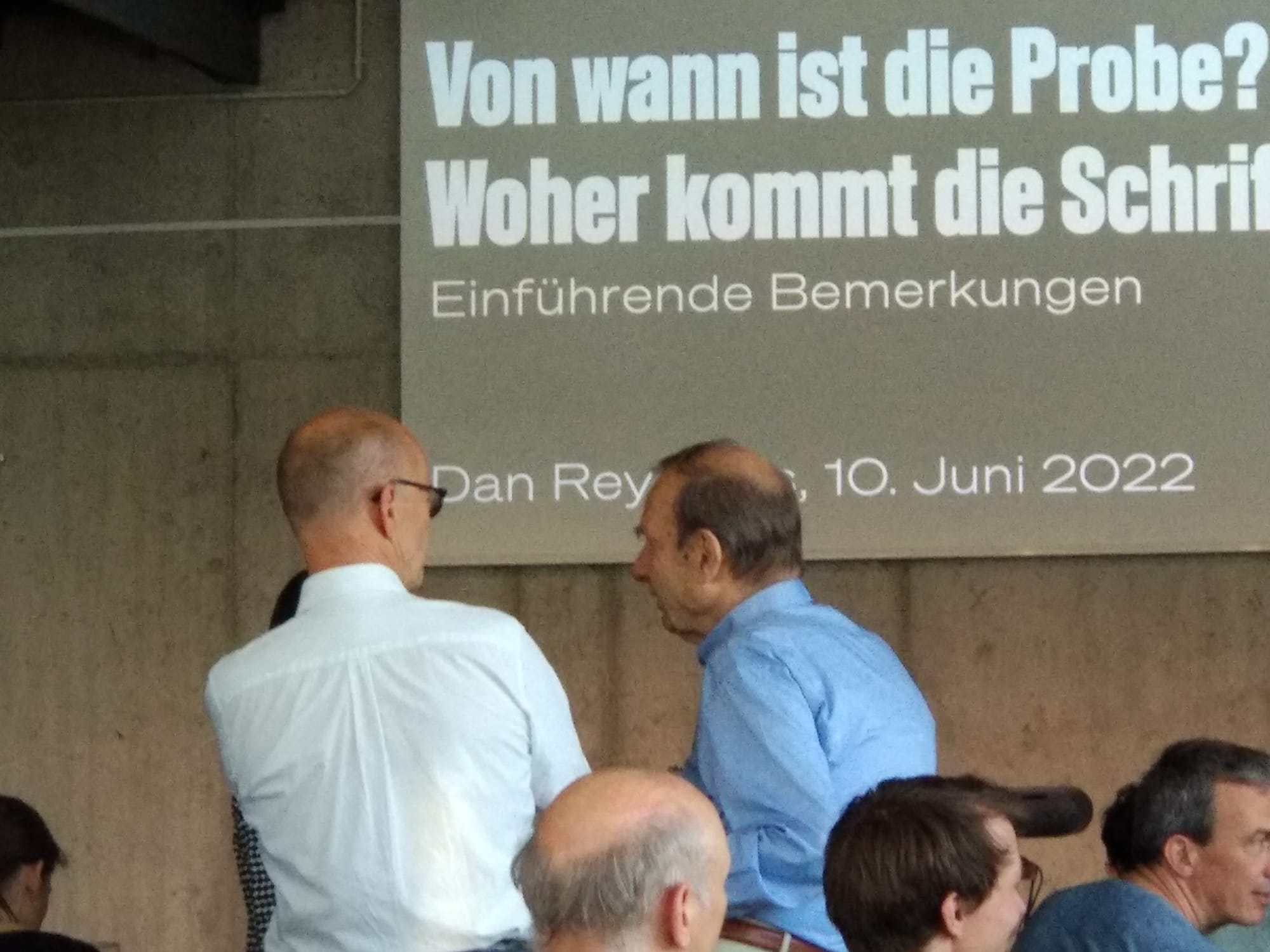
Berthold, Decker, Hamburg typefoundries, Leipzig typefoundries, Nineteenth-century sans serifs, Reichsdruckerei, Research, TheinhardtAbove, a digital collage showing two castings of the same design. The very top reproduces Benjamin Krebs Nachfolger’s product number 333, the 28pt size of the foundry’s Moderne Steinschriften typeface. Krebs first advertised its Moderne Steinschriften in 1865. That was one of the nine or more original sans serifs the Krebs foundry produced before 1900.…
Written by
-
Another word on Accidenz-Grotesk and Royal-Grotesk’s appearances in Theinhardt specimens
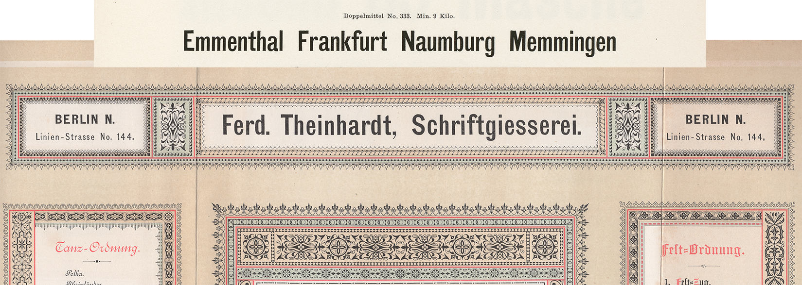
Above, I have reproduced a specimen of Akzidenz-Grotesk’s regular weight showing its 4pt size on a 6pt body. That is taken from a scan of page 58 from the undated H. Berthold AG Hauptprobe Nr. 470, probably printed at some point during the 1960s. I’ve highlighted the last four digits of its product number: 0760. This…
Written by
-
Decker and Reichsdruckerei punches, part 2
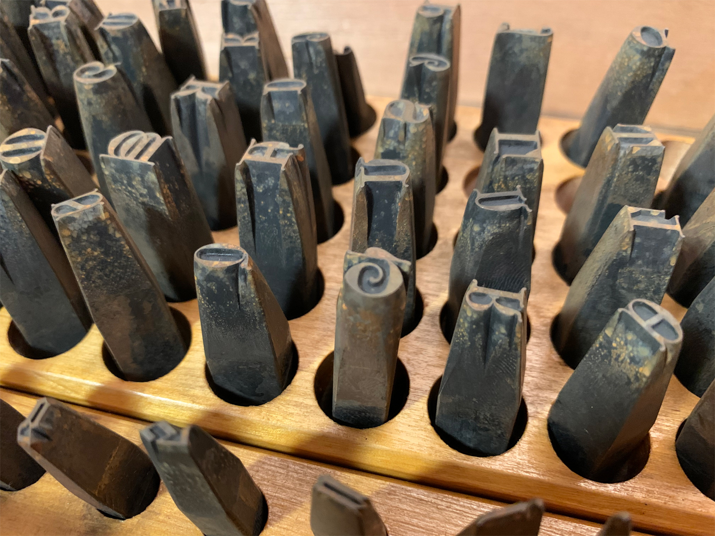
Above, I have reproduced my photograph showing part of Stiftung Deutsches Technikmuseum Berlin, inventory number 1/2018/0342, drawer 28. In it, you see the steel typographic punches for the 28-pt (and maybe a few 24-pt) sizes from one of the Reichsdruckerei typefaces. The design’s name is Diplom-Gotisch and the punches were probably cut in Berlin, ca 1893. This is…
Written by
-
Decker and Reichsdruckerei punches, part 1
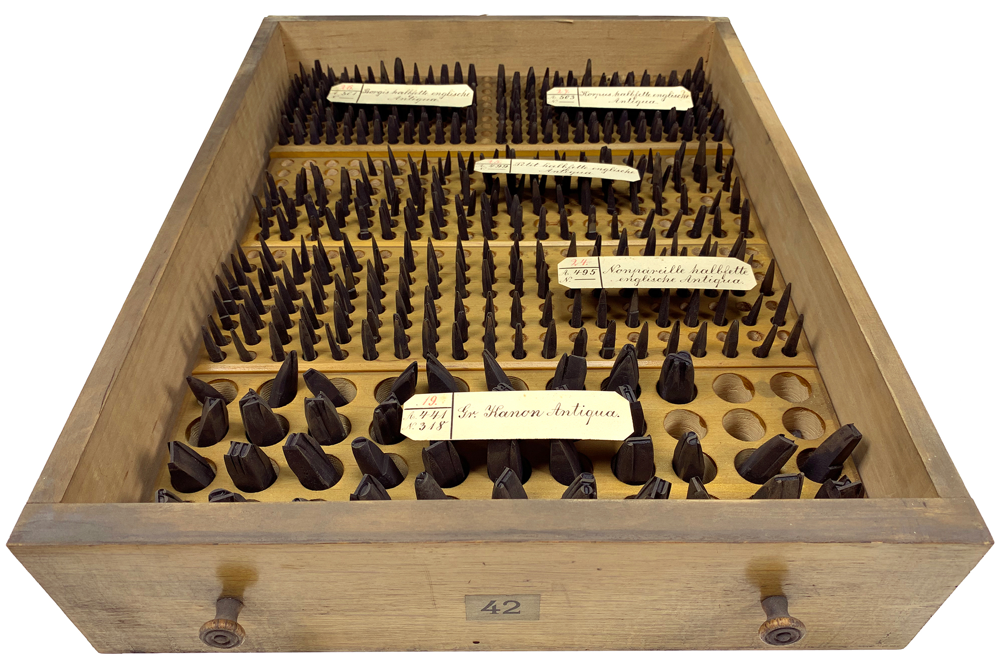
Above, I’ve reproduced my photograph of Stiftung Deutsches Technikmuseum Berlin, item number 1/2018/0443, drawer 42. This stores the hand-cut typographic steel punches for four fonts of a bold English-style roman typeface named halbfette englische Antiqua. Their approximate sizes are 6, 8, 9, and 10 Didot points. They were probably cut at Rudolf Decker’s Court Printing House at…
Written by
-
Footnotes C: Retracing the origins of Akzidenz-Grotesk
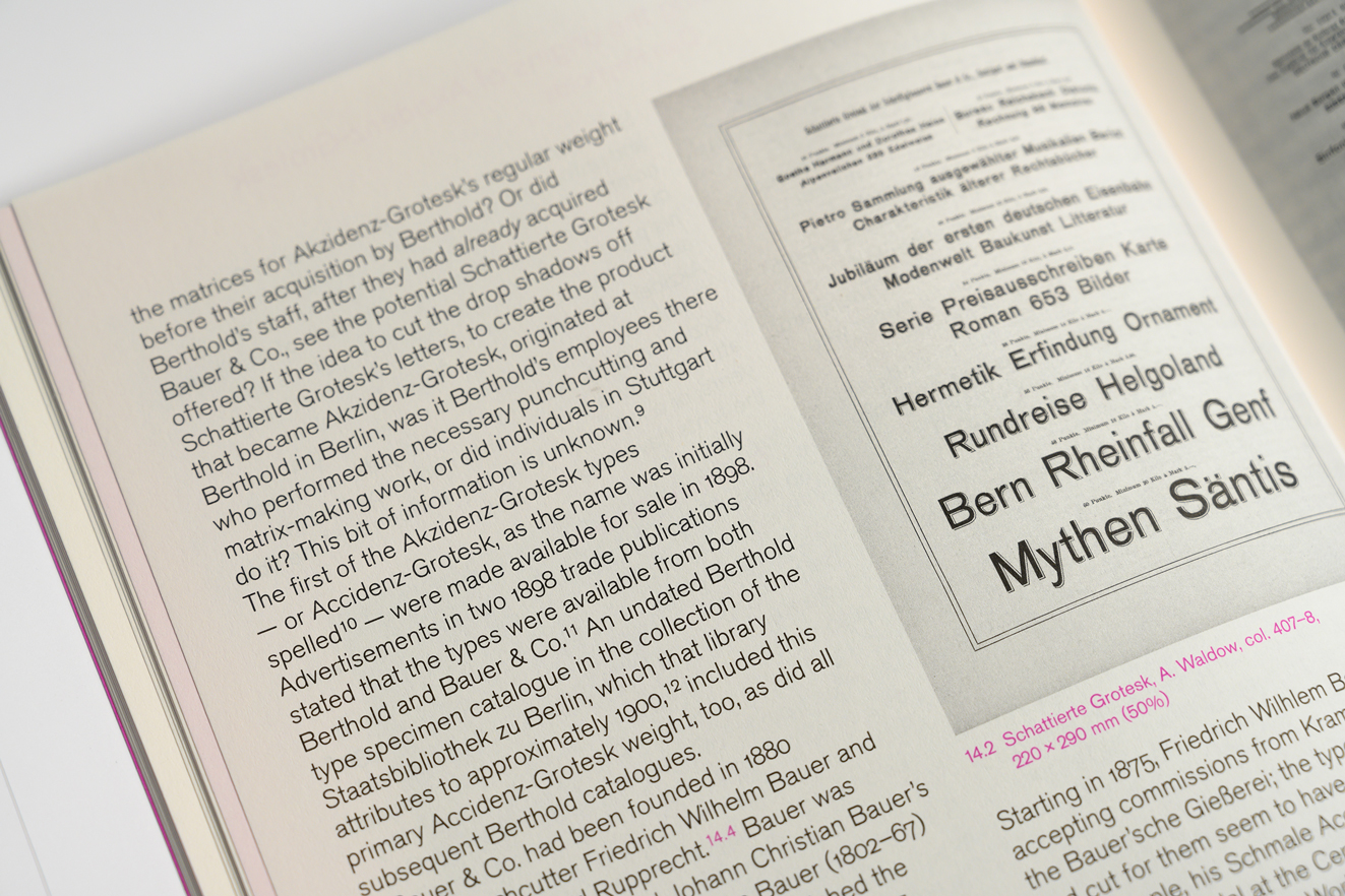
Above. part of a spread from Footnotes C. Footnotes is a typographic journal published in Geneva. Its most recent issue includes my article “The godfather: retracing the origins of Akzidenz-Grotesk.” In the photograph above, you can see an 1896 specimen of Schattierte Grotesk typeface, which the Bauer & Co. type foundry at Stuttgart published the…
Written by
-
Berlin locations of the old Ferd. Theinhardt foundry
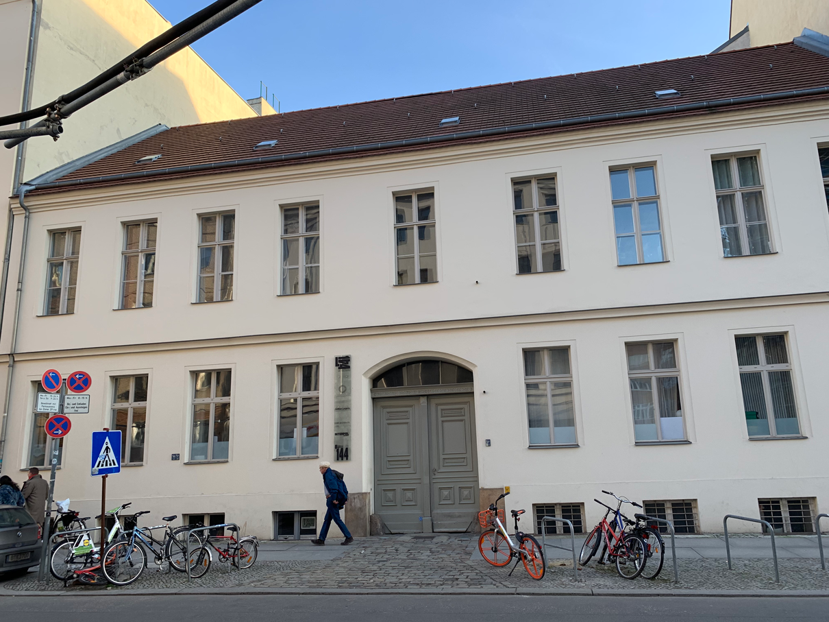
When Theinhardt purchased this house at Linienstraße 144 in 1860, he added a new building behind it. Then his typefoundry operated here for almost thirty years. After he sold the business off, his successors never changed the foundry’s name. It always retained the “Ferd. Theinhardt” name. In 1849, Ferdinand Theinhardt (1820–1906) became an independent punchcutter and…
Written by
-
The Academy of Sciences of the USSR’s hieroglyphs font (1928)
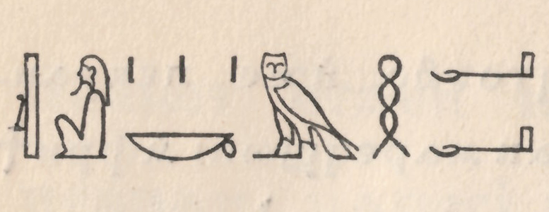
In 1928, the Academy of Sciences of the USSR – then still in Leningrad – published a specimen of their press’s oriental typefaces. This small book’s ancillary text is in both German and Russian. The Academy printed it for the Internationale Presse-Ausstellung (Pressa) held at Cologne that year. One of the book’s pages displays Egyptian…
Written by
-
J. H. Bachmann’s three favorite punchcutters (1869)
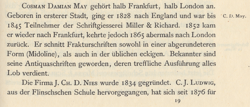
Above is a scan showing Carl B. Lorck’s entry on the punchcutter C. D. May in his 1883 Handbuch der Geschichte der Buchdruckerkunst.[1] I don’t think that Lorck’s attribution of a rounded-style Fraktur (called a Midoline here) to C. D. May implies that May was the punchcutter behind any or all of the typefaces named…
Written by
-
German, Swiss, and Austrian typefaces named Royal or Akzidenz
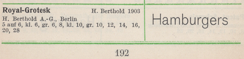
This is another post related to the history of Akzidenz-Grotesk. Contrary to Günther Gerhard Lange’s statement in a 2003 interview with Yvonne Schwemer-Scheddin in Typografische Monatsblätter, the Royal-Grotesk typeface was not a product Berlin’s H. Berthold AG acquired in 1908 when they purchased the Ferd. Theinhardt typefoundry. Instead, Royal-Grotesk had already been created at Berthold…
Written by