Category: Research
-
Genzsch & Heyse employees in 1907
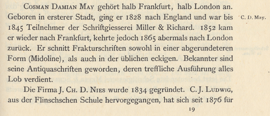
Above: For Genzsch & Heyse’s 70th anniversary in 1903, the Hamburg Senate allowed the foundry to incorporate the city’s coat-of-arms into their signet. Scan of part of page 2 from the Hamburger Kalender für das Buchgewerbe 1904. Preface In the type community today, we take certain things for granted, including the ready-availability of knowledge and…
Written by
-
Genzsch & Heyse employees in 1883
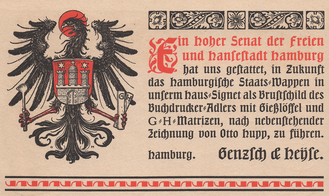
The list in this post is taken from a chronicle Genzsch & Heyse published to celebrate its 75th anniversary in 1908. The image above, of that book’s title spread, is taken from the Freunde des Klingspor Museums website. When researching the history of typefoundries, many sources have not survived. Rosters of company employees are one…
Written by
-
Another word on Accidenz-Grotesk and Royal-Grotesk’s appearances in Theinhardt specimens
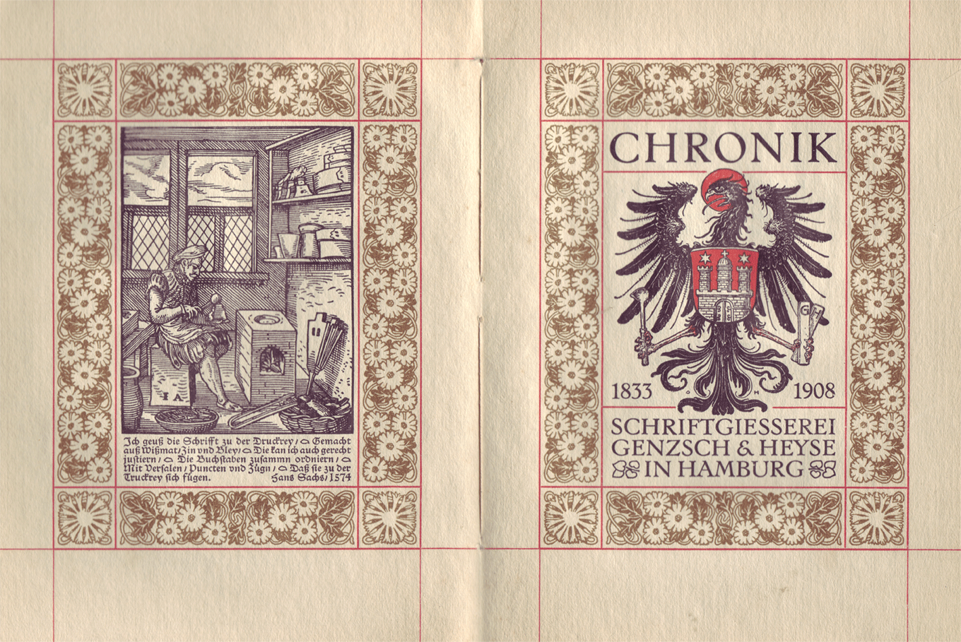
Above, I have reproduced a specimen of Akzidenz-Grotesk’s regular weight showing its 4pt size on a 6pt body. That is taken from a scan of page 58 from the undated H. Berthold AG Hauptprobe Nr. 470, probably printed at some point during the 1960s. I’ve highlighted the last four digits of its product number: 0760. This…
Written by
-
Limited number of copies of my dissertation available
My doctoral dissertation on late-19th and early-20th-century German typefoundry-collaboration with external designers is now available for publication. I’ll make the document available as a PDF on the website of the Braunschweig University of Art’s library. There, it will be downloadable for free. I’ll also upload the file to some other sites, like Academia.edu, etc.[*] As part…
Written by

-
Decker and Reichsdruckerei punches, part 2
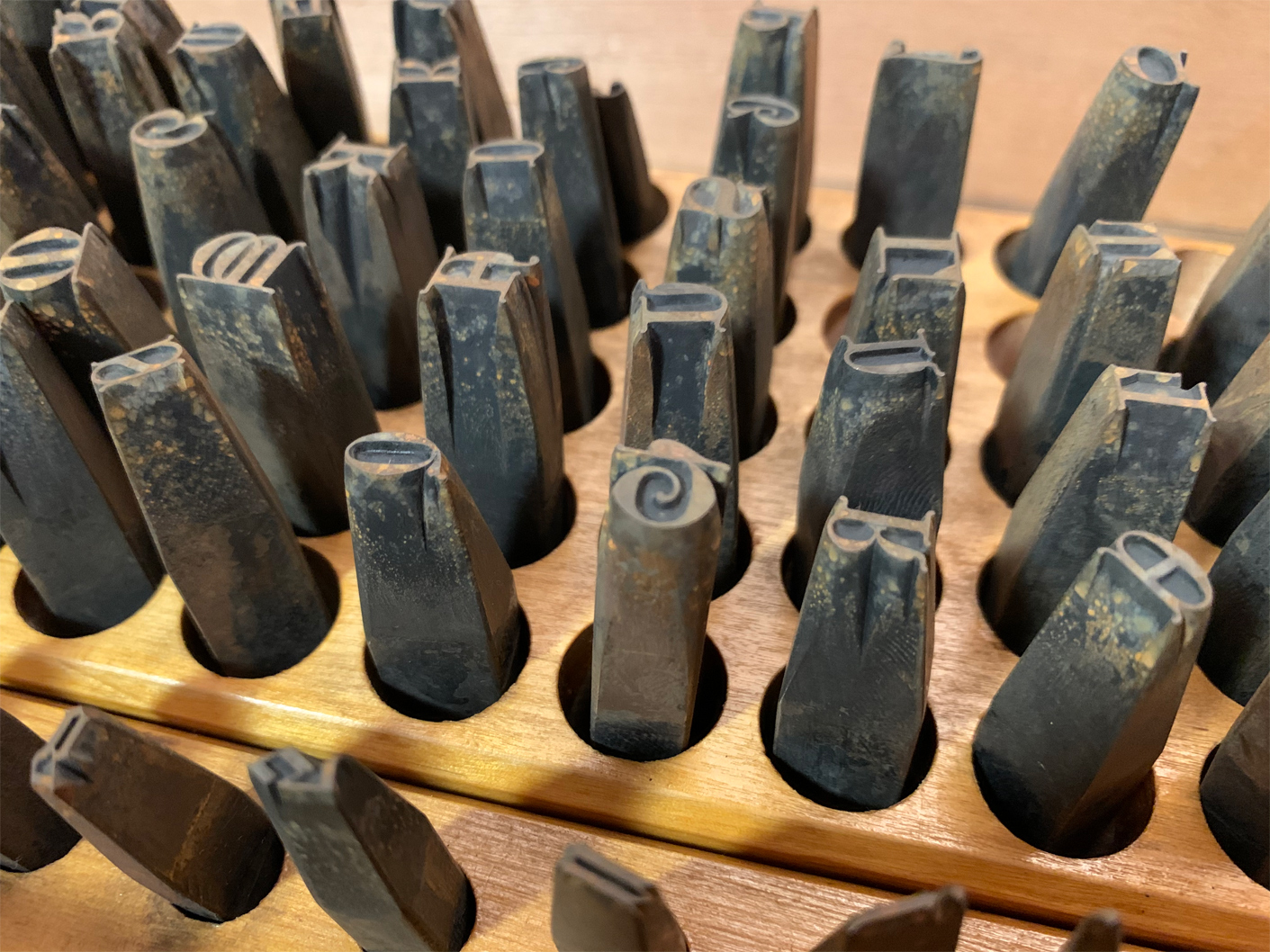
Above, I have reproduced my photograph showing part of Stiftung Deutsches Technikmuseum Berlin, inventory number 1/2018/0342, drawer 28. In it, you see the steel typographic punches for the 28-pt (and maybe a few 24-pt) sizes from one of the Reichsdruckerei typefaces. The design’s name is Diplom-Gotisch and the punches were probably cut in Berlin, ca 1893. This is…
Written by
-
Read about 18th-century typefounding in Cast it #3
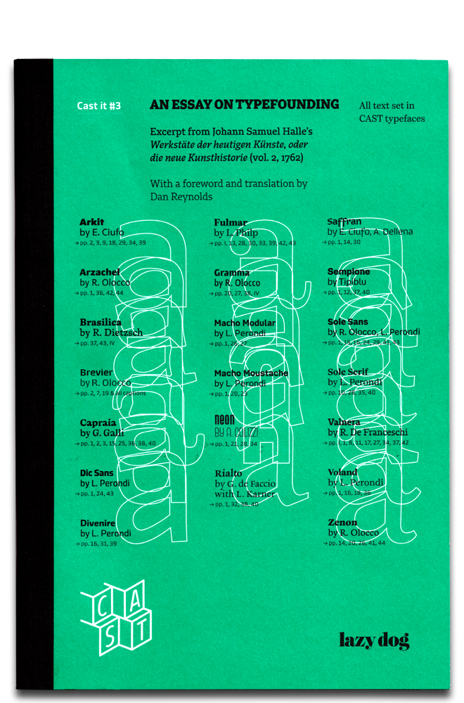
In December 2019, the third issue of Cast it became available. This republishes an eighteenth-century description of typefounding from Johann Samuel Halle, as well as my translation of his German text into English. Cast it is a series of printed specimens showcasing the typefaces of the Italian digital font foundry CAST – Cooperativa Anonima Servizi Tipografici.…
Written by
-
Decker and Reichsdruckerei punches, part 1
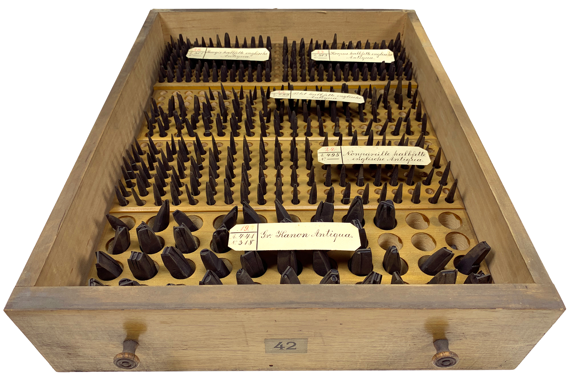
Above, I’ve reproduced my photograph of Stiftung Deutsches Technikmuseum Berlin, item number 1/2018/0443, drawer 42. This stores the hand-cut typographic steel punches for four fonts of a bold English-style roman typeface named halbfette englische Antiqua. Their approximate sizes are 6, 8, 9, and 10 Didot points. They were probably cut at Rudolf Decker’s Court Printing House at…
Written by
-
VEB Typoart’s typefaces, more than 25 years later
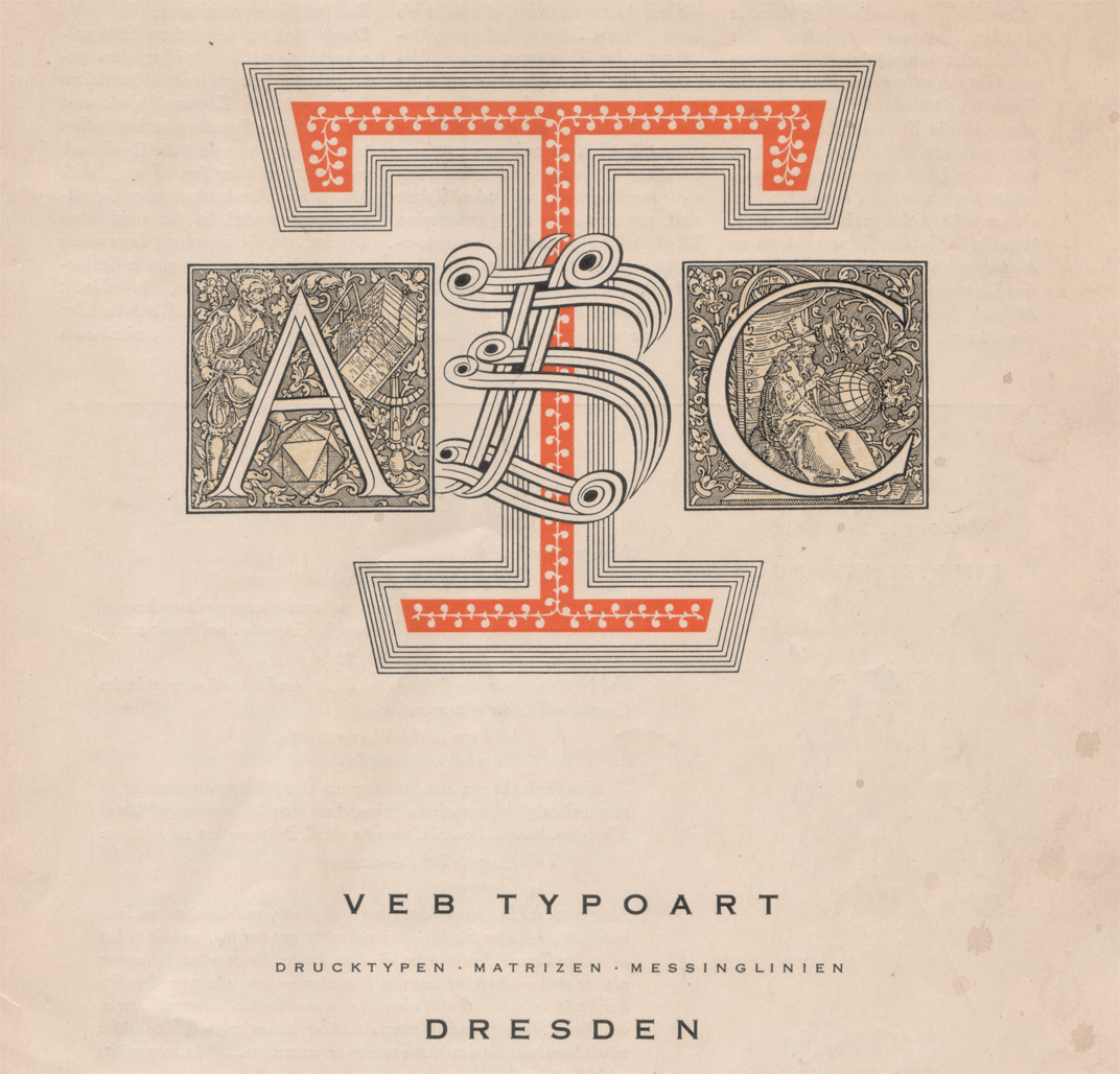
Above, a cropped scan of the cover page from an undated VEB Typoart Dresden brochure. In December 2015, I attended a lovely conference in Dublin called Face Forward. I presented a paper entitled “East German typefaces: 25 years on.” After the conference, I wrote up a proper version of that paper, for a publication that…
Written by
-
Footnotes C: Retracing the origins of Akzidenz-Grotesk
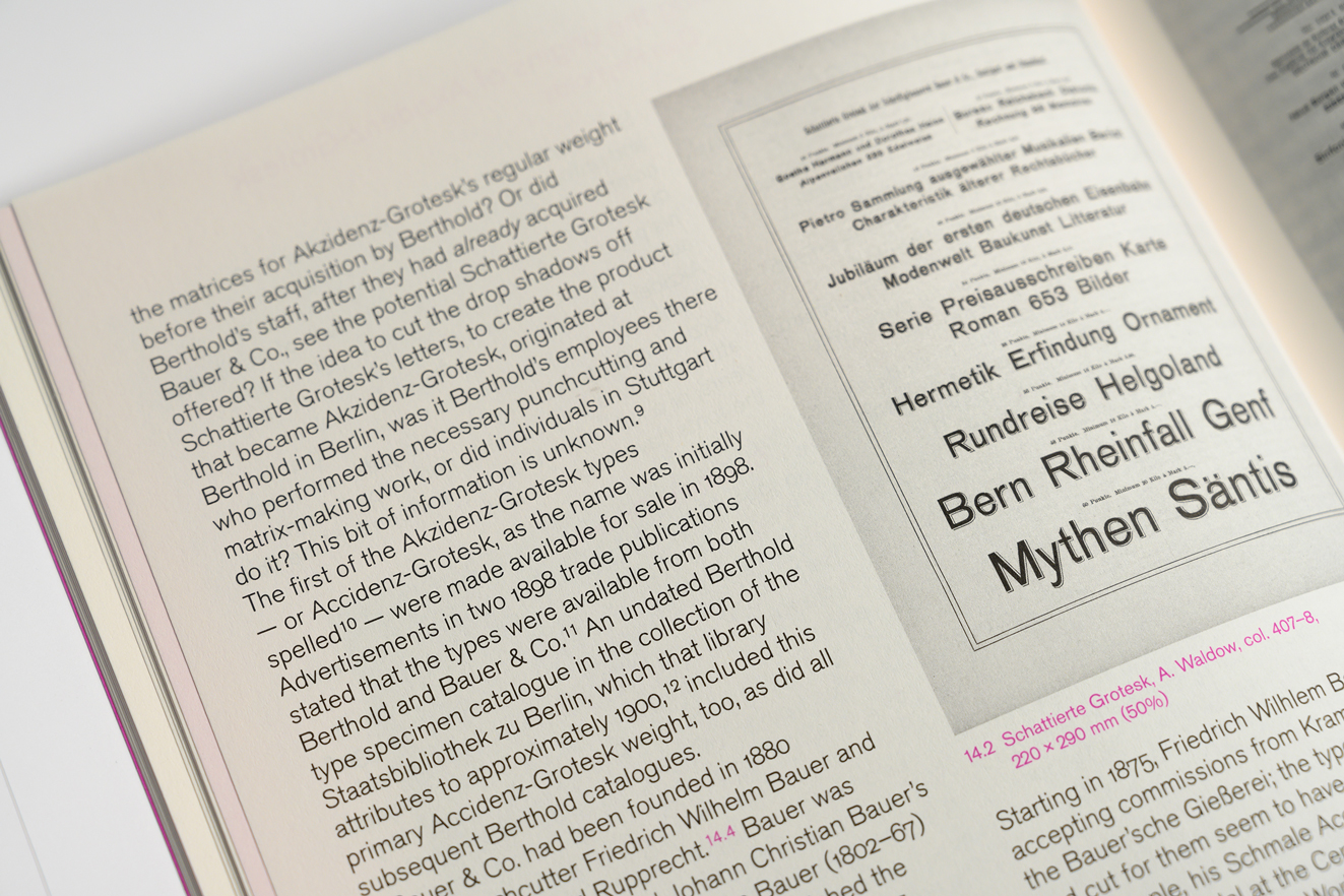
Above. part of a spread from Footnotes C. Footnotes is a typographic journal published in Geneva. Its most recent issue includes my article “The godfather: retracing the origins of Akzidenz-Grotesk.” In the photograph above, you can see an 1896 specimen of Schattierte Grotesk typeface, which the Bauer & Co. type foundry at Stuttgart published the…
Written by
-
Research update: Distribution of sans serifs in German-speaking foundries during the nineteenth century
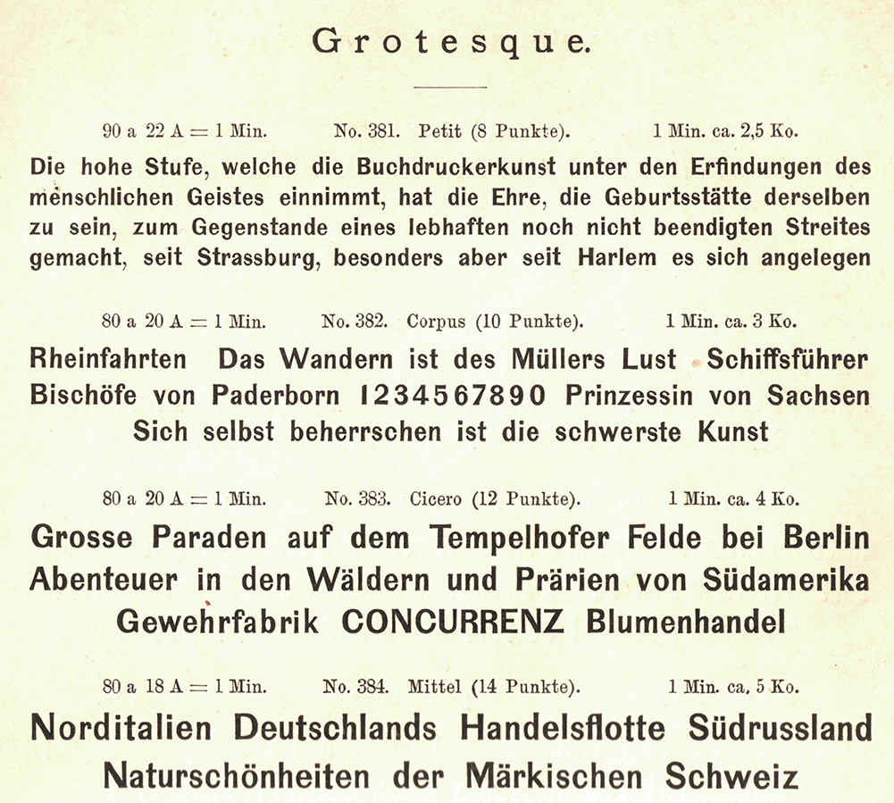
Four sizes of a Grotesque are reproduced above from the Berlin-based Wilhelm Gronau typefoundry’s 1891 catalogue. The foundry began carrying this typeface at the end of the 1850s, while the business was named after Eduard Haenel. An identical product – potentially even the source of these letters’ matrices – was sold by the Dresler foundry in Frankfurt,…
Written by
-
List of employees at the F.A. Brockhaus printing office & typefoundry, 1842
Crop of a 1856 illustration showing the F.A. Brockhaus building in Leipzig. See the full image here. How many people worked at typefoundries during the nineteenth century? Who were those individuals and what did they do? Wouldn’t it be great if registries survived, which could let us know? Employee lists are hard to come by.…
Written by

-
Berlin locations of the old Ferd. Theinhardt foundry
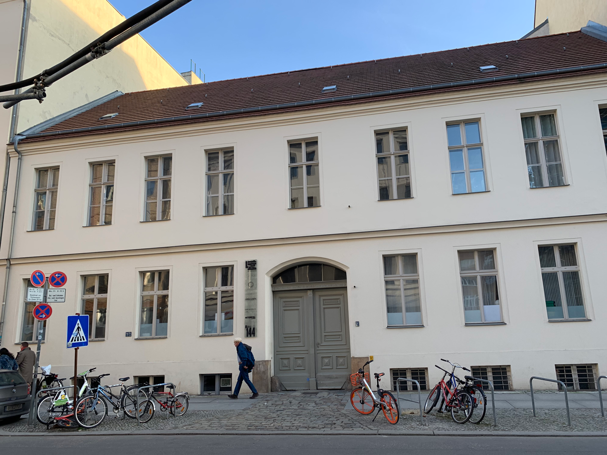
When Theinhardt purchased this house at Linienstraße 144 in 1860, he added a new building behind it. Then his typefoundry operated here for almost thirty years. After he sold the business off, his successors never changed the foundry’s name. It always retained the “Ferd. Theinhardt” name. In 1849, Ferdinand Theinhardt (1820–1906) became an independent punchcutter and…
Written by
-
The Academy of Sciences of the USSR’s hieroglyphs font (1928)
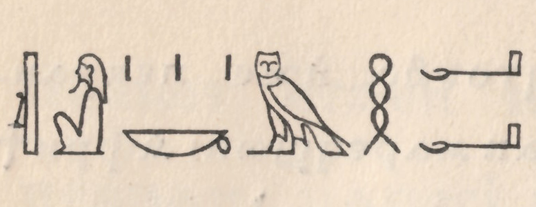
In 1928, the Academy of Sciences of the USSR – then still in Leningrad – published a specimen of their press’s oriental typefaces. This small book’s ancillary text is in both German and Russian. The Academy printed it for the Internationale Presse-Ausstellung (Pressa) held at Cologne that year. One of the book’s pages displays Egyptian…
Written by
-
J. H. Bachmann’s three favorite punchcutters (1869)
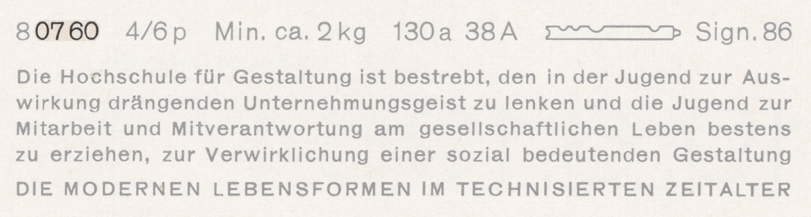
Above is a scan showing Carl B. Lorck’s entry on the punchcutter C. D. May in his 1883 Handbuch der Geschichte der Buchdruckerkunst.[1] I don’t think that Lorck’s attribution of a rounded-style Fraktur (called a Midoline here) to C. D. May implies that May was the punchcutter behind any or all of the typefaces named…
Written by