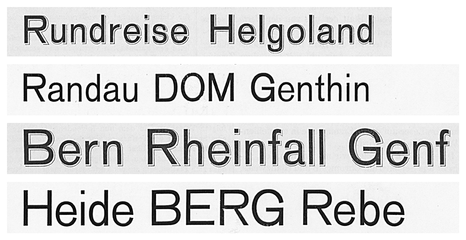
Above, I’ve reproduced my comparison of Bauer & Co.’s 1895 Schattierte Grotesk with Bauer & Co. and H. Berthold AG’s 1898 Accidenz-Grotesk. The image shows both typefaces in their 36 and 48-pt sizes. I took this Schattierte Grotesk specimen is from columns 407–8 of the 1896 Archiv für Buchdruckerkunst und verwandte Geschäftszweige issues. The lines of Accidenz-Grotesk are from Bauer & Co. and Berthold’s joint 1911 catalogue.
April 28th, 2023: Akzidenz-Grotesk’s 125th birthday
When I published the initial version of this post in August 2019, I hypothesized that Akzidenz-Grotesk was typeface that Bauer & Co. in Stuttgart had been working on when H. Berthold AG acquired the typefoundry in late 1897 – but which Bauer & Co. had not yet released. That hypothesis was grounded in two facts. First, as you can see above, the release version of Akzidenz-Grotesk appears to match an earlier drop-shadowed typeface Bauer & Co. released in late 1894/early 1895. Second, as you can read below, Bauer & Co. filed a design-patent registration with the Stuttgart authorities for a typeface with the same product numbers as Akzidenz-Grotesk two weeks before Berthold registered the product in Berlin. In 2022, I found additional evidence in the Deutsches Technikmuseum’s Historical Archive that supports this claim. An internal Berthold notebook listing the sources for each of its fonts’ sizes noted that the regular weight of Akzidenz-Grotesk came from Bauer & Co. in Stuttgart. Since then, additional materials from Berthold’s type-cutting department – also kept at the Deutsches Technikmuseum – have been inventoried. Anyone can go to the museum’s library and archive reading room and request them. Since today is the 125th anniversary of Akzidenz-Grotesk’s design-patent registration, I have updated this post with new material from that Historical Archive. For my best recap of the history of Akzidenz-Grotesk’s creation, please check out an article I wrote to accompany the release of Kris Sowersby’s Söhne typeface in 2019. And for information about Royal-Grotesk – a derivative of Akzidenz-Grotesk and not its source – check out the design-patent information in this other post.
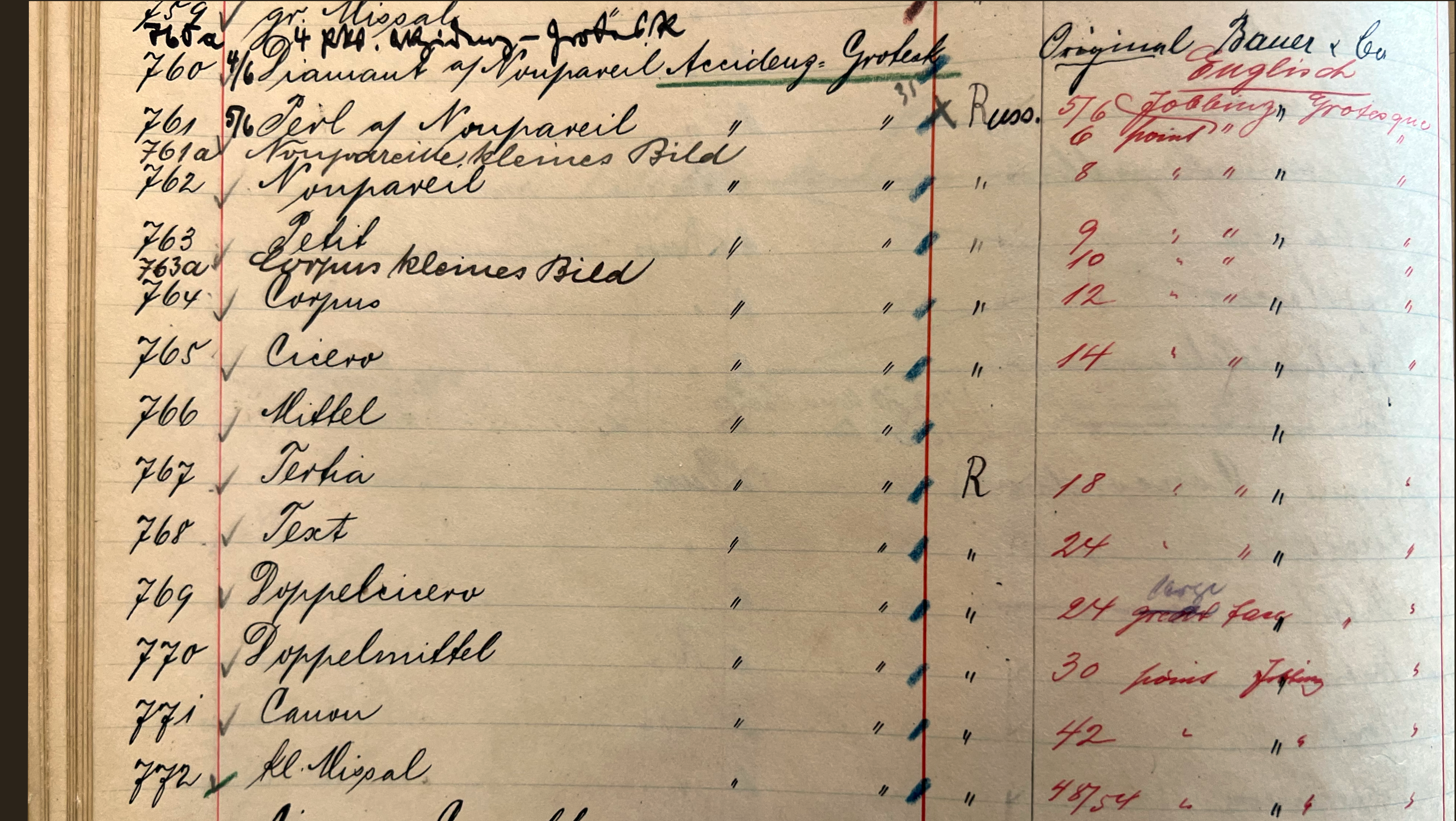
The above image is a close-up on page 26 of Berthold-Schriften, an internal H. Berthold AG notebook whose first entries may have been made around 1900 at Berthold’s St. Petersburg office. The notebook eventually made its way to Berlin and was updated until at least the early 1940s, if not the 1950s. Today, it is part of the Sammlung Möllenstädt at the Deutsches Technikmuseum’s Historical Archive. It can be ordered via the number I.4.327 0038. In the photograph, you can see the Berthold product numbers 760–772. These are the various sizes of Akzidenz-Grotesk’s regular weight. The notes indicate that all sizes had “Russian” versions (i.e., Cyrillic character sets) except the Mittel size [14 p]. The right-hand column notes that all sizes are Original Bauer & Co. creations. The red ink annotations show the original English-language name for the typeface: Jobbing Grotesque. They also give Jobbing Grotesque’s Anglo/American body sizes. It was only in the 1950s when Amsterdam Continental began selling Akzidenz-Grotesk in New York that the typeface’s English-language name changed to “Standard.” The black-ink annotations were made before about 1912; this is a primary source indicating that Akzidenz-Grotesk is a Bauer & Co. creation that Berthold acquired along with that Stuttgart foundry. Click to enlarge.
Akzidenz-Grotesk’s background
As you can read over on the Klim Type Foundry website, the regular weight of Akzidenz-Grotesk was derived from Schattierte Grotesk, a drop-shadowed display typeface that the Bauer & Co. type foundry in Stuttgart and Düsseldorf published in 1895. Clip the drop shadows off of Schattierte Grotesk’s letters and you get the Akzidenz-Grotesk design.
Bauer & Co. was bought by the Berlin-based H. Berthold AG in 1897, who closed Bauer & Co.’s Düsseldorf branch down but kept the Stuttgart factory open until 1930 (Berthold would do business in Stuttgart again after the Second World War). When it came to Akzidenz-Grotesk’s origins, the question that I had was not where the design came from in general, but rather where its punches were cut specifically. It turns that this work was done at Stuttgart – or, potentially, by an independent punchcutter located elsewhere on behalf of the Stuttgart foundry. Berthold would continuously expand and edit Akzidenz-Grotesk, after its release. The first addition to the typeface was Royal-Grotesk, later renamed Akzidenz-Grotesk Light, in late 1902. In 1909, several more weights were added, etc.
The original spelling of Akzidenz-Grotesk was with two c’s instead of a kz: Accidenz-Grotesk. The typeface was initially published in 13 sizes. These ranged from 3 on 6 pt through 48 pt, and those sizes had the product numbers 760 through 772. Accidenz/Akzidenz was a very common naming element in German-language type founding during the late-nineteenth and early-twentieth centuries.
On German design patents
Germany introduced design patents (Geschmacksmuster) in 1876. At the time of Akzidenz-Grotesk’s release, firms would file patent registrations for their products with local magistrates, who noted them in their Muster-Register. A nationwide registry was not maintained. Nevertheless, notices of the registrations were printed in the national government’s newspaper: the Deutscher Reichsanzeiger. Notices of many typeface design registrations also ran in Journal für Buchdruckerkunst, Schriftgießerei und verwandte Fächer.
Some Berthold design-patent registrations are listed in the Berthold-Schriften notebook mentioned in the above image’s caption, but only for typefaces published between 1900–1907 and 1921–1931. Earlier this year, I located another internal notebook in the Sammlung Möllenstädt, which has since been cataloged at the Deutsches Technikmuseum’s Historical Archive under the number I.4.327 0073. That notebook, called Musterschutz-Register, was started at Gustav Reinhold’s Berlin-based typefoundry, probably in 1886. Berthold acquired Reinhold’s foundry in 1893, and the notebook was kept up-to-date until 20 June 1944. All Reinhold/Berthold design-patent registrations between 1886 and 1944 were recorded in this notebook, including Akzidenz-Grotesk’s in 1898.
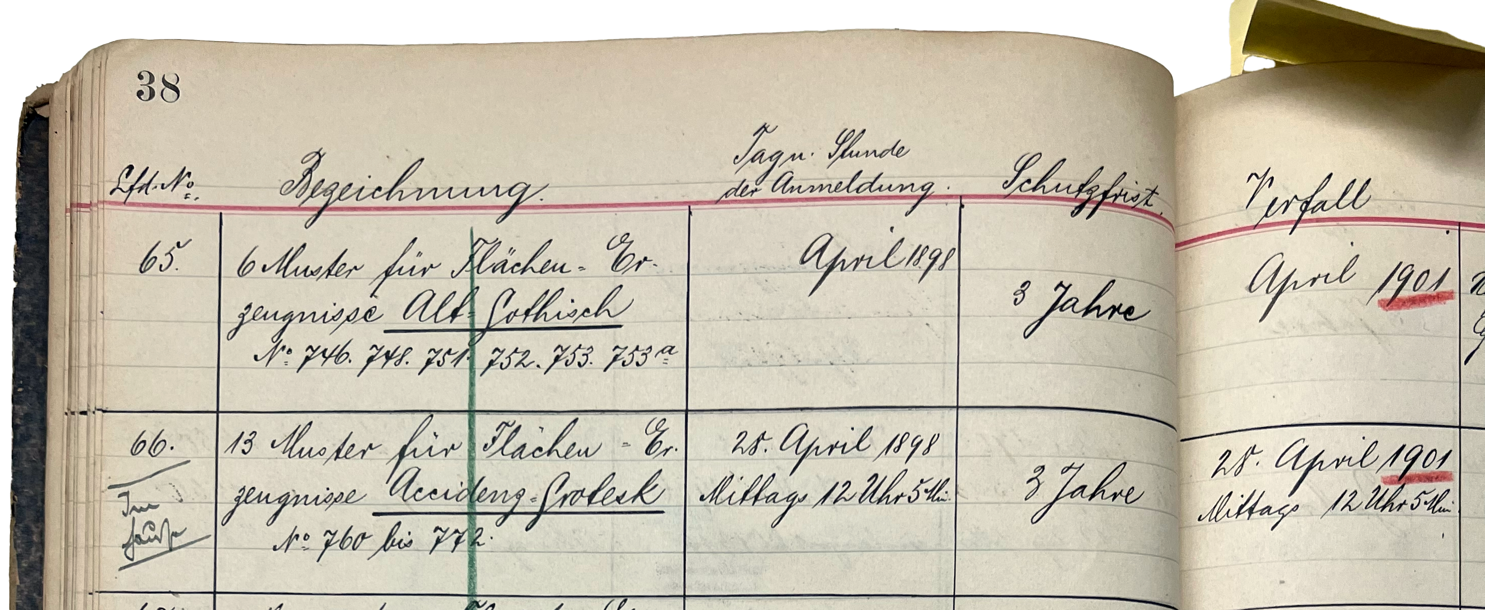
Above, you can see the top of page 38 and part of the top of page 39 from Musterschutz-Register, an internal notebook kept first by the Gustav Reinhold foundry in Berlin and then, after Berthold acquired that business, by H. Berthold AG. All Reinhold and Berthold design-patent registrations were recorded in this notebook. This is kept in the Sammlung Möllenstädt at the Deutsches Technikmuseum’s Historical Archive, where is can be called under the number I.4.327 0073. The bottom half of the image record’s Akzidenz-Grotesk’s design-patent registration information. It was an in-house design in 13 sizes filed on 28 April 1898 at 12:05 in the afternoon. The patent was only granted for three years; it was not renewed in 1901. Click to enlarge.
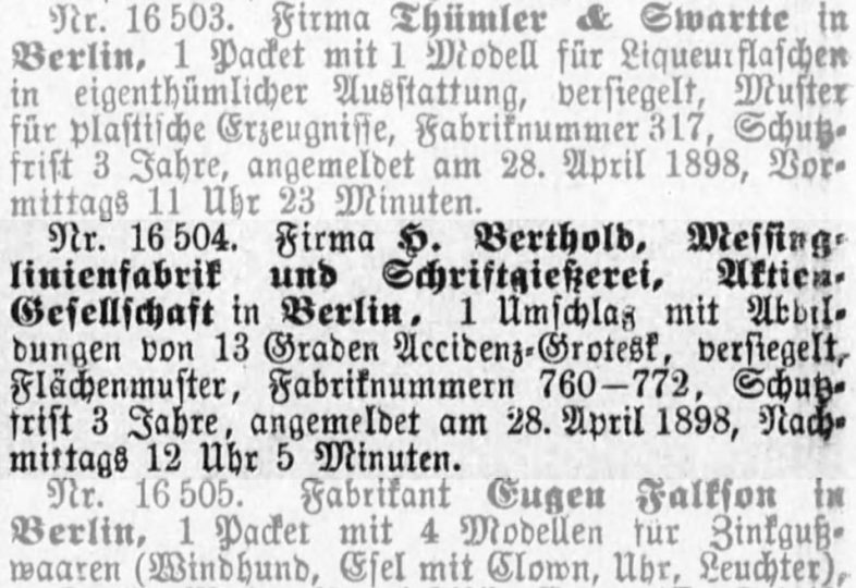
A few years ago, I found a notice of Berthold’s design patent registration for Accidenz-Grotesk in the 9 May 1898 issue of the Deutscher Reichsanzeiger newspaper. I have reproduced that notice below, but since it is composed in Fraktur type, I’ve transposed its content into roman type here:
Nr. 16 504. Firma H. Berthold, Messinglinienfabrik und Schriftgießerei, Aktien-Gesellschaft in Berlin, 1 Umschlag mit Abbildungen von 13 Graden Accidenz-Grotesk, versiegelt, Flächenmuster, Fabriknummern 760–772, Schutzfrist 3 Jahre, angemeldet am 28. April 1898, Nachmittags 12 Uhr 5 Minuten.
My English translation of that notice would read:
No. 16,504. [Registered by the] firm H. Berthold, brass rule factory and type foundry, joint-stock company in Berlin, one envelope with images of 13 sizes of Accidenz-Grotesk, sealed, surface pattern, product numbers 760–772, period of protection [to last for] three years, registered on the 28th of April 1898, [at] 12:05 o’clock in the afternoon.
In the summer of 2019, I found another notice from an issue of the Reichsanzeiger printed nine days later, on 18 May 1898. However, that registration notice was for a design patent that had been filed two weeks before Berthold’s. Registration notices were not published in the Reichsanzeiger by the nationwide order that they had been filed in. Instead, the newspaper would regularly publish a collection of the most recent registrations made in one city. That explains why notice of a Berlin registration was printed before one from Stuttgart, even though the Stuttgart registration had taken place earlier.
The notice of this earlier registration stated that Bauer & Co. had filed for a design patent on an unnamed Grotesk typeface, which also had 13 sizes. While this notice only listed one product number, instead of the typeface’s whole product range, the number given was 772, which at the joint Bauer & Co./Berthold company denoted Accidenz-Grotesk’s 48-pt size.
This suggests that the master punches and matrices for the typeface may indeed have been produced in Stuttgart, and that Bauer & Co. then gave those to their mother company in Berlin. Perhaps it was Berthold’s staff in Berlin that christened the typeface with the title Accidenz-Grotesk – but we should not give too much credence to this product’s name.
Here is the text of the notice of Bauer & Co.’s registration, followed by my translation of it:
Nr. 1 483. Firma Schriftgießerei Bauer u. Cie. in Stuttgart, ein Muster einer Garnitur Grotesk in 13 Größen, Fabr.-Nr. 772, für Druck- und Prägezwecke, in verschloßenem Umschlag für Flächenerzeugnisse, Schutzfrist 3 Jahre, angemeldet am 14. April 1898, Nachmittags 4 Uhr.
No. 1,483. [Registered by the] firm Bauer & Co. type foundry in Stuttgart, a sample [showing] a set of sans serifs in 13 sizes, product number 772, for printing and embossing purposes, in a closed envelope for surface products, period of protection [to last for] three years, registered on the 14th of April 1898, [at] 4 o’clock in the afternoon.
For completion’s sake, I should also add details about Bauer & Co.’s design-patent registration for Schattierte Grotesk. It was from the 6 July 1894 Deutscher Reichsanzeiger issue:
Nr. 1307. Firma Schriftgießerei Bauer u. Cie. in Stuttgart, zwei Muster für Buchdruckerzwecke, nämlich die Typen a. einer Garnitur halbfette „Carmen“ in 8 Graden, Fabr.-Nrn. 20/27, b. einer Garnitur breite verzierte „Grotesk“ in 9 Graden, Fabr.-Nrn. 28/36, je in Abdrücken, in einem versiegelten Umschlag, Flächenmuster, Schutzfrist 3 Jahre, angemeldet am 27. Juni 1894, Nachmittags 5¾ Uhr.
No. 1307. [Registered by the] firm Bauer & Co. type foundry in Stuttgart, two samples [showing] the types a. a weight of “Carmen” Bold in 8 sizes, factory numbers 20–27, [and] b. a weight of an extended ornamented “Grotesk” in 9 sizes, factory numbers 28–36, each as prints for surface products in a sealed envelope, period of protection [to last for] three years, registered on the 27th of June 1894, [at] 5:45 in the afternoon.
Correspondence between H. Berthold AG, Berlin and Bauer & Co., Stuttgart
Recently, the Technikmusuem’s Historical Archive inventoried several surviving folders kept by Berthold’s type-cutting department (this is the Lord’s work!), including a few about the Akzidenz-Grotesk family as it changed over many decades. In celebration of Akzidenz-Grotesk’s 125th anniversary today, Marcel Ruhl from the Historical Archive shared a few items with me, which I have reproduced below. For the moment, I’m just happy to share these images. I have not annotated them with as much explanation as I would like. Please let me know if you would like to see more. And remember that you can visit the museum to see these yourself!
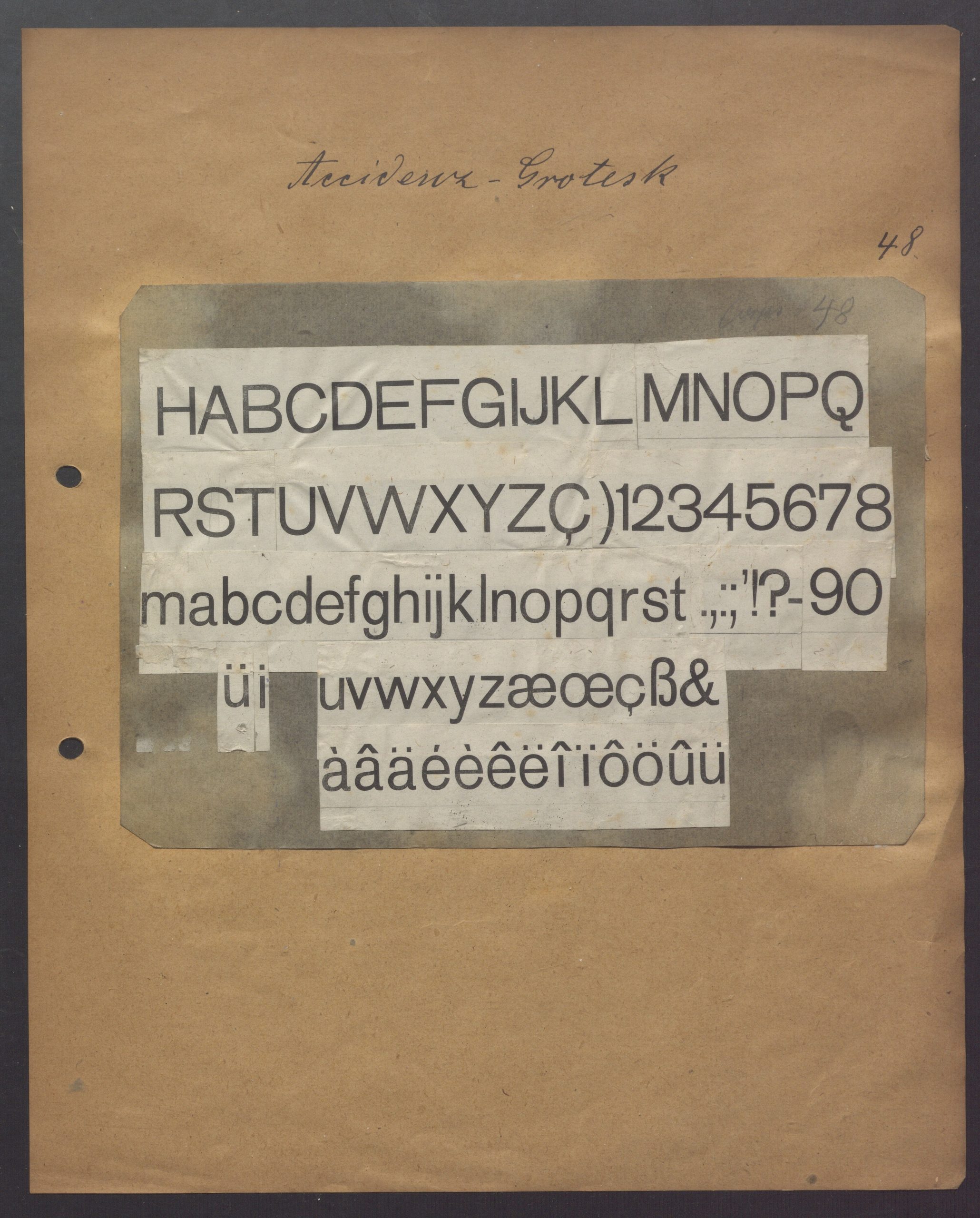
Scan of a page from I.2.046 389, a folder of information from H. Berthold AG’s type-cutting department about Akzidenz-Grotesk. Its year is not known. The page shows a character set for Akzidenz-Grotesk’s 48-p size. Close observers of Akzidenz-Grotesk will know that Berthold changed the letterforms of this weight of the typeface at least once over time. As far as I can reconstruct (at the moment), these are the original letters published in 1898. As designers like Erik Spiekermann and Eckehart SchumacherGebler have noted in the past, the form of the Q in this print is not the Q that Berthold was selling between the 1950s and 1970s – although I am not yet sure if those changes were already in place by the 192s or not. The lowercase t is also very different: the top of its flag ends in a diagonal cut rather than a horizontal one. Click to enlarge.
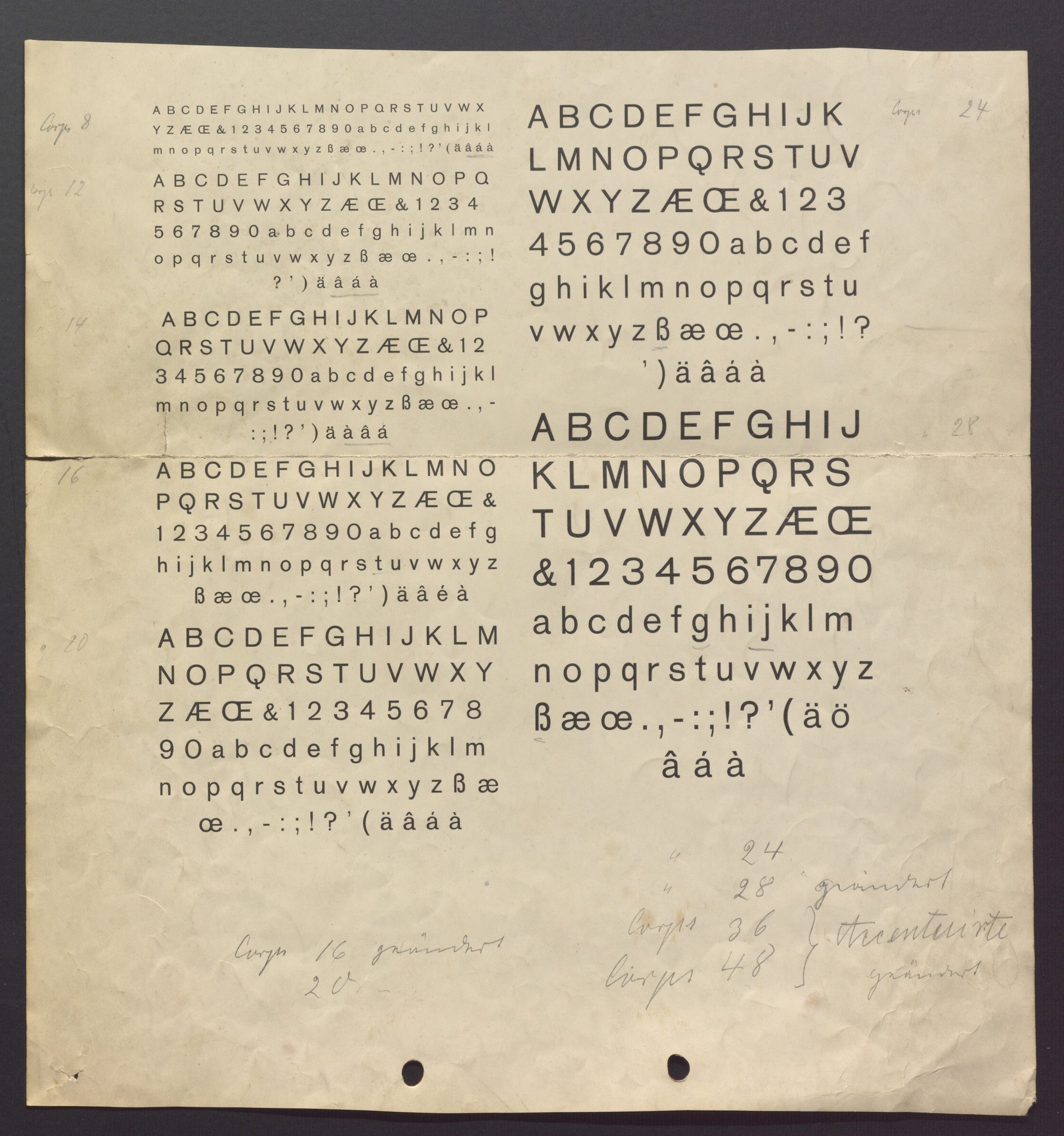
Scan of a page from I.2.046 389, a folder of information from H. Berthold AG’s type-cutting department about Akzidenz-Grotesk. Its year is not known. The page shows the character sets for Akzidenz-Grotesk’s 8, 12, 14, 16, 20, 24, and 28-p sizes. As far as I can tell, these are original forms from 1898, before changes were made. See my caption to the previous image for information about the unexpected Q and t. Click to enlarge.
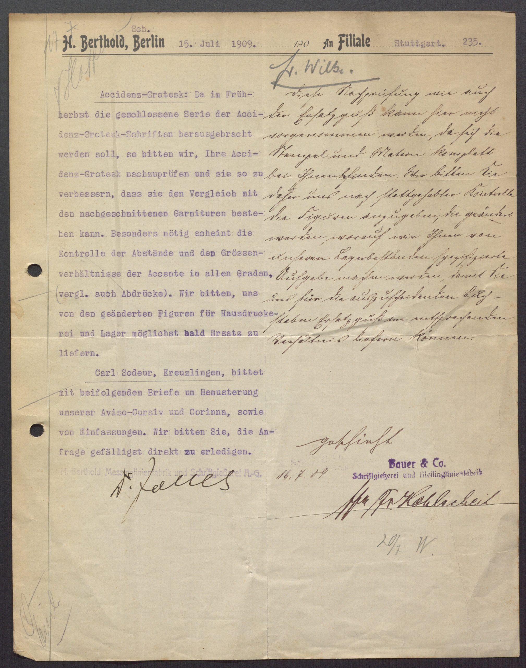
15 July 1909 memorandum from Oscar Jolles, director of H. Berthold AG in Berlin, to the company’s Stuttgart Branch – which still operated under the “independent” Bauer & Co. name. Jolles announced that Berthold was finished with its additional Akzidenz-Grotesk weights (halbfett, fett, etc.) – although in fact, Berthold would continue to add more styles to the family after this time. In light of Akzidenz-Grotesk’s expansion into a proper typeface family, Jolles asked Bauer & Co. to change its Akzidenz-Grotesk (i.e., the original, regular weight of the family) so that its characters would better fit with the new weights. The handwritten reply from Stuttgart is signed by Friedrich Hohlscheit, who had been one of Bauer & Co.’s directors since 1901. It reads: »Diese Nachprüfung wie auch der Ersatzguß kann hier nicht vorgenommen werden, da sich die Stempel und Matern komplett bei Ihnen befinden. Wir bitten Sie daher uns nach stattgehabter Kontrolle die Figuren anzugeben, die geändert werden, worauf wir Ihnen von unseren Lagerbeständen spezifizierte Aufgabe machen werden, damit Sie uns für die auszuscheidenden Buchstaben Ersatzguß im entsprechenden Verhältnis liefern können.« Thanks go to Florian Hardwig, who transcribed that for me. Click to enlarge.
Digitized type specimens
To see early specimens of the Akzidenz-Grotesk typeface, check out the following links:
- H. Berthold AG, circa 1900
- Royal- und Accidenz-Grotesk brochure, circa 1904 [1915 is the year the library acquired the specimen, not the date of its printing!]
- Accidenz-Grotesk-Schriften brochure, circa 1921 [reprinting of a circa 1912 brochure]