For decades after the 1760s, the in-house typefoundry within the Decker printing house was the most significant foundry in Berlin. Arguably, it was only surpassed after Eduard Haenel moved his Magdeburg-based foundry to Berlin in the late 1830s. Despite Decker’s long prominence, it never developed a typeface as influential in German typography as the Unger-Fraktur, produced at Unger’s in the 1790s. Thanks to recastings and extensions, it was a popular text-face in German-speaking Europe during the 1920s and ’30s, becoming the first typeface from Berlin to enter the “canon” of typographic history. Daniel Berkeley Updike included it in the first volume of his historical survey Printing Types – he even described it in almost favorable terms.[1] Decker, on the other hand, hardly got a mention. Aside from a mistaken remark that the Decker “foundry and printing-house [were] fashioned after the Imprimerie Royale de France” that Frederick the Great had wanted, the foundry is absent from Updike.[2]
Johann Friedrich Unger learned the printing trade in Decker’s printing house. I’ve written about Decker and its foundry here before. In 1879, they were joined with the Prussian State Printing House to establish the Reichsdruckerei. After the Second World War, the Bundesdruckerei – or Federal Printing House – was created as its successor. In the 1980s, the Bundesdruckerei’s collection of typographic punches from Decker’s and the Reichsdruckerei was transferred to Berlin’s Museum für Technik und Verkehr, now the Deutsches Technikmuseum in Berlin. A few years ago, I helped catalog these punches at the museum.
This post’s sources
The best-published source on the history of the Decker printing house is Nikolaus Weichselbaumer’s article »Die Druckerfamilie Decker und die klassizistische Typographie in Berlin um 1800«.[3] Ernst Crous’s 1929 history of the Reichsdruckerei includes a thorough summary of the typefaces created for its in-house foundry, as few new Reichsdruckerei types appeared after that.[4] Much more literature is available on the Unger foundry even though it operated for a shorter period.
Unger’s foundry was particularly active during its first decade, the 1790s, selling roman and italic types from the Didots and Unger’s reformed Fraktur, which he cut with Firmin Didot and Johann Christoph Gubitz. Just as in my previous post on the Thurneysser and Francke foundry, Crous’s 1928 book on the Berlin foundries active before the early 19th century provides a wealth of information on the Decker and Unger foundries, even nearly a century after its publication.[5] Unger and his types played a pivotal role in the debates in German publishing regarding the use of roman and Fraktur types, at least those parts of those long-running debates concurrent with the French Revolution and Napoleonic Wars.[6] In the 21st century, this has been addressed in detail by, e.g., Susanne Wehde[7] and especially Christopher Busch.[8]
Less literature is available for the history of Trowitzsch & Sohn’s in-house foundry.[9] Those printers took over the Unger printing and typefounding business in 1821. They continued to found type for more than 70 years but then in 1897, Trowitzsch & Sohn sold its in-house foundry to the Rotterdamsche Lettergieterij.[10] Since that firm was acquired by Joh. Enschedé en Zonen a few years into the 20th century, the best account of the Unger foundry’s complete range of typefaces appears the English-language edition of Charles Enschede’s Typefoundries in the Netherlands, revised by Harry Carter and Netty Hoeflake in 1978.[11] As Enschedé wrote: “Those [matrices] of historical interest, having for long been disregarded, were untouched, for the most part still in the paper packets in which, most probably, Unger himself had left them.”[12] Having the matrices enabled Enschedé to recompose one of Unger’s specimen books[13] and a 1793 pamphlet.[14]
Not all of Unger’s type specimens have been digitized. When digitizations of specimens mentioned below are available, I have linked to them in the text and/or this post’s footnotes. The early specimens from the Decker foundry are also not digitally available. However, in a 2021/2 project to digitize historical type specimens from Berlin, most of Decker’s later catalogs were digitized, as were the Reichsdruckerei’s. Specimens from two more foundries mentioned below – Gubitz’s and Trowitzsch & Sohn – were also digitized.
Specimens not explicitly mentioned in the text below include one of Decker’s for vignettes from 1821, an 1837 Decker catalog, an 1840 Decker specimen, and Decker’s bi-lingual catalog for the Great Exhibition in London from 1851. The latter may have been the thickest single-volume German foundry catalog of the 19th century, although – true to the time – its pages include a lot of white space. Decker published supplements to that catalog in 1859, 1862, 1862, and 1867. Berlin’s Zentral- und Landesbibliothek digitized Decker’s 1844 catalog, albeit in lower quality. The Reichsdruckerei’s three-volume catalog from 1886 was digitized, as were three later Reichsdruckerei specimens from around 1910. Two volumes – each with similar collections of specimen sheets – from Trowitzsch & Sohn’s foundry were also digitized. Hopefully, they will assist the research into that foundry’s history, which I find chronically overlooked.
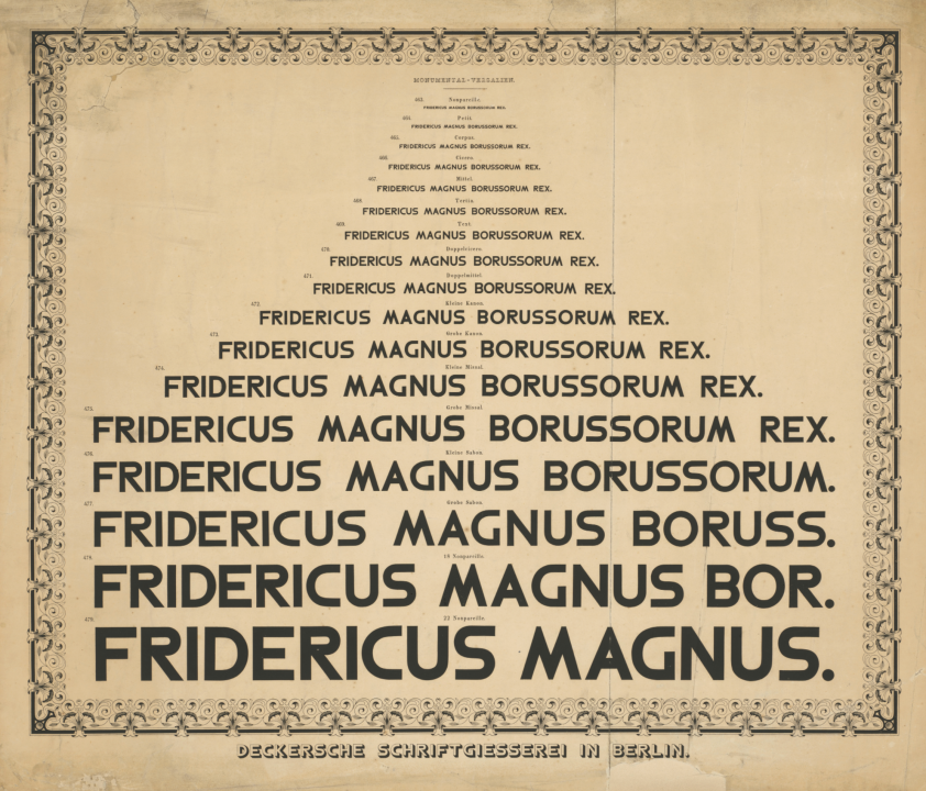
Broadsheet from Decker’s foundry for its Monumental-Versalien typeface. The actual size is 62.4 × 73 cm. The Kunstbibliothek in Berlin has misclassified this print as a lithograph from about 1900; it must be printed directly from the type and date to around 1850. Photo: Staatliche Museen zu Berlin, Kunstbibliothek / Dietmar Katz. Public Domain Mark 1.0.
The following text – save for image captions, the post script about the Unger-Fraktur, and the footnotes – is my translation of pages 15–19 from Friedrich Bauer’s Chronik der Schriftgießereien in Deutschland und den deutschsprachigen Nachbarländern (1928). For more details about that book, see my Friedrich Bauer Project landing page.
Decker – Reichsdruckerei
1767
In 1767, at the instigation of Frederick II, the royal court printer Georg Jakob Decker added a typefoundry to his printing office. Decker’s ancestors came from Eisfeld in Thuringia and had been printers for four generations in Basel, Breisach, and Colmar. His great-grandfather Georg Decker acquired a printing office in Basel through marriage in 1635 and was made an academic printer in 1644. Georg Jakob Decker (born 12 February 1732 in Basel) was the son of Johann Heinrich Decker. He came to Berlin, marrying Louise Dorothea [Grynäus], the daughter of the academic printer Johann Grynäus, on 8 January 1755.[15] On 30 November 1756, [Georg Jakob Decker] became a partner in [his father-in-law’s] printing house, established by Arnold Dussarrat in 1713,[16] which changed its name to Grynäus & Decker. On 31 January 1763, Decker became the sole owner of the business, and on 26 October 1763, he received the title and rights of a Royal Court Printer. To establish a typefoundry,[17] Decker contacted the famous Paris typefounder Simon Pierre Fournier le jeune.[18] Fournier recommended punchcutters and typefounders to him. In addition to Fournier, Decker bought matrices for the best contemporary typefaces from Didot in Paris, Bodoni in Parma, and Haas in Basel, among others.
1787
Decker was appointed Privy Court Printer by Frederick William II on 19 September 1787 in recognition of the printing of Frederick the Great’s works, translated into German, at the Royal Palace in Potsdam.[19] Decker had first set up ten presses in rooms assigned to him in the palace – this was later expanded to 20 presses.[20] Thus, the printing of the 25-volume work could be completed in just over two years.
1792
Georg Jakob I Decker died on 17 November 1799. At that time, the Decker typefoundry not only worked to meet its own printing house’s needs but also hose of other printers. Many deliveries even went abroad. The son of the previous one, Georg Jakob II Decker (born 9 November 1765, a partner since 1 July 1788), had already taken over the business on 25 June 1792, which from then on was called the »Georg Jakob Decker & Sohn, Königl. Geh. Ober-Hofbuchdruckerei«.[21] Decker further expanded the typefoundry by purchasing matrices from, among others, his brother-in-law Wilhelm Haas in Basel, Levrault in Strasbourg,[22] and the Hessenland typefoundry in Brandenburg.[23] Decker was the first German printer to support the inventor of the double-cylinder press, Friedrich König in Germany, by placing an order.[24]
1819
Georg Jakob II Decker died on 25 August 1819. After his death, the business continued under a guardianship.
His sons Karl Gustav Decker (born 23 January 1801) and Rudolf Ludwig Decker (born 8 January 1804) took over the business on 21 January 1828. The former died on 20 April 1829, while the latter led the printing house to brilliant heights. The typefoundry was maintained. Quality Fraktur typefaces were cut there, for instance, as well as various oriental typefaces for the Berlin Academy of Sciences.[25]

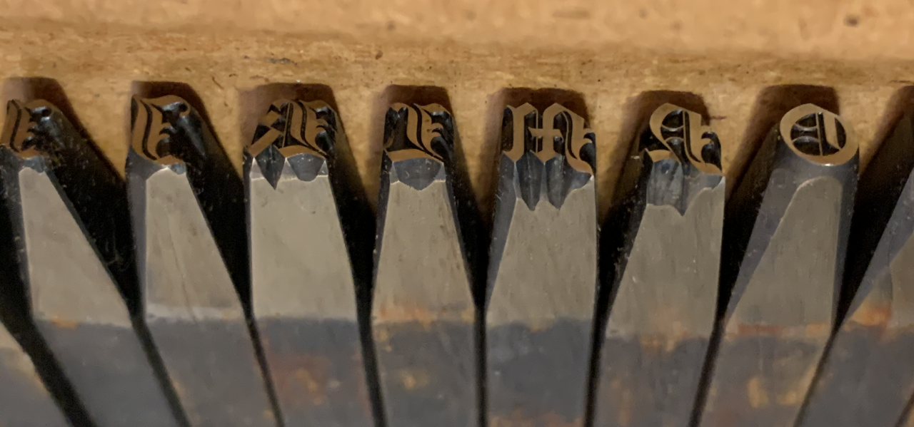
One drawer from a cabinet of steel typographic punches from the Bundesdruckerei. Inside are the punches for Decker’s Grobe Sabon Fraktur. They were cut before 1837. These are part of the printing and paper collections at the Deutsches Technikmuseum in Berlin (SDTB 1/2018/0342, drawer 24).
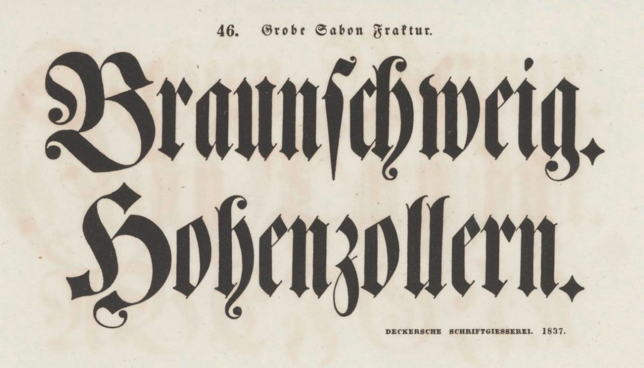
Specimen page for the Decker foundry’s Grobe Sabon Fraktur face. This is the size printed from the type cast from matrices the above punches struck. This page (cropped) is from the 1837 Decker foundry catalog.
1854
In 1854, the typefoundry operated four furnaces and two pivotal typecasting machines.[26]
1863
In honor of the business’s centenary, Rudolf Decker was elevated into the hereditary nobility in 1863. Thereafter, the company ran under the name of the Royal Privy Court Printing House (R. v. Decker).[27] At that time, the foundry employed 15 castermen and twelve apprentices.[28]
1877
Rudolf von Decker died on 12 January 1877. According to legislation enacted on 23 May 1877,[29] the typefoundry and the printing house, along with the real estate they operated on, became the property of the German Empire on 1 July 1877.
The purchase price for the entire property belonging to the printing house, located on Berlin’ Wilhelmstraße 75,[30] was 6,780,000 marks. Excluding the buildings, 1,780,000 marks were paid for the printing works, the typefoundry, and the auxiliary workshops.[31] However, neither Decker’s publishing business nor commissions from private customers were not taken over by the imperial government. The staff amounted to 325 people. There were two steam engines in operation, as well as 22 cylinder presses, 21 hand presses, and eight pivotal typecasting machines.
1879
According to legislation enacted on 15 May 1879 and put into effect from 1 April 1879,[32] the Royal Prussian State Printing Office at Oranienstraße 92–94 – which had been established in Berlin in 1851 to print securities – was purchased by the imperial government for the price of 3,573,000 marks and immediately merged with Decker printing office. The combined printing works were renamed the Reichsdruckerei and assigned to the post and telegraph administration.[33] The management was given over to [a man named Büsse, who had been] the director of the former Prussian State Printing Office.[34]
To physically combine the Decker Printing Office with the Prussian State Printing Office, two of the latter printing house’s neighboring properties were purchased and redeveloped between 1879 and 1881 according to the Reichsdruckerei’s needs. After occupying the new facility, the [Reichsdruckerei] staff numbered around 700.[35]
In February 1880, the Reichsdruckerei and two Berlin foundries (Ferd. Theinhardt and Trowitzsch & Sohn) began recasting the typographic material from Decker’s old in-house system to the French standard.[36] That was completed at the end of 1881.[37]
Close-up photo of seven punches from the Reichsdruckerei’s Tertia Psalter Gotisch (16 point). From a cabinet of steel typographic the Bundesdruckerei transferred to the Deutsches Technikmuseum in Berlin. One of the first of the bespoke typefaces the Reichsdruckerei produced for itself, Psalter Gotisch is an “Old English”-style textura. The Bundesdruckerei cabinets also contain this typeface’s punches in the 12 and 14-point sizes. SDTB 1/2018/0342, drawer 24.
The Reichsdruckerei is primarily engaged in work on behalf of Reich authorities, the authorities of the German states, or municipal and other authorities and bodies. For other customers, it undertakes work that can only be carried out in Germany, requiring the Reichsdruckerei’s specific methods and resources – as an exception and with preconditions. That applies to projects that substantially promote the arts and sciences. The Reichsdruckerei’s typefoundry provides the majority of the typesetting material required for the department of letterpress printing. It does not sell matrices[38] and castings of its own fonts to the trade so as not to compete with private companies and to keep its forms’ uniqueness secret.
Unger – Trowitzsch
1791
On Easter 1791, the academic printer Johann Friedrich Unger established a typefoundry as part of his printing house.[39]
J. F. Unger (born 16 August 1753 in Berlin) was the son of the famous wood engraver Johann Georg Unger, who was born on 26 October 1715 in Goes near Pirna and died in Berlin on 15 August 1788. He was a printer by training, having apprenticed at Decker’s printing house. Unger also trained as a wood engraver, punchcutter, and typefounder.
In 1780, J. F. Unger established his own printing house; its excellent work became appreciated. As a publisher, he came into contact with the most renowned writers [of his day], including Schiller and Goethe. In 1794, he received a lease from the Prussian government for the calendar-publishing business.
For his typefoundry, Unger acquired sole rights to the prettiest typefaces from Didot in Paris for Germany.[40] Roman type had become fashionable among German writers at that time. But Unger also turned his interest to Fraktur and strove to make it as beautifully light as roman type.[41] Unger suggested that Firmin Didot [attempt to achieve exactly such a Fraktur design]. After that attempt failed, Unger cut a new Fraktur type himself, with the support of his assistant Johann Christoph Gubitz (died 1826).[42]
1793
In 1793, Unger published his Probe einer neuen Art deutscher Lettern, erfunden und in Stahl geschnitten von J. F. Unger.[43] In his time, those new typefaces did not enjoy wide distribution, but their beauty has recently been recognized, and they are now widely used both in their original form and in revivals.[44] Unger’s efforts to create quality musical notation types were also noteworthy.
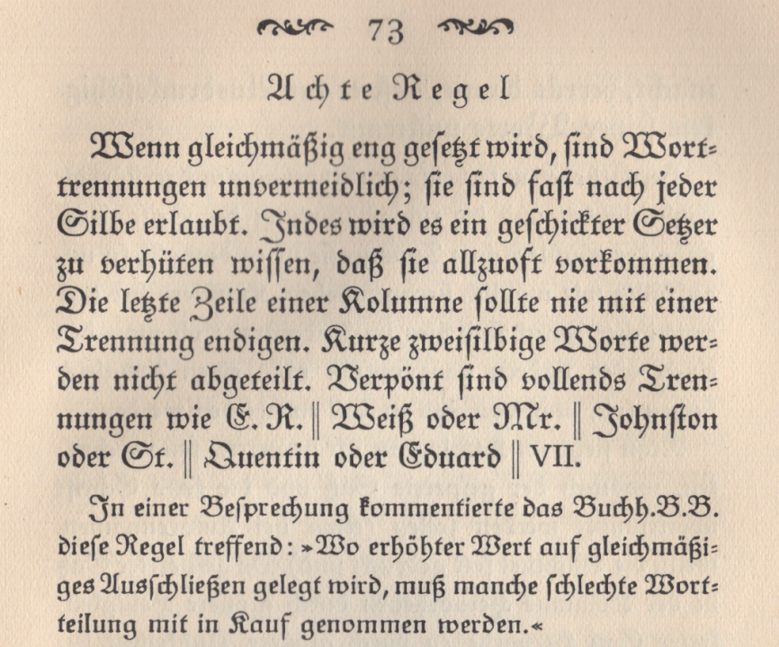
Top of page 73 from Paul Renner’s Typographie als Kunst (München: Georg Müller, 1922). And yes, this is the same Paul Renner who designed Futura just a few years later. Renner had his first typography manual composed in multiple sizes of the Original-Ungerfraktur, as cast by the Julius Klinkhardt foundry in Leipzig. The larger of the two sizes above corresponds to Unger’s Grobe Cicero size. The smaller matches Unger’s Kleine Cicero. Berthold later sold these sizes as a big-on-the-body 12 point and 10 point, respectively.
1804, 1809, 1821
After being appointed as a senator of the Prussian Academy of Arts and professor of wood engraving, Unger died on 26 December 1804. His widow, Friederike Helene née von Rothenburg, inherited the extensive business, which included letterpress printing, music printing,[45] typefounding, and book publishing. Due to the difficulties of the time, however, she could not keep it afloat.[46] After unsuccessfully petitioning the king to purchase the firm for the university, the business went bankrupt in 1809. A. W. Schade, a nephew of Unger’s, acquired the publishing venture. For the benefit of the creditors, the printing and typefounding facilities were managed by a printer named J. S. G. Otto as the Joh. Friedrich Unger printing house and typefoundry[47] until they were purchased by Trowitzsch & Sohn on 29 October 1821.
The Trowitzsch & Sohn printing house was established in Küstrin in 1711 and moved to Frankfurt an der Oder in 1815.[48] Karl Ferdinand Sigismund Trowitzsch (born on 6 August 1797 in Küstrin), the firm’s owner, established a Berlin branch of the business by taking over the Unger printing and typefounding operations. The new Berlin location of Trowitzsch & Sohn mainly dealt with calendar publishing.
1830
From Karl Trowitzsch’s death on 6 February 1830, Wilhelm Mütterlein – the previous managing director of the Berlin branch – managed the company until 1849.[49] Then, his son Gustav Mütterlin took up the management on behalf of Trowitzsch’s underage heirs.
1851
In January 1851, the business was handed over to the Trowitzsch children. Eugen Trowitzsch (born on 8 December 1826 in Frankfurt an der Oder) took over the management. On 1 August 1851, the printing house and typefoundry became the joint property of the brothers Karl and Eugen Trowitzsch. On 1 August 1852, the latter became the sole owner.
Under Eugen Trowitzsch, the typefoundry flourished. He acquired matrices for the best French and English typefaces, and the border-printing elements[50] he purchased as matrices from Lorrain & Deberny[51] in Paris also found many admirers in Germany.
1854
The foundry operated with four casting furnaces and five pivotal casting machines in 1854.[52]
1867
Eugen Trowitzsch died on 10 February 1867. Once again, Gustav Mütterlein managed the business as the heirs’ guardian. He continued to run it for them when they came of age.
1888, 1897, 1901
In the summer of 1888, Edmund Mangesldorf and Dr. Otto Freiherr von der Pfordten purchased Trowitzsch & Sohn. Mangesldorf, a bookseller from Leipzig, was then based in Munich; the Freiher von der Pfordten was a Privatdozent.[53] The latter resigned on 1 August 1892 to fully devote himself to poetry. He later became a professor at the University of Strasbourg and died in Brussels in early March 1918. That left Edmund Mangelsdorf as Trowitzsch & Sohn’s sole owner after 1892. Under his leadership, the business mainly focused on publishing and printing, which it did with great success. Since Eugen Trowitzsch’s death, the typefoundry had increasingly limited itself to casting type for its own needs. Two big tasks still fell to it: Together with Ferd. Theinhardt’s foundry, Trowitzsch & Sohn carried out the recasting of the Reichsdruckerei’s type.[54] It also recast its own printing house’s type according to the new standard system.[55] The typefoundry was then sold to the Rotterdamsche Lettergieterij in Holland in 1897, from which it passed on to Johannes Enschedé en Zonen in Haarlem in 1901. That was how matrices of Unger’s Fraktur types came to Holland.[56]
The W. Drugulin printing house in Leipzig acquired two strikes of every matrix from each of the Unger-Fraktur types from Trowitzsch & Sohn around 1875. One set of these went to Julius Klinkhardt in Leipzig.[57] The D. Stempel AG in Frankfurt am Main acquired the other set in 1920.[58]
1919
Edmund Mangelsdorf died on 21 June 1919.
Gubitz
1824
An F. W. Gubitz typefoundry and cliché-making company was in operation by 1824.[59] The first issue of Gubitz’s Sammlung von Verzierungen in Abgüssen für die Buchdrucker-Presse was published that year.[60] Issues 2 through 8 were published by 1839. The ornaments were very popular in their time.
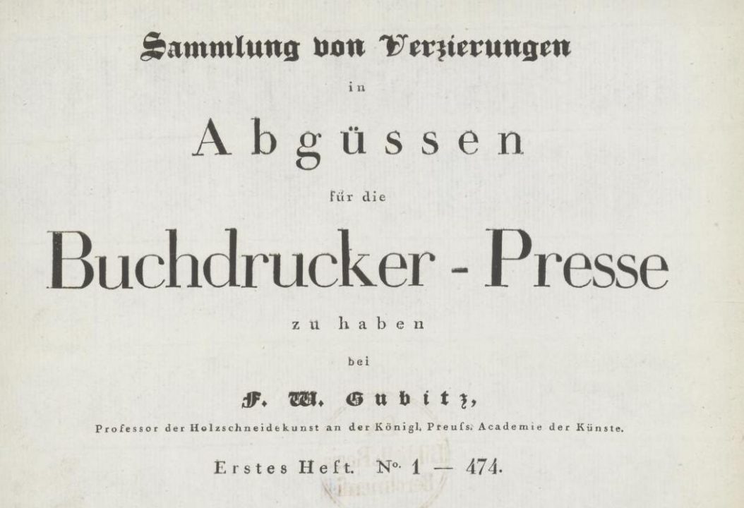
Cropped view of the title page from Sammlung von Verzierungen in Abgüssen für die Buchdrucker-Presse zu haben bei F. W. Gubitz, Professor der Holzschneidekunst an der Königl. Preuss. Akademie der Künste. Erstes Heft No. 1–474 (Berlin: Vereins-Buchhandlung, 1824). The tight-but-not-touching letters spelling Buchdrucker-Presse look to me like they were designs from the Unger foundry. According to Enschedé 1978 (note 1 below), pp. 505 and 460, they were cut in brass by Unger himself. It is easily conceivable, however, that F. W. Gubitz’s father could have cut some of them.
1854
The foundry operated with two casting furnaces and one pivotal caster in 1854.[61]
Friedrich Wilhelm Gubitz (born 27 February 1786 in Leipzig, died 5 June 1870 in Berlin) was the son of Unger’s colleague, the famous wood engraver who – after Unger – brought this art form back to a place of honor in Germany. He was also a writer and founded the Vereinsbuchhandlung in 1822.
Post Script: The Unger-Fraktur
Unger’s reformed Fraktur was a text typeface. He did not produce it in any “display” size. Ernst Crous provides the years when each size was finished:[62]
- The very first attempt (Cicero/approximately 12 point): 1789
- Firmin Didot’s Korpus size (10 p): circa 1791
- Petit, first attempt (8 p): 1792/93
- Petit (8 p): 1793
- Bourgeois on Korpus (9 on 10p): 1793
- Nonpareille (6 p): 1794
- Kleine Cicero (small on body 12 p): 1795
- Grobe Cicero (big on body 12 p): 1797
- Perl (smaller than 6 p): 1798
Two discarded drafts for Unger’s reformed Fraktur. The top four lines were presumably cut by Unger in 1789. The six lines below that were cut by Unger, circa 1791. Gubitz may have assisted in some capacity. From Enschedé 1978 (note 11 below), p. 368.
Because Unger’s Fraktur was the basis for several twentieth-century revivals, I think that it would be helpful to differentiate between the various metal-type versions. Like the Walbaum fonts sold in the twentieth century, not all the Unger-Fraktur revivals’ characters were re-cut. I find this very important. In the case of Walbaum’s roman and italics, printers could buy fonts of type from H. Berthold AG that included forms cast from matrices that were direct descendants of those struck by Justus Erich Walbaum himself. Printers who installed Monotype machines used Walbaum fonts, which were the complete invention of the Monotype Type Drawing Office.
Unger’s 1793 specimen for his “new style of German letters” can be viewed online. A facsimile of his “second specimen of newly revised German printing type” from 1794 – published by Berthold in 1925 – has also been digitized. Trowitzsch & Sohn, which acquired his foundry in 1821, sold five sizes of this, called the Ungersche Schriften. Unger’s matrices – and perhaps some punches? – seem to have survived, by way of Enschedé, and are now at the Noord-Hollands Archief in Haarlem. It would be swell if someone in the Netherlands could go and have a look at them. For Unger’s Neue Deutsche Lettern, the archive’s database includes the following entries for matrices:[63]
- 2488/1538: Strikes for Perl Fraktur; number 9 in the list above.
- 2488/1539: Strikes and galvanos for Nonparel Fraktur No. 4; number 6 in the list above.
- 2488/1540: Strikes for Petit Fraktur No. 5 (Erster Versuch); number 3 in the list above.
- 2488/1541: Strikes Petit Fraktur; number 4 in the list above.
- 2488/1542: Strikes and galvanos for Bourgeois Fraktur; number 5o in the list above .
- 2488/1543: Strikes for the Corpus Fraktur from Firmin Didot; number 2 in the list above.
- 2488/1544: Strikes and galvanos for Augustijn Fraktur (Erster Versuch); number 1 in the list above.
- 2488/1545: No further details are provided in the database entry. Number 7 in the list above.
- 2488/1546: No further details are provided in the database entry. Number 8 in the list above.
Bauer mentioned above that Trowitzsch & Sohn sold matrices of the Unger-Fraktur to the W. Drugulin and Julius Klinkhardt foundries in Leipzig. I have not been able to locate specimens of these fonts from either of them. Secondary sources from the beginning of the 20th century indicate that Klinkhardt expanded the Unger-Fraktur to include additional bold and light styles in 1907 and 1910, respectively.[64] According to FontsInUse.com, “Julius Nitsche added Unger-Initialen, a set of initials for one- and two-color printing, for Klinkhardt in 1908.”[65] Sources from D. Stempel AG and H. Berthold AG, which acquired the W. Drugulin and Julius Klinkhardt foundries after the First World War, respectively, indicate that each did have original Unger-Fraktur matrices.
Joh. Enschedé en Zonen printed the top four lines of the comparison above with the Unger foundry’s reformed Fraktur’s Bourgeois size. Scanned from Enschedé 1978 (note 11 below), p. 368. Below it are four lines of Berthold’s Original-Unger-Fraktur in 9 point, scanned from Original-Unger-Fraktur, Berthold-Heft Nr. 222. The letterforms look lighter than Enschedé’s but this is due to different paper surfaces. That also applies to Stempel’s Unger-Fraktur – the last three lines above. Its 9-pt size matches Berthold’s Orginal-Unger-Fraktur as well as Unger’s own types. Scanned from Qualitäts-Schiften für Qualitäts-Drucke (Frankfurt am Main: D. Stempel AG, n. d.), p. 106.
An inventory of Stempel’s matrices from Drugulin lists the Unger-Fraktur in sizes 8, 9, 10, 12, 14, 16, and 20. Berthold’s first specimen for its Original-Unger-Fraktur revival claim’s that the typeface’s smaller sizes – 6, 8, 9, 10, 10g, 12, and 12g – were cast from original matrices that Berthold acquired from Klinkhardt. The sizes for Berthold’s Original-Unger-Fraktur from 14 to 48 point were new, but I suspect that Klinkhardt made these sometime before 1907. Drugulin’s four largest sizes cannot be from the 18th century; Stempel’s 10-point size seems to be Unger’s small-on-body Cicero design from 1795, but its 12-point size is not a match for Unger’s big-on-the-body Cicero. Berthold’s 12g size, on the other hand, does match Unger’s big-on-body Cicero. Since Berthold’s 10-point matches Unger’s small-on-the-body-Cicero, however, its small-on-the-body 12-point size may be a Klinkhardt addition. Stempel’s massive catalog from the late 1920s has a few pages showing its expanding Unger-Fraktur. The first page, showing the three smallest (and ostensibly “original” sizes) can be seen online. That catalog was published before Stempel added its bold weight in 1928.[66] Stempel manufactured Linotype matrices for its Unger-Fraktur weights, and a German Linotype brochure for those has been digitized. Berthold’s specimen also states that the Typograph line-casting machine’s Unger-Fraktur was based on Berthold’s fonts.
Comparison of the Unger foundry’s Corpus-sized reform Fraktur with the 10-point types from the truest Unger-Fraktur revivals. The middle section is Berthold’s Original-Unger-Fraktur. Stempel’s Unger-Fraktur is shown on the bottom. While Berthold’s and Stempel’s 6, 7, 8, and 9-point Unger-Fraktur types all seem match’s Unger’s exactly, their 10-point sizes must both be independent creations. The Unger foundry’s size of this type (top) was cut by Firmin Didot instead of Johann Friedrich Unger and Johann Christoph Gubitz and does not really match the rest of the range. Stempel’s 10-point size is smaller on the body than Berthold’s. Both of the types cannot come from the same matrices.
Three other German foundries’ marketing suggested that they had also acquired Unger-Fraktur matrices, although I am skeptical that was true. Before Berthold acquired Klinkhardt, the Böttger foundry in Leipzig had fonts of Original-Unger-Fraktur and accompanying initials. Perhaps additional investigation will indicate whether this foundry got its matrices from Klinkhardt. In 1918, bought Böttger, just like Klinkhardt. The Schriftguss foundry in Dresden sold an Original-Unger-Fraktur typeface only available in sizes between 6 and 12 point. A second typeface, the Unger-Neuschnitt-Fraktur – which also had a bold – had sizes ranging from 6 to 36 point. Otto Weisert in Stuttgart also had an Original-Unger-Fraktur typeface, though I do not know the source of its matrices, either.[67] The Norddeutsche Schriftgießerei’s Kabinett-Fraktur – billed as a recutting rather than a recasting of the Unger-Fraktur – was a latecomer to the party, appearing only in 1938.[68]
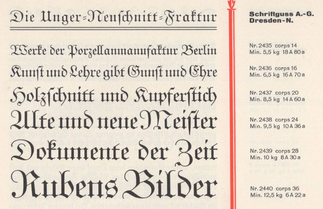
Above, the six largest sizes of Schriftguss AG’s Unger-Neuschnitt-Fraktur. This Dresden-based foundry also sold an Original-Unger-Fraktur (not pictured). From Kleiner Schriften Katalog (Dresden: Schriftguss A.-G. Schriftgießerei und Messinglinien-Fabrik vorm. Brüder Butter, n. d.), p. 19.
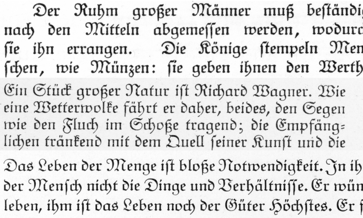
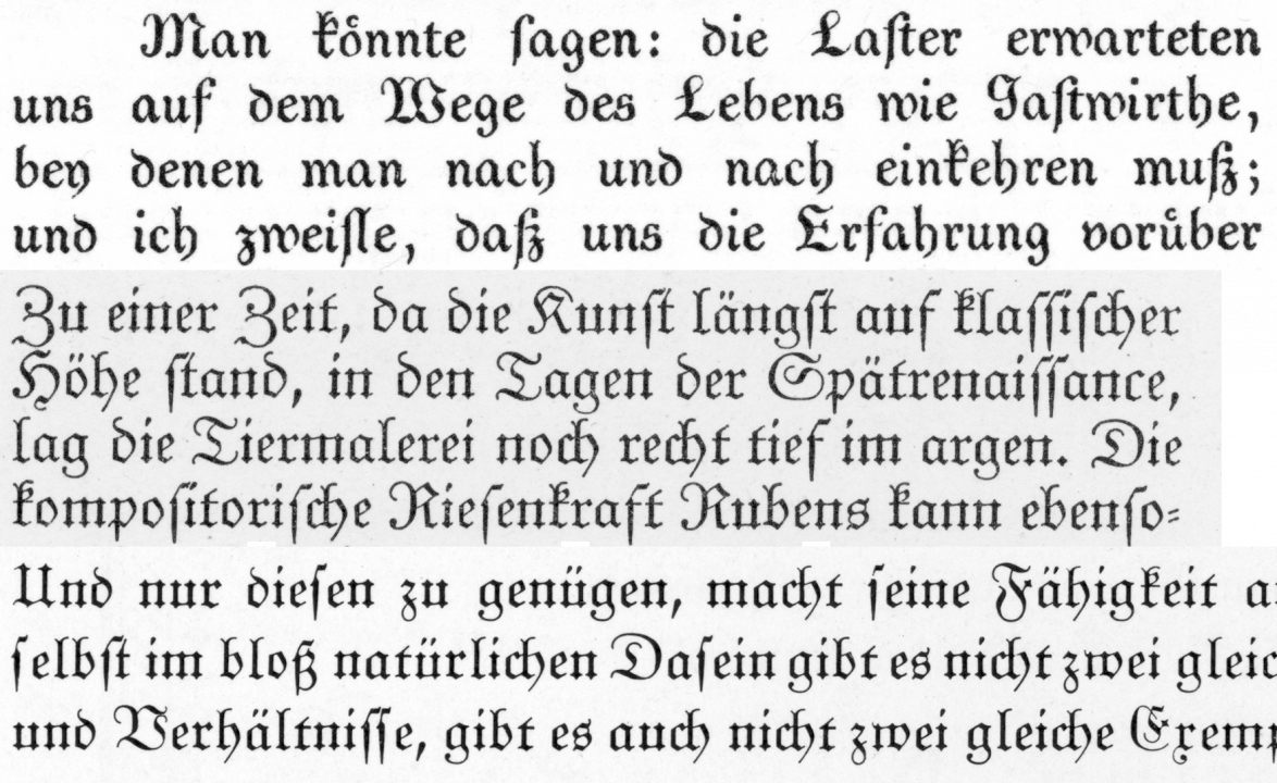
The Unger-Fraktur revival, in terms of actual use, seems to have been quite significant in Germany during the early 1920s. For instance, Paul Renner’s first book on typography was composed with the typeface. Aside from the Typograph and Linotype Unger-Frakturs, Intertype – another linecasting-machine manufacturer – also offered Unger-Fraktur (typeface no. 124). Sadly, though, I have no information about it. The typeface was also essentially remixed and reinterpreted. For instance, Emil Rudolf Weiß’s Weiß-Fraktur was a self-described Unger-inspired design.[69] Weiß first designed it as a private typeface for the Tempel-Verlag. The Bauersche Gießere published it for the general public.
Scan from the Weiß-Fraktur specimen (note 69 below), p. 74 (cropped). Although Weiß-Fraktur was an original type design from Emil Rudolf Weiß, it was strongly influenced by Unger’s reformed Fraktur. Its letterforms are rounder, with somewhat simplified skeletons, making them more like roman and italic type.
Monotype sold an Unger-Fraktur in regular and bold. According to the Effra Press and Typefoundry, Monotype introduced the regular weight – Series 205 – in 1925. Its revival must have been an attempt to cash in on the Unger-Fraktur revival that was already underway. Likely, a German customer requested its addition. A German foundry could have provided the design; it was only in 1935 that the German Founders’ Organization forbade its members to collaborate with the Corporation.[70] Monotype’s regular Unger-Fraktur weight was followed up by Series 277, a bold, in 1929. The Effra Press list notes that both were discontinued in 1972. At least some punches for the Monotype’s Unger-Fraktur survive at the Science Museum in London. The Museum für Druckkunst Leipzig likely has the Monotype Unger-Fraktur matrices from Eckehart-SchumacherGebler’s Offizin Haag-Drugulin, which closed in Dresden last year.
Notes
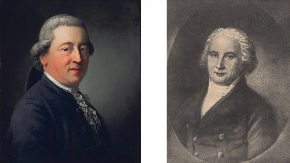
This post’s header images shows an 1783 portrait of Georg Jakob Decker (1732–1799) on the left and Johann Friedrich Unger (1753–1804) on the right. Decker’s portrait was painted by Anton Graff (1736–1813). Today it is at the Alte Nationalgalerie in Berlin, where it was photographed by Andres Kilger. The museum shares it under a CC BY-NC-SA license. Unfortunately, I have less details for Unger’s portrait. I scanned a black-and-white print of it from Ernst Crous’s Die Schriftgießereien in Berlin von Thurneysser bis Unger (note 5 below). Crous noted only that the painting was in the possession of one Professor Staerk in Jena – probably this one.
- Daniel Berkeley Updike, Printing Types: Their History, Forms, and Use vol. 1 (Cambridge, Massachusetts: Belknap Press, 1922), pp. 157–158.
- ibid., p. 148.
- Nikolaus Weichselbaumer, »Die Druckerfamilie Decker und die klassizistische Typographie in Berlin um 1800«, in Imprimatur N.F. XXV (2017), pp. 249–268.
- Erst Crous, Fünfzig Jahre Reichsdruckerei 1879–1929 (Berlin: Reichsdruckerei, 1929), pp. 233–240. Reprinted as a supplement to Archiv für Buchgewerbe und Gebrauchsgraphik 68, issue 7 (July 1931).
- Ernst Crous, Die Schriftgießereien in Berlin von Thurneysser bis Unger. Nach handschriftlichen und gedruckten Quellen dargestellt (Berlin: H. Berthold AG, Abteilung Privatdrucke, 1928).
- For Unger’s denunciation of Johann Carl Ludwig Prillwitz’s Didot-style types, see Christina Killius, Die Antiqua-Fraktur Debatte um 1800 und ihre historische Herleitung (Wiesbaden: Harrassowitz Verlag, 1999), pp. 260–281. See also Crous 1928 (note 5 above), pp. 73–81.
- Susanne Wehde, Typographische Kultur. Eine zeichentheoretische und kulturgeschichtliche Studie zur Typographie und ihrer Entwicklung (Tübingen: Max Niemeyer Verlag, 2020), pp. 216–245.
- Christopher Busch, Unger-Fraktur und literarische Form (Göttingen: Wallstein Verlag, 2019).
- For a history of the printing house, see Das Haus Trowitzsch & Sohn in Berlin. Sein Ursprung und seine Geschichte von 1711 bis 1911 (Berlin: Trowitzsch & Sohn, 1911).
- John A. Lane, Mathieu Lommen, and Johan de Zoete, Dutch typefounders’ specimens. From the Library of the KVB and other collections in the Amsterdam University Library, with histories of the firms represented (Amsterdam: De Buitenkant, 1998), pp. 281–283.
- Charles Enschedé, Typefoundries in the Netherlands from the fifteenth to the nineteenth century. A history based mainly on the collection of Joh. Enschedé en Zonen at Haarlem. An English translation with revisions and notes by Harry Carter and Netty Hoeflake. Edited by Lotte Hellinga (Haarlem: Stichting Museum Enschedé, 1978), pp. 366–409.
- ibid., p. 368.
- ibid., pp. 368–372 and 452. This was from Unger’s ca. 1798 Schriftproben der Didotschen und gewöhnlichen Lettern, welche in der Ungerschen Schriftgiesserei in Berlin für nebenstehenden Preise zu haben sind. In Enschedé 1978 (note 11 above), additional specimens of types from Unger’s foundry appear on pp. 373, 405, 407, 408, and 410.
- Enschedé 1978 (note 11 above), pp. 375–379.
- Johann Grynäus was also originally from Basel. However, he died before the time when Decker married his daughter.
- Arnaud Dussarrat may be the same Frech printer as the Arnaud du Sarrat in Tomas Górny’s 2023 paper on “the international music trade in Halle in Leipzig c. 1700.”
- Weichselbaumer 2017 (note 3 above), pp. 253–254 mentions that Decker first applied for permission to open a typefoundry in 1765, Frederick II refused his request. The king did relent two years later, however. The Berlin typefounder Johann Ludwig Zinck, who I discussed in my previous post, believed that this infringed on his privileges but he received no satisfaction; see Crous 1928 (note 5 above), p. 54
- Crous 1928 (note 5 above), p. 63 confirms that this was the Fournier le jeune, author of the Manuel Typographique. Weichselbaumer 2017 (note 3 above), p. 254 notes that Decker visited Fournier “in the summer of 1767.” As Fournier died a year later, Decker’s timing proved fortunate as he was able to procure strikes of typefaces from Fournier for the new Berlin foundry. The initial plan for a Royal Typefoundry in Berlin, prepared at the start of Frederik II’ reign in 1741, included a broad range of faces from the then 20-year-old Fournier; see my previous post in this series.
- Weichselbaumer 2017 (note 3 above), p. 252 states that this commission was printed at the palace in Berlin.
- Weichselbaumer mentions 16 presses. ibid.
- An approximate translation for this title would be “George Jakob Decker & Son, Royal Privy Court Printers.”
- Franz Laurent Xavier Levrault (1762–1821) appears in one of the entries for Strasbourg in Bauer’s Chronik. As such, I shall address him as part of this project at a later date.
- The entirety of Bauer’s entry for Hessenland reads: “The Hessenland typefoundry operated in Brandenburg an der Havel until 1813. Afterwards, the Decker Court Printing House in Berlin acquired it, along with its 6,000 matrices. Breitkopf & Härtel in Leipzig received some of the matrices for 325 Reichstaler.” See Friedrich Bauer, Chronik der Schriftgießereien in Deutschland und den deutschsprachigen Nachbarländern (Offenbach am Main: Verlag des Vereins Deutscher Schriftgießereien, 1928), p. 39.
- You can find some basic information about Friedrich König and his press on the König & Bauer website.
- After the Royal Prussian Academy of Sciences’ printing operations closed in the 1890s, its typographic materials were transferred to the Reichsdruckerei. Some of the non-Latin punches from the Academy of Sciences kept at the Deutsches Technikmuseum in Berlin must date back to Rudolf Ludwig Decker’s time.
- In 1854, Johann Heinrich Meyer – publisher of the Journal für Buchdruckerkunst – printed an address book of Central European printing houses and typefoundries, etc. The book’s entries included details on the number of machines, etc. Bauer included these statistics whenever they were relevant to his chronicle’s entries; see Johann Heinrich Meyer (ed.), Adressbuch der Buchdruckereien von Mitteleuropa, der Stein-, Kupfer- und Stahlstichdruckereien, der Schrift- und Stereotypengiesser, xylographische Institute, Pressen- und Druckmaschinenbauer, Farbefabrikanten, sowie der mechanischen Papierfabriken in Deutschland (Braunschweig: Meyer, 1854).
- The original German title was the Königliche Geheime Ober-Hofbuchdruckerei (R. v. Decker).
- Fifteen castermen and twelve apprentices meant that, by the 1860s, the Decker foundry was no longer particularly large. While it had more employees than the Johann Christian Bauer’s foundry at the time of Bauer’s death in 67 (only 20), Schelter & Giesecke in Leipzig had 200 employees in 1869, and Flinsch in Frankfurt 220 in 1873; see Dan Reynolds, Schriftkünstler (diss. HBK Braunschweig, 2020), pp. 198–199.
- The legislation, printed in the Reichsgesetzblatt, has been digitized and can be read here.
- The Stoltze’s Palais, which the Decker operated out of from the 1790s until the 1870s, became the home for the German Foreign Office after the printing house moved out. The building that was at this address was destroyed during and after the Second World War. It was located on the westward side of Wilhelmstraße, somewhere between Behrenstraße and Vossstraße.
- The equivalent purchasing power of these 1,780,000 marks in March 2023 would be €13,706,000, according to the Deutsche Bundesbank.
- The minutes of the Reichstag session in which this legislation was passed have digitized. You can read the relevant portion beginning on the bottom right of this page.
- Reichsdruckerei translates literally into Imperial Printing House.
- This was the architect Carl Büsse, who has a Wikipedia page.
- That facility was located with the current German federal printing house (Bundesdruckerei) is today. You can find it easily on Google Maps or simply ride Berlin’s M29 Bus from Friedrichstraße to the Oranienstraße in Kreuzberg.
- Just as Decker and the Reichsdruckerei had an in-house typefoundry, so did the Trowitzsch & Sohn printing house. Ferd. Theinhardt’s foundry, on the other hand, was independent of any single printer.
- Let’s think about this for a minute. Combining the Decker printing house and the Prussian State Printing Office into one imperial printing house meant the type in the new printing house’s cases did not match. Each firm followed different standards for typographical measurement and their types’ height-to-paper. In the early 1870s, the German printing industry adopted the Didot point from France. Nevertheless, there was some dispute about a point’s exact millimeter value. Hermann Berthold standardized this at 0.376 mm in 1878. The Reichsdruckerei had to recast all its types. To do that as quickly as possible, they hired two other foundries to help. All three foundries were good-sized operations, but the endeavor still took almost two years!
- While it was generally true that the Reichsdruckerei did not distribute copies of its matrices to commercial typefoundries, there was at least one exception. Georg Schiller’s Neudeutsch typeface, designed and cut inside the Reichsdruckerei, was made commercially available through the J. John Söhne and C. F. Rühl typefoundries at the beginning of the twentieth century.
- The term “academic printer” refers to the license Unger had received in 1788, giving him a monopoly on the printing and publishing of works from the Prussian Academy of Sciences.
- Some authors are cagey about whether Unger purchased matrices from Firmin Didot in Paris or simply, with a license from Didot, cut Didot-style types. In Crous 1928 (note 5 above), pp. 72–73, however, we can read exactly which typefaces Unger had matrices from Didot, with which he had sole rights to cast from in Germany between 1790 and 1805. Enschedé notes which larger-sized types were cut at Unger’s in brass to match the smaller Didot types; see Enschedé 1978 (note 11 above), pp. 405–406 and 460.
- From Bauer’s description, one gets the impression that Unger’s foundry consisted of Didot-style roman and italic types, as well as the reformed Fraktur that Unger created with Didot and Gubitz. That was not the case. He had a number of other types, especially Fraktur and Schwabachers; see Enschedé 1978 (note 11 above), pp. 368–372. Enschedé believed that many of his matrices were strikes from the Luther foundry in Frankfurt.
- Bauer gave 1828 as the year of Gubitz’s death, which was two years too late. He did not provide Gubitz’s year of birth, which was 1754.
- This specimen has been digitized by the Bayerische Staatsbibliothek.
- See this article’s post script for a list of the Unger-Fraktur revivals in metal type.
- I was hoping that Bauer’s use of the the word Notendruckerei implied intaglio printing but based on Crous 1928 (note 5 above), pp. 101–105, it must have been cast fonts of musical notation printed via letterpress.
- The War of the Fourth Coalition in 1806–1807 was disastrous for Prussia. It had allied with Saxony, as well as with Britain, Russia, and Sweden to halt Napoleon and the French Empire. Instead, Napoleon defeated Prussia and Saxony at the Battle of Jena–Auerstedt and then occupied Berlin. Prussia lost about a third of its territory in 1807, although it regained much ground in the aftermath of the Napoleonic Wars.
- The proper company name in German was the Joh. Friedrich Ungersche Buchdruckerei und Schriftgießerei.
- This sentence contains a bit of an anachronism. The printing house established at Küstrin in 1711 was done so by Gottfried Heinichen. Carl Gottlob Trowitzsch took it over in 1780. When he purchased the Frankfurt an der Oder printing house of Christian Ludwig Apitz in 1815 and moved his business there, the company name changed to Trowitzsch & Sohn. It had only had that name for about six years when it bought the Unger business in 1821.
- Charles Enschedé, probably a more reliable source, gives him a fuller name: Friedrich Wilhelm Mütterlein. See Enschedé 1978 (note 11 above), p. 367.
- In German: Einfassungen.
- I assume that Bauer was referring to the Laurent et Deberny foundry in Paris.
- Meyer 1858 (note 26 above).
- Dear reader, please don’t make me translate Privatdozent into English! A Privatdozent is an academic within the German University system who has attained an intermediary role without any sort of equivalent in the English or North American university systems.
- See the third paragraph under “1879” in this article’s Decker – Reichsdruckerei section.
- All of the printing house’s type would have been recast to have the new German height-to-paper size of 62 ⅔ point. Bodies would also now have to be delineated in exact increments within the Didot point system.
- The account about Unger’s reformed Fraktur types coming to Holland, as well as the next paragraph in this entry, do not appear in the first edition of Bauer’s Chronik der deutschen Schriftgießereien (1914), as the revival of the Unger-Fraktur had not yet reached the heights it would in the 1920s.
- While I will take it on faith that Bauer is correct about Drugulin’s 1875 strike purchase, I am doubtful about Drugulin’s having sold its duplicate sets to Julius Klinkhardt right away. I have not yet been able to locate a specimen of the Unger-Fraktur in a 19th century specimen. It is neither in Klinkhardt’s 1883 nor in its 1892 catalog, for instance.
- Bauer’s explanation of Stempel’s Unger-Fraktur matrices is not clear-cut. The D. Stempel AG foundry acquired W. Drugulin’s entire typefoundry in 1919 – and with it, of course, one set of the Unger-Fraktur matrices.
- The first edition of Bauer’s Chronik der deutschen Schriftgießereien (1914) had no account for Gubitz.
- This was a collection of cast ornaments for use in letterpress printing. All eight issues of these specimen have been digitized by the Staatsbibliothek zu Berlin.
- Meyer 1858 (note 26 above).
- Crous 1928 (note 5 above), Tafel 8.
- All nine – with the same Enschedé product numbers – can be seen on Enschedé 1978 (note 11 above), p. 373.
- Philipp Bertheau (ed.), Buchdruckschriften im 20. Jahrhundert. Atlas zur Geschichte der Schrift, ausgewählt und kommentiert von Philipp Bertheau unter Mitarbeit von Eva Hanebutt-Benz und Hans Reichardt (Technische Hochschule Darmstadt, 1995), p. 143.
- “Unger-Fraktur” on FontsInUse.com, last accessed on 6 January 2024. The sources for this statement come from the Klingspor Museum and Dieter Steffmann.
- Bertheau 1995 (note 64 above), p. 143.
- ibid. dates Schriftguss AG’s Unger-Fraktur typefaces to 1928 and Otto Weisert’s to 1929.
- ibid. gives the year for this typeface’s publication and mentions that it also had an accompanying bold weight. The Staatsbibliothek zu Berlin has digitized a Norddeutsche Schriftgießerei specimen for Kabinett-Fraktur, but it does not include a bold.
- The Bauersche Gießerei’s 1913 specimen for Weiß-Antiqua was dedicated to Johann Friedrich Unger; see Weiß-Fraktur. Die Schrift des Tempel-Verlags (Frankfurt am Main: Bausche Gießerei, 1913), n. p.
- Leonie Tafelmaier, »Der Verein der Schriftgießereien Offenbach am Main (1903–1972)« in Gutenberg-Jahrbuch 72 (Mainz: Gutenberg-Gesellschaft, 1997), pp. 189–205, here p. 199.