Welcome to the seventh post from my Friedrich Bauer Project. Below is my translation of his entry for Berthold as it appears on pages 24–31 of his Chronik der Schriftgießereien in Deutschland und den deutschsprachigen Nachbarländern (1918). I added illustrations and captions to the text, plus some commentary in this post’s footnotes.
Berthold
1858
On 1 July 1858, Hermann Berthold (born 19 August 1831 in Berlin) opened an “Institute for Electro-Plating”[1] at Wilhelmstraße 1.[2]
1861
In October 1861, he became a partner in a typefoundry, brass-rule factory, stereotyping, and engraving business set up with Gustav Zechendorf, a relative. They named the company Zechendorf & Berthold.
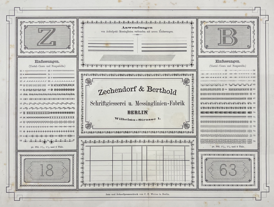
A very early Berthold specimen. This 1863 flyer advertised border-printing elements from Zechendorf & Berthold. It was composed and printed by C. F. Weiss in Berlin. Kept at the Noord-Hollands Archief, inventory number 2487/231
1865
Berthold left the company on 1 January 1865. At the previous premises, he built a new factory manufacturing brass printing rules, with a machinist workshop and electroplating. Making new and useful linear patterns soon secured him a widespread reputation for quality. Berthold’s business expanded, and his products went to all parts of the world where Gutenberg’s art was practiced.

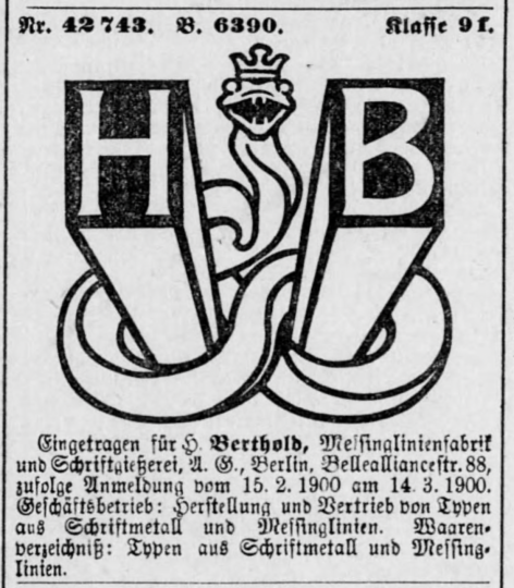
The above composition, from the footer of one of Hermann Berthold’s brass-rule specimen sheets. was made from brass printing pieces and probably printed during the mid-1870s. While the intertwined HB is not a company logo, per se, it helps illustrate how Hermann Berthold was building his company’s brand. The composition is exquisite. I think the presswork’s quality is probably due to the capabilities of an external printing house since the Berthold company had likely not yet added an internal printing unit. Digitized by the Staatsbibliothek zu Berlin – Preußischer Kulturbesitz.
1869
To create space for the rapidly expanding company, he moved into a larger factory building at Belle-Alliance-Straße 88 in 1869.[3]
1878
In 1878, Berthold was entrusted by the other Berlin typefoundry owners – with the consent of their colleagues throughout the Empire – to create a measurement standard for the typographic system based on the meter. This honorable task, which presented great difficulties, was carried out with the usual care and mathematical precision of Berthold’s work. First, an Urmaß [or definitive measure] was made, examined by the responsible imperial authorities, and officially set down. In May 1879, the typefoundries involved received officially verified partial measuring sticks, which were 30 cm long. That corresponded to 133 Nonpareille exactly, or 798 Didot points.[4] One meter may be divided into exactly 2660 points. Thus was the German standard created. It has since become the unchanging basis for all German-typefoundry products.
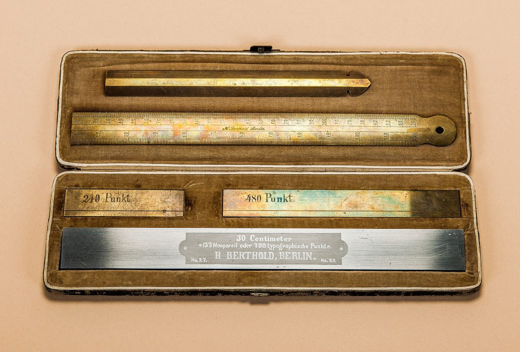
Hermann Berthold’s definitive measuring sticks formed the basis for the German typographic norm. Refining a system already in place in France, he delineated 30 cm into 798 Didot points. From the permanent printing and paper exhibit at the Deutsches Technikmuseum in Berlin. Photo: C. Kirchner/SDTB.
1888, 1891
Patriarchal conditions prevailed in the workshops. Masters and assistants worked hand in hand, allowing specialists to emerge. Each was an artist in the invention of patterns and in the treatment of his technique.[5] Ultimately, the tireless Berthold also felt the need for peace and quiet. At the instigation of the managing clerk[6] Balthasar Kohler, who had worked under Berthold for nine years, the salesman A. Selberg took over the factory on 14 March 1888. The company name did not change. In May 1891, Selberg transferred the business and its real estate to Kohler, who formed a limited partnership with the support of the Hirschler brothers’ banking house.
1893
Since some of the company’s biggest customers [were typefoundries who] were setting up their own facilities to manufacture brass printing rules, Kohler sought a way to expand the company’s scope of business. In 1893, the Gustav Reinhold typefoundry in Berlin – which had already incorporated the Leipzig-based Emil Berger typefoundry in 1890 – was taken over. Additionally, Kohler bought the Berliner Messinglinienfabrik AG at Reinickendorfer Straße 64 and merged it onto his company’s premises at Belle-Alliance-Straße 88. The plot at Belle-Alliance-Straße 88 no longer offered enough space for future expansion, so the neighboring property at number 87 was purchased in 1894.
1894
In the spring of 1894, a subsidiary was founded in St. Petersburg, and an office with a warehouse was opened.
1896
In 1896, the H. Berthold company became a stock corporation with a 2,200,000 mark capitalization.[7] It traded under the name H. Berthold Brass-Rule Factory and Typefoundry AG.[8]
1897
On 9 November 1897, the Bauer & Co. typefoundry in Stuttgart and Düsseldorf was acquired. It continued to operate as an independent business under its existing name. At the same time, Berthold’s capitalization increased to 3,000,000 marks.
1898
Karl Rupprecht, the previous owner of Bauer & Co., joined Berthold’s management in 1898.
In the summer of 1898, a separate piece of land was purchased for the St. Petersburg branch in the city center at 13 Meshchanskaya.[9] A large factory building was constructed there. Two years later, a five-story building was built in front of it. At the end of 1898, brass-rule manufacturing facilities were added to the Stuttgart branch.
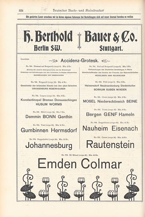
Advertisement that Berthold ran in 1898 and 1899 issues of Deutscher Buch- und Steindrucker for Accidenz-Grotesk. The peculiar-looking plants at the bottom were composed from Berthold’s Stilisierte Cyclamen. Photographed at the Staatsbibliothek zu Berlin – Preußischer Kulturbesitz.
1899
Gustav Reinhold stepped down on 1 July 1899; he died shortly thereafter. On 4 July 1899, Dr. Oscar Jolles (born 10 November 1860) was initially appointed by a delegation from the board of directors. He officially joined the board on 1 January 1900.
Also in 1899, Bauer & Co.’s Düsseldorf branch was merged into the company’s Stuttgart base.
In November 1899, Berthold could move into its new factory premises in St. Petersburg.
1900
In July 1900, the old St. Petersburg foundry of Georg Ross & Co. was purchased, and in February 1901, a branch foundry opened in Moscow.
1901
Karl Rupprecht stepped down from the management in 1901.
1902
In 1902, a large new building was built for the Stuttgart branch on its property at Rötestraße 17.[10] It moved into it that same year.
1904
Hermann Berthold died in Berlin on 23 December 1904.
1905
In the meantime, business relationships in the Austro-Hungarian dual monarchy were growing.
The typefoundry J. H. Rust & Co. in Vienna was purchased in 1905. Its name was changed to H. Berthold, but otherwise, it continued operations. Construction of a modern, large new factory building began immediately on the property at Margaretenstraße 94, which had been taken over from Rust & Co. For tax reasons, the Vienna branch was converted into a limited liability company in 1907.
1908
The A. Haase typefoundry in Prague, which had existed for about a hundred years, became the property of the Vienna branch of H. Berthold in 1908.
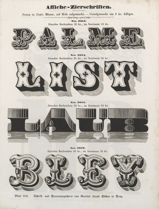
As Friedrich Bauer mentioned, the Haase foundry in Prague had been active for a long time. During the 1830s and ’40s – when the poster-types specimen above must have been printed – the Gottfried Haase Söhne printing house arguably had the most significant typefoundry in the Austrian empire. Photo: Ghent University Library, BIB.ACC.054851.
Meanwhile, the Berlin operation continued to grow and was enlarged by around half with a new building. Since the new rooms were not sufficient either, a third and larger extension was started in 1908, directed toward the property in front of it, which was carried out in two construction phases. The first part of the new factory building was occupied at the beginning of 1909.
With the collaboration of the H. Berthold AG, the Ferd. Theinhardt typefoundry was converted into a limited liability company in January 1908. Its shares became the property of H. Berthold AG.
1909
At the end of 1909, the second part of the new building at Belle-Alliance-Straße 87/88 was completed. Berthold moved in during the summer of 1910.
1910
In 1910, the location of the Ferd. Theinhardt GmbH company was relocated from Schöneberg to the H. Berthold AG factory building at Belle-Alliance-Straße 88, which has now been enlarged by its third expansion. The companies were merged.
On 10 November 1910, the St. Petersburg house received the honorable distinction of being appointed as a supplier to the Imperial Academy of Sciences in St. Petersburg thanks to “its significant contributions to Russian printing at home and abroad, especially in the Slavic countries.” That gave [Berthold’s St. Petersburg branch] the right to use the coat of arms of the Imperial Academy.
1911
In 1911, the large Berthold Hauptprobe [complete specimen catalog] was published.[11] The large octavo-format volume contained 850 pages, which presented all company materials systematically and orderly. Also, the Viennese house was awarded the Imperial Eagle with Austrian Shield and Seal in recognition of its achievements.[12]
The St. Petersburg branch felt compelled to purchase its neighboring property at Meshchanskaya 15 because further expansion of the business had to be considered.
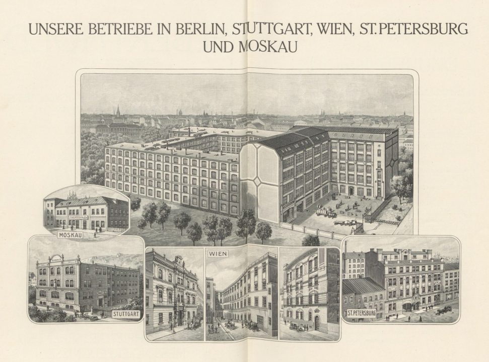
The above drawing shows all Berthold locations in 1911. It is from the foundry’s catalog of that year. The large building at the top displays the company headquarters in Berlin-Kreuzberg. That structure – heavily damaged in 1945 – was rebuilt after the war. Berthold sold it in 1978. You can still visit it today; just look for the Mehringhof. More details about the building can be found here.
1912
At the general meeting of 8 March 1912, an increase in capitalization from 3 to 4 million marks was approved and carried out in April of that same year. In May 1912, the St. Petersburg branch acquired the inventory of machines, punches, and matrices – as well as the warehouse – from the Frankfurt-based Flinsch typefoundry’s St. Petersburg branch. Flinsch thus withdrew from the Russian market.
1914
Stephan Pramor, head of the Moscow branch, was interned after the outbreak of war, and the [Moscow] foundry was destroyed in a popular uprising on 18 May 1915. The head of the St. Petersburg branch, Heimbert Leunig, was expelled from Russia in November 1914. Company manager Balthasar Kohler resigned in 1917 after almost 40 years in office. Thereafter, he was elected to the board of directors.
1917
In July 1917, part of the Otto Tech typefoundry’s equipment and warehouse was acquired. The other portion went to the Emil Gursch typefoundry.
1918
The Emil Gursch typefoundry was acquired on 1 January. Two of its owners, Karl Graumann and his son Erwin Graumann (born 17 March 1884), joined Berthold’s management.
In February 1918, the A. Reimann typefoundry was incorporated into the H. Berthold AG since it had to cease operations as a result of the difficulties of the war economy.
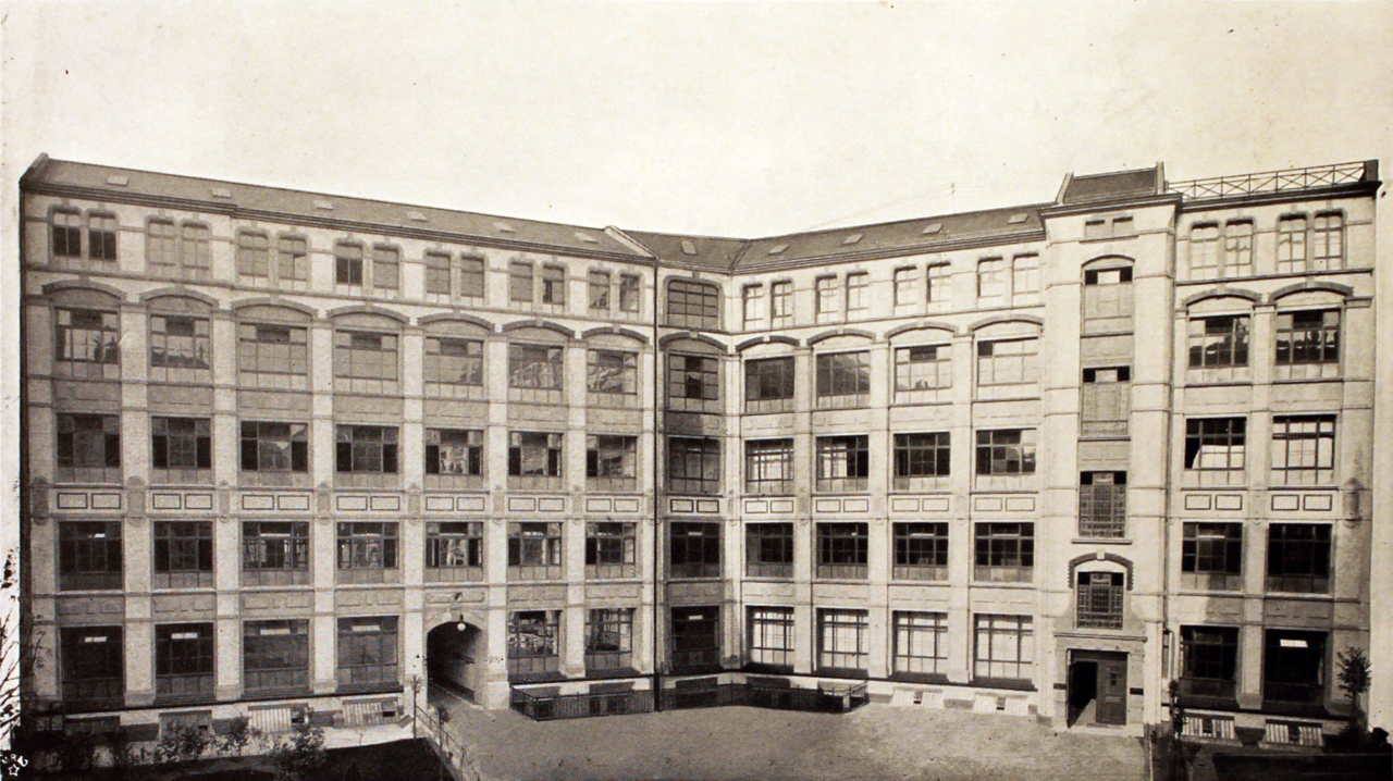
Photograph showing the Emil Gursch factory building shortly after its completion at the beginning of the twentieth century. Scanned from Die Entwicklung der Schriftgiesserei Emil Gursch, Berlin SW, 1866–1901 (Berlin, 1901), kept in the library at the Deutsches Technikmuseum in Berlin. Another library prepared a digitization, available here. Gursch’s factory was just a few blocks away from Berthold’s. After Berthold acquired the Gursch foundry, it kept this factory in operation for several decades. Berthold did not give it up before the end of the Second World War. Today, the building stands behind the back courtyard of Gneisenaustraße 27 in Kreuzberg.
On 1 July 1918, Berthold acquired three typefoundries: Gottfried Böttger in Paunsdorf-Leipzig, C. F. Rühl in Leipzig, and A. Kahle Sons[13] in Weimar. Together with the Leipzig-based F. A. Brockhaus typefoundry, which Berthold had acquired in March, these foundries continued operating as Berthold’s Leipzig-Paunsdorf branch. Eugen Schmidt and Wilhelm Böttger were appointed as deputy Berthold managers. They were the co-owners of C. F. Rühl and Gottfried Böttger, respectively.
1919
In 1919, the Julius Klinkhardt typefoundry in Leipzig merged with H. Berthold AG. Together with the foundries acquired earlier – Gottfried Böttger, C. F. Rühl, A. Kahle Söhne, and F. A. Brockhaus – it became part of the “Böttger-Klinkhardt” branch of H. Berthold AG in Leipzig.
1921
For the 25th anniversary of the stock corporation’s establishment, Hermann Hoffmann’s illustrated Das Haus Berthold, 1858–1921 portrayed the history of the company and presented specimens of its most important creations.
1922
In November 1922, the C. Kloberg typefoundry in Leipzig was purchased and merged into Berthold’s Leipzig branch.
The Leipzig branch’s building was significantly enlarged through renovation and newly-constructed additions, based on the latest technical experience. As a result, all the Leipzig foundries Berthold had taken over could fit inside.
1923
In May 1923, H. Berthold AG entered into a joint venture with the Aktiengesellschaft für Schriftgießerei und Maschinenbau in Offenbach am Main. The purpose of this was to further expand Berthold’s south-German market share and also to support the construction of rotary printing presses.[14]
Although its Russian factories had been nationalized, Berthold did not want to give up its business in the peripheral states. Therefore, a new branch was established in Riga under the name H. Berthold Burtu Lietuve, Zeltys Leunigs un b-ri.
1927
To expand its business in the Austrian successor states and the Balkan countries, the typefoundries H. Berthold AG in Berlin and D. Stempel AG in Frankfurt am Main purchased the Vienna-based Poppelbaum typefoundry on 1 January 1927. A joint company called Berthold & Stempel GmbH thereafter operated from the Grüngasse 16a in Vienna’s fifth district.
The D. Stempel AG typefoundy in Frankfurt am Main owned [all] shares of the First Hungarian Typefoundry AG in Budapest.[15] H. Berthold AG in Berlin acquired half of them.

30 January 2021 screenshot from MTVA Archívum website showing all four photographs tagged with the keyword “Első Magyar Betűöntöde.” The images must be from the postwar years when this was the state-owned foundry of socialist Hungary.
H. Berthold AG also acquired a stake in the Haas’sche Schriftgießerei AG in Münchenstein near Basel, together with D. Stempel AG.[16] In December 1927, H. Berthold AG entered into a joint venture with the Lettergieterij “Amsterdam” voorh. N. Tetterode in Amsterdam.[17]
1928
In January 1928, H. Berthold AG’s was increased by 1,300,000 marks in preferential shares to a total of 5,500,000 marks.[18]
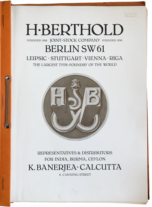
Title page from an undated specimen folder that Berthold produced for a sales agent in Kolkata, K. Banerjea. The firth line reads “The largest type-foundry of the world.” Probably printed between 1924 and 1926 and later kept in the Berthold company library. SDTB/Hist. Archiv III.2-23979. A digitization is available here.
When H. Berthold AG began operating as a typefoundry, it initially followed a path of making advertising typefaces, and in that field, it has been groundbreaking. It then pivoted to all kinds of type-making and produced significant products. The Rococo ornaments, taken over from Gustav Reinhold’s foundry, were completed in 1892 and published in effective type specimens.[19]
Before 1900, the following typefaces were developed: Akzidenz-Grotesk, Carola, Original-Gotisch, Schreibschrift Romana, and Herkules. The roman and italic fonts from the Lateinisch family were completed [by 1900], before [three] additional types were published by 1911 [sic!] – so that, in 1911 [sic!], a special brochure 100 pages in length could present the five [total] styles.[20]
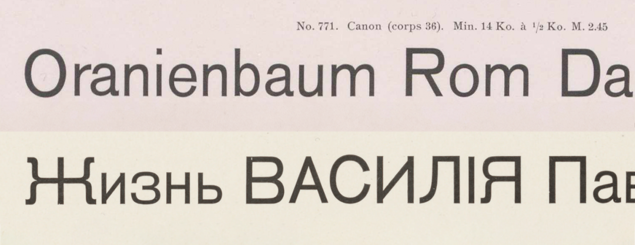
Above, you can see Berthold’s product number 771, better known as 36-point Accidenz-Grotesk. Its Latin-script characters were filed by Bauer & Co. with the Stuttgart design-patent registry on 14 April 1898. H. Berthold AG followed suit and registered them in Berlin two weeks later. To date, I have not found registration details for the Cyrillic characters.
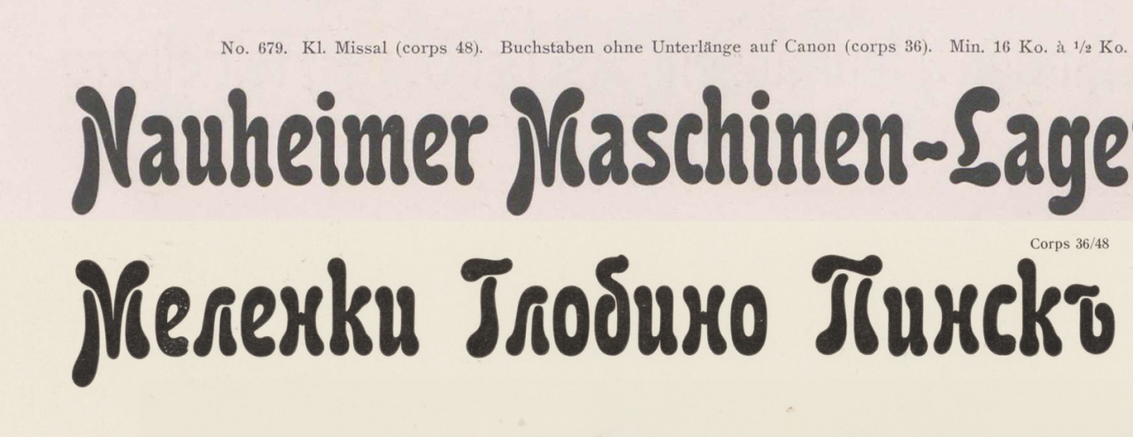
Berthold’s product number 679 is shown above. Better known as Carola-Grotesk (sic!). These were 36-point letters cast on a 48-point body. The Latin script characters for Carola-Grotesk’s sizes were filed with Berlin’s design registry on 15 September 1896. The Cyrillic followed on 5 February 1897.

Originally spelled “Original-Gothisch,” Berthold filed the four smallest sizes of its Original-Gotisch design with the Berlin Muster-Register on 1 December 1898. Four more followed on 6 June 1899. FontsInUse.com’s editors write that “several German foundries added a lighter weight to their adaptations of Bradley.” This is one of those.
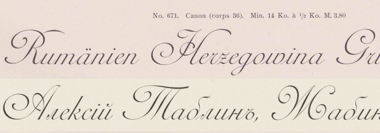
Product number 671 is shown above – the copperplate-script typeface Romana. These 36-point letters were cast on a 48-point body. Berthold filed the Latin-script characters with Berlin’s design registry on 7 May 1896, and the Cyrillic on 5 February 1897.
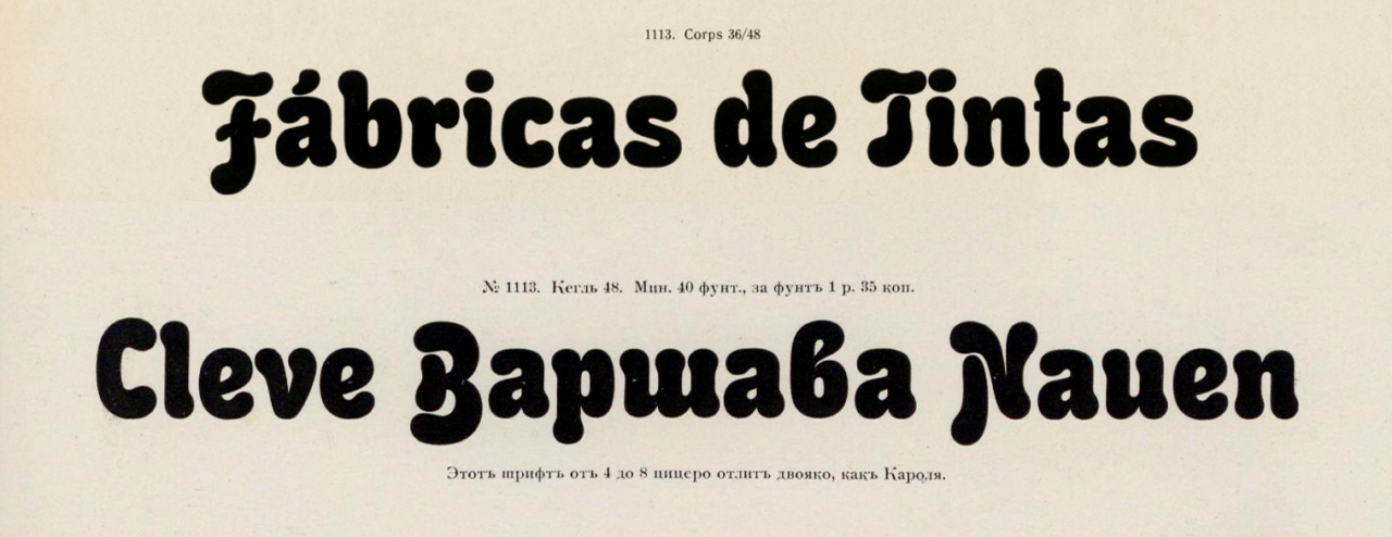
Berthold’s product 1113 is shown above. Better known as Herkules, these were 36-point letters cast on a 48-point body. Herkules’s sizes were filed with the Berlin design registry on 14 and 22 September and 14 October 1899. The Cyrillic registration took place on 26 January 1900.
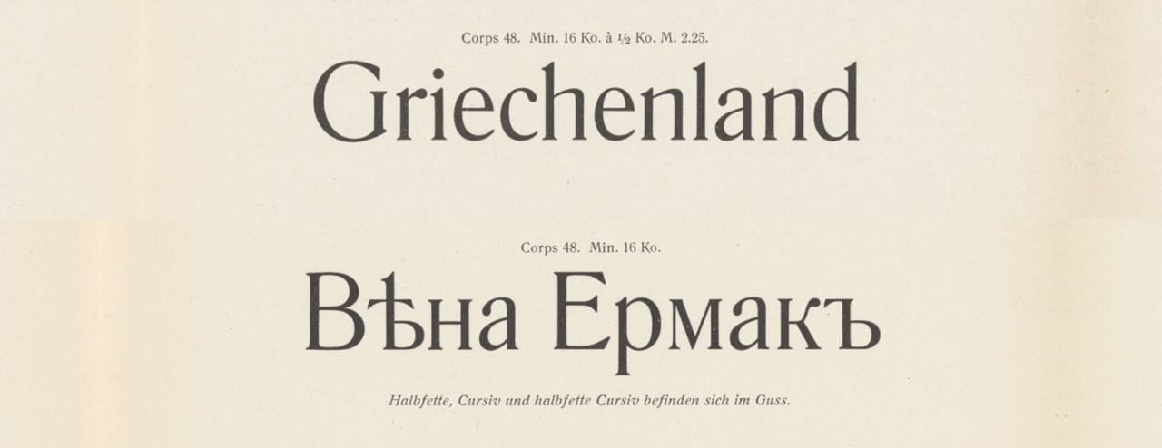
Above, you can see product number 1535, the 48-point size of Lateinsch’s regular style. Berthold filed its Latin script characters with the Berlin design registry on various appointments throughout 1899. The Cyrillic followed in 1900 and 1901.
The most important products from 1901 to 1905 were the Augsburger Schrift, drawn by Peter Schnorr, the Mainzer Fraktur, the multiple styles of Herold, Imperial-Scheibschrift, Aviso-Kursiv, Rekord, Korinna, the Augustea series and the Sorbonne series, and the ornaments and vignettes from the Anker series, made from Hanns Anker’s drawings.

Berthold’s Augsburger Schrift is shown above in its 48-point size. The typeface was filed with Berlin’s design registry on 10 September 1901.

On 22 July 1901, Berthold filed Mainzer-Fraktur’s design with the Berlin Muster-Register.
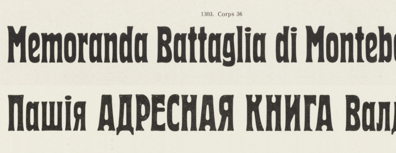
Berthold’s Herold typeface is shown above in its 36-point size. Its Latin-script characters were filed with Berlin’s design registry on 22. Juli 1901. Berthold filed the Cyrillic on 30 November 1904.
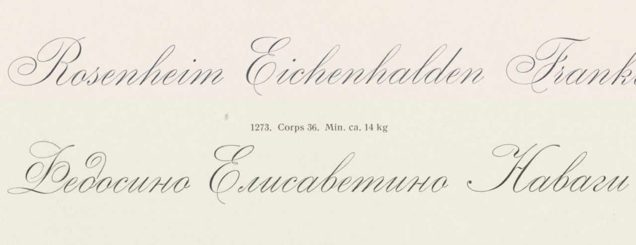
Berthold filed its Imperial copperplate script with Berlin’s design registry on 12 February 1901 (Latin) and 26 April 1901 (Cyrillic).

Aviso-Kursiv: Berthold filed its Latin script characters with Berlin’s design registry on 23 January 1903 and submitted the Cyrillic eight months later on 27 August.

Berthold filed Rekord with Berlin’s design registry on 27 October 1903.

Berthold filed Corinna with Berlin’s design registry on 21 November 1904.

Berthold registered Augustea’s design in Berlin on 23 November 1905. A week later, on 30 November, the typeface was registered in Vienna. A Budapest filing followed on 5 December.

Sorbonne. It’s Cheltenham, from ATF! But not? Really?! This one always got me. Anyway, Berthold filed Sorbonne for a design patent (that is not how those things were supposed to work??) in Berlin on Berlin 6 November 1905. On the 30th, it did the same in Vienna, and also in Budapest on December 5th. A design patent for Berthold’s Cyrillic extension was received a few years later. Sorbonne proved very successful for Berthold in Russia, where it became the typeface of the Imperial Academy of Sciences in St. Petersburg. Sorbonne Cyrillic would go on to be used in the USSR as well. By that time, however, the type was presumably cast in a Soviet foundry instead of being imported from Berthold’s inter-war foundry in Riga.
The publication of the Mainzer Fraktur initiated a new movement in the creation of Fraktur types. Over the next five years, the following were created: Kaufhaus-Fraktur, Block – which included multiple-width alternates for various letters to facilitate justified text-setting – Kantate, and Berthold-Fraktur.

Berthold filed Kaufhaus-Fraktur with Berlin’s design registry on 29 December 1906.

This one is super famous: the first and regular style of the Block family! Sometime marketed as “Reklameschrift Block” [advertising typeface Block]. Berthold filed the weight’s sizes with the Berlin Muster-Register on 23 October 1908 and in Vienna, too, on the 26th.

Kantate and Halbfette Kantate (Kantate Bold), designed for Berthold by Johann Graf. Berthold registered the bold first, in Berlin 22 November 1909 and in Vienna three days later. The “regular” weight was filed with the Berlin Muster-Register in 13 May 1910, and the Vienna registry on May 18th.

The Berthold-Fraktur typeface’s design was filed with the Berlin Muster-Register on 28 Juli 1909. The next day, Berthold filed for an Austro-Hungarian design patent, too.
In 1910, Emil Gursch’s pantographic punch and matrix-engraving machines were introduced into the company. In that same year, the first edition of a specimen exchange organized by the company, “Thirty for Three,” was published, which brought together 30 sample letterheads. 1,250 marks were offered in prize money, and each participant who submitted three designs received a booklet with the best 30 entries. The undertaking was repeated four more times over the following years, namely for the design of envelopes, business cards, business advertisements, and stationery.[21]
In the decade from 1911 to 1920, many additions to earlier typefaces appeared, including Cyrillic extensions. New products included the Wiener Grotesk based on a drawing by the painter [Rudolf] Geyer in Vienna, the Zierschrift Marion, the Plakette ornament series from Hanns Anker, Alt-Mediäval from Max Hertwig, Stuttgarter Fraktur and Block-Fraktur from the painter [A.] Froescher in Stuttgart, Lo -Schrift from Louis Oppenheim in Berlin, Klinger-Antiqua from Julius Klinger in Vienna, and a heavy Block style,[22] etc.
Over this decade, many valuable punches and matrices from the typefoundries purchased by H. Berthold AG also became the company’s property, giving it a wealth of materials unlike that of any other typefoundry in the world.

Rudolf Geyer’s Wiener-Grotesk. Berthold registered the design in Berlin on 19 June 1912. On July 2nd, it filled with the pattern registry in Vienna. Berthold also registered Wiener-Grotesk in Paris on 9 July 1912.

Sorry about the low-resolution quality of the above images. They show the five largest sizes of Marion, which Berthold registered in Berlin on 13 December 1913. The company filed in Paris on the 17th, and Vienna on the 19th, too.

At least internally, the initial name for Max Hertwig’s Alt-Mediäval typeface as “Halbfette Alt-Mediäval,” or Alt-Mediäval Bold. Berthold filed its “Halbfette Alt-Mediäval” with the Berlin Muster-Register on 25 July 1914. On the 27th of July, it registered the design in Vienna as well. That was the day before Austria-Hungary declared war on Serbia, and the First World War began, explaining why the entries in Berthold’s design-patent notebook for Alt-Mediäval’s registrations in France and Russia are blank.

Berthold filed Stuttgarter Fraktur with the Berlin registry on 1 June 1915 and the Vienna registry on June 12th. A painter named A. Froescher designed the typeface.

Forscher also designed Block-Fraktur. Berthold filed the design in Berlin on 15 January 1914, and in Vienna on February 12th.

Louis Opennheim’s Lo-Schrift. Berthold filed the typeface’s design with the Berlin Muster-Register on 9 April 1914. A similar registry took place in Vienna on 5 June.

Klinger-Antiqua, designed by Julius Klinkhardt. This typeface was produced by the Emil Gursch typefoundry, also of Berlin-Kreuzberg, and shown at the international BUGRA fair in Leipzig during the summer of 1914. Berthold acquired that foundry in 1918.

Berthold submitted Schwere Block to the Berlin design registry on 1 September 1922.
Since 1920, many good old typefaces have been recast, including the Unger-Fraktur, Walbaum-Fraktur, Walbaum’s roman and italic, and a Didot roman and italic. The Block family was further expanded to include eleven styles, and the Lo-series grew to include six. The Industria series, taken over from Gursch, was expanded to include more styles. Augustea and Journal-Antiqua were also expanded. New typefaces included Nova-Antiqua with italic and a heavier weight, two textura typefaces – Sebaldus and Straßburg –, Recta italic, and a gripping advertising typeface named Fanfare, condensed and extended.

The matrices for Unger’s Fraktur travelled around somewhat. Two Leipzig foundries had duplicates of the matrices: Drugulin and Klinkhardt. After the First World War, each of those foundries was acquired by larger competitors. Stempel took over Drugulin’s foundry, and Berthold bought Klinkhardt’s. Each began to heavily market their Unger-Fraktur types, causing the typeface to undergo quite a renaissance in terms of its use.

After the First World War, Berthold also acquired F. A. Brockhaus’s foundry, which in turn had purchased the Walbaums’ foundry back in the 1830s. Thus did the matrices for Walbaum’s Fraktur (above) and roman and italic types (below) arrive at Berthold. Brockhaus had already begun to advertise the Walbaum fonts again before the war had begun, no doubt as a response to other successful revivals like the the many made of Caslon’s roman, or ATF’s Bodoni, etc. Berthold was able to properly capitalize on the Walbaum revival, beginning in the early 1920s. Revived versions of Walbaum’s roman and italics are still in use today.

Walbaum-Antiqua

Walbaum-Kursiv
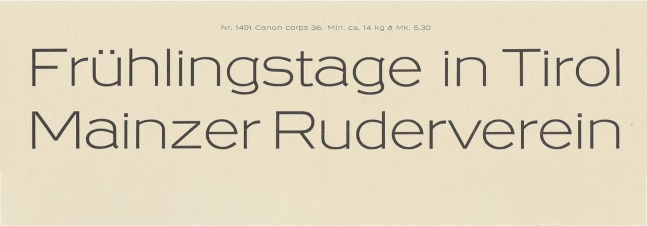
Industria was a pre-war sans serif published by the Emil Gursch typefoundry, which Berthold acquired in 1918. Berthold continued to sell Industria, at least for a decade and a half or so. The typeface was designed by Hermann Zehnpfundt, just like Journal-Antiqua below.

Hermann Zehnpfundt’s Journal-Antiqua, also originally published by Gursch.

Berthold filed Nova-Antiqua with Berlin’s Muster-Register on 15 August 1922.

Nova-Kursiv, the italic for the Nova-Antiqua shown previously, was filed with Berlin’s design registry on 8 September 1923.

Berthold submitted Sebaldus with the Berlin design registry on 31 January 1925.

Berthold filed Straßburg with the Berlin design registry on 26 January 1926.

Berthold filed Recta with Berlin’s design registry on 9 August 1926.

Berthold filed Fanfare with Berlin’s design registry on 25 April 1927.

Schmale Fanfare’s design was never officially registered; Berthold assumed that its design patent for Fanfare’s regular width would offer sufficient-enough protection.
Two volumes of the new Registerprobe specimen were published in 1926. These were based on a system of loose-leaf pages. When completed, it will be four volumes in length. The volumes contain 25 typographic categories.
The company has an extremely large selection of original Russian typefaces, as well as Greek, Hebrew, and almost all oriental scripts, including Devanagari and [Egyptian] hieroglyphs, which were each original creations.[23]
Exemplary type-specimen brochures present all of the products to the professional community. The “Thirty for Three” series aims to serve the graphic arts industry. The educational film On the development of letterpress type,[24] which shows the design of matrices and the casting of type, was given to the German Letterpress Association[25] for teaching purposes. In addition, H. Berthold AG’s private press[26] publishes books that not only are excellent examples of German book design but which also offer valuable contributions to the history of the art of printing and, in particular, typefounding.
Alternative ending from Bauer’s 1914 edition
1914[27]
In its headquarters and branches, the firm of H. Berthold AG currently works with a total of 188 automatic typecasting machines,[28] 29 pivotal type casters,[29] and 307 other machines. A large percentage of these machines were developed and constructed internally. The company employs about 100 people in its offices and about 600 people in its workshops – a large percentage of them have been with the firm for 25 years or longer.[30] Whenever it participated in an exhibition, it received a first-place prize.[31]
When H. Berthold AG began operating as a typefoundry, it initially followed two paths: ornaments and advertising typefaces.[32] It has gained a lot of experience in both areas and acquired a great deal of practical excellence, which is expressed in its products. The advertising typefaces, in order of release, are Kalligraphia, Carola, and Herkules, the four styles of the Herold series, the two styles of the Kaufhaus-Fraktur series, the three styles of the Block series, and the just-released Block-Fraktur.

Kalligraphia predates H. Berthold’s typefoundry. The design was first cast by Gustav Reinhold’s foundry, who filed it with Berlin’s Muster-Register on 20 July 1892. Shortly thereafter, Berthold acquired Reinhold’s foundry (it was probably more of a merger), which marked its entry into the business of casting and selling type. Reinhold remained with Berthold as a company executive for several years. A notebook from his foundry, which Berthold updated until the 1940s, also records that Berthold filed for a design patent of Kalligraphia’s Cyrillic design on 4 December 1895.

Carola-Grotesk, already mentioned.

Herkules, already mentioned.

Herold, already mentioned.

Kaufhaus-Fraktur, already mentioned.

Block, already mentioned.

Block-Fraktur, already mentioned.
These are just the main products, typefaces that are particularly characteristic and that have an extra large image.[33] This kind of advertising faces that is valuable in practice and has become a model.
The published typefaces for body text and other purposes are Jubiläums-Fraktur, the three styles of the Mainz-Fraktur series, the six styles of the Lateinisch series, the five styles of the Sezession series, the nine styles of the Akzidenz-Grotesk series so far (with more to follow), the three styles of the Corinna series, the seven styles of the Sorbonne series, the four styles of the Augustea series, the two styles of the Berthold-Fraktur series, and soon-to-be-released Alt-Mediaeval.

Mainzer Fraktur, already mentioned.

Lateinisch, already mentioned.

It is not clear to me what the “nine” styles of Akzidenz-Grotesk that Bauer mentioned above were. By the First World War, there were ten interrelated typefaces advertised as part of the family.. Those included: 1. The initial Accidenz-Grotesk style, already mentioned. 2. A lighter weight design named Royal-Grotesk, which was added in 1902. Between 1908 and 1911, Berthold added: 3. Breite Accidenz-Grotesk, 4. Fette Accidenz-Grotesk, 5. Halbfette Accidenz-Grotesk, and 6. Breite magere Akzidenz-Grotesk. A seventh, Enge Accidenz-Grotesk, was added in 1913. The eighth, a Skelett style, was added by 1914. The ninth and tenth were Enge Steinschrift and Halbfette Bücher-Grotesk.

Sorbonne, already mentioned.

Augustea, already mentioned.

Alt-Mediäval, already mentioned.
Alongside that, the old standard types have been completely recut: the bold Aldine (Augustea Bold), the old sans serif (Bücher-Grotesk), and the heavy slab serif (Moderne fette Egyptienne).

Halbfette Augustea

Berthold filed Halbfette Bücher-Grotesk with Berlin’s design registry on 3 August 1904. Cyrillics were added in 1912. Later, during the 1950s, Halbfette Bücher-Grotesk was renamed and became an official part of Berthold’s Akzidenz-Grotesk family. Based in its design, though, it looks more like Helvetica.

Berthold received a German design patent on its Moderne fette Egyptienne from the Berlin registry on 12 February 1901.
The published series of ornaments has included: the Rokoko-Einfassungen, which was the first large-[character-set] series of border elements where figures were able to interlock through a system of numerous notches. Then there were the bold linear ornaments: Stilisierte Cyclamen, Säcular-Ornamente, Schwarz-Weiß-Ornamente, Atlas-Ornamente, and the Französiche Einfassung.
As a repercussion of the Seven Artists’ Exhibition in Darmstadt,[34] the following fine linear designs [were published]: Libellen-Ornamente, Buch-Ornamente, and the Silvana-Serie.
After that, the Anker series was published, which dominated the market for eight years and made its way into almost every printing office. This series followed the medallions, for which a second brochure has just been published. All these border-printing elements have been developed so that compositors can use them according to their liking and create variations with almost no limitations.
The company has an extremely large selection of original Russian typefaces available, as well as Greek, Hebrew, and almost all oriental scripts, including Devanagari and [Egyptian] hieroglyphs, which were each original creations.
Notes
- In German: »Institut für Galvano-Typie«.
- The building that Hermann Berthold opened his business in has not survived. It was located near the location of today’s Mehringplatz, in Berlin’s Kreuzberg district. That was just south of what would soon become Berlin’s newspaper quarter.
- Berthold built a series of buildings in the space behind this address, and it remained at this location until 1978. For more information about this Kreuzberg building complex, see an earlier post of mine on this site.
- According to Hermann Berthold’s system – and all subsequent German industrial norms for typesetting – a Nonpareille was 6 Didot points in size.
- This is utter capitalistic propaganda and even for Germany in 1928, I am surprised to read it in Bauer’s text. I do not think any other business in the book is described in similar terms.
- In German: »Disponent«.
- In January 2024 euros, that would have the equivalent purchasing power of €18,480,000, according to the Deutsche Bundesbank.
- In German: »H. Berthold Messinglinienfabrik und Schriftgießerei AG«.
- In 1917, this street name was changed to Grazhdanskaya Ulitsa; see Ferdinand Ulrich’s note on a page listing the locations of former typefoundries.
- Some of this building still survives; see Ferdinand Ulrich’s note on a page listing the locations of former typefoundries.
- This is a great type specimen catalog. The Staatsbibliothek has digitized its copy. The library’s date – 1909 – is likely a cataloging error.
- In German: »Kaiserlicher Adler im Schild und Siegel«.
- In German: »A. Kahle Söhne«.
- In German: »Schnellpressen«. I must admit that I am not entirely sure whether the AG für Schriftgißerei und Maschinenbau manufactured more cylindrical presses rotary printing presses at this point. As the Offenbach firm’s name implies, it manufactured not just fonts of type but also printing machinery. Up until this point, Berthold did not manufacture printing presses itself, unlike some of its large global competitors, including Nebiolo in Torino, Schelter & Giesecke in Leipzig, or Tetterode in Amsterdam.
- In German: »Erste Ungarische Schriftgießerei AG«. In Hungarian: »Első Magyar Betűöntöde R. T.«. This foundry had been established by Dániel Czettel in 1890. Stempel acquired it after Czettel’s death in 1913. After the Second World War, the foundry was nationalized by the Soviet-backed socialist government of Hungary and it continued doing business, both for Hungarian printers and for those in other Eastern Block states. I do not know when the foundry closed down. Like state-owned foundries in Czechoslovakia and East Germany, it may have survived until the collapse of communist governments at the end of the 1980s.
- Berthold later sold its shares in the Haas Type Foundry to D. Stempel AG.
- I think that the “joint venture” – Interessengemeinschaft in German – with Lettergieterij Amsterdam was bigger deal than Bauer suggests. A more recent account describes it this way: “In December 1927 Typefoundry Amsterdam acquired a considerable interest in the Berlin typefoundry H. Berthold AG.” See John A. Lane, Mathieu Lommen, and Johan de Zoete, Dutch typefounders’ specimens. From the Library of the KVB and other collections in the Amsterdam University Library, with histories of the firms represented (Amsterdam: De Buitenkant, 1998), p. 29 ff.
- Or the purchasing power of €23,100,000 in January 2024 (see note 7 above).
- An opulent specimen printed for Gustav Reinhold’s foundry to promote the Rokoko-Ornamente has been digitized by the Staatsbibliothek zu Berlin.
- This cannot be correct; I suspect it was a typesetting error and that “1911” was set in place of “1901.” I think that the 1901 date of this long specimen for Lateinisch at the Staatsbibliothek zu Berlin is correct. It has slightly more than 100 pages.
- The fourth and fifth booklets from this series has been digitized by the Deutsches Technikmuseum.
- In German: »Schwere Block«.
- Either by Berthold itself, or designed and produced in-house at foundries it had acquired. The hieroglyphs, for instance, came with the Theinhardt foundry.
- In German: »Vom Werdegang der Buchdrucklettern«.
- In German: »Deutscher Buchdruckerverein«, a professional organization of employers within the printing industry.
- This press’s German name was the »Berthold-Privatdrucke«.
- In the first edition of Bauer’s book, he presented an ending with different details than his second edition provides; see Friedrich Bauer, Chronik der deutschen Schriftgießereien (Frankfurt am Main: Verlag des Vereins deutscher Schriftgießereien, 1914), pp. 22–24.
- In German: »Komplettgießmaschinen«.
- In German: »Handgießmaschinen«.
- I suspect that this easily made Berthold the second-largest typefoundry in Germany at the time, with just a few hundred fewer employees than Schelter & Giesecke.
- National trade fairs and World’s Fairs had competitions for their exhibiting companies. Each category of prizes would have many winners, even multiple winners from the same industry. Berthold did well in these competitions, but its competition results were not singular within German typefounding. Other firms like Genzsch & Heyse and the Klingspor foundries, etc., were also serial award winners.
- Note that, in the latter Chronik from 1928, Bauer hardly mentions Berthold’s many series of ornaments and border-printing elements. Those were incredibly important during the 1880s and ’90s, but quickly diminished in relevance during the twentieth century.
- It can’t be literally teased out of Bauer’s text, but I think he is describing typefaces that had a particularly large impact, rather than designs that were simply bigger on the body.
- The seven initial artists from the Darmstadt artists’ colony were Peter Behrens, Rudolf Bosselt, Paul Bürck, Hans Christiansen, Ludwig Habich, Patriz Huber, and Joseph Maria Olbrich.
