I dedicated a previous post to Berthold-Schriften, a notebook in the Deutsches Technikmuseum’s Historical Archive. That was an internal document from H. Berthold AG in Berlin tracking the company fonts’ sources from around 1900 until the early 1950s. The notebook indicates that Berthold contracted other type-making companies to produce the master patterns for its non-foundry-type fonts. For instance, D. Stempel AG in Frankfurt made the patterns for many of Berthold’s wood-type fonts, and Dornemann & Co. in Magdeburg translated several Berthold typefaces into large fonts whose sorts were cast in steel.
Steel type specimens
Berthold’s circa 1911 Hauptprobe includes a section for Stahl-Typen [steel types]. In most copies I’ve consulted, this section has eight typefaces, presenting 60 font sizes together. Some catalogs have a four-page “mini specimen” for Block in Stahl-Typen proceeding those typefaces, which shows steel-type fonts for nine sizes of Berthold’s Block typeface. The Berthold-Schriften notebook mentioned above includes source information for all 69 of these steel-type fonts. According to it, at least 32 of them came from Dornemann & Co. in Magdeburg.
Berthold also distributed the Stahl-Typen pages of its Hauptprobe – including those for Block – bound together as a dedicated type-specimen brochure. Aside from this, I am not aware of any other Berthold steel-type specimens.
While I have not found any D. Stempel AG wood-type specimens showing the Berthold fonts it helped manufacture, all of the Berthold steel types appear in a Dornemann & Co. specimen catalog. I rely on a 1930 edition of that Ferro-Typen catalog for this post.
Ferro-Typen?
In this post, I refer to Ferro-Typen in English as “steel types,” since that is a direct translation of what Berthold called them. There is some leeway when translating the term Ferro, and Dori Griffin calls them “tintypes” instead. In terms of individual sorts, if you held a piece of steel Dornemann & Co. type, its hollow base would be the thing you’d probably notice about it first.
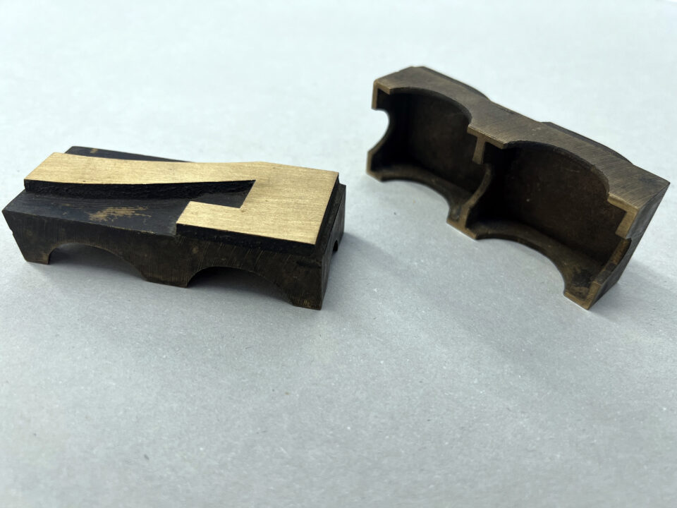
Two brass-type sorts from an unidentified condensed Egyptienne typeface. The font’s size is 20 Cicero (240p), but the sorts were cast on pica bodies. Unknown manufacturer. In the photograph, the sorts’ hollow base (Hohlfuß) is clearly visible. When Fritz Dornemann founded Dornemann & Co. in 1905, he purchased brass poster-type-making equipment from the Hugo Friebel & Co. company in Leipzig and J. H. Rust & Co. in Vienna. Both companies manufactured brass poster types like these. So did A. Numrich & Co. in Leipzig. The Bauersche Gießerei in Frankfurt carried that tradition on after it acquired Numrich. Dornemann & Co. was not convinced about the commercial viability of brass poster types. It pivoted to manufacturing hollow-base steel types instead, presumably with similar methods.
Both Berthold and Dornemann & Co.’s respective Stahl-Typen and Ferro-Typen specimens include a note on their pages reading “D. R. G. M.” That abbreviation stands for Deutsche Reichs-Gebrauchsmuster, which was a kind of German product patent. As far as I know, that was Dornemann & Co.’s patent for the pantographic milling of printing sorts from steel block. It was not a patent that Berthold held. However, in 1910, the designs of several typefaces Berthold sold as steel fonts were still protected by their Muster-Registeranmeldungen (design patents). Steel types were not manufactured along the same lines as the aluminum type produced by Swiss firms later in the 20th century. Those sorts were cut from aluminum blanks with pantograph routers.
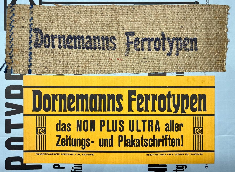
Two ephemera pieces printed for Dornemann & Co. to advertise its steel types. Both were sent to Joh. Enschedé en Zonen in Haarlem and today are kept at the Noord-Hollands Archief. They are stored there as part of item number 2487:308. The top item is a piece of burlap with text in the Carola-Grotesk typeface printed on it. “E. Baensch Jun.,” a Magdeburg printing company, produced the sheet of colored paper beneath it with the Herold and Runde Grotesk typefaces.
Block
Some copies of H. Berthold AG’s ca. 1911 Hauptprobe show nine Block in Stahl-Typen sizes. The Berthold-Schriften notebook lists ten available steel type sizes for the typeface. It does not explicitly attribute the Block Stahl-Typen to Dornemann & Co., but I suspect that Dornemann & Co. was their manufacturer anyway. My 1930 Dornemann & Co. Ferro-Typen catalog shows the typeface in 20 sizes. At least some Dornemann & Co. specimens of brass-type fonts for bookbinders also include Block.
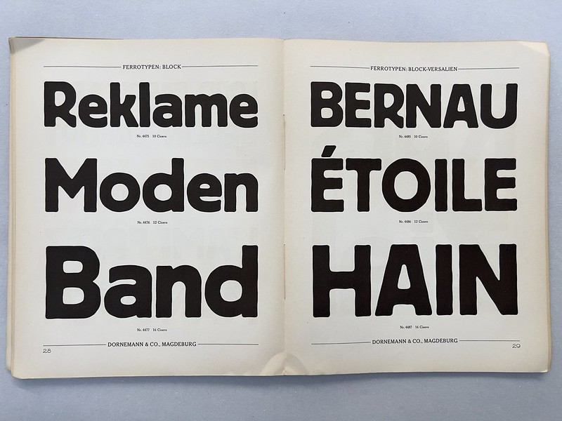
Two of the six pages showing Block sizes in Dornemann & Co.’s Ferro-Typen catalog. Although Block was an H. Berthold AG type design, Dornemann & Co. in Magdeburg sold large steel-type versions of it. Dornemann & Co. may also have manufactured the Block steel types that Berthold distributed.
Today, Block is one of the typefaces most associated with Berthold’s memory. Aside from steel-type fonts and foundry-type fonts [Bleisatz-Schriften], Berthold sold Block as wood types. The Berthold-Schriften notebook lists eight Block wood-type fonts. Berthold’s source for them was D. Stempel AG in Frankfurt. Block’s design gets attributed to Hermann Hoffmann (ca. 1865–1926). Berthold hired Hoffmann to run its internal printing office in 1895 and he remained with the company until at least 1921, if not until his death. The in-house printing offices at typefoundries – referred to as Hausdruckereien in German – often acted as the companies’ advertising departments. Hoffmann was not the only foundry printing-office director who designed several typefaces for his company.
Runde Grotesk
H. Berthold AG’s ca. 1911 Hauptprobe shows four Runde Grotesk: Stahl-Typen sizes. The Berthold-Schriften notebook lists seven available steel-type sizes for the typeface. According to that notebook, all seven came from Dornemann & Co. My 1930 Dornemann & Co. Ferro-Typen catalog shows the typeface in eight sizes.
This Runde Grotesk does not seem to have been a Berthold design. It appears to be somewhat related to the larger sizes of a typeface Berthold sold as Schmale runde Grotesk. Those may have been Berthold’s creation. Berthold either created a new type design for the large Runde Grotesk steel types and never it translated into wood type, or Dornemann & Co. provided the design, perhaps acquiring it from a different typefoundry. A Dornemanns Ferrotypen brochure for Runde Grotesk at the Noord-Hollands Archief in Haarlem, probably printed in 1908, suggests that the design was protected (patentamtlich Geschützt).

The Dornemann & Co. catalog spread Ferro-Typen showing Runde Grotesk. Dornemann & Co. also manufactured the steel-type fonts of this design that H. Berthold AG sold. It is not yet entirely clear to me where their design originated.
The Berthold-Schriften notebook lists six Runde Grotesk wood-type fonts. Its source for them was D. Stempel AG in Frankfurt. However, the wood-type Runde Grotesk had a different design from the steel-type Runde Grotesk. The underlying wood-type Runde Grotesk design originally appeared in 1886. It was created as a foundry-type design by the Ferd. Theinhardt typefoundry, also based in Berlin. After Berthold acquired the Ferd. Theinhardt foundry in 1908, it adopted the foundry-type sizes into its product range. Berthold specimen catalogs began presenting them around 1909 until some later date, and probably sold them into the late 1920s. The wood-type Runde Grotesk was sold for a considerable while longer.
Egyptienne
H. Berthold AG’s ca. 1911 Hauptprobe shows seven Engl. Egyptienne: Stahl-Typen sizes. Those sizes are listed in the Berthold-Schriften. According to that notebook, the sizes all came from Dornemann & Co. My 1930 Dornemann & Co. Ferro-Typen catalog shows the typeface in the same seven sizes.

The Dornemann & Co. catalog spread Ferro-Typen showing the Schmale Egyptienne types. At the moment, I do not know the source of this design.
Halbfette Sorbonne
H. Berthold AG’s ca. 1911 Hauptprobe shows five Halbfette Sorbonne: Stahl-Typen sizes, although Berthold sold those sizes both as all-caps fonts and as fonts with both uppercase and lowercase letters. However, the Berthold-Schriften notebook suggests that seven sizes for the typeface were available, and my 1930 Dornemann & Co. Ferro-Typen catalog shows the typeface in six sizes. The Berthold-Schriften notebook does not explicitly attribute the Halbfette Sorbonne Stahl-Typen to Dornemann & Co., but I suspect that Dornemann & Co. was their manufacturer anyway. At least some Dornemann & Co. specimens of brass-type fonts for bookbinders also include Halbfette Sorbonne.
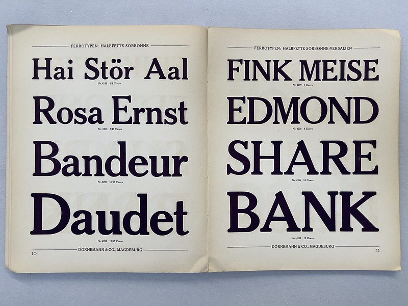
One of the two pages showing Halbfette Sorbonne sizes in Dornemann & Co.’s Ferro-Typen catalog. Sorbonne was Berthold’s version of Cheltenham, from the American Type Founders Company.
Berthold filed Halbfette Sorbonne’s design with the Berlin Muster-Register on 16 March 1906. The Sorbonne family was Berthold’s version of ATF’s Cheltenham typefaces.
Aside from steel-type fonts and foundry-type fonts, Berthold also sold Halbfette Sorbonne as wood type. The Berthold-Schriften notebook lists eleven Halbfette Sorbonne wood-type fonts. Berthold’s source for the three largest wood-type sizes – 30, 36, and 42 Cicero – was Mex y Cia from Chile in South America. D. Stempel AG in Frankfurt manufactured the other eight wood-type sizes. Berthold’s company library included one type specimen catalog from Mex y Cia, but it did not show wood-type fonts. That catalog is also at the Deutsches Technikmusuem in Berlin today. The museum digitized it in 2021.
Halbfette Sorbonne-Cursiv
H. Berthold AG’s ca. 1911 Hauptprobe shows six Halbf. Sorbonne Cursiv: Stahl-Typen sizes, although Berthold sold those sizes both as all-caps fonts and as fonts with both uppercase and lowercase letters. All six sizes are mentioned in the Berthold-Schriften notebook, and my 1930 Dornemann & Co. Ferro-Typen catalog shows the typeface in the same six sizes. However, the Berthold-Schriften notebook does not explicitly attribute the Halbfette Sorbonne-Cursiv Stahl-Typen to Dornemann & Co. I suspect Dornemann & Co. manufactured them anyway. At least some Dornemann & Co. specimens of brass-type fonts for bookbinders also include Halbfette Sorbonne-Curisv.
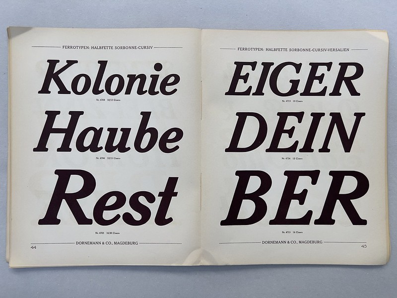
One of the two pages showing Halbfette Sorbonne-Cursiv sizes in Dornemann & Co.’s Ferro-Typen catalog.
Aside from steel-type fonts and foundry-type fonts, Berthold also sold Halbfette Sorbonne-Cursiv as wood type. The Berthold-Schriften notebook lists eight wood-type fonts for the typeface. Its source for them was D. Stempel AG in Frankfurt.
Herold
H. Berthold AG’s ca. 1911 Hauptprobe shows five Herold: Stahl-Typen sizes. The sizes are all listed in the Berthold-Schriften. According to that notebook, the sizes all came from Dornemann & Co. My 1930 Dornemann & Co. Ferro-Typen catalog shows the typeface in the same five sizes.
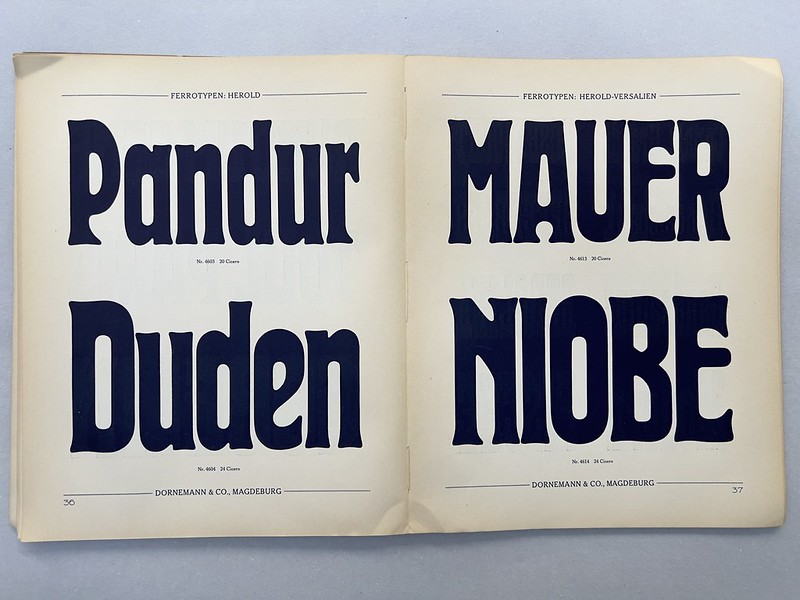
One of the two pages showing Herold sizes in Dornemann & Co.’s Ferro-Typen catalog. Herold is probably one of most indelible type designs created at H. Berthold AG in the twentieth century.
Berthold filed Herold’s Latin-script characters with the Berlin Muster-Register for a design patent on 22 July 1901. It registered the typeface’s Cyrillic on 30 November 1904. Berthold filed the design in St. Petersburg on 4 December 1904, although that registration may only have included the Cyrillic. Hans Reichardt attributes the typeface’s design to Hermann Hoffmann, who I mentioned above in my entry for Block.
Aside from steel-type fonts and foundry-type fonts, Berthold also sold Herold as wood type. The Berthold-Schriften notebook lists eleven wood-type fonts fonts for the typeface. Berthold’s source for the at least two of the largest sizes – 30 and 36 Cicero – was Mex y Cia from Chile in South America. D. Stempel AG in Frankfurt manufactured the other wood-type sizes.
Schmale Herold
H. Berthold AG’s ca. 1911 Hauptprobe shows five Schmale Herold: Stahl-Typen sizes. Those sizes are listed in the Berthold-Schriften. According to that notebook, the sizes all came from Dornemann & Co. My 1930 Dornemann & Co. Ferro-Typen catalog shows the typeface in the same five sizes. At least some Dornemann & Co. specimens of brass-type fonts for bookbinders also include Schmale Herold.
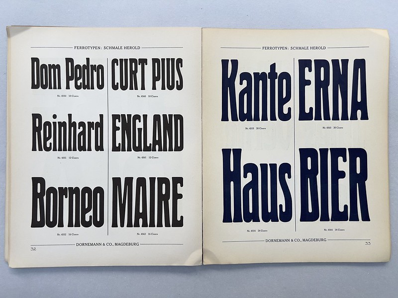
The Dornemann & Co. catalog spread Ferro-Typen showing the Schmale Herold types, another original H. Berthold AG design.
Berthold filed Schmale Herold with the Berlin Muster-Register on 25 February 1904. Hans Reichardt attributes the typeface’s design to Hermann Hoffmann, who is also credited with having designed Herold’s regular-width version.
Aside from steel-type fonts and foundry-type fonts, Berthold also sold Schmale Herold as wood type. The Berthold-Schriften notebook lists ten wood-type fonts fonts for the typeface. Berthold’s source for the at the two largest sizes – 30 and 36 Cicero – was Mex y Cia from Chile in South America. D. Stempel AG in Frankfurt manufactured the other wood-type sizes.
Carola-Grotesk
H. Berthold AG’s ca. 1911 Hauptprobe shows five Carola-Grotesk: Stahl-Typen sizes. Those sizes are listed in the Berthold-Schriften. According to that notebook, the sizes all came from Dornemann & Co. My 1930 Dornemann & Co. Ferro-Typen catalog shows the typeface in the same five sizes. At least some Dornemann & Co. specimens of brass-type fonts for bookbinders also include Carola-Grotesk.
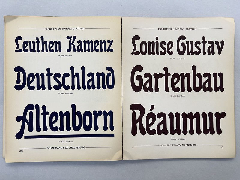
The Dornemann & Co. catalog spread Ferro-Typen showing the Carola-Grotesk types, another original H. Berthold AG design.
Berthold filed Carola-Grotesk’s design with the Berlin Muster-Register on 15 September 1896. Its initial three-year design patent was renewed for ten years on 11 September 1899. Curiously, a 1906 notice in the Deutscher Reichsanzeiger states that Carola-Grotesk’s 1896 registration had been valid for 10 years. Berthold got a 15-year extension on 11 September 1906. On 5 February 1897, Berthold also submitted Carola-Grotesk’s Cyrillic characters to Berlin’s Muster-Register for another design patent. Hans Reichardt attributes the Carola-Grotesk design to Hermann Hoffmann.
Aside from steel-type fonts and foundry-type fonts, Berthold also sold Carola-Grotesk as wood type. The Berthold-Schriften notebook lists eight wood-type fonts for the typeface. Its source for them was D. Stempel AG in Frankfurt.
Kaufhaus-Fraktur
H. Berthold AG’s ca. 1911 Hauptprobe shows five Kaufhaus-Fraktur: Stahl-Typen sizes. The Berthold-Schriften notebook mentions nine sizes, and only it explicitly attributes three of them to Dornemann & Co. My 1930 Dornemann & Co. Ferro-Typen catalog shows the typeface in all nine sizes.

One of the two pages showing Kaufhaus-Fraktur’s sizes in Dornemann & Co.’s Ferro-Typen catalog, another original H. Berthold AG design.
Berthold filed Kaufhaus-Fraktur with the Berlin Muster-Register on 29 December 1906. Hans Reichardt attributes the typeface’s design to Hermann Hoffmann. Aside from steel-type fonts and foundry-type fonts, Berthold also sold Kaufhaus-Fraktur as wood type. The Berthold-Schriften notebook lists eight wood-type fonts for the typeface. Its source for them was D. Stempel AG in Frankfurt.
Dornemann & Co. in Magdeburg
Not all typefoundries cast fonts from the traditional lead, tin, and antimony alloy. H. Berthold AG did, but Dornemann & Co. did not. As Friedrich Bauer explained in his Chronik der Schriftgießereien (1928), Dornemann & Co. was established as a brass typefoundry and engraving business. I mentioned the company in an earlier post introducing my ongoing research into Germany’s brass typefoundries.
Dornemann & Co. was named after its founder and long-time owner, Fritz Dornemann, who was born in Nordhausen on 28 November 1860. Today Nordhausen is in Thuringia, but it was part of Prussia in Dornemann’s lifetime. I suspect that Dornemann apprenticed as a tradesman in Nordhausen or Leipzig, about 120 kilometers to the east. Friedrich Bauer and Fritz Dornemann likely were personal acquaintances, and Bauer’s Chronik recounts that Dornemann worked at the Leipzig-based Julius Klinkhardt typefoundry before joining the Magdeburg engraving company Edm. Koch & Co. in 1884. Since Dornemann would only have been about 23 or 24 when he moved to Magdeburg, his position at Klinkhardt was probably only that of a journeyman.
Bauer’s reported that Fritz Dornemann directed Edm. Koch & Co. for 20 years. However, I don’t think a 24-year-old was likely to have been entrusted with the company. I suspect that Dornemann joined Edm. Koch & Co. as an employee and only became its director after Edmund Koch died in 1890. That would jive with a 1905 notice mentioning Dornemann’s “successful 15-year career” there, which ended in 1904. During that year, Edm. Koch & Co. ran into economic trouble, and Fritz Dornemann left the firm. By the end of 1904, Edm. Koch & Co. reorganized as the Magdeburger Gravieranstalt, but Dornemann struck out on his own, founding Dornemann & Co. on 1 January 1905. The “& Co.” in the company name likely referred to Dornemann’s financier associates.
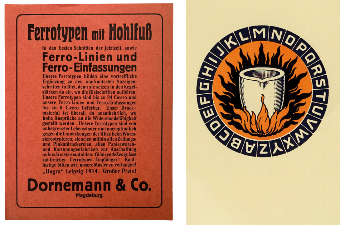
Digital collage showing two pieces of Dornemann & Co. ephemera. The flyer on the left advertises the critical success of Dornemann & Co.’s hollow-base steel types at the 1914 „Bugra“ exhibition in Leipzig. The graphic on the right is from an intertitle page in a circa-1910 catalog of brass types for bookbinders.
Fritz Dornemann must have been well connected within the German book-production industries. In 1899, Dornemann was welcomed into the Deutscher Buchgewerbeverein. He joined the Gesellschaft für Bibliophilen in 1905. After establishing Dornemann & Co., he quickly acquired the equipment necessary to make additional products. Here, it is easiest for me to simply translate Friedrich Bauer’s summary:
Dornemann bought all the equipment (patterns, machines, tools, etc.) from Hugo Friebel’s brass poster-types factory in Leipzig. It also purchased patterns for the same kind of types from the Rust typefoundry in Vienna. Since making those brass poster types proved too expensive, Dornemann became the sole producer of ferrotypes for newspaper and poster printers, as well as for paper-goods factories. Letters, rules, and borders made from a steel-strength iron alloy can withstand printing on any fabric. The ferrotypes’ sizes start from point sizes that are too large for foundry types.
Steel types were a new kind of product Dornemann & Co. introduced, and at least some of those Ferro-Typen were already for sale by late 1908. Dornemann & Co. marketed its steel types to poster printers. The types were also intended for printing and embossing text on cardboard and other materials.
Fritz Dornemann lived to be 74 years old, dying on June 2, 1935. Dornemann & Co. survived the Second World War and was eventually nationalized by the German Democratic Republic. It continued operating under various names until 1992. Its former factory at Weidenstraße 6/7 in Magdeburg still stands today.
More about Dornemann & Co.’s Ferro-Typen specimen catalog
I made several of the photographs above from my copy of Dornemann & Co.’s Ferro-Typen für Plakat- und Zeitungsdruckereien, sowie für Papierwaren-, Kartonnagen-, Säcke- und Kisten-Fabriken. D. R. G. M. The layout of that specimen catalog bears similarity to the typography of some H. Berthold AG publications. The text of the introduction, for instance, is set in Sorbonne – Berthold’s Cheltenham. The first paragraph even begins with one of the ornamented Sorbonne-Initialen. In addition to Sorbonne, Berthold’s Block typeface is also used extensively throughout the catalog.
The catalog also shows steel fonts of Berthold typefaces not mentioned in the Berthold-Schriften notebook at the Deutsches Technikmuseum and which do not appear in Berthold’s own specimens. Those steel types include Fette Akzidenz-Grotesk, Altgotisch, Block-Fraktur, Halbfette Lateinisch, LO-Schrift, Halbfette Mainzer Fraktur, and Sorbonne-Circular. Although the majority of the typefaces in the Ferro-Typen catalog are Berthold designs, products from other foundries appear as well.
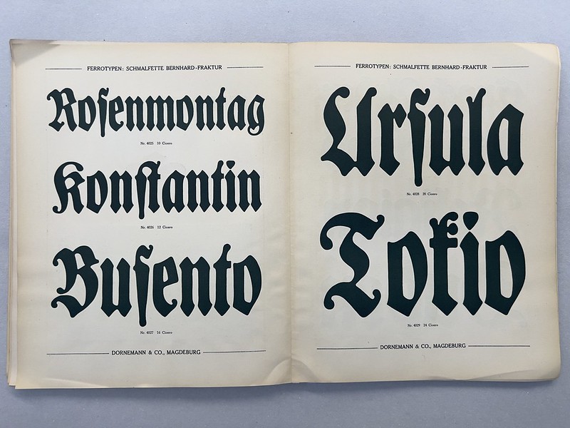
Lucien Bernhard’s Schmalfette Bernhard-Fraktur, a type design Bernhard drew for the Flinsch typefoundry in Frankfurt am Main. The design is presented in a supplement to Dornemann & Co.’s Ferro-Typen catalog.
A price list bound into my copy of the catalog is dated 1930, but the pages were probably laid out much earlier. Based on the testimonials printed at the catalog’s beginning, this specimen’s design may have been composed around 1912 and expanded/reprinted over subsequent decades. Probably for those reasons, the University of Amsterdam library dates its copy of the specimen to ca. 1912. Aside from that, I have not yet found another copy of this specimen in a public collection. There are several Dornemanns Ferrotypen typeface brochures at the Noord-Hollands Archief in Haarlem. Each of those brochures is four-pages long, and some of them have the date “January 1908” printed on their cover pages. Berthold and Dornemann & Co.’s partnership must have been arranged by 1907 at the latest.