Most of the Deutsches Technikmuseum’s collections are not on public display, including the original hand-made drawings for Berthold’s phototypesetting faces. The storage for Berthold’s Diatronic typefaces alone fills 32 metal cabinets that together take up 19 meters of storage space. Bundled into 2,179 red-colored cassettes are approximately 270,000 drawings. Aside from a single cassette on display in the museum’s permanent exhibition, the cassette cabinets are kept in the Technikmuseum’s off-set depot. Inventoried under the number I.2.046, these are all part of the archive from the former H. Berthold AG, a Berlin-based company founded in 1858, which disappeared from the market in 1993. I wrote the following article with Kerstin Wallbach and Marcel Ruhl from the Stiftung Deutsches Technikmuseum Berlin. Our original German-language version was published by the Staatsbibliothek zu Berlin on its blog last week.
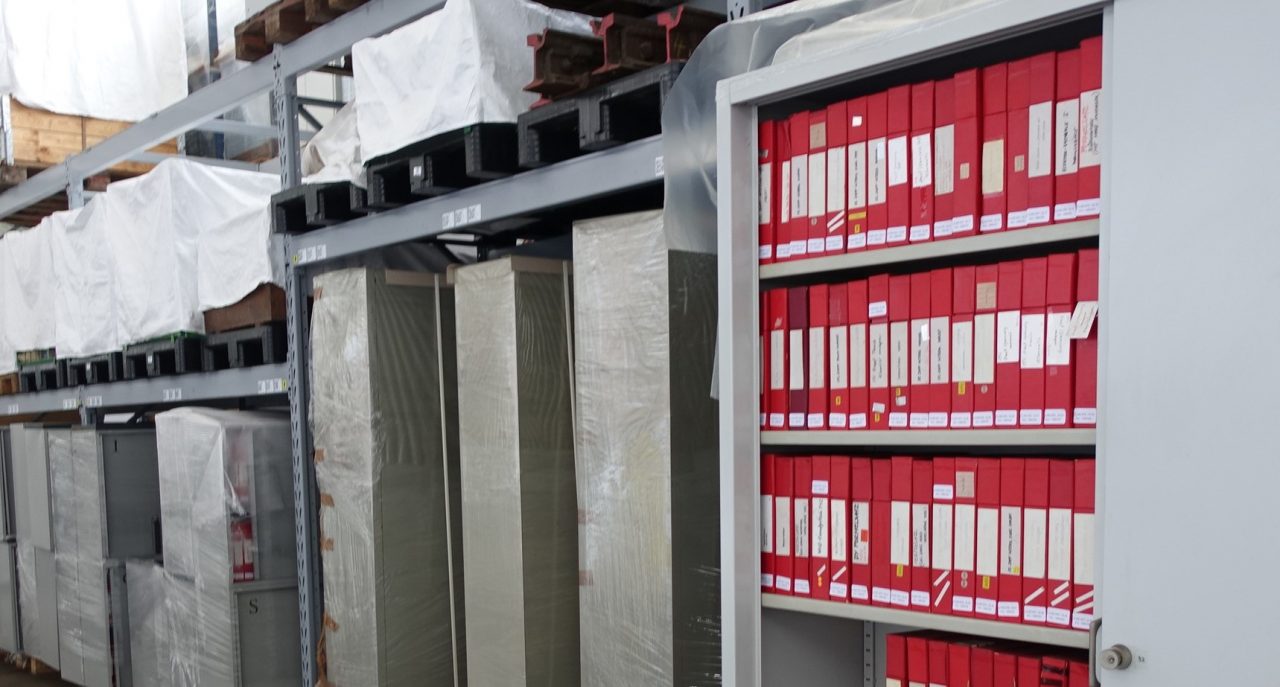
View of the cabinets in the Stiftung Deutsches Technikmuseum Berlin’s off-site storage depot. Photo: K. Wallbach.
In the near future, it is planned that the drawings will move from the museum’s off-set depot to its Historical Archive. These drawings for Berthold’s Diatype faces represent one portion of a two-part donation from Berthold, which the museum received on July 11, 1995. Internal documents from around 1995 describe them as the “Artwork diatronic (rote Kästen) à ca. 19 m Schränke à ca. 257.000 Handzeichnungen.” You might remember seeing a glimpse of them in a 2022 interview by Alexander Nagel. He referenced them as proof of the enormous increase in the variety of fonts that the then-new technology of phototypesetting brought about.
From Aeterna to ITC Zapf International
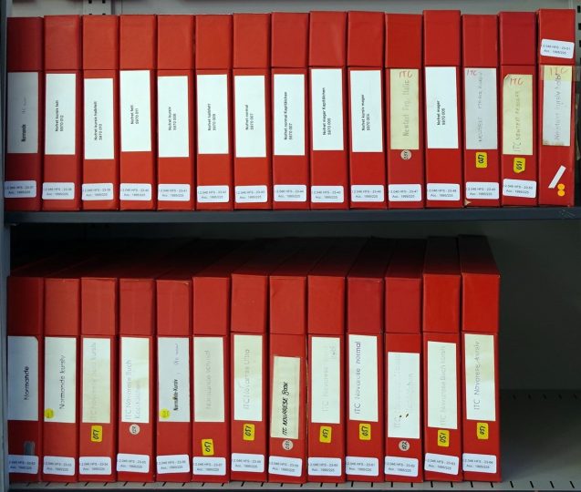
The red cassettes are sorted from A (for Aeterna) to Z ( for ITC Zapf International). In the last cabinet – number 32 – the alphabetical sorting stops with Zapf. Nevertheless, ITC Zapf International is followed by additional cassettes, which do not seem to adhere to any recognizable sorting. The cassettes holding the drawings are 45 mm × 250 mm × 325 × mm (thickness/height/width). They contain drawings for letters, numbers, and other typographic characters that make up a font. Each sheet shows just one glyph, representing its final form. Berthold’s staff photographed them to reproduce each glyph onto the font-storage devices for Berthold’s phototypesetting machines. Later generations of Berthold products would store fonts digitally.
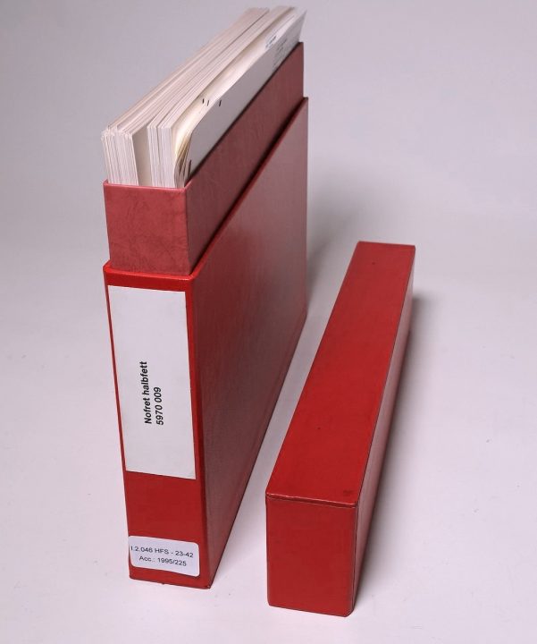
Cassette for Nofret Bold, designed by Gudrun Zapf von Hesse. Shelfmark I.2.046 HFS-23-42, Stiftung Deutsches Technikmuseum Berlin. Photo: K. Wallbach.
Some of the final artwork produced by Berthold draftspersons for Gudrun Zapf von Hesse’s Nofret Bold typeface. Unlike e.g., Linotype and Monotype master drawings – which featured the outlines for a specific letterform – Berthold’s drawings were filled in. From shelfmark I.2.046 HFS-23-42, Stiftung Deutsches Technikmuseum Berlin. Photo: K. Wallbach.
In type design’s centuries-long history, final artwork like the drawings made for Berthold’s phototypesetting typefaces represents something of an exception. This sort of drawing was only needed (generally speaking) by typesetting-machine manufacturers. Therefore, they were only made for about a century. Thanks to the phototypesetting technologies emerging in the 1950s, H. Berthold AG was able to evolve out of its market position as a manufacturer of metal type for hand-composition and become a typesetting-machine manufacturer like the companies behind the Photon/Lumitype and Intertype, Linotype, or Monotype, etc. Berthold’s drawings for its Diatype faces are a previously untapped body of source material that could open up new possibilities for research into the history of phototypesetting and type design during the phototypesetting era.
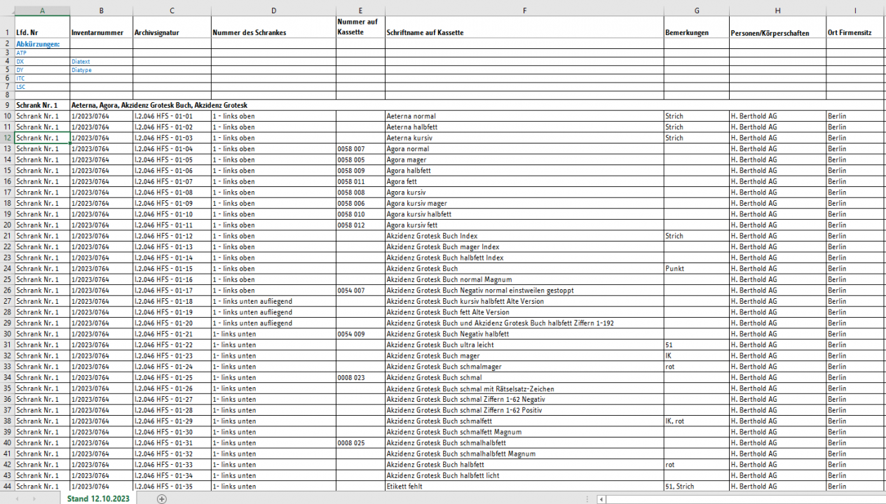
Excerpt from the list of red cassettes for Berthold Diatype faces, 12 October 2023. The sorting of the cabinets themselves – in addition to the alphabetical sorting of the cassettes – is visible thanks to the small numbers on the right of each cabinet’s lock. The cabinet numbers form the basis for the archival notation of the individual cassettes. The shelfmark I.2.046-01-27, for example, is the 27th cassette inside the first cabinet. Click to enlarge.
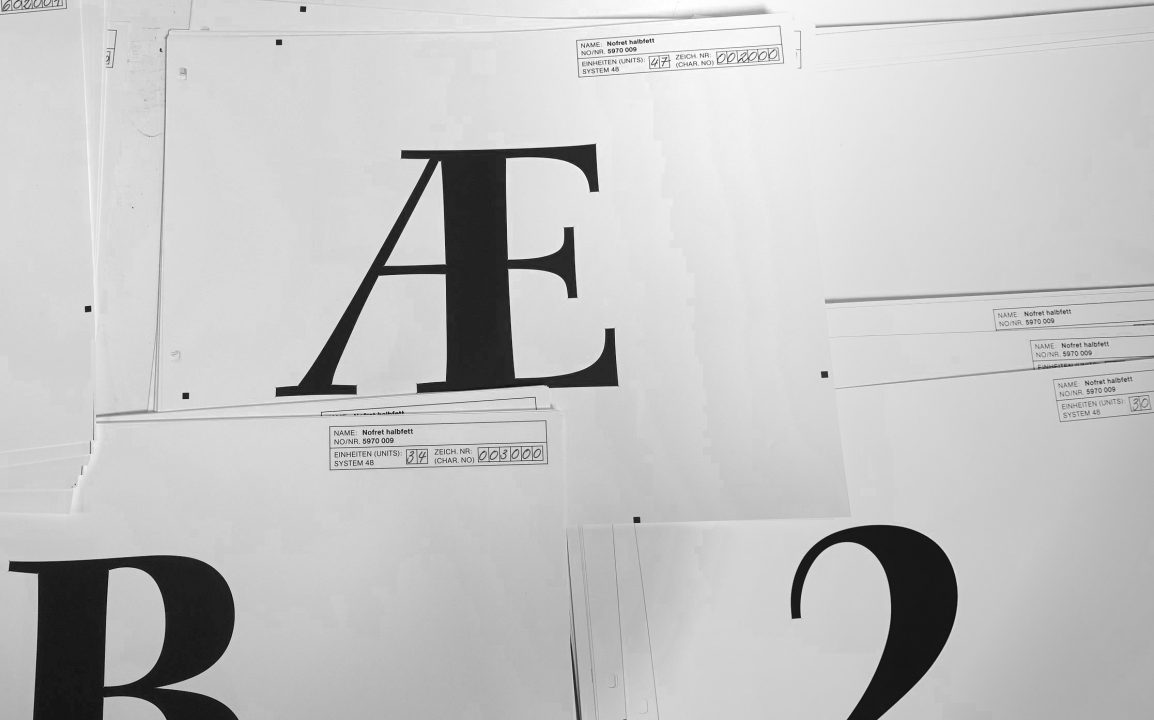
Each font for the Diatype was stored on a large, round glass disc. The drawings are significant because they were the last originals created before a font’s letterforms were projected onto those discs. Since the drawings are larger than the letterforms that later appeared on the discs, their shapes are easy to understand. In the 1980s, Adobe’s PostScript technology and personal computers running DTP software rendered the kind of beautiful final drawings described in this article unnecessary. As is the case now, computer applications enabled glyphs to be drawn directly on screen. PostScript and the accompanying DTP revolution made typesetting machines obsolete. Berthold joined a long list of German companies made obsolete by Silicon Valley disruptions.
Collection data is research data
From 1967 until 1993, drawings for Berthold’s phototypesetting faces were created inside the company’s drawing office in Taufkirchen, near Munich. A promotional film from the mid-1980s provides a fascinating glimpse of the office and some of the steps used to produce new typefaces and phototypesetting fonts. Berthold’s main offices in Berlin contained the company’s phototypesetting studio, where much of the firm’s advertising and type specimens were composed.
From a design-historical point of view, final phototypesetting typeface artwork offers at least one advantage over type specimens: the Diatype cassettes probably contain all characters from each font Berthold produced. On final artwork, letterforms are also significantly larger than in type specimens. Presumably, unpublished typefaces and custom commissions for other companies are also included in the collection.
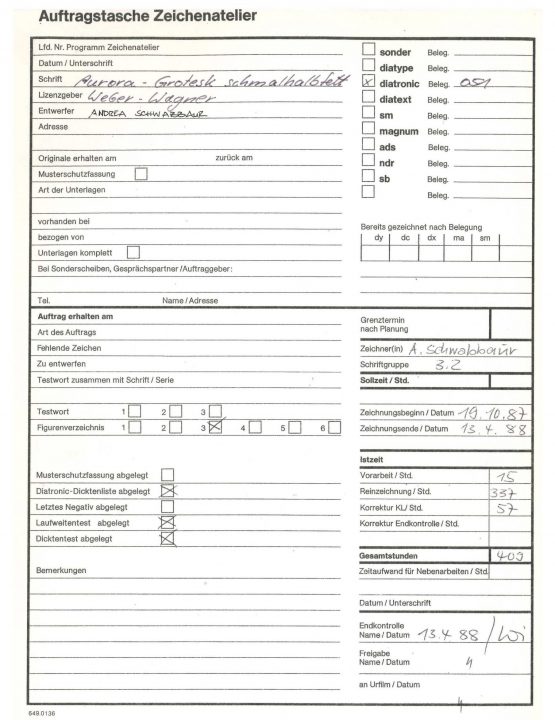
Berthold drawing office job envelope for Aurora-Grotesk Condensed Bold, an early 20th century sans serif typeface cut by the Leipzig punchcuttery Wagner & Schmidt and distributed as a metal typeface for hand composition by C. E. Weber in Stuttgart under the name Aurora-Grotesk. Andrea Schwabbauer designed the phototypesetting face for Berthold Diatonic machine. The production time ran through 1987 and 1988. Shelfmark I.2.046 700_1, Stiftung Deutsches Technikmuseum Berlin.
The materials from the phototypesetting and drawing studios present key possibilities for design-historical and sociological research. Examining them will provide new insights into the production of H. Berthold AG’s typefaces for phototypesetting and the early days of digital design. A high percentage of the final artwork was produced by women working in the drawing studio – a division of labor also present at other typesetting machine manufacturers. For instance, Women in Type, a Leverhulme-Trust-funded project completed in 2021, investigated women’s role at similar firms in Britain. In Germany, a BMBF-funded project researching the role of women in graphic design from 1865–1919 and today is currently underway at the Hochschule Mainz: UN/SEEN. Perhaps future projects will investigate the 1970s/1980s and draw upon the holdings at the Deutsches Technikmuseum.
Associated holdings in the museum’s Historical Archive
Exactly how long the production period for each typeface took – and all the individuals involved in its design and development – is still a matter for further research. At the moment, Deutsches Technikmuseum’s Historical Archive is cataloging the files from Berthold’s type-carrier creation (Schriftträgerfertigung) department. Those comprise 77 folders of job envelopes from the drawing studio, 26 folders of Diatype protocols, and 33 folders of Diatronic protocols.
The first set of files mentioned lists character sets, correction drawings and annotation, and internal notes. More rarely, correspondence with type designers or clients is also included. Sometimes, these job envelopes are empty for unknown reasons. However, those still represent a valuable source due to the entries they contain. The entries provide information about the production date, the work steps and persons involved, and, in some cases, licensors. Due to the formation of the material, the museum employees in the Historical Archive decided to record the job envelopes individually, according to the typeface name. It is estimated that there are around 3,850 job envelopes, which will gradually be added to the Historical Archive’s database.
The last two sets of files mentioned above mainly consist of sheets containing the character sets photographed for each font style and their date of creation. They do not contain correspondence or correction sheets. Since those folders have not yet been cataloged, they can only be accessed by their Berthold font number.
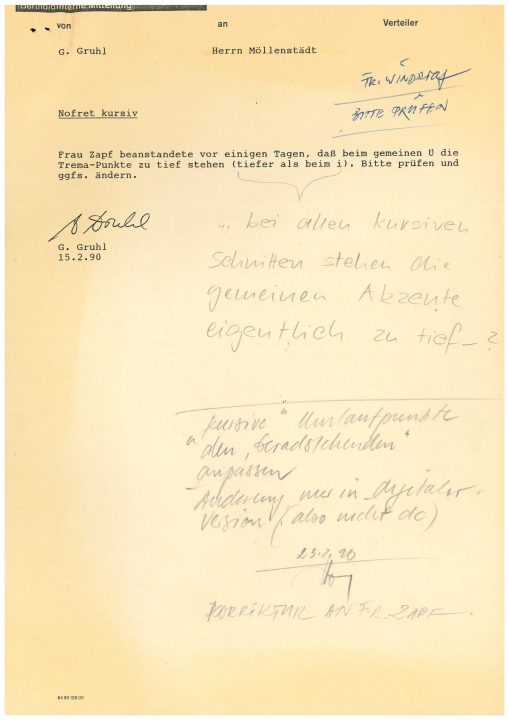
Piece of internal Berthold correspondence regarding Nofret Italic. From shelfmark I.2.046, Stiftung Deutsches Technikmuseum Berlin.
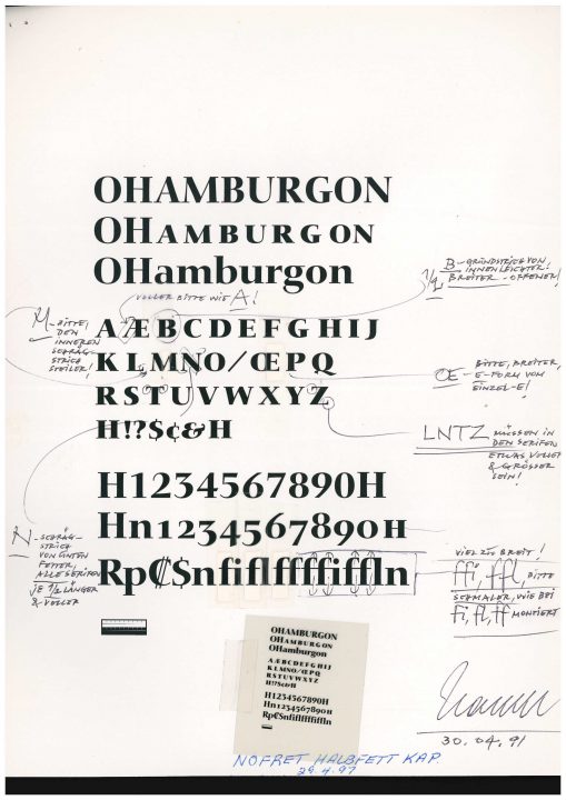
A 1991 correction sheet for Nofret Bold Italic, from shelfmark I.2.046, Stiftung Deutsches Technikmuseum Berlin.
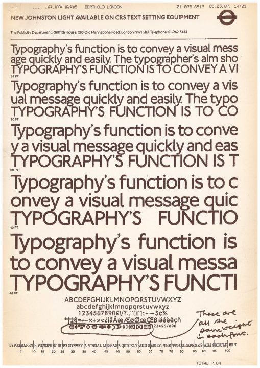
Internal Berthold correspondence from 1987 regrading symbols from New Johnston, a London Underground typefaces designed by Eiichi Kono at Banks & Miles in 1979.
The next generation
Without knowledge from interested external users, archives and museums would be unable to work with many of their holdings. Collaborations provide significant contributions to the quality of cataloged data, enriching it with additional content. For instance, in February 2024, the museum will work together with students from HTW Berlin’s Museology Department on the drawings from Berthold Fototypes GmbH in Munich kept in “blue cassettes.” Those are the artwork for the fonts used on Berthold’s Staromat phototypesetters. The Staromat cassettes are stored in seven meters of cabinetry, holding approximately 140,000 hand-made drawings.
A list of the cassettes for Diatype and Staromat fonts recorded to date will be accessible via this link for the next few years. The link also leads to working photos of each cabinet’s contents.