TypeOff.
Dan Reynolds
Home
About
German Sans Serifs
Blog
Blackletter Resources
The Friedrich Bauer Project
Site Info
Dan Reynolds is a Wuppertal-based design researcher
Latest Articles
Visit blog
Bauer’s view of Berthold up until about 1927
Posted on 2 June 2024 in:
Berthold
,
Friedrich Bauer Project
,
Research
Berlin foundries, part 3
Posted on 13 February 2024 in:
Friedrich Bauer Project
,
Research
,
Theinhardt
Unger versus Decker
Posted on 10 January 2024 in:
Berthold
,
Decker
,
Friedrich Bauer Project
,
Reichsdruckerei
,
Research
Thurneysser and the later privatization of Berlin’s first state-owned typefoundry
Posted on 4 December 2023 in:
Friedrich Bauer Project
,
Research
The Haas Type Foundry up until about 1927
Posted on 30 October 2023 in:
Friedrich Bauer Project
,
Research
Hand drawings for Berthold’s phototypesetting library
Posted on 23 October 2023 in:
Berthold
,
Research
,
SDTB
Augsburg typefoundries
Posted on 6 September 2023 in:
Friedrich Bauer Project
,
Research
J. D. Trennert & Sohn
Posted on 15 August 2023 in:
Friedrich Bauer Project
,
Hamburg typefoundries
,
Research
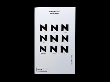
Making Neuland
Posted on 12 May 2023 in:
News
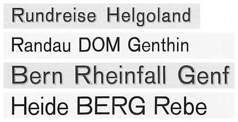
Notes on the origin of Akzidenz-Grotesk
Posted on 28 April 2023 in:
Berthold
,
Nineteenth-century sans serifs
,
Research
,
SDTB
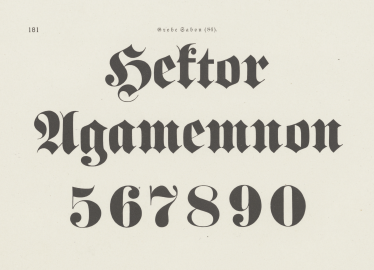
Fette Fraktur questions
Posted on 6 March 2023 in:
Reichsdruckerei
,
Research
,
SDTB
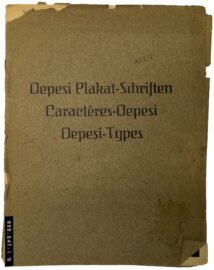
Depesi Types
Posted on 13 December 2022 in:
Research
,
Wood type
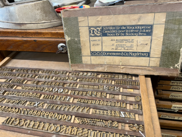
Sandcasting brass types for bookbinders
Posted on 6 December 2022 in:
Brass type
,
Dornemann & Co.
,
Research
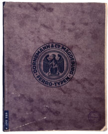
Berthold steel types from Dornemann & Co.
Posted on 23 November 2022 in:
Berthold
,
Brass type
,
Dornemann & Co.
,
Research
,
SDTB
Berthold’s patented type designs, 1900–1907 and 1921–1931
Posted on 26 August 2022 in:
Berthold
,
Research
,
SDTB
…
Blackletter Resources
Take a look
Webfonts
View all webfonts
8 Styles
By Matthew Carter & Dan Reynolds
4 Styles
By Roos & Junge & Dan Reynolds
…