Jérôme Knebusch and Alice Savoie’s Poem Pamphlet series has been a typographic highlight of 2020s. The first pamphlet tells the story behind Rudolf Koch’s Blumenbuch. Back in 2020, I wrote the fourth, which questioned the details of Gebr. Klingspor’s accounts of the Eckmannschrift’s. I refocused the view of that story onto the typeface’s punchcutter, Louis Hoell. This week, the seventh pamphlet debuted. It contains my account of the creation of Gebr. Klingspor’s Neuland typeface, which Rudolf Koch designed and cut in 1922/23. Jérôme distributed copies of the pamphlet to every attendee at this year’s ATypI conference in Paris. It is for sale on the Poem website for just €8. While you are there, you can order back issues from the series, too.
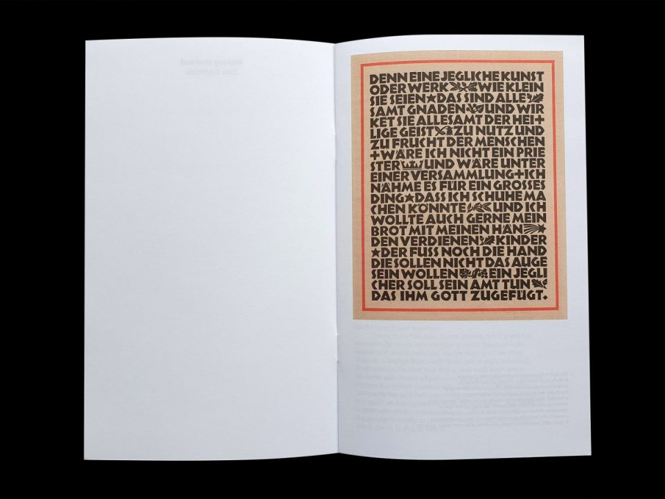
The first page of the pamphlet is illustrated with a reproduction of a Gebr. Klingspor composition set in Neuland’s 20pt size. Note the ornaments interspersed within the text; Rudolf Koch also cut the punches for these, although 20pt is the only Neuland size that includes ornamental sorts. This composition likely shows how Koch intended Neuland to be used. Originally published in Werbeschrift Neuland, Gebr. Klinsgpor’s first type-specimen brochure for the typeface. The text is from Johannes Tauler (c. 1300-1361), a Dominican mystic. The actual size of the print area ca 15 x 19 cm.
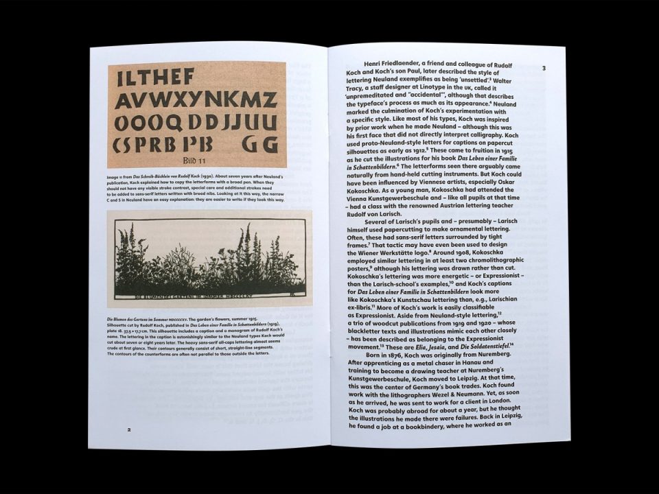
Today, a lot of calligraphers talk about Neuland-style writing. However, Neuland is probably the first of a small number of Rudolf Koch’s typefaces not to have originated from his exercises with broad pens. Although Koch later added Neuland-style letters into one of his writing manuals, he probably developed the style from hand-cutting silhouettes from black paper instead.
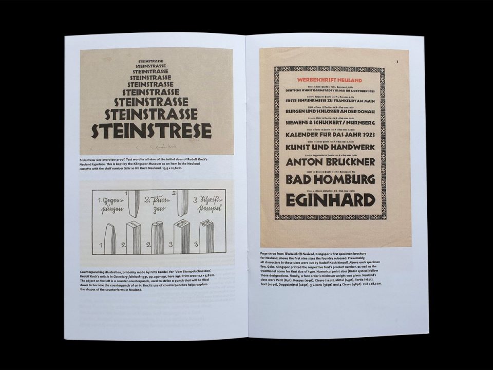
The initial nine Neuland sizes, published in 1923, were all hand-cut by Rudolf Koch. Aside from the novelty of a type designer cutting his own punches, Koch’s process was noteworthy because of his use of counterpunches. Although the punchcutters working in Germany in 1923 were all aware of counterpunches’ use, they had fallen out of common practice and no longer played the role they once had.
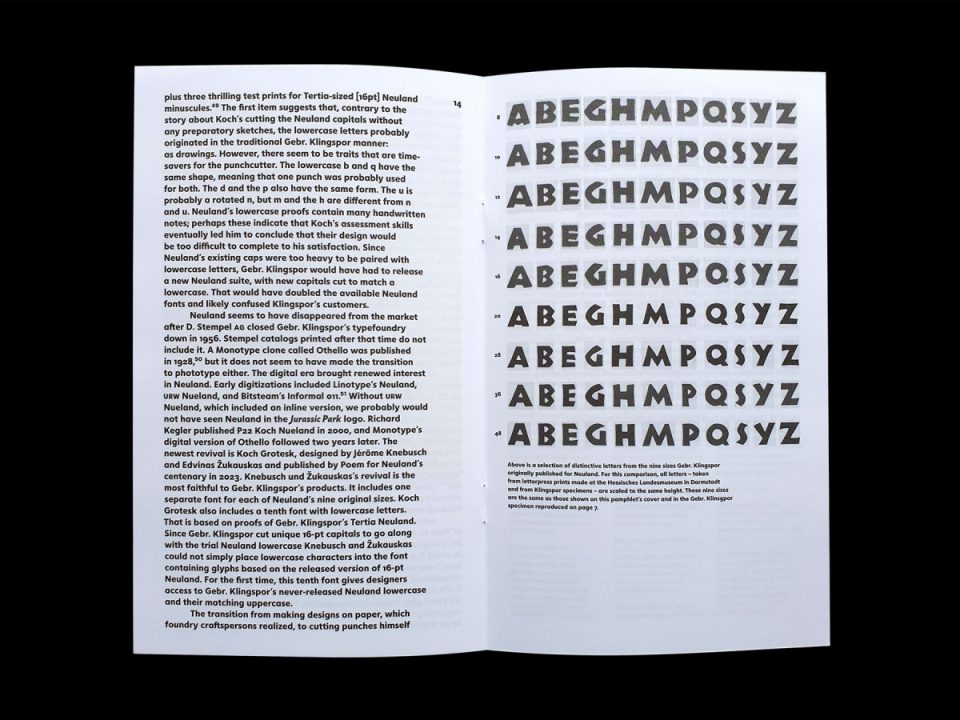
Since Koch cut each Neuland size without first making master drawings for reference, each letter varies in its appearance from size to size.
If you want more information about the pamphlet, here is the official description from the Poem website:
Of the display typefaces Rudolf Koch designed, Neuland may have received the most use abroad. But how was it made? A 1922 letter Koch sent to Ernst Kellner provides more questions than answers, and designers have speculated for almost half a century about whether Koch really cut its punches without any preparation. Dan Reynolds’s essay reviews these textual sources, comparing them with surviving process material preserved in the Klingspor Museum and elsewhere. Written by Dan Reynolds and edited by Alice Savoie and Jérôme Knebusch in the Poem Pamphlet series.
English texts
24 pages, 12 × 20 cm
Offset print on uncoated paper
Glossy UV varnish
Saddle stitch binding
2023