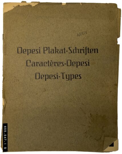
This post is about a somewhat mysterious German poster-type product. I recently acquired a specimen brochure entitled Depesi Plakat-Schriften, Caractères-Depesi, Depesi-Types. It is 24 pages long and has no publisher’s information or date of printing. A folded-up sheet measuring 53.5 × 31-5 cm is placed inside. All the interior pages are reproduced below, but photos of the entire specimen are on Flickr. Before this brochure came into my hands, it had been in Denmark for at least several decades. I guess the brochure was either produced around 1914 by the Deutsche Schrift-Industrie in Marburg or by the Depesi-Plakatschriften und -Tonplattenfabrik Hugo Rösch in Leipzig-Reudnitz during the early 1920s.
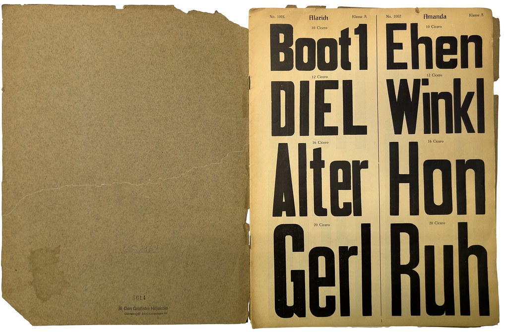
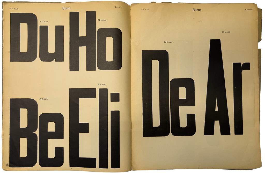
The first page of the Depesi Plakat-Schriften brochure shows two condensed sans-serif typefaces. Each features untraditional weight distribution at their letterforms’ corners. It is not immediately clear how the Alarich and Amanda typefaces differ. Alarich’s 10-Cicero size is heavier than its 12, 16, and 20-Cicero sizes. The 20-Cicero size includes an e whose form is — let’s be honest — much better than the other two on the page. It is fitting that the typefaces introducing this brochure are sans serif. Hardly any other styles appear on its subsequent pages.
Placing this brochure within a type-making timeline
While I cannot say how old the specimen is, it cannot have been before 1910. The typeface used for the text on the brochure’s cover and the typeface names at the top of each page is Feder-Antiqua, which the Frankfurt-based typefoundry Ludwig & Mayer published in 1910. Feder-Antiqua was designed for Ludwig & Mayer by Otto Ludwig Naegele. In 1913, a limited liability company called the “Deutsche Plakatschrift-Industrie GmbH” from Marburg registered the word “Depesi” as a trademark. In the Deutscher Reichsanzeiger newspaper, the notice about that registration was accompanied by a “Depesi” logo in the Feder-Antiqua typeface. I think that Depesi is an abbreviation of “Deutsche Plakatschrift-Industrie,” even though no e appears in the word Plakat. The company officially shortened its name to Deutscher Schrift-Industrie GmbH in March 1914.
So far, I am only aware of one other Depesi ephemera collection. The Allard Pierson collection at the University of Amsterdam has an undated 30-page specimen brochure of „Depesi“-Schriften, Deutsches Reichs-Patent.[1] Its pages are 31.6 cm tall, about half a centimeter taller than the specimen shown in the photos above. Although the „Depesi“-Schriften brochure’s pages are laid out differently from the specimen shown in the photos above, they also prominently feature the Feder-Antiqua typeface.
Along with „Depesi-Schriften“, the Allard Pierson has a small brochure from Deutsche Schrift-Industrie, and three loose sheets of paper the company distributed. That Depesi ephemera came to the University when it acquired the Lettergieterij “Amsterdam” company library. The Deutsche Schrift-Industrie may have sent ephemera to that foundry, or perhaps the Lettergieterij “Amsterdam” collected it at the Internationale Ausstellung für Buchgewerbe und Graphik (BUGRA), held at Leipzig in 1914. Those Depesi items have the Allard Pierson catalog number OTM: KVB LPP 19.
Deutsche Schrift-Industrie GmbH
The Deutsche Schrift-Industrie GmbH exhibited its types at the BUGRA. According to the exhibitor description in the official BUGRA catalog, and to an advertisement the firm ran in the book, Depesi-Schriften were cheaper and longer-lasting than wood types and equal to metal types. Those parts of the catalog each also mentioned the firm’s Depesi-Tonplatten – printing blocks intended for illustrations that would be reproduced in a high volume. The Deutsche Schrift-Industrie GmbH patented the process by which it manufactured its types. In the BUGRA catalog, it also mentioned that it had design patents. While I have not yet found any of those, the company’s type-making patent number was 15a. Sch. 38 571, registered on 12 June 1911. The notice in Deutscher Reichsanzeiger states that this patent was for “manufacturing die-cut poster types from linoleum or similar [substances].”
I do not know when the Deutsche Schrift-Industrie GmbH was established. However, in December 1912, a businessman named Karl Euker replaced Walter Schneid as the company’s managing director. Euker-Antiqua – a typefaces in the “Depesi-Schriften” specimen brochure – is named after him. The Deutscher Buchgewerbeverein inducted Euker as a member in April 1913, but I’m not sure whether the Deutsche Schrift-Industrie was connected with the Karl Euker publishing house that operated out of Marburg by the 1920s.
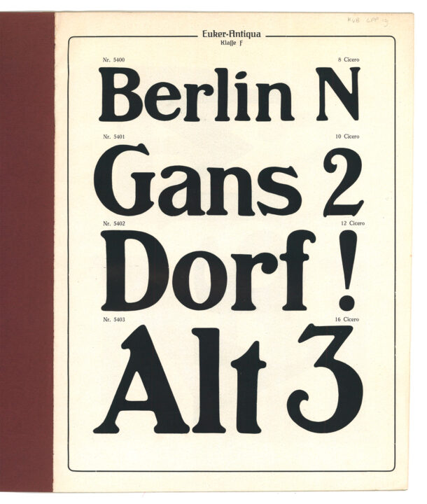
The specimen page reproduced above shows the four-smallest sizes of Euker-Antiqua from the „Depesi-Schriften“ specimen at the Allard Pierson. That brochure’s first four pages show this typeface’s sizes. While both known Depesi-type specimen brochures include slab-serif typefaces, Euker-Antiqua is the only proper serif design I have yet found in that format. Allard Pierson OTM: KVB LPP 19.
Karl Euker’s wife may have been a manager at the company, too. A notice ran in the 13 August 1914 issue of the Deutsche Reichsanzeiger stating that Anna Euker, née Hering, had been given the general commercial power of representation. She also had general commercial power of representation at several other firms. Giving her those official decision-making roles might have resulted from the First World War’s outbreak earlier that month, especially if her husband was a reservist or had enlisted.
Depesi-Plakatschriften und -Tonplattenfabrik Hugo Rösch
Although I have not reconstructed the matter yet, it seems that Hugo Rösch’s Leipzig brass-rule manufactory may have acquired the Deutsche Schrift-Industrie GmbH during or immediately after the First World War. A German printing-journal article published in late 1920 praised Rösch’s Depesi types:
In conclusion, I would like to point out one more technical innovation that seems to me to deserve the full attention of the printing world. These are the products of the Depesi-Plakatschriften und -Tonplattenfabrik Hugo Rösch in Leipzig-Reudnitz. In contrast to wood types, the Depesi typefaces are produced from Vulkan-Fibremasse – from the size of six Cicero and upwards – in a die-cutting process under enormous pressure.[2] They should guarantee unlimited durability and, in particular, uniform printability. It should be impossible for the letters attached to the wooden base to come loose and for the fonts to not be completely resistant against the effects of heat and moisture. The Depesi–Tonplatten, which are made from the same material, do not crumble and are said to give an even and sharp print even with the largest runs. I can only say that the letters and Platten that the company presented to me made an excellent impression. But the decisive word can only be delivered through practical experience.
– Albert Windisch, »Betrachtungen über das Schriftschaffen der letzten Jahre«. In: Archiv für Buchgewerbe und Graphik. Vol. 57, issue 11/12 (November–December 1920), p. 269–280, here p. 280.
How were Depesi types made?
The word “linoleum” crops up a few times in the post, both in the patent registration mentioned above and in an advertisement for cutting tools below. I am not sure what the “Vulkan-Fibremasse” material was that Windisch mentioned above in his roundup of German type-making in 1920. However, I suspect it was earthenware and not a linoleum variety.[3] More important than the material’s substance is what was done to it. The Depesi types were made by a die-cutting or stamping process. Perhaps that process was similar to what the American wood-type historians Rob Roy Kelly and David Shields call “the die-cut method.” That would entail the letters’ counterforms having been pressed down or cut away from the printing surface.

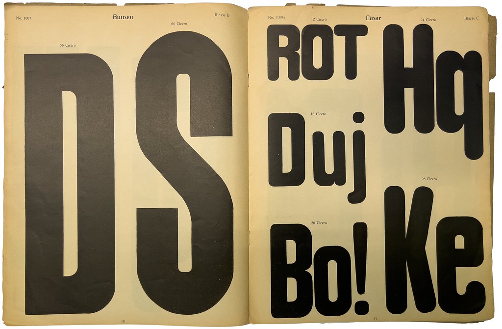
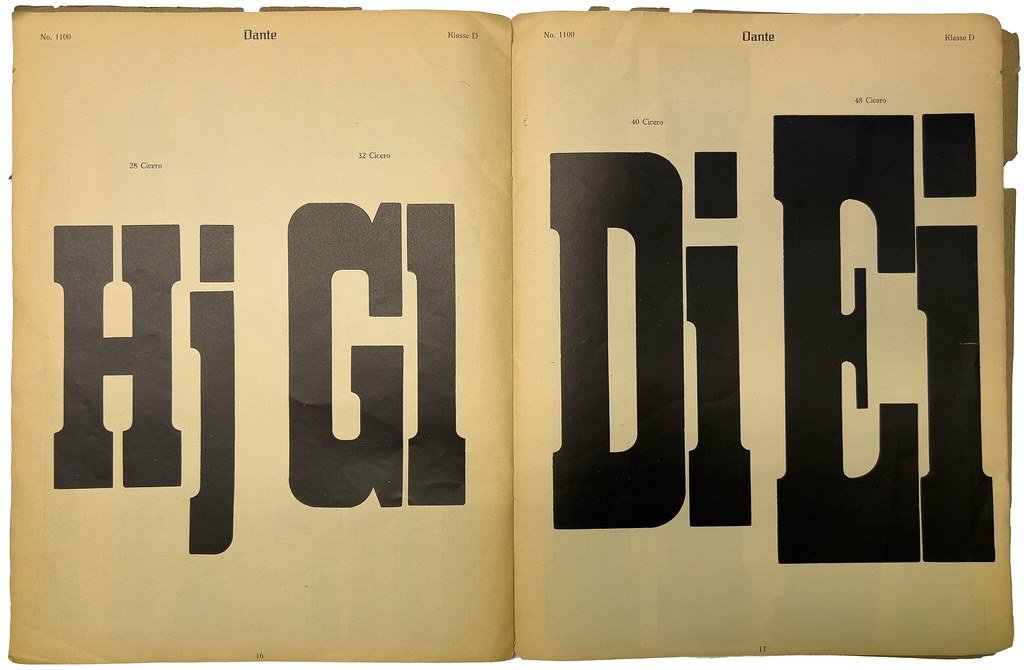
Although you cannot see it in this photo, a press error occurred during the printing of the large D on the right-hand side of this spread. When looking carefully at the top of the letter, you can see that the words “52 Cicero” have overprinted the D instead of being placed above it.
In his recent book, Shields writes that “in the die-cut methods, a brass or steel pattern matching the letter’s contour was pressed or punched directly into the printing side of a type-high block of hardwood.”[4] He contrasts this with three other methods used in American wood-type manufacturing during the 19th century: the end-cut or router-cut method, the veneer method, and enameled wood type.[5] Back in 1969, Kelly explained how the die-cut method enabled far faster wood-type manufacturing than the end-cut/router-cut method. At the same time, he wrote that “its greatest disadvantage was that it required a new die for each size.”[6] Whereas the router-cut method allowed type makers to cut multiple sizes from one pattern, a die is similar to the traditional matrices used in foundry typecasting: you can’t rescale it. My Depesi types brochure does not show very many letters per page. There are often only two or three letters shown for each type size. However, that is still enough to show that the letterforms vary drastically between typefaces’ sizes. Each size must have been made on its own, pretty much from scratch.
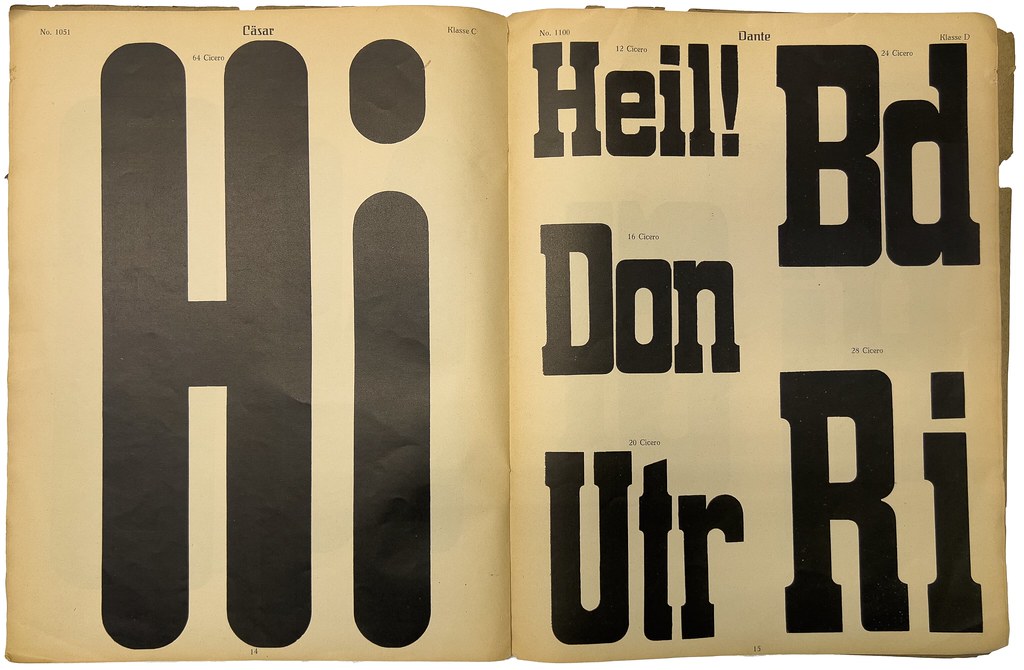
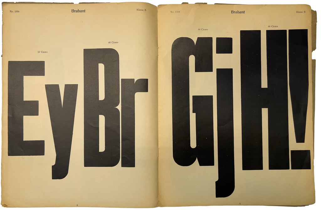
Page 13, on the right, is the beginning of the brochure’s second half. It also marks the first time a non-sans-serif typeface appears.
In the early 20th century, the German printing industry would have been quite familiar with wood type. Several European firms made wood-type fonts. At least some of them must have been using the router-cut method.[7] American wood type was also in circulation. In 1876, the Leipzig typefoundry J. G. Schelter & Giesecke became the German distributor for wood-type faces from Page & Co. in Connecticut – although the actual wood-type letters Schelter & Giesecke sold were probably manufactured in Leipzig from Page patterns.[8]
Windisch also mentioned that “it should be impossible” for the Depesi letterform-plates to loosen themselves from the wooden bases to which they were attached. Either before or after the die-cutting, the Depesi types’ letterforms were adhered to wooden blocks bringing the letters up to the necessary printing height. Perhaps their manufacturing was something like a combination of the die-cut and enameled wood type methods. Kelly included an illustration of “two methods for applying celluloid to wood in the making of enameled wood types” in his book,[9] but without actual Depesi types to examine, I’m only making guesses as to how they were created.
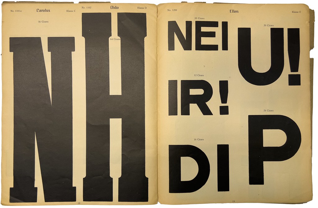
On the face of it, the sans-serif typeface called Ellen on page 19 appears the closest to foundry-type designs in circulation within Germany around 1914. Without more letters, however, it is difficult to suggest which foundry types may have influenced Ellen or if Ellen is a wood-type version of a preexisting design.
Deutsche Schrift-Industrie’s own explanation
The specimen and the company brochure at the Allard Pierson each contain another description of the Depesi type-making process, which is more descriptive than Windisch’s account. I have translated it below:
The production of our Depesi types is protected by an Imperial German Patent and design patents. The face is made of a solid, tough, vulcanized mass manufactured under enormous pressure. Due to the high pressure, this mass is sealed so that any pore formation ceases. After the letterform has been die-cut,[10] it is attached to the block in such a way that the back is artificially roughened beforehand since the material is non-porous. That allows the binding agent to penetrate the mass and into the wood’s fibers and pores at the same time. Under pressure, wood and [the earthenware] mass are combined by means making it hardly possible to remove the image, even with violent means. The types’ metallic finish is achieved on special grinding machines. Once the types’ body size and type height have been aligned with the justification machine, they are waterproofed to protect them from the effects of moisture. Our new Depesi types’ wear and tear are extraordinarily small. They are undoubtedly far superior to the wood types in this respect.
– From the first page of a small brochure at the Allard Pierson with the title Deutsche Schrift-Industrie i. H. The text also appears at the top of the last page in „Depesi“-Schriften, Deutsches Reichs-Patent.

Border-printing elements like those shown on page 21 above appear at the end of my Depesi Types brochure as well as at the end of the „Depesi“-Schriften brochure at the Allard Pierson.
As far as I can reconstruct it, the Depesi-Tonplatten that the Deutsche Schrift-Industrie and Hugo Rösch sold were un-die-cut earthenware surfaces adhered onto wooden blocks. Although they were similar to linoleum blocks, they were sold as competing products and the Deutsche Schrift-Industrie also sold linoleum block and linoleum cutting tools. One of the loose Deutsche Schrift-Industrie sheets at the Allard Pierson reproduces product testimonials, including a three-paragraph letter from Otto Neubert at the Königliche Akademie für graphische Künste und Buchgewerbe in Leipzig. Neubert praised the quality of the Depesi types but was too used to working with linoleum to employ Depesi-Tonplatten in anything other than exceptional circumstances. Those could include large print runs on hard, rough paper, which he suggested as one area where they could outperform linoleum.
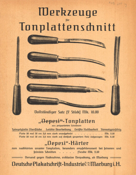
Single-page advertisement for tools to cut printing designs into Depesi-Tonplatten. It also mentions a liquid hardening agent for application to detailed cuts. I think that the text reading „Depesi“-Tonplatten aus präparierten Linoleum is not as straight-forward as it seems. The „Depesi“-Schriften“ brochure states that the company sold linoleum blocks as well as Depesi-Tonplatten. Allard Pierson OTM: KVB LPP 19.
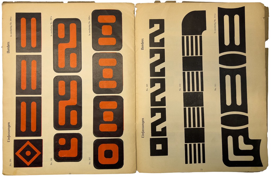
The borders on the left-hand page are two-color, even if their polychromatic scheme is not very sophisticated. Instead of providing sorts that would only print in the non-printing areas of the primary sorts, the secondary color is printed behind the main one’s entire area.
The Depesi types are a nearly-forgotten branch of early 20th-century poster-type development. The need for printers to produce text in large sizes was so great that many typefounding and engraving companies continued to refine the physical formats placed on the press for their dissemination. Around the same time that the Deutsche Schrift-Industrie in Marburg pioneered the Depesi types, Dornemann & Co. in Magdeburg developed a process for casting large-sized printing sorts from steel. Later in the century, manufacturers would apply wood-type style pantographs to aluminum blocks to create more robust letters for poster printing, especially in Switzerland. H. Berthold AG, who collaborated with Dornemann & Co. on steel-type production, and D. Stempel AG for wood-type versions of its fonts, would eventually sell poster types made out of Plakadur, a synthetic resin.[11] Berthold, of course, was a significant player in the post-war type market. Its high production numbers, coupled with Plakadur’s durability, resulted in many Plakadur fonts’ survival into the present day. Printers who have them can still use them on their presses. It is not inconceivable that some Depesi types could also have survived, but since they would be at least twice as old as any Plakadur fonts, it is less likely that they would still be in use.

Notes
- The Depesi-Types brochure I’ve dedicated this post to contains 13 typefaces. The „Depesi“-Schriften, Deutsches Reichs-Patent brochure at the Allard Pierson is six pages longer, but it devotes more pages to the typefaces it includes. Therefore, that specimen only has six typefaces. None of the typefaces in Depesi-Types are included in „Depesi“-Schriften, Deutsches Reichs-Patent.
- In Windisch’s original German text, he described what I’m calling “a die-cutting process under enormous pressure” as being »in Stanzverfahren unter riesigem Druck [hergestellt]«.
- Meyers Großes Konversations-Lexikon already mentioned poster types made out of linoleum in 1908. »Neuerdings hat man solche [Plakatschiften] auch aus Linoleum geschnitten, auf Holzfuß montiert und damit selbst im Mehrfarbendruck günstige Resultate erzielt.«
- David Shields, The Rob Roy Kelly American Wood Type Collection: A History and Catalog. Austin: University of Texas Press (2022), p. 42.
- ibid., p. 40–43.
- Rob Roy Kelly, American Wood Type, 1828–1900: Notes on the Evolution of Decorated and Large Types. New York: Van Nostrand Reinhold Company (1969), p. 55.
- For details on firms making wood-type fonts in 19th century Germany, please refer to Pierre Pané-Farré’s research. You can find details on his website.
- J. G. Schelter & Giesecke highlighted its sales agreement with William Page with an announcement in its house journal, and a full-page specimen of “Amerikanische Holztype von Page & Co. in Greenville (Conn.).” See J. G. Schelter & Giesecke, Typographische Mittheilungen. Vol. 1, issue 2 und 3 (March 1877), p. 27ff.
- Kelly 1969, p. 59.
- In the original German text, what I’ve translated as “die-cut” is described as being »ausgestanzt«.
- For more information about the successful 20th-century wood-type alternatives, see Dafi Kühne’s research on the subject.