Typeface names in the nineteenth century tended to be descriptive terms rather than brands. That was much less the case in the twentieth century, and today many typefaces are used whose nineteenth-century descriptive names have become brands. I’ve written several posts about Akzidenz-Grotesk, a classic example of this phenomenon. Another example is the Fette Fraktur font, made available by Adobe and Linotype around 1990. There are various attributions online for this type design, with some claiming it is a digital version of a C. E. Weber face and others that it comes from the AG für Schriftgießerei or Johann Christian Bauer. At the moment, I suspect the design originated at A. und C. Bauer, J. C. Bauers Söhne. That was an independent punchcuttery in Frankfurt operated in the early 1870s by Alexander and Conrad Bauer, two sons of the deceased Johann Christian Bauer. The Bauer’sche Gießerei’s Fette Fraktur seems to have come from it, and the Bauer brothers likely sold matrices of the design to dozens of typefoundries, including Julius Klinkhardt in Leipzig, the Reichsdruckerei in Berlin, and C. E. Weber in Stuttgart. Nevertheless, I have many questions. The image above shows this design’s 84p size, as shown in the Reichsdruckerei’s 1886 specimen.
The introduction of fette Fraktur typefaces
Fette is German for “heavy.” The oldest Fette Frakturs appeared in the mid-1830s as responses to Fat-Faced romans, which German typefounders were also selling. Some early German fat faces, or Fette Antiqua types, were probably imported as strikes from British foundries, but German foundries cut others.
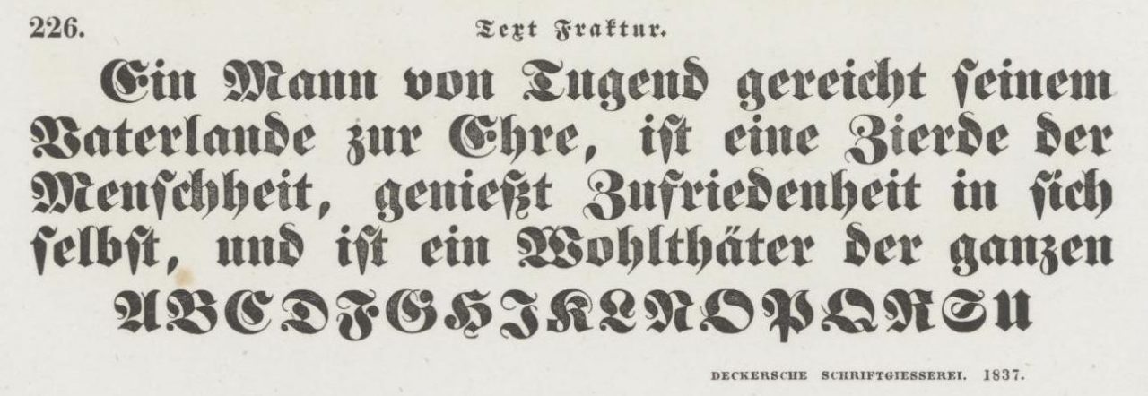
A Fette Fraktur from the in-house typefoundry at the Decker printing house in Berlin, printed in Decker’s 1837 type specimen catalog. Decker carried this design in several sizes. Here, you can see its Text size, which was approximately 20 point (Didot). Decker probably procured the strikes for these matrices from Krumwiede, a Berlin-based punchcutter. Krumwiede’s K has a platypus tail on its bottom-left terminal, which is one of the easier methods for identifying his types or those copying them.
The two earliest Fette Fraktur designs were likely created simultaneously. One came from a Berlin-based punchcutter whose last name was Krumwiede. The other was sold by the Walbaum typefoundry in Weimar, presumably cut by Theodor Walbaum, Justus Erich Walbaum’s son. Some founders mixed sizes by Krumwiede and Walbaum together, including Eduard Haenel – who first cast in Magdeburg and then, after 1837, in Berlin. As Eckehart SchumacherGebler pointed out in 1993, “the Borgis through Tertia sizes [of Haenel’s Fette Fraktur] came from Krumwiede, the rest from Walbaum.” In the nineteenth century, combining sizes of type from various sources into one overarching typeface was extremely common. Krumwiede and Walbaum’s types were not the only Fette Frakturs this would happen with.
Skilled punchcutters are capable of creating exact copies of existing types, and Germany’s chief mid-nineteenth-century printing journal – the Journal für Buchdruckerkunst, Schriftgießerei und die verwandten Fächer – includes several reports of typefoundries recutting Krumwiede’s Fette Fraktur – although Krumwiede himself sold matrices of the design to multiple foundries. Some of that may have had to do with foundry politics, but also because by 1840 or 1841, Krumwiede was dead. Theodor Walbaum had died a few years earlier, in 1836.
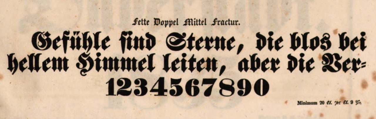
A Fette Fraktur from Theodor Walbaum’s typefoundry in Weimar. This typeface’s specimen accompanied the 1 March 1836 issue of the Journal für Buchdruckerkunst, Schriftgießerei und die verwandten Fächer. Here, you can see the typeface’s Doppelmittel size, which was approximately 28 point (Didot). Walbaum’s Fette Fraktur types feature a very high-waisted e, and that is a good method for identifying them.
How many Bauers does it take to make a typeface?
In 1837, Johann Christian Bauer (1802–1867) founded the Bauer’sche Gießerei in Frankfurt am Main. That date might be a little symbolic since he worked in Britain from 1839 through 1847. Bauer married Amalia Kretzschmar, and together, they had eight children: six sons and two daughters. At least three of their sons became punchcutters.
There are competing accounts for Johann Christian Bauer cutting a Fette Fraktur in either 1850 or 1855. I do not know where the 1850 date arose. The Bauer’sche Gießerei’s 1937 centenary publication Werden und Wachsen einer deutschen Schriftgießerei gives the 1855 date. However, I have not yet been able to find any specimens of a Fette Fraktur from Johann Christian Bauer or the Bauer’sche Gießerei before the early 1870s. Did Johann Christian Bauer cut a Fette Fraktur typeface that the foundry discarded in the early 1870s in favor of a design cut by his sons?
I greet the idea that the AG für Schriftgießerei played any role in the foundry dissemination of today’s Fette Fraktur with great suspicion. The source for this claim seems to come from a line on page 48 of Emil Wetzig’s 1926 Handbuch der Schriftarten, which reads »Fraktur, Fette Vor 1867–75«. The first of the seven foundries that Wetzig tabulated as still selling the design in 1926 was the AG für Schriftgießerei – but the list is alphabetical, meaning that authors who see that foundry’s placement at the top of the list underneath a date range as an attribution are probably misled.
I’m generally skeptical about the attribution origins of the other Fette Frakturs in the Handbuch der Schriftarten. The book is an excellent reference for what fonts were available for sale in 1926. Its origin attributions are often touch-and-go. I think that is the case with the Fette Fraktur designs, too. Page 48 from the Handbuch der Schriftarten lists a second Fette Fraktur sold (in 1926) by the AG für Schriftgießerei and Gebr. Klingspor. This design’s attribution line reads »Im Hause vor 1900«. The design was definitely an in-house design, but it was an in-house design from the Dresler/Flinsch foundry, not one of the AG für Schriftgießerei or Gebr. Klingspor. If you want to know what that design looks like, scroll down to the “D. Stempel AG and Linotype” section of this post.
The AG für Schriftgießerei did not call itself the Aktiengesellschaft für Schriftgießerei und Maschinenbau until the late 1880s, when the J. M. Huck & Comp. foundry reorganized itself – more on that below. An 1876 Huck specimen at the Plantin-Moretus Museum, digitized by Google Books, includes three Fette Fraktur designs: one matching Krumwiede’s design from the 1830s and two matching designs introduced by the Flinsch foundry, in 1861 and 1866, respectively. Huck may well have also carried the Bauer brothers’ Fette Fraktur, but it is not in this specimen and Huck can hardly be imagined as the typeface’s commissioner.
A brief text in the 3 November 1874 issue of the Österreichische Buchdrucker-Zeitung states that the “commissioner” of the typeface was the [Karl] Fromme foundry in Vienna. According to the note, the smallest Fette Fraktur sizes were cut by Johann Christian Bauer, who had died in 1867. Fromme had ordered additional sizes from the Bauer brothers. That is certainly conceivable. The Fromme foundry became Brendler & Harler in 1876; the business issued a specimen of the Bauer’sche Fette Fraktur design, although only a page showing rather large sizes from that has so far been digitized. Yet, if Johann Christian Bauer cut some of the Fette Fraktur’s smaller sizes, which were those? An 1873 list of steel punches in A. und C. Bauer’s possession mentions the Fette Fraktur sizes 6, 8, 9, 10, 12, 14, 16, 20, and 28p sizes. The Bauer’sche Gießerei’s 1874 specimen of those sizes states, at its top left, that they were “cut by A. and C. Bauer.”
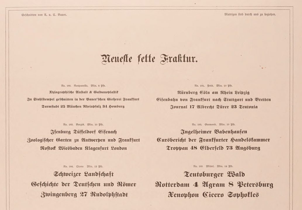
Top-half of a specimen sheet for the Bauer’sche Gießerei’s Neueste fette Fraktur that accompanied the December 1874 issue of Archiv für Buchdruckerkunst und verwandte Geschäftszweige. It is difficult to read in the above image, but the text in the top-left reads »Geschnitten von A. u. C. Bauer.« or “cut by A. and C. Bauer.” The text on the top-right reads »Matrizen sind durch uns zu beziehen.« or “matrices are to be procured through us.” Admittedly, it is difficult to say with certainty who “us” referred to in December 1874. Was it the Bauer brothers or was it the Bauer’sche Gießerei? I suspect the former, for in 1873, the Bauer family had sold off its interests in Johann Christian Bauer’s former foundry.
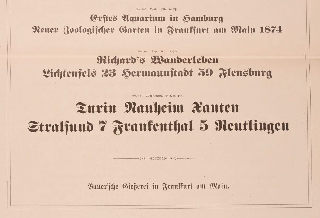
The bottom half of that same 1874 Bauer’sche Gießerei specimen sheet for the Neueste fette Fraktur. The name of the typeface, Neueste fette Fraktur, may suggest that this Fette Fraktur was in the newest style. It does not necessarily imply that the Bauer’sche Gießerei had an earlier Fette Fraktur this design replaced. Perhaps this is analogous to Times New Roman; there was no “Times Old Roman.”
Alexander and Konrad Bauer’s older brother was Friedrich Wilhelm Bauer, who in 1880 would go on to found the Bauer & Co. foundry with Karl Rupprecht in Stuttgart. Like Alexander and Konrad, Friedrich Wilhelm Bauer was also a punchcutter. He had been cutting new types since the 1850s. The Staatsbibliothek zu Berlin has two editions of ca 1890 Bauer & Co. catalogs that contain punchcutter attributions. These have the call numbers An 1214 and 4″@An 1214/3.
14p and 16p sizes of the Fette Fractur in a ca. 1890 catalog from Bauer & Co. in Stuttgart. The typefoundry was established in 1882 by Friedrich Wilhelm Bauer and Karl Rupprecht, Friedrich Wilhelm Bauer’s son-in-law. Two Bauer & Co. catalogs dated to approximately 1890 include punchcutter attributions! The two pages showing the smaller sizes of Fette Fractur attribute the types not to Johann Christian Bauer or Friedrich Wilhelm Bauer’s brothers but to Friedrich Wilhelm Bauer himself. It is not the case that Bauer & Co. tried to take credit for typefaces cut by Friedrich Wilhelm Bauer’s father, Johann Christian Bauer. The catalogs attribute many typefaces to him directly. Image: Staatsbibliothek zu Berlin, Preußischer Kulturbesitz, An 1214.
Most typefaces in those Bauer & Co. catalogs that include attributions were cut by Johann Christian Bauer, Friedrich Wilhelm Bauer, or Cosman Damian May. They attribute the 6p to 36p Fette Fraktur to Friedrich Wilhelm Bauer, not his brothers Alexander and Conrad. Indeed, Alexander and Conrad Bauer are not mentioned at all. The page showing the 48p to 84p sizes has no punchcutter attribution. Might the “smaller” sizes of Fette Fraktur be cut by Friedrich Wilhelm and sold by his brothers Alexander and Conrad? Why did F. W. Bauer not mention his brothers, who almost certainly provided the larger Fette Fraktur sizes, if not the entire typeface itself?
The AG für Schriftgießerei in Offenbach did carry the Bauer brothers’ typeface. A bound volume of loose type-specimen sheets from that foundry was donated by Karl Klingspor to one of the Berlin Kunstbibliothek’s predecessor libraries. Two sheets in that volume show the Neueste Fette Fraktur sizes. The AG für Schriftgießerei printed an elaborate symbol on the top-left corner of specimen sheets showing typefaces that the foundry created in-house. Since that symbol does not appear on the Neueste Fette Fraktur sheets, the Bauer Brothers’ design cannot have been commissioned by Huck or the AG für Schriftgießerei. Because the footer on these sheets reads, “Actiengesellschaft für Schriftgießerei & Maschinenbau, Offenbach a. Main,” the sheets cannot be older than 1888. The foundry could still have procured the typeface’s matrices between 1876 and 1888 when it was still doing business as J. M. Huck & Comp.
What about C. E. Weber?
C. E. Weber, at least after the Second World War, advertised its version of the Bauer brothers’ design as an in-house product from 1875. That is likely a clerical error. At the beginning of the twentieth century, the foundry had at least three Fette Fraktur designs in its portfolio. In addition to the Bauer brothers’ design, it sold a Fette Fraktur design introduced by the Dresler/Flinsch foundry in 1861 and a Fette Fraktur design called the “Universalfette Fraktur” (pictured below).
Like the other two Fette Fraktur designs Weber sold at the beginning of the twentieth century, Universalfette Fraktur was not designed at C. E. Weber. The design was probably created at Benjamin Krebs Nachfolger in Frankfurt am Main in 1863. Both Krebs and the J. H. Rust & Co. foundry showed specimens of the design in 1863 issues of the Journal für Buchdruckerkunst. Krebs called the design “Neue fette Fractur” and claimed it had the typeface’s punches. Rust & Co.’s specimen just focused on the 10p size, so on that sheet, the typeface’s name was “Universal fette Garmond Fraktur. (Garmond was the traditional name for type that was about 10p). In 1864, Krebs bundled another specimen of the design in the Journal. By that time, it was also using the “Universal fette Fraktur” name.
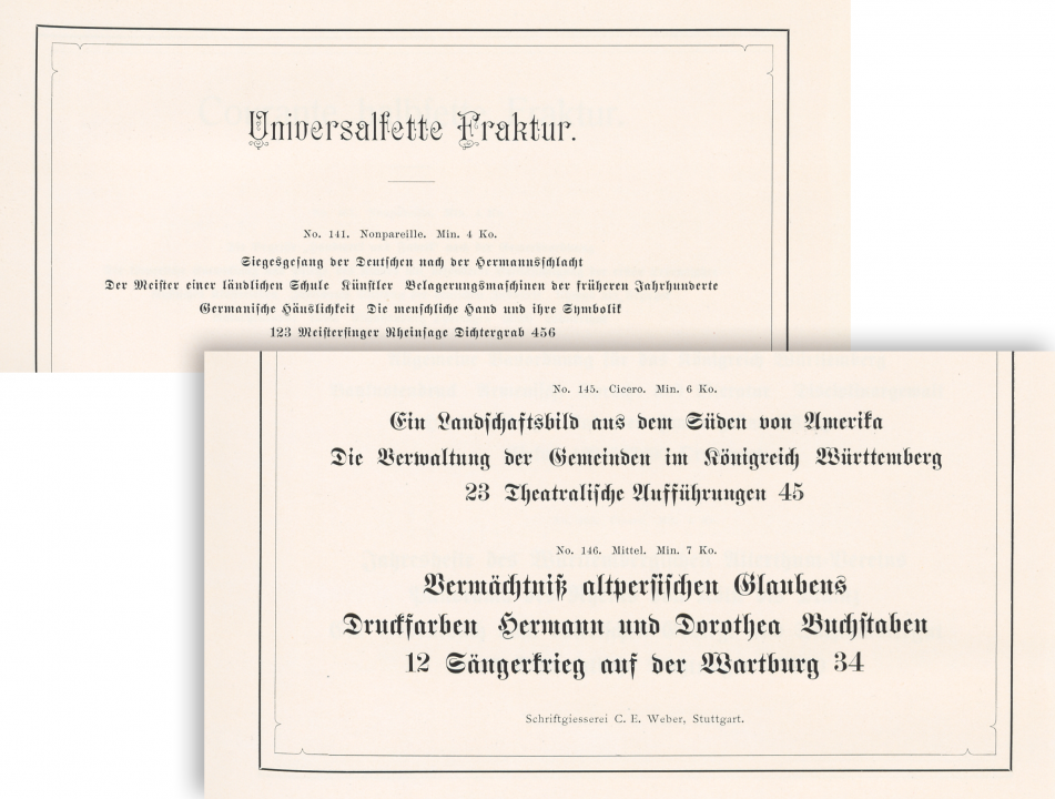
Digital collage showing the top and bottom portions of the Universalfette Fraktur page in C. E. Weber’s 1907 type specimen catalog. At the Staatsbibliothek zu Berlin, this catalog has the shelf number 4″@An 1825.
Typographic terminology was not as standardized in the nineteenth century as it would become in the twentieth. Where do you draw the line between bold and heavy type? In this investigation, I have only cataloged typefaces shown by various foundries as their Fette Fraktur designs, not their Halbfette Fraktur, Schmalfette Fraktur, or other Fraktur varieties. German Fette Fraktur designs were sold in other countries, too. In the catalogs from United States typefoundries, for instance, type sizes that originated in Germany as Fette Frakturs were occasionally mixed with European Halbfette Frakturs. While the distinction between Halbfett and Fett cannot be conclusively drawn, my investigation needs some limits, or I will never be able to wrap it up.
Do Fette Fraktur punches from the Bauers survive in Berlin?
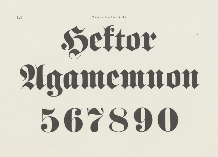
The Reichsdruckerei, or German Imperial Printing House, shows two Fette Fraktur designs in its 1886 type-specimen catalog. The first seems to match the Krumwiede design – and, indeed, one of the Reichsdruckerei predecessor houses had carried that design since at least 1837. The second appears to match the Bauer brothers’ design. The Reichsdruckerei’s 1886 catalog mentions when typefaces shown are in-house products, but no such designation is given for either Fette Fraktur. Despite this, a cabinet of punches from the Bundesdruckerei – the Reichsdruckerei’s West Berlin successor – includes hand-cut steel punches for the Bauer-brothers-like Fette Fraktur design. But only in the sizes ranging from 5p to 12p, not in the larger sizes the printing house also had. Did the Reichsdruckerei purchase these punches from Alexander and Conrad Bauer after 1886? If so, why?
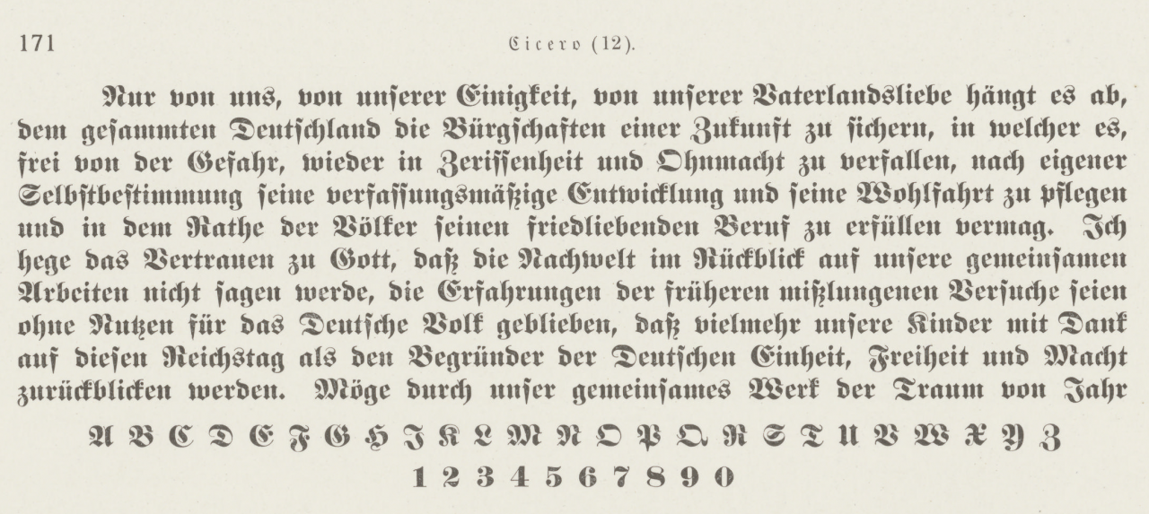
The image above shows a Cicero-sized Fette Fraktur typeface from the Reichsdruckerei’s 1886 catalog. Cicero is approximately 12 point (Didot). This typeface seems to match the Bauer Neueste fette Fraktur exactly. The punches for this typeface are in the collection of the Stiftung Deutsches Technikmuseum Berlin today, along with the punches for 6, 8, 9, and 10p sizes. Did a member of the Bauer family like Johann Christian Bauer, Alexander Bauer, Conrad Bauer, or Friedrich Wilhelm Bauer make them? Or were they cut inside the Reichsdruckerei’s engraving department to match?
D. Stempel AG and Linotype
The Fette Fraktur from D. Stempel AG includes several sizes that match a Flinsch foundry design from 1866, with large sizes matching the Bauer brothers’ design. Records from D. Stempel AG at the Hessisches Landesmuseum Darmstadt indicate that Stempel acquired these matrices when it purchased the Juxberg-Rust foundry in 1896. The Juxberg-Rust foundry had its roots in an Offenbach foundry called J. H. Rust & Co. That foundry had a branch in Vienna, and in the late 1870s, the Vienna branch became an independent company, retaining the J. H. Rust & Co. name. The old Offenbach mothership changed its name to Juberg-Rust. The independent Vienna-based J. H. Rust & Co. foundry’s catalogs do not include the Flinsch foundry’s Fette Fraktur. Juxberg-Rust must have acquired it but may never have printed a specimen showing it. Wetzig’s Handbuch der Schriftarten shows a Bauer-like Fette Fraktur on page 47, which he dates to 1908, as something Stempel sold. However, Stempel’s large ca. 1925 or 1927 Haupt-Probe (the 1,600-page catalog sometimes called the “Stempel Bible”) does not include that design in the sizes 6, 8, 9, 10, 12, 1, 16, 20, 28, 36 and 48p that Wetzig gives. Those are also not in Stempel’s ca 1912 Kleine Schriften-Probe catalog.
Two sizes of Fette Fraktur I, from the 1894 catalog published by Wilhelm Gronau’s foundry in Berlin. This Fette Fraktur design originated at the Dresler’sche Gießerei/Ferd. Flinsch typefoundry in Frankfurt about 28 years earlier. Like the Bauer family Fette Fraktur, Flinsch’s 1866 design was a popular one that many foundries carried. The lowercase a in this design is the best way to differentiate it from other Fette Fraktur styles. Its left-most extreme is noticeably curved, much more so than in the Krumwiede or the Bauers’ designs.
Before the First World War, Stempel called its Fette Fraktur design Neue fette Fraktur. By the mid-1920s, they shortened this to just “Fette Fraktur.” Stempel was the manufacturer of German Linotype’s matrices and, at some point between 1913 and 1926, it created a Linotype version of Neue fette Fraktur, but only in one size: 14p. Like Stempel’s Neue fette Fraktur/Fette Fraktur, this Linotype font matched the Dresler/Flinsch 1866 design shown above.
In the second half of the 1930s, German Linotype added another Fette Fraktur to its typeface portfolio. It had far more sizes (6, 7, 8, 9, 10, 12, 14, 16, 20p). Although the smaller sizes of Stempel’s Fette Fraktur were not based on the Bauer brothers’ Fette Fraktur, this Linotype Fette Fraktur it made was. Why?
Links to the various Fette Fraktur styles
To help make sense of the distribution of competing Fette Fraktur designs across the German network, I created a database cataloging specimens of these designs. Indeed, many of my links above lead to entries in it. So far, I have found 15 attributable designs. I also have a category for things I cannot yet attribute. Note: many instances of Krumwiede’s design were probably not cast from matrices struck by punches Krumwiede cut. Instead, they are near identical clones whose punchcutters I have not yet identified.
- F. W. Assmann, Berlin
- Bauer, Frankfurt am Main
- Culemann, Hannover
- A circa 1861 design from the Dresler’sche Gießerei/Ferd. Flinsch, Frankfurt am Main
- A circa 1866 design from the Dresler’sche Gießerei/Ferd. Flinsch, Frankfurt am Main
- Hanemann, Jena
- L. E. Junge, Erlangen
- C. Kloberg, Leipzig
- A circa 1863 design from Benj. Krebs Nachf., Frankfurt am Main
- A circa 1874 design from Benj. Krebs Nachf., Frankfurt am Main
- Krumwiede, Berlin
- J. B. Metzler, Stuttgart
- Pichler, Vienna
- J. G. Schelter & Giesecke, Leipzig
- Schickenberg, Hannover
- Walbaum, Weimar
- Not yet identified
Conclusion
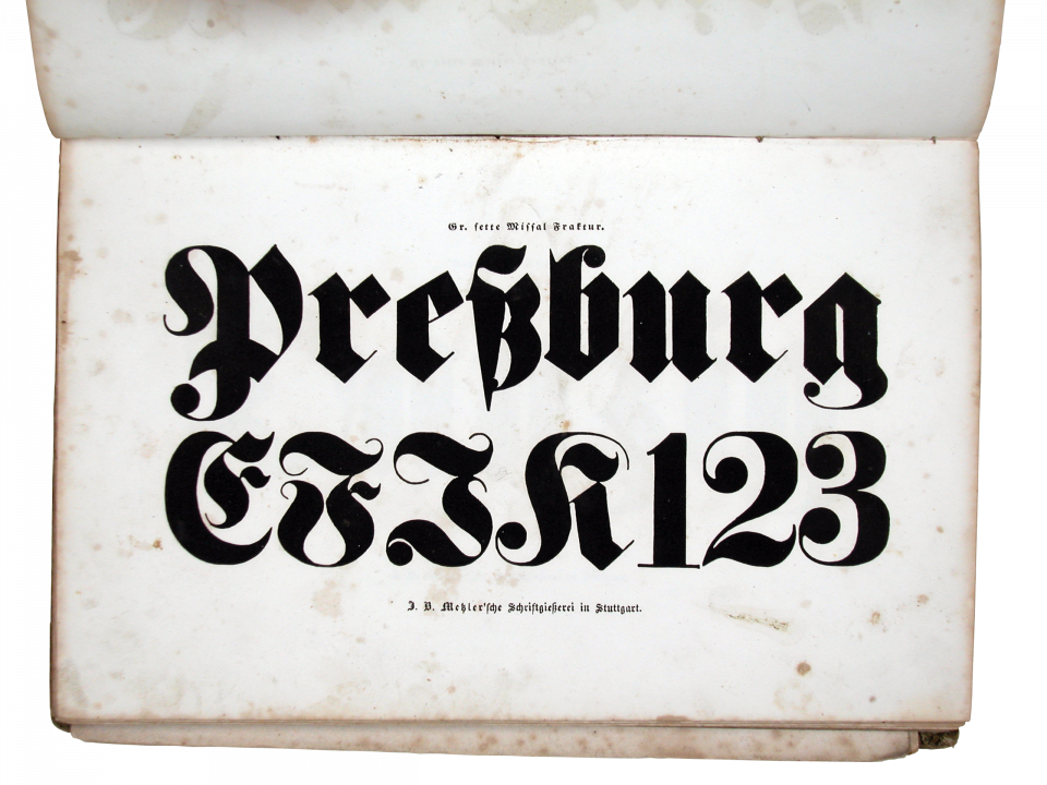
This larger-sized Fette Fraktur was probably produced at J. B. Metzler in Stuttgart. It appears in the foundry’s 1840 catalog. I photographed this page in the library of the Gutenberg Museum in Mainz, either in 2005 or 2006. This feels close to Walbaum’s large types but it is not the same.
In 2010, I wrote a short article for I Love Typography about type specimens at the Gutenberg Museum. That included a page from an 1840 J. B. Metzler catalog showing a large Fette Fraktur. As 1840 was a decade before some sources provided for Johann Christian Bauer’s Fette Fraktur, I received an e-mail asking if I “really supported the conspiracy that Fette Fraktur did not come from Johann Christian Bauer.” I had no idea that mid-nineteenth-century typefaces could be controversial to anyone. Perhaps this post will provide more context to Internet users searching for the term “Fette Fraktur” in the future. I hope to expand this database with more specimens in the future. Perhaps additional specimens will eventually help answer the questions I pose above. Please point me in the direction of any specimens I may have overlooked!
Putting research-in-progress out onto the Internet is risky. Indeed, it would be a little embarrassing if a reader pointed me at an 1855 specimen from Johann Christian Bauer for a Fette Fraktur tomorrow. I’ll update this page when I find more information.