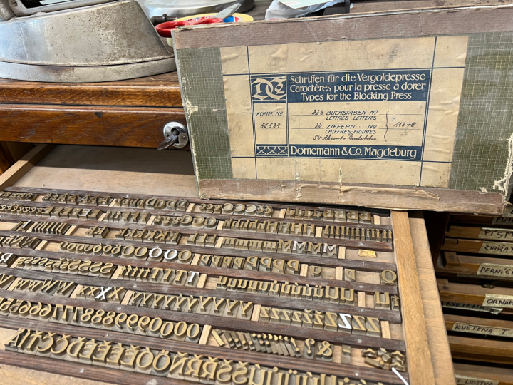
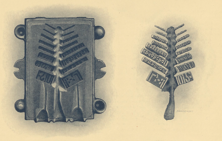
The above photograph reproduces a drawer of brass bookbinders’ type from Dornemann & Co. in Magdeburg. The original packaging is also inside the cabinet, and the label tells us that this is Dornemann & Co.’s font number 11348. That’s the 36p size of Friedrich Wilhelm Kleukens’s Halbfette Kleukens-Antiqua. The Bauersche Gießerei originally published that as a foundry typeface in 1910. Later, Dornemann & Co. began distributing the design in brass. I took this photo at UMPRUM in November while visiting the Prague art school’s new technical building. Depending on exactly when in the 20th century’s first four decades this font was purchased, the brass types were either made by sand casting or by a matrix/hand-mold method. This post explains the sand-casting process Dornemann & Co. used for making brass bookbinders’ types between 1905 and around 1922.
Sandcasting brass types
Fonts of brass letters usually took one of two forms. Brass “poster types,” on the one hand, were intended for printing on more surfaces than just paper. Those were produced at type height, allowing printers to use them together with foundry types and wood-type fonts. Brass types for bookbinders were the other form. They were not necessarily type-high. At the beginning of the twentieth century, brass bookbinding fonts were manufactured by at least two different methods. Sandcasting was the most common. That was how Magdeburg-based engraving factories like Edmund Koch & Co. and Dornemann & Co. made bookbinding fonts. Otto Kaestner in Krefeld claimed that his graving firm was the only German company that cast individual sorts in a hand mold, as foundry-types had been cast before the introduction of typesetting machines.
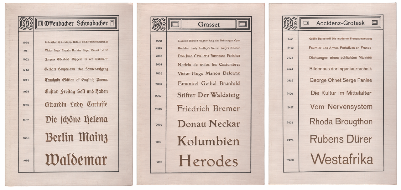
Three gilded type-specimen boards that Dornemann & Co. in Magdeburg produced around 1910. Each is 22.2 × 14.8 cm. The boards show typefaces Dornemann & Co. almost certainly licensed from German typefoundries. The left-most board has Offenbacher Schwabacher, then sold by Gebr. Klingspor in Offenbach am Main. The middle specimen shows the Grasset typeface – originally from La Fonderie G. Peignot & Fils and sold in Germany by Genzsch & Heyse in Hamburg. The board on the right is for Accidenz-Grotesk, from H. Berthold AG in Berlin and Bauer & Co. in Stuttgart. Since the lettering on these boards is gilded, the specimen surfaces are slightly three-dimensional.
The sand-casting process engraving companies used for manufacturing brass types was complicated enough to warrant an explanation. Dornemann & Co. published an illustrated account – »Kurze Abhandlung über die Fabrikation von Schriften für die Vergoldepresse« – in a type specimen catalog published around 1910, which I translated into English. You can find the original German-language text online in Dornemann & Co. Magdeburg, Deutschland. Dornemann & Co.’s text takes up the rest of this post. I annotated my translation with notes that appear below it. This post reproduces all illustrations from the »Kurze Abhandlung…« text, including their original captions. Since those captions were all brief, I have slightly expanded the amount of information each caption contains.
General information
The most important thing in the manufacture of typefaces for the gilding press are the models, which are laborious and very expensive to produce. Therefore, the models are also the most valuable part of an engraving company’s inventory; in our case, for example, they have an acquisition value in the hundreds of thousands.[1]
Large-scale production of gilded lettering is not possible without models, and without one, fast delivery and moderate selling prices with good workmanship are unthinkable.[2] Often, a customer believes that fonts can easily be made, according to any given template, expressly for his order. He is then extremely surprised when he is told that there are no models for the font he requested and that the bespoke production of the typeface is impossible, thanks to the high costs. Other customers believe themselves to be better informed and consider the matter from a different angle. They calculate it like this: “The forms or models are there. All you have to do is make a mold from them, and ‘the font will be done.’” He cannot understand how, according to such simple logic, we do not immediately carry out his order. At the same time, he stubbornly points to the prices in the catalog, which he believes are far too high. The matter is not as simple as it may seem to some; in fact, it is much, much more difficult than most people think. The main work in the production of typefaces is not complete once the models are cast. It has only just begun.
Models
The font models are lines on which the letters of an alphabet and the associated characters are positioned according to certain rules and arranged side by side in such a way that there is a gap (space)[3] between the individual letterforms for the saw to cut through. Only the types for ribbon-printing[4] and poster types are different[5]. Because of their size, they have enough body to be molded, cast, engraved, and finished as individual sorts.
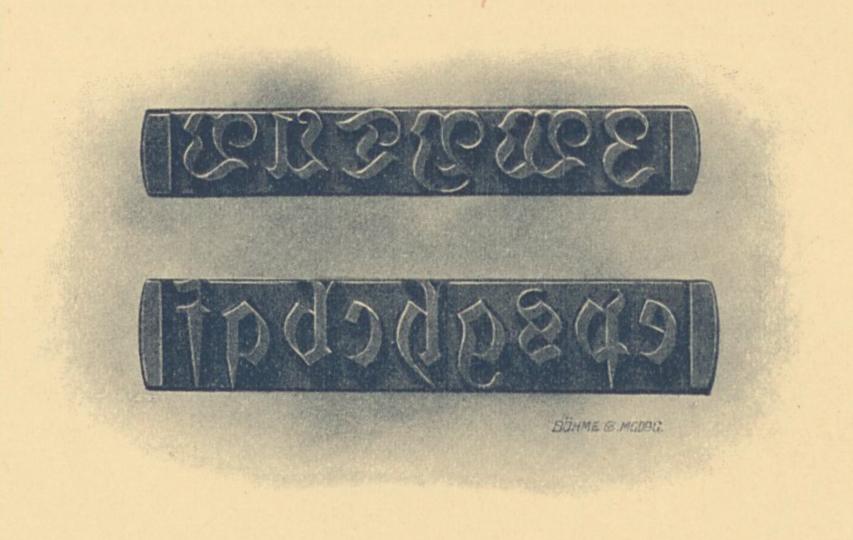
Above, the text’s illustration for Modellzeilen, or model slugs. Each contains several letters. The slugs would be pressed into sand to create the sand-casting matrices, in which new slugs out of brass would be cast.
As an aside, the capital or initial letters have the technical term “uppercase,” while the small letters are called “lowercase.”[6]
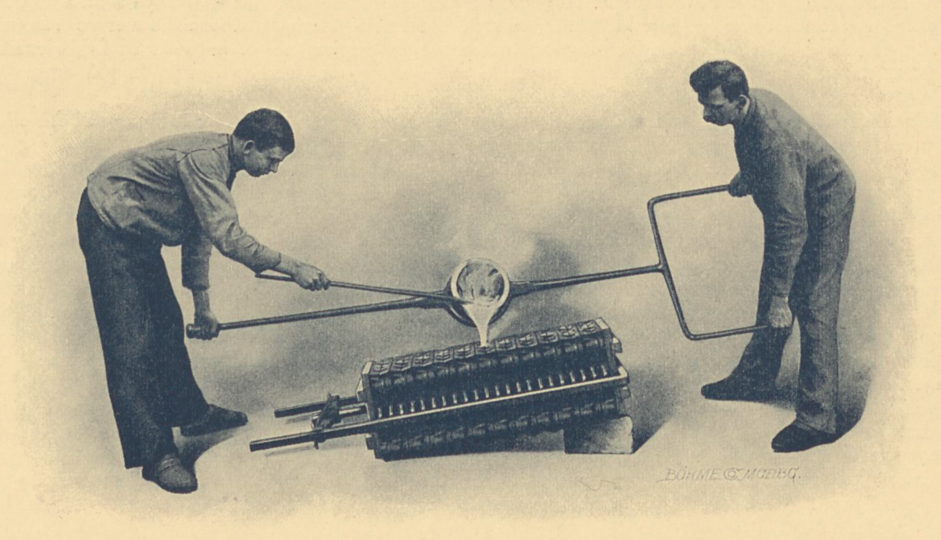
Above, the text’s illustration for Gießen, or casting. It shows two men pouring molten metal into a large sand-casting mold.
Metal
Metal plays a chief role in the manufacture of typefaces. It should be both hard and robust. Such a composition is obtained from copper and tin. [In German,] the gunmetal is called Rotguß [red cast] because of its reddish color. When copper and tin are mixed in the right proportions and well conjoined, they produce bell metal or bronze, which is the metal best suited for letters that will be embossed [Pressenschriften].
Another variety is brass, called Gelbguß [yellow cast] in German, whose components are copper and zinc. As a category, brass also includes the so-called “wild” gunmetal, often used as a substitute for expensive bell metal when copper and tin prices are high.
On the other hand, we expressly point out that we only process the very best raw metals, regardless of current metal prices. Since we have our own metal foundry – in contrast to some other engraving companies – we can give a full guarantee that our typefaces and engravings for the gilding press are, in fact, manufactured from bell metal or bronze rather than just being described by those names.
Molding and casting
The material for molding typefaces and engravings for the gilding press is a particular kind of sand that is not found everywhere – just in a few areas of Germany. Furthermore, tall and elongated frames made of iron or brass are required for molding, with openings for the pouring channel and two air channels on one narrow side. The first of these sits in the middle of the latter two. When two of these frames are placed on top of each other and connected, they form the molding or casting container.
When the molding work is complete, the molding boxes are placed in the drying oven to remove the moisture from the sand. At the same time, the sand becomes solid enough to withstand the pressure of the liquid metal sufficiently.
When one proceeds to the casting, the two molding box parts – which always belong together – are fitted onto one another, with guidance and support being affected by pins located outside. Several boxes thus assembled are placed in a screw press with the pouring channel facing upwards. The liquid metal prepared in the graphite crucible is then carefully poured into the middle of the three openings that form the pouring channel’s mouth.
Once the metal has cooled, the boxes or casting-device bottles are disassembled. The cast metal is then removed, which destroys the sand mold in the process. If more casts are needed, new casting molds must be formed again and again – a fact that should especially be noted by those who were previously of the opinion that the impressed form remains intact forever, allowing for as many castings as one likes.[7]
The left-hand image above shows the sand mold inside a casting frame. Dornemann & Co. employees would have pressed several model slugs, one after another, into wet sand to create this mold. The above-right illustration shows a rendering of the metal cast made from the mold on the left.
After the casting has been freed from the loose and burned-on sand adhering to it, and the individual rows have been knocked off the central rod, the casting rows are sorted, and at the same time, the bad ones are discarded.
Engraving
Even the best casting does not turn out in such a way that it can immediately be placed in the hands of the engraver. The main problem is that, due to the uneven contraction or shrinkage of the casting metal, the individual lines of type differ in height and often collapse in the middle. In large typefaces, that is particularly noticeable in an unpleasant way.
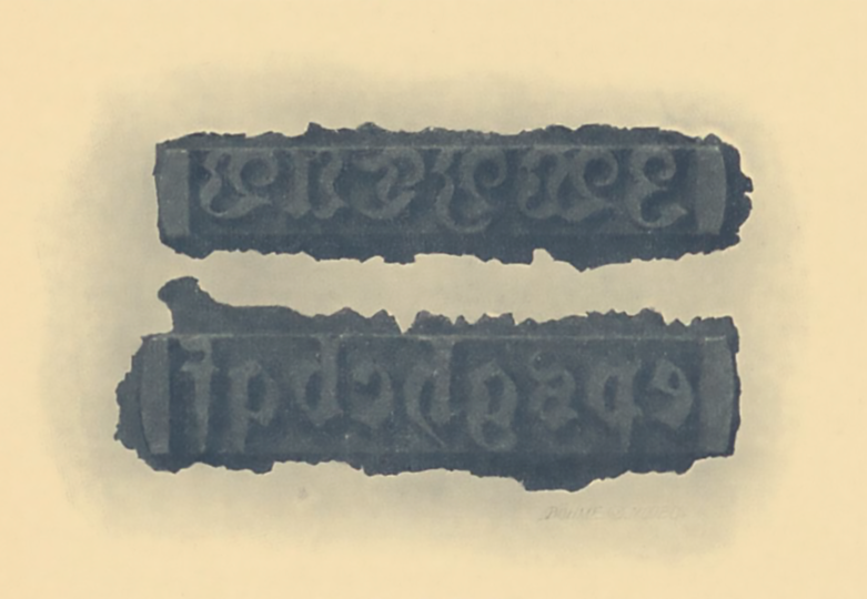
Above, the text’s illustration for Rohguß-Zeile, or raw-cast lines. The image shows two slugs after being taken out of the sand-casting mold. At this stage, the letterforms’ surfaces are still too rough for use.
However, since having a completely even face is the first prerequisite for achieving an exact height for all individual letters along a line, all slugs must first be aligned. Then, the face-sides must be sanded down until they are completely flat, and each letter stands as high as all the others. This processing cannot be avoided. It naturally changes the original image of the letters; the latter becomes stronger or bolder and no longer in the same proportion because letters standing further upwards on the slug have to be sanded down enough to match the height of the deeper ones. Then, it becomes the engraver’s task to trim down the deformed letters on the slug so that they appear the same as they do in the type specimen from which the customers place their orders. In other words, it comes down to the skill and understanding of the engraver whether or not the letterforms are reproduced as they appear on the models; the models alone cannot guarantee this.
That is especially true for the smallest and most condensed typefaces. Because of the smallness and narrowness of their letter images, they can only be imperfectly reproduced by casting and, therefore, place increased demands on the engraver. But finishing those letters is also associated with considerable difficulties because their body sizes are so small. Logically, cleanly engraved and precisely justified typefaces in small sizes must therefore be more expensive than their successively larger sizes.
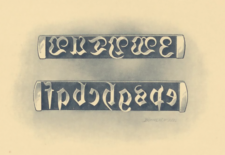
Above, the text’s illustration for gravierte Gußzeile, or engraved slugs. Here, we see the same slugs shown in the previous image, but now their letters have been sounded down, and an engraver has removed all excess weight resulting from the sand casting process. The letters have also been polished, and each one is ready to be sawn off of the slug.
Finishing
The engraved slugs proceed to the finishing shop for further processing, where they are planed to the correct height, justified so that the baseline is aligned to the expected position, polished, broken apart into individual letters, fonted together, and prepared for shipping. All this work must be carried out with utmost care and by specialist workers, for the slightest mistake in finishing the typefaces will jeopardize their usefulness. For instance, just a little bit of carelessness on the part of the planer will cause some letters – after they have been cut off of the slugs and bundled together into packaged fonts – to differ in height and then sometimes protrude too much during printing, while other will not print at all. On the other hand, a tiny oversight on the part of the justifier will prevent the letters from sharing a common baseline and cause them to “dance,” as one says.
Cutting the slugs apart into individual letters is also a job that requires the utmost attention. If the saw blade does not go very sharply through the center of the space between two letters, too much from the cone of one letter will be removed, and too little from the other. As a consequence, when a title is composed with these letters, one will stick too close to other letters while another will stand so far away from its neighbor that one might think tracking had been added.[8]
Polishing is not that simple of a matter, either. The types should receive a high gloss polishing. That means they must be vigorously polished. Yet, polishing too much will destroy the engraving’s sharpness.
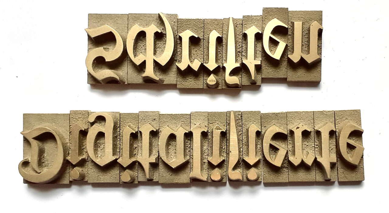
Above, you can see two lines of brass type. The text they spell out reads Digitalisierte Schriften. These letters are (probably) from a 60p font of the Offenbacher Schwabacher typeface. Kurt Wanschura designed that for the Rudhard’sche Gießerei about six years before Karl and Wilhelm Klingspor renamed their typefoundry Gebr. Klingspor. However, these brass types were not manufactured in Offenbach or sold by Gebr. Klingspor. They are from a font kept at a Krefeld bookbinding studio today. I cannot be sure whether this brass-type font came from Dornemann & Co. in Magdeburg or from one of the Krefeld-based brass-type manufacturers who also sold the Offenbacher Schwabacher design. Based on the sorts’ non-polished surfaces, I assume they were sand cast. Nevertheless, since I do not know enough about their provenance, I cannot rule out the matrix/hand-mold casting method, either.
Final word
As we have seen, fabricating typefaces for the gilding press is as difficult as it is time-consuming and expensive. Therefore, it is also self-evident that typefaces for embossing that meet the highest requirements cannot be supplied cheaply. Contrary assurances should not be believed. Anyone who intends to purchase typefaces for the gilding press should be wary of cheap offers, for cheap and good have always gotten along badly.
Translation notes
- According to the German Bundesbank, one hundred thousand Marks had an equivalent purchasing power of €600,000 in 1910 (stand: 2021).
- Decades after Dornemann & Co. printed this type-making explanation, Ernst Collin mentioned newer methods in a pamphlet he wrote for the company, Messingschriften für Handvergolder. There, we read that “Dornemann & Co. is the only German firm that casts its brass types according to the best methods, namely from [casting] instruments and matrices of a special nature (and not from models made from sand forms). See “Promotional Leaflet by Ernst Collin for Dornemann & Co.” on Peter D. Verheyen’s excellent The Pressbengel Project site. Collin’s text is amusing because using models made from sand forms is exactly how Dornemann & Co. manufactured brass types between 1905 and 1922. Otto Kaestner in Krefeld developed a mold and matrix method, probably in the 1890s. He was the only one in Germany to use it for a while, but he sold his company’s brass-type business line to Dornemann & Co. in 1922, allowing the latter firm to switch to better methods. After that, Dornemann & Co. had a lock on casting brass-type from matrices, at least in Germany.
- The German term used for “space” here is Spatium. The specific Spatium that Dornemann & Co. workers placed between the letterforms in its model slugs was probably as wide as the saw blade they used to cut each successive sort from the brass slug that resulted from the casting process.
- Dornemann & Co. also made brass types for printing texts on ribbons. It called those products Bändeschriften.
- See Dornemann & Co.’s Ferrotypen, some of which H. Berthold AG also sold as Stahl-Typen.
- In German, this sentence reads: Nebenbei sei bemerkt, daß die großen oder Anfangsbuchstaben die technische Bezeichnung „Versalien“ haben, während man die kleinen Buchstaben „Gemeine“ nennt. “Versalien” and “Gemeinen” are typical German typographic terms for majuscule and minuscule letters.
- Dornemann & Co.’s sand-casting process seems incredibly similar to how brass type was made in Korea; see Indra Kupferschmid’s photographs illustrating Korean type-making on Flickr.
- My use of the term “tracking” is probably an anachronism here. What the author meant, in the original text, is that a sort with too much negative space on one side would appear to viewers as if additional spacing material had been placed before or after its letterform.