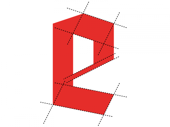
Figure 1: Diagram of the lowercase “e” construction from the so-called Reichsbahnschrift design. HTW Berlin students Aleksej M. and Ronak J. drew this as part of their three-poster series explaining the blackletter alphabets found on various signs in Berlin’s S-Bahn train network today.
Earlier this month, I lead a week-long workshop for third-semester communications design students at HTW Berlin. I had pitched one of the department’s professors on the idea of a class combining typographic history with a practical component. Students searched for signage in Berlin S-Bahn stations that were made with blackletter. Together, we read parts of two articles on so-called Schaftstiefelgrotesks, or “jackboot grotesk style” blackletter typefaces.[1] I also brought in a number of other texts about the history of blackletter – particularly in National Socialist Germany – and several type specimens. After taking photographs, students created posters or booklets informed by what they had collected, and the materials I presented them with.
An unnamed lettering system from 1935
About a week before the course, I was able to borrow original plans made by the Deutsche Reichsbahn-Gesellschaft in 1935. These were for a system of “German” lettering, presumably for use on train station signage. I asked the students to compare the lettering in their photographs with the letters on these plans, to see how many Berlin S-Bahn blackletter signs used the model in the first place, and to figure out how true those signs that were using these models are to the plans.
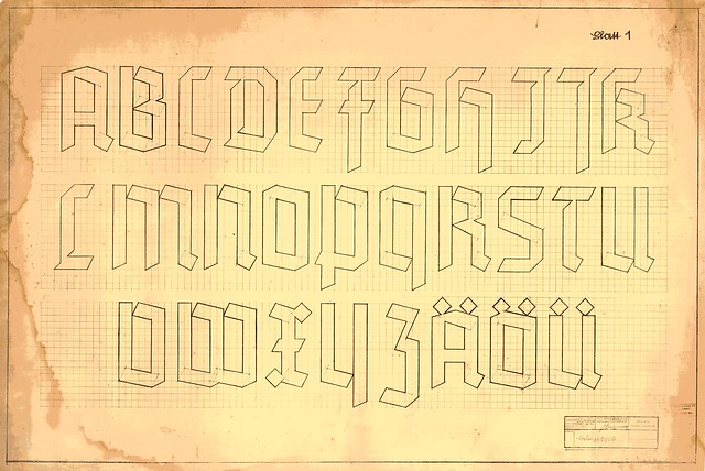
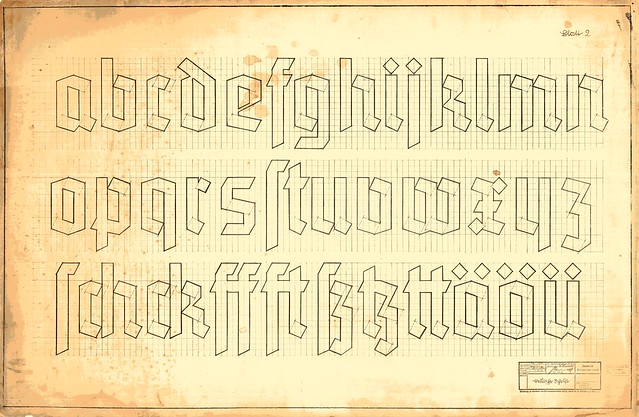
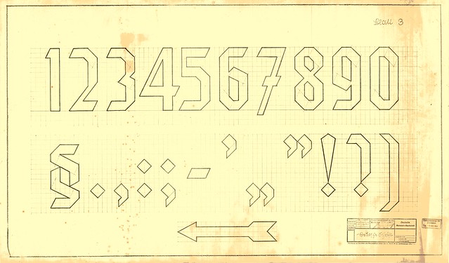
Figures 2–4: Scans of the three sheets displaying the plans for the Reichsbahnschrift. These drawings were produced by Deutsche Reichsbahn-Gesellschaft in Berlin. They are entitled »Deutsche Schrift« (German script), and were drawn in May 1935 by a Mr. or Ms. Friedling. Sheet one measures 109 × 73 cm, sheet two 111 × 73 cm, and sheet three 93 × 55 cm. Berlin. Private collection of Lars Krüger, Berlin.
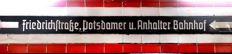
Figure 5: Enamel direction sign at the Nordbahnhof S-Bahn station. It was produced in Kreuzberg at the Emaillierwerk Gottfried Dichanz, Berlin SO36 (the enamel workshop of Gottfried Dichanz). The sign’s lettering uses the Reichsbahnschrift.
The Reichsbahnschrift and halbfette Element
I will refer to as the lettering on the plans reproduced in figs. 2–4 as the Reichsbahnschrift from here on out. The Reichsbahnschrift was not a “typeface.” In terms of the commercial typefaces produced in Germany during the 1930s – the time when jackboot grotesks were en vogue – the Reichsbahnschrift seems most similar to halbfette Element. Max Bittrof (1890–1972) designed the Element typeface, which Bauersche Gießerei of Frankfurt am Main published in 1933, or about two years before the drafting of the plans for the Reichsbahnschrift. Element has several variants, and halbfette Element was the bold weight. Other members of the family included mager (light), fett (heavy), and schmalfett (condensed heavy).
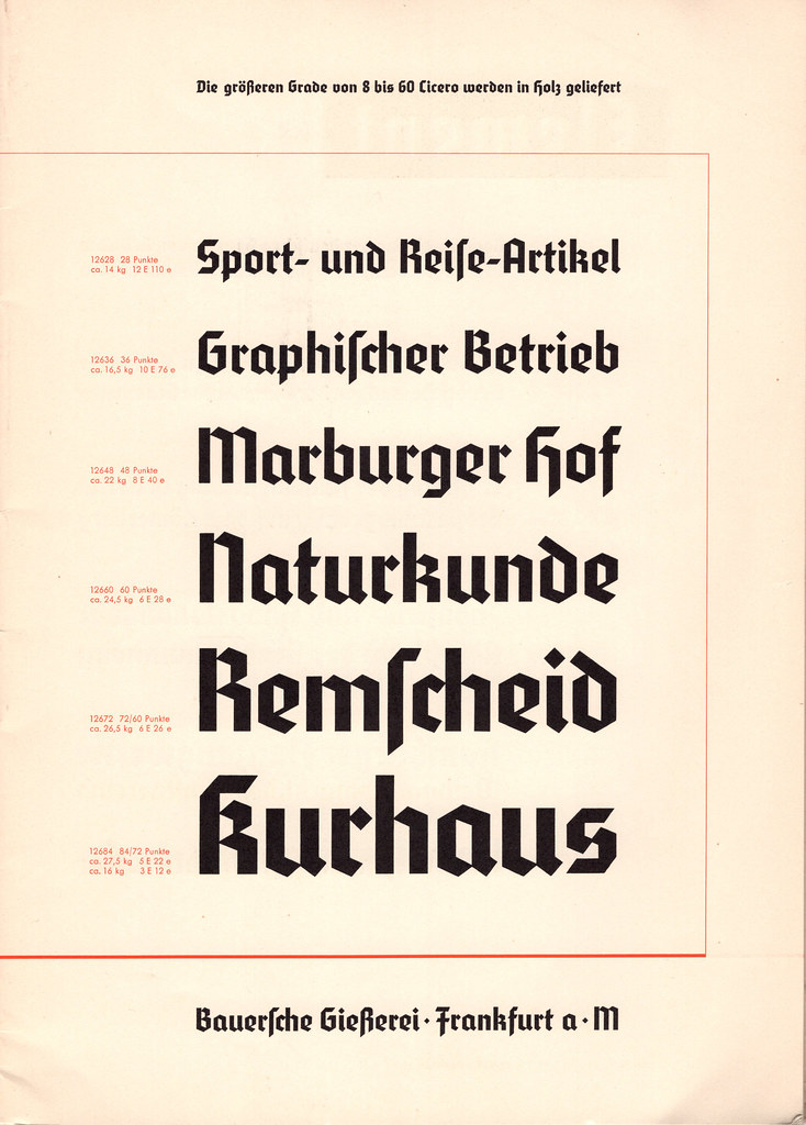
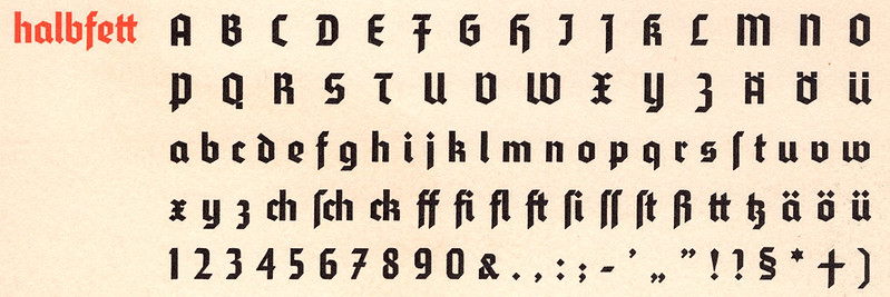
Figures 6 and 7: The upper of the two images above reproduces six sizes of the bold weight from Max Bittrof’s Element, as printed on page 7 of the 1934 type specimen brochure that the Bauersche Gießerei produced for the typeface. The lower image shows the character set of the same weight at 16 pt size, from page 35 of the same brochure.
The Reichsbahnschrift has almost none of the optical compensations found in printing typefaces: it has no overshoots, for instance. When the tops or bottoms of letters have points, those pointy parts fall on the same grid lines as the horizontal strokes, in the letterforms with flat tops or bottoms are flat. For example, the top of the lowercase /u is flat, and its strokes reach just as high as the top point of the lowercase /o does. This causes the /u to actually seem a bit larger than the /o. That kind of “mistake” is not something found in the halbfette Element design, as can be seen above in figs. 6 and 7. The Reichsbahnschrift plans use a grid of 1 × 1 cm squares. All vertical strokes are two units wide – or 2 cm – and that is true for both uppercase and lowercase letters. Horizontal strokes are two units thick as well. Halbfette Element was a proper typeface, manufactured for use in printing, so its design included optical compensations typically found in that medium.
In a future post, I plan to present a deeper comparison of the Reichsbahnschrift and halbfette Element (character by character).
Research questions
Going into the workshop, I had developed a few questions. Although I have already hinted at each of them above, they were as follows:
- How many of the blackletter signs hanging in Berlin S-Bahn stations use the Reichsbahnschrift letters as a guide?
- Of the signs that seem to feature the Reichsbahnschrift, how faithful are their letterforms to those in the plans?
- How similar is the Reichsbahnschrift design to the Element typeface?
- For blackletter signs whose lettering does not match the Reichsbahnschrift, might the letterforms be similar to any specific printing typefaces?
Some of the designed results from the course
Students in the workshop worked individually or in teams to design small projects that attempted to answer some of the research questions. Concretely, workshop participants had about three days time in which they could work on their projects. The course began on a Monday, with an introduction and readings, followed by time in train stations looking for signs and taking photographs. On Thursday afternoon, students began printing and binding their work. We built up an exhibition in our classroom on Friday morning, and the participants presented their projects to all of the other third-semester students early on Friday afternoon.
There was also material we could not look at within our workshop’s timeframe. For example, the Berlin S-Bahn Museum has old station signs in its collection, and some of those use the Reichsbahnschrift. This museum is now closed. They are moving locations, and plan to reopen in 2019. The history departments of Deutsche Bahn – Germany’s national rail service – and the city-state of Berlin also each contain photographs from the 1930s depicting train station signage. Although that material was not included in the scope of items we looked at during the workshop, examining archival photographs of train stations from across the country could help find the extent the to which the Reichsbahnschrift was used outside of Berlin, if it even appeared outside the city’s S-Bahn network at all.
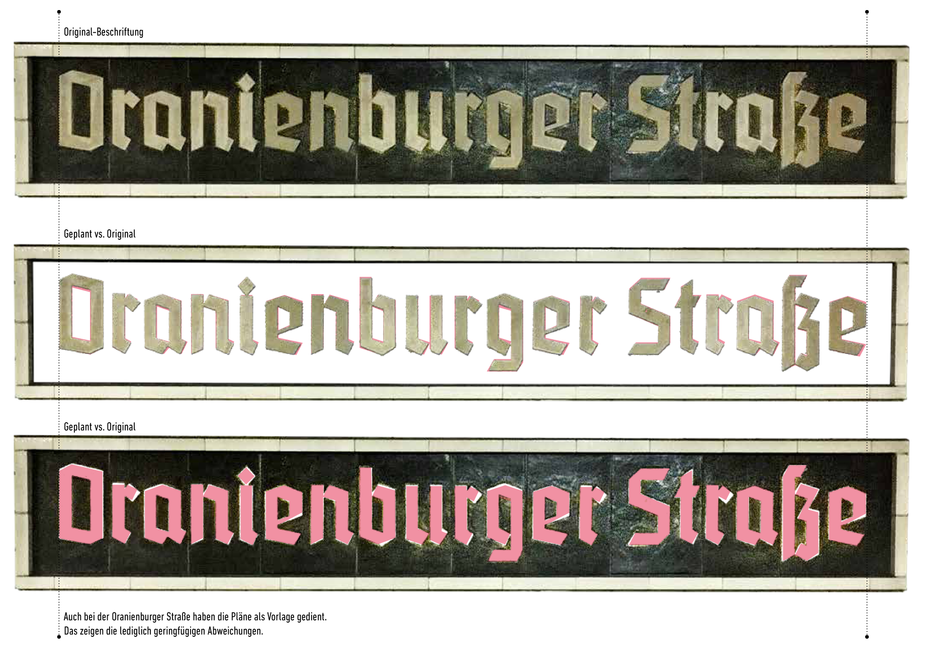
Figure 8: This spread from Yves T.’s project book compares the lettering on station signs hanging at Oranienburger Straße with the Reichsbahnschrift plans. Click to enlarge.
Since the Reichsbahnschrift letters are made up entirely of straight lines, and because those letters were designed with the help of a very simple grid, it does not take much time to digitally recreate them. Almost every student in the class redrew some letters in Illustrator. Nevertheless, the class did not have a type design focus, and students did not “fontify” the Reichsbahnschrift lettering.

Figure 9: Vector redrawing of the Reichsbahnschrift’s lowercase letters, by Lisa S. and Lisa S. These were made by directly consulting the actual 1935 plans, reproduced above in fig. 3.

Figure 10: A comparison by Laura K. of the Reichsbahnschrift (dotted lines) with the letters in the word »Bahnhof«, as they appear in four S-Bahn station names (orange): Anhalter Bahnhof, Bahnhof Rummelsburg, Bahnhof Berlin-Zehlendorf, and Bahnhof Nikolassee. Click on image to enlarge. This vector drawing was made from photographs of the stations’ signage and the original plans for the Reichsbahnschrift, as seen above in figs. 2–4. The letters on the Nikolassee sign (bottom right) are the most divergent from the Reichsbahnschrift, as they were made with a bold weight of the Tannenberg typeface. Erich Meyer designed Tannenberg during the late 1920s and early and mid 1930s. The typeface family had several weights and styles, and these were published by the D. Stempel AG typefoundry of Frankfurt am Main in the mid 1930s.
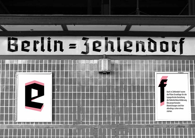
Figure 11: Spread from Yves T.’s project book comparing the /e and the /f on this Berlin-Zehlendorf S-Bahn station enamel wall sign with the Reichsbahnschrift. In addition to those two letters, the /B and the /hyphen on the sign also differ from the Reichsbahnschrift plans. On the sign above, the top bowl of the /B is the same width as the bottom bowl – as can also be seen in Laura K.’s comparison in fig. 10. In the Reichsbahnschrift, the top bowl is half a unit narrower than the bottom one. The Reichsbahnschrift’s hyphen is also a single stroke, rather than the double stroke used on this sign.
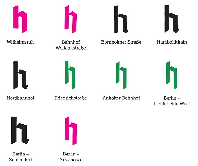
Figure 12: The students in the workshop found nineteen S-Bahn stations that included at least one piece of signage featuring blackletter on it. Of those signs, ten included a letter /h in their text. The graphic above is from Felix M.’s project book. On this page, he compared all ten of those /h’s. The four black-colored /h’s seem to have been informed by the Reichsbahnschrift plans. The three magenta /h’s have a left-handed stroke that is angled on top and flat on the bottom. The right-handed stroke descends below the baseline and ends in a diagonal. These three /h-forms look like the halbfette Tannenberg typeface (Tannenberg Bold). The three green /h’s are similar to each other, but are not the Reichsbahnschrift or halbfette Tannenberg.


Figures 13 and 14: Comparison by Rick L. of the Reichsbahnschrift and the lettering from a sign on the platform at the Bornholmer Straße station. Although this sign seems to have been based on the Reichsbahnschrift plans, it interprets them rather poorly. For example, the capital S in »Straße« seems to have been flipped upside down. Rick’s graphic explains additional details in overall stroke thickness, as well as in the B, r, m, and t. The sign at Bornholmer Straße is probably made rather recently, but it is difficult to understand why its lettering quality is so low.
Research findings
There are several surviving pieces of signage in Berlin S-Bahn stations that were probably made using those Reichsbahnschrift plans as a guide. These include some – but not all – of the signs hanging today at the Nordbahnhof, Oranienburger Straße, and Brandenburger Tor/Unter den Linden stations. Those underground stops all opened around the same time: in 1936, as part of Berlin’s preparations for the Olympic Games that summer. Additional underground stations in the same tunnel opened three years later at Potsdamer Platz and Anhalter Bahnhof. Those stops’ wall signs did not use the Reichsbahnschrift; however, the blackletter style their signs did use was somewhat similar. This raises the question of why the Reichsbahnschrift was abandoned so quickly, at least in those two instances from 1939.
The more suburban stations located at Bornholmer Straße, Humboldthain, Wannsee, and Zehlendorf feature signs that must have been somewhat informed by those Reichsbahnschrift plans as well. As I mentioned in the caption to figs. 13 and 14, not all S-Bahn signage is necessary “original.” The Bornholmer Straße sign reproduced above is one example of a sign whose current state is probably of recent origin. For future research, it would be helpful to look into this further. Not all of the signs with Reichsbahnschrift-letters in the Berlin S-Bahn network today actually date back to the 1930s. Even if a sign in a Berlin S-Bahn station looks old at first, it could still be a historical reconstruction.
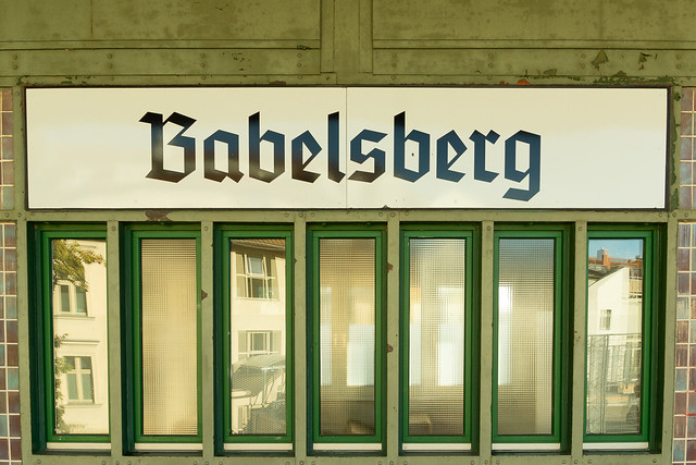
Figure 15: This photo of Iris’s shows a sign on the Babelsberg S-Bahn station platform. It was only hung rather recently. The letters used are not from the Reichsbahnschrift plans. Instead, they look like they are from the halbfette Tannenberg typeface.
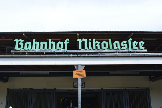
Figure 16: The letters from this sign at the Nikolassee S-Bahn station are also not from the Reichsbahnschrift. According to Florian Hardwig, these letters match those in the digital version of Tannenberg Bold distributed by Delbanco. Photo by Annick, Celine, Yves, and Moira.
Aside from Babelsberg and Nikolassee, where else in the network can signs that are based on specific blackletter typefaces be found? If you know of any, please tell this Flickr discussion!
Notes
- These two articles were Albert Giesecke’s »Schriftschaffen im neuen Deutschland« and Hans Peter Willberg’s »Schrift und Typografie im Dritten Reich«.
- Giesecke, Albert: »Schriftschaffen im neuen Deutschland«. In: Raederscheidt, G. and Fritz Helmuth Ehmcke (ed.): Schrift und Schreiben. Zeitschrift für alle praktischen und wissenschaftlichen Fragen der Schrift und des Schreibunterrichts. Vol. 6, no. 5 (June 1935). Verlag F. Soennecken, Bonn and Leipzig 1935, p. 125–141
- Willberg, Hans Peter: »Schrift und Typografie im Dritten Reich«. In: Forum Typografie, Arbeitskreis Berlin (ed.): Umbruch – 8. Bundestreffen des Forum Typografie, 31. Mai bis 2. Juni 1991 in Berlin, Kunsthochschule Berlin-Weißensee. Verlag Hermann Schmidt Mainz 1994, p. 28–41
- A complete list of texts I mentioned in the workshop may be found on this page.