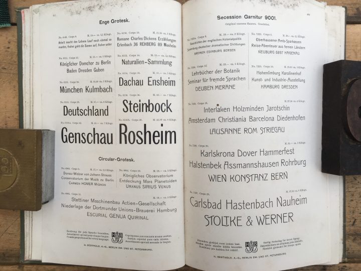
Above, a spread from an H. Berthold AG type specimen catalogue. The photograph is © Boris Chauvet. This spread is likely from Berthold’s c.1900 export catalogue, or one of the additions to it produced in c.1903 or c.1907. See note [1] below.
Hey Internet, this is my website. Some of you have told me that you missed my blogging. This post is for you. Finding enough time and relevant content to feed the site is difficult, but I’m happy to announce a research project I’ll be undertaking soon.
At the end of March, I finally submitted my dissertation to the Braunschweig University of Art for review. In May, I started a new job. Before either of those things happened, I began thinking about what I might want to research next. Thanks to a generous grant from the Printing Historical Society, I have a project that will keep me busy later this year, and in early 2019 – in the times when I will not already be occupied. This post is an edited version of my project’s initial abstract. I’d be happy to hear any feedback you might have.
Typeface distribution
In his introduction to the 2002 edition of Harry Carter’s A view of early typography up to about 1600, James Mosley highlighted Carter’s contribution to the growing awareness among typographic historians “between 1920 and 1960 … [of the] international distribution [of European types during the sixteenth century].”[2] Mosley explained that “some popular types from the sixteenth century onwards were not only cast simultaneously by several typefounders in different countries from multiple sets of matrices, [but that] these matrices [themselves also] remained in use for centuries.”[3] That phenomenon was not limited to typefaces created before 1600; punchcutters and typefounders continued to sell strikes and matrices for designs created after that date amongst themselves. The overlap of products offered by various typefoundries during the nineteenth and early twentieth centuries is visible upon even cursory comparisons of specimens from that time – as Pierre Pané-Farré, for example, recently described in an article on poster typefaces sold by the Eduard Haenel and Gottlieb Haase Söhne foundries during the 1830s and 1840s.[4] The same fonts of type, occasionally under different names, could be available from multiple sources.
This was the case for many genres, but I believe it to be especially true for sans serifs. Fritz Grögel suggests that the impulse for the introduction of sans serif type in German-speaking foundries came from the use of sans serifs in public lettering; sans serifs were common in the urban landscape of central Europe decades before they would experience usage at similar levels of proportion in print.[5] Indeed, as a category, sans serifs would not become as significant in German printing as roman or blackletter until the 1920s, and perhaps not even until the 1950s. Less research into pre-twentieth century German sans serifs has been published than on British examples, for instance. In my dissertation on the relationship between German typefoundries and freelance designers between 1871 and 1914, I wrote very little about sans serif types at all: I only discussed the designs of Bauer & Co./H. Berthold AG’s Akzidenz-Grotesk (1898), Royal-Grotesk (1903), and an unpublished sans serif Peter Behrens had begun to prepare with the Gebr. Klingspor foundry (1914).[6] How many sans serifs were available from German-speaking foundries during the nineteenth century? Of the number available, how many were original designs?
Project description
During the nineteenth century, about 100 typefoundries operated within the territory that formed into a unified German state in 1871. Approximately half of them were internal divisions of larger printing houses. When they produced catalogues, these rarely included more than a few pages of sans serifs. Especially for catalogues printed after the 1870s, it is relatively easy to determine which of the types shown had been produced by the foundry itself; their pages contained small notices stating as much (faces originating outside the foundry lacked those notices). To illustrate the distribution of individual sans serifs across the nineteenth century German-speaking typefounding landscape, I shall compare the sans serifs present in all nineteenth-century specimens from German-speaking typefoundries held in public collections in Berlin, Darmstadt, Frankfurt, Leipzig, and Mainz, in order to prepare an article for publication, with an associated web resource including charts and photographs.
In addition to bound specimens published by the typefoundries themselves, I shall consult the issues of two German-language periodicals that regularly featured new typeface specimens: the Journal für Buchdruckerkunst, Schriftgießerei und verwandte Fächer (published 1834–1919) and the Archiv für Buchdruckerkunst und verwandte Geschäftszweige (published 1864–1899). It was the editorial policy of the former to only feature specimens of typefaces that were new, for which matrices had not been purchased or copied from another foundry.[7] The latter seems to me to have followed the former’s lead in that regard.
A number of public institutions in Germany maintain excellent collections of nineteenth-century type specimen catalogues. For my research, I shall primarily rely on institutions in Berlin, Darmstadt, Frankfurt am Main, Leipzig, and Mainz. In Berlin, these are – specifically – the Kunstbibliothek, the Staatsbibliothek, and the archive/library inside the Deutsches Technikmuseum. The other public collections I intend to rely on are the University libraries in Darmstadt and Frankfurt, the Leipzig branch of the German National Library, and the Gutenberg Museum in Mainz. Despite my only mentioning this handful of institutions, I do not intend to neglect collections elsewhere, in other countries, or in private hands.
The greatest difficulty I foresee for this project is not related to the accessibility of surviving specimens, but rather that not every German-speaking typefoundry produced bound specimen catalogues or e.g., had their products regularly discussed in the Journal or Archiv. Many of the sans serifs types distributed through German typefounding would have originated abroad – such as in Britain, France, or the United States – but tracing those origins is not a step that will be covered in this project.
Model research projects
Family trees mapping the distribution across multiple foundries – and even across multiple countries and linguistic areas – could be created for almost any typeface design developed during the nineteenth century. Some such undertakings have already been made. For example, at the 2014 ATypI conference, Indra Kupferschmid presented on the wide distribution of Neue moderne Grotesk, an early-twentieth century sans serif produced by the Wagner & Schmidt punchcuttery in Leipzig.[8] David Shields has written on the distribution of type designs throughout the nineteenth-century American wood type manufacturing landscape.[9] In my own dissertation, I presented an overview of the distribution of the various Midolline typefaces across American, Austrian, Bohemian, British, Dutch and German foundries between the late 1840s and about 1914.[10]
Sources cited
- Dr. Oscar Jolles (ed.): Die deutsche Schriftgießerei – Eine gewerbliche Bibliographie. Unter Mitwirkung von Friedrich Bauer, Gustav Mori und Heinrich Schwarz. Bearbeitet von Dr. Lothar Frhrn. v. Biedermann. Berlin: H. Berthold AG (1923), p. 180
- Harry Carter, A view of early typography up to about 1600. London: Hyphen Press (2002), p. [6]
- Ibid., note 3
- Pierre Pané-Farré, “Affichen-Schriften.” In Stephan Müller, Pierre Pané-Farré, and Reymund Schröder (ed.), Forgotten Shapes, https://forgotten-shapes.com/affichen-schriften?article=affichen-schriften/ (June 2018) [link]
- Fritz Grögel, « Les lettres des peintres – histoire et formes du lettrage allemand ». In Verena Gerlach, Fritz Grögel, Sébastien Morlighem et al, Karbid. Berlin: De la lettre peinte au caractère typographique. Paris: Bibliothèque Typographique, Ypsilon.éditeur (2013). Compare with Grögel’s »Lettering und Schrift im öffentlichen Raum: Eine bislang unterschätzte Facette unserer Schriftkultur«. In Harry Neß and Silvia Werfel (ed.), Journal für Druckgeschichte, Neue Folge, vol. 20, no. 1 (June 2015), p. 23–25 [link]
- Dan Reynolds, Schriftkünstler: A historiographic examination of the relationship between handcraft and art regarding the design and making of printers’ type in Germany between 1871 and 1914. Unpublished dissertation. Braunschweig: HBK Braunschweig (2018), p. 63–75, 233–237, and 295
- Hermann Smalian, »Die Stempelschneider und ihr Musterschutz«. In Deutscher Buchgewerbeverein (ed.), Archiv für Buchgewerbe, vol. 37, no. 4 (April 1900), p. 125–126
- Indra Kupferschmid, “How Wagner & Schmidt complicated type history.” In ATypI (ed.), ATypI.org, https://www.atypi.org/type-typography/how-wagnerschmidt-complicated-type-history/ (September 2014) [link]
- David Shields, “Aldine & Aldine Ornamented.” In David Shields (ed.), Wood Type Research, http://www.woodtyperesearch.com/aldine-aldine-ornamented/ (April 2017) [link]
- D. Reynolds, p. 152–169 and 178–209