
As I mentioned in this earlier post, I recently went through my doctoral defence at the HBK Braunschweig. I prepared a presentation summarising a few key points from my dissertation, which you can read via the link in the previous sentence. While I knew I would not be able to include all of the information from my research into that short presentation, there were some details – as well as a few images – that did not make the cut into my talk, but which I did want attendees to see and read. So I prepared a small handout to distribute to them. This explained the various kinds of sources for foundry type research that are available. I have edited the contents of that handout and posted them here for all of you. I hope that you enjoy them! This is a short TypeOff. post for once: not even 1,500-words long, and no footnotes!
Designers and drawings
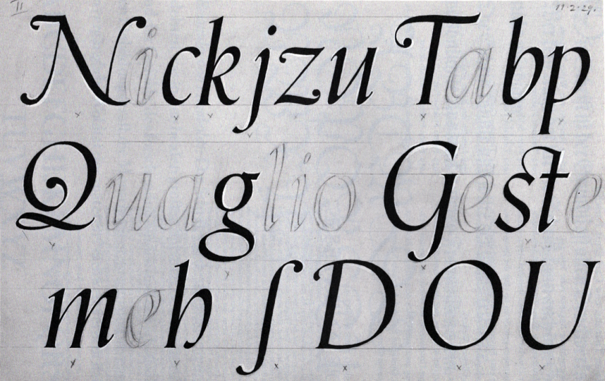
1929 Drawing by Walter Tiemann for his Euphorion Kursiv typeface. Reproduced from Gewerbelehrerstudium Graphisches Gewerbe (ed.), Altas zur Geschichte der Schrift, Band 3. Ausgewählte Schriftbeispiele des 20. Jahrhunderts zusammengestellt von Hermann Zapf. Technische Hochschule Darmstadt 1989, p. 45. Printed by the Lehrdruckerei der TH Darmstadt.
Very few drawings made by type designers active in Germany between 1871 and 1914 survive. Of those drawings held today in various archives, libraries, and museums, I don’t have the rights to reproduce any of my photographs. So instead, in order to provide an illustration for the kind of drawings designers would have provided, I have included an image of one made by Walter Tiemann (1876–1951) for the Gebr. Klingspor foundry in 1929 here. Although Tiemann made this drawing after the time period I researched for my dissertation, his long collaboration with Klingspor at least began during that time.
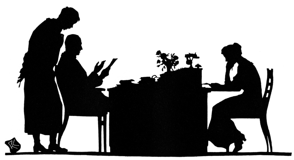
I’ve reproduced the Illustration above from Rudolf Koch’s Die Schriftgießerei im Schattenbild. Wie bei Gebr. Klingspor in Offenbach a.M. eine Druckschrift entsteht (second edition, 1936; first published 1918. No page numbers). The figure on the left is a self portrait of Koch looking over his employer’s shoulder. Karl Klingspor, seated, examines the drawing for Koch’s new typeface. The figure on the far right is not named, but she may be Else Klingspor, Karl Klingspor’s wife – the Berlin Kunstbibliothek’s copy of this book’s first edition includes the notation “Frau Klingspor” underneath her, in pencil.
I am not aware of any photographs from between 1871 and 1914 that show an artist at work on a typeface design in Germany, or which record a foundry owner discussing a design with an artist. Some correspondence about in-progress designs has survived. For example, Otto Hupp’s papers at the Bayerisches Hauptstaatsarchiv include draft letters from him to Emil Julius Genzsch (1842–1907), a director at the E.J. Genzsch typefoundry in Munich and the Genzsch & Heyse foundry in Hamburg. Many of Karl Klingspor’s letters to Hupp are also in that same archive, also the the Klingspor Museum houses more of Karl Klingspor’s surviving correspondence. In one way or another, Otto Hupp (1859–1949) was probably more involved in type design than may be said to be the case for any other German-speaker active during the nineteenth and twentieth centuries.
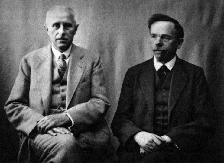
A double portrait of the two men in the previous image: Karl Klingspor (1868–1950, left) with Rudolf Koch (1876–1934, right). Unknown photographer; no date, but probably taken just before Koch’s death. Reproduced from Gerald Cinamon’s Rudolf Koch: Letterer, Type Designer, Teacher. Oak Knoll Press, New Castle/Delaware and The British Library, London 2000, p. 177.
Sources for foundry type research: List of materials
At least eight varieties of sources for foundry type research regarding a typeface’s design and manufacturing could conceivably have survived and be available for researchers to consult today:
- Letter drawings from its designer.
- Correspondence relating to its design and realisation, written by parties involved during the activities described.
- If punches for the typeface were cut, smoke proofs documenting the punchcutting progress, as well other production artefacts from a foundry’s type-making staff. If the typeface was machine-engraved, then the original drawings the machine operator would have used in the engraving process.
- The typeface’s original punches, either cut by hand by the punchcutter or engraved on a pantographic-cutting machine.
- The original matrices – either struck with punches, grown electrochemically from soft-metal patrices, or produced with a pantographic engraving machine from a drawing or pattern followed by the machine operator.
- Fonts of type cast from those matrices.
- Printed specimens of the finished font of type.
- Firsthand accounts of the events described above, written afterwards by the participants.
When it comes to commercial German typefaces, Eckmann – produced in 1899–1900 at the Rudhard typefoundry (renamed Gebr. Klingspor in 1906) from drawings provided by Otto Eckmann (1865–1902) – has the greatest amount of surviving documentation, regarding the details surrounding its design and manufacturing. From the list above, sources of the first, second, seventh, and eighth varieties have survived for Eckmann. It is possible that original fonts of the type (variety #6) also survive, but I did need seek those out in my own research.
Type designers and punchcutters
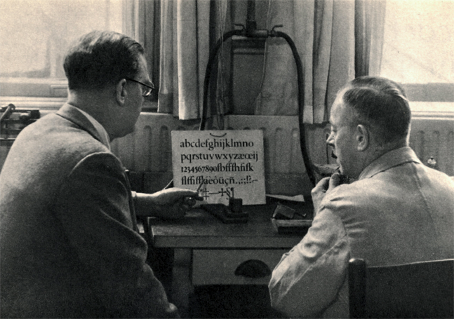
The type designer Jan van Krimpen (1892–1958, left) and the punchcutter Paul Helmuth Rädisch (1891–1976, right) inside the Joh. Enschedé en Zonen printing house at Haarlem in the Netherlands. Unknown photographer; no date, but likely between 1941 and 1951. Reproduced from John Dreyfus’s The work of Jan van Krimpen: A record in honour of his sixtieth birthday. Joh. Enschedé en Zonen, Haarlem and W. De Haan, Utrecht 1952.
Although the above photograph of Van Krimpen and Rädisch is rom after the period of time I researched, and does not depict a German designer or foundry, the scene of an artist discussing an in-progress project with a punchcutter is so rare that I had to include it here. The alphabetic drawing in the middle of the image was made by Van Krimpen for his Spectrum typeface. Rädisch, born in 1891, spent most of his career working at Enschedé; however, he began cutting punches during his apprenticeship at the Leipzig punchcuttery of Paul Schwieger, between 1905 and 1910.
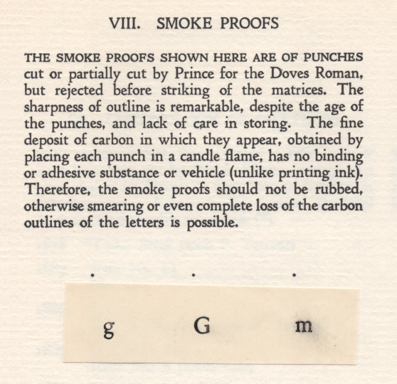
This photograph captures smoke proofs made from three in-progress punches that cut around 1900 by the English punchcutter Edward Philip Prince (1846–1923). Reproduced from Frederick Compton Avis’s Edward Philip Prince: Type Punchcutter. London 1967, p. 89.
Smoke proofs are test prints of a punch that the punchcutter might make, while they cut it. These were the best means by which a punch’s progress might be documented. Note that I did not follow Avis’s advice about avoiding rubbing the smoke proofs: my print of the m is now smudged. This illustration of their fragility helps explain why so few smoke proofs have survived.
Sources for foundry type research: Punchcutting and matrix-making illustrations

From Paul Koch’s “The Making of Printing Types” in The Dolphin, no. 1. The Limited Editions Club, New York 1933, p. 24–57 (here figs. 9, 14, and 15 from p. 34, 40, and 42).
Other sources for foundry type research include physical punches and matrices, as well as illustrations of the punchcutting and matrix-making processes. The three vignettes reproduced above illustrate how Paul Koch (1906–1945) would use various files and gravers to form a letter on the end of a steel punch. In the 1920s, Rudolf Koch taught himself punchcutting. He also ensured that his son Paul received training in both punchcutting and typefounding at the Gebr. Klingspor foundry. Although Paul Koch cut punches for his father, as well as for other type designers, he never worked primarily as a punchcutter, or as a typefoundry employee. Actual working punchcutters active in Germany during his lifetime did not publish explanations of their processes at all, either with illustrations or without them.
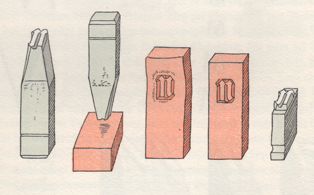
Image from Karl Klingspor’s Über Schönheit von Schrift und Druck: Erinnerungen aus fünfzigjähriger Arbeit. Georg Kurt Schauer, Frankfurt am Main 1949, p. 74. Illustrator unknown; perhaps drawn by Willi Harwerth.
After the punchcutter had completed a steel punch, it was hammered into a copper bar, creating a “strike” (in the image above, see the second and the third illustrated items from the left). All sides of this strike were filed down in a process called justification, resulting in a justified matrix – second item from the right – which was later placed in a manual casting devices, or in a type casting machines. A virtually infinite number of pieces of type could then be cast from that matrix. The finished piece of type, shown on the right, was cast from a metal alloy of lead, tin, and antimony. Printers could used it for setting any number of texts, until it would eventually wear down, and need to be replaced.
Klingspor’s matrices were so valuable to company operations that they were not all held in the same location during WWII. Nevertheless, most of them were still destroyed in a single Allied bombing raid on Offenbach, one night in 1944.
In my dissertation, I also discuss additional kinds of “punches,” such as soft-metal patrices, as well as machine-engraved punches and patrices. Additionally, I discuss other matrix-making methods, like pantographic engraving and electrotyping. While I do not go into detail about those techniques in this post, I did discuss them in my lecture at the 2016 ATypI conference in Warsaw. You can watch a video of that presentation here: Did photography kill punchcutting?