Category: Typography
-
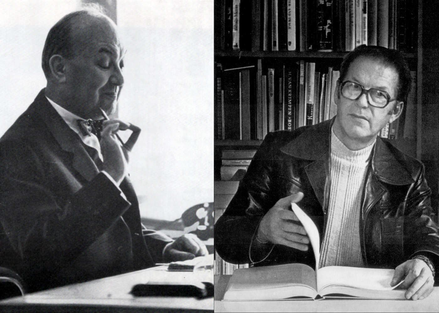
When Jan Tschichold “blue penciled” Albert Kapr
If you read Jost Hochuli’s 2016 Tschichold in St. Gallen: Jan Tschichold’s reference library in the Vadiana Cantonal Library St. Gallen, you’ll come across one of my favourite anecdotes about Jan Tschichold: Of particular interest are the sometimes lengthy letters attached to some of the publications, as either originals or copies, as for example, Albert Kapr’s…
Written by
-
Some thoughts on geometric type
Introduction Graphic design and printing has engaged with geometric letters for at least a century. Designers pride themselves on their ability to create complex systems from simple elements, and the alphabet is no exception. By repeating a series of basic shapes, all of the forms of our writing system may be easily recreated, or at…
Written by
-
Carter Sans typeface
Earlier this week, Monotype Imaging released Carter Sans: a new typeface family from Matthew Carter, designed for International Typeface Corporation. I happily worked on the Carter Sans project for several months in 2010, and am glad to see the fonts’ release. While I usually try not to quote from press releases too much on this…
Written by
-
Malabar claims German Design Prize Gold
This year’s German Design Prize jury has selected my Malabar typeface as one of ten works from across the nation to received the coveted design prize of the Federal Republic of Germany in gold. In June, the German Federal Ministry of Economic and Technology nominated my Malabar typeface for the 2010 German Design Prize. The…
Written by
-
Malabar takes home silver at the ED-Awards
My typeface family Malabar received a silver award at ED2009, the European Design Awards 2009 competition. Malabar grew out of Martel, a multi-script design that I initially created in 2008 on the MA Typeface Design course at the University of Reading. The Latin component of the family is distributed by Linotype, and you can buy…
Written by
-
Malabar typeface released
Malabar™ is a new type family for extensive text available at Linotype.com. This study oldstyle serif face currently includes six fonts for the Latin script. The family grew out of Martel, a multi-script project that I created on the MA Typeface Design course at the University of Reading in 2008. Malabar received a Certificate of…
Written by
-
Malabar receives TDC Award
My typeface family Malabar received a Certificate of Typographic Excellence in Type Design at the Type Directors Club of New York TDC² competition in January 2009. Malabar grew out of Martel, a multi-script design that I initially created in 2008 on the MA Typeface Design course at the University of Reading. To date, Malabar is…
Written by
-
What you would do today, do now
काल करे सो आज कर आज करे सो अब । पल में परलय होयगी बहुरि करोगे कब ॥ — कबीर What you would do tomorrow, do today, what you would do today, do now. Disaster may come in a moment, when will you do all that you intend? — Kabir (the weaver) Christopher Chapman posted…
Written by
-
Mountain and the Prosanova festival
After returning to Germany from Reading last September, I had to wait around Frankfurt and Berlin for a few days before I could move into my new Offenbach apartment. While spending a few nights in a friend’s study, I noticed a small brochure for an annual literary festival in Hildesheim, Prosanova. At least in 2008,…
Written by
-
Morris Sans on FontShuffle
I have reached a new level of geekdom now that I can lovingly stare at Morris Sans, a display typeface family I designed for Linotype two years ago, on my iPhone. All of this is thanks to FontShuffle, a free iPhone font shuffling app released by FontShop on Friday. What is “font shuffling?” Well, FontShop…
Written by
-
Typeface submitted
Monday July 7th was the submission deadline here in Reading, and I uploaded my files about an hour or so before the noon requirement. The typeface, pictured rather briefly above, will still need ages of finishing before I could call it properly complete, but I guess that I am proud anyway. Here are the details:…
Written by
-
First Morris Sans application found
Linotype released my Morris Sans typeface about a year ago, but until a the day before yesterday, I hadn’t seen the fonts in use anywhere. Since I spend most of my time walking through the streets looking at letters anyway, I always held out a little beacon of hope that I might one day run…
Written by
-
More about Morris Sans (in French, too)
It has been about a year since Linotype released Morris Sans, an update and expansion to its old digital version of ATF’s Bank Gothic typeface. This month’s LinoLetter contains an article detailing the differences between ATF’s metal Bank Gothic, Linotype’s first digital Bank Gothic, and the current Morris Sans. I’ve recapped the English text and…
Written by
-
Four Reading designers in STEP
I received my copy of the January–February 2008 issue of STEP Inside Design while I was away for the holidays. Inside is an article by Allan Haley entitled “type… four more emerging talents.” This profiles the work of Alice Savoie, Tim Ahrens, myself, and Sandra Winter. I’m studying at Reading now, while the other three…
Written by