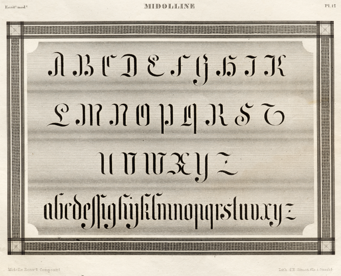
Close-up of plate 12 (Midolline), by Jean Midolle. From the Spécimen des écritures modernes. Printed in Strasbourg by Simon Fils, 1834–35. Image © Letterform Archive.
4 March 2021 update: About the Gotico-Antiqua book
An extended version of this post, encompassing additional research and more imagery, was recently published in English and French as part of the book Gotico-Antiqua, proto-roman, hybrid, 15th-century types between gothic and roman. That book is an excellent introduction to the middle ground between two common typographic categories. The Midolline typefaces described below are just one kind of blackletter–roman hybrid produced between the fifteenth and twentieth centuries. I highly recommend that you check the Gotico-Antiqua book out.
Back to the original post: An introduction to Midolline
For the 2018 ATypI conference in Antwerp, I made a 20-minute presentation about the various Midolline typefaces. These originated in Germany during the nineteenth century. My abstract for this talk read:
German design historians define nineteenth-century designers as people who created drawings determining new products’ appearances but were not involved in their production. They may not have even understood the process behind those products’ manufacture. By this definition, Jean Midolle might be Germany’s first type designer, although he was almost certainly unaware that Eduard Haenel’s typefoundry in Berlin used a page from a pattern book of his as a design source. This presentation explains how Haenel’s Midolline typeface quickly inspired a new category of nineteenth-century type classification and became a term that printers briefly used as shorthand for all roman/blackletter hybrids. I shall also address the Midolline phenomenon, by which nine loosely related type designs were distributed across dozens of foundries in the western world during the second half of the nineteenth century, from St. Louis in the United States to St. Petersburg in Russia, from Edinburgh and Oslo in the north to Vienna in the south. Jean Midolle was born in or near Besançon in Revolutionary France. Among other places, his career took him to Belfort, Geneva, and Strasbourg before his trail went cold in Belgium, where he may have died. With this presentation, I hope to encourage researchers to uncover more details of his work there.
The ATypI published a video of the presentation after the conference, embedded below. I have also included a basic transcript of my presentation, with only minimal footnotes.[1] Wherever possible, I have just directly linked to online editions of books, articles, or other items instead.
Jean Midolle and the various Midolline typefaces
Alix Christie’s novel Gutenberg’s Apprentice presents Peter Schöffer as the designer of the type used in the Gutenberg Bible. While Schöffer had previously been a scribe in Paris, he was from Gernsheim – a Rhine town 40 kilometers south of Mainz – and was not French. Nicolas Jenson, who was French, may have also worked for Gutenberg. This paper is not about either of those men, however. Nor is it about Claude Garamont or Robert Granjon, the first punchcutters mentioned by name on a type specimen printed within the territory that eventually became modern Germany. It is also not about Fraktur design that the Berlin printer Johann Friedrich Unger commissioned from Firmin Didot in the 1790s.
What is a “type designer?” My dissertation supervisors suggested that I develop a working definition of type design as a professional activity. For example, Luc(as) de Groot designs typefaces and makes fonts today. Indeed, with digital font-editing software, it is difficult to design type without making a font at the same time. Before the Industrial Revolution, punchcutters also designed type and made fonts. Their products’ design probably occurred directly as they were cutting their punches since there is little evidence to suggest that many pre-industrial punchcutters made preparatory drawings. In my dissertation, I classified the type designers that typefoundries collaborated with during the late-nineteenth and early twentieth centuries into different categories. At least in Germany between 1871 and 1918, the processes of type design and font making were undertaken at different times, by separate people. Those people were not often not working in the same physical location. One person prepared a design as a drawing on paper, while others interpreted that design into type, as they cut the fonts’ punches or engraved its matrices.
In the above video at 2:55, I reproduce nine polychromatic initials produced by the Hamburg typefoundry Genzsch & Heyse in 1881. Those were the first of the more than forty type designs made by Heinz König (1857–1937) over about fifty years. Most of his later faces were not ornaments or initials but rather designs for either body text or display purposes. I see König is being representative of the class of artists and artisans of his time who delivered designs on paper to German industrial manufacturers. Type foundry employees interpreted all of König’s designs into working fonts.
I also have a category for artists whose work may have been typographized completely without their knowledge. A prime representative of this category is the French calligrapher Jean Midolle. Little biographical information about Midolle is available, but he was born in or near Besançon, in 1794. As an adult, he spent several years working and teaching calligraphy in relatively nearby Belfort and Geneva. Midolle traveled widely throughout Western Europe, visiting collections of manuscripts, whose styles he then interpreted. The Letterform Archive in San Francisco has the Spécimen des écritures modernes, one of three Midolle portfolios printed in the mid 1830s by Frédéric Emile Simon at Strasbourg.[2] Lithography itself had come from Bavaria in 1796. By 1834, color lithography was still relatively new, and this printing-house was at the forefront of its development.
The prints in the Spécimen des écritures modernes portfolio differ from much of Midolle’s other work. They display a series of alphabets, rather than interpretations of texts illuminated in the style of medieval manuscripts. Midolle named several of the alphabets in the portfolio after himself, including the unique narrow blackletter shown on plate number 12 that was simply entitled “Midolline.” Compared with other designs in the portfolio, “Midolline” is probably the least fanciful: not only could its letters be turned into a typeface, but a typeface in its style – with the same name – was eventually produced.
About fifteen years after the portfolio’s publication, a printing company in Berlin produced that typeface. This was the printing-house of Eduard Haenel. A printer who was originally from Magdeburg, Eduard Haenel (1804–1856) took over his family’s printing business there as a young man. In 1830, he established a typefoundry as part of this printing business. After a fire in 1838, he moved part of his operations to Berlin, including the in-house typefoundry. During the nineteenth century, it was still common for large German printing houses to have typefounding facilities.
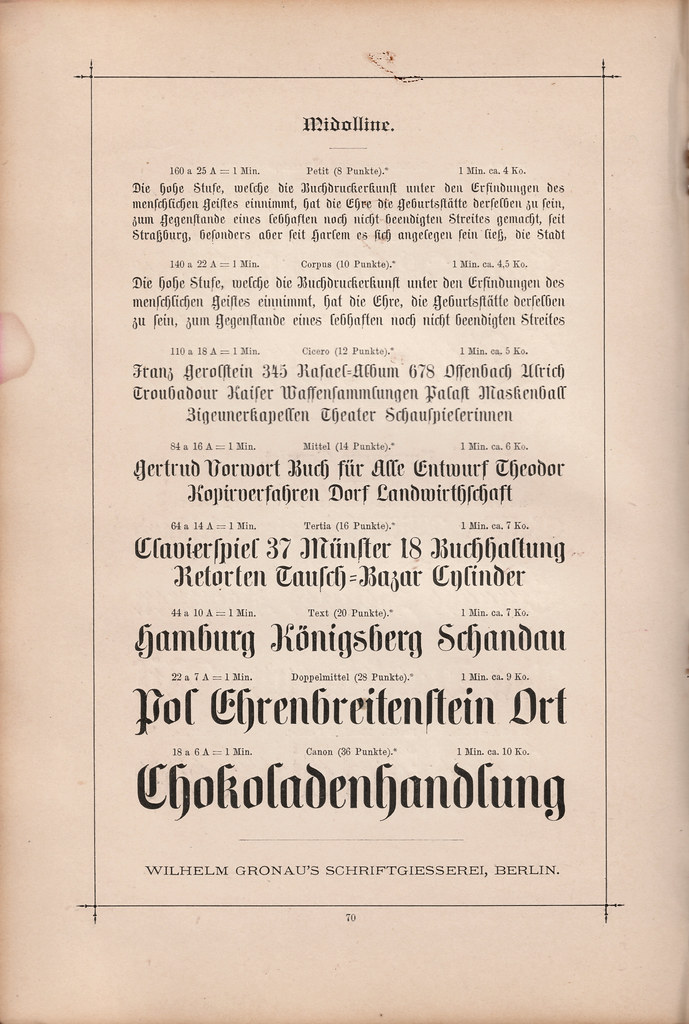
Above, you can see the eight sizes of the Haenel foundry’s original Midolline typeface. Eduard Haenel published this around 1850 or 1851. In 1852, he sold his business to Karl David. In 1864, Wilhelm Gronau took over its ownership, renaming the firm after himself. I scanned this page from the 1891 catalog produced by the Wilhelm Gronau typefoundry.
I do not know the date of Midolle’s death, and I have found no evidence to help me reconstruct exactly how Haenel’s Midolline typeface came about. One possibility I see is that Haenel might have produced it as a posthumous tribute to Midolle, for display at the 1851 Great Exhibition at the Crystal Palace in London — the first of the World’s Fairs. Nevertheless, that hypothesis is just a guess. Haenel published Midolline in eight sizes, from 8 pt through 36 pt. The company displayed these on three loose specimen sheets (see [one], [two], and [three]). A line of text printed on the bottom of the first sheet states, in small type, that Haenel owned the types’ steel punches, and that duplicate matrices for all eight sizes were for sale. Foundries across Europe either took him up on in his offer or copied the fonts illicitly. By the mid-1850s, this was already in the catalogues of several other companies.
Haenel never attributed Midolline to a specific punchcutter, and there is no surviving Haenel archive or employee list. I know of three punchcutters who worked there, before starting Berlin foundries of their own. The most likely of those to be behind Midolline was either Heinrich Ehlert or Eduard Eisoldt. Yet depending on when types were produced, their punches could also have been cut by Ferdinand Theinhardt – who worked for Haenel during the 1840s, before leaving in 1849. Theinhardt (1820–1906) was a well-known punchcutter in his lifetime, because of his typefaces for ancient languages like hieroglyphs and cuneiform, and as well as for “exotic” languages like Tibetan. Today, his name is most well-known because H. Berthold AG’s long-time artistic director Günter Gerhard Lange (1921–2008) incorrectly attributed Akzidenz-Grotesk and Royal-Grotesk to him twenty years ago.
Midolline in context
Two additional mid-nineteenth century German blackletter/roman hybrid types. The upper design is from Friedrich Schoch in Augsburg, while the lower design is from C.G. Schoppe in Berlin.
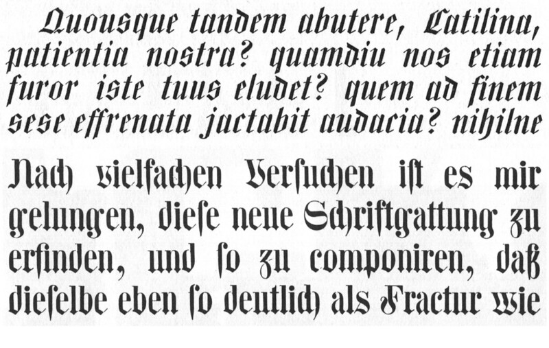
In retrospect, Midolline is just one of a small number of hybrid blackletter/roman types made by German-speaking foundries in the mid-nineteenth century. More foundries picked up Midolline than any of the other hybrids, which might have been because of the relative size and reputation of Haenel’s printing company vis-à-vis the smaller, independent foundries responsible for hybrid designs like the Centralschrift or Schochische designs shown above. Typographic authors in the late-nineteenth and early twentieth-centuries were interested in blackletter–roman hybrid typefaces because the idea of such a hybrid kept coming up in German type design as a potential “third way” between blackletter and roman. Until the 1940s, German printing was split between both varieties, and the blackletter or roman problem was one that many wanted to solve, in favor of one script or the other – which is eventually what did happen.
German type historians interested in Midolline seem to have been intrigued by its being a typographization of a French calligrapher’s design, but they did not know where the typeface itself originated, with some authors suggesting Leipzig foundries, and others Frankfurt’s. This was probably due to only very few copies of the three specimen sheets that Haenel printed to originally display Midolline having survived. I mentioned these above, and they are viewable online [here], [here], and [here].[3] Historians can only draw conclusions from sources they are aware of. In all the work I did on my dissertation, looking into the wide distribution Midolline enjoyed was my favorite part, even though it started as a tangent, and pin-pointing its typographic origin was not a particular goal I had set for myself.
By 1855, other type makers in the area had produced Midolline derivatives of their own. The word “Braunschweig” in the second line of the 1854 broadsheet I show in the video at 11:06 is a wood type version of the design, from the short-lived Nickel brothers’ foundry in Dessau. More curious is a condensed design named Schmale Midolline, published in several sizes in 1854–55 by Trowitzsch & Sohn – another Berlin printing business with an in-house foundry. The journal that published this specimen was quite critical of the rampant unlicensed selling of typeface copies.[4] That makes me think Trowitzsch & Sohn and the Haenel operation must have come to some sort of agreement. Perhaps Haenel had no interest in selling such a similar design, and no concerns that an independent condensed design would hurt their earnings for Midolline. Or maybe they were furious, and there is just no surviving record of their anger.
In 1863, Haenel published an ornamented derivative that they called Verzierte Midolline, meaning “Decorated Midolline.” The Midolline family tree continued expanding throughout the 1860s. While Austrian, Bohemian, Dutch, Norwegian, and Swedish typefounders retained the Midolline name when they sold this design, English-speaking foundries would change it. The typeface was sold in Britain as Saxon Text, and in the United States as Composite.[5] Type makers in both Germany and the United States converted Trowitzsch & Sohn’s condensed design into wood type fonts. Meanwhile, Haenel’s business passed to a long-time employee, Wilhelm Gronau. When Gronau published the two types pictured at the bottom of this family tree, he likely did not intend for them to be viewed as derivatives of Midolline. Instead, they were two members of a family of Gronau types that the company named Bastard – short for the blackletter category Bastarda. In their specimens, German typefounders always sorted Midolline with their Bastardas and other chancellery blackletters. When other German founders began carrying these two designs, they did not call them by their proper names – magere Bastard and fette Bastard, which can be translated as “Light Bastard” and “Heavy Bastard” – but rather some variant on the Midolline name, which in English would read like “Light Condensed Midolline” or “Heavy Midolline,” etc.

The Fette Bastard typeface, as shown in the 1891 type specimen catalogue produced by the Wilhelm Gronau typefoundry in Berlin
Gronau complained that every German foundry carrying Bastard had pirated the matrices via electrotyping. Perhaps, by associating their offerings with the slightly older Midolline, Gronau’s competitors were attempting to cover their tracks. As Patrick Goossens mentioned in his presentation, electrotyping could be used by a typefoundry to produce matrices for new typefaces, based on “patrices” – punches cut into soft-metal, instead of steel ones. Electrotyping could also be used by a typefoundry to produce copies of types that originated at another firm. Very briefly summarised: for electrotyping, a typefoundry would place either their own patrices or sorts from fonts cast by another foundry into an electrochemical bath for days or weeks. Those patrices or types would be positioned across from thin plates of e.g., copper or nickel. As the plates dissolved slowly, the particles covered the punches (or type … ) with a layer of metal. That layer could then be cut off and placed into “blank” – a metal bar that, once finished, resulted in a new matrix that was ready for typecasting.[6] Through electrotyping, one foundry could acquire a new font of type from a competitor, making matrices of their letterforms, and then casting infinite numbers of perfect copies of the original fonts for sale.
The J.H. Rust & Co. typefoundry of Vienna sold Bastard under the name Borussia, the Latin name of the German state of Prussia, whose capital was Berlin. In the United States, types of the Bastard design were sold as Borussian and Boldface Borussian.[7] Like Midolline, Bastard was mildly popular with printers in the United States. Theodore Low De Vinne even implied that it was of American origin. For De Vinne, Composite and Borussian were better blackletter designs for the English language than the blackletter types he was sure were being imported in from Germany.
In 1874, the Flinsch typefoundry in Frankfurt published a Midolline derivative that combined design elements both from the condensed Midolline and the Fette Bastard types. They called their new product Halbfette Midolline (or “Midolline Bold”). I should take this opportunity to restate that most of the types I mentioned in this paper were cut in a range of sizes: usually starting at 8 pt and going up to at least 36 pt, if not to 60, 72, or 84 pt. Flinsch had carried the original Midolline design since the 1850s. After creating the Halbfette Midolline, they went on two create two more products whose names also included the term “Midolline” in them during the late 1880s or early 1890s, despite their having borne little stylistic relation to earlier Midollines. Flinsch called these Moderne Midolline and Schmale Midolline. Flinsch registered a design patent for Moderne Midolline in 1891. The similar Schmale Midolline, which means “Condensed Midolline,” did not have an original name at all – Trowitzsch & Sohn’s 1854–55 condensed types had also been called Schmale Midolline.
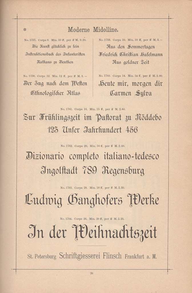
The Flinsch typefoundry’s Moderne Midolline typeface strays quite a bit from Jean Midolle’s calligraphy and the Haenel foundry’s original Midolline typeface. The page shown above is from an undated Flinsch type specimen catalog, probably printed in the 1890s.
Midolline started as a named typeface in a time when almost no typefaces had branded product names. Instead, they were usually listed with “names” that were just descriptive terms. Now, we are used to them having proper names, as they did throughout the twentieth century. At some point around the end of the nineteenth century, J. John Söhne in Hamburg published a much more roman-looking typeface called Römische Midoline (or “Roman Midoline”), and its a mystery to me why they thought that was a good idea.
For most of the second half of the nineteenth century, Midolline was viewed in the German printing industry as a unique typeface category, not one type-design from a specific foundry. Already in 1856, the type in 10-point size appeared in a written printer’s examination, as one of 41 fonts of text-sized type a new printing office should have.[8] Around the year 1900, however, the term Midolline was supplemented by a new word that was going to describe all hybrid blackletter–roman designs in Germany for the next several decades: Neudeutsch, or “New German.” Like Midolline, that term came directly from specific typefaces. In 1899 and 1900, two designs were published in Germany that were each called Neudeutsch. One was designed by Otto Hupp, and the other by Georg Schiller.[9] It is a pity, I think, that “Neudeutsch” replaced “Midolline” as the term for hybrids. I would prefer to call Hupp’s Neudeutsch a new kind of Midolline.
Conclusion
Back to Jean Midolle. In 1840, he seems to have moved to Belgium. Another of his portfolios – Recueil, ou, alphabet de lettres initiales historiques – was published in Ghent in 1846. According to Michael Twyman, that may have also been worked on by a Midolle fils, meaning Midolle the son, so Midolle may have had a son.[10] Midolle may have died before 1846, or he may have lived passed the 1851 World’s Fair. If he ever interacted with Haenel’s foundry, he may have done so by mail from Belgium. In any event, his trail went cold there. Perhaps someone researching in Belgium or France today would like to pick it up?
The first Midolline was almost certainly the first typeface – in Germany, if not anywhere – to explicitly be named after its designer. Otherwise, that only became common at the end of the nineteenth century, with graphic designers today are more familiar with: Bradley Text in the United States, Grasset in France, and Eckmann in Germany.
Notes
- In March 2018, I submitted my doctoral dissertation to the Braunschweig University of Art. This presentation is roughly half of one chapter from that dissertation.
- See Dominique Lerch: “The Simons, father and son, engravers and lithographic printers in Strasbourg (1802–1881) — a hight point in French lithography.” In: Journal of the Printing Historical Society. New series number 26 (summer 2017). Pages 25–40, here p. 35–36.
- At the moment, I am only aware of two surviving copies of the three specimen sheets that Haenel printed to originally display Midolline. One set is bound into a larger volume of Haenel specimen sheets held by the University Library at Ghent; a digital edition of that volume is available on Google Books. The second set is bound into the second of a three-volume set of Haenel/Gronau specimen sheets held by the Kunstbibliothek in Berlin (part of the city’s State Museums). The University of Amsterdam’s Bijzondere Collecties also includes several Haenel specimens. I have not examined these in person. They may also have surviving copies of these sheets.
- The journal I refer to here is Johann Heinrich Meyer’s Journal für Buchdruckerkunst, Schriftgießerei und die verwandten Fächer, which was then published in Braunschweig.
- Composite strikes me as an excellent name for a hybrid-style typeface design. The name is quite descriptive of what Midolline was. Some American typefounders and wood type manufacturers sold a design similar and/or identical to Trowitzsch & Sohn’s Schmale Midolline [“Condensed Midolline”], which they called Composite Condensed. A Type@Cooper student named Annica Lydenberg drew a revival of Composite Condensed, based on the Page wood type version of the design held at the Rob Roy Kelly American Wood Type Collection at UT Austin.
- The video stills that I show in my presentation are from a 1937 promotional film produced by H. Berthold AG in Berlin, Wie werden Druckbuchstaben hergestellt? That film can be viewed online [here].
- In 2009, Nick Curtis designed a Borussian revival, which he calls McKellar Borussian. That name is a misspelling; the first word should read “MacKellar,” as in the nineteenth-century Philadelphia-based typefoundry Mackellar, Smiths & Jordan, who sold Borussian and Boldface Borussian. Gerhard Helzel has also drawn digital revivals of Midolline [he spells it with one “l,” like many nineteenth-century typefounders] as well as magere Bastard and fette Bastard, but I cannot find web pages distributing just those fonts to link to here.
- See Christian Ritzi: »Buchdrucker-Prüfungen um 1850. Die Prüfungspraxis im Regierungsbezirk Arnsberg – dargestellt anhand von Prüfungsprotokollen und -arbeiten«. In Hans-Joachim Koppitz (ed): Gutenberg-Jahrbuch 1993. Mainz: Gutenberg-Gesellschaft (1993). Pages 227–248, here p. 234.
- These were not the first two typefaces in Germany that bore the name “Neudeutsch;” Wilhelm Gronau’s foundry already had one in 1891, if not earlier. Nevertheless, I don’t think that the term “Neudeutsch” began to be applied to hybrid blackletter/romans until about 1900, after the release of Hupp and Schiller’s designs. The 1926 Handbuch der Schriftarten has six pages of 74 “Neudeutsch”-classified typefaces; see Emil Wetzig (ed.): Handbuch der Schriftarten. Leipzig: Albrecht Seemann Verlag (1926). Pages 67–72. Wetzig included three “Midollines” in the book. He classified two as Kanzleischriften. The third – Römische Midoline – is grouped with the Neudeutsche Schriften; Ibid., p. 27–28 and 69.
- See Michael Twyman: A history of chromolithography. London/New Castle: The British Library/Oak Knoll Press (2013). Pages 88 and 181–183.