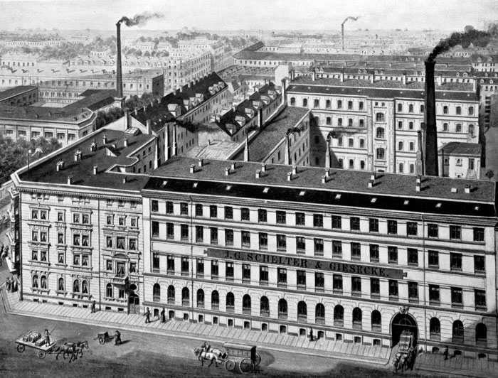
Above: Image of the J.G. Schelter & Giesecke typefoundry’s factory building at Brüderstraße 26/28, circa 1894. The firm was one of the largest players in Leipzig type history. Reproduced from Typografie.info.
This past April, I was invited to the Typotage 2018 at the Museum für Druckkunst Leipzig. The conference organizers asked me to speak about typefaces designed at the Academy of Visual Arts Leipzig for VEB Typoart in the 1950s, ’60s, and ’70s, while Albert Kapr was a professor there. Since I had just submitted my dissertation, which covered the relationships between German typefoundries and external type designers between 1871 and 1914, I was keen to shoehorn something from that period into my talk as well. I think I managed to do so inside just a few minutes time, leaving enough space to discuss what I had actually been invited for. The entire 42-minute talk (in German) can be viewed online at Schriften im Auftrag: Die HGB als Schmiede der Typoart-Schriften zwischen den 1950er und 1970er Jahren. The following post in an English translation of what I said about that slightly earlier time in Leipzig type history, expanded a little bit.
Leipzig’s typefounding landscape in the early twentieth century
In the late spring and in the summer of 1914, just before the outbreak of the First World War, the Deutscher Buchgewerbeverein (or “Organization of the German Book Trades”) mounted an international exhibition of the book trades and graphic arts, known by its German abbreviation: the Bugra. This event was something of a “World’s Fair” for the book, and many German manufactures contributed to the exhibition. The trade group representing many of Germany’s independent typefoundries – the Verein Deutscher Schriftgießereien – organized a collective exhibition for sixteen participants.[1] Brüder Butter and Ludwig Wagner, two typefoundries who were not part of that group, mounted separate exhibits of their own.
At the time of the Fair, there were thirty-eight independent typefoundries doing business in Germany. Here, I use the term “independent” to refer to typefoundries that were not internal divisions of printing companies. The total number of typefoundries in Germany around 1914 was seventy-four, since there were still a number of printing houses who cast type.[2] In German, those internal operations were called Hausgießereien. “In-house foundries” is a pretty good translation of the term. Some in-house foundries only cast type for internal use, while others also fulfilled orders for external printers.
The fourteen largest independent German typefoundries active c. 1914 were:
- J.G. Schelter & Giesecke in Leipzig, c. 1,000 employees
- H. Berthold in Berlin, c. 700 employees
- Julius Klinkhardt in Leipzig, c. 600 employees
- D. Stempel in Frankfurt am Main, c. 500 employees
- Bauer in Frankfurt am Main, c. 400 employees
- Gebr. Klingspor in Offenbach am Main, c. 240 employees
- Flinsch in Frankfurt am Main, c. 210 employees
- Genzsch & Heyse in Hamburg, c. 200 employees
- Emil Gursch in Berlin, c. 200 employees
- C. Kloberg in Leipzig already had a 150 employees in 1891; I have not found later figures for the firm
- Benjamin Krebs Nachfolger in Frankfurt am Main already had a 100 employees in 1880; I have not found later figures for the firm
- Brüder Butter in Dresden, c. 80 employees
- Ludwig Wagner in Leipzig, c. 80 employees
- Heinrich Hoffmeister in Leipzig, c. 70 employees[3]
Leipzig was a significant center within the national typefounding industry. In addition to a number of in-house typefoundries, several independent punchcutting businesses were also located within the city. Those punchcutteries included the firms of Hugo Friebel, Paul Schwieger, Wagner & Schmidt, Kurt Wanschura, as well as Riegerl, Weißenborn & Co. There was also Zierow & Meusch, which had been a typefoundry. By 1914, that company – which employed over one hundred workers – was making brass rules and galvanos for printers, instead of fonts of alphabetic type.[4]
I have found less data on employee figures for the above-mentioned companies covering the time during and after the First World War. Despite that, my hunch is that Schelter & Giesecke was not able to keep its relative position within the industry. Particularly Berthold and Stempel, for instance, each acquired a number of smaller typefoundries during the war and in its immediate aftermath. Those acquisitions included a number of Leipzig firms.
Reorganizing toward the book trades
In 1901, the Leipzig Academy – founded in 1764 – was reorganized as the Königliche Akademie für graphische Künste und Buchgewerbe (the “Royal Academy for the Graphic Arts and the Book Trades”).[5] The intention was to enable the Academy to better train artists and artisans who would go on to work in all branches of the book-making professions, and to improve the products made by the Leipzig firms engaged in those activities. It must have also been intended that Leipzig’s typefoundries would profit from this. For the time, those foundries were large businesses within the city. Several of them even operated internationally.
The independent typefoundries active in Leipzig c. 1903 were:
- Böttger (in operation 1863–1918)
- Heinrich Hoffmeister (in operation as a typefoundry 1898–1918)
- Julius Klinkhardt (in operation as a typefoundry 1871–1920; this foundry operated for several centuries, if you count all of its previous owners)
- C. Kloberg (in operation 1854–1922)
- A. Numrich & Co. (in operation 1885–1912)
- C.F. Rühl (in operation 1864–1918)
- J.G. Schelter & Giesecke (in operation 1819–1946)
- Ludwig Wagner (in operation 1902–1961; its predecessor firm, Gundelach & Ebersbach, had been established in 1897)
Some of the above-mentioned firms continued to cast type after the dates I list, as subsidiaries of larger typefoundries who acquired them.[6] Schelter & Giesecke and Ludwig Wagner were nationalized by the governments of the Soviet Zone of occupation and the German Democratic Republic, respectively, and eventually became parts of the East German state-owned foundry VEB Typoart. Elsewhere on this blog, I have written about Otto Erler – the head punchcutter at Schelter & Giesecke and its subsequent firms – who witnessed this nationalization, and may have even played an active role in it. I have also posted about some of the later Wagner businesses.
As part of the Academy’s reorganization, Hermann Delitsch (1869–1937) – who was a relatively new teacher at that time – was instructed to begin teaching Schrift classes. I think it is best to look at the term Schrift broadly. Delitsch would not have trained students in how to create new typeface designs, per se. His classwork would instead prepare students to work with letters in several ways. This would have encompassed a number of design directions that have different terms in English today, such as calligraphy and lettering, in addition to type design (and presumably some palaeography and other letter-history, too). In 1905, a proper class for Schrift was established, with him as its teacher. Later, he would be named a professor, too.
Introducing Schrift instruction in Germany
The Leipzig Academy was not the first German educational institution to add Schrift instruction before the First World War. The following list gives the introduction dates for Schrift instruction at a number of Arts & Crafts schools in the Germany. Those institutions likely did not all have the same level of prestige as the Leipzig Academy. Art academies had been founded in the eighteenth and nineteenth centuries to train fine artists, primarily, while the “Arts & Crafts schools” – my preferred translation for Kunstgewerbeschulen – were more like professional training.
I have included London and Vienna on my list below, since the teaching methods developed by Edward Johnston and Rudolf von Larisch for schools in those cities were adopted by almost all German Schrift teachers. I have not found dates for the introduction of Schrift instruction at the Kunstgewerbeschulen in Magdeburg and Weimar, but I presume that this occurred in about 1904–05 and 1907–08, respectively.
- Berlin (1882)
- London (1898)
- Vienna (1901)
- Düsseldorf (1903)
- Leipzig (1903)
- Magdeburg
- Solingen (1905)
- Offenbach am Main (1907)
- Weimar
- Barmen (1909)
- Breslau (1912)
- München (1912)
It was the example of the Schrift courses at the Unterrichtsanstalt des Kunstgewerbemuseums zu Berlin (the “School of the Arts & Crafts Museum of Berlin”) that directly inspired the Leipzig Academy to add instruction in the subject. Nevertheless, Delitsch himself drew more direct inspiration from the teaching methods used by Rudolf von Larisch in Vienna than from any of the instructors who had then been teaching in Berlin.
Leipzig’s constellation of excellence
The Institut für Buchkunst published an overview of the history of Schrift instruction at the Leipzig Academy in the twentieth and early twenty-first centuries in 2010, One century of type and teaching typefaces in Leipzig.[7] A series of articles from the period described here that details the various Leipzig teachers’ classes, with illustrations of student work, was published in a special January 1909 issue of Archiv für Buchgewerbe.[8] A full narrative of Leipzig type history that encompasses both what happened inside the Academy, as well as in industry, has not yet been published. Friedrich Bauer’s 1914 Chronik der Schriftgießereien offers an overview of many of the typefoundries that had been active in the city since the sixteenth century, while Monique Dickmanns recently created a more holistic work that does come closer to presenting a complete picture: for the theoretical part of her Diplomarbeit at the Academy, she collected a variety of historical information together, which she later self-published as the book Leipziger Kegel.[9]
From my perspective, what made Schrift lessons at the Leipzig Academy special was not only Delitsch’s teaching – or establishing a proper “class” for Schrift – but that several professors at the Academy at this time tackled various aspects of Schrift and typography: Georg Belwe, Hermann Delitsch, Georg Schiller, Hugo Steiner-Prag, and Walter Tiemann. As far as I am concerned, this was a veritable “Murderers’ Row” of instructors. In addition to other professionals endeavours, all five of these teachers designed typefaces for various German typefoundries during the decade before the First World War. In terms of market performance, Walter Tiemann’s typefaces for the Gebr. Klingpor foundry were probably the most successful from this group, but that may have been a later, post-war development.
Not all these instructors were still teaching at the Academy after the First World War, when the young Johannes Tzschichhold (1902–1974; he later changed his name to Jan Tschichold) was enrolled there. Nevertheless, the milieu that they had contributed to must have played an influence on Tschichold’s development – but that is another chapter in Leipzig type history.[10]
Georg Belwe (1878–1954) had been one of the three co-founders of the Steglitzer Werkstatt in 1900. He joined the Academy staff in 1906 and was responsible for typesetting and letterpress printing. Belwe was made a professor in 1911, and he remained at the Academy until 1945. His eponymous typefaces were published by Schelter & Giesecke. That foundry published additional typefaces designed by Belwe as well. Additionally, he designed a Fleischmann revival, published by Ludwig Wagner.
Hermann Delitsch, described above, began teaching Schrift classes at the Academy in 1903. He was elevated to the professoriat in 1916. Delitsch remained at the Academy until 1934. His history of writing, Geschichte der abendländischen Schreibschriftformen, was published in 1928, and Umgang mit Buchstaben – his calligraphy manual – followed in 1931. Delitsch designed a few typefaces for Julius Klinkhardt.
Before Georg Schiller (1858–1937) came to the Academy in 1905, he had been an Imperial engraver at the Reichsdruckerei in Berlin. At the Reichsdruckerei, he designing several typefaces for the printing house’s publications. These typefaces were also sold commercially. After joining the Academy staff, he developed additional typefaces that were published by the C.F. Rühl typefoundry in Leipzig, and Ludwig & Mayer in Frankfurt am Main. He also designed Akademie Fraktur, a typeface for the Leipzig Academy itself. Schiller became a professor in 1910, and retired from his teaching post in 1920.[11]
Beginning in 1907, Hugo Steiner-Prag (1880–1945) taught printmaking and illustration at the Academy. He became a professor in 1910 and remained in Leipzig until the Nazis seized power in 1933. Steiner-Prag then left Germany. Having been born in Prague, returned to that city, before heading to Stockholm, and eventually New York. He designed fonts of ornaments for the Bauer typefoundry in Frankfurt am Main, and for C.F. Rühl. His only alphabetic typeface – the Steiner-Prag-Schrift – was published by Genzsch & Heyse in Hamburg in 1914.
Like several of the German type designers of his generation, Walter Tiemann (1876–1951) self-identified as an easel painter. In the printing network, he was probably most well-known for his book designs – later, for his typefaces, too. Tiemann joined the Academy’s staff in 1903. Until 1914, he taught drawing and painting. Later, he did teach Schrift classes, and he was one of Tschichold’s Leipzig teachers, like Delitsch. Tiemann became the Academy’s rector in 1920, a post he remained in until 1941, and which he returned to briefly after the Second World War ended. While Delitsch’s typefaces were based on his own writing experiments with broad-pens, Tiemann’s type designs were almost certainly drawn – or even drafted.
Teachers and students
Before 1914, typefoundries collaborated more often with teachers at Academies and Arts & Crafts schools than with their students. I see it like this: typefoundries probably thought that people hired as Schrift instructors would be capable of providing good designs for new typefaces. Today, it is more likely the other way around: young designers who have already designed successful typefaces are likely to come up for consideration when an art school or university is trying to find someone to teach a type design class.
For typefoundries in Imperial Germany, fonts of ornaments, initials, and border elements – as well as vignettes – were likely almost as important revenue sources as their alphabetic typefaces. For example, in 1912, the Leipzig Academy professor Hugo Steiner-Prag designed Akzidenzschmuck and Kalenderschmuck, sets of ornaments for the Leipzig foundry C.F. Rühl. Genzsch & Heyse published his first alphabetic typeface, the Steiner-Prag-Schrift, about two years later. That kind of working-order was rather common: design ornaments first, alphabetic typefaces later. I suspect that fonts of ornaments were faster and less expensive for foundries to produce than alphabetic typefaces. This likely made ornaments a market sector where students and young graduates would have found it easier to gain a foothold, too.
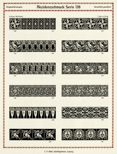
Some of the ornaments designed by Hugo Steiner-Prag for C.F. Rühl. Reproduced from Cees de Jong (ed.) Type: A Visual History of Typefaces and Graphic Styles. Vol. 2. Cologne: Taschen (2010), p. 174
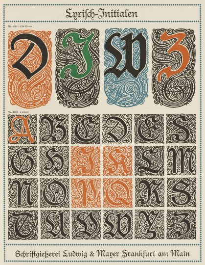
The Lyrisch typeface was designed by Leipzig Academy professor Georg Schiller and published by Ludwig & Mayer in Frankfurt am Main. The initials reproduced above, however, were not designed by Schiller. Instead, they came from Max Hertwig (1881–1975), who in 1910 would have still been a less experienced designer. Hertwig later designed “proper” alphabetic fonts for text-setting. Berthold published his Alt-Mediäval in 1914. Reproduced from De Jong, p. 146.[12]
Notes
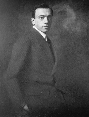
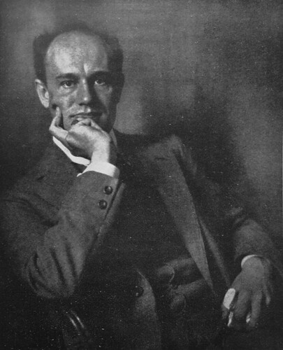
- The sixteen foundries who participated in the Verein Deutscher Schriftgießereien’s collective exhibition at the Bugra in 1914 were Bauer, H. Berthold AG, Gottfried Böttger, Flinsch, Genzsch & Heyse, Emil Gursch, Heinreich Hoffmeister, Gebr. Klingspor, Julius Klinkhardt, Benj. Krebs Nachf., Ludwig & Mayer, C.F. Rühl, J.G. Schelter & Giesecke, D. Stempel AG, Ludwig Wagner, and Wilhelm Woellmer; see Heinrich Hoffmeister’s »Die Schriftgießerei auf der Weltausstellung für Buchgewerbe und Graphik Leipzig 1914«. In Deutscher Buchgewerbeverein (ed.) Archiv für Buchgewerbe. Vol. 51, no. 7–9 (July–September 1914). Leipzig: Verlag des Deutschen Buchgewerbevereins, p. 266–276. The article was followed by six pages featuring portraits of twenty-three »Deutsche Schriftkünstler« (no page numbers), from which I reproduced the five portraits in this post.
- See Friedrich Bauer »Gruppe IX: Schriftschneiderei & -Gießerei/Gravierkunst & verwandte Gewerbe – Stereotypie & Galvanoplastik«. In Amtlicher Katalog. Internationale Ausstellung für Buchgewerbe und Graphik, Leipzig 1914. Pages 209–214, here p. 214
- Most of these employee figures come from the company’s respective entries in Friedrich Bauer’s Chronik der deutschen Schriftgießereien. Offenbach am Main: Verlag des Vereins Deutscher Schriftgießereien (1914). There is a PDF version of the book’s second edition from 1928 available online. The figure of 600 employees at Klinkhardt and 70 at Hoffmeister are from 1904, and I do not know if those typefoundries expanded or declined over the following decade, although I do suspect that they are most likely to have either held their respective sizes, or grown. The employee figure I give for Flinsch is from 1906. Brüder Butter’s figure is for 1913, and it is from Maurice Göldner’s article “The Brüder Butter typefoundry.” In Eric Kindel and Paul Luna (ed.) Typography papers 9. London: Hyphen Press (2013), p. 91–116, here p. 94
- See Bauer’s Chronik, p. 136–137. Another brass printing-item manufacturer from Leipzig mentioned by Friedrich Bauer in his Chronik was the Rüger company; Ibid., p. 138
- Indeed, the Bugra was ostensibly organized to celebrate the Leipzig Academy’s one hundred fiftieth birthday. The Academy was reorganized again after the Second World War, receiving the name it still has today: the Hochschule für Grafik und Buchkunst. This name could be translated into English as the “university for printmaking and book art;” however, the name that the school now uses in English-language communication is “Academy of Visual Arts.”
- The Bauer typefoundry in Frankfurt am Main purchased the Leipzig typefoundry A. Numrich & Co. in 1912. Bauer had Numrich continue as a subsidiary in Leipzig until 1927; see the Numrich PDF on the Klingspor Museum website [link]. Between 1918 and 1920, H. Berthold AG in Berlin acquired the Leipzig typefoundries F.A. Brockhaus, Julius Klinkhardt, C. Kloberg, and C.F. Rühl. Together with the A. Kahle Söhne typefoundry of Weimar, these were all merged into a Leipzig subsidiary of Berthold, which operated under the name Böttger-Klinkhardt; see the Gottfried Böttger PDF on the Klingspor Museum website [link]. D. Stempel AG of Frankfurt am Main acquired Heinrich Hoffmeister of Leipzig in 1918. The company was then a subsidiary for ten years, until Stempel closed it; see the Hoffmeister PDF on the Klingspor Museum website [link].
- See Julia Blume and Fred Smeijers (ed.) Ein Jahrhundert Schrift und Schriftunterricht in Leipzig / One Century of Type and Teaching Typefaces in Leipzig. Leipzig: Institut für Buchkunst (2010)
- See Deutscher Buchgewerbeverein (ed.) Archiv für Buchgewerbe. Sonderausgabe über die Königliche Akademie für graphische Künste und Buchgewerbe zu Leipzig. Vol. 46, no. 1 (January 1909). Leipzig: Verlag des Deutschen Buchgewerbevereins
- See Bauer’s Chronik and Monique Dickmanns’s Leipziger Kegel: Zur Entwicklung der Schriftgießereien in Leipzig. [Theoretischer Teil einer Diplomarbeit.] Leipzig: Hochschule für Grafik und Buchkunst (2013)
- For information about the years that Jan Tschichold spent in Leipzig as a boy and a young man, see Christopher Burke’s Active Literature: Jan Tschichold and the New Typography. London: Hyphen Press (2007) and Günter Karl Bose’s Tschichold in Leipzig, Das Neue in der Typographie. Zwei Vorträge. Leipzig: Institut für Buchkunst (2009)
- Georg Schiller’s teaching activities included typographic punchcutting. The name of his class was the »Klasse für Stempelschneiden, Gravieren und Prägedruck«; see Blume/Smeijers, p. 262
- In 2011, C. Arthur Croyle wrote an English-language biography of Max Hertwig – his grandfather; see C. Arthur Croyle’s Hertwig: The Zelig of Design. Ames/Iowa: Culicidae Architectural Press (2011)