In 1928, the Academy of Sciences of the USSR – then still in Leningrad – published a specimen of their press’s oriental typefaces. This small book’s ancillary text is in both German and Russian. The Academy printed it for the Internationale Presse-Ausstellung (Pressa) held at Cologne that year. One of the book’s pages displays Egyptian hieroglyphs. These are Theinhardt’s hieroglyphs. The specific sorts were almost certainly cut in Berlin during the mid-nineteenth century by Augustus Beyerhaus and Ferdinand Theinhardt for the Egyptologist Karl Richard Lepsius. Lepsius probably began using the typeface in his publications before the font was finished. According to Rijks Smitskamp, the first book printed with them was published in 1849.[1]
Ferdinand Theinhardt
Beginning in the 1850s, Ferdinand Theinhardt (1820–1906) cut the punches for several scholarly typefaces. Most were commissioned to enable text composition in other writing systems, such as Avestan, cuneiform, Cypriot, Demotic, Devanagari, Hebrew, or Tibetan. Theinhardt’s foundry then cast these types, and sold them to academic printers. In the same vein, Theinhardt produced Monumental,[2] a series of scholarly types commissioned by the Prussian Academy of Sciences, with which the texts of the inscriptions in Theodor Mommsen’s Corpus inscriptionum latinarum were set.
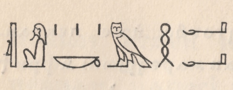
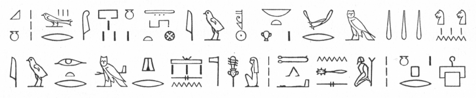
Above, four lines from the hieroglyphs page in the 1928 Academy of Sciences of the USSR’s catalogue. The punches for these types were probably cut by Theinhardt (some may have come from Beyerhaus, making them a bit older). I don’t know where the Academy purchased this type. It could have bought the fonts from the Theinhardt foundry, as long as the order was from before 1910. Or it could have been placed afterwards, with H. Berthold AG. Theinhardt also sold duplicate matrices of these hieroglyphs to at one printing house, from whom the Academy press might also have sourced its hieroglyph font. You can see the full hieroglyphic setting from this catalogue’s page on Flickr. Thanks to D.P. for letting me make a scan from her copy of the catalogue.[3]
I am not sure what the exact nature of the collaboration between Theinhardt and his academic counterparts was, or how the design and making of those typefaces unfolded. (By that I mean, what the step-by-step process was like.) A 1875 specimen of Theinhardt’s hieroglyphs types hinted at the exact division of labor behind their design’s creation.[4] This specimen included a foreword from Lepsius, who – on an expedition to Egypt from 1842 to 1846 – had been accompanied by the draughtsman Ernst Weidenbach. Lepsius wrote that Weidenbach prepared detailed drawings of each hieroglyphic character, which were the provided to the fonts’ punchcutters. Augustus Beyerhaus cut the first of Lepsius’s hieroglyphic sorts,[5] but the project was transferred to Theinhardt in 1851.[6] Theinhardt – who had only started to work independently in 1849 – began fulfilling orders for the Prussian state printing house in 1851, too, which could have led to his receiving the hieroglyphs commission. Beyerhaus seems to have closed his own typefoundry down around 1850; I have written a bit more about his foundry below.
Theinhardt wrote an autobiography later on in life. There, he briefly touched upon specific documents he consulted while cutting e.g., his Tibetan and cuneiform types.[7]
Money and reputation
I suspect that Theinhardt’s hieroglyphs were not a big money-maker for him. According to his autobiography, he cut at least some of the punches on his own time, and subsidized at least a part of the fonts’ typecasting costs:
When the funds granted by the government for the work were exhausted, I offered to continue cutting the punches and casting the type for this valuable undertaking at my expense, and I also cast fonts of the hieroglyphic types to be given to Munich, Leipzig, Heidelberg, London, Edinburgh, Chalon-sur-Saône, Christiania [Oslo], and Cairo. I made it a matter of honor for myself.[8]
Theinhardt must having been willing to invest in the project because he believed that it would be good for his business in the long run. That was almost certainly borne out. Theinhardt’s hieroglyphs probably led to the commissions for the other academic types I mentioned above. In his lifetime, Theinhardt was most well-known and regarded for those types, and not for the bulk of his foundry’s output – i.e., the “normal” fonts that he produced for newspaper and jobbing printers. The product range of the Ferd. Theinhardt foundry was typical for its time, all except for its academic faces. Putting it another way: if Theinhardt’s other work was typical, his academic typefaces were exceptional.
The Adolf Holzhausen printing house at Vienna purchased matrices of Theinhardt’s hieroglyph types, and that was the office who provided the setting for the short specimen included in the Viennese author Karl Faulmann’s 1882 book, Illustrirte Geschichte der Buchdruckerkunst (pictured further below). In that book Faulmann wrote that “among the punchcutters, Ferdinand Theinhardt won an international reputation through his hieroglyphs and cuneiform typefaces, yet he is no less distinguished by the other work he cut.”[9] Faulmann’s statement isn’t merely a résumé of Theinhardt’s oeuvre: at the time of the book’s publication, Theinhardt was still active as a punchcutter and typefoundry owner. Writing in 2007, Jo De Baerdemaeker stated that, “Theinhardt’s Tibetan is generally regarded as an optimal design of the Tibetan characters in metal.”[10] While De Baerdemaeker applied his praise specifically to Theinhardt’s work in one script, it makes me suspect that late nineteenth and early twentieth century praise for Theinhardt’s academic types within the German printing trade media was not merely hyperbolic.
Augustus Beyerhaus (1805–1874)
Friedrich Bauer’s 1928 Chronik der Schriftgießereien in Deutschland und den deutschsprachigen Nachbarländern only has scant information about Augustus Beyerhaus’s typefoundry. That information regards its activities in 1840:
From the typefoundry of A. Beyerhaus, an 1840 specimen of characters from a Chinese typeface is known. These were cut in steel “under the direction of Director-General Dr. von Olfers by A. Beyerhaus in Berlin for the Royal Academy of Sciences in Berlin and for the missionary Carl Gützlaff in China.” In addition to standard typefaces, an octavo specimen from this period (1840) has a total of 16 pages showing 165 figures of kaleidoscopic border-printing elements, printed at the office of A.W. Schade.[11]
In the early 1840s, Berlin’s address books listed Beyerhaus as a typefoundry owner living at Spandauer Straße 30; his place of business was Spandauer Straße 53. Beginning in 1845, address books described him as a »Hofgraveur, Wappenstecher, Steinschneider und Schriftgießerei-Besitzer« (court engraver, heraldist, gemcutter[?], and typefoundry owner), and listed him as doing business at Oberwallstraße 6. Note that Theinhardt, despite his having undertaken work for Prussian institutions, was never granted a title along the lines of Hofgraveur or königlicher Graveur – at least according to any documents that I have been able to find. From 1850, the term »Schriftgießereibesitzer« (typefoundry owner) was no longer part of Beyerhaus’s address book entries. This likely indicates that he closed his foundry down around that time. In its collections from the Joh. Enschedé printing house, Noord-Hollands Archief today has an 1851 specimen of Beyerhaus’s Chinese types.[12] Beyerhaus would have been just over forty when he began cutting hieroglyphs for Lepsius.
Other fonts of hieroglyph type
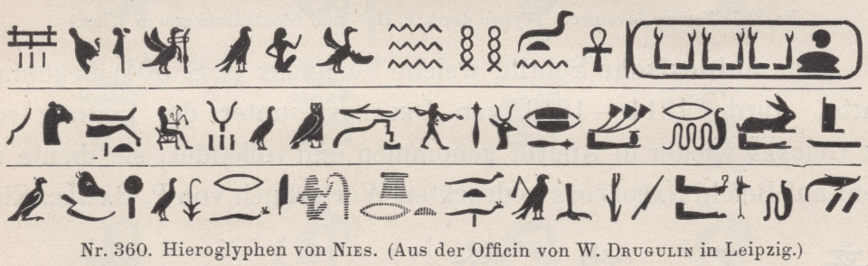
Hieroglyphs cut by F. Matthés for the typefoundry inside Friedrich Nies’s printing house, as reproduced in Faulmann, p. 738. Today, matrices of Nies’s hieroglyphs are part of the collection at the Haus für Industriekultur in Darmstadt; see Karl Zimmermann’s 2012 article about them in the Journal für Druckgeschichte.[13]
Faulmann’s history provides a brief summary of the first few decades of hieroglyphic type, although his account focused almost exclusively on hieroglyph examples produced and used in German-speaking Europe. For example, while he stated that Delafond in Paris had made the first hieroglyphic type, he did not give his readers a date for this, or describe its appearance, moving swiftly on instead to the hieroglyphs cut by Nies at Leipzig in 1835. Friedrich Nies’s printing office and typefoundry passed into the hands of Carl Berendt Lorck in 1856, and Lorck’s 1859 specimen sheets included four lines each of the Nies hieroglyphs in left-facing and right-facing directions, respectively.[14] Wilhelm Eduard Drugulin bought the Nies business from Lorck in 1868, and the Nies hieroglyphs appear in the specimens of the “W. Drugulin” foundry. For example, they are on the first page of a Drugulin 1872 specimen held in Berlin.[15] Eventually, Drugulin seems to have replaced its own Nies hieroglyphs with those cut by Theinhardt. Under its entry for hieroglyphs, Drugulin’s 1929 catalogue only included a specimen of Theinhardt’s design, in 18 pt.[16]
Faulmann then presented a two-line sample text composed with type from the Viennese k. k. Hof- und Staatsdruckerei (the Court and State printing house). According to him, these had come from the Imprimerie nationale in Paris. Like Nies’s hieroglyphs, that design’s letterforms were made to print dark, or “filled in” – unlike Beyerhaus and Theinhardt’s characters, which are “outlined.” Faulmann wrote that the Beyerhaus/Theinhardt hieroglyphs were “the most beloved among Egyptologists,”[17] and my half hazard internet searches have not turned up any criticism of them. Since Theinhardt only inherited the hieroglyphs project from Beyerhaus, I assume that the “design decision” to have its letterforms be outlined – instead of filled – had already been determined by Beyerhaus, Lepsius, and/or Weidenbach, years before Theinhardt’s involvement with their cutting ever began.
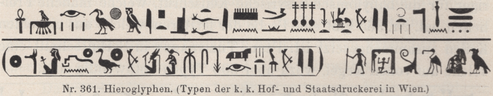
Imprimerie nationale (?) hieroglyphs acquired by the Court and State Printing house in Vienna, as reproduced in Faulmann, p. 739
Faulmann may have left some things out of his summary, and of course my notes on his historical overview above don’t touch on the long period after 1882 at all. I don’t have a handle on what has since happened with hieroglyphic type development, although I did read that several more types were produced, and there seems to have been some fine English examples, too. I was intrigued to find snippets of the digital hieroglyphs typeface that Jonathan Fabreguettes designed at the École Estienne in 2006–2007 online, as well as the one designed by Pierre Fournier at the ANRT Nancy in 2015. Do check their projects out!
Update, 19 July 2022: Rijk Smitskamp gives the history of hieroglyphic typefaces in far more detail in his article “Typographia hieroglyphica.” [18] Smitskamp had many more sources available than Faulmann; he mentions examples that Faulmann did not and corrects details that Faulmann got wrong.
Theinhardt’s hieroglyphs at H. Berthold AG
After the Berlin typefoundry H. Berthold AG acquired Theinhardt’s former foundry in 1908, they began to sell Theinhardt’s hieroglyphs. Here is a showing of them, from one of Berthold’s undated type specimen catalogues,[19] printed during the 1950s:
Theinhardt’s hieroglyphs in the Berlin Reichsdruckerei’s catalogue of oriental and occidental alphabets
The Academy of Sciences of the USSR may have been inspired by a similar type specimen catalogue produced by the Reichsdruckerei (imperial printing house) at Berlin in 1924. That also had an entry for hieroglyphs. While the Reichsdruckerei catalogue does not mention its source for them,[20] the hieroglyphs are almost certainly Theinhardt’s.[21] According to Hans Reichardt’s Ferdinand Theinhardt PDF on the Klingspor Museum website, the Reichsdruckerei eventually acquired the steel punches for the hieroglyphs Theinhardt cut. Today, those Beyerhaus/Theinhardt hieroglyph punches are stored in a cabinet at the Stiftung Deutsches Technikmuseum Berlin’s offsite depot. The cabinet was acquired from the German Bundesdruckerei, and it contains punches made at – and collected by – the Decker and Reichsdruckerei printing offices.
The Museum für Druckkunst Leipzig has two sets of matrices for the Beyerhaus/Theinhardt hieroglyphs design: one set came into their collection from the Reichsdruckerei, and the second set is from the Holzhausen printing house in Vienna, which I mentioned above. Incidentally, the lock-up of the type for the Reichsdruckerei’s hieroglyphs page in [22] has been preserved for almost 100 years, and can be seen today at the Typostudio SchumacherGebler Dresden.
The Reichsdruckerei book had a larger page size, as well as a completely different format than the Academy’s catalogue. It was also altogether more opulently produced. The Reichsdruckerei book presented readers with explanations of each alphabet or writing system it included, rather than a sample page of text composed in type made for those scripts: its pages were filled with texts about each writing system, not sample typesettings in each writing system. The intended audience for the Reichsdruckerei book was not international fair visitors. Instead, it was made for a broad range of readers. Its title page contained the subtitle: »zur allgemeinen Gebrauch mit besonderer Berücksichtigung des Buchgewerbes« (for general use, especially in the book trades). This was probably a book that many of the workers in the various printing industries could afford to buy. Or at least, it would be the kind of book that a printers’ or typesetters’ training school might acquire for its library.
While the Reichsdruckerei book does not give a source for its hieroglyph types, it does cite the sources for some of the fonts used in its explanations of other scripts. For example, the Devanagari font it used was attributed to H. Berthold AG. Although Berthold acquired Theinhardt’s foundry in 1908, they did not adopt the Devanagari that Theinhardt had cut – for whatever reason. Instead, Berthold sold another design (I don’t know its source). The Reichsdruckerei’s Tamil page was composed with type that came from the J.G. Schelter & Giesecke foundry at Leipzig, but I do not know who cut those punches, either, or in which timeframe that work was undertaken.[23] No source is given for the type on the book’s Tibetan page,[24] but De Baerdemaeker tells me that it is a design independent from Theinhardt’s, cut about twenty years earlier, which the Reichsdruckerei must have gotten from the Königlich-Preußische Akademie der Wissenschaften.
Sources
- That was Karl Richard Lepsius: Die Chronologie der Aegypter. Einleitung und erster Teil. Kritik der Quellen. Berlin: Nicolaische Buchhandlung, 1849. See Rijk Smitskamp: “Typographia hieroglyphica.” In Quaerendo, vol. 9, issue 4 (1 January 1979), p. 309–336, here p. 323
- Ferdinand Theinhardt’s Monumental typeface was eventually carried by the Reichsdruckerei in Berlin, who somewhat confusedly already carried a series of typefaces with the word “Monumental” in their name. These earlier Monumental typefaces were also all-caps, but unlike Theinhardt’s Monumental, the Reichsdruckerei’s Magere Monumental, Fette Monumental, and Schmale Monumental were sans serif designs. Fette Monumental was the oldest of these “Monumental” types, originating around 1850 at Rudolf Decker’s Berlin printing house – one of the Reichsdruckerei’s predecessor institutions. See, for example, the catalogues Schriftproben der Reichsdruckerei, 2. Band: Antiqua (1886) and Schriftproben der Reichsdruckerei: Von anderen Giessereien bezogene Schriften (c. 1912). Charles Mazé compares Theinhardt’s Monumental with two other typefaces made for transcribing Roman inscriptions, Caractères Augustaux and Latin Épigraphique, in “Three typefaces for Latin epigraphy in France and Germany, 1846–63.”
- Akademie der Wissenschaften der Sozialistischen Sowjet-Republiken (ed): Proben Orientalischer Schriften der Akademischen Druckerei. Verlag der Akademie der Wissenschaften, Leningrad 1928, p. 63
- Ferdinand Theinhardt: Liste der hieroglyphischen Typen aus der Schriftgiesserei des Herrn F. Theinhardt. With a foreword by Karl Richard Lepsius. Buchdruckerei der Königl. Akademie der Wissenschaft (G. Vogt). Universitätsstrasse 8, Berlin 1875. [Link to the online edition]
- ibid., p. v. Rijk Smitskamp writes that, when it came to preparing the hieroglyph designs for Augustus Beyerhaus, Ernst Weidenbach was joined by his brother Max. See note 1 above.
- Friedrich Bauer: Chronik der Schriftgießereien in Deutschland und den deutschsprachigen Nachbarländern. Bearbeitet von Friedrich Bauer, Offenbach am Main 1928. Mit Ergänzungen und Nachträgen von Hans Reichardt. PDF file. Hans Reichardt, Frankfurt am Main 2011, p. 25 [link]
- Ferdinand Theinhardt: Erinnerungsblätter aus meinem Leben. Second edition. H. Berthold AG, Berlin 1920, p. 18–19. [Available online here]
- ibid., p. 15–16
- Karl Faulmann: Illustrirte Geschichte der Buchdruckerkunst mit besonderer Berücksichtigung ihrer technischen Entwicklung bis zur Gegenwart. A. Hartlebens Verlag, Vienna/Pest/Leipzig 1882, p. 589 and 568
- Jo De Baerdemaeker: “An introduction to the Tibetan script and typography.” In: Filip Blažek, Pavel Kočička, Jakub Krč, and Pavel Zelenka (ed.): Typo – typografie, grafický design, vizuální komunikace. Issue 26. Vydavatelství Svět tisku, spol. s r.o., Prague 2007, p. 2–9. See also the video of De Baerdemaeker’s ATypI 2019 talk, “Ferdinand Theinhardt’s Legacy in Tibetan Typography.”
- Bauer, p. 24–25
- Augustus Beyerhaus: A specimen of new Chinese types by Augustus Beyerhaus, Berlin, engraver to His Majesty the King of Prussia. “These new Chinese characteres are cut in steel and cast in matrices for the Chinese Mission of the Board of Foreign Missions of the Presbyterian Church in the United States of America”, 1851. At the Noord-Hollands Archief, this item has the inventory number 1767. This specimen was made for the Great Exhibition at the Crystal Palace in London in 1851, the first World’s Fair. It was printed in Eduard Haenel’s Berlin printing house.
- Karl Zimmermann: »Neuguss von Hieroglyphen nach 180 Jahren«. In Harry Neß und Silvia Werfel (ed.): Journal für Druckgeschichte, Neue Folge, vol. 18, no. 2 (2012). Internationale Arbeitskreis Druck- und Mediengeschichte 2012, p. 28.[link]
- Carl B. Lorck Buchdruckerei und Schriftgiesserei Leipzig (ed.): Buchdruckerei und Schriftgiesserei von Carl B. Lorck in Leipzig. Probeblatt 1–24. Lorck, Leipzig 1859. No page numbers, first sheet after the title page. In the Staatsbibliothek zu Berlin, this volume has the call number RLS Fq 2643
- Schiftgiesserei und Buchdruckerei W. Drugulin in Leipzig (ed.): Proben der Schriftgiesserei und Buchdruckerei von W. Drugulin in Leipzig. I. Aelteste Schriftzeichen. Orientalische, Griechische und Slawische Schriften. Drugulin, Leipzig 1872. In the Staatsbibliothek zu Berlin, this volume has the call number RLS Fp 4671
- Offizin Haag-Drugulin AG (ed.): Schriftproben der Offizin Haag-Drugulin A.-G. Offizin Haag-Drugulin AG, Leipzig 1929, p. 142. In the Staatsbibliothek zu Berlin, this volume has the call number RLS Fp 4674
- Faulmann, p. 738–739
- See note 1 above.
- H. Berthold AG Schriftgießerei und Messinglinienfabrik (ed.): Schriftprobe Nr. 405. H. Berthold AG, Berlin/Stuttgart. Undated (1950s), p. 173
- Direktion der Reichsdruckerei (ed.): Alphabete und Schriftzeichen des Morgen- und des Abendlandes. Reichsdruckerei, Berlin 1924, p. 6
- For a Reichsdruckerei type specimen catalogue that displays the hieroglyphs, see Anon.: Schriftproben der Reichsdruckerei. Schriften, Einfassungen. Reichsdruckerei, Berlin. Undated, c.1910. No page numbers, but in this catalogue, the hieroglyphs have the product number 601. Both the Kunstbibliothek at the Staatliche Museen zu Berlin and the Staatsbibliothek zu Berlin have copies of this catalogue in their collections.
- Reichsdruckerei 1924, p. 45–47 for Devanagari and p. 54 for Tamil.
- ibid., p. 50
- De Baerdemaeker shows this Tibetan typeface both as it appeared in a circa 1910 Reichsdruckerei specimen catalogue and as its punches are now house at the Stiftung Deutsches Technikmuseum Berlin in his ATypI 2019 talk, the already-mentioned “Ferdinand Theinhardt’s Legacy in Tibetan Typography.”