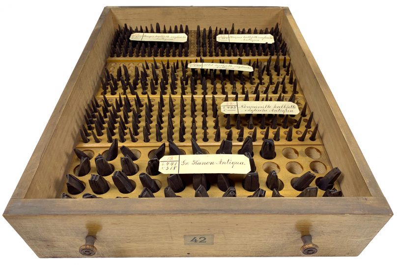
Above, I’ve reproduced my photograph of Stiftung Deutsches Technikmuseum Berlin, item number 1/2018/0443, drawer 42. This stores the hand-cut typographic steel punches for four fonts of a bold English-style roman typeface named halbfette englische Antiqua. Their approximate sizes are 6, 8, 9, and 10 Didot points. They were probably cut at Rudolf Decker’s Court Printing House at Berlin. I think he showed them for the first time on three specimen sheets printed in 1862: [1], [2], and [3]. For a larger version of this photo, click here. The same cabinet this drawer is kept in also contains many of the Reichsdruckerei punches.
The Bundesdruckerei collection of Decker and Reichsdruckerei punches
This summer, I began working on a small side project documenting a collection of typographic punches. These were from Germany’s Federal Printing Office: the Bundesdruckerei. Now they belong to the Deutsches Technikmuseum in Berlin. The collection is of considerable size. Its presence has long been known to the typographical research community, but details about the collection have not been readily available (see e.g., James Mosley’s “The materials of typefounding” article; scroll down to the entry for the Deutsches Technikmuseum in the section for Germany).
Above: Stiftung Deutsches Technikmuseum Berlin, item number 1/2018/0443, drawer 47. Hand-cut typographic steel punches for two more sizes of the halbfette englische Antiqua – 72 and 84 pt. They were probably made in Rudolf Decker’s Court Printing House at Berlin and first shown on a specimen sheet printed in 1862. You can see a scan of that on this Google Book page.
This is not to say that the Bundesdruckerei punches were not inventoried. The collection is astonishingly well sorted and easy to “read.” Each set of punches has a little identification card placed over it, as you can see in the above photo. These cards are numbered. Some of the cards even contain three separate numerical designations. The one designation that can be found on every card is a red number, which for its part does not correlate with any known documents. These numbers were probably written just for sorting punch sets within the cabinets themselves. If a set of punches takes up more cabinet space than average, it might contain duplicate cards where the same information is simply repeated. You can also that in the photo above. For instance, the cards numbered 37 and 38 are each doubled.
On most cards, the red numbers are joined by one or two additional numbers written in black ink, which according to the layouts I call A-numbers and N-numbers. The letter A must simply be an abbreviation for Alt, or “old,” while N is for Neu, or “new.” Or so I assume. These old and new designations must refer to the two product numbering systems used in the Bundesdruckerei’s preceding printing house, the Reichsdruckerei. At some point between 1886 and circa 1910, the Reichsdruckerei renumbered all of its typefaces: you can see this clearly by comparing the Reichsdruckerei’s 1886 specimen catalogues with the later ones printed in circa 1910. The A-numbers on the punches’ cards are the fonts’ older product numbers, while the N-numbers are the newer designations – introduced by the time the circa 1910 catalogues were printed (at the latest). Some old typefaces do not appear in the Reichsdruckerei’s circa 1910 catalogues; those typefaces’ punches have no N-numbers. Again, that can be seen by looking at the cards in the photo above.
Initially, I had hoped that the cards’ A-numbers would correspond to the product-numbering system used by the foundry in the old Decker printing house, but those numbers and the typefaces in the Decker catalogues unfortunately do not match. To my dismay, the methods used by the Decker foundry for product labeling were also something of a mess, with competing numbering systems present within single catalogues.
Where do the punches come from?
The information from the cards for the punches in this collection does not correspond to any master handwritten, typewritten, or single printed registry. No inventory from the Reichsdruckerei or Bundesdruckerei seems to have survived, but the Reichsdruckerei did print type specimen catalogues. Since the data from each card has not yet been input into any electronic database, I created an Excel spreadsheet listing all the information. I also photographed the contents of each drawer; a number of my photos are posted on Flickr. By comparing my photographs and the inventory information on each card with printed type specimens, I could populated my Excel file with details about when which printing houses cut a specific typefaces, or which external source they acquired a typeface’s punches from. To build this record, I relied on type specimen catalogues from two Berlin libraries. Since those are also held by other collections, some of you might like to read my list:
- Rudolf Ludwig Decker (ed.): Proben der Deckerschen Schriftgießerei in Berlin. Königliche Geheime Ober-Hofbuchdruckerei, Berlin 1837. At the Kunstbibliothek in the Staatsmuseen zu Berlin, this catalogue has the shelfmark H 1179 kl.
- Rudolf Ludwig Decker (ed.): Proben von Buchdruck-Lettern aus der Schriftgiesserei. Königliche Geheime Ober-Hofbuchdruckerei, Berlin 1851. This catalogue was printed for the Great Exhibition at the Crystal Palace in London, 1851, at which Decker was an exhibitor. At the Kunstbibliothek in the Staatsmuseen zu Berlin, this catalogue has the shelfmark H 1179 c mtl.
- Rudolf Ludwig Decker (ed.): Nachtrag zu den im Jahre 1851 ausgegebenen Proben von Buchdruck-Lettern. Königliche Geheime Ober-Hofbuchdruckerei, Berlin 1859. At the Universität der Künste Berlin, this has the shelfmark RK 1849-2.
- Rudolf Ludwig Decker (ed.): Proben von Buchdruck-Lettern aus der Schriftgiesserei. Königliche Geheime Ober-Hofbuchdruckerei, Berlin 1862. At the Staatsbibliothek zu Berlin, this catalogue has the shelfmark 4 An 1272-3.
- Rudolf Ludwig von Decker (ed.): Proben von Buchdruck-Lettern aus der Schriftgiesserei. Königliche Geheime Ober-Hofbuchdruckerei, Berlin 1867. This is the second Nachtrag to Decker’s 1851 catalogue. At the Staatsbibliothek zu Berlin, this has the shelfmark 2 An 1271.
- Anon. (ed.): Schriftproben der Reichsdruckerei in drei Bänden. 2. Band: Antiqua. Reichsdruckerei, Berlin 1886. At the Kunstbibliothek in the Staatsmuseen zu Berlin, this catalogue has the shelfmark H 1279 mtl-2.
- Anon. (ed.): Schriftproben der Reichsdruckerei. Schriften, Einfassungen. Reichsdruckerei, Berlin. Undated, circa 1910. At the Kunstbibliothek in the Staatsmuseen zu Berlin, this catalogue has the shelfmark H 1280 mtl-1.
- Anon. (ed.): Musterbuch von Ferd. Theinhardt, Schriftgießerei, Berlin S.W. Ferd. Theinhardt Schriftgießerei, Berlin. Undated, circa 1896. At the Staatsbibliothek zu Berlin, this catalogue has the shelfmark RLS Gm 7303.
There are earlier Decker catalogues, too, such as those from 1819, 1844, and 1850. I’ve also consulted secondary sources mentioning some of the typefaces in this collection. Most of those were written during the late nineteenth and early twentieth centuries.
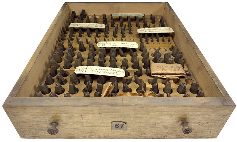
Above: Stiftung Deutsches Technikmuseum Berlin, item number 1/2018/0443, drawer 67. Several all-caps titling faces from the Reichsdruckerei. While the smaller sizes of the fette breite Egyptienne Versalien at the back of the drawer probably originated in-house at the Decker printing office, I have not yet determined the source of the seriffed capitals in the front.
What was the Reichsdruckerei?
Let’s start with a short genealogy of the Bundesdruckerei. The institution was established at West Berlin in 1951 as a successor of the previous governments’ national printing houses: the Imperial Printing House, or Reichsdruckerei, and the Royal Prussian State Printing House, or Königlich Preußische Staatsdruckerei. The Bundesdruckerei’s location is on the former site of the Reichsdruckerei and Staatsdruckerei, and its building today incorporates some pre-WWII structural elements from the Reichsdruckerei.
The Reichsdruckerei was founded in 1879 when two governmental printing establishments were merged. The first of these was the already mentioned Königlich Preußische Staatsdruckerei, which itself had been established in 1851. The other was the Decker family’s Court Printing House, the Königlich Preußische Geheime Ober-Hofbuchdruckerei, which the imperial German government had purchased after Rudolf Ludwig von Decker’s death in 1877. Note that Rudolf Ludwig Decker and Rudolf Ludwig von Decker are the same person; he was ennobled in 1863 while his business celebrated its centenary.
In the 1750s, Georg Jacob Decker moved from Basel – where he had been part of that city’s printing Deckers – to Berlin. He married into the Grynaeus family and took over their printing office. Named Court Printer in 1763, he installed an in-house type foundry in 1767. The best-published source on the history of the Decker printing house is Nikolaus Weichselbaumer’s article “Die Druckerfamilie Decker und die klassizistische Typographie in Berlin um 1800,” published in Imprimatur N.F. XXV (2017). Weichselbaumer also discusses the foundry and its typefaces, although most of the punches in the Bundesdruckerei cabinets were probably cut after the period his article focuses on.
Like the Decker office it partially grew out of, the Reichsdruckerei also had an in-house type foundry, which created typefaces for use in its publications. While I think that Decker sold type to other printers, the Reichsdruckerei probably did not engage in commercial type founding. The most “famous” typefaces designed and cut at the Reichsdruckerei are probably those designed by Georg Schiller, who was then an imperial engraver there. These are the Neudeutsch, Borussia, Germania, Reichsdruckerei Fraktur, and Reichsdruckerei Mediäval-Antiqua typefaces, which were all produced between about 1899 and 1905. At least for Neudeutsch, a few commercial foundries acquired duplicate matrices, allowing them to cast their own fonts of the typeface to sell to their customers.
The Reichsdruckerei also acquired punches from other sources, including those for a few academic typefaces cut by Ferdinand Theinhardt, which they got by way of the Königlich Preußische Akademie der Wissenschaften. Those fonts were also sold by Theinhardt’s foundry, and then by Berthold, after Berthold’s acquisition of the Ferd. Theinhardt business. Printers would not have needed to procure these fonts from the Reichsdruckerei, since there was always another source.
George Schiller: engraver, type designer, and punchcutter?
Over the last few years, I have tried to figure out whether Schiller cut the punches for the typefaces he designed himself. If he did this, I would also like to be able to determine whether he cut the punches for all of their sizes himself, or if he only cut certain sizes, and then allowed other punchcutters to build the faces’ size ranges out. To try and gain an understanding of what might have happened, I’ve read statements in publications by him and about him, as well as the introductions to the type specimen brochures for the typefaces that he designed for commercial type foundries published (that happened between about 1905 and 1914, after he left the Reichsdruckerei to become a professor for engraving at the Leipzig Academy, which must have freed him up to take independent commissions). My current hypothesis is that he probably cut the trial sizes for some of his commercial typefaces, but that employees at the foundries producing them made most of the sizes themselves, based on resized photographs from prints made of what he had cut (e.g., at the C.F. Rühl and Ludwig & Mayer foundries). Additionally, Schiller probably cut the punches for the typeface he designed for the Leipzig Academy.
Based on a Reichsdruckerei text from 1929, I think that Schiller also cut the punches for his Reichsdruckerei typefaces himself, ot at least for Neudeutsch, Borussia, and Germania. This text was a passage on the Reichsdruckerei’s type foundry in the Reichsdruckerei’s 1929 Festschrift, made to celebrate the printing office’s fiftieth anniversary – Fünfzig Jahre Reichsdruckerei 1879–1929, edited by the Reichsdruckerei’s direction and the typographic historian Ernst Crous. Its type foundry section was reprinted by the Reichsdruckerei for the July 1931 issue of the Archiv für Buchgewerbe und Gebrauchsgraphik printing journal, too (see pages 235–236 of this Reichsdruckerei text for mentions of Schiller’s punchcutting).

Above: Stiftung Deutsches Technikmuseum Berlin, item number 1/2018/0443, top part of the cabinet. This is stored in the museum’s offsite Außendepot. It is 1.47 meters wide, 1.41 meters tall, and 0.48 meters deep. It has 48 drawers, numbered from 37 through 84. Each drawer is 34 centimetres wide, 8.5 cm tall, and 43 cm deep. Its bottom part (not pictured) is shorter, measuring 1.47 meters wide, 0.94 meters tall, and 0.58 meters deep. That has 28 drawers, numbered 106 through 133. Each drawer in the cabinet’s bottom part measure 34 cm wide, 9 cm tall, and 49 cm deep. The cabinet inside the museum – also not shown here – is narrower than the one at the Außendepot, with only 36 drawers in its top and 21 in its bottom parts.
Division of materials between collections
Aside from punches, at least some of the Decker/Reichsdruckerei’s other type-making equipment survived the Second World War. During the 1980s, the Bundesdruckerei sold their punches to the Museum für Verkehr und Technik in West Berlin. But that museum – now the Stiftung Deutsches Technikmuseum Berlin – did not receive the Decker/Reichsdruckerei matrices or the fonts of type from the Bundesdruckerei’s letterpress printing office. Today, the Decker/Reichsdruckerei matrices are part of the Museum für Druckkunst Leipzig’s collections, while the fonts of type are at the Offizin Haag-Drugulin in Dresden.
This division is significant; there are several typefaces whose hand-cut steel punches are in Berlin, while their copper matrices are kept in Leipzig, and the fonts cast from those matrices are in Dresden. More Decker and Reichsdruckerei catalogues are held in nearby Berlin libraries like the Kunstbibliothek and the Staatsbibliothek than at the Deutsches Technikmuseum. In other words, it is not possible to compare the punches, matrices, cast fonts of type, and printed type specimens for any single Decker/Reichsdruckerei typeface at the same time in one place. Nevertheless, I do not want this paragraph to sound like a complaint: it is a wonder that all this material survived into the twenty-first century at all.
How many punches were cut at the Reichsdruckerei?
The fiftieth anniversary Festschrift I mentioned above stated that “the number of punches created [at the Reichsdruckerei] was in the thousands, and those of the justified matrices in the tens of thousands” (my translation; see page 234 of the original text). Decker and the Reichsdruckerei each sold typefaces whose matrices they purchased from other foundries. This enabled them to offer many more fonts of type than what they created themselves, as was still normal for type foundries at that time. I have not attempted to count the punches in the Bundesdruckerei cabinet at the Außendepot, nor have I been able to look in most of the drawers from the cabinet in the museum’s printing exhibit; however, by my “back-of-the-envelope” estimate, the total number of punches at the Deutsches Technikmuseum from the Bundesdruckerei – including punches from Decker, the Reichsdruckerei, and other sources like Theinhardt’s work for the Akademie der Wissenschaften – could easily be over 20,000.
Above: Stiftung Deutsches Technikmuseum Berlin, item number 1/2018/0443, drawer 68. In this photograph, the bottom three rows contain punches for a 32-pt slab serif typeface called the fette breite Egyptienne Versalien. This is probably the product numbered 113 in Decker’s catalogues [Google Books link], even though they labelled the typeface’s size as grobe Kanon instead of kleine Kanon. According to Reichsdruckerei catalogues, their grobe Kanon-sized fonts measured 40 Didot points.
About the objects
All of the Reichsdruckerei punches are stored in two large wooden cabinets purpose-built at the Reichsdruckerei or later Bundesdruckerei. While smaller of these two cabinets is in the printing exhibition within the Deutsches Technikmuseum itself, a larger one is kept in the museum’s offsite storage facility. The existence of that offsite cabinet was generally not known outside of the museum. Together, the two cabinets contain 133 drawers. Some of those drawers have the steel punches for as many as four or more different fonts of type inside them. Other typefaces have so many punches – or are large-sized, with correspondingly big punches – that the materials for a single font take up several drawers. So far, I have only photographed the punches from the second cabinet held in the museum’s Außendepot storarge facility. At a later date, I hope to photograph the contents of the cabinet exhibited inside the museum iteself.
I first asked the museum about the contents of the Reichsdruckerei cabinet in their printing exhibition because I hoped it contained the punches for two typefaces in particular. The first of those was an all-caps sans serif design from around the year 1850 that Decker and later the Reichsdruckerei showed in their catalogues and called the Monumental-Versalien. Fritz Grögel wrote eloquently about this typeface and its visual connection to lettering on city monuments in Karbid and the Journal für Druckgeschichte. The second set of punches I hoped were present were the Egyptian hieroglyphs cut by August Beyerhaus and Ferdinand Theinhardt for Karl Richard Lepsius.

Above: Stiftung Deutsches Technikmuseum Berlin, item number 1/2018/0443, drawer 69. Punches for six sizes of Decker’s (fette) Monumental-Versalien, first shown in 1850. Those sizes are Korpus, Cicero, Mittel, Tertia, Text, and Doppelcicero – or approximately 10, 12, 14, 16, 20, and 28 Didot points.
Monumental-Versalien
Monumental-Versalien is an interesting design because it is one of the first sans serif typefaces sold in Germany to include a wide range of sizes. It is also quite similar in appearance to Handel Gothic, an American typeface from the 1960s. Decker sold seventeen sizes of the base typeface, which would later be renamed fette Monumental-Versalien, or “bold Monumental capitals” (the Monumental types were all-caps designs). That size-range included 6, 8, 10, 12, 14, 16, 20, 24, 28, 32, 40, 52, 60, 72, 84, 108, and 132-pt fonts. Already in the 1850s, Decker sold a drop-shadowed member of the Monumental-Versalien family, but only in one 32-pt sized font.
Decker also had a font of macthing initials. These were two-dimensional flat representations of the Monumental-Versalien letters, superimposed on floral backgrounds. Interestingly, the letterforms inside those initials aren’t the same size as any of the Monumental-Versalien fonts’ characters; they are somewhere between the 32 and 40-pt in size. By 1867, Decker added lighter-weight fonts of Monumental-Versalien to his catalogue, but only in small sizes (e.g., 4–10 pt). Decker’s 1867 catalogue also contained another Monumental-Versalien extension called Schmale Monumental, or “Monumental Condensed.” This was only available in large sizes – from 40 to 72 pt – and its letterforms diverge somewhat from the original Monumental-Versalien’s. Its R has a very prominent out-stroke, etc.

Above: Stiftung Deutsches Technikmuseum Berlin, item number 1/2018/0443, drawer 70. Hand-cut typographic steel punches for the 28-pt size of the Decker foundry’s (fette) Monumental-Versalien.
I’m not sure where all the Monumental-Versalien sizes came from. Symbols placed next to each font in Decker’s 1851 catalogue indicate that only the smaller sizes were cut in-house at Decker. Those same symbols appear again in the Reichsdruckerei’s 1886 catalogue. The symbols identify the Nonpareille through Doppelmittel – or 6–28 pt – sizes of the typeface as in-house products. The larger sizes, as well as the drop-shadowed font and the initials, do not contain indications next to their names in the above-mentioned catalogues. This means that Decker’s matrices for those fonts almost certainly came from an external source. However, I have not yet found specimens of the larger sizes of the Monumental-Versalien design in any other type foundry’s catalogues. The similarly named and designed Monumental-Schrift, which Trowitzsch & Sohn – another Berlin printing house with a type foundry – advertised in an 1856 issue of Journal für Buchdruckerkunst, is not a match. You can have a look at the Monumental-Versalien sizes cut at Decker on this page of the 1862 Decker catalogue.

Above: Stiftung Deutsches Technikmuseum Berlin, item number 1/2018/0443, drawer 70. Hand-cut typographic steel punch for the Æ sort from the 28-pt size of the Decker foundry’s (fette) Monumental-Versalien.
Anyway, I found what I was looking for. The punches for the nine sizes of the (fette) Monumental-Versalien cut at Decker’s printing house are part of the Bundesdruckerei holdings at the Deutsches Technikmuseum. These are probably the oldest typographic steel punches for a sans serif typeface that survive in Germany today. The cabinet also contained the punches for the small, light extension to the Monumental-Versalien.

Above: Stiftung Deutsches Technikmuseum Berlin, item number 1/2018/0443, drawer 117. First of ten drawers containing the steel punches of the hieroglyphs cut by August Beyerhaus and Ferdinand Theinhardt for Karl Richard Lepsius during the mid-nineteenth century. Later acquired by the Reichsdruckerei from the Königlich Preußische Akademie der Wissenschaften.
Hieroglyphs
In the 1840s, August Beyerhaus began cutting punches for a hieroglyphs typeface, based on drawings made by Ernst Weidenbach, who had accompanied the Egyptologist Karl Richard Lepsius on a Prussian archaeological expedition to Egypt. In 1851, this work was transferred to the punchcutter Ferdinand Theinhardt, who had just opened a type foundry in the then-northern part of Berlin. Theinhardt had a long career and was successful both in the cutting as well as in the casting and selling of type. Nevertheless, I believe that his reputation during the last quarter of the nineteenth-century – and the first quarter-or-so of the twentieth – was based in large part on the success of his hieroglyph types. In 1875, Theinhardt published a specimen of his hieroglyphs, which Google Books has digitized – see the Liste der hieroglyphischen Typen aus der Schriftgiesserei des Herrn F. Theinhardt in Berlin. According to Theinhardt, he cut over 2,000 punches for Lepsius, and even financed part of the project himself.

Above: Stiftung Deutsches Technikmuseum Berlin, item number 1/2018/0443, drawer 117. Steel typographic punch cut for Karl Richard Lepsius by August Beyerhaus or Ferdinand Theinhardt. Probably acquired by the Reichsdruckerei from the Königlich Preußische Akademie der Wissenschaften.
As I mentioned in this previous post on Theinhardt’s hieroglyphs, the Museum für Druckkunst Leipzig has two sets of matrices for that typeface. One set is from the Holzhausen printing house in Vienna, which specialized in foreign-language printing. The other is the Reichsdruckerei’s set.

Above: Stiftung Deutsches Technikmuseum Berlin, item number 1/2018/0443, drawer 126. Copper matrices for nine hieroglyphic punches cut for Karl Richard Lepsius by August Beyerhaus and Ferdinand Theinhardt. These were almost certainly struck inside Ferdinand Theinhardt’s type foundry, and later acquired by the Reichsdruckerei from the Königlich Preußische Akademie der Wissenschaften.
Other type-making artefacts in the collection
This Außendepot cabinet also contained two of the Reichsdruckerei’s Künstlerschriften, or so-called “artistic typefaces,” from around 1900: the Niebelungenschrift designed by Josef Sattler and produced between 1897 and 1904, as well as the regular and bold Reichsdruckerei Mediäval-Antiqua designed by Georg Schiller, circa 1905. Almost no Fraktur punches are stored inside the Außendepot cabinet; based on the printing exhibition inside the museum, it is clear that the cabinet shown there has several Decker/Reichsdruckei blackletters inside of it. I suspect that virtually all the Fraktur punches cut at those printing houses are stored in the museum cabinet. I hope that more Künstlerschriften are in there, too.
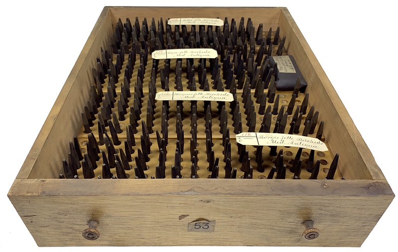
Above: Stiftung Deutsches Technikmuseum Berlin, item number 1/2018/0443, drawer 53. Steel punches for four sizes of Georg Schiller’s fette Reichsdruckerei Mediäval-Antiqua. These are the Borgis, Corpus, Cicero, and Mittel sizes – or 9, 10, 12, and 14 pt. They were probably cut at the Reichsdruckerei in or around 1905.
While I mentioned above that I think Georg Schiller cut the punches for the Reichsdruckerei’s Neudeutsch, Borussia, and Germania typefaces himself – in addition to designing those typefaces’ appearances – I am less sure that he cut the punches for the Reichsdruckerei Mediäval-Antiqua. The same Reichsdruckerei Festschrift that praised Schiller’s earlier designs was somewhat critical of this latter typeface, stating that “the roman typeface called the Reichsdruckerei-Mediäval is well worked out technically, but its effect and usage possibilities are far behind those of the [Reichsdruckerei-Fraktur, also designed by Schiller]” (my translation; see page 236 of the original text).
Several drawers in the cabinet also include wrapped-paper packages. Sometimes, these contained more punches. Other times, like in the top-right part of the photo above, they contained raised letterforms cut out of brass [click here to see those]. Non-punch masters like these were used to create matrices via electrotyping, rather than the traditional method of striking copper bars with steel punches. Below is another example showing five plates of brass, onto which 30 raised decorative initials have been cut. Cutting these initials out of brass – and using those masters to create electrotyped matrices for casting the sorts – must have easier than more traditional processes for designs like this.

Above: Stiftung Deutsches Technikmuseum Berlin, item number 1/2018/0443, drawer 54. Raised initials engraved in brass, which go with Joseph Sattler’s Niebelungen typeface. These plates would have been used to create 30 electrotyped matrices for casting. They were probably engraved at the Reichsdruckerei between about 1897 and 1902.
This is the end of my post, but not the conclusion of my project
To date, I have photographed a little more than half of the drawers from the Bundesdruckerei collection at the Deutsches Technikmuseum. Sometime this year, I hope to repeat my efforts for the contents of the cabinet in the museum’s printing exhibition. Additionally, I hope to find a better way of photographing individual punches, especially ones cut for very small type sizes. In the future, I may expand my data set to include more information about the punches themselves, including how many punches were cut per font, and which characters appear on the respective punches, etc.