In December 2019, the third issue of Cast it became available. This republishes an eighteenth-century description of typefounding from Johann Samuel Halle, as well as my translation of his German text into English. Cast it is a series of printed specimens showcasing the typefaces of the Italian digital font foundry CAST – Cooperativa Anonima Servizi Tipografici. The series is published by Lazy Dog Books. Every type specimen needs some sort of underlying text to use, in which its typefaces are set. Often, these “texts” are just strings of random words or phrases from multiple languages, and cannot be read. Instead, they are just for looking at. Since the primary purpose of a type specimen is to convince font customers – graphic designers and others – to want to use that typeface for a specific purpose, it is not strictly necessary for a type specimen’s text to have a narrative. This has always been the case, going back to the fifteenth century.
Throughout the history of typography, there have been exceptions, e.g., all the text blocks on a specimen page might together contain the text of a speech from a Cicero, a contemporary monarch, or some other notable person. Other foundries have used a single essay as the underlying text for a specimen. Indeed, entire magazines like U&lc and Emigre may be considered type specimens (in those cases, for the typefaces developed by the International Typeface Corporation – ITC for short – and Emigre Fonts, respectively). More recently, Henning Skibbe published the first issue of Characters, “a blend of type magazine and a typeface specimen … a specimag.” I hope that more issues follow the premiere number that debuted in 2019.
About Cast it
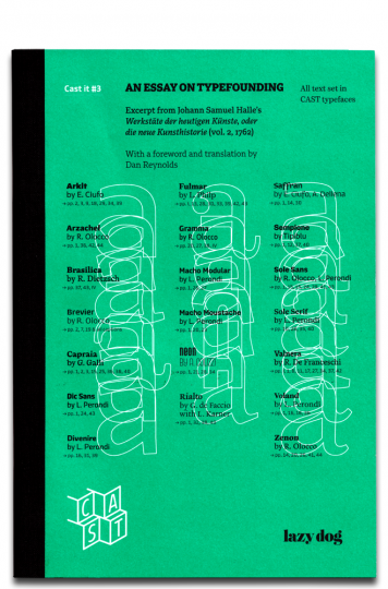
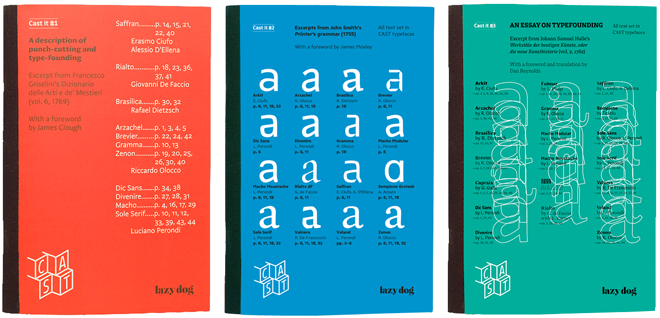
The texts in Cast it are works from the history of printing, introduced by researchers. The first issue was published in 2016. It reprinted an excerpt from Francesco Griselini’s 1769 Dizonario delle Arti e de’ Mestieri on punch-cutting and type-founding. This was in the original Italian, with an English-language foreword by James Clough. Cast it #2, which followed in 2017, reprinted excerpts from John Smith’s 1755 Printer’s grammar, with a foreword by James Mosley. Cast it #3, already mentioned, reprinted most of Johann Samuel Halle’s 1762 essay on typefounding. This ran in its original German, together with my translation into English, and an English-language foreword that I wrote.
That essay originally appeared in the second volume of Halle’s Werkstäte der heutigen Künste, oder die neue Kunsthistorie. This encyclopaedia-like series described the trades of the day. It was published in Brandenberg an der Havel and Leipzig between 1761 and 1779. Johann Samuel Halle (1727–1810) was an academic and a Prussian civil servant. His description of typefounding is probably the first detailed text on the subject printed in German to have been written by someone who was neither a printer nor any other kind of tradesman.
Cast it #3 was edited by Massimo Gonzato and Riccardo Olocco. The layout is from Tipiblu. The best way to buy the issue is to order it directly from the publisher, who sells it for just €13, plus shipping: https://lazydog.eu/product/cast-it-3/
Johann Samuel Halle and his essay’s publication history
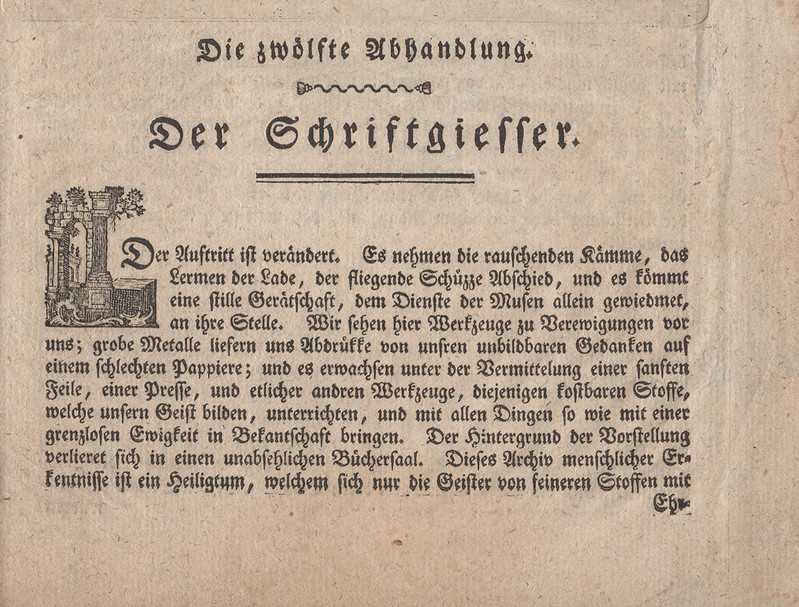
Born at Bartenstein in East Prussia, Johann Samuel Halle became a professor of history at the Königlich-preußische Kadetten-Corps at Berlin in 1760. His Werkstäte der heutigen Künste, oder die neue Kunsthistorie series ran through six volumes. A second edition of the complete volumes was never published; however, each one has been digitised and is available online and as print-on-demand books. The volume that Halle’s essay on typefounding appears in – in German, the essay is entitled Der Schriftgiesser – includes descriptions of several trades involved in book production: Der Schriftgiesser is followed by an essay on printing, and there are also essays on bookbinding and paper-making. Der Schriftgiesser is not mentioned on the various lists I am aware of that compile early typefounding literature and which have been published during the last three-quarters of a century. However, at least some people working in German typefounding a century ago were familiar with the text.
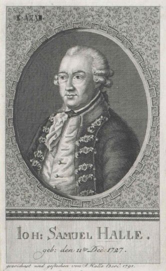
Above: 1791 portrait by of Johann Samuel Halle by his son, the copperplate engraver Johann Samuel Ludwig Halle (1763–1829).
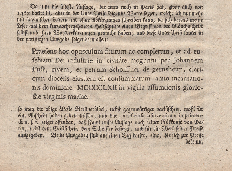
In 1922, Wilhelm Woellmer’s typefoundry in Berlin published a new edition of Johann Samuel Halle’s Der Schriftgiesser text in an edition of 300 copies. This was a keepsake for the 26 September 1922 meeting of the Verein Deutscher Schriftgießereien made in Woellmer’s in-house printing office. Its text was composed in one of the foundry’s typefaces (Deutsche Reichs-Schrift), which was a Fraktur – indeed, the original 1762 text was also entirely set in Fraktur type. In a way, Woellmer’s edition is also a type specimen – just like CAST’s – even though their 1922 printing was more about disseminating a rare historic text, and not being a vehicle to market a printing product. Woellmer’s edition of the Schriftgiesser essay was cited in Die deutsche Schriftgießerei, eine gewerbliche Bibliographie, a grand bibliography of texts on every aspect of typefounding that was published in 1923 by the H. Berthold AG’s in-house printing office, also at Berlin.
As in Woellmer’s 1922 edition and CAST’s specimen, other individual essays from Halle’s Werkstäte der heutigen Künste, oder die neue Kunsthistorie have been republished in the twentieth and twenty-first centuries. For example, the Papierfabrik Kabel in Hagen-Kabel/Germany published a facsimile edition of Halle’s paper-making essay in 1954. The Buchateiler Bischoff in Lehrte-Arpke/Germany produced a facsimile edition of Halle’s bookbinding essay in 2015.
Above: Neither Werkstäte with one “t” nor Schriftgiesser without a “ß” is a typo. More or less, we followed Halle’s particular spelling in this issue. That’s explained in the foreword, too.
Because of my interest in the texts read by early twentieth-century German typographic historians, I recommended Halle’s essay to CAST when they asked for an early treatise on typefounding in German, despite another description by a non-practitioner also being available – Otto Ludwig Hartwig’s in P.N. Sprengels Handwerke und Künste, fortgesetzt von O.L. Hartwig, published at Berlin in 1771. Hartwig’s text is better written, but it is too long for bilingual reprinting in Cast it, and he did not have the republication history within the German typefounding industry that Halle did.
Some pages from Halle’s series contain footers reading »Hallens Werkstäte der Künste …« Our author’s name on all six title pages in the series also reads »Johann Samuel Hallens«. In each case, the “ns” added after Halle’s last name denotes the genitive case. This is used instead of just an “s” because the surname Halle is a so-called weak noun in German.
When it came to determining proper English-language terminology, I principally relied on two sources. The first was the 1995 edition of Harry Carter’s 1930 translation of Pierre Simon Fournier le jeune’s 1764–66 Manuel Typographique. Particularly for the parts of a hand-held casting mould, I consulted Stan Nelson’s “Mould Making, Matrix Fitting, and Hand Casting,” published in Visible Language (Winter 1985). I had difficulty finding definitions in clear, more contemporary German for some terms, and in determining what those terms’ equivalent names in English would be. The aptest example is the Besehblech, which I called a “lining gauge.”
The Werkstäte’s typefaces
I have not found any evidence that the Werkstäte’s printers cast their type. However, I have not compared the typefaces used to print the series with surviving eighteenth-century type specimens to see where they might have bought their fonts from. If I ever do such a comparison, I would start by looking at the various sizes of the type used throughout the book, as well as the typefaces used in the printing essay. Unlike the typefounding essay, this includes a sample paragraph in roman letters. That is composed with real type, rather than a woodblock or copperplate illustration.
Above: Various sizes of Fraktur text from the opening page of Halle’s essay on typefounding.
Above: Page 98 from Johann Samuel Halle’s essay on printing showing a Latin text composed with roman type.
Brandenberg an der Havel is not known as a center of typefounding. Eventually, another Brandenberg printing office named Hessenland would cast type. Yet, as Johann Valentin Hessenland Sr. only received a concession to open his printing business in 1762, he is an unlikely supplier for the type in Halle’s second volume. At this time, Berlin only had one typefoundry. I have not yet looked into which typefoundries might have operated in nearby Magdeburg, Halle, or Braunschweig at that time – but I suspect that the most likely source of this book’s type was a typefoundry in Leipzig. In the early 1760s, several typefoundries were running in that city.
Sources Johann Samuel Halle may have relied on
As I describe in my foreword, the sources that Johann Samuel Halle relied on for some of his essays remains a mystery. He was also accused of plagiarism on at least one occasion. In 1762, two essays from Halle’s first volume came under fire in the Berlin journal Briefe, die neueste Litteratur betreffend. Published by Friedrich Nicolai, this journal included articles written by Gotthold Ephraim Lessing, Moses Mendelsohn, and Nicolai himself – but all texts were printed anonymously. Halle’s critic addressed the essays on painting and copperplate engraving; he only signed himself off with an “S.” The review accused Halle of having his painting essay be an unattributed copy of Antoine-Joseph Pernety’s Traité pratique des différentes manières de peindre. I also discuss French sources for his second volume’s essays in my foreword. I don’t want to spoil that text, but the short of it is: while his printing and other book-trades essays were probably based on French texts, the same cannot be said for his typefounding essay.
In that essay, Halle relied heavily on at least two German-language texts that had been published in 1740. Cast it #3 reproduces forty-nine paragraphs from Halle’s essay. In at least twenty-two of those paragraphs, Halle seems to me to be paraphrasing one of those texts, while half a dozen paragraphs and an accompanying copperplate showing printing and typefounding instruments seems to paraphrase the other. For instance, Halle’s text about how large-sized types were cast from lead matrices likely came directly from Die so nöthig als nützliche Buchdruckerkunst und Schriftgießerey, vol. 1 (Leipzig, 1740). Compare Halle’s:
… die groben Schriften werden anfangs nicht in Stal, sondern in Messing geschnitten, und man giesset sie alsdenn von bleiernen Matricen ab, dergleichen geschicht mit den Kanon- und Missalschriften …
… with this passage from Die so nöthig als nützliche Buchdruckerkunst und Schriftgießerey’s text:
… die groben Schriften, zum Exempel, Canon, Missal etc. werden nicht in Stahl, sondern in Meßing geschnitten. Denn so grosse Schriften gebraucht man nur eine kleine Anzahl in den Druckereyen, die also aus bleyern Matricen, obwohl sehr langsam, erlanget werden können.
Halle’s images
In both the 1762 original of Halle’s essay and Woellmer’s 1922 edition, the text itself is bookended with images. These are copperplates, and the first of the two images shows five people working inside a typefoundry setting. I suspect that this is an idealized depiction, but it is still one of the earliest typefoundry-at-work scenes to have been printed – despite larger, more iconic copperplates like the one accompanying Joh. Enschedé en Zonen’s 1768 specimen probably offering more accurate information. Since these images were not reproduced in Cast it #3, I show them here. They are scanned from my copy of Halle’s original 1762 typefounding and printing essays.
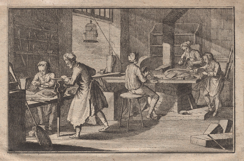
I took the above image from page 63 of the second volume of Johann Samuel Halle’s Werkstäte der heutigen Künste, oder die neue Kunsthistorie. This was printed in 1762 by the unrelated Johann Samuel Halle and Johann Wendelin Halle in Brandenburg an der Havel. Page 73 of Halle’s original text includes a short description of this plate, which reads:
Die Vignette beschäftigt sich mit dem Schriftgiessen in das vierekkige Inſtrument, worinnen ein gegossner Buchstabe sein Enstehn bekömmt. Einige Personen befeilen die stälernen Schriftstempel.
The vignette deals with the casting of type in the rectangular instrument, inside of which a cast letter is created. A few people file the steel typographic punches.
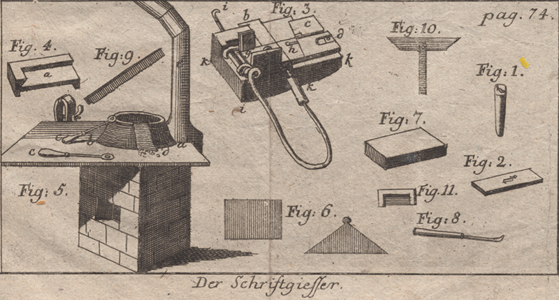
The above image is from the bottom of a full-page copperplate reproducing the instruments of both printing and typefounding. You can see that whole plate on Flickr.
In comparison with the 1740 plate I’ve mentioned, Halle’s illustration has less detail, particularly for the casting instrument and stove. But it also includes two items the “inspiration” did not: a punch and a matrix.
In my translation, Halle’s explanation of the items (i.e., the figures) on this plate reads:
- shows the patrix, or the steel punch with the letter i. The punchcutter strikes this punch forcefully
- into the copper matrix, creating an impression.
- is the casting instrument, into which the matrix is put, and quasi from the womb of this copper, a leaden letter will be cast a few thousand times, with which one prints books. The instrument has two equal-shaped halves, which one joins together during casting, and which are then taken apart again afterwards. The parts are called: (a) the wings, (b) is the mouthpiece, (c) the base plate, (d) the carriage, (e) the stool, and at the same time the place where the copper matrix is vertically inserted, in order for it to be held by the loose part of the spring, (f) is the bow made of wound brass wire, with which one holds the instrument in the hand, (g) is the body with the signature groove (h), (i) is the hook to pull the cast letter out of the instrument with, (k) is the wooden insulator protecting against the heat of the brass instrument.
- The solid brass type-high gauge used to check whether the cast letters, instrument parts, and other tools are exactly right-angled or not. (a) are the sorts lying next to each other inside of it.
- The casting stove. On that is (a) the workbench, under which the furnace is installed. (b) the iron pan containing the liquified type metal. (c) two spoons leaning on the bench, used for casting small typefaces. (d) tilted sheets of metal leaning against the pan to catch drops as one ladles out the metal, so that they do not fall on the table. (e) the steam tube that carries smoke out of the room.
- The lining gauge, for setting on a row of letters to see if they all have the same thickness.
- The brass block, a flat surface where the letters are laid side by side, so that they may be viewed with the lining gauge.
- A finished sort (a) as it comes out of the instrument, with a long casting jet, which is broken off at (b).
- A composing stick, which is a long wooden ruler, into whose right-angled cutout one can set a long row of letters to smooth down their broad surfaces down.
- Cross gauge with the form of a roman T, on which the upper crossbar is movable and can be pushed up and down as needed, in order to make its inner angle towards the parts of the instrument large or small.
- The body gauge is a filled-in brass angle bracket or composing stick, used for giving the body right angles.