Above, a cropped scan of the cover page from an undated VEB Typoart Dresden brochure.
In December 2015, I attended a lovely conference in Dublin called Face Forward. I presented a paper entitled “East German typefaces: 25 years on.” After the conference, I wrote up a proper version of that paper, for a publication that the Face Forward organizers were planning. Their peer reviewers made some helpful suggestions, which improved the focus of my article. Nevertheless, several years have now gone by, and the publication does not seem like it is going to materialize. There is no recording of my conference presentation, either. So I have decided to publish the paper here. Thank you very much to all the Face Forward organizers, and to their anonymous peer reviews for their feedback as well!
Before you venture into this post, dear reader, I should explain that this overview of type production in the former East Germany is just a short introduction to the topic. At least ten times more research and a hundred times more text would be needed to do the subject the justice I think it deserves. If you only have little time, I urge you to skip the article and just head for the footnotes at the end – the text in them makes up about half of this post. Personally, I think that my details there are more exciting than the main article. You’ll find a number of literature suggestions in the footnotes, too.
Finally, the text in this post is about three-and-a-half years old. I think that I am a better researcher and a better writer than I was then, and I am not entirely pleased with my treatment of the subject below. Nevertheless, I think that this post will offer readers a better introduction into type-making in the former East Germany than any other article available online or in print in the English language. The information here is probably new to most of my English-speaking readers. My German friends probably already know all of this, and will find me a bit dull here.
Abstract
While the founding of the German Democratic Republic (GDR) in October 1949 might have seemed provisional, the East German state experienced a parallel existence alongside Western Europe for four decades. Most typesetting in that country employed typefaces produced by the state-owned type foundry, VEB Typoart. Following East Germany’s collapse, most Typoart products disappeared from the market after the early 1990s; however, in recent years, revisions and new interpretations of several of them have been designed. A short list includes Leipziger Antiqua, Liberta, Maxima, Minima, and Super-Grotesk. Created in an economy of scarcity, GDR design has lessons to offer practitioners working in today’s environment, where almost anything may be produced, whether it is even desirable.
Introduction
“East Germany” is an unofficial English-language designation for the German Democratic Republic,[1] a country that existed between 1949 and 1990 inside of what is now the northeastern part of the Federal Republic of Germany. After World War II, the victorious Allied powers divided Germany into four occupied zones.[2] The areas under American, British, and French control formed the geographic basis for the Federal Republic of Germany[3] founded in 1949.[4] The GDR was a socialist state established that same year, in the Soviet zone. Four decades later – on 3 October 1990 – it joined the Federal Republic of Germany (West Germany, or the BRD). At that time, the German state established the national borders that it has had since.
Before the war, the area comprising the GDR had a thriving professional-community of lithographers, printers, and typesetters; particularly in cities like Berlin, Dresden, and Leipzig. Not to mention poster designers, typeface designers, and type foundries, too. They continued their work after 1945. Operating under socialism, designers in the GDR experienced shortages and restrictions their counterparts in West Germany would not have been familiar with. The experiences of GDR designers were likely similar to those working all across the Eastern Block.[5] For typographers, there may have been some “positive” features:
- The GDR considered itself as a society that valued books. As a governmental and economic system, socialism made frequent use of foundational texts.[6]
- State officials encouraged reading, and there is some anecdotal evidence that their efforts were successful. For instance, during the first of six international book arts exhibitions that the GDR organised in Leipzig between 1959 and 1989, that event’s catalogue stated that the average sale price of a book was lower in the GDR than in West Germany, and that GDR citizens also purchased almost twice as many books per year on average as their West German counterparts did.[7]
- According to a history of the GDR’s book trade published in 1970 – about the mid-point of the GDR’s history – the authors reported that, during the 1960s, it had been assumed that every East German household would soon build up a small personal library of its own.[8]
- At that time, there were more than 70 different publishing houses in the GDR.[9]
Writing in 2007, Simone Barck stated that, although the GDR was one of the countries with the highest number of books produced per head in the world, its reputation as a “reading country” might not have been as correct as presented.[10] It seems unlikely that the predicted “library in every home” was ever a nationwide reality.
This post discusses typefaces that designers working within the GDR would have had available for use. It rests on three theses:
- The typeface palette of VEB Typoart,[11] the GDR’s state-owned type foundry, was one of the most aesthetically notable examples produced by a type-making company during the twentieth century.
- Typesetting in the GDR had more in common, materially, with Western European “capitalist” countries than might be expected.
- GDR design has lessons applicable for designers working today.
Font availability
Design schools still run today in locations like Berlin-Weißensee, Halle, Leipzig, and Weimar – where generations of designers were educated in GDR-times. Within the geographical area that comprised the GDR, many of the designers now engaging with East German typefaces are too young to have worked in the GDR itself. Liner Notes from Spector Books,[12] a text about book design in Leipzig published in 2009, includes several dialogues between fictional designers. These take place at an imaginary six-day-long jury meeting, but the books discussed are real.[13] I think that Liner Notes is the best example of designers working in the territory of the former East Germany – who were too young to have worked in that country professionally – presenting their views of that system’s typography that I have found.
Liner Notes’s text is composed with Leipziger Antiqua and Maxima, two Typoart typefaces mentioned in this post. Regarding designers’ reactions to the number of fonts available today, one protagonist states in the book’s typography dialogue that “you get the impression that the designers behave like customers in a supermarket. There is a culture of self-service. The choice of products is overwhelming.”[14] Although spoken by a fictional character, that sentiment is likely shared by many real designers – in eastern Germany today, as well as anywhere else in the world where languages are predominantly written with the Latin script.
You get the impression that the designers behave like customers in a supermarket. There is a culture of self-service. The choice of products is overwhelming.
Before desktop publishing in the 1980s, designers were dependent on the number and variety of fonts stocked either by individual printing establishments[15] or by photo-typesetting bureaus. They often had a limited palette of typefaces to choose from. On average, there would have been even less product diversity in the Eastern Block than in many North American or Western European countries; the number of font suppliers (type foundries) was also smaller in the GDR than the BRD.

Figure 1: In addition to manufacturing foundry type, Typoart’s Dresden factory reverse-engineered Linotype-matrix production, allowing them to create matrices that could be used on all Linotype-style line-casting machines. Image from Albert Kapr and Hans Fischer, Typoart Typenkunst (Leipzig: VEB Fachbuchverlag, 1973) pp. 106–7.

Figure 2: Linotype-style line-casting machines produced in the Soviet Union were used throughout the Eastern Block. These Neotypes – as well as surviving pre-WWII Intertype and Linotype machines – regularly needed new matrices to keep casting their lines of type, since line-casting matrices wore out with time. Photograph of a machine manufactured at Leningrad, taken in the Linotype Museum at Schopfheim, Germany in 2011.

Figure 3: Typoart produced matrices for the photo-typesetting machines of several manufacturers, including models from the USSR, the GDR, and the BRD. Image from Kapr and Fischer, Typoart Typenkunst, 110. The photograph on the left shows letters from the Maxima typeface. Both workers are likely involved in making photo-type matrices for the Linotron 505 machine. Imported from Linotype in West Germany, the Linotron 505 was probably the most-used photo-typesetter for book printing in the GDR.
Typoart emerged from the nationalization and merger of the two most-significant type foundries operating in the Soviet occupation zone after the Second World War: J.G. Schelter & Giesecke in Leipzig and Schriftguß AG vormals Brüder Butter in Dresden.[16] From 1961 until 1990, it was the only internal supplier of foundry type, line-casting matrices, and photo-type in the GDR. Typoart’s product catalogue retained some of the foundry types developed at their predecessor companies, before the Second World War and their later expropriation.[17] Typoart exported type to printers across Eastern Europe and the USSR,[18] as well as the BRD. Beginning in the 1970s, Typoart started working with digital tools, just as typefoundries in West Germany were doing. With the help of the Ikarus from URW in Hamburg, Typoart produced several typefaces in digital format.[19] URW also digitized five Typoart font families under license. They published Typoart’s Garamond, Hogarth-Script, Magna, Maxima, Stentor, and Timeless in 1985, allowing customers in the West to use designs in digital formats, too.[20] A few years later, the GDR’s collapse led to the gradual disappearance of most Typoart products from the graphic design landscape.
Figure 4: Erler-Versalien, a titling face designed by designed by Herbert Thannhaeuser, was named in honour of Otto Erler (1890–1965), a punchcutter who had joined Schelter & Giesecke in 1921 and had subsequently led the engraving department there, as well as at VEB Polygraph and VEB Typoart. Image from Albert Kapr, Deutsche Schriftkunst (Dresden: VEB Verlag der Kunst, 1955) p. 252. After Erler’s retirement from Typoart in 1957, he began working at the HGB; see Julia Blume and Fred Smeijers (ed.), One Century of Type and Teaching Typefaces in Leipzig (Leipzig: Institut für Buchkunst, 2010) p. 44–47 and 248. See also Monique Dickmanns, Leipziger Kegel: Zur Entwicklung der Schriftgießereien in Leipzig (Leipzig: Hochschule für Grafik und Buchkunst 2013), p. 110, as well as SED-Grundorganisation Typoart, Dresden (ed.), Die Entwicklung des Betriebes Typoart in Fakten und Daten 1945–1985 (Dresden: VEB Typoart, 1988.)
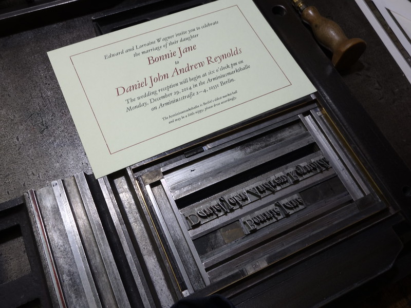
Figure 5: Typoart’s Garamond is a Jannon-style typeface – similar to the twentieth-century Garamond revivals from the American Type Founders Company and English Monotype – designed by Herbert Thannhaeuser. My wife and I specified it for our wedding invitations, composed and printed by Martin Z. Schröder in Berlin.
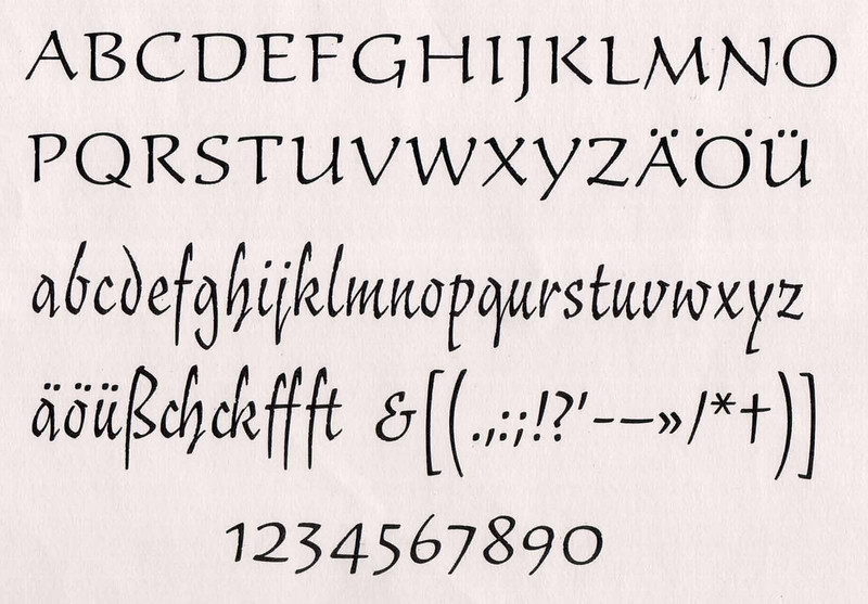
Figure 6: Typo-Skript is an upright informal handwriting-style typeface designed by Hildegard Korger. Image from Albert Kapr, Leipziger Schriftblätter. Schriftbeispiele des Fachgebiets Schrift der Hochschule für Grafik und Buchkunst Leipzig (Leipzig: Hochschule für Grafik und Buchkunst, 1977). Loose portfolio of prints, without page numbers.
Figure 7: Freundschafts-Antiqua is a serif typeface designed for use in Latin-script texts set together with text in Chinese characters. It was designed by Yü Bing-nan. A trial size was cut at the HGB by Otto Erler and cast at Typoart. Yü also designed an italic, but this was never cut; see Blume and Smeijers, One Century of Type, 245. The HGB has a digital version of Freundschafts-Antiqua that they used to set a 2014 exhibition catalog; see Julia Blume and Heidi Stecker, Freundschaftsantiqua (Leipzig: Hochschule für Grafik und Buchkunst, 2014).

Figure 8: This image from the jacket of Kapr and Schäfer, Fotosatzschriften, 1989 shows all the font families Typoart created for photo-typesetting (each family includes additional weights and styles not pictured).

Figure 9: Comparison of Times New Roman, Times, and Timeless’s digital versions.
To develop their typefaces, Typoart collaborated with designers from several professional categories. These included both internal staff and external freelance designers, as well as students and faculty members at the Hochschule für Grafik und Buchkunst Leipzig.[21] New typefaces produced by Typoart during the 1950s can best be described as traditional, or even historicist; three examples include Erler-Versalien, Liberta,[22] and Typoart Garamond. Herbert Thannhaeuser, Typoart’s first artistic director, died in 1963;[23] he was succeeded by Albert Kapr.[24] One of the GDR’s most-prominent book designers, calligraphers, and typographic authors, Kapr had been a professor at the HGB since 1951.[25] He fulfilled each of these professional roles for decades.[26] Several HGB students designed typefaces under his tutelage. At Typoart, he instituted a new programme of typeface development, based on the following four methods:
- Literal revivals of classic typefaces.[27]
- Designs based on broad-nib calligraphy.[29]
- Reinterpretations of existing typefaces or calligraphic styles.[29]
- Typefaces based on contemporary handwriting.[30]
In addition to Kapr’s own Faust-Antiqua and Leipziger Antiqua,[31] the HGB’s staff punchcutter Otto Erler engraved soft-metal punches (or “patrices”) for the trial sizes at least four typefaces designed by Kapr’s students. These were then cast as type at Typoart.[32] They included Gert Wunderlich’s Antiqua 58 and Maxima,[33] Hildegard Korger’s Typo-Skript,[34] and Yü Bing-nan’s Freundschafts-Antiqua.[35] “Western” typefaces would also be copied at Typoart; in addition to Garamond, the foundry would produce its own versions of typefaces like Baskerville, Clarendon, Eckmann, Janson, and Times New Roman.[36]
A few brief contextual points about Typoart
Typoart didn’t operate in isolation from other Eastern Block type foundries; for example, in a 1977 book, Kapr recalled a type founding “summit” that had taken place eight years earlier in Dresden. At that time, the socialist type foundries had determined that 25 text families would be enough choice to satisfy all possible applications throughout the entire Block. The range would include traditional serif faces, as well as more contemporary designs, and typefaces for newspaper-setting. At least twelve of the 25 text typefaces would still need to be produced, and the type foundries agreed to avoid parallel-developments, as well as to either phase-out unsuccessful typefaces, or improve them.[37]
Not all of the typefaces used in GDR design came from Typoart; many printing establishments still had stocks of foundry type and typesetting-machines that had survived the war.[38] Some typefaces and typesetting equipment from “Western” countries were also imported, particularly Berthold and Linotype photo-typesetting machines from West Germany.[39] When it came to creating camera-ready artwork for reproduction in offset printing, lettering played an important role, just as it would have in “Western” countries from the 1940s to the 1980s.[40] It was here that forms from foreign typefaces found their greatest use: GDR designers traced letters from “Western” type specimen. By cutting and pasting photographed-letters into strings of text, they could lay out collages, which could then be photographed and printed.
Typoart had fewer typefaces on offer than the West German type foundries – the Bauer’sche Gießerei, H. Berthold AG, Genzsch & Heyse, Gebr. Klingspor, Ludwig & Mayer, D. Stempel AG, Johannes Wagner, or C.E Weber.[41] While designers in the GDR did use type and letters from a variety of sources, they would have had to rely on Typoart fonts in many cases, in order for several kinds of documents to be printed.
A completely different font market after 1990
Typoart remained in business for a few years after German reunification. A 2007 publication produced at the Bauhaus University in Weimar under Jay Rutherford’s supervision states that, “Typoart GmbH had 100 employees [in 1995 and the typefaces] were sold as ‘PostScript fonts’ on diskettes … [The company was then] dissolved in a mysterious way. It is not clear whether bankruptcy was officially declared. [Because of this,] the widespread use of Typoart typefaces was hindered by their uncertain legal status.”[42]
I am not of the opinion that legal uncertainties were the real reason for their lack of use after the early 1990s. The explanation is likely more complicated, and rooted in the circumstances of Germany’s reunification. Over the preceding four decades, type foundries in the BRD had developed some of the most widely used typefaces in the world – including Frutiger, Helvetica, Optima, and Palatino, just to name a few examples. After reunification, as designers in the former GDR began to use desktop publishing software, it became easier than ever before for them to use “Western” fonts in their work. During the 1990s, many new typefaces were released as well. Even if one only considers the German market, new companies such as FontShop – with their FontFont library – introduced typefaces that would have been brand new for designers working in both the former East and West. The decision to use Typoart products in ones work would also have been, practically speaking, a conscious revival of designs from what could almost already have been called the pre-DTP era.[43]
Conclusion
This post presents a glimpse into the variety of typefaces that East German designers had available to them. A longer text would be able to present more statements from GDR designers about the motivations behind their type design. Particularly Albert Kapr wrote prolifically about this; statements from Hildegard Korger, Karl-Heinz Lange, and Gert Wunderlich – as well as from other GDR type designers – are also available. Further inquiry could bring in the views of GDR typographers and graphic designers who used these typefaces before 1990, as well as the views of designers from the multiple generations that have used them since. Almost 30 years have no past since Germany’s reunification. Perhaps it is time for more designers around the world to reevaluate the achievements of East German type designers, as well as those of the state-run type foundry, Typoart.
Footnotes
- In German, this state was called the Deutsche Demokratische Republik, and it referred to itself with the initials DDR (in English: GDR). While the state was often called “East Germany,” that designation was not preferred within the GDR itself.
- After the war, the territories located east of the Oder river – which had formed part of Germany before 1938 – were permanently ceded to Poland and the Soviet Union. Today, they make up parts of Poland and the Russian Federation, respectively.
- In German, this state was – and is – called the Bundesrepublik Deutschland. The German-language initials “BRD” are used in this post, in lieu of English-language abbreviations like FRG or FROG. Between 1949 and 1989, this BRD was often referred to as “West Germany.”
- The western portion of Berlin – surrounded by the East-German-built Berlin Wall from 1961 until 1989 – remained under American, British, and French administration. West Berlin also had locally-elected government. Its territory would not technically become part of one of the BRD’s federal states until after German reunification.
- By the term “Eastern Block,” this post refers to the Soviet Union, as well as to the Eastern European states that were signatories of the Warsaw Pact treaty.
- For example, the books by authors such as Karl Marx, Friedrich Engels, or Vladimir Lenin, etc.
- Supposedly, in circa 1959, BRD residents purchased 2.6 books per year per capita, with GDR residents purchasing 4.3; see anon. Internationale Buchkunst-Ausstellung Leipzig 1959 (Leipzig: Sekretariat der Internationalen Buchkunst-Ausstellung, 1959): p. 62
- Harry Fauth and Hans Hünich. »Zur Geschichte des Buchhandels der Deutschen Demokratischen Republik. Ein Abriß der Entwicklung des Buchhandels 1945–1970.« Karl-Heinz Kalhöfer and Helmut Rötzsch (ed.). Beiträge zur Geschichte des Buchwesens, no. 5. (Leipzig: VEB Fachbuchverlag, 1970): p. 145
- See Albert Kapr. Albert Kapr: Schrift- und Buchkunst. Aufsätze, Reden und künstlerische Arbeiten. (Leipzig: VEB Fachbuchverlag, 1982): p. 103
- See Simone Barck. »Fragmentarisches zur Literatur.« Helga Schultz and Hans-Jürgen Wagener (ed.). Die DDR im Rückblick: Politik, Wirtschaft, Gesellschaft, Kultur. (Berlin: Ch. Links, 2007): p. 331
- The letters VEB stand for Volkseigene Betrieb – literally, a nationally-owned enterprise.
- Spector Books was founded by three graduates of the Hochschule für Grafik und Buchkunst Leipzig: Markus Dreßen, Anne König, and Jan Wenzel. They were each students during the 1990s. Dreßen, a book designer, is now a professor of graphic design at the school. Liner Notes was edited by Spector Books’s three principals, together with Lina Grumm. Like Dreßen, König, and Wenzel, Grumm also studied at the HGB. Afterwards, she founded HIT Studio in London, where she works as a book designer. See Markus Dreßen, Lina Grumm, Anne König, and Jan Wenzel (ed.). Liner Notes: Gespräche über das Büchermachen. Leipzig z.B. (Leipzig: Spector Books, 2009). A much smaller English-language translation, without the book’s images, was published a year later; see Markus Dreßen, Lina Grumm, Anne König, and Jan Wenzel (ed.). Liner Notes: Conversations about Making Books. Leipzig for instance. (Leipzig: Spector Books, 2010).
- The book’s fictional dialogues are written by Jan Wenzel.
- Ibid., 189. The character making this statement is Luis, purportedly a 33-year-old graduate of the design school in Zurich, who thereafter had moved to Leipzig to continue his studies at the HGB. Ibid., 13–14
- At least when it came to typesetting with foundry type or machine-composition, the later of which relied on equipment from e.g., Linotype or Monotype.
- J.G. Schelter & Giesecke had been in business since 1819. Schriftguß AG went back to 1892. Until 1922, Schriftguß AG had operated as “Brüder Butter.” Of the two companies, Schelter & Giesecke was nationalised first, creating an entity known as VEB Polygraph; Schriftguß AG was merged into that in 1951. Afterwards, the VEB became known as Typoart. In 1961, the remaining GDR type foundries, Ludwig Wagner KG from Leipzig and the Norddeutsche Schriftgießerei from East Berlin, were also nationalised and merged into VEB Typoart. See Peter Straßer, Ursprung der Schriftgießerei J.G. Schelter & Giesecke in Leipzig: Ein Beitrag zur Dokumentation des Schriftgießereigewerbes. (Mainz: Institut für Buchwissenschaft an der Universität, 1986). See also SED-Grundorganisation Typoart, Dresden (ed.): Die Entwicklung des Betriebes Typoart in Fakten und Daten 1945–1985. (Dresden: VEB Typoart, 1988) p. 39 and 42. Finally, see Maurice Göldner, “The Brüder Butter type foundry,” Typography papers, no. 9 (2013): 91–116
- One such example was Super-Grotesk. This geometric sans serif typeface is similar in appearance to Futura. It was designed by Arno Drescher and first published by Schriftguß AG in 1930. Typoart would sell Super-Grotesk for various typesetting technologies throughout its corporate existence.
- Typoart produced Cyrillic fonts for their Garamond, Magna, Maxima, and Timeless typefaces. The extensions to Garamond and Magna were designed by Albert Kapr; see Albert Kapr and Detlef Schäfer. Fotosatzschriften: Type-Design und Schriftherstellung. (Itzehoe: Beruf+Schule, 1989).
- Edit, 4 May 2002: According to Ferdinand Ulrich, “URW had been in touch with Typoart since meeting them at the 1975 ATypI in Warsaw, the first Ikarus workstation was installed at Typoart in 1978, for which Peter Karow travelled to Dresden. An extension followed in 1982.”
I have received conflicting reports about where Typoart’s digital font files were actually produced, and I really need to investigate this matter further, both by asking additional questions of people who were involved with them at the time, and by consulting archival records. For example, in a conversation with Albert-Jan Pool at the 2011 ATypI conference in Reykjavík, Albert told me that URW’s Ikarus system for typeface digitalisation was not permitted by the West German government to be sold to East Germany. Pool himself was an employee at URW in the late-1980s and early-1990s. However, Frank Blokland told me at the 2015 Face Forward conference in Dublin that Ikarus had been used at Typoart during the 1980s, inside the GDR. Blokland’s type foundry, the Dutch Type Library, distributes typefaces by Erhard Kaiser, who began designing type for Typoart in the ’80s. Blokland also uses Ikarus as a design tool, and DTL helps develop and distribute computer-assisted design application based on the same fundamentals that were part of the Ikarus system in the 1970s and ’80s. - Today, these fonts are still available from the URW Type Foundry and Elsner+Flake.
- The Leipzig academy dates back to 1764. In 1947, it adopted the name Hochschule für Grafik und Buchkunst Leipzig. Today, it also uses the English-language name “Academy of Visual Arts Leipzig,” which is not a literal translation of the German. In this post, I refer to the Leipzig academy by the three initials commonly used to describe it in German: HGB.
- Liberta, designed by Typoart’s first artistic director Herbert Thannhaeuser, was a large family of serif typefaces intended for what one might today call “editorial design.” In 2008, the type designer Friedrich Althausen designed a digital interpretation of Liberta, while he was a student at the Bauhaus University in Weimar; this is not yet commercially available. See Ralf Herrmann (ed.), »Schriftvorstellung: Die Interpretation der Typoart Liberta für den Knabe-Verlag,« TypoJournal: Das Magazin von Typografie.info, no. 1 (2009): pp. 42–7
- Before the war, Hebert Thannhaeuser (1898–1963) designed typefaces for several type foundries, including the two chief firms that would eventually constitute Typoart: Schelter & Giesecke and Schriftguß AG. He became Typoart’s artistic director in 1951; see Jay Rutherford (ed.), Typoart-Freunde. (Weimar: Bauhaus-Universität, 2007): p. 24
- Albert Kapr (1918–1995) was a student of Friedrich Hermann Ernst Schneidler (1882–1956) in Stuttgart until 1948, when he moved to Weimar for a position as a design educator. Kapr’s eastward migration must have been a sign of his devotion to the socialist cause; already as a teenager in the 1930s, he had been active in the communist underground against the Nazis.
- Kapr founded the HGB’s Institute for Book Design (Institut für Buchgestaltung) in 1955. Today, this institute operates under the name Institut für Buchkunst, having substituted the term “book art” for “book design.”
- Kapr stepped down from running the Institut für Buchgestaltung in 1978. He retired from the HGB in 1983, and from Typoart in 1987; see Julia Blume and Fred Smeijers (ed.), One Century of Type and Teaching Typefaces in Leipzig. (Leipzig: Institut für Buchkunst, 2010): p. 252
- Kapr mentions Prillwitz’s types as an example of faces in this first category that should be revived. Johann Carl Ludwig Prillwitz (1758/1759–1810) had been a typefounder in Jena, a city inside the GDR’s territory. Prillwitz had been the first German typefounder to produce roman typefaces in the Didot style. Typoart would eventually release a family named Prillwitz-Antiqua, in 1971. This was designed by Kapr himself. Other Typoart designs that could be placed into this first category include Fleischmann, Hogarth-Script, and Kis-Antiqua; see Albert Kapr, »Entwürfe für neue Satzschriften des Instituts für Buchgestaltung an der Hochschule für Grafik und Buchkunst Leipzig,« Papier und Druck, vol. 21, no. 1 (1963): pp. 5–20
- Kapr’s own Faust-Antiqua and Leipziger Antiqua might be viewed as falling into this second category. Both typefaces are likely based on Kapr’s own calligraphic exercises; they share similarities with other typefaces designed by Schneidler’s students; compare Leipziger Antiqua’s italic with Georg Trump’s (1896–1985) Delphin typeface, for example.
- Kapr’s Neutra – a Clarendon-revival – could be placed in this third category, as could Gert Wunderlich’s Maxima. Several of Typoart’s display typefaces could fit into this category as well, such as Biga, Nidor, and Zyklop, or the Eckmannn that Werner Schulze redrew for photo-typesetting.
- Typoart’s Stentor and Typo-Skript typefaces could be placed in this fourth and final category.
- Kapr’s first typeface to be produced was Faust-Antiqua, which was cut by Otto Erler at the HGB and used for the first time in a 1961 edition of Goethe’s Faust, which itself was designed by Kapr; see Johann Wolfgang von Goethe, Faust: Der Tragödie 1. Teil. (Dresden: VEB Verlag der Kunst, 1961). Faust-Antiqua experienced limited use in comparison with Kapr’s later Leipziger Antiqua typeface. He intended Leipziger Antiqua to be a text face for setting political texts and contemporary literature; see Albert Kapr, Ästhetik der Schriftkunst. (Leipzig: VEB Fachbuchverlag, 1977): p. 90. Curiously, at least two separate books purport to have been the first example of Leipziger Antiqua in use; the first was a 1971 compilation of sayings about books, while the second was a German-language edition of Pablo Neruda poems from 1973. See Wolfgang Hirsekorn (ed.), Amicis Librorum: Aussagen über Bücher und Büchermacher. (Leipzig: VEB Polygraph, 1971). See also Pablo Neruda, Aufenthalt auf Erden. (Leipzig: Verlag Philipp Reclam jun., 1973). Erler also engraved Leipziger Antiqua’s trial size; Typoart produced the typeface in a range of sizes for foundry type, line-casting matrices, and photo-typesetting. See Kapr and Schäfer, Fotosatzschriften, 83, 99 and 122. See also Horst Bunke, Albert Kapr: Schrift- und Buchkünstler. (Leipzig: Deutsche Bücherei, 1988): p. 25, as well as Rutherford, Typoart-Freunde, 33f, and Blume and Smeijers, One Century of Type, 252–3
- In the pre-digital era, such collaboration between an educational institution and a working-type-foundry was rare. Team’77 may be the closest parallel. This was a group of designers around André Gürtler in Basel; they designed photo-typefaces for Bobst Graphic, Compugraphic, the Haas type foundry, and the International Typeface Corporation; see my Media77 review on Typographica.
- Born in 1933, Gert Wunderlich taught at the HGB from the 1960s until the late-1990s; he became a professor in 1979. Antiqua 58 is a slab serif typeface, while Maxima is a sans serif design in a similar vein to typefaces like Folio, Helvetica, or Univers. It was eventually produced by Typoart in multiple sizes and weights, as foundry type, photo-type, and digital type; see Blume and Smeijers, One Century of Type, 273, and Monique Dickmanns, Leipziger Kegel: Zur Entwicklung der Schriftgießereien in Leipzig. (Leipzig: Hochschule für Grafik und Buchkunst 2013): pp. 134–41. Another design he had initially developed for Typoart was finally published by Forgotten Shapes as Lector in 2018.
- Hildegard Korger (1935–2019) also taught at the HGB from the 1960s until the late-1990s. She became the professor for type design in 1992; Ibid., 120–33, and Blume and Smeijers, One Century of Type, 273
- Born in 1933 in Beijing, Yü Bing-nan studied with Kapr at the HGB from 1956 through 1962. Afterwards, he returned to China and began teaching there. He was named a professor in Beijing in 1983; Ibid., 245
- Neutra was Typoart’s Clarendon-style typeface; it was designed by Kapr. Their Janson-style stypeface, called Kis-Antiqua, was designed by Korger. Typoart’s Times New Roman-clone seems to have been the most self-aware of the “copied” typefaces they produced. Named Timeless, it was designed for photo-typesetting by Werner Schulze 1983, and is still available in digital format from Elsner+Flake and URW++.
- See Kapr, Ästhetik der Schriftkunst, 90–1
- While Linotype-style machine matrices would wear out, Monotype matrices were long-lasting.
- Linotype’s Linotron 505 typesetting machines were used heavily in the GDR, as were Berthold’s less-complex Diatype machines. Typoart produced matrices of several of their typefaces for use on these devices. Monotype’s Monophoto typesetters were also used in the GDR, as were machines from Letterphot, a typesetting-machine manufacturer from Munich. Before Typoart had produced Linotron-matrices, their machines only had photo-type fonts provided by Linotype, such as Times and Univers. Among the over 200 books designed by Kapr during his career, one finds several books set in “Western” typefaces, including Dante, Palatino, Times, and Univers. These examples further indicate that typography in the GDR made use of typefaces from Western European “capitalist” countries more often than one might assume.
- The GDR brand Typofix produced dry transfer lettering sheets. These were similar to Letraset in the “West.” Designers could rub down Typofix letters onto their artwork as a means of setting text.
- Technically speaking, Typoart survived all of these companies – except for Johannes Wagner, which operated in Ingolstadt until 2002. For example, Gebr. Klingspor ceased type founding operations in 1956, and Genzsch & Heyse was forced to do so in 1963 as well. C.E. Weber of Stuttgart closed in 1971. Bauer closed its Frankfurt headquarters in 1972 (although its former dependency Neufville in Barcelona still distributes digital fonts). Frankfurt’s Ludwig & Mayer operated until 1985; D. Stempel AG, also of Frankfurt, closed in 1986. The H. Berthold AG type foundry operated in Berlin until 1993, although they had stopped casting foundry type in 1978.
- See Rutherford, Typoart-Freunde, 15. The original text cited is in German; the above translation is my own.
- Several typefaces designed in the former East Germany have been revived as OpenType fonts; some were even redrawn digitally by their original designers. For example, there are multiple digital interpretation of Leipziger Antiqua available. One family, which retains the original name, is distributed by URW++; this was produced by the type designer Ralf M. Unger. Another interpretation, with additional weights and optical sizes, was designed by Tim Ahrens. He distributes the fonts under the name Lapture at Just Another Foundry. In a conversation with Tim, he told me that Kapr’s widow authorized his redesign and gave him her blessing to sell the fonts. Another digital interpretation of Leipziger Antiqua is Hawkhurst, designed by Richard Yeend and distributed by Linotype. The Linotype website does not include any mention of Kapr, or the name Leipziger Antiqua, in conjunction with Hawkhurst. Steve Jackaman’s digitalisation of Kapr’s Faust-Antiqua is distributed under the name Faust by his Red Rooster type foundry. Together with Erhard Kaiser, Hildegard Korger created an OpenType version of her Kis-Antiqua typeface; this is called Kis Antiqua Now and is distributed by Elsner+Flake. That type foundry also distributes Gert Wunderlich’s OpenType re-digitalisation of Maxima, Maxima Now. Ralph M. Unger has created his own digital version of Maxima, which he distributes on MyFonts.com under the name Avus Pro. Before his death in 2010, Karl-Heinz Lange redesigned several of his typefaces for the digital type foundry primetype. Two of these were Minimala and Superla. Minimala is an OpenType reinterpretation of Minima, a typefaces designed in the late-1980s for telephone-book–typesetting; see Kapr and Schäfer. Fotosatzschriften, 118–9 and 155. See also Karl-Heinz Lange and Olaf Schäfer, Schriftmuster: Karl-Heinz Lange Collection. (Berlin: Edition Primetype, 2009) pp. 28–33. In the 1980s, Lange had redrawn Super-Grotesk – originally designed by Arno Drescher for Schriftguß AG in the 1930s and retained in the Typoart catalog from 1951 onward – for photo-typesetting. Superla is his digital reinterpretation of the typeface. Ibid., 24–7. Other digital versions of Super-Grotesk have also been produced since 1990, for instance Svend Smital’s FF Super Grotesk for FontFont (1999). Andreas Frohloff worked together with Axel Bertram to develop the Videtur typeface Bertram designed for East German television into the commercial family FF Videtur, which FontFont published in 2013. Videtur had not been a Typoart product at all, although Typofix sheets had been produced so that the television’s on-screen graphics could be created.