Category: TypeOff
-
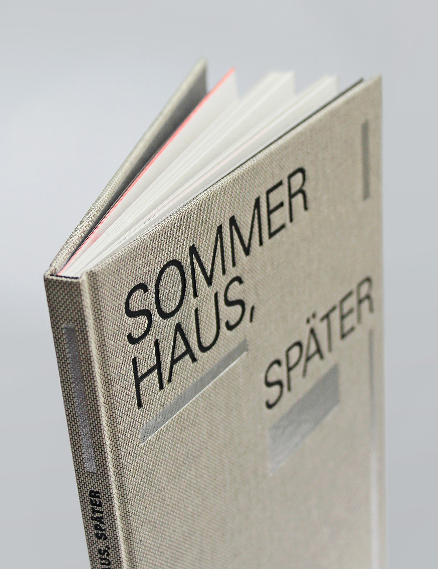
The Maximilian-Gesellschaft’s edition of Sommerhaus, später
Founded in 1911, the Maximilian-Gesellschaft is one of Germany’s bibliophile societies. The society has a regular publications program, and the book it sent to members for 2021 was a new edition of a text from Judith Hermann’s 2004 book, Sommerhaus, später. Stefan Gunnesch designed this hard-cover book using my Malabar typeface, together with Adrian Frutiger’s Univers. Maximilian-Gesellschaft produced this Sommerhaus, später edition in…
Written by
-
Freelance diary, week 6
The end As I mentioned last week, this entry is the last I’ll be adding to this weekly freelance-work wrap-up series. The projects that I’ve been writing about over the past month-and-a-half have mostly been anonymous, as they have all been contributions to larger projects that may not be complete for some time. This makes…
Written by
-
Freelance diary, week 5
The future I wrapped this post up on August 2nd. In less than 30 days, I’ll be moving across the country to Krefeld. I got a job as a teacher in the design program there, which I still can’t believe. I guess it will all settle in eventually! The school is called the Hochschule Niederrhein.…
Written by
-
Freelance diary, week 4
Now is the right time to talk about “managing expectations.” I don’t mean that it is time to write about how to navigate a client’s expectations, but about the expectations that I have as the writer of these blog post entries, and that you might have as a reader. When I wrote my first entry…
Written by
-
Freelance diary, week 3
I’m proud of a few things in this week’s post. For instance, I think this website’s speed problem is fixed. My laptop is out for fixing. A long-term research project I’d hoped would work out kicked off. On Thursday and Friday, I got to spend all of each morning in two different libraries. I’ve also…
Written by
-
Freelance diary, week 2
This week was abbreviated: I was out-of-town through Wednesday night. On Thursday and Friday, I worked a bit slower than normal, because of all that travel. I was very chuffed by all the likes my first post last week ended up receiving on Twitter. Some of you even texted me words of encouragement, and trust…
Written by
-
Freelance diary, week 1
Hey everyone. I’m not sure how many readers this is going to get, or if it needs to have any at all. But here we are. I’m been working in design since 1999; at least, that’s when my first internships and teaching assistantships were. Perhaps more importantly for this discussion: I’ve been working and paying…
Written by
-
New business cards
I picked up my new business cards today, and I do think they are really swell. These are the first business cards that I’ve had made for myself since 2004, and they are – both in terms of design and production quality – the best I have yet had. I am not a fan of…
Written by
-
Now with web fonts! (Test)
After recently switching this website’s font from Lucida Grande/Lucida Sans to Georgia, I have decided to tinker further with CSS. At the moment, most text on TypeOff.de is set in a not publicly available font of mine. Based on the Martel/Malabar typeface I designed at the University of Reading, this is more bookish. I originally…
Written by
-
Mountain type in Cheers magazine
In August, the people behind Slanted published the first issue of a new magazine called Cheers. It offers in interesting combination of photography and letterforms. This issue, containing text in both German and English, was printed in an edition of 2000. The magazine’s colophon describes the thinking behind its design philosophy well: Cheers magazine is…
Written by
-
Malabar in Use: Schusterfisch
The newspaper/magazine to the left is Schusterfisch; I’ve been sitting on this example of Malabar-in-use for months. It is time that I wrote up this neat project. Schusterfisch was designed by Indra Kupferschmid’s students at the HBKsaar for the Deutsches Zeitungsmuseum (German Newspaper Museum) in Wadgassen. It was printed at the Saarbrücker Zeitung, Saarbrücken’s daily…
Written by
-
TypoJournal 2 set in Malabar
As I mentioned in my post-TYPO article, a new issue of the German-language TypoJournal has just been published. TypoJournal is the magazine of the website/wiki/forum Typografie.info. For almost a decade, Ralf Herrmann has successful maintained Typografie.info’s position as one of Germany’s most important graphic design websites. A year ago, he extended the brand into a…
Written by
-
Dmig2 published! (Read the HTML version)
Years ago, in what seems to have been a time before the German type blogs Slanted and FontBlog were born, I recall often visiting a site called Design Made in Germany. Under the motto “German design is gray,” this site offered users a reduced, simple interface, as well as lively discussion. It was not unique…
Written by
-
Mountain and the Prosanova festival
After returning to Germany from Reading last September, I had to wait around Frankfurt and Berlin for a few days before I could move into my new Offenbach apartment. While spending a few nights in a friend’s study, I noticed a small brochure for an annual literary festival in Hildesheim, Prosanova. At least in 2008,…
Written by