It has been about a year since Linotype released Morris Sans, an update and expansion to its old digital version of ATF’s Bank Gothic typeface. This month’s LinoLetter contains an article detailing the differences between ATF’s metal Bank Gothic, Linotype’s first digital Bank Gothic, and the current Morris Sans.
I’ve recapped the English text and images here. But if you’d prefer, you can read the piece in German or in French at Linotype.com (which is now a tri-lingual website)!
Bank Gothic was a typeface released in 1930 by the American Type Founders. Morris Fuller Benton, ATF’s chief designer, created the family. ATF Bank Gothic was a family of five types: Light, Medium, Bold, Condensed Light, and Condensed Medium. These were cast in metal for hand composition, and remained in use for decades.
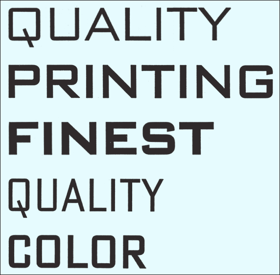
Figure 1: The five weights of Bank Gothic, as the typeface family was original released. These words are taken from a scan of an ATF catalog in Linotype’s collection. The letters—not shown at original size—are from the 72-point sized fonts of Bank Gothic Light, Bank Gothic Medium, Bank Gothic Bold, Bank Gothic Condensed Light, and Bank Gothic Condensed Medium (top to bottom).
ATF Bank Gothic was an uppercase-only design. When Linotype created a digital version during the 1980s, it developed small caps characters to map onto the lowercase keys of the keyboard. While ATF Bank Gothic had five variants, Linotype only digitized one of them: Bank Gothic Medium. Moreover, this digitization’s letterforms was drawn rather wide. The Linotype Bank Gothic characters were on the whole rather extended compared with the ATF originals.

Figure 2: The top line (PRINTING) is taken from a scan of the ATF specimen’s Bank Gothic Medium page. The second line (D’AUTR) is taken from a scan of the 1990 Linotype card catalog. Whereas the ATF specimen was set with metal type, the Linotype example shows a digital forerunner of the PostScript format. Note that the letter proportions of Linotype Bank Gothic are wider than the ATF original (especially visible in the letter R).
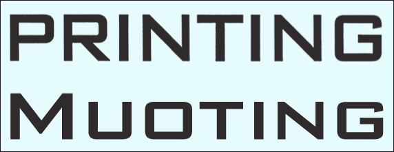
Figure 3: Again, the top line is from an ATF specimen and the second from a Linotype specimen. ATF’s Bank Gothic was an uppercase-only typeface. When Linotype digitized the face, it created small cap letters to be placed into the lowercase section of the font’s character set. At the time, this was rather innovative.
In 2005, I began work on the Morris Sans family, to revise and extend Bank Gothic for 21st century OpenType setting. Although Linotype had created a digital Bank Gothic weight almost 20 years earlier, this font was never converted into PostScript Type 1 format, meaning that it had fallen out of distribution during the early 1990s. I took the Linotype Bank Gothic Medium IKARUS data, added newly designed lowercase letters, and revised its character set.
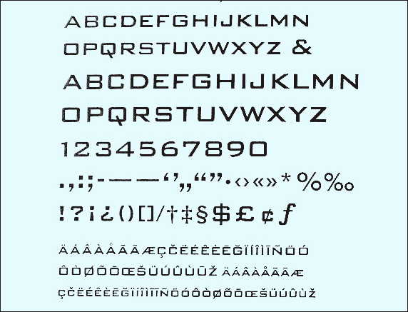
Figure 4: Original (rather limited) character set of Linotype’s first digital Bank Gothic Medium font. Scan from the 1990 card file, not shown at actual size.
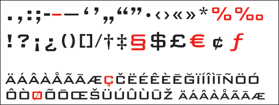
Figure 5: Bottom four lines of the image from figure 4, reset in Morris Sans Medium. The characters highlighted in red were redesigned, as the 1980s Linotype Bank Gothic forms were deemed no longer appropriate.
The proportions of the uppercase letters and small caps from Linotype Bank Gothic Medium did not change during this update. However, the other five variants of Morris Sans designed—Light, Heavy, Light Condensed, Medium Condensed, and Heavy Condensed—were designed to match harmoniously with Morris Sans Medium. When drawing these characters, specimens or samples of the original Bank Gothic were not consulted. As a result, the capital letter proportions of Morris Sans in those weights diverge significantly from Bank Gothic.
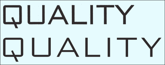
Figure 6: The first line of this image is set in ATF’s 72-point metal Bank Gothic, while the second shows in Linotype’s Morris Sans Light. The difference in stroke thickness is clearly visible, as are the different letter proportions. Like Linotype’s Bank Gothic, Morris Sans has wider letters than the ATF original (image not shown at actual size).
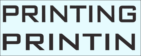
Figure 7: ATF Bank Gothic Medium 72-point (top), Morris Sans Medium (bottom).
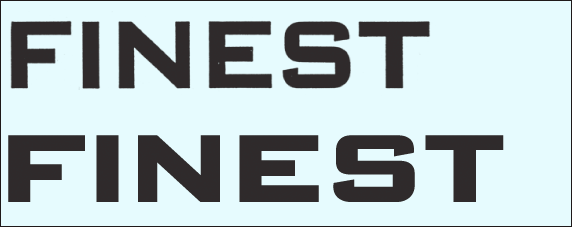
Figure 8: ATF Bank Gothic Bold 72-point (top), Morris Sans Heavy (bottom). In order to create greater weight differentiation across the family, Morris Sans does not have a Bold weight, but rather a much darker Heavy face.
Figure 9: ATF Bank Gothic Condensed Light 72-point (top), Morris Sans Light Condensed (bottom). The slightly wider Condensed variants of Morris Sans allow for clearer text when the fonts are set in smaller point sizes. The Condensed weights of Morris Sans are actually more like the regular-width variants of normal fonts, since the Regular weights of Morris Sans are rather wide.

Figure 10: ATF Bank Gothic Condensed Medium 72-point (top), Morris Sans Medium Condensed (bottom).

Figure 11: Morris Sans Heavy Condensed. ATF never released a “Bold Condensed” variant of Bank Gothic, but Morris Sans has a Heavy Condensed face for the sake of completeness.
Why was this necessary? Unlike Bank Gothic, Morris Sans has a lowercase component. In normal upper and lowercase text—even display applications—the primary vehicle of communication is lowercase letters (see figs 12–13). Therefore, the function of uppercase and small cap letters within Morris Sans is intended almost solely for working well together with the new lowercase. Many of Bank Gothic’s forms, although they work well with each other, do not necessarily lend themselves to harmony with non-capital letters.
Figure 12: 26pt/34pt Morris Sans Light Condensed, Medium Condensed, and Heavy Condensed.
Figure 13: Figure 13: 25pt/33pt Morris Sans Light, Medium, and Heavy.
Morris Sans supports all Latin-based languages used in Western, Central, and Eastern Europe—including those from the Baltic states and Turkey. Each font in the family includes both lining and oldstyle figures—another innovation over Bank Gothic. Both figure styles are included in both tabular and proportional varieties. There are also small caps figures available.
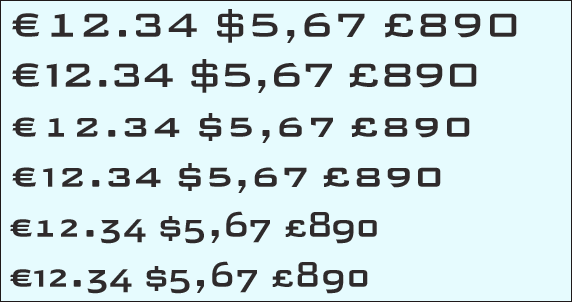
Figure 14: The different figure options in Morris Sans, from top to bottom—tabular lining figures, proportional lining figures, tabular small cap figures, proportional small cap figures, tabular oldstyle figures, and proportional oldstyle figures.