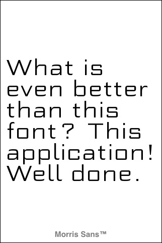
I have reached a new level of geekdom now that I can lovingly stare at Morris Sans, a display typeface family I designed for Linotype two years ago, on my iPhone. All of this is thanks to FontShuffle, a free iPhone font shuffling app released by FontShop on Friday.
What is “font shuffling?” Well, FontShop has devised a simple tiered-system of font classification (more here). First you select a general classification category, e.g., sans serif, serif, slab serif, script, blackletter, or display. Each of these categories has its own sub-categories. For instance, inside the sans serif category, you can select from grotesque, humanist, geometric, gothic, decorative, or hybrid sans serif styles. Once you are inside one of FontShuffle’s 36 sub-categories, the application will show you six randomly-selected fonts fitting that genre. If you don’t like these, just shake your iPhone or hit the “Shuffle” key; FontShuffle will show you six more.
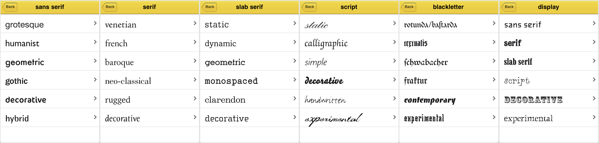
I’ve heard that the database FontShuffle accesses currently references about 450 fonts. On average, that would imply that each category has just about 12 typefaces in it at the moment, meaning that you could have theoretically seen all of the fonts in a given category after just one shuffle. Does this bother me? No.
From my own experiences with font classification databases, I can tell you that the creative challenge lies in defining your system. Adding more fonts afterwards is just grunt work. FontShuffle has only been available for four days; I’m sure that more fonts will be added to it in time. But the fonts that are in FontShuffle right now are already great! For instance, when I shuffle my iPhone, I see plenty of Linotype fonts.
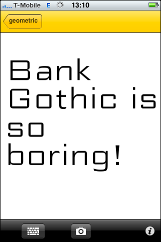
When FontShuffle debuted on the App Store last week, I lamented that I couldn’t find Morris Sans in any of the categories, even though Bank Gothic readily presented herself. This was just your typical Type Designer whining; Bank Gothic is a great typeface and a pillar of graphic design work the world over. It even landed in FontShop’s 2006 list of the 100 greatest typefaces. Morris Sans is just a later development that adds lowercase letters. But I drew it and I love it, just like Dr. Frankenstein must have always had a soft spot for his monster.
Now font shufflers everywhere can gaze at the peculiarities of Morris Sans, too (or at least at one of the six fonts in the family). How fantastic!