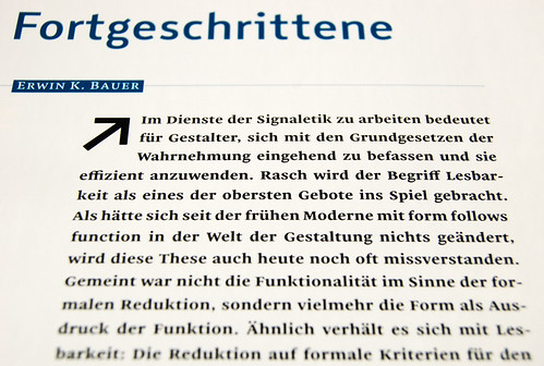
As I mentioned in my post-TYPO article, a new issue of the German-language TypoJournal has just been published. TypoJournal is the magazine of the website/wiki/forum Typografie.info. For almost a decade, Ralf Herrmann has successful maintained Typografie.info’s position as one of Germany’s most important graphic design websites. A year ago, he extended the brand into a second medium, publishing the first TypoJournal in time for TYPO Berlin 2009.
Earlier this year, Ralf asked me to write a short piece on Malabar for a new TypoJournal. At TYPO Berlin 2010 last month, he gave me a fresh copy of the issue. When he handed it to me, I thumbed through it quickly to get to the end and see how my article looked. In my rush, he had to point out to me that the text throughout the entire issue was set in Malabar! Large headlines are set in the navigation typeface that was part of Ralf’s Diplomarbeit at the Bauhaus University in Weimar. His decision to use Malabar was quite a surprise, and honestly, one of the nicest surprises I have ever had as a designer. I cannot express my gratitude enough.
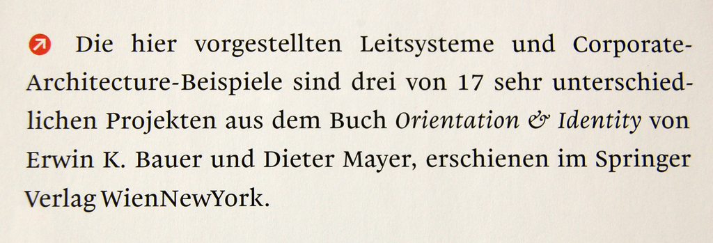
Here is the place for some more details
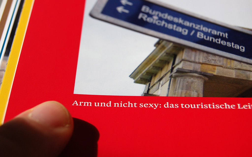
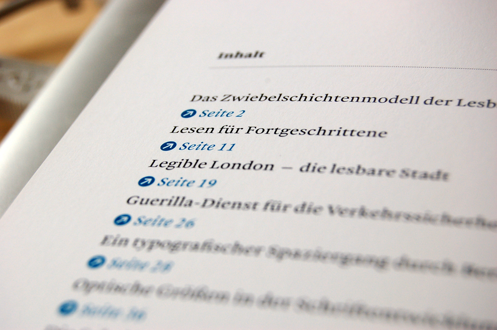
Franziska Jähnke and Ralf Herrmann designed the issue. TypoJournal 2 has 96 pages. Texts, including captions, are set justified. The magazine was printed offset at Laserline, Berlin. The issue’s theme is “wayfinding and legibility.” There are thirteen articles, by at least four authors. Credited contributor include Tim Ahrens, Erwin K. Bauer, and Helmut Ness. All text is in German.
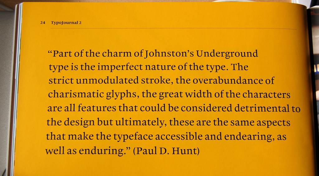
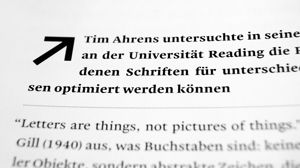
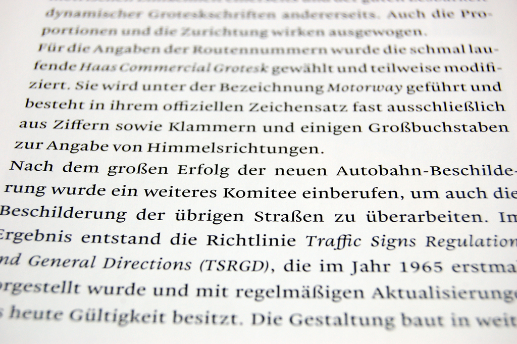
More information about this issue may be found (in German) at typojournal.typografie.info. Here is my English translation of the issue’s official description:
Following the success of the first TypoJournal, it was clear that would could set the bar much higher for the second issue. The amount of content has almost doubled, and the list of authors who have written their articles exclusively for the TypoJournal, can be seen more than ever. The issue is dedicated to wayfinding and legibility. We begin by illuminating the mystery behind legibility: how do we read, actually? What roll do so-called word-images play? Are serif faces are actually easier to read than sans serifs? Why should optical versions be created for different sizes? We also investigate the legibility of navigation systems, and the tension between their functionality and aesthetics. How should letters for signage to be designed? How can visitors in exhibition halls—or entire cities—find their way? These, and many other exciting topics, await in the second TypoJournal. Enjoy the issue!
Order a copy of TypoJournal 2 for just €8.50 at the Fonts.info store!
Correction
In my initial post, I wrote that TypoJournal 2 was printed on a digital press. This was a misunderstanding on my part. The issue is offset printed. No wonder it looks so good!
Comments
6 responses to “TypoJournal 2 set in Malabar”
Thanks for the article!
Minor correction: The magazine is printed in Offset, of course.
Oh my! I didn’t even know Laserline did that… shows how much I know. Time for a big text update.
Malabar looks ‘accustomed’ to all the setting examples showing versatility and poise.
I was thinking it was a little spaced out (word-space) for the Note example – but of course it is small text. The italic is effortless in this example – real nice.
The paragraph about figures made me dizzy! I am currently working out the logic of when Tabulated Figures stop because including them for Super weighted (heavier than bold makes the required width too wide for lighter weights.
I don’t think that it is reasonable to expect that all fonts’ tabular figures be “tabular” with each other. Maybe Regular and Bold and Italic… but heavier weights would likely not be used together with the others in the same table. Malabar “Heavy” weight, for instance, has too much contrast for text sizes, and should only be used in display applications. Malabar Heavy wasn’t used in this TypoJournal at all, for instance.
Dan,
Glad to see your Malabar beautifully displayed in print where it belongs for all to see.
Chris
Thanks! There is another usage example coming up; end of June / beginning of July…