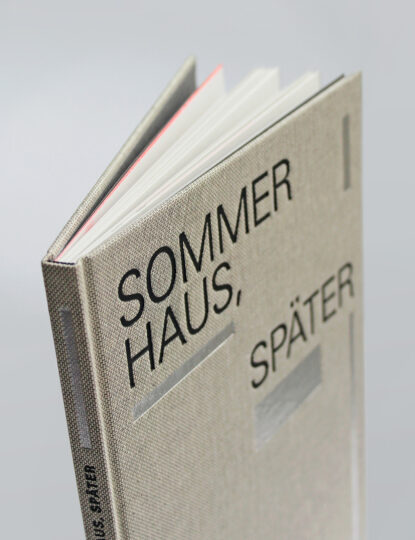
Founded in 1911, the Maximilian-Gesellschaft is one of Germany’s bibliophile societies. The society has a regular publications program, and the book it sent to members for 2021 was a new edition of a text from Judith Hermann’s 2004 book, Sommerhaus, später. Stefan Gunnesch designed this hard-cover book using my Malabar typeface, together with Adrian Frutiger’s Univers. Maximilian-Gesellschaft produced this Sommerhaus, später edition in 700 copies. DZA Druckerei zu Altenburg GmbH printed the books and bound them in linen. The cover is embossed in two colors. The books dimensions are 17 × 25 cm.
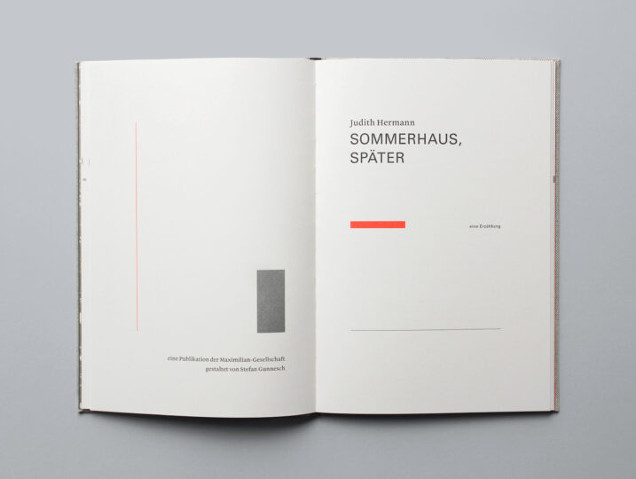
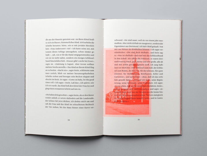
Gunnesch’s Sommerhaus, später title-page spread shows all of the colors and typefaces used in the book’s design. I have taken this photograph – as well as the other four accompanying this article – from the Maximilian-Gesellschaft’s website.
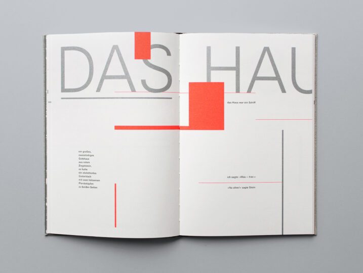
The Univers typeface is used particularly effectively in Sommerhaus, später. Although it was created more than 60 years ago, Gunnesch still managed to find a way to make Univers appear fresh.
The colors in this Sommerhaus, später edition are all spot colors, rather than composites.
Although I’m a Maximilian-Gesellschaft member, I doubt that this played a role in Gunnesch’s selection of Malabar for the book. This is a really lovely example of the typeface in use!