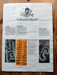
The newspaper/magazine to the left is Schusterfisch; I’ve been sitting on this example of Malabar-in-use for months. It is time that I wrote up this neat project. Schusterfisch was designed by Indra Kupferschmid’s students at the HBKsaar for the Deutsches Zeitungsmuseum (German Newspaper Museum) in Wadgassen. It was printed at the Saarbrücker Zeitung, Saarbrücken’s daily newspaper. The typeface is Malabar, which I designed as a student in Reading for possible use in newspapers.
At Reading, during the typeface’s development, I did not run any offsett tests—either on newspaper or any other sort of presses. Over the past few years, I have often wondered how the letters would appear in newsprint, or if they would even be legible at all. In 2010, I have seen a few great examples of Malabar in use. At TYPO Berlin in May, I received one of the first printed copies of the second issue of TypoJournal. In mid-June, the Gutenberg-Jahrbuch 2010 was published; this journal’s body text was set in a custom Malabar Book version, and footnotes were set in Malabar Regular.
Schusterfisch was printed to accompany an exhibition on type, called Schrift, at the German Newspaper Museum [photo]. I have a few dozen copies of Schusterfisch; if you’d like one, just ask!
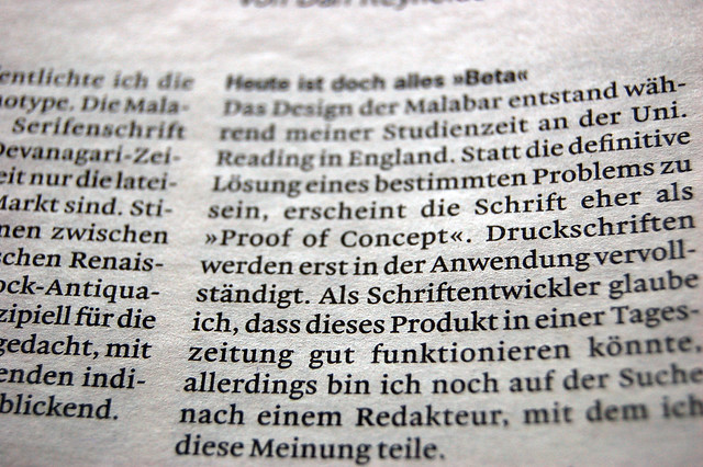
Enlarged scan of text from the front page of the newspaper magazine. My main worry was that the thin strokes of certain letters might not print darkly enough, which can happen with this typeface when it is printed offset on coated paper. With this ink, paper, and press combination, everything got darker and heavier. I need not have worried!
I am quite pleased with how Schusterfisch came out; looking at its pages has taught me alot. The Malabar Regular typeface prints much darker here than I expected. The Schusterfish layout has a lot of white space: the layout is more magazine-like, but the paper, ink, and press are from a newspaper. I wonder what a filled-up page in this type would look like? Perhaps it would all be too dark. I have an un-published Light version of the face. A newspaper-printed comparison of this Light with the Regular, and the Book face from the Gutenberg-Jahrbuch, would be fantastic thing to examine.
The Regular and Italic fonts from the Malabar typeface family were paired with Franklin Gothic throughout the issue. I am very happy that Indra and her students selected Malabar for this project.
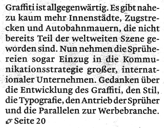
[Enlarged scan from the front page]. Looking over the text, I’m disturbed by my ligatures. In the first line of the above image, an ffi ligature may be seen in the word “Graffiti.” I think that the forms of my f-ligatures are too bookish for newspaper setting.
Toward the end of the project, Indra asked for a Malabar-matching printer’s fist. This may be seen in the above image’s bottom row.
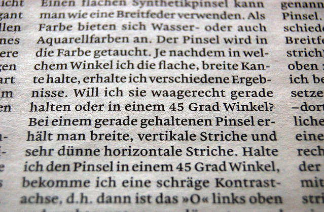
Malabar’s default figure style is tabular lining, as can be seen in the “45” in the middle of the above image. But Malabar has several other styles available via OpenType features, including proportional oldstyle figures.