Category: Interviews & Reviews
-
From Offenbach to London: Berthold Wolpe’s Monotype typefaces and the new Berthold Wolpe Collection from Monotype
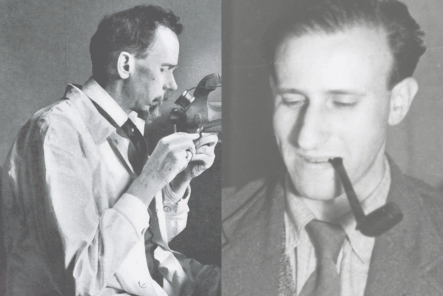
Above left: Rudolf Koch cutting a punch, photographed in the Gebr. Klingspor typefoundry of Offenbach am Main, circa 1931. Above right: Berthold Wolpe as young man while drawing. That photograph is presumably also from the 1930s. Born in 1905, Berthold Wolpe grew up as part of a jewish family in Offenbach am Main. When he…
Written by
-
Slanted #15
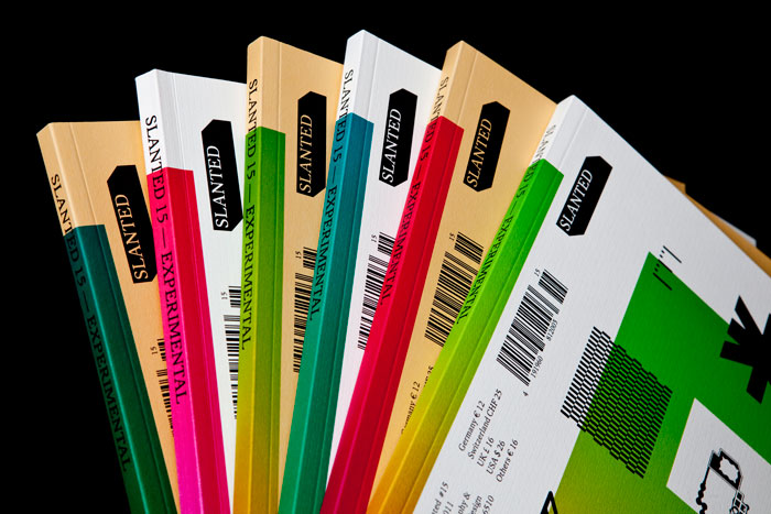
I’ve had a copy of Slanted magazine’s newest issue on my desk for weeks. The pals over at MAGMA Brand Design were very kind to send me a copy, and I enjoyed flipping through the issue very much. Still, I have no idea what to write about it. Issue 15’s theme is “Experimental,” which surprises…
Written by
-
New Cooper Black book
It is very rare that I publish “press release” sorts of posts here on TypeOff. I normally don’t like to promote events in which I am not actively involved, or recommend books that I haven’t actually read. However, I got an e-mail last night from BIS Publishers that made me curious. They’ve just announced the…
Written by
-
TYPO issue 44 is out
I’m a subscriber of TYPO magazine, a quarterly publication from Prague. Surprisingly, TYPO is one of the only regular magazines dedicated to type and typography. Sure, there are several great new-comers on the scene, like 8 Faces or Codex. And then there are stalwarts, like Baseline and Typografische Monatsblätter. But TYPO has been running strong…
Written by
-
Reorganizing my books
I have never been able to get too excited about typeface classification systems. Of all the texts that I have read about the subject, I think that I most agree with Jonathan Hoefler’s “On classifying type” from Emigre number 42 (1997). Or perhaps with John Hudson’s classification system (based on this source). Still, I’m excited…
Written by
-
French sans serifs in Slanted #13
For about two years, I’ve been wanting to write a short piece about current typeface design in France. Of course, writing about the type design output of just about any country with a rich typographic history is a much larger undertaking; something more book like, e.g., Jan Middendorp’s Dutch Type (2004) or the ATypI +…
Written by
-
End of 2010 book recommendations
Over the past two months, I’ve acquired more books than usual … books that I purchased on my own, received review copies of, or was given as gifts for my birthday or Christmas. Of those, these are the titles that I have just finished reading, or am starting now, as the year changes. They are…
Written by
-
Graphic design and the soul
Princeton Architectural Press recently published an expanded, second edition of Adrian Shaughnessy’s How to be a graphic designer without losing your soul. About a month ago, I received a free review copy. Although I had never read the first edition, published by Laurence King Publishing Ltd. London in 2005, I decided to read the book…
Written by
-
Slanted 11: Monospace, Typewriter
To begin this review, I would like to reiterate my affection for Slanted magazine; of their ten previous issues, I’ve contributed in a small way to at least six. While I played no role in issue 11, this rests entirely on my shoulders: Slanted regularly asks its readers for article contributions. Magma Brand Design, the…
Written by
-
Short German TV interview
In April 2010, Frankfurt hosted the annual Art Directors Club Germany meeting. Apparently, this was a big deal, a tremendous coup for the city. Previous meetings had been held in Berlin and Düsseldorf. Many German cities are fighting each other to put together the most exciting package and entice the ADC to change their venue…
Written by
-
Video of Robin Nicholas
I should start off this short post by writing that I don’t know Robin Nicholas very well. Robin is the Head of Typography at Monotype Imaging, and is perhaps best known as the designer behind the Arial typeface. While we work in the same department at Monotype Imaging, we are in different locations. He’s at…
Written by
-
My blackletter angst (and Slanted #10)
The newest issue of the Slanted magazine—its tenth—is entitled “Heavy Metal. Lovers.” Devoted to blackletter type, it is naturally a collection the absolute coolest elements in typography today. My love affair with blackletter runs deep; I’ve drawn half a dozen blackletter typefaces, but they never seemed quite right. I will never release them. Early in…
Written by
-
Dmig2 published! (Read the HTML version)
Years ago, in what seems to have been a time before the German type blogs Slanted and FontBlog were born, I recall often visiting a site called Design Made in Germany. Under the motto “German design is gray,” this site offered users a reduced, simple interface, as well as lively discussion. It was not unique…
Written by
-
Slanted #8—“2d3d. 4.” Simulating the third dimension
“2d3d” deals with a step-up of dimensions—from linearity to space—and everything in between. More than ever Slanted Magazine even crosses geographical borders, presenting works from Edhv (Eindhoven), Klein Dytham architecture (Tokyo), Pixelgarten (Frankfurt), Maxime Buechi (Lausanne), Ina Saltz (New York), Erwin K. Bauer (Vienna), Sangho Park (Stuttgart), and many others. The sections “Fontlabels, Fonts &…
Written by