Search results for: “Slanted”
-
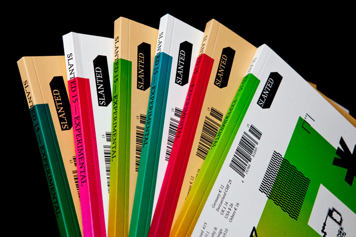
Slanted #15
I’ve had a copy of Slanted magazine’s newest issue on my desk for weeks. The pals over at MAGMA Brand Design were very kind to send me a copy, and I enjoyed flipping through the issue very much. Still, I have no idea what to write about it. Issue 15’s theme is “Experimental,” which surprises…
Written by
-
French sans serifs in Slanted #13
For about two years, I’ve been wanting to write a short piece about current typeface design in France. Of course, writing about the type design output of just about any country with a rich typographic history is a much larger undertaking; something more book like, e.g., Jan Middendorp’s Dutch Type (2004) or the ATypI +…
Written by
-
Slanted 11: Monospace, Typewriter
To begin this review, I would like to reiterate my affection for Slanted magazine; of their ten previous issues, I’ve contributed in a small way to at least six. While I played no role in issue 11, this rests entirely on my shoulders: Slanted regularly asks its readers for article contributions. Magma Brand Design, the…
Written by
-
My blackletter angst (and Slanted #10)
The newest issue of the Slanted magazine—its tenth—is entitled “Heavy Metal. Lovers.” Devoted to blackletter type, it is naturally a collection the absolute coolest elements in typography today. My love affair with blackletter runs deep; I’ve drawn half a dozen blackletter typefaces, but they never seemed quite right. I will never release them. Early in…
Written by
-
Slanted #8—“2d3d. 4.” Simulating the third dimension
“2d3d” deals with a step-up of dimensions—from linearity to space—and everything in between. More than ever Slanted Magazine even crosses geographical borders, presenting works from Edhv (Eindhoven), Klein Dytham architecture (Tokyo), Pixelgarten (Frankfurt), Maxime Buechi (Lausanne), Ina Saltz (New York), Erwin K. Bauer (Vienna), Sangho Park (Stuttgart), and many others. The sections “Fontlabels, Fonts &…
Written by
-
Geo.Type history in Slanted 7
The newest issue of Slanted, the über-typography magazine from Karlsruhe, Germany, is now out. This is their seventh issue, and the first of 2009. Three more are planned to be released before Christmas, making this their year, hands down. Slanted can better be described as a phenomenon, rather than any specific thing. Begun as a…
Written by
-
Out now: slanted magazine #6
The sixth issue of slanted magazine has been released at the German bookfair in Frankfurt, Germnay. For the first time the award-winning typography magazine has been issued in offset. We could upgrade the previously recognized type- and image-quality of slanted – our partner E & B Engelhardt and Bauer is one of the most high-performance…
Written by
-
Slanted talks
…and today they talked about magazines. First came what they call “the new minimalism.” What is that about? Well, how does one make a new, independent-looking style magazine, for instance? Simple. Reduced layout, lots of white space, a grid, fancy page numbers, and text in Helvetica or a classic serif face. Plus sort-of everyday photography…
Written by
-
Slanted 3—Now For Sale
My copy of the newest Slanted just arrived in the mail. Like the last issue, this one features an article of mine. The article recaps a lettering project I undertook in 2004 at the HfG Offenbach, which has been written up on TypeOff. twice, here and here. The issue, Slanted #3 Handmade Custom Script may…
Written by
-
Augsburg typefoundries
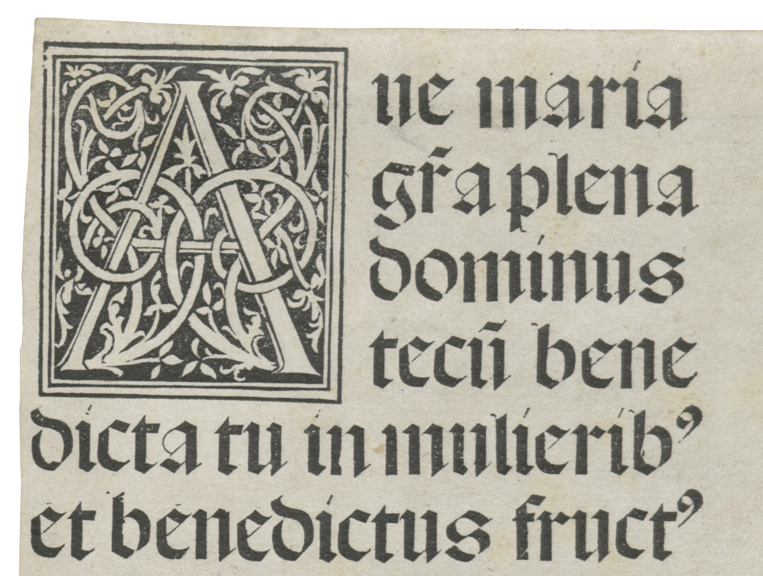
Augsburg was never a major typefounding center. However, the city was one of the earliest locations for printing in Western Europe. Augsburg was a Roman foundation – a military encampment was established about 15 years before the Common Era – named after Caesar Augustus. About a millennium and a half later, the city was the…
Written by
-
Albert Kapr and the Complete Works of Marx and Engels
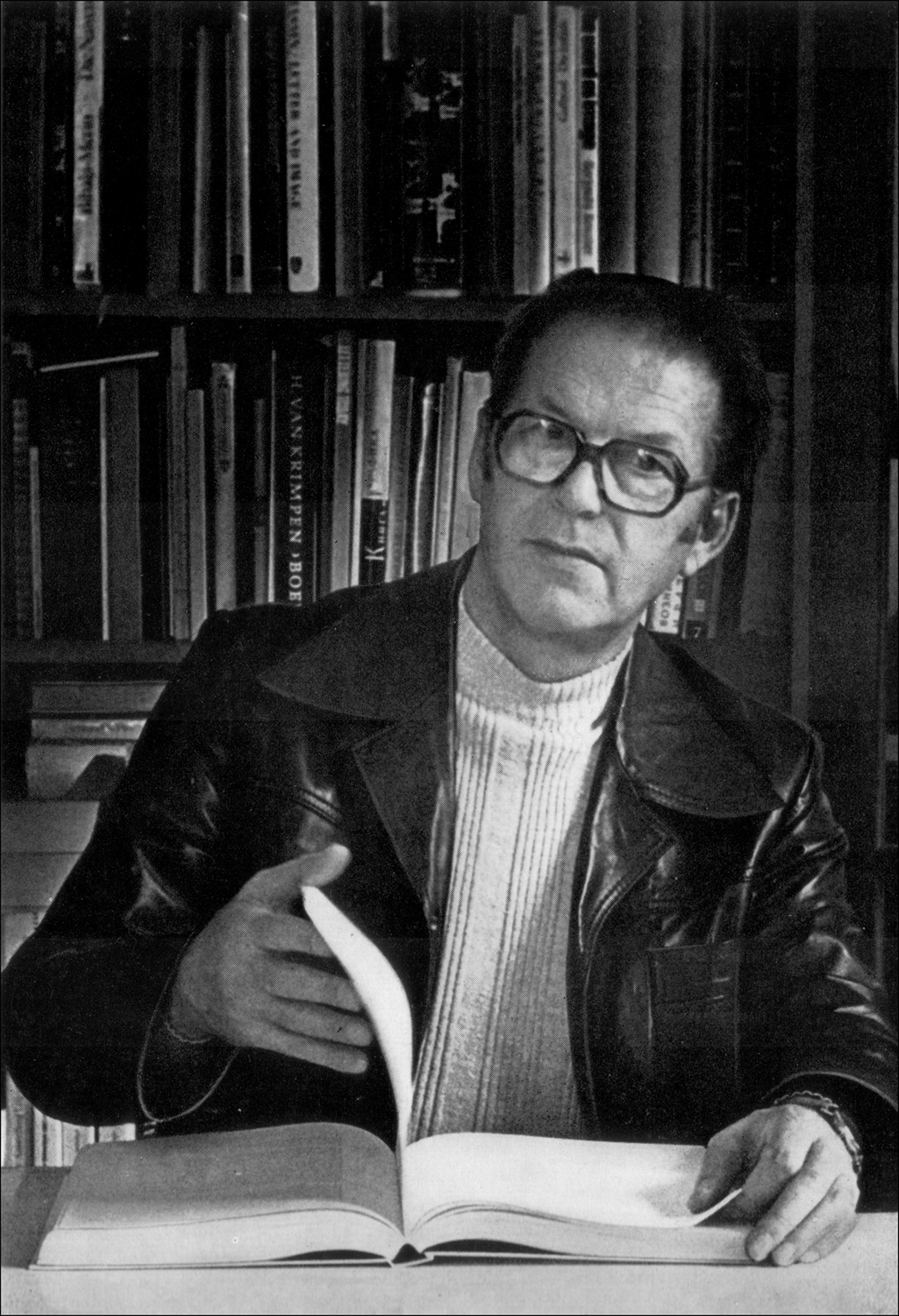
Figure 1 (above): Portrait of Albert Kapr from his 1982 book, Schrift- und Buchkunst. Historical-critical editions pose more than just academic challenges for publishers: they also raise technical and typographic questions. I originally wrote the following article in German for the Journal für Druckgeschichte, which published it in 2012.[1] Sylvia Werfel, who edited that version, invited…
Written by
-
TYPO TALK in Mainz in March
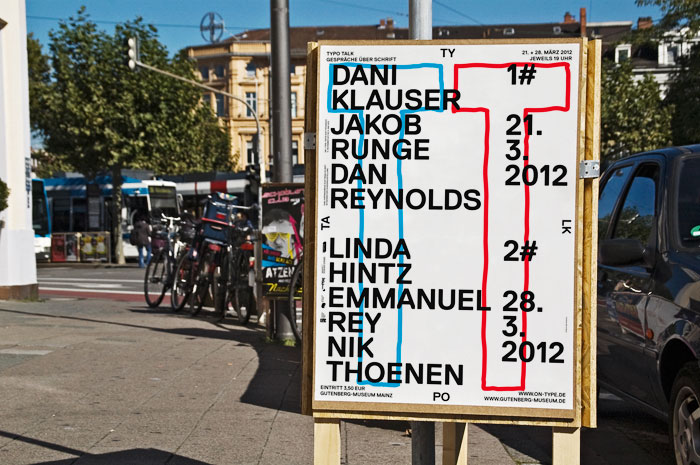
As part of their ON-TYPE exhibition, the Gutenberg-Museum in Mainz will hold a two-day lecture series entitled TYPO TALK on March 21 and 28, 2012. I’ve been invited as one of three speakers to present on the 21st. The series organizer, Marcel Häusler shared some information with today that I am pleased to translate into…
Written by
-
Some thoughts on geometric type
Introduction Graphic design and printing has engaged with geometric letters for at least a century. Designers pride themselves on their ability to create complex systems from simple elements, and the alphabet is no exception. By repeating a series of basic shapes, all of the forms of our writing system may be easily recreated, or at…
Written by
-
Jost Hochuli in Berlin!
I’ve already run across news of some awesomeness headed for Berlin this week, but here is a detailed (German-language) run-down, from the folks over at Slanted: Vom 04.01.2011 bis 22.01.2011 (08:00-20:00h) findet im Foyer Bo.01 der Weißensee Kunsthochschule Berlin eine Ausstellung zum Thema «Buchgestaltung in St. Gallen« statt. Das Fachgebiet Visuelle Kommunikation lädt zur Ausstellung…
Written by