…and today they talked about magazines. First came what they call “the new minimalism.” What is that about? Well, how does one make a new, independent-looking style magazine, for instance? Simple. Reduced layout, lots of white space, a grid, fancy page numbers, and text in Helvetica or a classic serif face. Plus sort-of everyday photography (will photographers be mad at me for writing that?).
Can one put all of this in the brand eins drawer, or is brand eins just the most prominent example? According to Slanted, brand eins style equals soft minimalism and straightness. It is neither at all sensitive nor playful; the opposite of both David Carson’s Raygun years and even Purple.
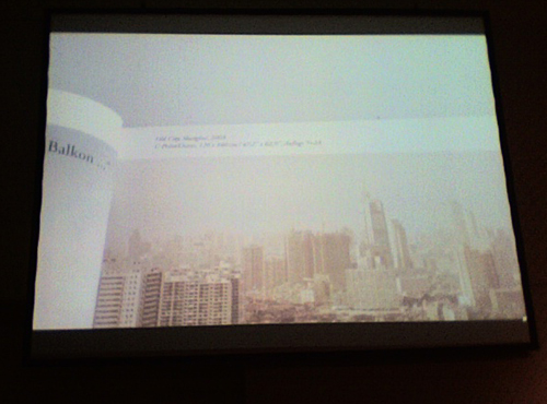
The above image is a slide from a spread from Booklet, a photo magazine. It fits the aesthetic of several examples that Slanted presented during their lecture. One attribute of Booklet is that they change the headline type with each article. Perhaps Slanted will put up a list of all the discussed magazines. I can’t keep track of them all here.
Their matrix for discussing magazines is interesting. For instance, Emigre = maximum typographic discourse and wow! factor. Very far away from “not bad” and “art, architecture, design.” They must be referring to the traditional expectations of magazine people here regarding those last two points, I guess.
Frame and Mark are magazines from Holland (product design and architecture, respectively) that are fantastically well put together. Maybe Anke would like these. I haven’t ever read them myself.
The most interesting typography—by far—was shown in student magazines published by students and design colleges in Germany and Switzerland. Go students! You beat the pants off of big publishing houses. Unfortunately, most of the magazines don’t live past the first few issues. Do big magazine houses sacrifice creativity for continuity?