To begin this review, I would like to reiterate my affection for Slanted magazine; of their ten previous issues, I’ve contributed in a small way to at least six. While I played no role in issue 11, this rests entirely on my shoulders: Slanted regularly asks its readers for article contributions. Magma Brand Design, the Karlsruhe graphic design agency behind projects including Slanted magazine, the Slanted.de blog, the Volcano-Type foundry, and the Typodarium calendar, is one of Germany’s most creative companies. It is difficult for me to criticize anything to do, as I have much respect for their enthusiasm, their ability to continually follow their passions, and their work in general. Nevertheless, I’m a bit at a loss when it comes to the newest issue of Slanted magazine.
If you are unfamiliar with the newest issue, you can read a few basic facts about it on the official description at Slanted.de (in German and English, with images). You may also enjoy the Magma Brand Design project page for Slanted 11 (in German, with images).
Introduction
At the beginning of September, one of Slanted’s editors asked me to write a review of this issue. I have blogged about Slanted here on TypeOff. before, but most of my posts regarding the magazine have just highlighted my own contributions to it. After receiving my copy of Slanted 11 the mail, I read the issue from cover to cover in a single day. Actually, as I the magazine arrived on the day I travelled to the ATypI 2010 conference, I read the issue in the air, en route to Dublin. Since then, it has been necessary for me to mull over the issue somewhat. Had Slanted not requested a review, I would not be writing this.
Format
I applaud Slanted’s frequent change of magazine format. This seems to be the fifth so far over the life of the magazine to date. The previous four issues shared a similar format. This included book jacket style covers that unfolded to produce a series of posters writing out the phrase, “porn 4 type lovers.” Issue 11 is smaller than the previous few issues, but just by a few millimeters. The simple black-on-yellow cover is visually striking. I feel that there is less white space on the interior pages than there was before. Slanted 11 certainly has a looser structure throughout the issue; articles and sections overlap, and explanations of typefaces as well as author bios are now at the very end.
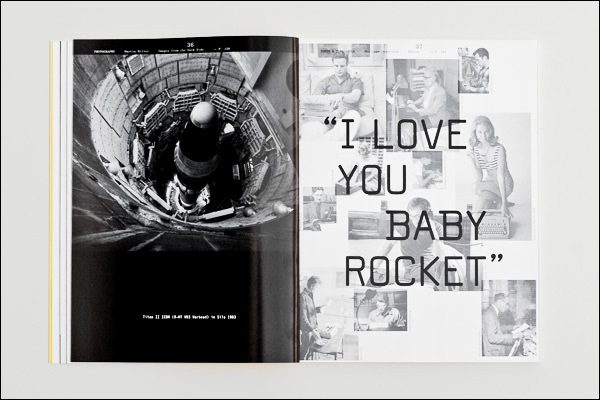
This issue has the same mix of familiar sections that readers will have come to expect, such as “Fonts & Type Labels,” “Font Names Illustrated,” “TypoLyrics,” and “Projects” – which includes more than just student work. I don’t typically spend much time looking at the “Font Names Illustrated” or “TypoLyrics” sections, but maybe other readers love this sort of thing, and ignore the more text-based articles that are my favorite part. Most issues of Slanted include an uncommented photo-essay; Slanted 11’s is Martin Miller’s “Images from the Dark Side,” a series of black and white photographs of nuclear weapons and delivery systems.
I don’t know how many copies of each issue are printed, but the magazine seems to be growing in prominence. It is great to see Slanted receive wide distribution. Just last week, in the stuffy, corporate chain-run newsstand of Berlin’s central train station, I saw copies of Slanted 11 for sale.
What bothers me?
I am not pleased by the way Slanted mixed typewriter-revival and monospace typefaces together in the same pot. The two genres are separate things, but they are treated in this issue as a single one. Not all typewriters had fixed-width fonts, and not all digital monospace faces are revivals of old technology-style letterforms. Typefaces in Slanted 11 are treated at face value; there is little asking why so many designers in the 21st century design and use monospace typefaces in the first place. Is it because so many clients have tabular matter to be set? Is it because there is a general desire to mimic mid-20th-century typewriters? Very few of the sample layouts with these fonts look as if they had been typed on paper by a typewriter. A typewriter typically has one size of letter, available in one style, although some models would allow the switching of fonts. Or is it that designers feel that monospace design is easy?
Looking through the pages of Slanted 11, the reader will see that some graphic designers and many type designers love to make and use monospace fonts. But I find no accompanying discussion on the merits or drawbacks of this genre. This sort of use is a trend; Slanted 11 does not point toward a movement to replace proportional text with monospaced writing.
By my count, the magazine’s “Fonts & Typelabels” section includes 16 typefaces. One is an ornaments font. From the 15 typefaces that can set text, 13 are either monospaced, or families with both proportional and monospaced variants. One of these 15 typefaces, Erich Brechbühl’s DOS, is a revival of the MS-DOS screen font. Of the 13 monospace designs, only Gilles Le Corre’s 1913 Typewriter mimics more of a typewriter’s effects than just have a monospace width. The typeface features letters that look corroded, although there only seems to be one glyph variant per character. A few of the 16 “Fonts & Typelabels” featured typefaces are also used to set parts of the magazine. These are joined by more traditional monospaced designs, including Century Schoolbook Mono and a custom, monospaced version of Times.
Completely absent from Slanted 11 are fonts that feature “pressure” as an element. Several contemporary digital typefaces – the most sophisticated of which is probably FF Trixie HD – simulate this pretty well. With the help of OpenType features, typefaces like FF Trixie HD can better simulate the effect of typewritten text via the automatic substitution of alternate glyphs, e.g., each time the letter e appears in a word, it will look different.
In my opinion, the previous four issues of Slanted also did a better job at showing some of the historical diversity behind contemporary styles: Issue 7 revolved around geometric type. Issue 8 spoke to the dialectic between 2D and 3D effects in display typefaces. Issue 9’s theme was about stencil lettering. Issue 10 was devoted to the blackletter genre. An interesting inclusion in Slanted 11 might have been something along the lines of the research that Dr. Thomas Maier presented at the fourth Berlin Typostammtisch on May 4, 2007. In a presentation entitled »die Typographie der Schreibmaschine«, Thomas explained how many of the old, industrial type foundries distributed “typewriter-stlye” typefaces. These were printers’ types that would simulate the effect of typewritten text. The letters were mostly monospace, but also uneven; parts of the letterforms were eroded away. This allowed for printed documents to better emulate the effect of a typewritten page. Their motivation was not unlike that of contemporary digital foundries. As Stephen Coles writes on the FontShop microsite for FF Trixie, “the more digital we get, the more we miss analog. The more we miss analog, the better digital gets at analog simulation.” Earlier in the 20th century, type foundries were producing types that mimicked typewritten text. This was a time when typewriters were actually in use.
Some of this issue’s articles
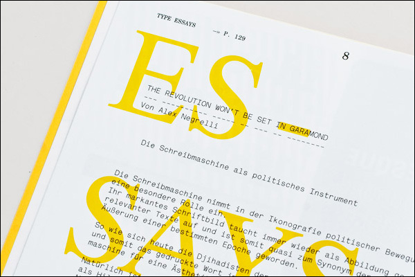
Slanted 11 and its lead article are both titled, “the revolution won’t be set in Garamond.” This refers to a theme running through several contributions, explaining how both government officials and dissidents made use of typewriting machines during the 20th century. The title is a bit inappropriate for the present; should the revolution come tomorrow, it might well be set in Garamond. In any event, I hold this for a greater probability than a renewed use of typewriters, or the mass-adoption of typewriter-style fonts. Today, Garamond typefaces, and similar selections from the garalde genre, may in fact be the most read style of text face in Germany. In their presentation at TYPO-Berlin 2007, »Typografie, Magazine & Playlists«, Lars Harmsen and Flo Gaertner – two of the prime movers behind Slanted – pointed toward as much while explaining the so-called “Brand Eins phenomenon” in German magazine design.
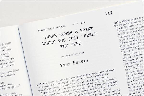
The “Interviews & Reports” section at the back of the magazine was my favorite. I enjoyed Ian Lynam’s interviews with Kunihiko Okano and Daijiro Ohara. These two texts alone are worth the cost of the magazine. The Slanted staff interviews with Richard Kegler, Yves Peters, and Georg Seifert are also interesting, but as I’ve known all three of these designers for years, I was more intrigued by the Japanese designers.
Order details
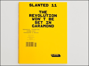
Slanted 11
Monospace, Typewriter
Summer 2010
148 pages
Some articles in German, others in English
€12, plus shipping and handling. Purchase at Slanted.de